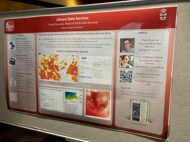
I presented a poster last April on the library’s GIS and Data Services at the CHAIRS-C conference at the Brown School of Public Health. CHAIRS-C is an acronym for Center on Heat, Health, and Aging Innovation and Research Solutions for Communities; it’s a small cluster whose members are interested in heat-related research, and the impact of extreme heat on vulnerable communities. I provided some examples in the poster of heat-related datasets and research that I’ve supported over the last few years. I thought I’d share a summary of these datasets in this post that include air conditioning, heat indices, and sources that provide climate-related rasters with variable that include temperature and precipitation. Most of these examples are US-based, the last one is global.
Local Air Conditioning Estimates (LACE)
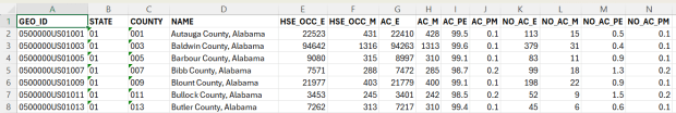
The Local Air Conditioning Estimates (LACE) is a new, experimental dataset produced by the US Census Bureau. It includes estimates of occupied housing units that have air conditioning at the national, state, county, and census tract levels. The estimates are published with margins of error at a 90% confidence level, and represent the year 2023. Each record includes the census summary level / fips GEOID, so you can readily match them to vector boundary files for GIS mapping.
Sample records from the Local Air Conditioning Estimates for census tracts
Questions about air conditioning are regularly collected as part of the American Housing Survey (AHS), but the sample size isn’t large enough to publish reliable estimates below the state and metropolitan area levels. To create LACE, the Census Bureau employed machine learning in a process called cross survey modeling, and triangulated the AHS with some other datasets to create small-area estimates. Summary documentation is included on the LACE website if you want to learn more, and there are links to working papers that go into greater detail.
The concept is similar to what the CDC has done in taking data from the Behavioral Risk Factor Surveillance System and using models to create small area estimates for the PLACES project. LACE fills a vital data gap for studying heat; most small-area sources for AC are a patchwork series of parcel data published by individual municipalities. I attended a couple of presentations given by the Census Bureau at FedGeoDay back in April, and they suggested that they will increasingly move in a modeling direction that draws on administrative data and smaller surveys, given declining response rates to large sample surveys like the ACS. Of course, this was before the current administration made the bonkers decision to ban the use of injecting noise into statistical datasets (a basic practice for protecting the privacy of survey participants), so who knows what will happen next.
Urban Heat Severity Index
Research has shown that temperature varies considerably over small areas, especially in cities. So if you are looking at the temperature reported for an entire city, or even at gridded data where the cells are large, both will mask a good deal of geographic variability. The absence of trees and green space, an abundance of impervious surfaces, and concentrated emissions from vehicles and air conditioners can dramatically increase the temperature of urban areas, creating “heat islands”.
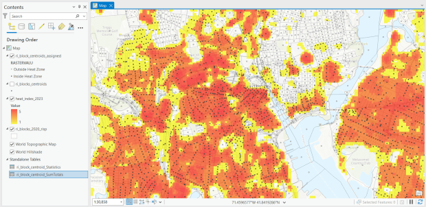
The Trust for Public Land has been publishing the annual Heat Severity Urban Areas index for the past few years; originally the dataset covered just incorporated places but was expanded to include the entire US. Index values from 1 to 5 indicate the severity of a heat island, measured relative to the average summer temperature for the city or place where each grid cell is located. The data is published as a grid at 30m resolution (matching the resolution of LANDSAT imagery used in their workflow) and is distributed via an ESRI hub site. You can search for it within the Living Atlas in the data catalog in ArcGIS Pro to add it to a project, or grab the url from the hub site to render it as a web mapping service in QGIS or another package. In order to use it in an analysis, you’ll need to export and save the raster locally. To save time and space, you can clip the layer to a polygon or extent of the screen, and then save the result.
For one project, I had to estimate the number of people in Rhode Island who were living within an urban heat island. I used census block boundaries from the 2020 census, which include total population and housing units as attributes, calculated the centroid of the blocks, and overlaid them on the grid and assigned the intersecting grid value to each point. Then I summed the population by the index values; a value of null indicated that the center of the block fell outside a heat cell.
Urban Heat Severity Index overlayed with census blocks in Providence, RI in ArcGIS Pro
US Gridded Climate Data: PRISM
For rasters of climate data on temperature and precipitation, I’ve often turned to PRISM at Oregon State University. They work with the USDA to generate the maps for plant hardiness zones, and have developed a model to generate gridded climate data. The public data is available at 4km resolution, but researchers with project proposals can submit requests to access 800m resolution data. They publish mean daily, monthly, and annual values, as well as normals. Each raster is stored in one file, where the file represents one observation for one time period. I have written about PRISM in the past as I used it for several projects, writing Python scripts to pull a raster file for specific dates that match attributes in a point file, in order to determine what the temperature was for that date for each point, based on the grid cell the point fell within. PRISM has updated some of their products since I’ve run that analysis, specifically replacing the older raster file formats with tifs.
US County Climate Data: NCEI Climate at a Glance
For certain statistical analyses, it can be helpful to have climate data summarized for an entire geographic area so that it aligns with other variables that are published for that area. NOAA’s National Center for Environmental Information (NCEI) employs a model that takes their gridded data product (derived from the U.S. Climate Divisional Database) to produce monthly state and county-level estimates for the US, from 1895 to the present. I wrote a post that summarizes how to download, interpret, and parse these files so that you can start using them; if you’re seeking the entire dataset you’ll skip the web-based interface for creating summary charts and maps and go right to the FTP site to download data in bulk.
Since our current government doesn’t like the weather, this is one of the datasets that I’ve archived in DataLumos as part of the Data Rescue Project, in case it vanishes one day.
Global Climate Data: ERA5
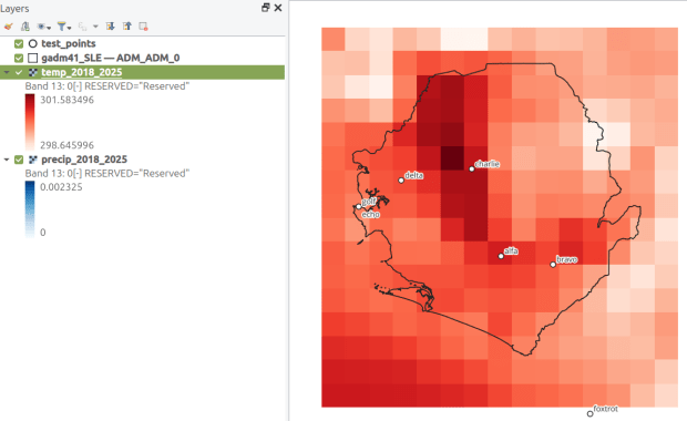
How about the rest of the world? ERA5 is produced by the European Centre for Medium-Range Weather Forecasts, which publishes gridded climate data at 1/4 degree resolution, modeled from 1940 to present. You can choose hourly, daily, or monthly estimates (accessed via separate web pages), and at the download stage you can provide bounding box coordinates to clip the data (so you don’t have to download the entire planet). The data is packaged in a GRIB file, where variables are stored in separate bands. So if you download monthly data for one variable, each month is stored sequentially; if you download two or more variables, they are sorted by variable and then by time period. Similar to my US project with PRISM, I wrote a Python script that extracts ERA5’s monthly gridded data for specific point locations, but in this case I pulled all dates for each point (with an option to highlight a specific month for a matching date). I wrote a detailed post that describes the dataset and process.
ERA5 mean monthly temperature data for Sierra Leone in QGIS
In my previous post, I summarized several efforts to rescue and preserve US federal government datasets that are being removed from the internet. In this post, I’ll provide a basic primer on screen scraping with Python, which is what I’ve used to capture datasets in participating in the Data Rescue Project. Screen scraping can employed to many ends, such as capturing text on web pages so it can be analyzed, or taking statistics embedded in HTML tables and saving them in machine readable formats. In the context of this post, screen scraping is an approach for downloading data and documentation files stored on websites.
There are several benefits to using a scripting approach for this work. It saves you from the tedious task of clicking and downloading files one by one. The script serves as documentation for what you did, and allows you to easily repeat the process in the future, if the datasets continue to exist and are updated. A scripted, screen-scraping approach may not be best or necessary if the website and datasets are relatively small and simple, or conversely if the site is complicated and difficult to scrape given the technology it employs. In both cases, manual downloading may be quicker, especially with a team of volunteers. Furthermore, if it seems clear that the dataset or website are not going to be updated, or are going to vanish, then the benefit of repeating the process in the future is moot.
In this example, we’ll assume that screen scraping is the way to go, and we’ll use Python to do it. I’ll address a few alternatives to this approach at the end, the primary one being using an API if and when it’s available, and will share links to working code that colleagues and I have written to save datasets.
You should only apply these approaches to public, open data. Capturing restricted or proprietary information violates licenses, terms of service, and in some cases privacy constraints, and is not condoned by any of the rescue projects. Even if the data is public, bear in mind that scraping can put undue pressure on web servers. For large websites, plan accordingly by building pauses into the process, breaking up the work into segments, or running programs at non-peak times (overnight). When writing and testing scripts, don’t repeat the process over and over again on the entire website; run your tests on samples until you get everything working.
Screen Scraping Basics
The first step is to explore the website where the data is hosted, to identify the best pages to use as a source and determine the feasibility of the approach. Many websites will have feature rich, user friendly pages that make it easy to view extracts of data and visualize it, such as the NOAA climate website below.
While easy to use, these pages can be complex and tedious to scrape. Always look for an option for bulk downloading datasets. They may lead you to a page sitting behind the scenes of the fancy website, such as the NOAA file directory below. Saving data from a page like this is fairly straightforward.
For the benefit of those of you who are not 1990s era people like myself and may not be familiar with working with HTML, the example below illustrates a simple webpage. With any browser, you can right click on a page and View the Source, to see the HTML code and stylesheets behind the page, which the browser processes and renders to display the site. HTML is a markup language where text is enclosed in tags that tell us something about the content within the tags, and which can be used for displaying the content in different ways. HTML is also hierarchical, so that content can be nested. For example, there is a head section that contains preliminary content about the page, and a body section that encloses the main content. Within the body there can be divisions, and anchor tags that represent links. In this example, one of these anchors is a link to a data file that we want to download.
We can use Python to parse these tags and pull out desired content. There are four core modules I always use: Requests for downloading content, os for creating folders and working with paths, Beautiful Soup for screen scraping, and datetime for creating time stamps. In the code below, we begin by importing the modules and saving the url of the page we wish to scrape as a variable.
In most Python environments (unless you’ve modified some settings) it’s assumed that your current working directory is the folder where your Python script is stored. When you download files, they will automatically be stored in that folder. To keep things tidy, I always create a subfolder named with the date; I use the date function from datetime to retrieve today’s date, append that date to the word “downloaded-‘, and use the os module to create a subfolder with that name. If we run the program at a later date it will save everything in a new folder, rather than overwriting existing files.
import requests, os
from bs4 import BeautifulSoup as soup
from datetime import date

url='https://www.page.gov'

today = str(date.today())
outfolder='downloaded-'+today
if not os.path.exists(outfolder):
    os.makedirs(outfolder)

webpage=requests.get(url).content
soup_page=soup(webpage,'html.parser')
page_title = soup_page.title.text
container=soup_page.find('div',{'class':'content'})
links=container.findAll('a')
The final block in this example captures data from the website. We use requests to get the content stored at the url (the webpage), and then we pass this to Beautiful Soup, which parses all the HTML using their tags. Once parsed, we can retrieve specific objects. For example, we can save the page title (the text that appears in the heading of your browser for a particular site) as a variable. We also grab the section of the page that contains the links we want to capture by looking for a specific div or id tag. This isn’t strictly necessary for simple pages like this one, but speeds up processing for larger, more complex pages. Lastly, we can search through that specific container to find all the anchor tags, or links.
Once we have the links, we loop through and save the ones we want. My preference is to store them in a dictionary as key / value pairs, where the key is the name of the file, and the value is the file’s URL. We iterate through the links we saved, and with the soup we determine if the link has an ‘href’ attribute. If it does, we see if it ends with .zip, which is the data file. This skips any link that’s not a file we want, including links that go to other webpages as opposed to files. In practice, I provide a list of several file types here such as .zip, .csv, .txt, .xlsx, .pdf, etc to capture anything that could be data or documentation. If we find the zip, we split the link’s attributes from one string of text into a list of strings that are separated by the backslash, and grab the last element, which is the name of the file. Lastly, we add this to our datalinks dictionary; in this example, we’d have: {'data.zip':'https://www.page.gov/data.zip'}.
datalinks={}

for lnk in links:
    if 'href' in lnk.attrs:
        if lnk.attrs['href'].endswith(('.zip')):
            fname=lnk.attrs['href'].split('/')[-1]
            datalinks[fname]=lnk.attrs['href']
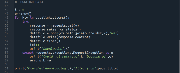
Time to download! We loop through each key (file name) and value (url) in our dictionary. We use the requests module to try and get the url (v), but if there’s a problem with the website or the link is invalid we bail out. If successful, we use the os module to go to our output folder and we supply the name of the file from the website (k) as the name of the file that we want to store on our computer. The ‘wb’ parameter specifies that we’re writing bytes to a file. I always like to keep count of the number of files I’ve done with an iterator (i) so I can print messages to a screen or a log file.
i = 0
for k,v in datalinks.items():
    try:
        response=requests.get(v)
        response.raise_for_status()
        dfile=open(os.path.join(outfolder,k),'wb')
        dfile.write(response.content)
        dfile.close()
        i=i+1
        print('Downloaded',k)
    except requests.exceptions.RequestException as e:
        print('Could not get',k,'because of',e)
print('Downloaded',i,'files from',page_title)
It’s important to save documentation too, so people can understand how the data was created and structured. In addition to saving pdf and text files, you can also save a vanilla copy of the website; I use a generic name with a date stamp. This saves the basic HTML text of the page, but not any images, documents, or styling. Which is usually good enough for providing documentation.
As mentioned previously, you don’t want to place undue burden on the webserver. With the time module, you can use the sleep function and add a pause to your script for a fixed amount of time, usually at the end of a loop, or after your iterator has recorded a certain number of files. The random module allows you to supply a random time value within a range, if you want to vary the length of the pause.
import time
from random import randint

# Pause fixed amount
time.sleep(5)

# Pause random amount within a range
time.sleep(randint(10,20))
Screen Scraping Caveats
Those are the basics! Now here are the primary exceptions. The first problem is that links to files may not be absolute links that contain the entire path to a file. Sometimes they’re relative, containing a reference to just the subfolder and file. The requests module won’t be able to find these, so we have to take the extra step of building the full path, as in the example below. You can do this by identifying what the relative path starts with (unless they’re all relative and the same), and you create the absolute by adding (concatenating) the root url and the relative one contained in the soup.
    <div class='content'>
        <p>Paragraph with text.</p>
        <a href='/us/data.zip'/>
    </div>
url='https://www.page.gov'
datalinks={}
for lnk in links:
    if lnk.attrs['href'].endswith(('.zip')):
        if lnk.attrs['href'].startswith('/us/'):
            fname=lnk.attrs['href'].split('/')[-1]
            datalinks[fname]=url+lnk.attrs['href']
            ...
In other cases, a link to a data file may not lead directly to the file, but leads to another web page where that file is stored. We can embed another scraping block into a loop; retrieve and start scraping the main page, then once you find a link go to that page, and repeat retrieval and scraping. In these cases, it’s best to save these steps in a function, so you can call the function multiple times instead of repeating the same code.
<div class='content'>
        <p>Paragraph with text.</p>
        <a href='https://www.page.gov/us/'>
 </div>
Some websites will have dedicated pages where they embed a parameter in the url, such as codes for countries or states. If you know what these are, you can define them in a list, and iterate through that list by formatting the url to insert the code, and then scrape that page. If a page uses a unique integer as an ID and you know what the upper limit is, you can use for i in range(1,n) to step through each page (but make sure you handle exceptions, in case an integer isn’t used or is missing).
codes=['us','ca','mx']
url='https://www.page.gov/{}'
for c in codes:
    webpage=requests.get(url.format(c)).content
    soup_page=soup(webpage,'html.parser')
    ...
For complicated sites with several pages, you might not want to dump all the files into the same folder. Instead, as you iterate through pages, you can create a dedicated folder for that iteration. Using the example above, if there is a page for each country code, you can create a folder for that code and when writing files, use the path module to store files in that folder for that iteration.
codes=['us','ca','mx']
for c in codes:
    ...
    cfolder=os.path.join(outfolder,c)
        if not os.path.exists(cfolder):
            os.makedirs(cfolder)
    ...
    response=requests.get(v)
        response.raise_for_status()
        dfile=open(os.path.join(cfolder,k),'wb')
        dfile.write(response.content)
        dfile.close()
For websites with lots of files, or with a few big files, you may run out of memory during the download process and your script will go kaput. To avoid this, you can stream a file in chunks instead of trying to download it in one go. Use the request module’s iter_content function, and supply a reasonable chunk size in bytes (10000000 bytes is 10 MB).
...
try:
    with requests.get(v,stream=True) as response:
        response.raise_for_status()
        fpath=os.path.join(outfolder,k)
        with open(fpath,'wb') as writefile:
            for chunk in response.iter_content(chunk_size=10000000):
                writefile.write(chunk)
    i=i+1
    print('Downloaded',k)
except requests.exceptions.RequestException as e:
        print('Could not get',fname,'because of',e)
If you view the page source for a website, and don’t actually see the anchor links and file names in the HTML, you’re probably dealing with a page that employs JavaScript, which is a show stopper if you’re using Beautiful Soup. There may be a dropdown menu or option you have to choose first, in order to render the actual page (and you may be able to use the page parameters trick above, if the url on each page varies). But you may be stuck; instead of links, there may be download buttons you have to press or a dropdown menu option you have to choose in order to download the file.
One option would be to use a Python module called Selenium, which allows you to automate the process of using a web browser, to open a page, find a button, and click it. I’ve tried Selenium with some success, but find that it’s complex and clunky for screen scraping. It’s browser dependent (you’re automating the use of a browser, and they’re all different), and you’re forced to incorporate lots of pauses; waiting for a page to load before attempting to parse it, and dealing with pop up menus in the browser as you attempt to download multiple files, etc.
Another option that I’m not familiar with, and thus haven’t tried, would be to use JavaScript since that’s what the page uses. Most browsers have web developer console add-ons that allow you to execute snippets of JavaScript code in order to do something on a page. So some automation may be possible.
Using an API
You may be able to avoid scraping altogether if the data is made available via an API. With a REST API, you pass parameters into a base link to make a specific request. Using requests, you go to that URL, and instead of getting a web page you get the data that you’ve asked for, usually packaged in a JSON type object within your program (Python or another scripting language). Some APIs retrieve documents or dataset files, that you can stream and download as described previously. But most APIs for statistical data retrieve individual data records, which you would store in a nested list or dictionary and then write out to a CSV. The example below grabs the total population for four large cities in Rhode Island from 2020 decennial census public redistricting dataset.
import requests,csv

year='2020'
dsource='dec' # survey
dseries='pl' # dataset
cols='NAME,P1_001N' # variables
state='44' # geocodes for states
place='19180,54640,59000,74300' # geocodes for places
outfile='census_pop2020.csv'
keyfile='census_key.txt'

with open(keyfile) as key:
	api_key=key.read().strip()

base_url = f'https://api.census.gov/data/{year}/{dsource}/{dseries}'

# for sub-geography within larger geography - geographies must nest
data_url = f'{base_url}?get={cols}&for=place:{place}&in=state:{state}&key={api_key}'

response=requests.get(data_url)

popdata=response.json()
for record in popdata:
    print(record)

with open(outfile, 'w', newline='') as writefile:
    writer=csv.writer(writefile, quoting=csv.QUOTE_MINIMAL, delimiter=',')
    writer.writerows(popdata)
The benefit of an API is that it’s designed to retrieve machine readable data, and might be easier than scraping pages that have complex interfaces. The major downside is, if you’re forced to download individual records as opposed to entire files, the process can take a long time, to the point where it may be infeasible if the datasets are too large. It’s always worth checking to see if there is a bulk download option as that could be easier and more efficient (for example, the Census Bureau has an FTP site for downloading datasets in their entirety). Using an API also requires you to invest time in studying how it works, so you can build the appropriate links and ensure that you’re capturing everything.
Conclusion
Screen scraping will vary from website to website, but once you have enough examples it becomes easy to resample your code. You’ll always need to modify the Beautiful Soup step based on the structure of the individual pages, but the requests downloading step is more rote and may not require much modification. While I use Python, you can use other languages like R to achieve similar results.
Visit my library’s US Federal Government Data Backup GitHub for working examples of code that I and colleagues have used to capture datasets. In my programs I’ve added extra components, like writing a basic metadata file and error logs, which I haven’t covered in this post. The NOAA County at a Glance, IRS-SOI, and IMLS, scripts are basic examples, and the IMLS ones include some of the caveats I’ve described. The NOAA lake and sea level rise scripts are far more complex, and include cycling through many pages, creating multiple folders, streaming downloads, and encapsulating processes into functions. The USAID DHS Indicators scripts used APIs that retrieved files, while the USAID DHS SDR script used Selenium to step through a series of JavaScript pages.
You’ll find scripts but no datasets in the GitHub repo due to file size limitations. If you’re a member of an institution that has access to GLOBUS, you can access the data files by following the instructions at the top of the page. Otherwise, we’ve contributed all of our datasets to DataLumos (except for the sea level rise data, I’m working with another university to host that).
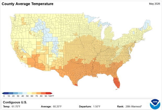
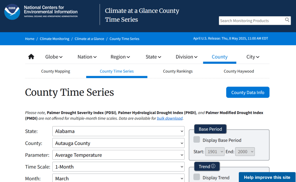
I recently had a question about finding historic climate data in the United States at the county-level. In this post I’ll show you how to access it, and how to parse fixed-width text files in Excel. Weather data is captured and reported by point-based weather stations, and then is often interpolated and modeled over gridded surfaces (rasters). The National Centers for Environmental Information at NOAA have used their models to create zonal statistics for counties, which they publish via the Climate at a Glance County Mapping program (I described what zonal statistics are in an earlier post).
The basic application lets you map the continental US or an individual state (includes AK but not HI). You choose a parameter (Avg / Min / Max temperature, precipitation, cooling / heating days, drought indexes), year (1895 to present), month, and time scale (1 month to 5 years). This creates a map that you can modify to depict that value, or to display ranks or anomalies. You can download the map as an image, or the underlying data as CSV or JSON.
A separate app allows you to create a time series profile for a particular county, with a table, chart, and data that you can download.
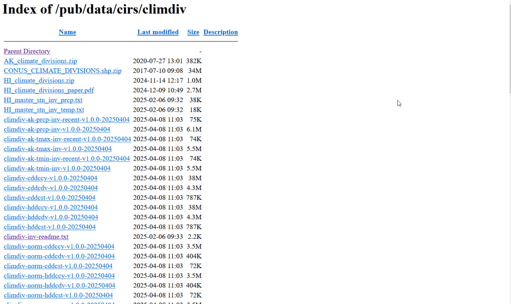
These apps are great for the basics, but bulk downloading the underlying data for all counties and years is a bit trickier. You crash land in a file directory and have to choose from an array of zipped files. Fortunately there is good documentation. In that folder, these are the county-level files for precipitation, min temp, max temp, and avg temp:
climdiv-pcpncy-vx.y.z-YYYYMMDD
climdiv-tmaxcy-vx.y.z-YYYYMMDD
climdiv-tmincy-vx.y.z-YYYYMMDD
climdiv-tmpccy-vx.y.z-YYYYMMDD
Where v is for “version”, the xyz is a version number, and the final portion is the date. The archive is updated monthly. The other files in the directory are for climate divisions, states and regions, and data that pertains to the drought indexes. There are also files that have climate normals for each of these areas. If you’re interested in these, you can go up to the parent-level directory and view the relevant documentation.
The county files are fixed-width text files, which means you have to parse them to separate the values. If you treat them as delimited files (using spaces), then all of the fields at the beginning of the file will be lumped together, which is not useful. Spreadsheets and stats packages have tools for importing delimited text, or you could script something in Python or R. Modern versions of Excel will allow you to parse fixed-width data by supplying a list of endpoints for each column; older versions of Excel and other spreadsheets have you “eyeball” the columns and manually insert breaks in an import screen.
If you’re using a modern version of Excel: open a blank workbook and on the Data ribbon click the From Text/CSV button. Browse and select the county text file you’ve downloaded. In the import screen change the Delimiter drop down to Fixed Width.
In the box underneath, begin with zero and type the end points for each position (with the exception of the final endpoint, 95) as a comma separated list. You’ll find these in the README file, but I’ve also tacked on the most salient bits to the end of this post. For your convenience:
0,5,7,11,18,25,32,39,46,53,60,67,74,81,88
If you click on the preview grid, it will parse the columns.
In this example, I’m not parsing the state and county code separately, but am keeping them together to create a single unique identifier. Once everything is parsed, hit the Transform Data button. For column 1, hit the small 123 button, and change the option to Text, and choose Replace data.
This will preserve the leading zero in the state/county code. It’s important to do this, so the codes in this table with match the codes in other county data table or spatial data files that you may wish to join this table to. Do the same for the element code in column 2. The remaining Year and Month columns can be left alone, as they’re already appropriately saved as integers and decimals respectively.
Hit the Close and Load button in the upper left hand corner, and Excel will parse and load the data. It formats the columns and applies a filter option. To get rid of the styling and filter dropdowns, I’d copy the entire table, and do a Paste-Special-Values in a new worksheet. Then replace the generic column labels with these:
Save the file, and now you have something to work with. Each record represents the monthly temperature or precipitation for a particular county for a particular year. To create a unique record ID, you can concatenate the state/county code, element code, and year values. For GIS applications, you would need to pivot the data to a wide form, so that the year becomes a column to give you month-year as a column, and each row represents each county with no repeats. With over 120 years of monthly data, that would give you over 1500 columns – so filter out what you don’t need. The state / county code can be used to join the table to the Census Bureau’s Cartographic Boundary Files, using the CBF’s GEOID field.
When would you use this data? If you’re creating data profiles or are running a statistical analysis and are using counties as your geographic unit, and temperature or precipitation is one variable among many that you need. Or, you’re making a series of county-level maps, and this is one of your variables. This dataset is clearly pretty convenient for doing time series analyses, as compiling data for a times series is usually time consuming. The counties in this dataset represent present day boundaries, so normalizing geography over time isn’t necessary.
When not to use it? Counties vary in size and can encompass a great deal of internal variety in terms of elevation, land use and land cover, and proximity to / presence of water bodies, all of which impact the climate. So the weather in one part of a county could be quite different from another part. To capture these internal differences, it would be better to use gridded data, such as the 4×4 km rasters that PRISM produces for daily, monthly, annual, and normal summaries.
Gridded climate data and zonal stats derived from grids are estimates based on models; if you wanted or needed the actual measurements as they were recorded, you would need to go back and get point-based weather station data, from the Local Climatological Database for instance. There are a limited number of stations, and not one for every county. The closest station to a given place could be used to represent or approximate the weather for that place.
Codebook for county data files (extracted from README):
Element Record
Name Position Element Description
STATE-CODE 1-2 as indicated in State Code Table as described in FILE 1. Range of values is 01-48.
DIVISION-NUMBER 3-5 COUNTY FIPS - Range of values 001-999.
ELEMENT CODE 6-7
01 = Precipitation
02 = Average Temperature
25 = Heating Degree Days
26 = Cooling Degree Days
27 = Maximum Temperature
28 = Minimum Temperature
YEAR 8-11 This is the year of record. Range is 1895 to current year processed.
Monthly Divisional Temperature format (f7.2) Range of values -50.00 to 140.00 degrees Fahrenheit. Decimals retain a position in the 7-character field.  Missing values in the latest year are indicated by -99.99.

Monthly Divisional Precipitation format (f7.2) Range of values 00.00 to 99.99.  Decimal point retains a position in the 7-character field. Missing values in the latest year are indicated by -9.99.

JAN-VALUE 12-18

FEB-VALUE 19-25

MAR-VALUE 26-32

APR-VALUE 33-39

MAY-VALUE 40-46

JUNE-VALUE 47-53

JULY-VALUE 54-60

AUG-VALUE 61-67

SEPT-VALUE 68-74

OCT-VALUE 75-81

NOV-VALUE 82-88

DEC-VALUE 89-95
I’ve also received a number of questions this semester about animal observation and tracking data. Since I usually study people and not animals, I was a bit out of my element and had some homework to do. If you’ve ever watched nature shows, you’ve seen scientists tagging animals with collars or bands to track them by radio or satellite, or setting up cameras to record them. Many scientists upload their GPS coordinate data into publicly accessible repositories for others to download and use.
I’ve written a short, three-part document that I’ve posted on our tutorials page: GIS Data Sources for Wildlife Tutorial. In the first part, I provide summaries, links, and guidance on using large portals like Movebank and Zoatrack* that include many species from all over the world (wild and domestic), as well a government repositories including NOAA’s National Center for Environment Information Geoportal and the National Park Service’s Data Store. The second part focuses on search strategies, crawling the web and combing through academic literature in library databases to find additional data. Since these datasets are highly diffuse, it’s worth going beyond the portals to see what else you can discover.
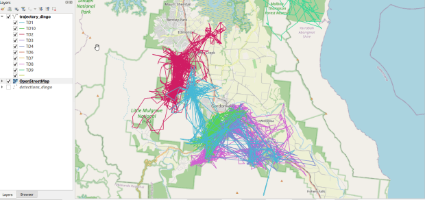
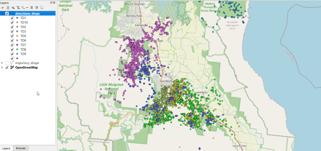
I describe how you can add and visualize this data in QGIS and ArcGIS Pro in the third and final part. Wildlife data comes packaged in a number of formats; in some cases you’ll find shapefiles or geodatabases that you can readily add and visualize, but more often than not the data is packaged in a plain CSV / TXT format. This requires you to plot the coordinates (X for longitude, Y for latitude) to create a dot map of the observations. Data files will often contain a number of individual animals, which can be uniquely identified with a tag ID, allowing you to symbolize the points by category so you have a different color or symbol for each individual. Alternatively, there might be separate data files for each individual, that you could add and symbolize differently. The files will contain either a sequential integer or a timestamp that indicates the order of the observations. With one field that indicates the order and another that identifies each individual, you can use a Points to Line or Points to Path tool to generate lines (tracks or trajectories) from the points (observations or detections).
You can see where dingos in Queensland, Australia are going in the screenshot below, which displays individual observation points, and the screenshot in the header of this post where the points were connected to form paths. I obtained the data from ZoaTrack and used QGIS for mapping. Check out the tutorial for details on how to find and map your favorite animals.
* NOTE: ZoaTrack went offline in July 2024. You can still access an archive of the site and its datasets via the Internet Archive’s Wayback Machine. Here is a cached version of Zoatrack from June 2024. The tutorial will be updated to reflect this change soon.
Over the course of this academic year I’ve helped many students find GIS data related to coastal storms and flooding in the US. There’s a ton of data available, particularly from NOAA, but there are so many projects and initiatives that it can be tough to find what you’re looking for. So I’ll share a few key resources here.
NOAA’s DigitalCoast is a good place to start; it’s a catalog of federal, state, and US territory projects and websites that provide both spatial and non-spatial datasets related to coastal storms and flooding. You can filter by place and data type; there are even a few global sources. Most of the projects I mention below are cataloged there.
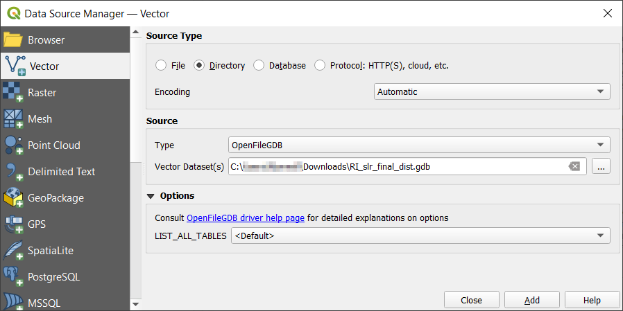
Given the size of many of these datasets, the ArcGIS File Geodatabase is often used for packaging and distribution. Once you’ve downloaded and unzipped one, it looks like a folder with lots of subfolders and files. If you’re an ArcGIS user, use the Catalog pane to browse your file system and add a connection to the database / folder to access its contents. If you’re a QGIS user, use the Data Manager and on the Vector tab change the source type from File to Directory. In the Source Type dropdown you can choose OpenFileGDB, and browse and select the database, which appears as a folder. Once you hit the Add button, you’ll be prompted to choose the features in the DB that you wish to add to the project.
Adding a File Geodatabase in QGIS
FEMA Flood Hazards and Disasters
The FEMA flood maps are usually the first thing that comes to mind when folks set out to find data on flooding, but good luck finding their GIS data. I’ve searched through their main program site for the National Flood Hazard Layer and followed every link, but can’t for the life of me find the connection to the page that has actual GIS data; there are map viewer tools, scanned paper maps, web mapping services, and everything else under the sun.
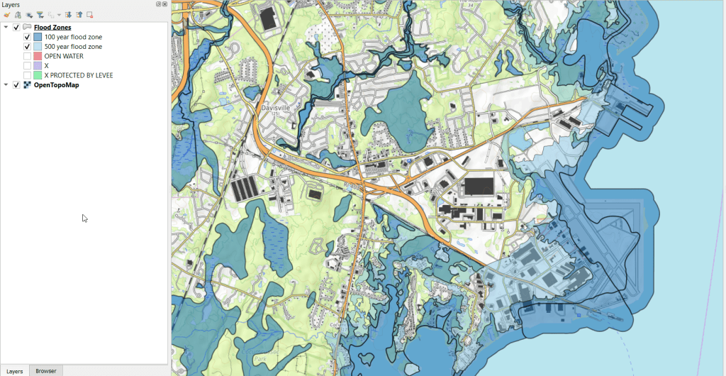
If you want FEMA flood data in a GIS format: GO HERE! You have to search by state, county, and jurisdiction, but after searching under Effective products at the bottom choose NFHL-Data State, and you’ll get the database for the whole state (or choose county if you prefer). The data is packaged in an ArcGIS File Geodatabase, and among the many layers there is a flood hazard area layer. Features are categorized into different types of flood zones, open water bodies, areas outside of flood zones, and areas outside flood zones protected by levees. The pic below illustrates 100 and 500 year zones overlaid on the OpenTopoMap.
FEMA Flood Hazard Layer, 100 year zones in dark blue, 500 year in light blue
FEMA also has a GIS data feed for current and historical emergencies and disasters, that are available in a variety of formats both spatial and non-spatial. These are county-level layers that indicate where disaster areas were declared and what kind of funding or assistance is / was available.
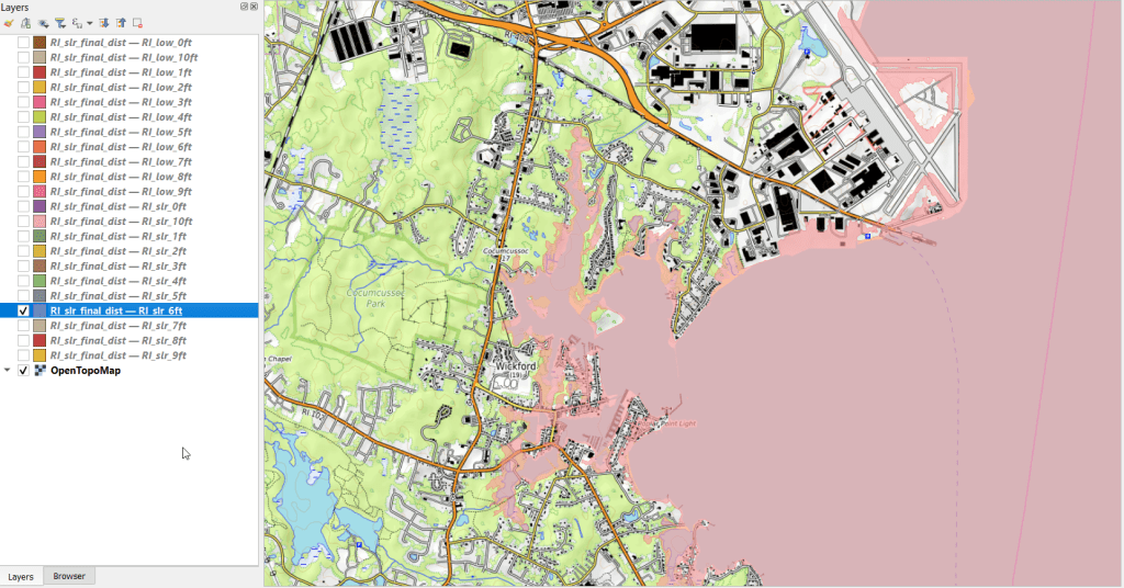
NOAA Sea Level Rise
The FEMA maps assess both past events and current conditions to model the likelihood of flooding in a 100 or 500 year period for a major storm event. A different way of looking at flooding is to consider sea level rise due to climate change, where the impact of sea level rise is measured in different increments. Instead of the impact of a one-shot event, this illustrates potential long term change. NOAA’s Sea Level Rise (SLR) viewer allows you to easily visualize the impact of sea level rise in 1 foot increments, between 1 and 10 feet. You can download the data by US state or territory for coastal areas. There are separate downloads for sea level rise, rise depth, the confidence intervals for the models, as well as DEMs and flood frequency. The sea level rise data is package in an ArcGIS file geodatabase, with two sets of files (a low estimate and high estimate) in one foot increments. An example of 6 feet in sea level rise is shown below.
NOAA Sea Level Rise. Areas in pink illustrate sea level 6 feet higher than present
NOAA National Hurricane Center
Beyond showing the general impact of flooding or sea level rise, you can also look at the track of individual hurricanes and tropical storms. The National Hurricane Center’s GIS data page provides historical forecasts – the projected path and cone of storms, windspeeds, storm surges, etc. You choose your year, then can choose a storm, and then a particular day. You can use this data to see how the forecasts evolved as the storm moved. When we’re in hurricane season, you can also see what the circumstances are day by day for tracking new storms.
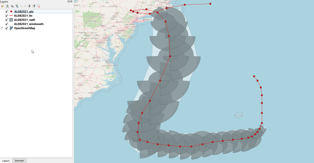
If you want to see what actually happened (as opposed to a forecast), you can dig through the data page and browse the different options. There’s the Tropical Cyclone Report (TCR) which provides “information on each tropical cyclone, including synoptic history, meteorological statistics, casualties and damages, and the post-analysis best track (six-hourly positions and intensities). Tropical cyclones include depressions, storms and hurricanes.” The default page shows you the Atlantic, but you can swap to Eastern or Central Pacific using the link at the top. Storms are listed alphabetically (and thus by date) and your format options are shapefile or KML. There’s a map at the bottom that depicts and labels all the storms for that season. You actually get four shapefiles in a download; a point file that contains a number of measurements, a line file for the storm track, a polygon file for the radius of the storm, and another polygon with the wind swath. The layers for 2021’s Tropical Storm Henri are illustrated below.
Layers from NOAA”s NHC Tropical Cyclone Report, Tropical Storm Henri 2021
GIS data for the storms begins in 2010 with KMZ files (which you’ll need to convert in ArcGIS or QGIS to make them useful beyond display purposes), and shapefiles appear in 2015. Further back in time are just PDF reports and map scans.
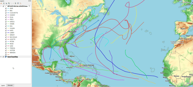
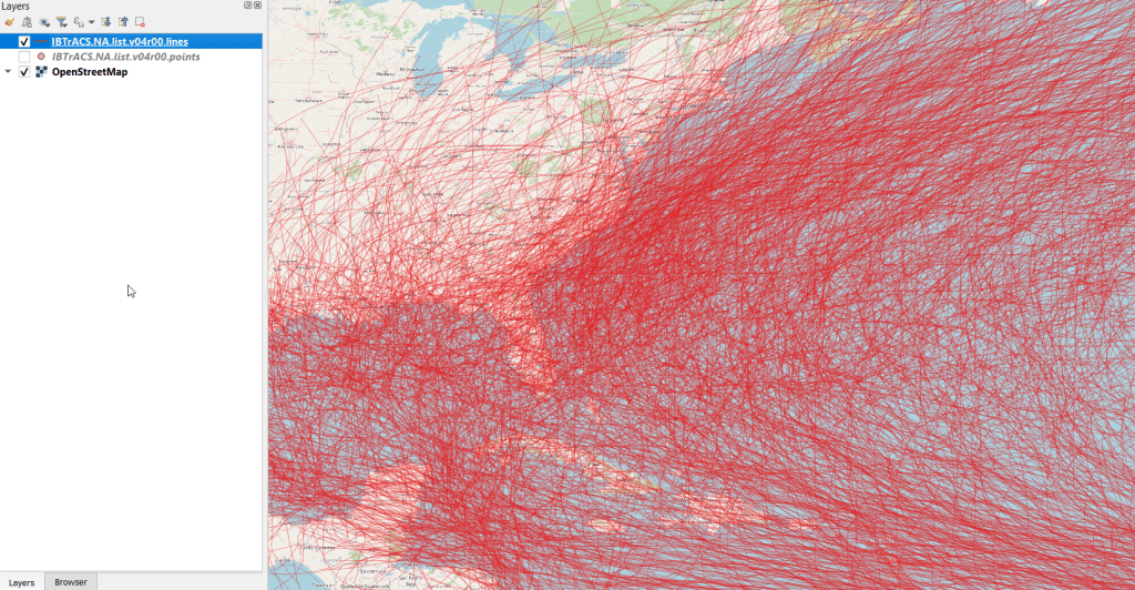
If you really want to go back and time and get all the tracks at once, there’s the HURDAT2 database; one for the Atlantic (1851 to present) and another for the Pacific (1949 to present). It’s a csv file that contains coordinates for the track of every storm, which you can process to create a geospatial file using a points to line tool. Or – you can grab a version where that’s already been created! The International Best Track Archive for Climate Stewardship (IBTrACS) keeps a running CSV and shapefile of all global storms. Scroll down and choose shapefile (CSV is another option). The download page is just a list of files – you can choose points or lines, storms by ocean (East Pacific, North Atlantic, North Indian, South Atlantic, South Indian, South Pacific, West Pacific), or grab everything in lists that are: active, everything (ALL), last 3 years, or since 1980. Below is an example of all storms in the North Atlantic – there are quite a lot (see below)! You get storm speed and direction, wind speed and direction, coordinates, and identifiers associated with the storm as points and lines. A subset of this data for the 2021 season is displayed in the feature image at the top of this post.
Historical hurricane / storm tracks from 1851 to 2021 in the North Atlantic from IBTrACS
How About the Weather?
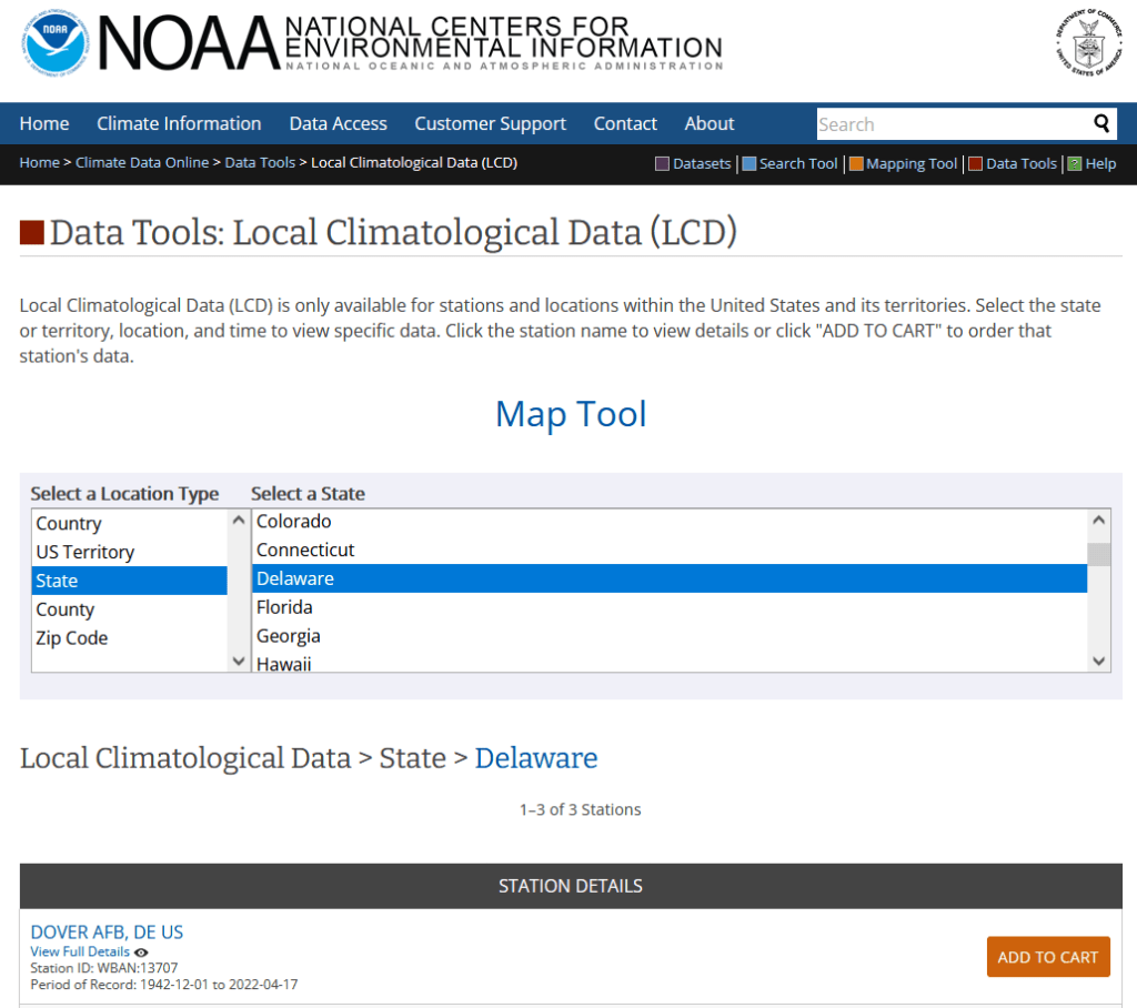
There are many places you can go for this and the best source depends on the use case. More often than not, I end up using the Local Climatological Database. Choose a geographic type, then a specific area, and you’ll see all the weather stations in this area. Add them to the cart, and then view the cart once you have all the stations you want. On the next screen choose an output format (CSV or TXT fixed width) and a date range. You submit an order and wait a bit for it to be compiled, and are notified by email when it’s ready for download. Mixed in this CSV are records that are monthly, daily, and hourly, so after downloading you’ll want to extract just the period you’re interested in. Data includes temperature, precipitation, dew point, wind speed and direction, humidity, barometric pressure, and cloud cover.
Map Tool search interface for NOAA Local Climatological Data
Some processing is required to make these files GIS ready. Each record represents an observation at a station at a given point in time, so if you plot these “as is” the likely idea is you’re making an illustrated time series of some sort, as you’ll have tons of observations plotted on a few spots (where the stations are). If this isn’t desirable, then you’ll filter records to create extracts for just a given point in time, maybe separate features for each time period. For monthly summaries you can pivot time to columns, to create a column for each month and indicator. This would be impractical for daily or hourly summaries, unless you’re focusing on a single month for the former or day / week for the latter (otherwise you’ll have a bazillion columns).
Annoyingly, the CSV option doesn’t include any of the station information in the download (like the standard WBAN ID, name, longitude, latitude, and elevation) except for one unique identifier. I know that this information was all included in the past, and am not sure why it was dropped. The TXT version includes the station info, but fixed-width files are a pain to work with. If you are working with a small number of stations, you can pull the station info individually by previewing the station on the download screen (click on the station title or little eye symbol). The five digit WBAN number is included as the last 5 digits of the identifier in the CSV, so you can identify and relate each one. If you don’t want to mess with copying and pasting, you can generate a second extract for all the stations for just a single day and download that in the TXT format, and then parse just the station columns and associate them with your main table.
There are multiple ways that you can create extracts for this data beyond the example I just provided, available from the main data tools page. For a more refined search you can select the summary period (yearly, monthly, daily, hourly) and targeted variables in advance. There are also FTP options for bulk downloads.
One thing that surprises folks who are new to working with this data, is that there aren’t many weather stations. For the LCD, my home state of Delaware only has three, one in each county. The entire City of New York only has three as well, at each of the airports and one in Central Park. If you’re not interested in points and want areas, then you would need to gather a significant number of stations and do interpolation. Or – use data that’s already modeled. I mentioned PRISM at Oregon State in a previous post, as a nice source for national US rasters of temperature and precipitation that you can generate for dailies, monthlies, and normals.
Here’s a fun post to close out the year. During GIS-based research consultations, I often help people understand the importance of coordinate reference systems (or spatial reference systems if you prefer, aka “map projections”). These systems essentially make GIS “work”; they are standards that allow you to overlay different spatial layers. You transform layers from one system to another in order to get them to align, perform specific operations that require a specific system, or preserve one aspect of the earth’s properties for a certain analysis you’re conducting or a map you’re making.
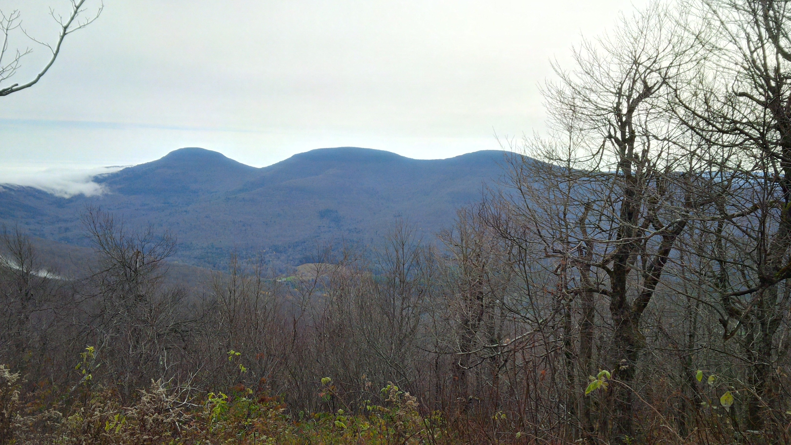
Wrestling with these systems is a conceptual issue that plays out when dealing with digital data, but I recently stumbled across a physical manifestation purely by accident. During the last week of October my wife and I rented a tiny home up in the Catskill Mountains in NY State, and decided to go for a day hike. The Catskills are home to 35 mountains known collectively as the Catskill High Peaks, which all exceed 3,500 feet in elevation. After consulting a thorough blog on upstate walks and hikes (Walking Man 24 7), we decided to try Windham High Peak, which was the closest mountain to where we were staying. We were rewarded with this nice view upon reaching the summit:
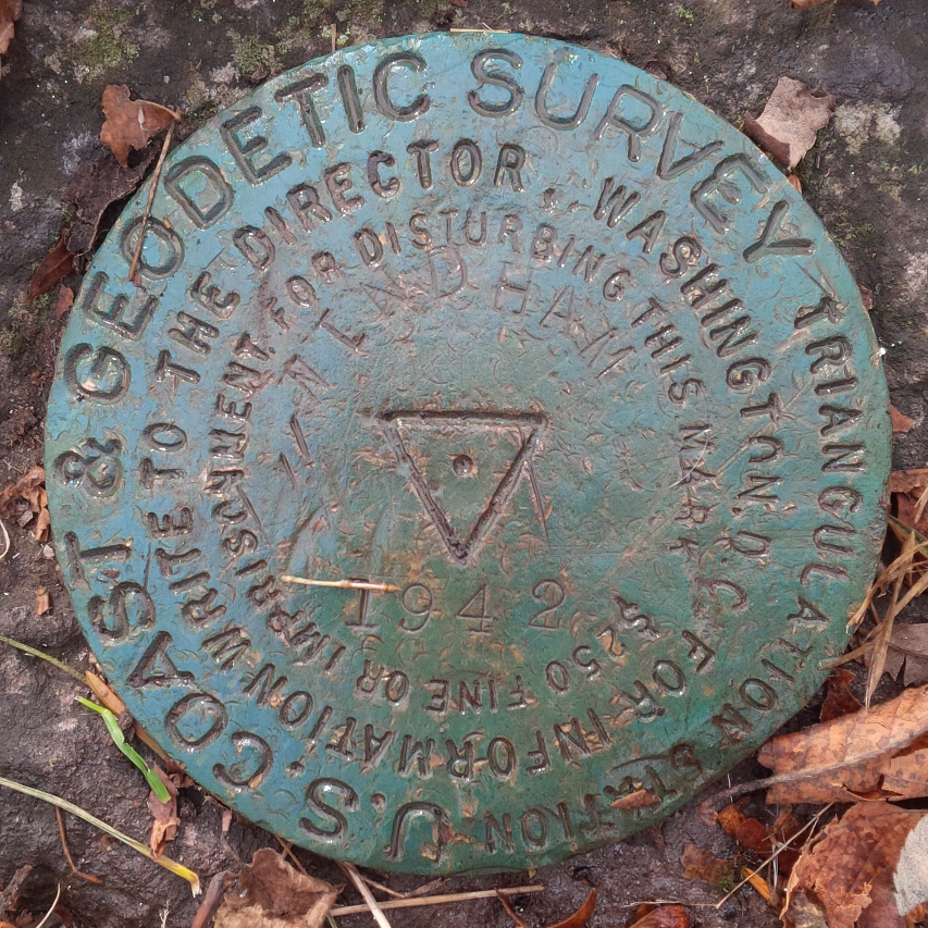
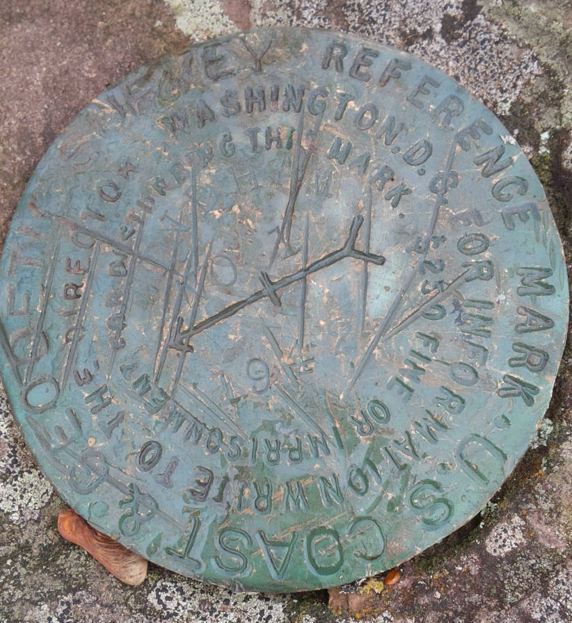
While poking around on the peak, we discovered a geodetic survey marker from 1942 affixed to the face of a rock. These markers were used to identify important topographical features, and to serve as control points in manual surveying to measure elevation; this particular marker (first pic below) is a triangulation marker that was used for that purpose. It looks like a flat, round disk, but it’s actually more like the head of a large nail that’s been driven into the rock. A short distance away was a second marker (second pic below) with a little arrow pointing toward the triangulation marker. This is a reference marker, which points to the other marker to help people locate it, as dirt or shrubbery can obscure the markers over time. Traditional survey methods that utilized this marker system were used for creating the first detailed sets of topographic maps and for establishing what the elevations and contours were for most of the United States. There’s a short summary of the history of the marker’s here, and a more detailed one here. NOAA provides several resources for exploring the history of the national geodetic system.
Triangulation Survey Marker
Reference Survey Marker
When we returned home I searched around to learn more about them, and discovered that NOAA has an app that allows you to explore all the markers throughout the US, and retrieve information about them. Each data sheet provides the longitude and latitude coordinates for the marker in the most recent reference system (NAD 83), plus previous systems that were originally used (NAD 27), a detailed physical description of the location (like the one below), and a list of related markers. It turns out there were two reference markers on the peak that point to the topographic one (we only found the first one). The sheet also references a distant point off of the peak that was used for surveying the height (the azimuth mark). There’s even a recovery form for submitting updated information and photographs for any markers you discover.
NA2038’DESCRIBED BY COAST AND GEODETIC SURVEY 1942 (GWL)
NA2038’STATION IS ON THE HIGHEST POINT AND AT THE E END OF A MOUNTAIN KNOWN
NA2038’AS WINDHAM HIGH PEAK. ABOUT 4 MILES, AIR LINE, ENE OF HENSONVILLE
NA2038’AND ON PROPERTY OWNED BY NEW YORK STATE. MARK, STAMPED WINDHAM
NA2038’1942, IS SET FLUSH IN THE TOP OF A LARGE BOULDER PROTRUDING
NA2038’ABOUT 1 FOOT, 19 FEET SE OF A LONE 10-INCH PINE TREE. U.S.
NA2038’GEOLOGICAL SURVEY STATION WINDHAM HIGH PEAK, A DRILL HOLE IN A
NA2038’BOULDER, LOCATED ON THIS SAME MOUNTAIN WAS NOT RECOVERED.
For the past thirty plus years or so we’ve used satellites to measure elevation and topography. I used my new GPS unit on this hike; I still chose a simple, bare-bones model (a Garmin eTrex 10), but it was still an upgrade as it uses a USB connection instead of a clunky serial port. The default CRS is WGS 84, but you can change it to NAD 83 or another geographic system that’s appropriate for your area. By turning on the tracking feature you can record your entire route as a line file. Along the way you can save specific points as way points, which records the time and elevation.
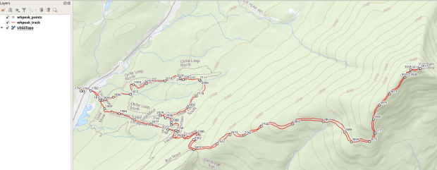
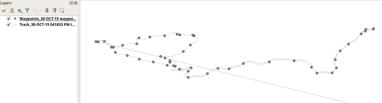
Moving the data from the GPS unit to my laptop was a simple matter of plugging it into the USB port and using my operating system’s file navigator to drag and drop the files. One file contained the tracks and the other the way points, stored in a Garmin format called a gpx file (a text-based XML format). While QGIS has a number of tools for working with GPS data, I didn’t need to use any of them. QGIS 3.4 allows you to add gpx files as vector files. Once they’re plotted you can save them as shapefiles or geopackages, and in the course of doing so reproject them to a projected coordinate system that uses meters or feet. I used the field calculator to add a new elevation column to the way points to calculate elevation in feet (as the GPS recorded units in meters), and to modify the track file to delete a line; apparently I turned the unit on back at our house and the first line connected that point to the first point of our hike. By entering an editing mode and using the digitizing tool, I was able to split the features, delete the segments that weren’t part of the hike, and merge the remaining segments back together.
Original way points and track plotted in QGIS, with erroneous line
Using methods I described in an earlier post, I added a USGS topo map as a WMTS layer for background and modified the symbology of the points to display elevation labels, and voila! We can see all eight miles of our hike as we ascended from a base of 1,791 to a height of 3,542 feet (covering 1,751 feet from min to max). We got some solid exercise, were rewarded with some great views, and experienced a mix of old and new cartography. Happy New Year – I hope you have some fun adventures in the year to come!
Stylized way points with elevation labels and track displayed on top of USGS topo map in QGIS


You must be logged in to post a comment.