labor force

IPUMS CPS Table

Creating Geographic Estimates with the IPUMS CPS Online Data Analysis System

Introduction

In this post I’ll demonstrate how to use the IPUMS CPS Online Data Analysis System to generate summary data from the US Census Bureau’s Current Population Survey (CPS). The tool employs the Survey Documentation and Analysis system (SDA) created at UC Berkeley.

The CPS is a monthly stratified sample survey of 60k households. It includes a wide array of statistics, some captured routinely each month, others at various intervals (such as voter registration and participation, captured every November in even-numbered years). The same households are interviewed over a four-month period, then rotated out for four months, then rotated back in for a final four months. Given its consistency, breadth, high response rate and accuracy (interviews are conducted in-person and over the phone), researchers use the CPS microdata (individual responses to surveys that have been de-identified) to study demographic and socio-economic trends among and between different population groups. It captures many of the same variables as the American Community Survey, but includes a fair number that are not.

I think the CPS is used less often by geographers, as the sample size is too small to produce reliable estimates below the state or metropolitan area levels. I find that students and researchers who are only familiar with working with summary data often don’t use it; generating your own estimates from microdata records can be time consuming.

The IPUMS project provides an online analyzer that lets you generate summary estimates from the CPS without having to handle the individual sample records. I’ve used it in undergraduate courses where students want to generate extracts of data at the regional or state level, and who are interested in variables not collected in the ACS, such as generational households for immigrants. The online analyzer doesn’t include the full CPS, but only the data that’s collected in March as part of the core CPS series, and the Annual Social & Economic Supplement (ASEC). It includes data from 1962 to the present.

To access any of the IPUMS tools, you must register and create an account, but it’s free and non-commercial. They provide an ample amount of documentation; I’ll give you the highlights for generating a basic geographic-based extract in this post.

Creating a Basic Geographic Summary Table

Once you launch the tool, the first thing you need to do is select some variables. You can use the drill-down folder menus at the bottom left, but I find it’s easier to hit the Codebook button and peruse the alphabetical list. Let’s say we want to generate state-level estimates for nativity for a recent year. If we go into the codebook and look-up nativity, we see it captures foreign birthplace or parentage. Also in the list is a variable called statefip, which are the two-digit codes that uniquely identify every state.
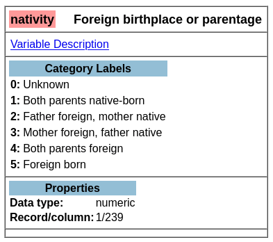
Codebook for Nativity – Foreign Birthplace or Parentage

Back on the main page for the Analyzer in the tables tab, we provide the following inputs:

  1. Row represents our records or observations. We want a record for every state, so we enter the variable: statefip.
  2. Column represents our attributes or variables. In this example, it’s: nativity.
  3. Selection filter is used to specify that we want to generate estimates from a subset of all the responses. To generate estimates for the most recent year, we enter year as the variable and specify the filter value in parentheses: year(2020). If we didn’t specify a year, the program would use all the responses back to 1962 to generate the estimates.
  4. Weight is the value that’s used to weight the samples to generate the estimates. The supplemental person weight sdawt is what we’ll use, as nativity is measured for individual persons. There is a separate weight for household-level variables.
  5. Under the output option dropdown, we change the Percentaging option from column to row. Row calculates the percentage of the population in each nativity category within the state (row). The column option would provide the percentage of the population in each nativity category between the states. In this example, the row option makes more sense.
  6. For the confidence interval, check the box to display it, as this will help us gauge the precision of the estimate. The default level is 95%; I often change this to 90% as that’s what the American Community Survey uses.
  7. At the bottom of the screen, run the table to see the result.
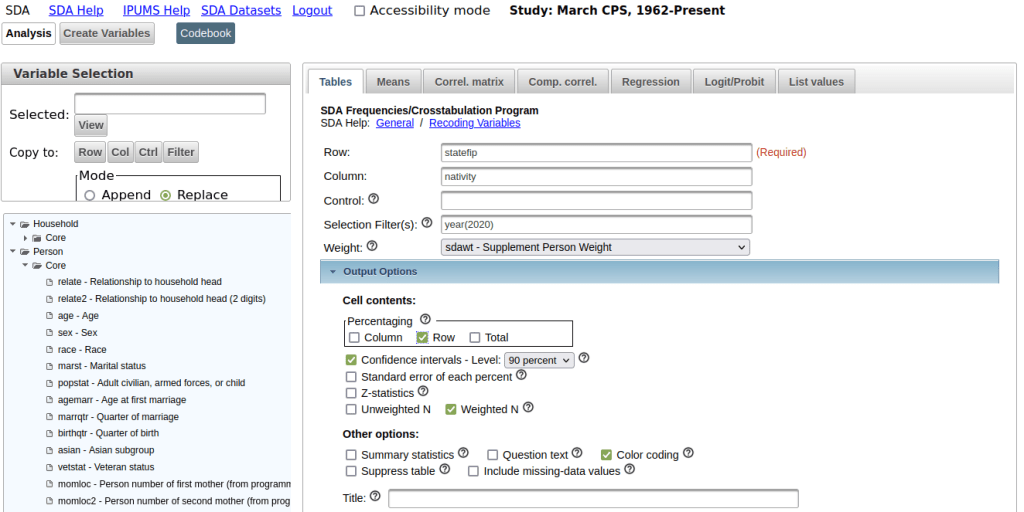
CPS Online Analyzer – Generate Basic Extract for Nativity by State for a Single Year

In the result, the summary of your parameters appears at the top, with the table underneath. At the top of the table, the Cells contain legend lists what appears in each of the cells in order. In this example, the row percent is first, in bold. For the first cell in Alabama: 91.0% of the total population have parents who were both born in the US, the confidence interval is 90.2% to 91.8% (and we’re 90% confident that the true value falls within this range), and the large number at the bottom is the estimated number of cases that fall in this category. Since we filtered our observations for one year, this represents the total population in that category for that year (if we check the totals in the last column against published census data, they are roughly equivalent to the total population of each state).
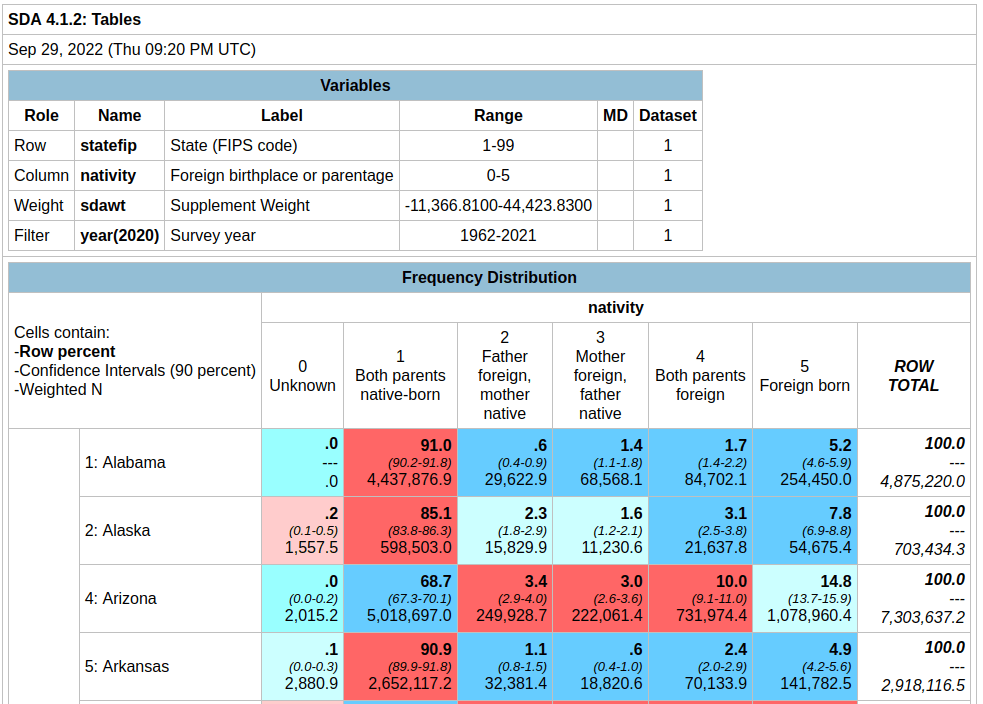
Output Table – Nativity by State in 2020

Glancing through the table, we see that Alabama and Alaska have more cases where both parents are born in the US (91.0% and 85.1%) relative to Arizona (68.7%). Arizona has a higher percentage of cases where both parents are foreign born, or the persons themselves are foreign-born. The color coding indicates the Z value (see bottom of the table for legend), which indicates how far a variable deviates from the mean, with dark red being higher than the expected mean and dark blue being lower than expected. Not surprisingly, states with fewer immigrants have higher than average values for both parents native born (Alabama, Alaska, Arkansas) while this value is lower than average for more diverse states (Arizona, California).

To capture the table, you could highlight / copy and paste the screen from the website into a spreadsheet. Or, if you return to the previous tab, at the bottom of the screen before running the table, you can choose the option to export to CSV.

Variations for Creating Detailed Crosstabs

To generate a table to show nativity for all races:

Input Parameters – Generate Tables for Nativity by State for each Race

In the control box, type the variable race. The control box will generate separate tables in the results for each category in the control variable. In this case, one nativity table per racial group.

To generate a table for nativity specifically Asians:

Input Parameters – Generate Table for Nativity by State for Asians

Remove race from the control box, and add it in the filter box after the year. In parentheses, enter the race code for Asians; you can find this in the codebook for race: year(2020), race(651).

Now that we’re drilling down to smaller populations, the reliability of the estimates is declining. For example, in Arkansas the estimate for Asians for both parents foreign born is 32.4%, but the value could be as low as 22.2% or as high as 44.5%. The confidence interval for California is much narrower, as the Asian population is much larger there. How can we get a better estimate?
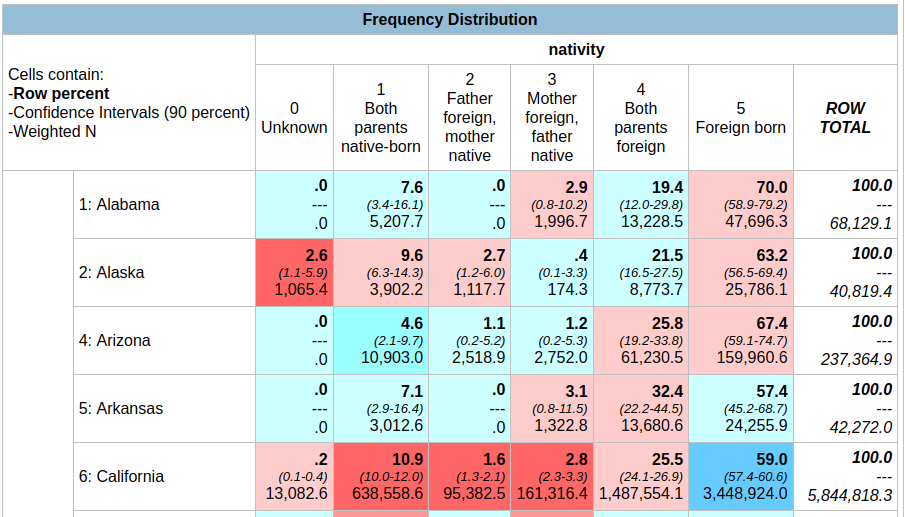
Output Table – Nativity by State for Asians in 2020

Generate a table for nativity for Asians over a five year period:

Input Parameters – Generate Table for Nativity by State for Asians for 5-year Period

Add more years in the year filter, separated by commas. In this version, our confidence intervals are much narrower; notice for Asians for both parents foreign born in Arkansas is now 19.2% with a range of 14.1% to 25.6%. By increasing the sample pool with more years of data, we’ve increased the precision of the estimate at the cost of accepting a broader time period. One big caveat here: the Weighted N represents the total number of estimated cases, but since we are looking at five years of data instead of one it no longer represents a total population value for a single year. If we wanted to get an average annual estimate for this 5-year time period (similar to what the ACS produces), we’d have to divide each of estimates by five for a rough approximation. You can download the table and do these calculations in a spreadsheet or stats program.
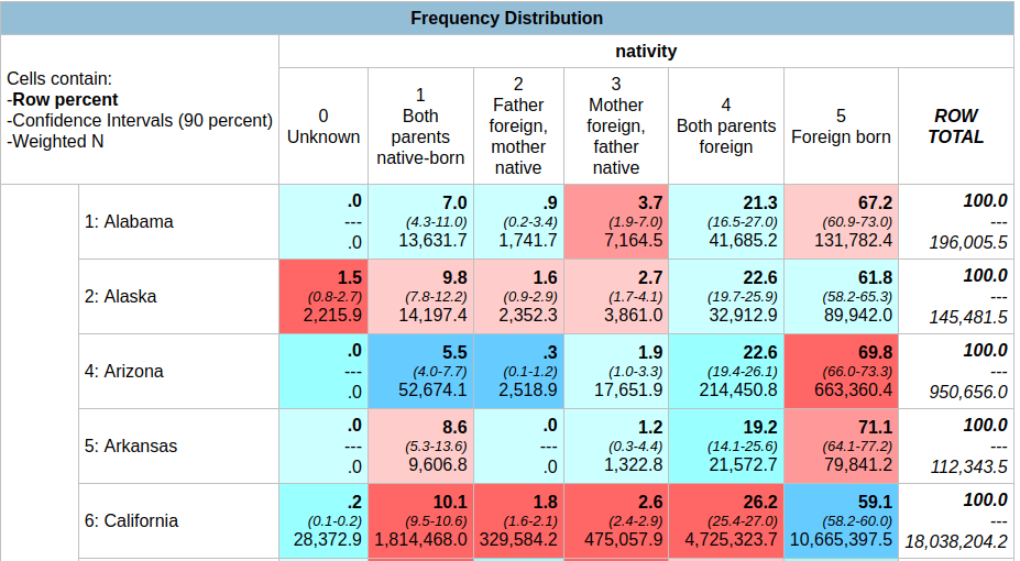
Output Table – Nativity by State for Asians between 2016-2020 (weighted N = estimate of total cases over 5 years, not an average annual value)

You can also add control variables to a crosstab. For example, if you added sex as a control variable, you would generate separate female and male tables for the nativity by state for the Asian population over a given time period,

Example of a Profile Table

If we wanted to generate a profile for a given place as opposed to a comparison table, we can swap the variables we have in the rows and columns. For example, to see nativity for all Hispanic subgroups within California for a single year:
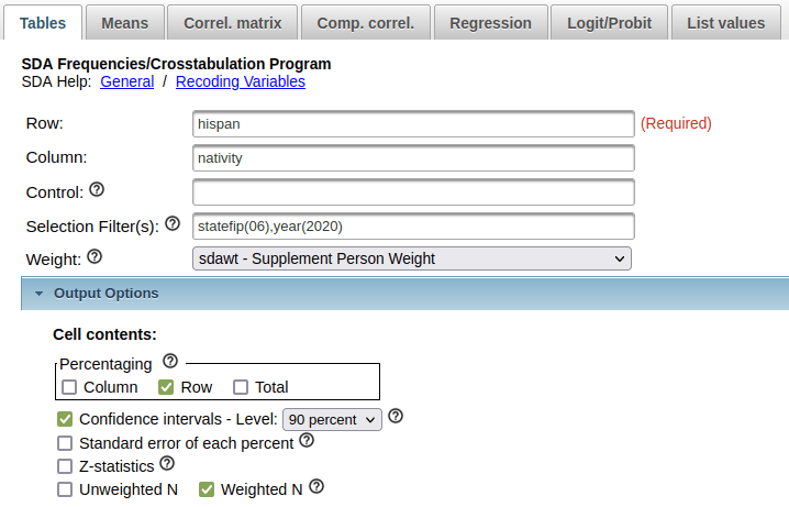
Input Parameters – Generate a Profile Table for California of Nativity by Hispanic Groups in 2020

In this case, you could opt to calculate percentages by column instead of row, if you wanted to see percent totals across groups for the categories. You could show both in the same chart, but I find it’s difficult to read. In this last example, note the large confidence intervals and thus lower precision for smaller Hispanic groups in California (Cuban, Dominican) versus larger groups (Mexican, Salvadoran).
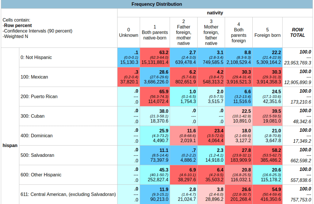
Output Table – Nativity by Hispanic Groups in California 2020 (confidence interval is much larger for smaller groups)

In short – this is handy tool if you want to generate some quick estimates and crosstabs from the CPS without having to download and weight microdata records yourself. You can create geographic data for regions, divisions, states, and metro areas. Just be mindful of confidence intervals as you drill down to smaller subgroups; you can aggregate by year, geography, or category / group to get better precision. What I’ve demonstrated is the tip of the iceberg; read the documentation and experiment with creating charts, statistical summaries, and more.
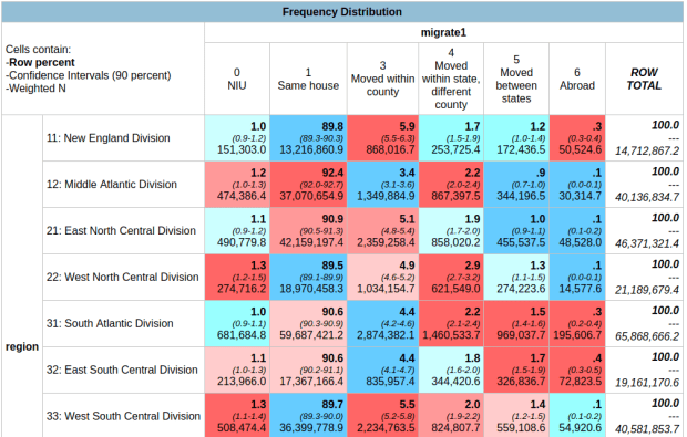
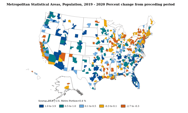
BEA Population Change Map

Population and Economic Time Series Data from the BEA

In this post, I’ll demonstrate how to access and download multiple decades of annual population data for US states, counties, and metropolitan areas in a single table. Last semester, I was helping a student in a GIS course find data on tuberculosis cases by state and metro area that stretched back several decades. In order to make meaningful comparisons, we needed to calculate rates, which meant finding an annual time series for total population. Using data directly from the Census Bureau is tough going, as they don’t focus on time series and you’d have to stitch together several decades of population estimates. Metropolitan areas add more complexity, as they are modified at least a few times each decade.

In searching for alternatives, I landed at the Bureau of Economic Analysis (BEA). As part of their charge is studying the economy over time, they gather data from the Census Bureau, Bureau of Labor Statistics, and others to build time series, and they update them as geography and industrial classification schemes change. They publish national, state, metropolitan area, and county-level GDP, employment, income, wage, and population tables that span multiple decades. Their economic profile table for metros and counties covers 1969 to present, while the state profile table goes back to 1958. Metropolitan areas are aggregates of counties. As metro boundaries change, the BEA normalizes the data, adjusting the series by taking older county-level data and molding it to fit the most recent metro definitions.

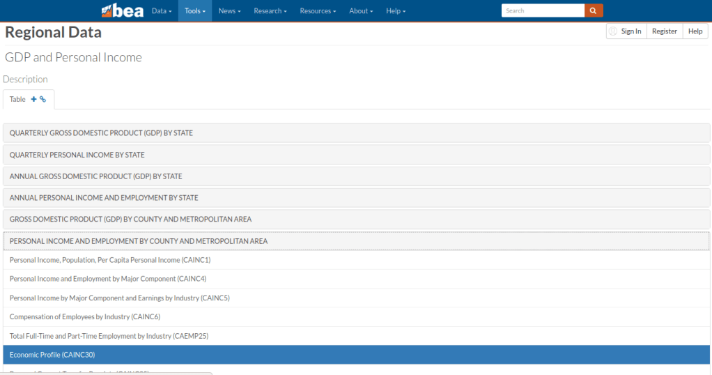
Finding the population data was a bit tricky, as it is embedded as one variable in the Economic Profile table (identified as CAINC30) that includes multiple indicators. Here’s the path to get it:

  • From the BEA website, choose Tools – Interactive Data.
  • From the options on the next page, choose Regional from the National, Industry, International or Regional data options. There’s also a link to a video that illustrates how to use the BEA interactive data tool.
  • From the Regional Data page, click “Begin using the data” (but note you can alternatively “Begin mapping the data” to make some basic web maps too, like the one in the header of this post).
  • On the next page are categories, and under each category are data tables for specific series. In this case, Personal Income and Employment by County and Metropolitan Area was what I wanted, and under that the Economic Profile CAINC30 table (states appear under a different heading, but there’s a comparable Economic Profile table for them, SAINC30).
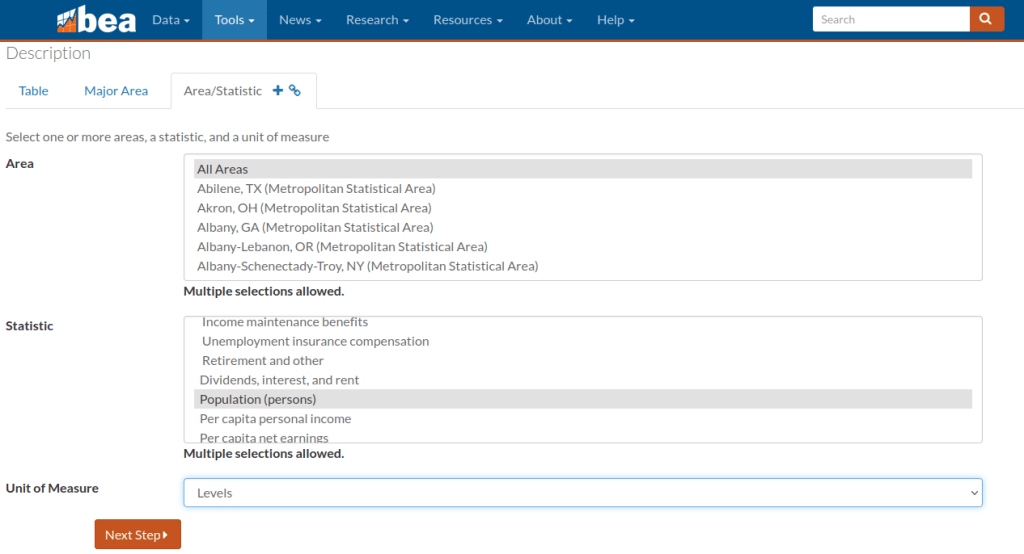
  • On the multi-screen table builder, you choose a type of geography (county or different metro area options), and on the next tab you can choose individual places, hold down CTRL and select several, or grab them all with the option at the top of the dropdown. Likewise for the Statistic, choose Population (persons), or grab a selection, or take all the stats. Under the Unit of Measure dropdown, Levels gives you the actual statistic, but you can also choose percent change, index values, and more. On the next tab, choose your years.
  • On the final page, if your selection is small enough you can preview the result and then download. In this case it’s too large, so you’re prompted to grab an Excel or CSV file to download.

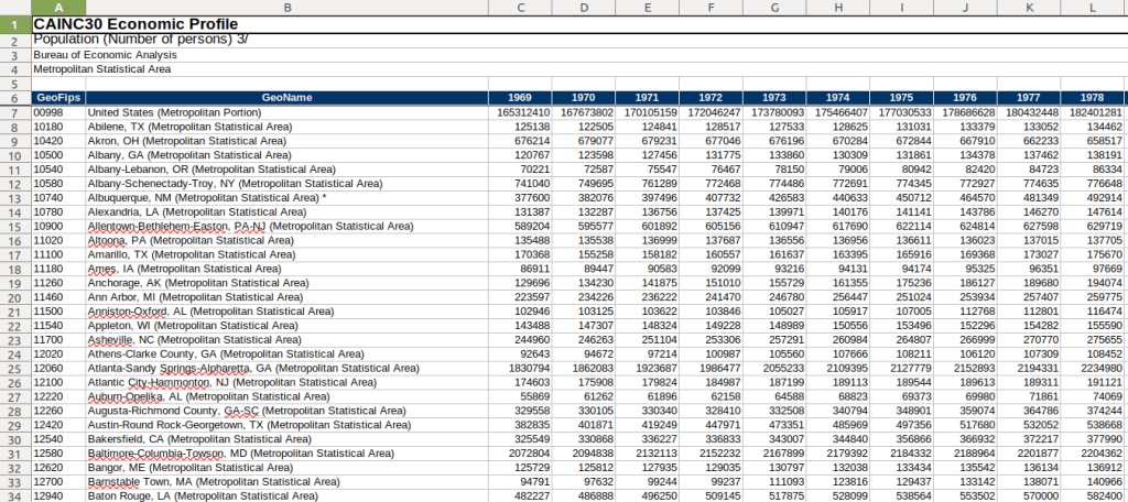
And there you have it! One table with 50+ years of annual population data, using current metro boundaries. The footnotes at the bottom of the file indicate that the latest years of population data are based on the most recent vintage estimates from the Census Bureau’s population estimates. Once the final intercensal estimates for the 2010s are released, the data for that decade will be replaced a final time, and the estimates from the 2020s will be updated annually as each new vintage is released until we pass the 2030 census. Their documentation is pretty thorough.

BEA 5-decade Time Series of Population Data by Metro Area

The Interactive Data table approach allows you to assemble your series step by step. If you wanted to skip all the clicking you can grab everything in one download (all years for all places for all stats in a given table). Of course, that means some filtering and cleaning post-download to isolate what you need. There’s also an API, and several other data series and access options to explore. The steps for creating the map that appears at the top of this post were similar to the steps for building the table.

UN ICSC Retail Price Index Map

UN Retail Price Index Time Series

We recently launched our fledgling geodata portal on GitHub for the open datasets we’ll create in our new lab. In the spring we carved out a space on the 11th floor of the Sciences Library at Brown which we’ve christened GeoData@SciLi, a GIS and data consultation and work space. We’ll be doing renovations on both the webspace and workspace over the summer.

Our inaugural dataset was created by Ethan McIntosh, a senior (now graduate) who began working with me this spring. The dataset is the United Nations International Civil Service Commission’s (UN ICSC) Retail Price Indices with Details (RPID). The index measures the cost of living based on several categories of goods and services in duty stations around the world. It’s used to adjust the salaries of the UN’s international staff relative to UN headquarters in New York City (index value of 100 = cost of living in New York). The data is updated six times a year, published in an Excel spreadsheet that contains a macro that allows you to look up the value of each duty station via a dropdown menu. The UN ICSC makes the data public by request; you register and are granted access to download the data in PDF and Excel format in files that are packaged in one month / year at a time.

We were working with a PhD student in economics who wanted to construct a time-series of this data. Ethan wrote a Python script to aggregate all of the files from 2004 to present into a single CSV; the actual values for each country / duty station were stored in hidden cells that the macro pulled from, and he was able to pull them from these cells. He parsed the data into logical divisions, and added the standard 3-letter ISO 3166 country code to each duty station so that each record now has a unique place identifier. His script generates three outputs: a basic CSV of the data in separate month / year files, a “long” (aka flat) time series file where each record represents a specific duty station and retail index category or weight for a given month and year, and a “wide” time series file where the category / weight has been pivoted to a column, so each record represents all values for a duty station for a given month / year. He’s written the program to process and incorporate additional files as they’re published.

While the primary intention was to study this data as a time series in a statistical analysis, it can also be used for geospatial analysis and mapping. Using the wide file, I created the map in the header of this post, which depicts the total retail index for February 2022 for each country, where the value represents the duty station within the country (usually the capital city). I grabbed some boundaries from Natural Earth and joined the data to it using the ISO code. I classified the data using natural breaks, but manually adjusted the top level category to include all countries with a value greater than or equal to the base value of 100.

There were only five duty stations that were more expensive than New York, with values between 102 and 124: Tokyo, Ashkhabad (Turkmenistan), Singapore, Beirut, and Hong Kong. Beijing and Geneva were equivalent in price at 100. The least expensive stations with values between 52 and 69 were: Caracas (Venezuela), Tripoli, Damascus, Ankara (Turkey), Bucharest (Romania), Mbabane (Eswatini – formerly Swaziland), and Sofia (Bulgaria). There appears to be regional clustering of like values, although I didn’t run any tests. The station in the US that’s measured relative to NYC is Washington DC (index value of 89).

The final datasets and code used to generate them are available on GitHub, and we’ll update it at least once, if not a couple times, a year. We are not providing the original month / year macro spreadsheets; if you want those you should register with the UN ICSC and access them there. If you’re using our data files, you should still register with them, as they would like to be aware of how their data is being used.

We will post additional projects, datasets, and code in individual repos as we create them, linked to from our main page. I’m working on creating a basic metadata profile for our lab, so we’ll provide structured metadata for each of our datasets in the near future.

NYC and NYMA Pop Change Graph 2000 to 2019

New York’s Population and Migration Trends in the 2010s

The Weissman Center for International Business at Baruch College just published my paper, “New York’s Population and Migration Trends in the 2010s“, as part of their Occasional Paper Series. In the paper I study population trends over the last ten years for both New York City (NYC) and the greater New York Metropolitan Area (NYMA) using annual population estimates from the Census Bureau (vintage 2019), county to county migration data (2011-2018) from the IRS SOI, and the American Community Survey (2014-2018). I compare NYC to the nine counties that are home to the largest cities in the US (cities with population greater than 1 million) and the NYMA to the 13 largest metro areas (population over 4 million) to provide some context. I conclude with a brief discussion of the potential impact of COVID-19 on both the 2020 census count and future population growth. Most of the analysis was conducted using Python and Pandas in Jupyter Notebooks available on my GitHub. I discussed my method for creating rank change grids, which appear in the paper’s appendix and illustrate how the sources and destinations for migrants change each year, in my previous post.

Terminology

  • Natural increase: the difference between births and deaths
  • Domestic migration: moves between two points within the United States
  • Foreign migration: moves between the United States and a US territory or foreign country
  • Net migration: the difference between in-migration and out-migration (measured separately for domestic and foreign)
  • NYC: the five counties / boroughs that comprise New York City
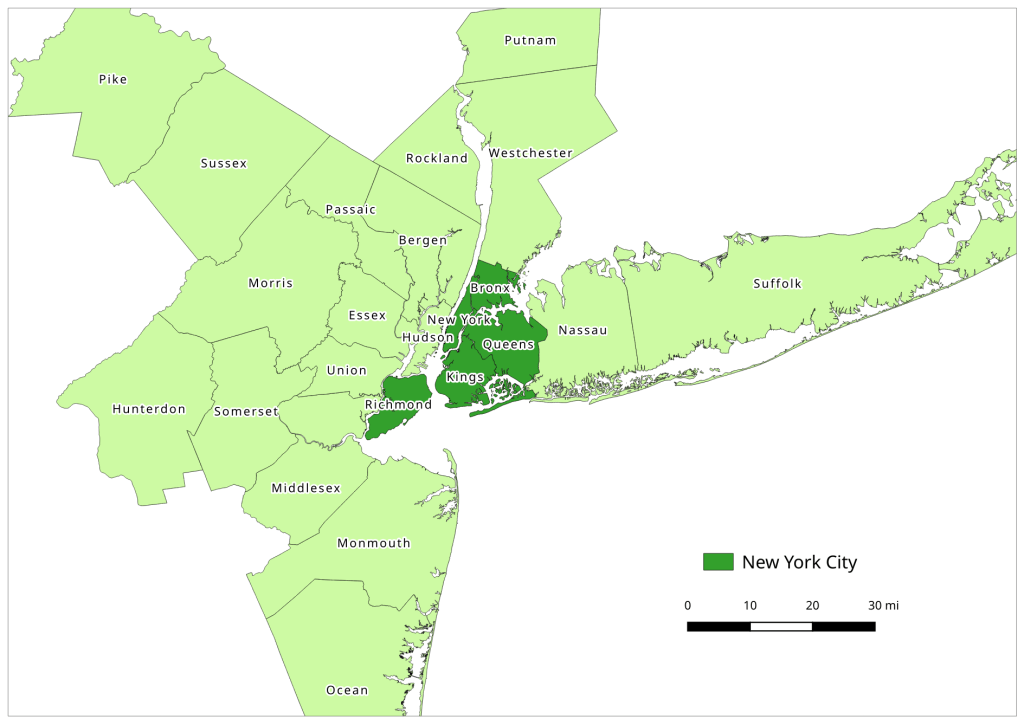
  • NYMA: the New York Metropolitan Area as defined by the Office of Management and Budget in Sept 2018, consists of 10 counties in NY State (including the 5 NYC counties), 12 in New Jersey, and one in Pennsylvania
Map of the New York Metropolitan Area
The New York-Newark-Jersey City, NY-NJ-PA Metropolitan Area

Highlights

  • Population growth in both NYC and the NYMA was driven by positive net foreign migration and natural increase, which offset negative net domestic migration.
  • Population growth for both NYC and the NYMA was strong over the first half of the decade, but population growth slowed as domestic out-migration increased from 2011 to 2017.
  • NYC and the NYMA began experiencing population loss from 2017 forward, as both foreign migration and natural increase began to decelerate. Declines in foreign migration are part of a national trend; between 2016 and 2019 net foreign migration for the US fell by 43% (from 1.05 million to 595 thousand).
  • The city and metro’s experience fit within national trends. Most of the top counties in the US that are home to the largest cities and many of the largest metropolitan areas experienced slower population growth over the decade. In addition to NYC, three counties: Cook (Chicago), Los Angeles, and Santa Clara (San Jose) experienced actual population loss towards the decade’s end. The New York, Los Angeles, and Chicago metro areas also had declining populations by the latter half of the decade.
  • Most of NYC’s domestic out-migrants moved to suburban counties within the NYMA (representing 38% of outflows and 44% of net out-migration), and to Los Angeles County, Philadelphia County, and counties in Florida. Out-migrants from the NYMA moved to other large metros across the country, as well as smaller, neighboring metros like Poughkeepsie NY, Fairfield CT, and Trenton NJ. Metro Miami and Philadelphia were the largest sources of both in-migrants and out-migrants.
  • NYC and the NYMA lack any significant relationships with other counties and metro areas where they are net receivers of domestic migrants, receiving more migrants from those places than they send to those places.
  • NYC and the NYMA are similar to the cities and metros of Los Angeles and Chicago, in that they rely on high levels foreign migration and natural increase to offset high levels of negative domestic migration, and have few substantive relationships where they are net receivers of domestic migrants. Academic research suggests that the absolute largest cities and metros behave this way; attracting both low and high skilled foreign migrants while redistributing middle and working class domestic migrants to suburban areas and smaller metros. This pattern of positive foreign migration offsetting negative domestic migration has characterized population trends in NYC for many decades.
  • During the 2010s, most of the City and Metro’s foreign migrants came from Latin America and Asia. Compared to the US as a whole, NYC and the NYMA have slightly higher levels of Latin American and European migrants and slightly lower levels of Asian and African migrants.
  • Given the Census Bureau’s usual residency concept and the overlap in the onset the of COVID-19 pandemic lock down with the 2020 Census, in theory the pandemic should not alter how most New Yorkers identify their usual residence as of April 1, 2020. In practice, the pandemic has been highly disruptive to the census-taking process, which raises the risk of an under count.
  • The impact of COVID-19 on future domestic migration is difficult to gauge. Many of the pandemic destinations cited in recent cell phone (NYT and WSJ) and mail forwarding (NYT) studies mirror the destinations that New Yorkers have moved to between 2011 and 2018. Foreign migration will undoubtedly decline in the immediate future given pandemic disruptions, border closures, and restrictive immigration policies. The number of COVID-19 deaths will certainly push down natural increase for 2020.

atcoordinates YouTube Channel

Video Tutorials for Finding US Census Data

I have recently created an atcoordinates YouTube channel that features a series of how-to videos on finding and accessing US census data using a variety of websites and tools. I explain basic census concepts while demonstrating how to access data. At this point there are four videos:

  1. Exploring US Census Data: Basic Concepts. This is a narrated slide show where I cover the essential choices you need to make and concepts you need to understand in order to access census data, regardless of the tool or platform: data set, time period, subjects or topics, and geography. I discuss the decennial census, American Community Survey, and population estimates. This video is intended as a prerequisite for viewing the others, so I don’t have to explain the same concepts each time and can focus on demonstrating each particular application.
  2. American Community Survey Census Profiles with MCDC Apps. This screencast illustrates how you can quickly and easily access census profiles for any place in the US using the Missouri Census Data Center’s profile applications. It’s also a good introduction to census data in general, if you’re unfamiliar with the scope of data that’s available.
  3. Search Strategies for data.census.gov. I demonstrate how to use the Census Bureau’s primary application for accessing current census data, using the advanced search tool and filters.
  4. Using TIGERweb to Explore US Census Geography. I show you how to use this web map application for viewing census geography, while explaining what some of the small-area census geographies are.

I plan on adding additional videos every month or so. The pandemic lock down and uncertainty over whether classes will be back in session this fall inspired me to do this. While I prefer written tutorials, I find that I’ve been watching YouTube more often for learning how to do certain tasks with particular software, so I thought this would be useful for others. The videos average about 10 to 15 minutes in length, although the introductory one is a bit longer. The length is intentional; I wanted to explain the concepts and describe why you’re making certain choices, instead of simply pointing and clicking without any explanation.

Feel free to spread the news, share and embed the videos in research guides or web pages, and use them in classes or workshops. Of course, for a more in-depth look at US census data, check out my book: Exploring the US Census: Your Guide to America’s Data published by SAGE.

FRED Chart - Pesronal Savings Rate

Finding Economic Data with FRED

I attended ALA’s annual conference in DC last month, where I met FRED. Not a person, but a database. I can’t believe I hadn’t met FRED before – it is an amazingly valuable resource for national, time-series economic data.

FRED was created by the Economic Research unit of the Federal Reserve Bank of St. Louis. It was designed to aggregate economic data from many government sources into a centralized database, with straightforward interface for creating charts and tables. At present, it contains 567,000 US and international time series datasets from 87 sources.

Categories of data include banking and finance (interest and exchange rates, lending, monetary data), labor markets (basic demographics, employment and unemployment, job openings, taxes, real estate), national accounts (national income, debt, trade), production and business (business cycles, production, retail trade, sector-level information about industries),  prices (commodities, consumer price indexes) and a lot more. Sources include the Federal Reserve, the Bureau of Labor Statistics, the Census Bureau, the Bureau of Economic Analysis, the Treasury Department, and a mix of other government and corporate sources from the US and around the world.

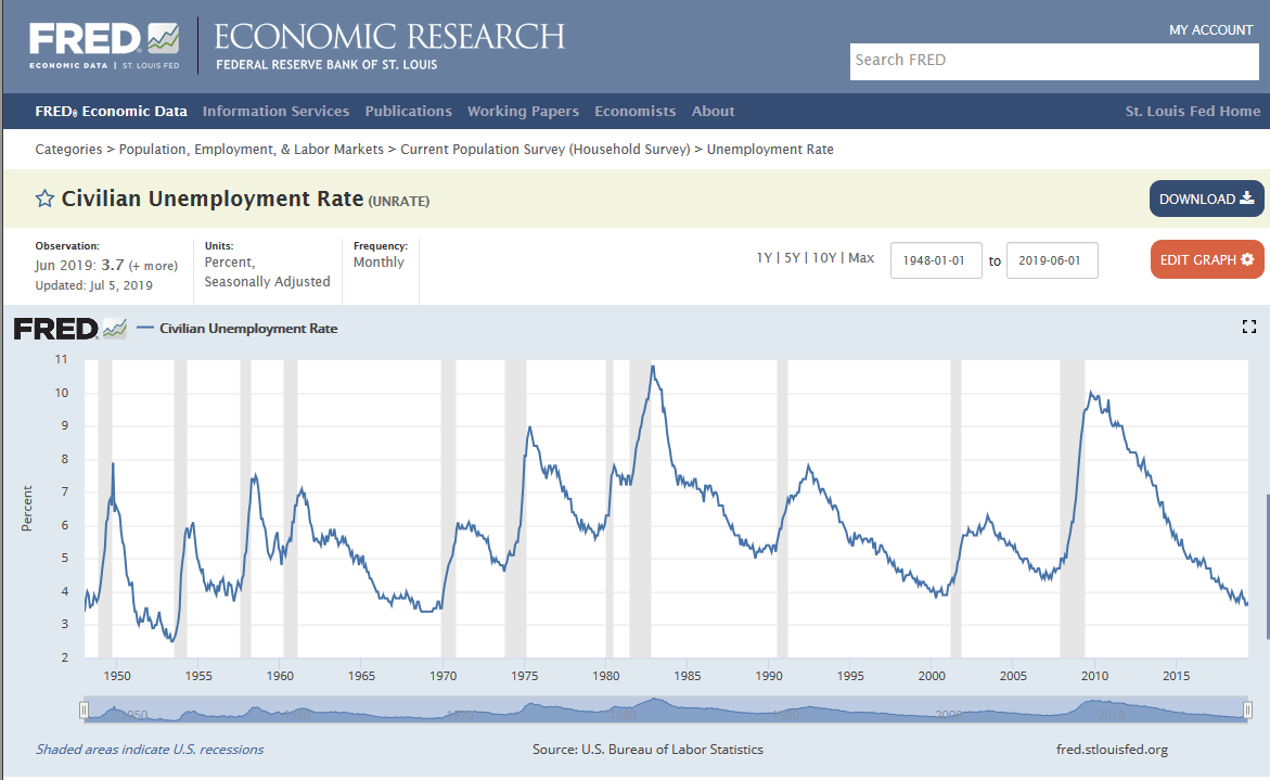
On their home page at https://fred.stlouisfed.org/ you can search for indicators or choose one of several options for browsing. The default dashboard shows you some of the most popular series and newest releases at a glance. Click on Civilian Unemployment Rate, and you retrieve a chart with monthly stats that stretch from the late 1940s to the present. Most of FRED’s plots highlight periods of recession since these have a clear impact on economic trends. You can modify the chart’s date range, change the frequency (monthly, quarterly, annually – varies by indicator), download the chart or the underlying data in a number of formats, and share a link to it. There are also a number of advanced customization features, such as adding other series to the chart. Directly below the chart are notes that provide a clear definition of the indicator and its source (in this case, the Bureau of Labor Statistics) and links to related tables and resources.

FRED - Chart of Civilian Unemployment Rate

The unemployment rate is certainly something that you’d expect to see, but once you browse around a bit you’ll be surprised by the mix of statistics and the level of detail. I happened to stumble across a monthly Condo Price Index for the New York City Metro Area.

Relative to other sources or portals, FRED is great for viewing and retrieving national (US and other countries) economic and fiscal data and charts gathered from many sources. It’s well suited for time-series data; there are lots of indexes and you can opt for seasonally adjusted or unadjusted values. Many of the series include data for large regions of the US, states, metro areas, and counties. The simplest way to find sub-national data is to do a search, and once you do you can apply filters for concepts, frequencies, geographies, and sources. FRED is not the place to go if you need data for small geographies below the county level. If you opt to create a FRED account (purely optional) you’ll be able to save and track indicators that you’re interested in and build your own dashboards.

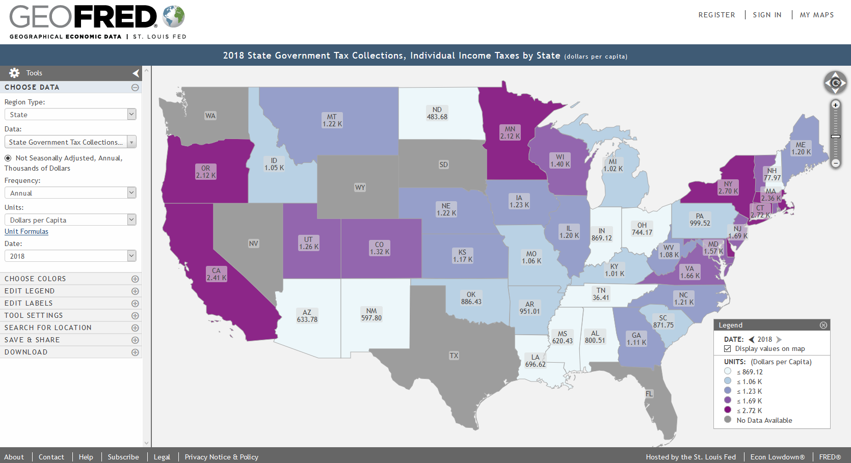
If you’re interested in maps, visit FRED’s brother GeoFRED at https://geofred.stlouisfed.org/.  The homepage has a series of sample thematic maps for US counties and states and globally for countries. Choose any map, and once it opens you can change the geography and indicator to something else. You can modify the frequency, units, and time periods for many of the indicators, and you have basic options for customizing the map (colors, labels, legend, etc.) The maps are interactive, so you can zoom in and out and click on a place to see its data value. Most of the county-level data comes from the Census Bureau, but as you move up to states or metro areas the number of indicators and sources increase. For example, the map below shows individual income taxes collected per capita by state in 2018.

GeoFRED - State Income Tax

There’s a basic search function for finding specific indicators. Just like the charts, maps can be downloaded as static images, shared and embedded in websites, and you can download the data behind the map (it’s simpler to download the same indicator for multiple geographies using GeoFRED compared to FRED).

Take a few minutes and check it out. For insights and analyses of data published via FRED, visit FRED’s blog at https://fredblog.stlouisfed.org/.