This project was an archival one, in that we were taking a final snapshot of what was in the repository before it went offline. In the coming year, I’ll be thinking about approaches for consistently capturing updates, and there are some folks who are interested in creating a community-driven portal to replace the defunct government site. Stay tuned!
2025 has been a tough year. Wishing you all the best for the year to come. – Frank
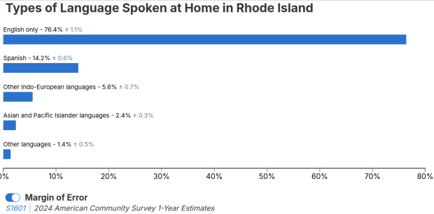
I visit courses to guest lecture on census data every semester, and one of the primary topics is immigrant or ethnic communities in the US. There are many different variables in the Census Bureau’s American Community Survey (ACS) that can be used to study different groups: Race, Hispanic or Latino Origin, Ancestry, Place of Birth, and Residency. Each category captures different aspects of identity, and many of these variables are cross-tabulated with others such as citizenship status, education, language, and income. It can be challenging to pull statistics together on ethnic groups, given the different questions the data are drawn from, and the varying degrees of what’s available for one group versus another.
But you learn something new every day. This week, while helping a student I stumbled across summary table S0201, which is the Selected Population Profile table. It is designed to provide summary overviews of specific race, Hispanic origin, ancestry, and place of birth subgroups. It’s published as part of the 1-year ACS, for large geographic areas that have at least 500,000 people (states, metropolitan areas, large counties, big cities), and where the size of the specific population group is at least 65,000. The table includes a broad selection of social, economic, and demographic statistics for each particular group.
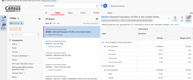
We discovered these tables by typing in the name of a group (Cuban, Nigerian, or Polish for example) in the search box for data.census.gov. Table S0201 appeared at the top of the table results, and clicking on it opened the summary table for the group for the entire US for the most recent 1-year dataset (2024 at the time I’m writing this). The name of the group appears in the header row of the table. Clicking on the dataset name and year in the grey box at the top of the table allows you to select previous years.
Selected Population Profile for Dominicans in the US
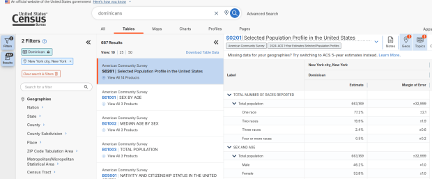
Using the Filters on the left, you can narrow the data down to a specific geography and year. You may get no results if either the geographic area or the ethnic or racial group is too small. Besides table S0201, additional detailed tables appear for a few, isolated years (the most recent being 2021).
Selected Population Profile for Dominicans in NYC
A more formal approach, which is better for seeing and understanding the full set of possibilities for ethnic groups and their data availability:
At data.census.gov, search for S0201, and select that table. You’ll get the totals for the entire US.
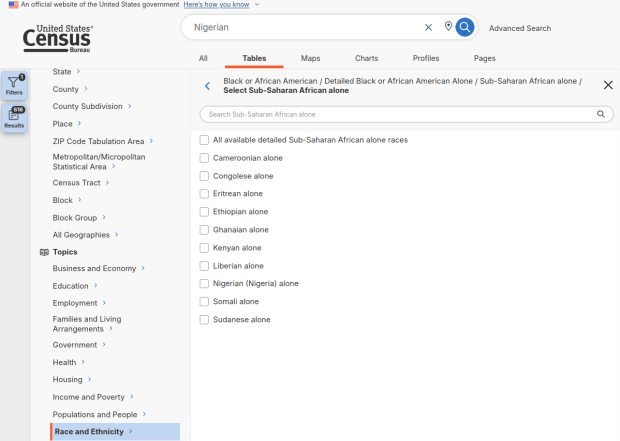
Using the filters on the left, choose Race and Ethnicity – then a racial or ethnic group – then a detailed race or group – then specific categories until you reach a final menu. This gives you the US-wide table for that group (if available).
Alternatively – you could choose Populations and People – Ancestry instead of Race to filter for certain groups. See my explanation below.
Use the filters again to select a specific geographic area (if available) and years.
With either approach, once you have your table, click the More Tools button (…) and download the data. Alternatively, like all of the ACS tables S0201 can be accessed via the Census Bureau’s API.
Filter Menu for Race and Ethnicity – Detailed Options
Where does this data come from? It can be generated from several questions on the ACS survey: Hispanic and Race (respectively, with respondents self-identifying a category), Place of Birth (specifically captures first-generation immigrants), and Ancestry (an open ended question about who your ancestors were).
The documentation I found provided just a cursory overview. I discovered additional information that describes recent changes in the race and ancestry questions. Persons identifying as Native American, Asian, or Pacific Islander as a race, or as Hispanic as an ethnicity, have long been able to check or write in a specific ethnic, national, or tribal group (Chinese, Japanese, Cuban, Mexican, Samoan, Apache, etc). People who identified as Black or White did not have this option until the 2020 census, and it looks like the ACS is now catching up with this. This page links to a document that provides an overview of the overlap between race and ancestry in different ACS tables.
The final paragraph in that document describes table S0201, which I’ll quote here in full:
Table S0201 is iterated by both race and ancestry groups. Group names containing the words “alone” or “alone or in any combination” are based on race data, while group names without “alone” or “alone or in any combination” are based on ancestry data. For example, “German alone or in any combination” refers to people who reported one or more responses to the race question such as only German or German and Austrian. “German” (without any further text in the group name) refers to people who reported German in response to the ancestry question.
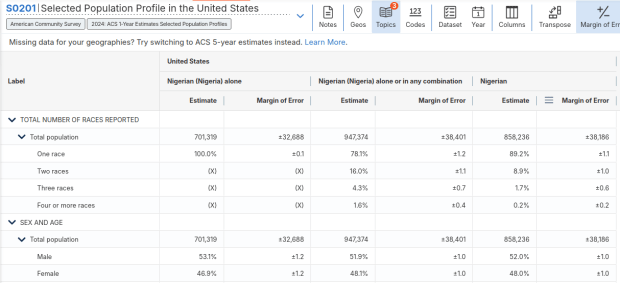
For example, when I used my first approach and simply searched for Nigerians as a group, the name appeared in the 2024 ACS table simply as Nigerian. This indicates that the data was drawn from the ancestry question. I was also able to flip back to earlier years. But in my second approach, when I searched for the table by its ID number and subsequently chose a racial group, the name appeared as Nigerian (Nigeria) alone, which means the data came from the race table. I couldn’t flip back to earlier periods, as Nigerian wasn’t captured in the race question prior to 2024.
Consider the screenshot below to evaluate the differences. Nigerian alone indicates people who chose just one race (Black) and wrote in Nigerian under their race. Nigerian alone or in any combination indicates any person who wrote Nigerian as a race, could be Black and Nigerian, or Black and White and Nigerian, etc. Finally, Nigerian refers to the ancestry question, where people are asked to identify who their ancestors are, regardless of whether they or their parents have a direct connection to the given place where that group originates.
Comparison of Race alone, Race Alone or in Combination, and Ancestry for Nigerians
Here’s where it gets confusing. If you search for the S0201 table first, and then try filtering by ancestry, the only options that appear are for ethnic or national groups that would traditionally be considered as Black or White within a US context. Places in Europe, Africa, the Middle East, and Central Asia, as well as parts of the world that were initially colonized by these populations (the non-Spanish Caribbean, Australia, Canada, etc). Options for Asians (south, southeast, and east Asia), Pacific Islanders, Native Americans, and any person who identifies as Hispanic or Latino do not appear as ancestry options, as the data for these groups is pulled from elsewhere. So when I tried searching for Chinese, Chinese alone appears in the table, as this data is drawn from the race table. When I searched for Dominican, the term Dominican appears in the table… Hispanic or Latino is not a race, but a separate ethnic category, and Dominican may identify a person of any race who also identifies as Hispanic. This data comes from the Hispanic / Latino origin table.
My interpretation is that data for Table S0201 is drawn from:
The ancestry table (prior to 2024), and either the race or ancestry table (from 2024 forward), for any group that is Black or White within the US context.
The race table for any group that is Asian, Pacific Islander, or Native American (although for smaller groups, ancestry may have been used prior to 2022 or 2023).
The Hispanic / Latino origin table for any group that is of Hispanic ethnicity, regardless of their race.
Place of birth isn’t used for defining groups, but appears as a set of variables within the table so you can identify how many people in the group are first-generation immigrants who were born abroad.
That’s my best guess, based on the available documentation and my interpretation of the estimates as they appear for different groups in this table. I did some traditional web searching, and then also tried asking ChatGPT. After pressing it to answer my question rather than just returning links to the Census Bureau’s standard documentation, it did provide a detailed explanation for the table’s sources. But when I prompted it to provide me with links to documentation from which its explanation was sourced, it froze and did nothing. So much for AI.
Despite this complexity, the Selected Population Profile tables are incredibly useful for obtaining summary statistics for different ethnic groups, and was perfect for the introductory sociology class I visited that was studying immigration and ancestry. Just bear in mind that the availability of S0201 is limited by size of the geographic area as a whole, and the size of the group within that area.
Just when we thought the US government couldn’t possibly become more dysfunctional, it shut down completely on Sept 30, 2025. Government websites are not being updated, and many have gone offline. I’ve had trouble accessing data.census.gov; access has been intermittent, and sometimes it has worked with some web browsers but not with others.
In this post I’ll summarize some solid, alternative portals for accessing US census data. I’ve sorted the free resources from the simplest and most basic to the most exhaustive and complex, and I mention a couple of commercial sources at the end. These are websites; the Census Bureau’s API is still working (for now), so if you are using scripts that access its API or use R packages like tidycensus you should still be in business.
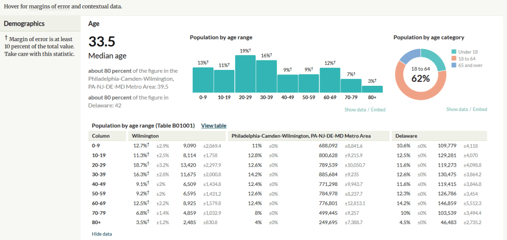
A non-profit project originally created by journalists, the Census Reporter provides just the most recent ACS data, making it easy to access the latest statistics. Search for a place to get a broad profile with interactive summaries and charts, or search for a topic to download specific tables that include records for all geographies of a particular type, within a specific place. There are also basic mapping capabilities.
Census Reporter Showing ACS Data for Wilmington, DE
Missouri Census Data Center Profiles and Trends https://mcdc.missouri.edu/ Focus: data from the ACS and decennial profile tables for the entire US
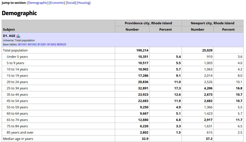
The Census Bureau publishes four profile tables for the ACS and one for the decennial census that are designed to capture a wide selection of variables that are of broad interest to most researchers. The MCDC makes these readily available through a simple interface where you select the time period, summary level, and up to four places to compare in one table, which you can download as a spreadsheet. There are also several handy charts, and separate applications for studying short term trends. Access the apps from the menu on the right-hand side of the page.
Missouri Census Data Center ACS Profiles Showing Data for Providence and Newport, RI
State and Local Government Data Pages Focus: extracts and applications for that particular area
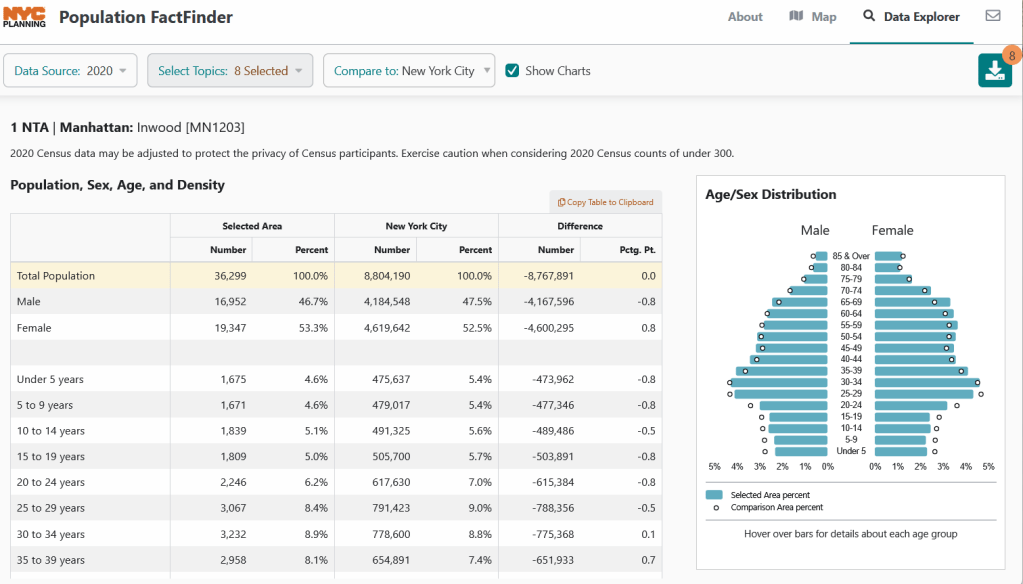
Hundreds of state, regional, county, and municipal governments create extracts of census data and republish them on their websites, to provide local residents with accessible summaries for their jurisdictions. In most cases these are in spreadsheets or reports, but some places have rich applications, and may recompile census data for geographies of local interest such as neighborhoods. Search for pages for planning agencies, economic development orgs, and open data portals. New York City is a noteworthy example; not only do they provide detailed spreadsheets, they also have the excellent map-based Population FactFinder application. Fairfax County, VA provides spreadsheets, reports, an interactive map, and spreadsheet tools and macros that facilitate working with ACS data.
NYC Population Factfinder Showing ACS Data for Inwood in Northern Manhattan
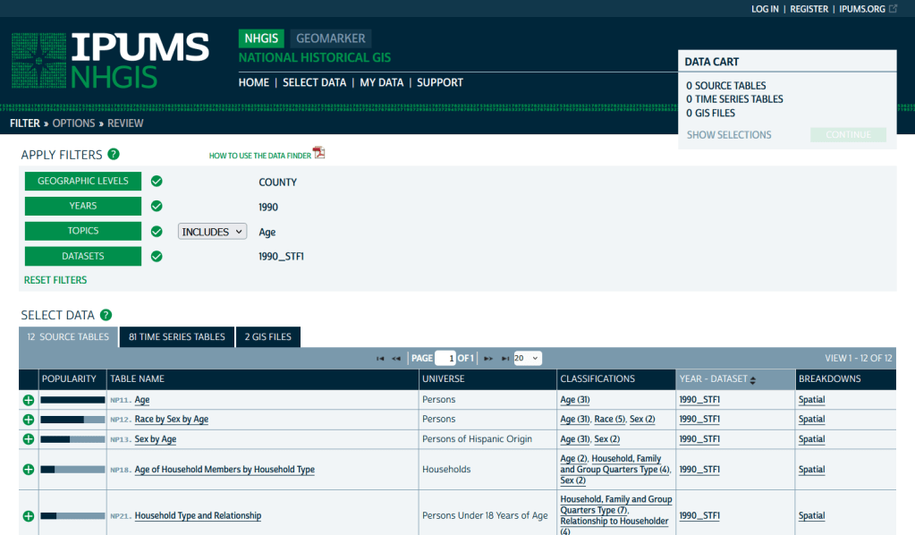
IPUMS NHGIS https://www.nhgis.org/ Focus: all contemporary and historic tables and GIS boundary files for the ACS and decennial census
If you need access to everything, this is the place to go. The National Historic Geographic Information System uses an interface similar to the old American Factfinder (or the Advanced Search for data.census.gov). Choose your dataset, survey, year, topic, and geographies, and access all the tables as they were originally published. There is also a limited selection of historical comparison tables (which I’ve written about previously). Given the volume of data, the emphasis is on selecting and downloading the tables; you can see variable definitions, but you can’t preview the statistics. This is also your best option to download GIS boundary files, past and present. You must register to use NHGIS, but accounts are free and the data is available for non-commercial purposes. For users who prefer scripting, there is an API.
IPUMS NHGIS Filtered to Show County Data on Age from the 1990 Census
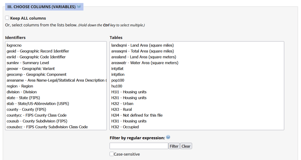
Unlike other applications where you download data that’s prepackaged in tables, Uexplore allows you to create targeted, customized extracts where you can pick and choose variables from multiple tables. While the interface looks daunting at first, it’s not bad once you get the hang of it, and it offers tremendous flexibility and ample documentation to get you started. This is a good option for folks who want customized extracts, but are not coders or API users.
Portion of the Filter Interface for MCDC Uexplore / Dexter
Commercial Products
There are some commercial products that are quite good; they add value by bundling data together and utilizing interactive maps for exploration, visualization, and access. The upsides are they are feature rich and easy to use, while the downsides are they hide the fuzziness of ACS estimates by omitting margins of error (making it impossible to gauge reliability), and they require a subscription. Many academic libraries, as well as a few large public ones, do subscribe, so check the list of library databases at your institution to see if they subscribe (the links below take you to the product website, where you can view samples of the applications).
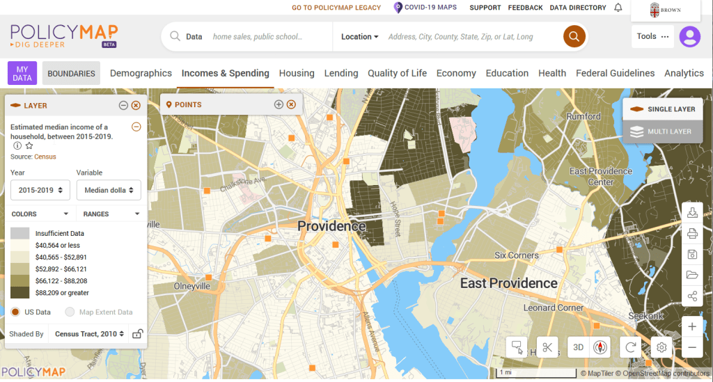
PolicyMap bundles 21st century census data, datasets from several government agencies, and a few proprietary series, and lets you easily create thematic maps. You can generate broad reports for areas or custom regions you define, and can download comparison tables by choosing a variable and selecting all geographies within a broader area. It also incorporates some basic analytical GIS functions, and enables you to upload your own coordinate point data.
PolicyMap Displaying ACS Income Data for Providence, RI
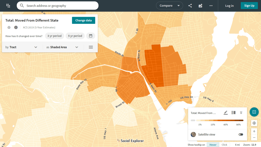
Social Explorer allows you to effortlessly create thematic maps of census data from 1790 to the present. You can create a single map, side by side maps for showing comparisons over time, and swipe maps to move back and forth from one period to the other to identify change. You can also compile data for customized regions and generate a variety of reports. There is a separate interface for downloading comparison tables. Beyond the US demographic module are a handful of modules for other datasets (election data for example), as well as census data for other countries, such as Canada and the UK.
Social Explorer Map Displaying ACS Migration Data for Providence, RI
Last year I wrote about my stamp collecting hobby in a piece that explored maps and geography on stamps. Since it was well received, I thought I’d do a follow-up about geography and postmarks on stamps. I also thought it would be a good time to feature some “lighter” content.
Many collectors search for lightly canceled stamps to add to their collections, where the postmark isn’t damaging, heavy, or intrusive to the point that it obscures what’s depicted on the stamp, while others will only collect mint stamps. But the postmark can be interesting, as it reveals the time and place where the stamp did its job, and may also convey additional, distinct messages that tie it to the location where it began its journey.
Consider the examples below. Someone was up late mailing letters, at 10:30pm in Edinburgh, Scotland on Jan 12, 1898, and just after midnight at the Franco-British Exhibition in London on Aug 31, 1908. A pyramid looms and the sphinx peers behind a stamp postmarked in Luxor at some point at the end of the 19th century (based on when that stamp was in circulation). While Queen Victoria has been blotted out and the sphinx is obscured, these marks turn the stamps into unique objects which situate them in history.
I add stamps like these to a special album I’ve created for postmarks. I’ll share samples from my collection here; they won’t be illustrative of all postmarks from around the world, but reflect whatever I happen to have. I’ll also link to pages that provide information about particular series that were widely published and popular for collecting. Check out this introduction on stamp collecting from the National Postal Museum at the Smithsonian if you’d like a primer. They are also an excellent reference for US stamps.
Time and Place in Cancellation Marks
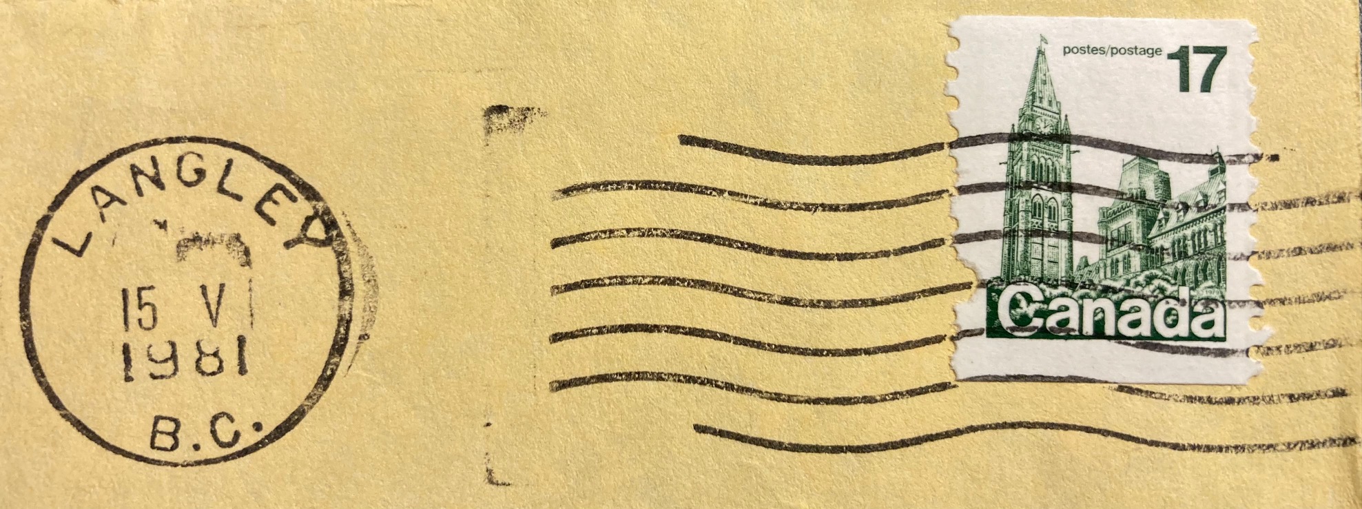
In the late 20th century, the time and place on standard North American postmarks appeared in a circular mark that contained the date and city where the letter was processed, followed by empty space and then wavy lines, bars, or a public service message that cancelled the stamp, as we can see in the early 1980s examples below (the “Please Mail Early for Christmas” cancellation appears atop a stamp from the popular US Transportation Coil series of the 1980s and 90s). This postmark convention continues today in the early 21st century, with time and place on the left and cancellation on the right; the mark in the last example celebrates the 250th anniversary of the beginning of the American Revolution.
Given the placement of the marks, the date and place often don’t appear on these US and Canadian stamps; you would need a piece of the envelope to see the provenance. But sometimes you get lucky. This low denomination stamp was probably one of two or three stamps on its letter; given it’s position on the envelope the mark landed squarely on the prime minister. Hope is a virtue, and also a place in British Columbia where a letter was mailed on Dec 8, 1977 (December being the 12th month, XII in Roman numerals which Canada used on its postmarks)
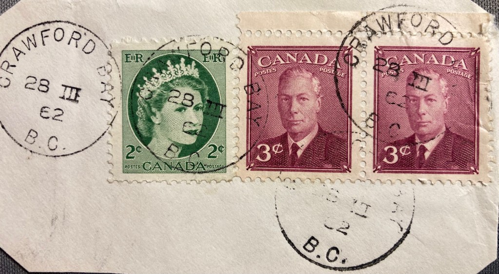
If we go further back in time to periods before mail was processed mechanically, or to places that didn’t have this equipment, we begin to see more stamps that were cancelled by hand, and we’re more likely to see the origin and date marked on the stamp. Queen Elizabeth II appears with her father King George VI on a letter from Crawford Bay, BC on March 28, 1962. QE II is probably the most widely depicted person on postage stamps; this series is known as Canada’s Wildings, their main definitive stamp from the 1950s to early 60s. The photo was taken by Dorothy Wilding, whose photos were also used for the UK’s 1950s definitive stamps of the queen (which are known by collectors as The Wildings). I should add, “definitives” are the small, basic, and most widely printed stamps that countries issue. Think of stamps of the flag in the US, or the queen (or now, the king) in the UK and Canada (Canadians also employ their flag and the maple leaf quite a bit).
Postmarks vary over time and place with many countries having distinct cancellation styles, and where the markings may appear on the stamp itself. The examples below depict marks that “hit the spot”, on afternoons in 1954 in Kingston, Jamaica and 1982 in Pinetown, South Africa (ten miles from Durban). The marks on the Danish and Italian stamps are a bit larger than the stamps themselves, but we can still make out Kobenhavn (Copenhagen) in Denmark. The year is 1951; the 1945 at top is actually 19:45 hours as they use the 24-hour clock (7:45pm). Since the Coin of Syracuse (the definitive Italian stamp from the 1950s through the 70s – this one cancelled in 1972) is still on the envelope, we can see it originated in Montese, a town in the Emilia-Romagna region of northern Italy.
German stamps had a couple of distinctive marks in the mid 20th century, which often landed directly on the stamp. If you acquire enough of these you can assemble a collection that represents cities across the country. The 1930s examples below depict Paul Von Hindenburg, a WWI general and later president of the Weimar Republic. After WWII, Germany and the city of Berlin were divided into occupation zones; we can see examples from the Northwest and Southwest Berlin zones canceled in the 1950s.
The postmarks in these Latin American stamps incorporate their country of origin.
Back in North America, in the first half of the 20th century post offices issued pre-cancelled stamps that bore the mark of the city where they were distributed. Pre-cancelling was an early solution for saving time and money in processing large volumes of mail. In the US, you’ll see these on definitive stamps from the 1920s to the 1970s, particularly on the 4th Bureau Issues (1922-1930) (example of 4c Taft and 5c Teddy Roosevelt on the left), and the Presidential Series of 1938, known as the ‘Prexies”. This series was proposed by Franklin Roosevelt, who was an avid stamp collector, and it depicted every president from Washington to Coolidge. Given the wide range of stamps and denominations, they remained in circulation into the 1950s.
If you’re lucky, you can discover some interesting connections between the postmark and the subject depicted on the stamp, like this 4th Bureau, 1920s stamp of the Statue of Liberty, prominently pre-cancelled in New York.
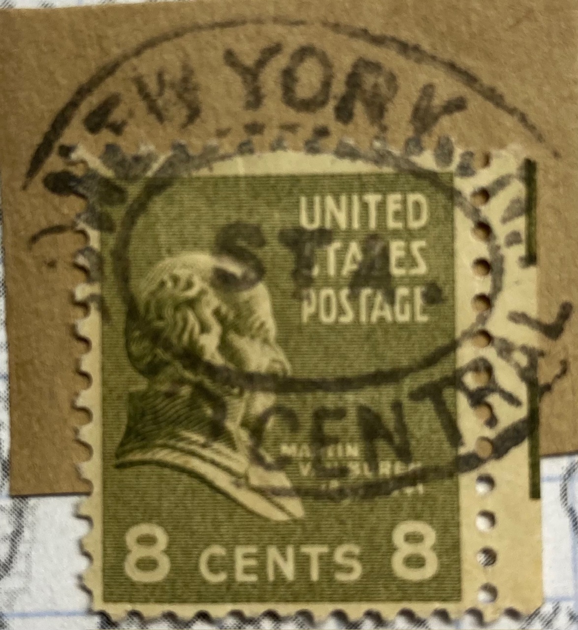
Mail was often transported by train, and train stations were key points where passengers would mail letters before and after traveling, and in some cases even on the train if there was a postal car. “Gare” is the French term for “station”, and we see examples from 1910 Belgium and 1985 France below. An example from Germany is marked Bahnpost (“station” or “train” mail) on board a Zug (“train”) that left Chemnitz early in the 20th century. Since I still had a portion of the envelope, we know the Prexie stamp of Martin Van Buren traveled through Grand Central Station in NYC, at some point in the mid 20th century.
Parts of the Address
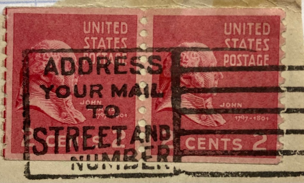
Beyond the cancellation mark that provides time and origin of place, geography also appears in postmarks as exhortations from post offices to encourage letter writers to address mail correctly, so that it ends up at the right destination. The development of addressing systems was, in part, prompted by the need to get mail to locations quickly and accurately. This mid-20th century mark on a pair of John Adams Prexies reminds folks to include both the street and house number in the address.
Postal codes were developed in the mid 20th century as unique identifiers to improve sorting and delivery, as the volume of mail kept increasing. The 1980s stamps below include an example from the US, where the ZIP Code or “Zone Improvement Plan” is the name of US postal code system (introduced in 1963). The USPS always wants you to use it. The other stamp comes from the UK, where the Royal Mail encourages you to “Be Properly Addressed” by adding your post code.
If you’ve ever lived in an apartment building, you’ve probably experienced the annoyance of not receiving letters and packages because the sender (or some computer system) failed to include the apartment number. This is particularly problematic in big cities like New York, so the post office regularly reminded folks with this special mark.
Celebrating Places in Postmarks
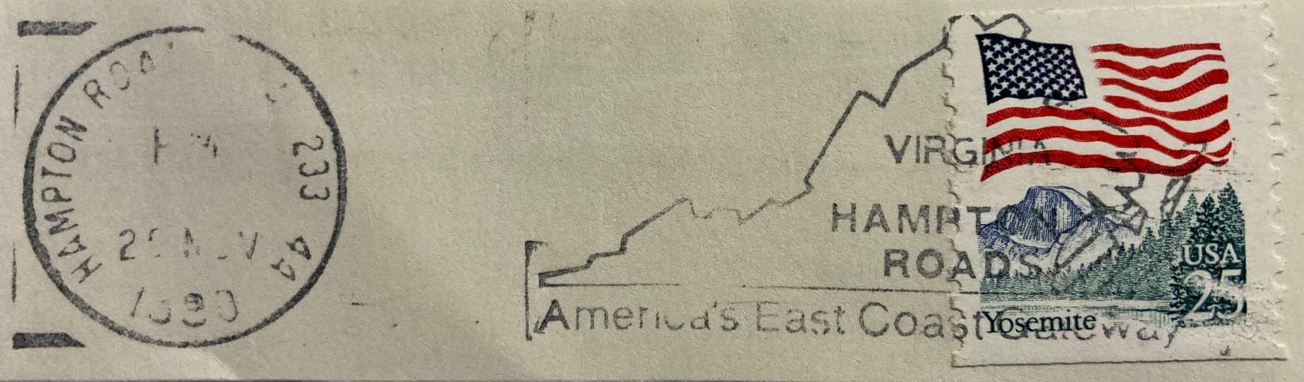
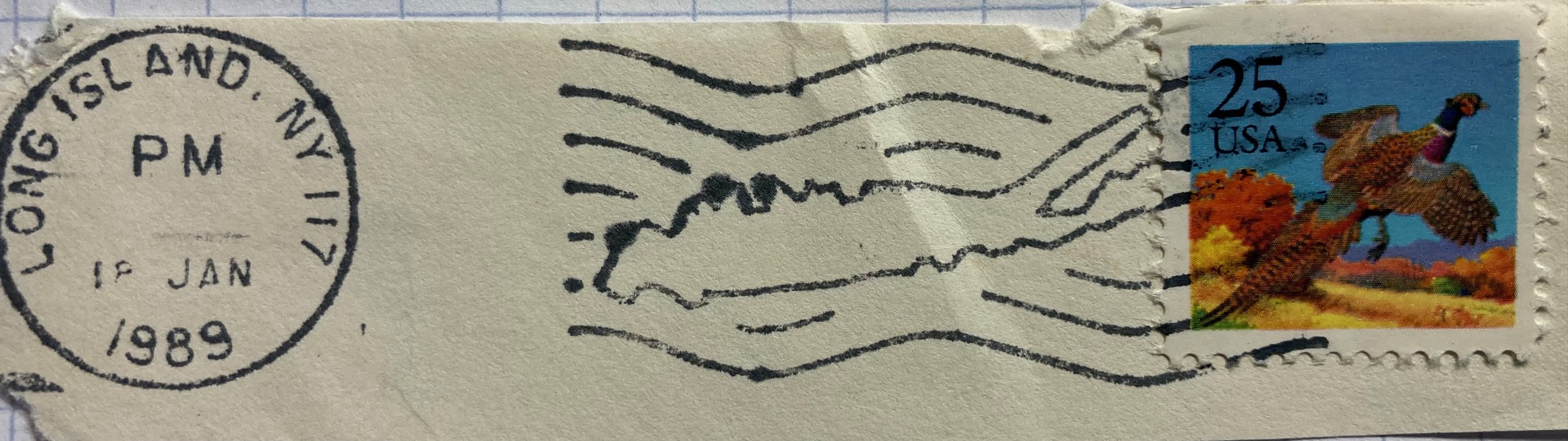
The most interesting examples of geography in postmarks are special, commemorative markings celebrating specific places and events tied to particular locales. Some of the marks have utilitarian designs like the ones below, commemorating the World’s Fair in New York in 1964 – 65, celebrating Delaware’s 200th anniversary of being the first state to ratify the Constitution, and promoting the burgeoning Research Triangle in North Carolina in the 1980s.
Others marks are fancier, depicting maps or places in the markings themselves. The examples below include a promotion for Hampton Roads in Virginia, and a stylized version of Long Island embedded in wavy cancellation lines. Most of the items I have are from the US, but you’ll find examples from around the world. The postal service in France has long created special markings to celebrate local and regional culture and history. This mark from the early 1960s celebrates an exhibition or trade fair in Neufchateau in northeastern France. For special markings like these, collectors will often save the entire envelope (in my case it was damaged, so I opted to clip out the marking and stamp). The stamp features Marianne, a legendary personification of the French republic who has appeared on definitive stamps there since the 1940s.
If you’ve acquired a bag of stamps you’ll get a mix that are on paper (clipped or torn from the envelope), or off paper (removed from the envelope by soaking in warm water, before the days of self adhesives). You often lose the message and provenance in these mixed bags, but are left with tantalizing clues, and funny quirks. The message on this 1970s Spanish stamp featuring long-time leader (aka dictator) Francisco Franco is unclear. He is shouting something about “districts” and “letters” in reference to the cities of Barcelona and Bilbao.
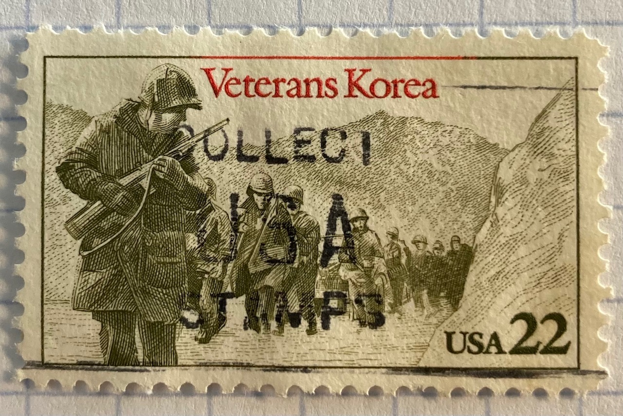
Did you know there were dinosaurs in Yosemite National Park? This brontosaurus was part of a larger marking that advertised the adventures of stamp collecting, which these US Korean War soldiers encourage you to do.
In Conclusion
I hope you enjoyed this nerdy journey through the world of postmarks on stamps and their relation to geography. I’ll leave you with one final, strange fact that you may be unaware of. The lead image at the top of this post depicts a stamp of Vancouver’s skyline, that happened to be postmarked in Vancouver, Canada in March 1980. It’s always neat when you find these examples where the postmark and the stamp are linked. But did you know Vancouver glows in the dark? Countries began tagging stamps with fluorescence or phosphorescence in the mid 20th century, so machines could optically process mail. You can see them glow using special UV lamps – just be sure to wear protective eye wear (the bright yellow lines along the edges of the stamp are the tags).
HIFLD Open, a key repository for accessing US GIS datasets on infrastructure, is shutting down on August 26, 2025. This is a revision from a previous announcement, which said that it would be live until at least Sept 30. The portal provided national layers for schools, power lines, flood plains, and more from one convenient location. DHS provides no sensible explanation for dismantling it, other than saying that hosting the site is no longer a priority for their mission (here’s a copy of an official announcement). In other words, “Public domain data for community preparedness, resiliency, research, and more” is no longer a DHS priority.
The 300 plus datasets in Open HIFLD are largely created and hosted by other agencies, and Open HIFLD was aggregating different feeds into one portal. So, much of the data will still be accessible from the original sources. It will just be harder to find.
DHS has published a crosswalk with links to alternative portals and the source feeds for each dataset, so you can access most of the data once Open HIFLD goes offline. I’ve saved a copy here, in case it also disappears. Most of these sources use ESRI REST APIs. Using ArcGIS Online or Pro, and even QGIS (for example), you can connect to these feeds, get a listing in your contents pane, and drag and drop layers into a project (many of the layers are also available via ArcGIS Online or the Living Atlas if you’re using Arc). Once you’ve added a layer to a project, you can export and save local copies.
Adding ArcGIS Rest Server for US Army Corps of Engineers Data in QGIS
If you want to download copies directly from Open HIFLD before it vanishes on Aug 26, I’ve created this spreadsheet with direct links to download pages, and to metadata records when available (some datasets don’t have metadata, and the links will bring you to an empty placeholder). Some datasets have multiple layers, and you’ll need to click on each one in a list to get to it’s download page. In some cases there won’t be a direct download link, and you’ll need to go to the source (a useful exercise, as you’ll need to remember where it is in the future). Alternatively, you can connect to the REST server (before Aug 26, 2025) in QGIS or ArcGIS, drag and drop the layers you want, and then export:
I’m coordinating with the Data Rescue Project, and we’re working on downloading copies of everything on Open HIFLD and hosting it elsewhere. I’ll provide an update once this work is complete. Even though most of these datasets will still be available from the original sources, better safe than sorry. There’s no telling what could disappear tomorrow.
The secure HIFLD site for registered users will remain available, but many of the open layers aren’t being migrated there (see the crosswalk for details). The secure site is available to DHS partners, and there are restrictions on who can get an account. It’s not exactly clear what they are, but it seems unlikely that most Open users will be eligible: “These instructions [for accessing a secure account] are for non-DHS users who support a homeland security or homeland defense mission AND whose role requires access to the Geospatial Information Infrastructure (GII) and/or any geospatial dashboards, data, or tools housed on the GII…“
I’m fortunate to be on sabbatical for much of this summer, and am working on a project where I’m measuring the effectiveness of comparing census American Community Survey estimates over time. I’ve written a lot of Python code over the past six weeks, and thought I’d share some general tips for working with bigger datasets.
For my project, I’m looking at 317 variables stored in 25 tables for over 406,000 individual geographic areas; approximately 129.5 million data points. Multiply that by two, as I’m comparing two time periods. While this wouldn’t fall into the realm of what data scientists would consider as ‘big data’, it is big enough that you have to think strategically about how handle it, so you don’t run out of memory or have to wait hours while tasks grind away. While you could take advantage of parallel processing, or find access to a high performance computer, with this amount of data you can stick with a decent laptop, if you take steps to ensure that it doesn’t go kaput.
While the following suggestions may seem obvious to experienced programmers, it should be helpful to novices. I work with a lot of students whose exposure to Python programming is using Google Colab with Pandas. While that’s a fine place to start, the basic approaches you learn in an intro course will fall flat once you start working with datasets that are this big.
Don’t use a notebook. Ipython notebooks like Jupyter or Colab are popular, and are great for doing iterative analysis, visualization, and annotation of your work. But they run via web browsers which introduce extra overhead memory-wise. Iterative notebooks are unnecessary if you’re processing lots of data and don’t need to see step by step results. Use a traditional development environment instead (Spyder is my favorite – see the pic in this post’s header).
Don’t rely so much on Pandas DataFrames. They offer convenience as you can explicitly reference rows and columns, and reading and writing data to and from files is straightforward. But DataFrames can hog memory, and processing them can be inefficient (depending on what you’re doing). Instead of loading all your data from a file into a frame, and then making a copy of it where you filter out records you don’t need, it’s more efficient to read a file line by line and omit records while reading. Appending records to a DataFrame one at a time is terribly slow. Instead, use Python’s basic CSV module for reading and append records to nested lists. When you reach the point where a DataFrame would be easier for subsequent steps, you can convert the nested list to a frame. The basic Python data structures – lists, dictionaries, and sets – give you a lot of power at less cost. Novices would benefit from learning how to use these structures effectively, rather than relying on DataFrames for everything. Case in point: after loading a csv file with 406,000 records and 49 columns into a Pandas DataFrame, the frame consumed 240 MB of memory. Loading that same file with the csv module into a nested list, the list consumed about 3 MB.
Reads a file, skips the header row, adds a key / value pair to a dictionary for each row using the first and second value (assuming the key value is unique).
import os, csv

keep_ids={}
with open(recskeep_file,'r') as csv_file:
    reader=csv.reader(csv_file,delimiter='\t')
    next(reader)
    for row in reader:
        keep_ids[row[0]]=row[1]
Or, save all the records as a list in a nested list, while keeping the header row in a separate list.
records=[]
with open(recskeep_file,'r') as csv_file:
    reader=csv.reader(csv_file,delimiter='\t')
    header=next(reader)
    for row in reader:
        records.append(row)]
Delete big variables when you’re done with them. The files I was reading were segmented in twos: one file for estimates, and one for margins of error for those same estimates. I read each into separate, nested lists while filtering for records I wanted. I had to associate each set with a header row, filter by columns, and then join the two together. Arguably that part was easier to do with DataFrames, so at that stage I read both into separate frames, filtered by column, and joined the two. Once I had the joined frame as a distinct copy, I deleted the two individual frames to save memory.
Take out the garbage. Python automatically frees up memory when it can, but you can force the issue by emptying deleted objects from memory by calling the garbage collection module. After I deleted the two DataFrames in the previous step, I explicitly called gc.collect() to free up the space.
...
del est_df
del moe_df
gc.collect()
Write as you read. There’s no way I could read all my data in and hold it in memory before writing it all out. Instead I had to iterate – in my case the data is segmented by data tables, which were logical collections of variables. After I read and processed one table, I wrote it out as a file, then moved on to the next one. The variable that held the table was overwritten each time by the next table, and never grew in size beyond the table I was actively processing.
Take a break. You can use the sleep module to build in brief pauses between big operations. This can give your program time to “catch up”, finishing one task and freeing up some juice before proceeding to the next one.
time.sleep(3)
Write several small scripts, not one big one. The process for reading, processing, and writing my files was going to be one of the longer processes that I had to run. It’s also one that I’d likely not have to repeat if all went well. In contrast, there were subsequent analytical tasks that I knew would require a lot of back and forth, and revision. So I wrote several scripts to handle individual parts of the process, to avoid having to repeat a lot of long, unnecessary tasks.
Lean on a database for heavy stuff. Relational databases can handle large, structured data more efficiently compared to scripts reading data from text files. I installed PostgreSQL on my laptop to operate as a localhost database server. After I created my filtered, processed CSV files, I wrote a second program that loaded them into the database using Psycopg2, a Python module that interacts with PostgreSQL (this is a good tutorial that demonstrates how it works). SQL statements can be long, but you can use Python to iteratively write the statements for you, by building strings and filling placeholders in with the format method. This gives you two options. Option 1, you execute the SQL statements from within Python. This is what I did when I loaded my processed CSV files; I used Python to iterate and read the files into memory, wrote CREATE TABLE and INSERT statements in the script, and then inserted the data from Python’s data structures into the database. Option 2, is you can use Python to write a SQL transaction statement, save the transaction as a SQL text file, and then load it in the database and run it. I followed this approach later in my process, where I had to iterate through two sets of 25 tables for each year, and perform calculations to create a host of new variables. It was much quicker to do these operations within the database rather than have Python do them, and executing the SQL script as a separate process made it easier for me to debug problems.
Connect to a database, save SQL statement as a string, loops through a list of variables IDs, and for each variable format the string by passing the values in as parameters, execute the statement and fetch the result – fetchone() in this case, but could also fetchmany():
# Database connection parameters
pgdb='acs_timeseries'
pguser='postgres'
pgpswd='password'
pgport='5432'
pghost='localhost'
pgschema='public'

conpg = psycopg2.connect(database=pgdb, user=pguser, password=pgpswd,
                             host=pghost, port=pgport)
curpg=conpg.cursor()

sql_varname="SELECT var_lbl from acs{}_variables_mod WHERE var_id='{}'"
year='2019'

for v in varids:
    # Get labels associated with variables
    qvarname=sql_varname.format(year, v)
    curpg.execute(qvarname)
    vname=curpg.fetchone()[0]
... #do stuff...

curpg.close()
When using Psycopg2, don’t use the executemany() function. When performing an INSERT statement, you can have the module executeone() statement at a time, or executemany(). But the latter was excruciatingly slow – in my case it ran overnight before it finished. Instead I found this trick called mogrify, where you convert your INSERT arguments into one enormous string, and pass that to the mogrify() function. This was lightning fast, but because the text string is massive I ran out of memory if my tables were too big. My solution was to split tables in half if the number of columns exceeded a certain number, and pass them in one after the other.
Use the database and script for what they do best. Once I finished my processing, I was ready to begin analyzing. I needed to do several different cross-tabulations on the entire dataset, which was segmented into 25 tables. PostgreSQL is able to summarize data quickly, but it would be cumbersome to union all these tables together, and calculating percent totals in SQL for groups of data is a pain. Python with Pandas would be much better at the latter, but there’s no way I could load a giant flat file of my data into Python to use as the basis for all my summaries. So, I figured out the minimal level of grouping that I would need to do, which would still allow me to run summaries on the output for different combinations of groups (i.e. in total and by types of geography, tables, types of variables, and by variables). I used Python to write and execute GROUP BY statements in the database, iterating over each table and appending the result to a nested list, where one record represented a summary count for a variable by table and geography type. This gave me a manageable number of records. Since the GROUP BY operation took some time, I did that in one script to produce output files. Creating different summaries and reports was a more iterative process that required many revisions, but was quick to execute, so I performed those operations in a subsequent script.
Instead of 386 mil records for (406k geographies * 317 variables * 3 categories), about 18k summary counts for 19 groups of geography
Lastly, while writing and perfecting your script, run it against a sample of your data and not the entire dataset! This will save you time and needless frustration. If I have to iterate through hundreds of files, I’ll begin by creating a list that has a couple of file names in it and iterate over those. If I have a giant nested list of records to loop through, I’ll take a slice and just go through the first ten. Once I’m confident that all is well, then I’ll go back and make changes to execute the program on everything.


You must be logged in to post a comment.