neighborhoods

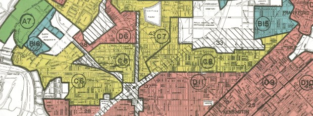
Philadelphia Redlining Map

Redlining Maps for GIS

I received several questions during the spring semester about redlining maps; where to find them, and how many were made. Known officially as Residential Security Maps, they were created by the Home Owners Loan Corporation in the 1930s to grade the level of security or risk for making home loans in residential portions of urban areas throughout the US. This New Deal program was intended to help people refinance mortgages and prevent foreclosures, while increasing buying opportunities to expand home ownership.

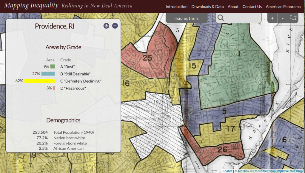
Areas were evaluated by lenders, developers, and appraisers and graded from A to D to indicate their desirability or risk level. Grade A was best (green), B still desirable (blue), C definitely declining (yellow), and D hazardous (red). The yellow and red areas were primarily populated by minorities, immigrants, and low income groups, and current research suggests that this program had a long reaching negative impact by enforcing and cementing segregation, disinvestment, and poverty in these areas.

The definitive digital source for these maps is the Mapping Inequality : Redlining in New Deal America project created at the University of Richmond’s Digital Scholarship Lab. They provide a solid history and summary of these maps and a good bibliography. The main portal is an interactive map of the US that allows you to zoom in and preview maps in different cities. You can click on individually zoned areas and get the original assessor or evaluator’s notes (when available). If you switch to the Downloads page you get a list of maps sorted alphabetically by state and city that you can download as: a jpeg of the original scanned map, a georeferenced image that can be added to GIS software as a raster, and a GIS vector polygon file (shapefile or geojson). In many cases there is also a scanned copy of the evaluators description and notes. You also have the option for downloading a unified vector file for the entire US as a shapefile or geojson. All of the data is provided under a Creative Commons Attribution Sharealike License.

Providence Redlining Map
Redlining Map of Providence, RI with graded areas, from the Mapping Inequality Project

There are a few other sources to choose from, but none of them are as complete. I originally thought of the National Archives which I thought would be the likely holder of the original paper maps, but only a fraction have been digitized. The PolicyMap database has most (but not all) of the maps available as a feature you can overlay in their platform. If you’re doing a basic web search this Slate article is among the first resources you’ll encounter, but most of the links are broken (which says something about the ephemeral nature of these kinds of digital projects).

How many maps were made? Amy Hillier’s work was among the earlier studies that examined these maps, and her case study of Philadelphia includes a detailed summary of the history of the HOLC program with references to primary source material. According to her research, 239 of these maps were made and she provides a list of each of the cities in the appendix. I was trying to discover how many maps were available in Rhode Island and found this list wasn’t complete; it only included Providence, while the Mapping Inequality project has maps for Providence, Pawtucket & Central Falls, and Woonsocket. I counted 202 maps based on unique names on Mapping Inequality, but some several individual maps include multiple cities.

She mentions that a population of 40,000 people was used as a cut-off for deciding which places to map, but noted that there were exceptions; Washington DC was omitted entirely, while there are several maps for urban counties in New Jersey as opposed to cities. In some case cities that were below the 40k threshold that were located beside larger ones were included. I checked the 1930 census against the three cities in Rhode Island that had maps, and indeed they were the only RI cities at that time that had more than 40k people (Central Falls had less than 40k but was included with Pawtucket as they’re adjacent). So this seemed to provide reasonable assurance that these were the only ones in existence for RI.

Finding the population data for the cities was another surprise. I had assumed this data was available in the NHGIS, but it wasn’t. The NHGIS includes data for places (Census Places) back to the 1970 census, which was the beginning of the period where a formal, bounded census place geography existed. Prior to this time, the Census Bureau published population count data for cities using other means, and the NHGIS is still working to include this information. It does exist (as you can find it in Wikipedia articles for most major cities) but is buried in old PDF reports on the Census Bureau’s website.

If you’re interested in learning more about the redlining maps beyond the documentation provided by Mapping Inequality, these articles provide detailed overviews of the HOLC and the residential security maps program, as well as their implications to the present day. You’ll need to access them through a library database:

Hillier, A.E. (2005). “Residential Security Maps and Neighborhood Appraisals: The Home Owners’ Loan Corporation and the Case of Philadelphia.” Social Science History, 29(2): 207-233.

Greer, J. (2012). “The Home Owners’ Loan Corporation and the Development of the Residential Security Maps“. Journal of Urban History, 39(2): 275-296.

A-Train Classic

Neighborhood Research and the Census for Undergrads

Each semester I visit several undergraduate classes in public affairs and journalism, to introduce students to census data. They’re researching or reporting on particular issues and trends in neighborhoods in New York City, and they are looking for statistics to either support their work or generate ideas for a story. I usually showcase the NYC Population Factfinder as a starting point, mention the Census Reporter for areas outside the city , and provide background info on the decennial census, American Community Survey, and census geography and subjects. This year I included two new examples toward the beginning of the lecture to spark their interest.

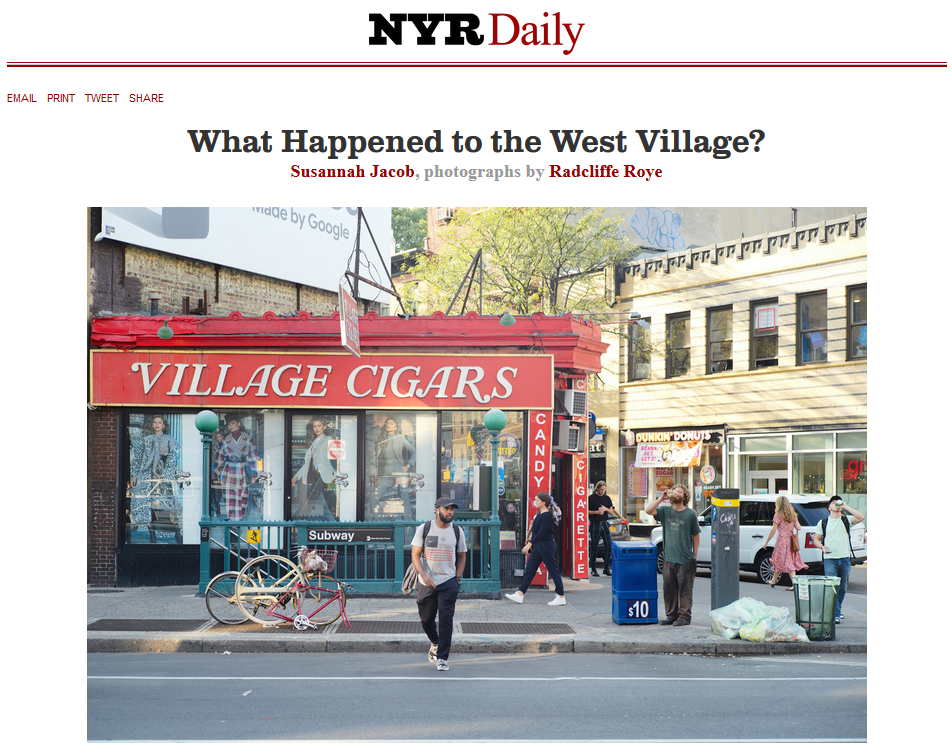
I recently helped reporter Susannah Jacob navigate census data for an article she wrote on hyper-gentrification in the West Village for the New York Review of Books. A perfect example, as it’s what the students are expected to do for their assignment! Like any good journalist (and human geographer), Susannah pounded the pavement of the neighborhood, interviewing residents and small businesses and observing and documenting the urban landscape and how it was changing. But she also wanted to see what the data could tell her, and whether it would corroborate or refute what she was seeing and hearing.

NYRB Article on the West Village

Source: Jacob & Roye, New York Review of Books, Oct 2019. https://www.nybooks.com/daily/2019/10/09/what-happened-to-the-west-village/

We used the NYC Population Factfinder to assemble census tracts to approximate the neighborhood, and I did a little legwork to pull data from the County / ZIP Code Business Patterns so we could see how the business landscape was changing. The most surprising stat we discovered was that the number of 1-unit detached homes had doubled. This wouldn’t be odd in many rapidly growing places in the US, but it’s unusual for an old, built-out urban neighborhood. A 1-unit detached home is a free-standing single family structure that doesn’t share walls with other buildings. Most homes in Manhattan are either attached (row houses / town houses) or units in multi-unit buildings (apartments / condos / co-ops). How could this be? Uber-wealthy people are buying up adjoining row homes, knocking down the walls, and turning them into urban mansions. Seems extraordinary, but apparently is part of a trend.

We certainly ran up against the limitations of ACS data. The estimates for tracts have large margins of error, and when comparing two short time frames it’s difficult to detect actual change, as differences in estimates are clouded by sampling noise. Even after aggregating several tracts, many of the estimates for change weren’t reliable enough to report. When they were (as in the housing example) you could only say that there has been a relative increase without becoming wedded to a precise number. In this case, from 214 (+/- 127) detached units in 2006-2010 to 627 (+/-227) in 2013-2017, an increase of 386 (+/- 260). Not great estimates, but you can say it’s an increase as the low end for change is still positive at 126 units. Considering the time frame and character of the neighborhood, that’s still noteworthy (bearing in mind we’re working with a 90% confidence interval). In cases where the differences overlap and could represent either an increase or decrease there are few claims you can make, and it’s best to walk away (or look at larger area). I always discuss the margin of error with students and caution them about treating these numbers as counts.

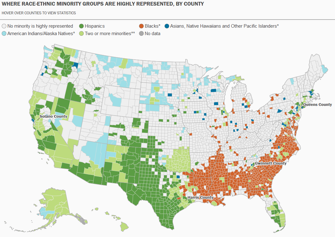
While census data is invaluable for describing and studying individual places, it’s inherent geographic nature also allows us to study places in relation to each other, and to illustrate geographic patterns. For my second example, I zoom out and show them this map of racial-ethnic distribution in the United States:

Map of US Racial and Ethnic Diversity

Source: William H. Frey analysis of US Census population estimates, 2018. https://www.brookings.edu/research/americas-racial-diversity-in-six-maps/

This is one of a series of six maps by demographer William Frey at the Brookings Institute that highlights the geographic diversity of the United States. In this map, each county is shaded for a particular race / ethnicity if the population of that group in that county is greater than that group’s share of the national population. For example, Hispanics / Latinos represent 18.3% of the total US population, so counties where they represent more than this percentage are shaded.

For the purpose of the class, it helps make the census ‘pop’ and gets the students to think about the statistics as geospatial datasets that they can see and relate to, and that can form the basis for interesting research.

Some footnotes – if you like Frey’s maps, I highly recommend his book Diversity Explosion: How New Racial Demographics are Remaking America. It explores the evolving demographic and geographic landscape of the US with clear, accessible writing and more of these great maps (in color).

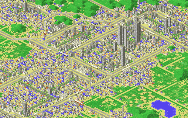
I used the pic at the top of this post as the background for my intro slide. It’s a screenshot of a city from A-Train, a 1992 city-building train simulator that was ported from Japan to the world by Artdink and Maxis, following the success of something called SimCity. It wasn’t nearly as successful, but I always liked the graphics which have now attained a retro-gaming vibe.

Calculate margin of error for ratio (mean income)

Calculating Mean Income for Groups of Geographies with Census ACS Data

When aggregating small census geographies to larger ones (census tracts to neighborhoods for example) when you’re working with American Community Survey (ACS) data, you need to sum estimates and calculate new margins of error. This is straightforward for most estimates; you simply sum them, and take the square root of the sum of squares for the margins of error (MOEs) for each estimate that you’re aggregating. But what if you need to group and summarize derived estimates like means or medians? In this post, I’ll demonstrate how to calculate mean household income by aggregating ZCTAs to United Hospital Fund neighborhoods (UHF), which is a type of public health area in NYC created by aggregating ZIP Codes.

I’m occasionally asked how to summarize median household income from tracts to neighborhood-like areas. You can’t simply add up the medians and divide them, the result would be completely erroneous. Calculating a new median requires us to sort individual household-level records and choose the middle-value, which we cannot do as those records are confidential and not public. There are a few statistical interpolation methods that we can use with interval data (number of households summarized by income brackets) to estimate a new median and MOE, but the calculations are rather complex. The State Data Center in California provides an excellent tutorial that demonstrates the process, and in my new book I’ll walk through these steps in the supplemental material.

While a mean isn’t as desirable as a median (as it can be skewed by outliers), it’s much easier to calculate. The ACS includes tables on aggregate income, including the sum of all income earned by households and other population group (like families or total population). If we sum aggregate household income and number of households for our small geographic areas, we can divide the total income by total households to get mean income for the larger area, and can use the ACS formula for computing the MOE for ratios to generate a new MOE for the mean value. The Census Bureau publishes all the ACS formulas in a detailed guidebook for data users, and I’ll cover many of them in the ACS chapter of my book (to be published by the end of 2019).

Calculating a Derived Mean in Excel

Let’s illustrate this with a simple example. I’ve gathered 5-year 2017 ACS data on number of households (table B11001) and aggregate household income (table B19025) by ZCTA, and constructed a sheet to correlate individual ZCTAs to the UHF neighborhoods they belong to. UHF 101 Kingsbridge-Riverdale in the Bronx is composed of just two ZCTAs, 10463 and 10471. We sum the households and aggregate income to get totals for the neighborhood. To calculate a new MOE, we take the square root of the sum of squares for each of the estimate’s MOEs:

Calculate margin of error for new sum

Calculate margin of error for new sum

To calculate mean income, we simply divide the total aggregate household income by total households. Calculating the MOE is more involved. We use the ACS formula for derived ratios, where aggregate income is the numerator of the ratio and households is the denominator. We multiply the square of the ratio (mean income) by the square of the MOE of the denominator (households MOE), add that product to the square of the MOE of the numerator (aggregate income MOE), take the square root, and divide the result by the denominator (households):

=(SQRT((moe_ratio_numerator^2)+(ratio^2*moe_ratio_denominator^2))/ratio_denominator)

Calculate margin of error for ratio (mean income)

Calculate margin of error for ratio (mean income)

The 2013-2017 mean household income for UHF 101 is $88,040, +/- $4,223. I always check my math using the Cornell Program on Applied Demographic’s ACS Calculator to make sure I didn’t make a mistake.

This is how it works in principle, but life is more complicated. When I downloaded this data I had number of households by ZCTA and aggregate household income by ZCTA in two different sheets, and the relationship between ZCTAs and UHFs in a third sheet. There are 42 UHF neighborhoods and 211 ZCTAs in the city, of which 182 are actually assigned to UHFs; the others have no household population. I won’t go into the difference between ZIP Codes and ZCTAs here, as it isn’t a problem in this particular example.

Tying them all together would require using the ZCTA in the third sheet in a VLOOKUP formula to carry over the data from the other two sheets. Then I’d have to aggregate the data to UHF using a pivot table. That would easily give me sum of households and aggregate income by UHF, but getting the MOEs would be trickier. I’d have to square them all first, take the sum of these squares when pivoting, and take the square root after the pivot to get the MOEs. Then I could go about calculating the means one neighborhood at a time.

Spreadsheet-wise there might be a better way of doing this, but I figured why do that when I can simply use a database? PostgreSQL to the rescue!

Calculating a Derived Mean in PostgreSQL

In PostgreSQL I created three empty tables for: households, aggregate income, and the ZCTA to UHF relational table, and used pgAdmin to import ZCTA-level data from CSVs into those tables (alternatively you could use SQLite instead of PostgreSQL, but you would need to have the optional math module installed as SQLite doesn’t have the capability to do square roots).

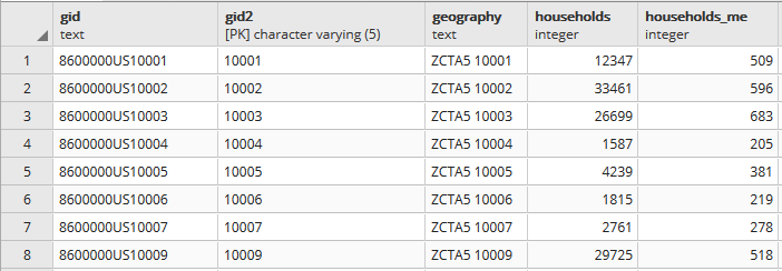
Portion of households table. A separate aggregate household income table is structured the same way, with income stored as bigint type.

Portion of households table. A separate aggregate household income table is structured the same way, with income stored as bigint type.

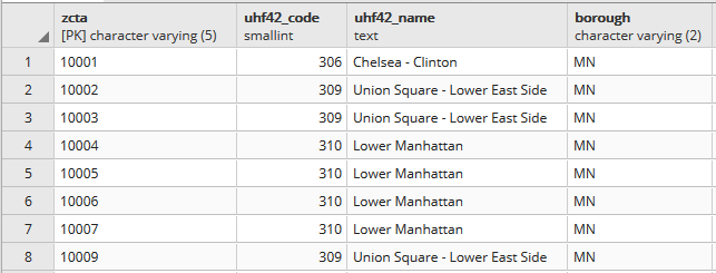
Portion of the ZCTA to UHF relational table.

Portion of the ZCTA to UHF relational table.

In my first run through I simply tried to join the tables together using the 5-digit ZCTA to get the sum of households and aggregate incomes. I SUM the values for both and use GROUP BY to do the aggregation to UHF. In PostgreSQL pipe-forward slash: |/ is the operator for square root. I sum the squares for each ZCTA MOE and take the root of the total to get the UHF MOEs. I omit ZCTAs that have zero households so they’re not factored into the formulas:

SELECT z.uhf42_code, z.uhf42_name, z.borough,
    SUM(h.households) AS hholds,
    ROUND(|/(SUM(h.households_me^2))) AS hholds_me,
    SUM(a.agg_hhold_income) AS agghholds_inc,
    ROUND(|/(SUM(a.agg_hhold_income_me^2))) AS agghholds_inc_me
FROM zcta_uhf42 z, hsholds h, agg_income a
WHERE z.zcta=h.gid2 AND z.zcta=a.gid2 AND h.households !=0
GROUP BY z.uhf42_code, z.uhf42_name, z.borough
ORDER BY uhf42_code;

Portion of query result, households and income aggregated from ZCTA to UHF district.

Portion of query result, households and income aggregated from ZCTA to UHF district.

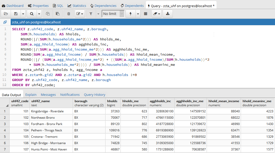
Once that was working, I modified the statement to calculate mean income. Calculating the MOE for the mean looks pretty rough, but it’s simply because we have to repeat the calculation for the ratio over again within the formula. This could be avoided if we turned the above query into a temporary table, and then added two columns and populated them with the formulas in an UPDATE – SET statement. Instead I decided to do everything in one go, and just spent time fiddling around to make sure I got all the parentheses in the right place. Once I managed that, I added the ROUND function to each calculation:

SELECT z.uhf42_code, z.uhf42_name, z.borough,
    SUM(h.households) AS hholds,
    ROUND(|/(SUM(h.households_me^2))) AS hholds_me,
    SUM(a.agg_hhold_income) AS agghholds_inc,
    ROUND(|/(SUM(a.agg_hhold_income_me^2))) AS agghholds_inc_me,
    ROUND(SUM(a.agg_hhold_income) / SUM(h.households)) AS hhold_mean_income,
    ROUND((|/ (SUM(a.agg_hhold_income_me^2) + ((SUM(a.agg_hhold_income)/SUM(h.households))^2 * SUM(h.households_me^2)))) / SUM(h.households)) AS hhold_meaninc_me
FROM zcta_uhf42 z, hsholds h, agg_income a
WHERE z.zcta=h.gid2 AND z.zcta=a.gid2 AND h.households !=0
GROUP BY z.uhf42_code, z.uhf42_name, z.borough
ORDER BY uhf42_code;

Query in pgAdmin and portion of result for calculating mean household income

Query in pgAdmin and portion of result for calculating mean household income

I chose a couple examples where a UHF had only one ZCTA, and another that had two, and tested them in the Cornell ACS calculator to insure the results were correct. Once I got it right, I added:

CREATE VIEW household_sums AS

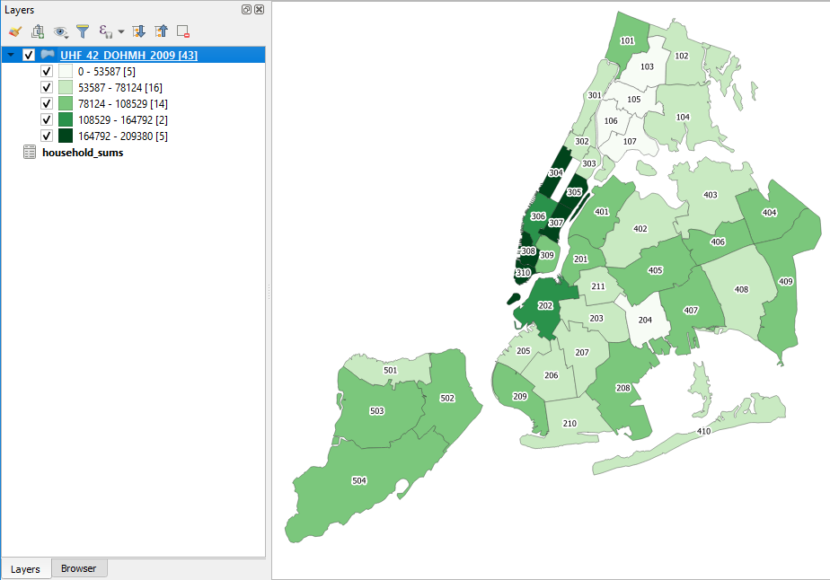
To the top of the statement and executed again to save it as a view. Mission accomplished! To make doubly sure that the values were correct, I connected my db to QGIS and joined this view to a UHF shapefile to visually verify that the results made sense (could also have imported the shapefile into the DB as a spatial table and incorporated it into the query).

Mean household income by UHF neighborhood in QGIS

Mean household income by UHF neighborhood in QGIS

Conclusion

While it would be preferable to have a median, calculating a new mean for an aggregated area is a fair alternative, if you simply need some summary value for the variable and don’t have the time to spend doing statistical interpolation. Besides income, the Census Bureau also publishes aggregate tables for other variables like: travel time to work, hours worked, number of vehicles, rooms, rent, home value, and various subsets of income (earnings, wages or salary, interest and dividends, social security, public assistance, etc) that makes it possible to calculate new means for aggregated areas. Just make sure you use the appropriate denominator, whether it’s total population, households, owner or renter occupied housing units, etc.

Lying with Maps and Census Data

I was recently working on some examples for my book where I discuss how census geography and maps can be used to intentionally skew research findings. I suddenly remembered Mark Monmonier’s classic How To Lie with Maps. I have the 2nd edition from 1996, and as I was adding it to my bibliography I wondered if there was a revised edition.

To my surprise, a 3rd edition was just published in 2018! This is an excellent book: it’s a fun and easy read that provides excellent insight into cartography and the representation of data with maps. There are concise and understandable explanations of classification, generalization, map projections and more with lots of great examples intended for map readers and creators alike. If you’ve never read it, I’d highly recommend it.

If you have read the previous edition and are thinking about getting the new one… I think the back cover’s tagline about being “fully updated for the digital age” is a little embellished. I found another reviewer who concurs that much of the content is similar to the previous edition. The last three chapters (about thirty pages) are new. One is devoted to web mapping and there is a nice explanation of tiling and the impact of scale and paid results on Google Maps. While the subject matter is pretty timeless, some more updated examples would have been welcome.

There are many to choose from. One of the examples I’m using in my book comes from a story the Washington Post uncovered in June 2017. Jared Kushner’s real estate company was proposing a new luxury tower development in downtown Jersey City, NJ, across the Hudson River from Manhattan. They applied for a program where they could obtain low interest federal financing if they built their development in an area were unemployment was higher than the national average. NJ State officials assisted them with creating a map of the development area, using American Community Survey (ACS) unemployment data at the census tract level to prove that the development qualified for the program.

The creation of this development area defies all logical and reasonable criteria. This affluent part of the city consists of high-rise office buildings, residential towers, and historic brownstones that have been refurbished. The census tract where the development is located is not combined with adjacent tracts to form a compact and contiguous area that functions as a unit, nor does it include surrounding tracts that have similar socio-economic characteristics. The development area does not conform to any local conventions as to what the neighborhoods in Jersey City are based on architecture, land use, demographics, or physical boundaries like major roadways and green space.

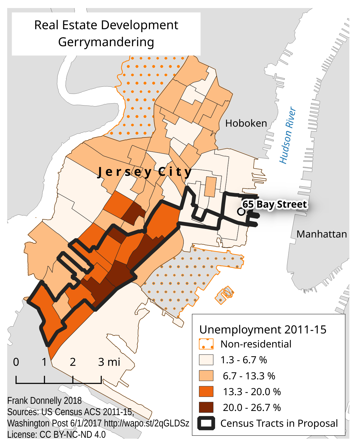
Jersey City Real Estate Gerrymandering Map

Census tracts that represent the “area” around a proposed real estate development were selected to concentrate the unemployed population, so the project could qualify for low interest federal loans.

Instead, the area was drawn with the specific purpose of concentrating the city’s unemployed population in order to qualify for the financing. The tract where the development is located has low unemployment, just like the tracts around it (that are excluded). It is connected to areas of high unemployment not by a boundary, but by a single point where it touches another tract diagonally across a busy intersection. The rest of the tracts included in this area have the highest concentration of unemployment and poverty in the city, and consists primarily of low-rise residential buildings, many of which are in poor condition. This area stretches over four miles away from the development site and cuts across several hard physical boundaries, such as an interstate highway that effectively separates neighborhoods from each other.

The differences between this development area and the actual area adjacent but excluded from the project couldn’t be more stark. Gerrymandering usually refers to the manipulation of political and voting district boundaries, but can also be used in other contexts. This is a perfect example of non-political gerrymandering, where areas are created based on limited criteria in order to satisfy a predefined outcome. These areas have no real meaning beyond this purpose, as they don’t function as real places that have shared characteristics, compact and contiguous boundaries, or a social structure that would bind them together.

The maps in the Post article high-lighted the tracts that defined the proposal area and displayed their unemployment rate. In my example I illustrate the rate for all the tracts in the city so you can clearly see the contrast between the areas that are included and excluded. What goes unmentioned here is that these census ACS estimates have moderate to high margins of error that muddy the picture even further. Indeed, there are countless ways to lie with maps!

The New NYC Census Factfinder

As I’m updating my presentations and handouts for the new academic year, I’m taking two new census resources for a test drive. I’ll talk about the first resource in this post.

The NYC Department of City Planning has been collating census data and publishing it for the City for quite some time. They’ve created neighborhood tabulation areas (NTAs) by aggregating census tracts, so that they could publish more reliable ACS data for small areas (since the margins of error for census tracts can be quite large) and so that New Yorkers have data for neighborhood-like areas that they would recognize. The City also publishes PUMA-level data that’s associated with the City’s Community Districts, as well as borough and city-level data. All of this information is available in a large series of Excel spreadsheets or PDFs in the form of comparison tables for each dataset.

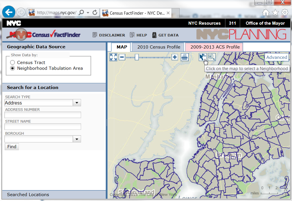
The Department of Planning also created the NYC Census Factfinder, a web-mapping interface that let’s users explore census tract and NTA level data profiles. You could plug in an address or click on the map and get a 2010 Census profile, or a demographic change profile that showed shifts between the 2000 and 2010 Census.

pic1_factfinder

It was a nice application, but they’ve just made a series of updates that make it infinitely better:

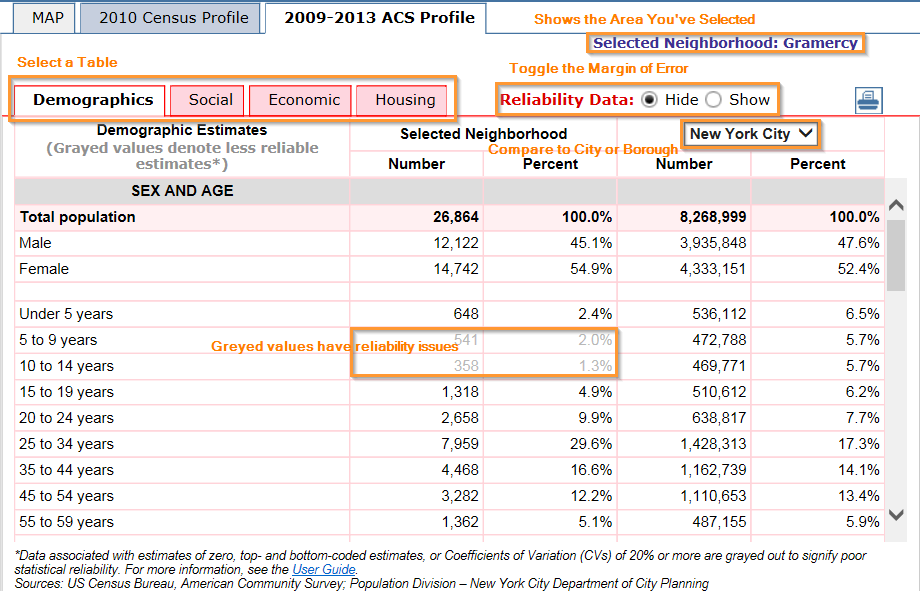
  1. They’ve added the American Community Survey data from 2009-2013, and you can view the four demographic profile tables (demographics, social, economic, and housing) for tracts and NTAs.
  2. Unlike many other sources, they do publish the margin of error for all of the ACS data, which is immensely important. Estimates that have a high margin of error (as defined by a coefficient of variation) appear in grey instead of solid black. While the actual margins are not shown by default, you can simply click the Show radio button to turn on the Reliability data.
  3. Tracts or neighborhoods can be compared to the City as a whole or to an individual borough by selecting the drop down for the column header.
  4. This is especially cool – if you’re viewing census tracts you can use the select pointer and hold down the Control key (Command key on a Mac) to select multiple tracts, and then the data tables will aggregate the tract-level data for you (so essentially you can build your own neighborhoods). What’s noteworthy here is that it also calculates the new margins of error for all of the derived estimates, AND it even calculates new medians and averages with margins of error! This is something that I’ve never seen in any other application.
  5. In addition to searching for locations by address, you can hit the search type drop down and you have a number of additional options like Intersection, Place of Interest, and even Subway Stations.

nyc_factfinder_table

There are a few quirks:

    1. I had trouble viewing the map in Firefox – this isn’t a consistent problem but something I noticed today when I went exploring. Hopefully something temporary that will be corrected. Had no problems in IE.
    2. If you want to click to select an area on the map, you have to hit the select button first (the arrow beside the zoom slider and print button) and then click on your area to select it. Just clicking on the map without hitting select first won’t do much – it will just highlight the area and tell you it’s name. Clicking the arrow button turns it blue and allows you to select features, clicking it again turns it white and lets you identify features and pan around the map.

factfinder_buttons

  1. The one bummer is that there isn’t a way to download any of the profiles – particularly the ones you custom design by selecting tracts. Hitting the Get Data button takes you out of the Factfinder and back to the page with all of the pre-compiled comparison tables. You can print the table out to a PDF for presentation purposes, but if you want a data-friendly format you’ll have to highlight and select the table on the page, copy, and paste into a spreadsheet.

These are just small quibbles that I’m sure will eventually be addressed. As is stands, with the addition of the ACS and the new features they’ve added, I’ll definitely be integrating the NYC Census Factfinder into my presentations and will be revising my NYC Neighborhood Census data handout to add it as a source. It’s unique among resources in that it provides NTA-level data in addition to tract data, has 2000 and 2010 historical change and the latest 5-year ACS (with margins of error) in one application, and allows you to build your own neighborhoods to aggregate tract data WITH new margins of error for all derived estimates. It’s well-suited for users who want basic Census demographic profiles for neighborhood-like areas in NYC.