
I attended ALA’s annual conference in DC last month, where I met FRED. Not a person, but a database. I can’t believe I hadn’t met FRED before – it is an amazingly valuable resource for national, time-series economic data.
FRED was created by the Economic Research unit of the Federal Reserve Bank of St. Louis. It was designed to aggregate economic data from many government sources into a centralized database, with straightforward interface for creating charts and tables. At present, it contains 567,000 US and international time series datasets from 87 sources.
Categories of data include banking and finance (interest and exchange rates, lending, monetary data), labor markets (basic demographics, employment and unemployment, job openings, taxes, real estate), national accounts (national income, debt, trade), production and business (business cycles, production, retail trade, sector-level information about industries), prices (commodities, consumer price indexes) and a lot more. Sources include the Federal Reserve, the Bureau of Labor Statistics, the Census Bureau, the Bureau of Economic Analysis, the Treasury Department, and a mix of other government and corporate sources from the US and around the world.
On their home page at https://fred.stlouisfed.org/ you can search for indicators or choose one of several options for browsing. The default dashboard shows you some of the most popular series and newest releases at a glance. Click on Civilian Unemployment Rate, and you retrieve a chart with monthly stats that stretch from the late 1940s to the present. Most of FRED’s plots highlight periods of recession since these have a clear impact on economic trends. You can modify the chart’s date range, change the frequency (monthly, quarterly, annually – varies by indicator), download the chart or the underlying data in a number of formats, and share a link to it. There are also a number of advanced customization features, such as adding other series to the chart. Directly below the chart are notes that provide a clear definition of the indicator and its source (in this case, the Bureau of Labor Statistics) and links to related tables and resources.

The unemployment rate is certainly something that you’d expect to see, but once you browse around a bit you’ll be surprised by the mix of statistics and the level of detail. I happened to stumble across a monthly Condo Price Index for the New York City Metro Area.
Relative to other sources or portals, FRED is great for viewing and retrieving national (US and other countries) economic and fiscal data and charts gathered from many sources. It’s well suited for time-series data; there are lots of indexes and you can opt for seasonally adjusted or unadjusted values. Many of the series include data for large regions of the US, states, metro areas, and counties. The simplest way to find sub-national data is to do a search, and once you do you can apply filters for concepts, frequencies, geographies, and sources. FRED is not the place to go if you need data for small geographies below the county level. If you opt to create a FRED account (purely optional) you’ll be able to save and track indicators that you’re interested in and build your own dashboards.
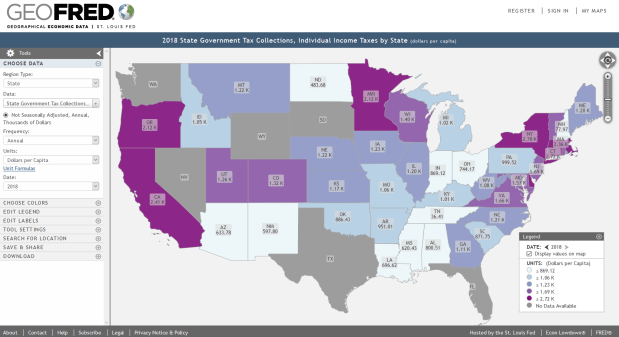
If you’re interested in maps, visit FRED’s brother GeoFRED at https://geofred.stlouisfed.org/. The homepage has a series of sample thematic maps for US counties and states and globally for countries. Choose any map, and once it opens you can change the geography and indicator to something else. You can modify the frequency, units, and time periods for many of the indicators, and you have basic options for customizing the map (colors, labels, legend, etc.) The maps are interactive, so you can zoom in and out and click on a place to see its data value. Most of the county-level data comes from the Census Bureau, but as you move up to states or metro areas the number of indicators and sources increase. For example, the map below shows individual income taxes collected per capita by state in 2018.
There’s a basic search function for finding specific indicators. Just like the charts, maps can be downloaded as static images, shared and embedded in websites, and you can download the data behind the map (it’s simpler to download the same indicator for multiple geographies using GeoFRED compared to FRED).
Take a few minutes and check it out. For insights and analyses of data published via FRED, visit FRED’s blog at https://fredblog.stlouisfed.org/.


You must be logged in to post a comment.