While spending February buried under snow here in Providence, I took the opportunity to update several of the data products we create here at GeoData@SciLi. I’ll provide a summary of what we’re working on in this post. The heading for each project links to its GitHub repo, where you can access the datasets and the scripts we wrote for creating them.
My overall vision has always been that library data services should go beyond simply finding public data and purchasing data for students and faculty; we should actively engage in creating value-added products to meet the research and teaching needs of the university. With a dedication to open data, we also contribute to building a data infrastructure that benefits our local communities, and researchers around world. Creating our own projects keeps our technical skills sharp, gives us more in-depth knowledge about working with particular datasets, and exposes us to the practical processing problems our users face, which makes us better at understanding these issues and thus better able to serve them. To ensure that we can maintain and update our datasets, we automate and script as many of our processes as much as possible. The goal is not to build products, but to build processes to create products.
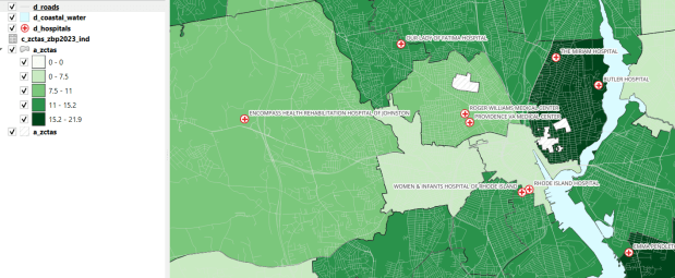
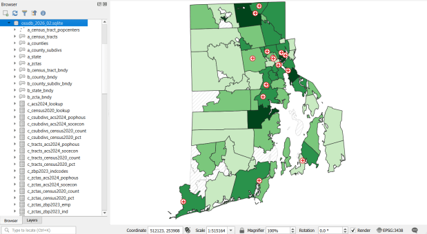
Ocean State Spatial Database
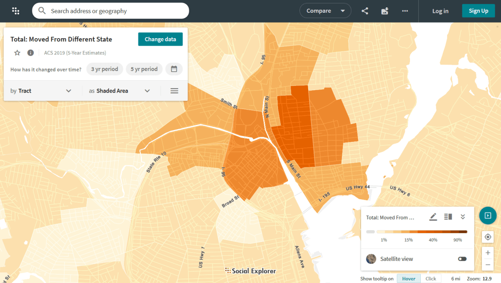
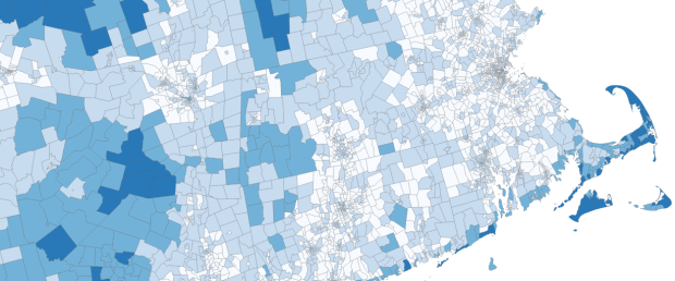
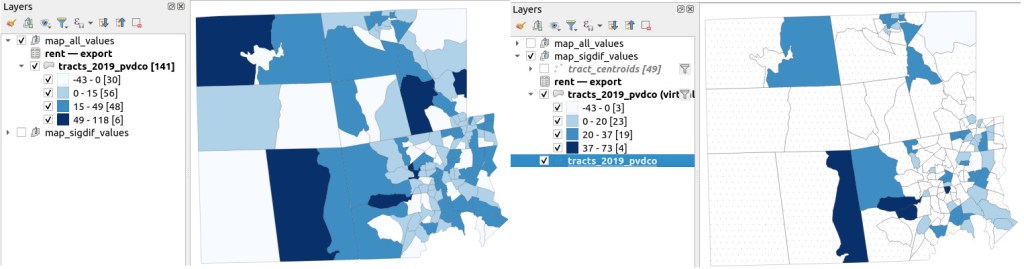
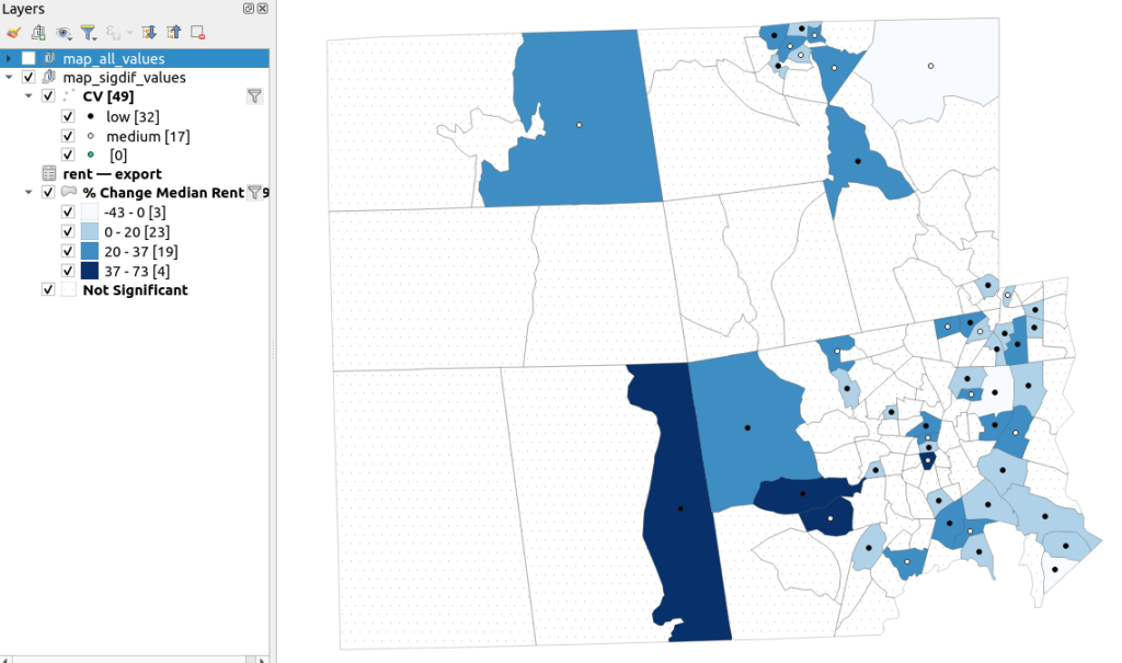
This is our signature product, a geodatabase of basic Rhode Island GIS and tabular data that folks can use as a foundation for building local projects. The idea is to save mappers the trouble of reinventing the wheel every time they want to do state-based research. I’ve honed this idea over a long period of time; as an graduate student at UW twenty years ago I was creating census databases for the Seattle metropolitan area that we published in WAGDA. I expanded this concept at CUNY, where we created and updated the NYC Geodatabase for many years, which included all forms of mass transit data (which wasn’t readily available at the time). For the Rhode Island version, I pivoted to include layers and attributes that would be of interest at a state-level, and was able to re-use many of the scripts and processes I built previously.
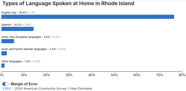
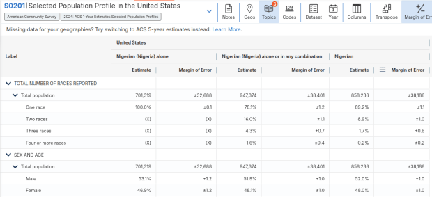
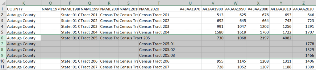
The Census TIGER files are the foundation, and we spent time creating suitably generalized base layers from them. Each layer or object is named with a prefix that categorizes and alphabetizes them in a logical order. “a” layers are areal features that represent land areas (counties, cities and towns, tracts, ZCTAs), “b” features are the actual legal boundaries for these areas (not generalized), “c” features are census data tables that can be joined to the a and b features, and “d” features consist of other points and lines (roads, water bodies, schools, hospitals, etc). The database is published in two formats: a Spatialite version for QGIS, and a file geodatabase for ArcGIS.
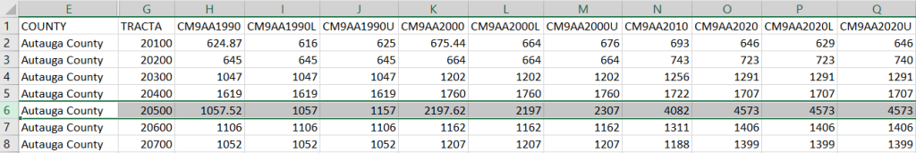
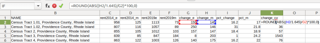
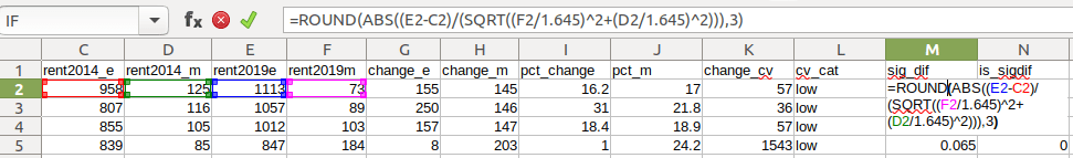
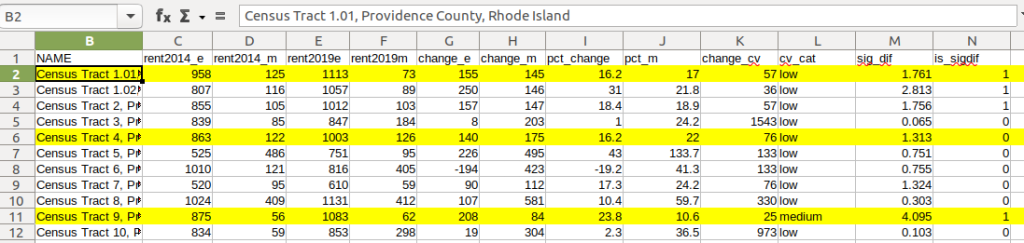
Most of the features are fixed to the 2020 census and don’t change. There are two feature sets that we need to update every year. The first set are tables from the American Community Survey (ACS) and ZIP Code Business Pattern (ZBP). We’ve created tables that consist of a selection of variables that would be of broad interest to many users. We use python notebooks to download the data from the Census Bureau’s API. The ACS variable IDs and labels are stored in a spreadsheet that the script reads in, and checks it against the Census Bureau’s variable list for the demographic profile tables, to see if identifiers and labels have changed compared to the previous year. They often change, so the program flags these and we update the spreadsheet to pull the correct variables. We run the program for a specific geography, and the results are stored in a temporary database. For the ZBP data, we crosswalk and aggregate ZIP Codes to ZCTAs to create ZCTA-level data. I have separate scripts for quality control, where we check number of columns, count of rows, and any given variable to data from last year to see if there are any significant differences that could be errors, and another script for copying the data from the temporary database into the new one.
The other set of features we update are points representing schools, colleges and universities, hospitals, and public libraries. The libraries come from a federal source (IMLS PLS survey), while the others come from state sources (schools and colleges from an educational directory, and hospitals from a licensing directory). We use python to access RIDOT’s geocoding API (their parcel or point-based geocoder) to get coordinates for each feature. There’s a lot of exception handling, to deal with bad or non-matching addresses, some of which creep up every year. I store these in a JSON file; the program runs a preliminary check to see if these addresses have been corrected, and if they’re not the program uses the good address stored in the JSON. For quality control, the Detect Dataset Changes tool in the QGIS Processing toolbox allows us to see if features and attributes have changed, and we do extra work to verify the existence of records that have fallen in or out since last year.
Providence Geocoded Crime Incidents
A few years ago I had an excellent undergraduate fellow in the Data Sciences program who created a process for taking all of the police case logs from the Providence Open Data Portal and creating a GIS dataset out of them. We created this dataset for three reasons: the portal contains just the last 180 days and we wanted to create a historic archive, the records did not have coordinates, and the crimes were not standardized. Geocoding was the biggest challenge, as the location information was listed as one of the following: a street intersection, a block number, or a landmark. The script identifies the type of location, and then employs a different procedure for each. Intersections were easy, as we could pass these to the RIDOT geocoder (their street-interpolation geocoder). For block numbers, the program looks at a local file that contains all addresses in the state’s 911 database, which we filter down to just the City of Providence. It finds the matching street, gets the minimum and maximum address numbers within the given block, and computes the centroid between those addresses. For landmarks like Roger Williams Park or Providence Place Mall, we have a local list of major landmarks with coordinates that the program draws from. All non-matching addresses are written to a separate file, and you have the opportunity to add additional landmarks that didn’t match and rerun them. Crimes are matched to the FBI’s uniform categories for violent and non-violent crime, and there’s also an opportunity to update the list if new incident descriptions appear in the data.
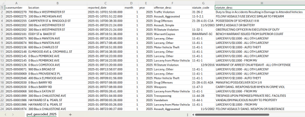
We warn users that the matches are not exact, and this needs to be kept in mind when doing any analysis; for every incident we record the match type so users can assess quality. For all of our projects, we provide detailed documentation that explains exactly how the data was created. At this point we have half the data for 2023, and everything for 2024 and 2025. We run the program a few times each year, to ensure that we capture every incident before 180 days elapses.
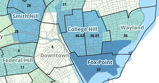
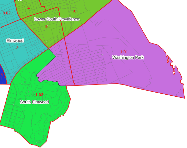
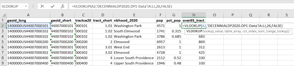
Providence Census Geography Crosswalk
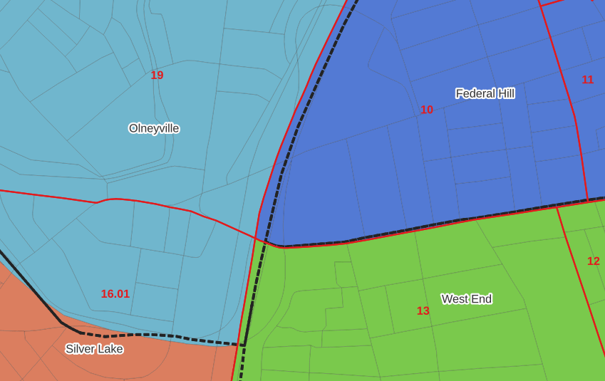
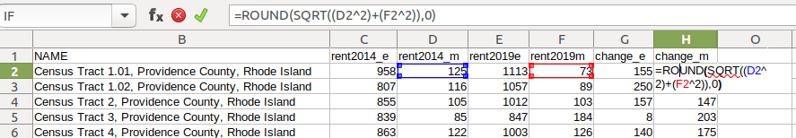
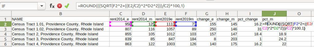
I wrote about this project when we released it last year; it is a set of relational tables for taking census data published at the tract, block group, and block level, and apportioning and aggregating it to local Providence geographies that include neighborhoods and wards (there’s also a crosswalk for ZCTAs to local geographies, but it’s rather useless as there is little correspondence). We also published a set of reference maps for showing correspondence or lack thereof between the census and local areas.
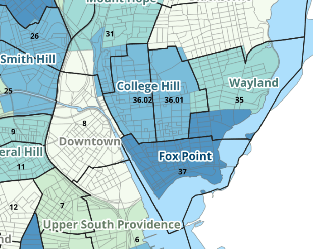
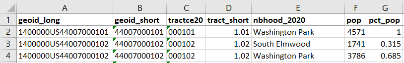
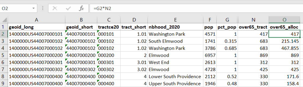
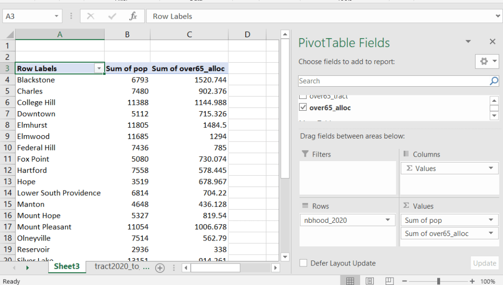
The newest development is that one of my undergraduates used the crosswalk to generate 2020 census demographic profile summaries for neighborhoods and wards, so that users can simply download a pre-compiled set of data without having to do their own crosswalking. Population and household variables were apportioned using total population as a weight, while housing unit variables were apportioned using total housing units. He also generated percent totals for each variable, which required carefully scrutinizing what the proper numerators and denominators should be based on published census results. Python to the rescue again, he used a notebook that read the census tables in from the Ocean State Spatial Database, which saved us the trouble of using the census API. We publish the data tables in the same GitHub repository as the crosswalk.
UN ICSC Retail Price Indexes
I haven’t updated this one yet, but it’s next on the list. I wrote about this project a few years ago; this is a country-level index that documents variation in the cost of living at different UN duty stations. The UN publishes this data at different intervals throughout the year, in macro-driven Excel files that allow you to pull up data for one country at a time. The trick for this project was looping through hundreds of these files, finding the data hidden by the macro, and turning it into a single time series that includes unique identifiers for place, time, and good / service. This project was born from a research request from a PhD student, and we saw the value of building a process to keep it updated and to publish it for others to use. The scripting was done by the first undergraduate student worker I had at Brown, Ethan McIntosh. Thanks to him, I download the new data each year, run the program, and voila, new data!
Conclusion
I hope you found this summary useful, either because you can use these datasets, or you can learn something from one of our scripts and processes that you can apply to your own work. I hope that more academic libraries will embrace the concept of being data creators, and would incorporate this work into their data service models (along with formally contributing to existing initiatives like the Data Rescue Project or the OpenStreetMap). Feel free to reach out with comments and feedback.


You must be logged in to post a comment.