I presented a poster last April on the library’s GIS and Data Services at the CHAIRS-C conference at the Brown School of Public Health. CHAIRS-C is an acronym for Center on Heat, Health, and Aging Innovation and Research Solutions for Communities; it’s a small cluster whose members are interested in heat-related research, and the impact of extreme heat on vulnerable communities. I provided some examples in the poster of heat-related datasets and research that I’ve supported over the last few years. I thought I’d share a summary of these datasets in this post that include air conditioning, heat indices, and sources that provide climate-related rasters with variable that include temperature and precipitation. Most of these examples are US-based, the last one is global.
Local Air Conditioning Estimates (LACE)
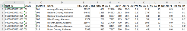
The Local Air Conditioning Estimates (LACE) is a new, experimental dataset produced by the US Census Bureau. It includes estimates of occupied housing units that have air conditioning at the national, state, county, and census tract levels. The estimates are published with margins of error at a 90% confidence level, and represent the year 2023. Each record includes the census summary level / fips GEOID, so you can readily match them to vector boundary files for GIS mapping.
Sample records from the Local Air Conditioning Estimates for census tracts
Questions about air conditioning are regularly collected as part of the American Housing Survey (AHS), but the sample size isn’t large enough to publish reliable estimates below the state and metropolitan area levels. To create LACE, the Census Bureau employed machine learning in a process called cross survey modeling, and triangulated the AHS with some other datasets to create small-area estimates. Summary documentation is included on the LACE website if you want to learn more, and there are links to working papers that go into greater detail.
The concept is similar to what the CDC has done in taking data from the Behavioral Risk Factor Surveillance System and using models to create small area estimates for the PLACES project. LACE fills a vital data gap for studying heat; most small-area sources for AC are a patchwork series of parcel data published by individual municipalities. I attended a couple of presentations given by the Census Bureau at FedGeoDay back in April, and they suggested that they will increasingly move in a modeling direction that draws on administrative data and smaller surveys, given declining response rates to large sample surveys like the ACS. Of course, this was before the current administration made the bonkers decision to ban the use of injecting noise into statistical datasets (a basic practice for protecting the privacy of survey participants), so who knows what will happen next.
Urban Heat Severity Index
Research has shown that temperature varies considerably over small areas, especially in cities. So if you are looking at the temperature reported for an entire city, or even at gridded data where the cells are large, both will mask a good deal of geographic variability. The absence of trees and green space, an abundance of impervious surfaces, and concentrated emissions from vehicles and air conditioners can dramatically increase the temperature of urban areas, creating “heat islands”.
The Trust for Public Land has been publishing the annual Heat Severity Urban Areas index for the past few years; originally the dataset covered just incorporated places but was expanded to include the entire US. Index values from 1 to 5 indicate the severity of a heat island, measured relative to the average summer temperature for the city or place where each grid cell is located. The data is published as a grid at 30m resolution (matching the resolution of LANDSAT imagery used in their workflow) and is distributed via an ESRI hub site. You can search for it within the Living Atlas in the data catalog in ArcGIS Pro to add it to a project, or grab the url from the hub site to render it as a web mapping service in QGIS or another package. In order to use it in an analysis, you’ll need to export and save the raster locally. To save time and space, you can clip the layer to a polygon or extent of the screen, and then save the result.
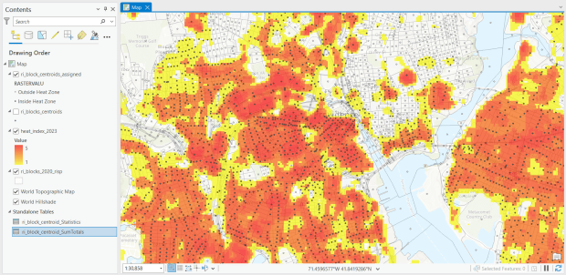
For one project, I had to estimate the number of people in Rhode Island who were living within an urban heat island. I used census block boundaries from the 2020 census, which include total population and housing units as attributes, calculated the centroid of the blocks, and overlaid them on the grid and assigned the intersecting grid value to each point. Then I summed the population by the index values; a value of null indicated that the center of the block fell outside a heat cell.
Urban Heat Severity Index overlayed with census blocks in Providence, RI in ArcGIS Pro
US Gridded Climate Data: PRISM
For rasters of climate data on temperature and precipitation, I’ve often turned to PRISM at Oregon State University. They work with the USDA to generate the maps for plant hardiness zones, and have developed a model to generate gridded climate data. The public data is available at 4km resolution, but researchers with project proposals can submit requests to access 800m resolution data. They publish mean daily, monthly, and annual values, as well as normals. Each raster is stored in one file, where the file represents one observation for one time period. I have written about PRISM in the past as I used it for several projects, writing Python scripts to pull a raster file for specific dates that match attributes in a point file, in order to determine what the temperature was for that date for each point, based on the grid cell the point fell within. PRISM has updated some of their products since I’ve run that analysis, specifically replacing the older raster file formats with tifs.
US County Climate Data: NCEI Climate at a Glance
For certain statistical analyses, it can be helpful to have climate data summarized for an entire geographic area so that it aligns with other variables that are published for that area. NOAA’s National Center for Environmental Information (NCEI) employs a model that takes their gridded data product (derived from the U.S. Climate Divisional Database) to produce monthly state and county-level estimates for the US, from 1895 to the present. I wrote a post that summarizes how to download, interpret, and parse these files so that you can start using them; if you’re seeking the entire dataset you’ll skip the web-based interface for creating summary charts and maps and go right to the FTP site to download data in bulk.
Since our current government doesn’t like the weather, this is one of the datasets that I’ve archived in DataLumos as part of the Data Rescue Project, in case it vanishes one day.
Global Climate Data: ERA5
How about the rest of the world? ERA5 is produced by the European Centre for Medium-Range Weather Forecasts, which publishes gridded climate data at 1/4 degree resolution, modeled from 1940 to present. You can choose hourly, daily, or monthly estimates (accessed via separate web pages), and at the download stage you can provide bounding box coordinates to clip the data (so you don’t have to download the entire planet). The data is packaged in a GRIB file, where variables are stored in separate bands. So if you download monthly data for one variable, each month is stored sequentially; if you download two or more variables, they are sorted by variable and then by time period. Similar to my US project with PRISM, I wrote a Python script that extracts ERA5’s monthly gridded data for specific point locations, but in this case I pulled all dates for each point (with an option to highlight a specific month for a matching date). I wrote a detailed post that describes the dataset and process.
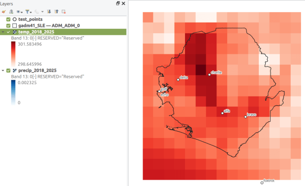
ERA5 mean monthly temperature data for Sierra Leone in QGIS
I recently revisited a project from a few years ago, where I needed to extract temperature and precipitation data from a raster at specific points on specific dates. I used python to iterate through the points and pull up a raster for matching attribute dates, and Rasterio to overlay the raster and extract the climate data at those points. I was working with PRISM’s daily climate rasters for the US, where each nation-wide file represented a specific variable and date, and the date was embedded in the filename. I wrote a separate program to clip the raster to my area of interest prior to processing.
This time around, I am working with global climate data from ERA5, produced by the European Centre for Medium-Range Weather Forecasts (ECMWF). I needed to extract all monthly mean temperature and total precipitation values for a series of points within a range of years. Each point also had a specific date associated with it, and I had to store the month / year in which that date fell in a dedicated column. The ERA5 data is packaged in a single GRIB file, where each observation is stored in sequential bands. So if you download two full years worth of data, band 1 would contain January of year 1, while band 24 holds December of year 2. This process was going to be a bit simpler than my previous project, with a few new things to learn.
There are multiple versions of ERA5; I was using the monthly averages but you can also get daily and hourly versions. The cell resolution was 1/4 of a degree, and the CRS is WGS 84. When downloading the data, you have the option to grab multiple variables at once, so you could combine temperature and precipitation in one raster and they’d be stored in sequence (all temperature values first, all precipitation values second). To make the process a little more predictable, I opted for two downloads and stored the variables in separate files. The download interface gives you the option to clip the global image to bounding coordinates, which is quite convenient and saves you some extra work. This project is in Sierra Leone in Africa, and I eyeballed a web map to get appropriate bounds.
I follow my standard approach, creating separate input and output folders for storing the data, and placing variables that need to be modified prior to execution at the top of the script. The point file can be a geopackage or shapefile in the WGS 84 CRS, and we specify which raster to read and mark whether it’s temperature or precipitation. The point file must have three variables: a unique ID, a label of some kind, and a date. We store the date of the first observation in the raster as a separate variable, and create a boolean variable where we specify the format of the date in the point file; standard_date is True if the date is stored as YYYY-MM-DD or False if it’s DD-MM-YYYY.
import os,csv,sys,rasterio
import numpy as np
import matplotlib.pyplot as plt
import geopandas as gpd
from rasterio.plot import show
from rasterio.crs import CRS
from datetime import datetime as dt
from datetime import date

""" VARIABLES - MUST UPDATE THESE VALUES """

# Point file, raster file, name of the variable in the raster
point_file='test_points.gpkg'
raster_file='temp_2018_2025_sl.grib'
varname='temp' # 'temp' or 'precip'

# Column names in point file that contain: unique ID, name, and date
obnum='OBS_NUM'
obname='OBS_NAME'
obdate='OBS_DATE'

 #The first period in the ERA data write as YYYY-MM
startdate='2018-01' # YYYY-MM

# True means dates in point file are YYYY-MM-DD, False means DD-MM-YYYY
standard_date=False # True or False
I wrote a function to convert the units of the raster’s temperature (Kelvin to Celsius) and precipitation (meters to millimeters) values. We establish all the paths for reading and writing files, and read the point file into a Geopandas geodataframe (see my earlier post for a basic Geopandas introduction). If the column with the unique identifier is not unique, we bail out of the program. We do likewise if the variable name is incorrect.
""" MAIN PROGRAM """

def convert_units(varname,value):
    # Convert temperature from Kelvin to Celsius
    if varname=='temp':
        newval=value-272.15
    # Convert precipitation from meters to millimeters
    elif varname=='precip':
        newval=value*1000
    else:
        newval=value
    return newval

# Estabish paths, read files
yearmonth=np.datetime64(startdate)
point_path=os.path.join('input',point_file)
raster_path=os.path.join('input',raster_file)
outfolder='output'
if not os.path.exists(outfolder):
    os.makedirs(outfolder)
point_data = gpd.read_file(point_path)

# Conditions for exiting the program
if point_data[obnum].is_unique is True:
    pass
else:
    print('\n FAIL: unique ID column in the input file contains duplicate values, cannot proceed.')
    sys.exit()

if varname in ('temp','precip'):
    pass
else:
    print('\n FAIL: variable name must be set to either "temp" or "precip"')
    sys.exit()
We’re going to use Rasterio to pull the climate value from the raster row and column that each point intersects. Since each band has an identical structure, we only need to find the matching row and column once, and then we can apply it for each band. We create a dictionary to hold our results, open the raster, and iterate through the points, getting the X and Y coordinates from each point and using them to look up the row and column. We add a record to our result dictionary, where the key is the unique ID of the point, and the value is another dictionary with several key / value pairs (observation name, observation date, raster row, and raster column).
# Dictionary holds results, key is unique ID from point file, value is
# another dictionary with column and observation names as keys
result_dict={}

# Identify and save the raster row and column for each point
with rasterio.open(raster_path,'r+') as raster:
    raster.crs = CRS.from_epsg(4326)
    for idx in point_data.index:
        xcoord=point_data['geometry'][idx].x
        ycoord=point_data['geometry'][idx].y
        row, col = raster.index(xcoord,ycoord)
        result_dict[point_data[obnum][idx]]={
            obname:point_data[obname][idx],
            obdate:point_data[obdate][idx],
            'RASTER_ROW':row,
            'RASTER_COL':col}
Now, we can open the raster and iterate through each band. For each band, we loop through the keys (the points) in the results dictionary and get the raster row and column number. If the row or column falls outside the raster’s bounds (i.e. the point is not in our study area), we save the year/month climate value as None. Otherwise, we obtain the climate value for that year/month (remember we hardcoded our start date at the top of the script), convert the units and save it. The year/month becomes the key with the prefix ‘YM-‘, so YM-2019-01 (this data will ultimately be stored in a table, and best practice dictates that column names should be strings and should not begin with integers). Before we move to the next band, we update our year / month value by 1 so we can proceed to the next one; Python’s timedelta function allows us to do math on dates, so if we add 1 month to 2019-12 the result is 2020-01.
# Iterate through raster bands, extract the climate value,
# store in column named for Year-Month, handle points outside the raster
with rasterio.open(raster_path,'r+') as raster:
    raster.crs = CRS.from_epsg(4326)
    for band_index in range(1, raster.count + 1):
        for k,v in result_dict.items():
            rrow=v['RASTER_ROW']
            rcol=v['RASTER_COL']
            if any ([rrow < 0, rrow >= raster.height,
                    rcol < 0, rcol >= raster.width]):
                result_dict[k]['YM-'+str(yearmonth)]=None
            else:
                climval=raster.read(band_index)[rrow,rcol]
                climval_new=round(convert_units(varname,climval.item()),4)
                result_dict[k]['YM-'+str(yearmonth)]=climval_new
        yearmonth=yearmonth+np.timedelta64(1, 'M')
The next block identifies the year/month that matches the date for each point, and saves that value in a dedicated column. We identify whether we are using a standard date or not (specified at the top of the script). If it was not standard (DD-MM-YYYY), we convert it to standard (YYYY-MM-DD). We use the datetime function to get just the year / month from the observation date, so we can look it up in our results dictionary and pull the matching value. If our observation date falls outside the range of our raster data, we record None.
# Iterate through results, find matching climate value for the
# observation date in the point file, handle dates outside the raster
for k,v in result_dict.items():
    if standard_date is False: # handles dd-mm-yyyy dates
        formatdate=dt.strptime(v[obdate].strip(),'%m/%d/%Y').date()
        numdate=np.datetime64(formatdate)
    else:
        numdate=v[obdate] # handles yyyy-mm-dd dates
    obyrmonth='YM-'+np.datetime_as_string(numdate, unit='M').item()
    if obyrmonth in v:
        matchdate=v[obyrmonth]
    else:
        matchdate=None
    result_dict[k]['MATCH_VALUE']=matchdate
Here’s a sample of the first record in the results dictionary:
{0:
{'OBS_NAME': 'alfa',
'OBS_DATE': '1/1/2019',
'RASTER_ROW': 9,
'RASTER_COL': 7,
'YM-2018-01': 28.4781,
'YM-2018-02': 29.6963,
'YM-2018-03': 28.9622,
...
'YM-2025-12': 26.6185,
'MATCH_VALUE': 28.7401},
}
The last bit writes our output. We want to use the keys in our dictionary as our header row, but they are repeated for every point and we only need them once. So we pull the first entry out of the dictionary and convert its keys to a list, and then insert the name of the observation variable as the first list element (since it doesn’t appear in our dictionary). Then we proceed to flatten our dictionary out to a list, with one record for each point. We do a quick plot of the points and the first band (just for show), and use the CSV module to write the data out. We name the output file using the variable’s name (provided at the beginning) and today’s date.
# Converts dictionary to list for output
firstkey=next(iter(result_dict))
header=list(result_dict[firstkey].keys())
header.insert(0,obnum)
result_list=[header]
for k,v in result_dict.items():
    record=[k]
    for k2, v2 in v.items():
        record.append(v2)
    result_list.append(record)

# Plot the points over the first raster that was processed to see visual
with rasterio.open(raster_path,'r+') as raster:
    raster.crs = CRS.from_epsg(4326)
    fig, ax = plt.subplots(figsize=(12,12))
    point_data.plot(ax=ax, color='black')
    show((raster,1), ax=ax)

# Output results to CSV file
today=str(date.today())
outfile=varname+'_'+today+'.csv'
outpath=os.path.join(outfolder,outfile)
with open(outpath, 'w', newline='') as writefile:
    writer=csv.writer(writefile, quoting=csv.QUOTE_MINIMAL, delimiter=',')
    writer.writerows(result_list)

count_r=len(result_list)
count_c=len(result_list[0])
print('\n Done, wrote {} rows with {} values for {} data to {}'.format(count_r,count_c,varname,outpath))
This gives us temperature; the next step would be to modify the variables at the top of the script to read in and process the precipitation raster. Geospatial python makes it super easy to automate these tasks and perform them quickly. My use of desktop GIS was limited to examining the GRIB file at the beginning so I could understand how it was structured, and creating a visualization at the end so I could verify my results (see the QGIS screenshot in the header of this post).
It’s been awhile since I’ve written a post that showcases different GIS datasets. So in this one, I’ll provide an overview of some free and open data sources that I’ve learned about and worked with this past spring semester. The topics in these series include: global land use and land cover, US heat and temperature, detailed population data for India, and public health in low and middle income countries.
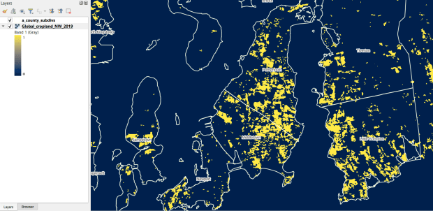
The GLAD lab at the Department of Geographical Sciences at the University of Maryland produces over a dozen GIS datasets related to global land use, land cover, and change in land surface over time. Last semester I had folks who were interested in looking at recent global change in cropland and forest. GLAD publishes rasters that include point-in-time coverage, period averages, and net change and loss over the period 2000 to 2020. Much of the data is generated from LANDSAT, and resolution varies from 30m to 3km. Other series include tropical forest cover and change, tree canopies, forest lost due to fires, a few non-global datasets that focus on specific regions, and LANDSAT imagery that’s been processed so it’s ready for LULC analysis.
Most of the sets have been divided up into tiles and segmented based on what they’re depicting (change in crops, forest, etc). The download process is basic point and click, and for larger sets they provide a list of tifs in a text file so you can automate downloading by writing a basic script. Alternatively, they also publish datasets via Google Earth Engine.
GLAD Cropland Extent in 2019 in QGIS, Zoomed in to Optimal Resolution in SE Rhode Island
For the past few years, the Trust for Public Land has published an annual heat severity index. This layer represents the relative heat severity for 30m pixels for every city in the United States; depicting where areas of cities are hotter than the average temperature for that same city as a whole (i.e. the surface temperature for each pixel relative to the general air temperature reading for the entire city). Severity is measured on a scale of 1 to 5, with 1 being a relatively mild and 5 being severe heat. The index is generated from a Heat Anomalies raster which they also provide; it contains the relative degrees Fahrenheit difference between any given pixel and the mean heat value for the city in which the pixel is located. Both datasets are generated from 30-meter Landsat 8 imagery, band 10 (ground-level thermal sensor) from summertime images.
The dataset is published as an ArcGIS image service. The easiest way to access it is by to adding it from the Living Atlas to ArcGIS Pro (or Online), and then export the service from there as a raster feature class (while doing so, you can also clip the layer to a smaller area of interest). It’s possible that you can also connect to it as an ArcGIS REST Server in QGIS, but I haven’t tried. While there are files that go back to 2019, the methodology has changed over time, so studying this as a national, annual time series is not appropriate. The coverage area expanded from just large, incorporated cities in earlier years to the entire US in recent years.
US Heat Severity Index 2023 in ArcGIS Pro, Providence and Adjacent Areas with Census Blocks
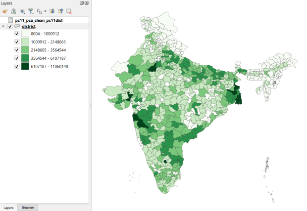
Created and hosted by the Development Data Lab (a collaborative project created by academic researchers from several universities), the Socioeconomic High-resolution Rural-Urban Geographic Platform for India (SHRUG) is an open access repository consisting of datasets for India’s medium to small geographies (districts, subdistricts, constituencies, towns, and villages), linked together with a set of common geographic IDs. Getting geographically detailed census data for India is challenging as you have to purchase it through 3rd party vendors, and comparing data across time is tough given the complex sets of administrative subdivisions and constant revisions to geographic identifiers. SHRUG makes it easy and open source, providing boundaries from the 2011 census and a unique ID that links geographies together and across time, back to 1991. In addition to the census, there are also environmental and election datasets.
Polygon boundaries can be downloaded as shapefiles or geopackages, and tabular data is available in CSV and DTA (STATA) formats. Researchers can also contribute data created from their own research to the repository.
SHRUG India Districts Total Population Data from 2011 Census in QGIS
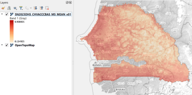
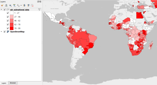
USAID published the detailed Demographic and Health Surveys (DHS) as far back as the mid 1980s for many of the world’s low and middle income countries. The surveys captured information about fertility, family planning, maternal and child health, gender, HIV/AIDS, literacy, malaria, nutrition, and sanitation. A selection of different countries were surveyed each year, and for most countries data was captured at two or three different points in time over a 40 year period. While researchers had to submit proposals and request access to the microdata (individual person and household level responses), the agency generated population-level estimates for countries and country subdivisions that were readily downloadable. They also generated rasters that interpolated certain variables across the surface of a country (the header image for this post is a raster of Senegal in 2023, illustrating the percentage of children aged 12-36 months who are vaccinated for eight fundamental diseases, including measles and polio). The rasters, boundary files, and a selection of survey indicators pre-joined to country and subdivision boundaries were published in their Spatial Data Repository. You could access the full range of population indicators as tables from a point and click website, or alternatively via API.
I’m writing in the past tense, as USAID has been decimated and de-funded by DOGE. There is currently no way to request access to the microdata. The summary data is still available on the USAID website (via links in the previous paragraph), but who knows for how long. As part of the Data Rescue Project, I captured both the Spatial Data Repository and the Indicators data, and posted them on DataLumos, an archive of archived federal government datasets. You can download these datasets in bulk from DataLumos, from the links under the title for this section. Unfortunately this series is now an archive of data that will be frozen in time, with no updates expected. The loss of these surveys is not only detrimental to researchers and policymakers, but to millions of the world’s most vulnerable people, whose health and well-being were secured and improved thanks to the information this data provided.
USAID Country Subdivisions in QGIS where Recent Data is Available on % Children who are Vaccinated
There’s been a lot of turmoil emanating from Washington DC lately. One development that’s been more under the radar than others has been the modification or removal of US federal government datasets from the internet (for some news, see these articles in the New Yorker, Salon, Forbes, and CEN). In some cases, this is the intentional scrubbing or deletion of datasets that focus on topics the current administration doesn’t particularly like, such as climate and public health. In other cases, the dismemberment of agencies and bureaus makes data unavailable, as there’s no one left to maintain or administer it. While most government data is still available via functioning portals, most of the faculty and researchers I work with can identify at least a few series they rely on that have disappeared.
Librarians, archivists, researchers, professors, and non-profits across the country (and even in other parts of the world), have established rescue projects, where they are actively downloading and saving data in repositories. I’ve been participating in these efforts since January, and will outline some of the initiatives in this post.
The Internet Archive
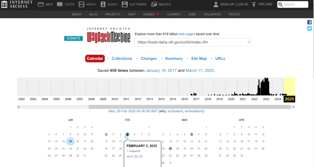
The place of last resort for finding deleted web content is the Internet Archive. This large, non-profit project has been around as long as the web has existed, with the goal of creating a historic archive of the internet. It uses web crawlers or spiders to creep across the web and make copies of websites. With the Wayback Machine, you can enter a URL and find previous copies of web pages, including sites that no longer exist. You’re presented with a calendar page where you can scroll by year and month to select a date when a page was captured, which opens up a copy.
This allows you to see the content, navigate through the old website, and in many cases download files that were stored on those pages. It’s a great resource, but it can’t capture everything; given the variety and complexity of web pages and evolving web technologies, some websites can’t be saved in working order (either partially or entirely). Content that was generated and presented dynamically with JavaScript, or was pulled and presented from a database, is often not preserved, as are restricted pages that required log-ins.
An archived copy of the NIEHS page (the actual website was deleted in mid February 2025)
The Internet Archive also hosts a number of special collections where folks have saved documents, images, sound and video, and software. For example, you can find many research articles that are available in PubMed from the PubMed Central collection, a ton of documents from the USDA’s National Agricultural Library, and about 100 GB of data someone captured from the CDC in January 2025. A large project called the End of Term Archive was launched in 2008 to capture what federal government websites looked like at the end of each presidential term. The pages are saved in a special collection in the IA.
Data Rescue Project
Dozens of new data archiving projects were launched at the end of 2024 and beginning of 2025 with the intention of saving federal datasets. The Data Rescue Project is one of the larger efforts, which has been driven by data librarians and archivists with non-profit partners. Professional groups including IASSIST, ICPSR, RDAP, the Data Curation Network, and the Safeguarding Research & Culture project have been active organizers and participators. While this will be an oversimplification, I’ll summarize the project as having two goals
The first goal is to keep track of what the other archiving projects are, and what they have saved. To this end, they created the Data Rescue Tracker, which has two modules. The Downloads List is an archive of datasets that have been saved, with details about where the data came from and locations of archived copies. The Maintainers List is a catalog of all the different preservation projects, with links to their home pages. There is also a narrative page with a comprehensive list of links to the various rescue efforts, data repositories, alternate sources for government data, and tools and resources you can use to save and archive data.
The Data Rescue Tracker Downloads List
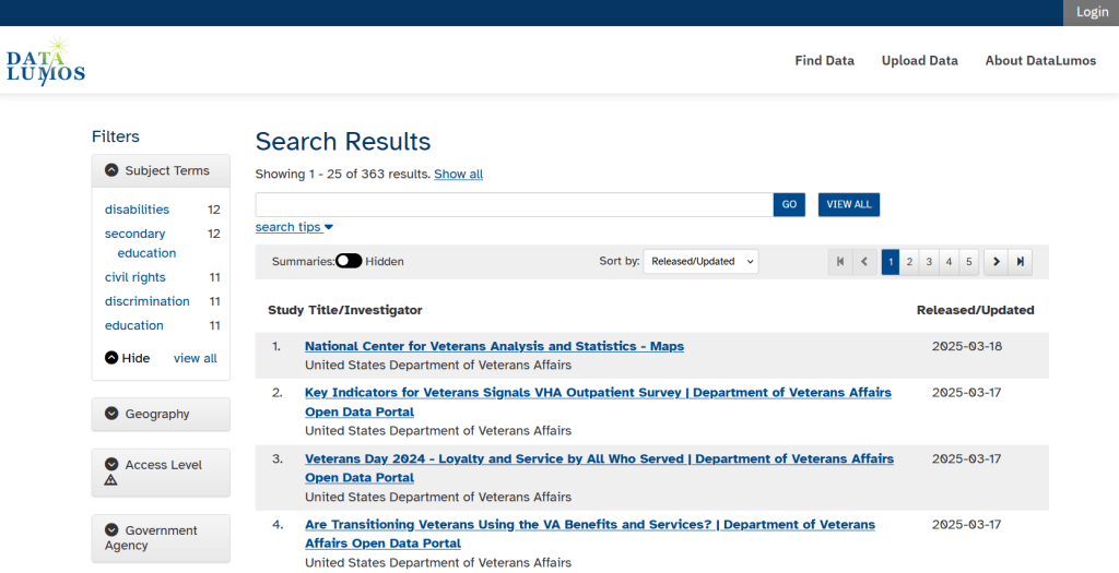
The second goal is to contribute to the effort of saving and archiving data. The team maintains an online spreadsheet with tabs for agencies that contain lists of datasets and URLs that are currently prioritized for saving. Volunteers sign up for a dataset, and then go out and get it. Some folks are manually downloading and saving files (pointing and clicking), while others write short screen scraping scripts to automate the process. The Data Rescue Project has partnered with ICPSR, a preeminent social science research center and repository in the US, at the University of Michigan. They created a repository called DataLumos, which was launched specifically for hosting extracts of US federal government data. Once data is captured, volunteers organize it and generate metadata records prior to submitting it to DataLumos (provided that the datasets are not too big).
DataLumos archive for federal government datasets, maintained by ICPSR
Most of the datasets that DRP is focused on are related to the social sciences and public policy. The Data Rescue Project coordinates with the Environmental and Government Data Initiative and the Public Environmental Data Partners (which I believe are driven by non-profit and academic partners), who are saving data related to the environment and health. They have their own workflows and internal tracking spreadsheets, and are archiving datasets in various places depending on how large they are. Data may be submitted to the Internet Archive, the Harvard Dataverse, GitHub, SciOp, and Zenodo (you can find out where in the Data Rescue Tracker Download’s List).
Mega Projects
There are different approaches for tackling these data preservation efforts. For the Data Rescue Project and related efforts, it’s like attacking the problem with millions of ants. Individual people are coordinating with one another in thousands of manual and semi-automated download efforts. A different approach would be to attack the problem with a small herd of elephants, who can employ larger resources and an automated approach.
For example, the Harvard Law School Library Innovation Lab launched the Archive of data.gov, a large project to crawl and download everything that’s in data.gov, the US federal government’s centralized data repository. It mirrors all the data files stored there and is updated regularly. The benefit of this approach is that it captures a comprehensive amount of data in one go, and can be readily updated. The primary limitation is that there are many cases where a dataset is not actually stored in data.gov, but is referenced in a catalog record with a link that goes out to a specific agency’s website. These datasets are not captured with this approach.
If trying to find back-ups is a bit bewildering, there’s a tool that can help. Boston University’s School of Public Health and Center for Health Data Science have created a find lost* data search engine, which crawls across the Harvard Project, DataLumos, the Data Rescue Project, and others.
Beyond the immediate data preservation projects that have sprung up recently, there are a number of large, on-going projects that serve as repositories for current and historical datasets. Some, like IPUMS at the University of Minnesota and the Election Lab at MIT focus on specific datasets (census data for the former, election results data for the latter). There are also more heterogeneous repositories like ICPSR (including OpenICPSR which doesn’t require a subscription), and university-based repositories like the Harvard Dataverse (which includes some special collections of federal data extracts, like CAFE). There are also private-sector partners that have an equal stake in preserving and providing access to government data, including PolicyMap and the Social Explorer.
Wrap-up
I’ve been practicing my Python screen scraping skills these past few months, and will share some tips in a subsequent post. I’ve been busy contributing data to these projects and coordinating a response on my campus. We’ve created a short list of data archives and alternative sources, which captures many of the sources I’ve mentioned here plus a few others. My library colleagues in the health and medical sciences have created a list of alternatives to government medical databases including PubMed and ClinicalTrials.gov
Having access to a public and robust federal statistical system is a non-partisan issue that we should all be concerned about. Our Constitution justifies (in several sections) that we should have such a system, and we have a large body of federal laws that require it. Like many other public goods, the federal statistical system contributes to providing a solid foundation on which our society and economy rest, and helps drive innovation in business, policy, science, and medicine. It’s up to us to protect and preserve it.
I recently had a question about finding historic climate data in the United States at the county-level. In this post I’ll show you how to access it, and how to parse fixed-width text files in Excel. Weather data is captured and reported by point-based weather stations, and then is often interpolated and modeled over gridded surfaces (rasters). The National Centers for Environmental Information at NOAA have used their models to create zonal statistics for counties, which they publish via the Climate at a Glance County Mapping program (I described what zonal statistics are in an earlier post).
The basic application lets you map the continental US or an individual state (includes AK but not HI). You choose a parameter (Avg / Min / Max temperature, precipitation, cooling / heating days, drought indexes), year (1895 to present), month, and time scale (1 month to 5 years). This creates a map that you can modify to depict that value, or to display ranks or anomalies. You can download the map as an image, or the underlying data as CSV or JSON.
A separate app allows you to create a time series profile for a particular county, with a table, chart, and data that you can download.
These apps are great for the basics, but bulk downloading the underlying data for all counties and years is a bit trickier. You crash land in a file directory and have to choose from an array of zipped files. Fortunately there is good documentation. In that folder, these are the county-level files for precipitation, min temp, max temp, and avg temp:
climdiv-pcpncy-vx.y.z-YYYYMMDD
climdiv-tmaxcy-vx.y.z-YYYYMMDD
climdiv-tmincy-vx.y.z-YYYYMMDD
climdiv-tmpccy-vx.y.z-YYYYMMDD
Where v is for “version”, the xyz is a version number, and the final portion is the date. The archive is updated monthly. The other files in the directory are for climate divisions, states and regions, and data that pertains to the drought indexes. There are also files that have climate normals for each of these areas. If you’re interested in these, you can go up to the parent-level directory and view the relevant documentation.
The county files are fixed-width text files, which means you have to parse them to separate the values. If you treat them as delimited files (using spaces), then all of the fields at the beginning of the file will be lumped together, which is not useful. Spreadsheets and stats packages have tools for importing delimited text, or you could script something in Python or R. Modern versions of Excel will allow you to parse fixed-width data by supplying a list of endpoints for each column; older versions of Excel and other spreadsheets have you “eyeball” the columns and manually insert breaks in an import screen.
If you’re using a modern version of Excel: open a blank workbook and on the Data ribbon click the From Text/CSV button. Browse and select the county text file you’ve downloaded. In the import screen change the Delimiter drop down to Fixed Width.
In the box underneath, begin with zero and type the end points for each position (with the exception of the final endpoint, 95) as a comma separated list. You’ll find these in the README file, but I’ve also tacked on the most salient bits to the end of this post. For your convenience:
0,5,7,11,18,25,32,39,46,53,60,67,74,81,88
If you click on the preview grid, it will parse the columns.
In this example, I’m not parsing the state and county code separately, but am keeping them together to create a single unique identifier. Once everything is parsed, hit the Transform Data button. For column 1, hit the small 123 button, and change the option to Text, and choose Replace data.
This will preserve the leading zero in the state/county code. It’s important to do this, so the codes in this table with match the codes in other county data table or spatial data files that you may wish to join this table to. Do the same for the element code in column 2. The remaining Year and Month columns can be left alone, as they’re already appropriately saved as integers and decimals respectively.
Hit the Close and Load button in the upper left hand corner, and Excel will parse and load the data. It formats the columns and applies a filter option. To get rid of the styling and filter dropdowns, I’d copy the entire table, and do a Paste-Special-Values in a new worksheet. Then replace the generic column labels with these:
Save the file, and now you have something to work with. Each record represents the monthly temperature or precipitation for a particular county for a particular year. To create a unique record ID, you can concatenate the state/county code, element code, and year values. For GIS applications, you would need to pivot the data to a wide form, so that the year becomes a column to give you month-year as a column, and each row represents each county with no repeats. With over 120 years of monthly data, that would give you over 1500 columns – so filter out what you don’t need. The state / county code can be used to join the table to the Census Bureau’s Cartographic Boundary Files, using the CBF’s GEOID field.
When would you use this data? If you’re creating data profiles or are running a statistical analysis and are using counties as your geographic unit, and temperature or precipitation is one variable among many that you need. Or, you’re making a series of county-level maps, and this is one of your variables. This dataset is clearly pretty convenient for doing time series analyses, as compiling data for a times series is usually time consuming. The counties in this dataset represent present day boundaries, so normalizing geography over time isn’t necessary.
When not to use it? Counties vary in size and can encompass a great deal of internal variety in terms of elevation, land use and land cover, and proximity to / presence of water bodies, all of which impact the climate. So the weather in one part of a county could be quite different from another part. To capture these internal differences, it would be better to use gridded data, such as the 4×4 km rasters that PRISM produces for daily, monthly, annual, and normal summaries.
Gridded climate data and zonal stats derived from grids are estimates based on models; if you wanted or needed the actual measurements as they were recorded, you would need to go back and get point-based weather station data, from the Local Climatological Database for instance. There are a limited number of stations, and not one for every county. The closest station to a given place could be used to represent or approximate the weather for that place.
Codebook for county data files (extracted from README):
Element Record
Name Position Element Description
STATE-CODE 1-2 as indicated in State Code Table as described in FILE 1. Range of values is 01-48.
DIVISION-NUMBER 3-5 COUNTY FIPS - Range of values 001-999.
ELEMENT CODE 6-7
01 = Precipitation
02 = Average Temperature
25 = Heating Degree Days
26 = Cooling Degree Days
27 = Maximum Temperature
28 = Minimum Temperature
YEAR 8-11 This is the year of record. Range is 1895 to current year processed.
Monthly Divisional Temperature format (f7.2) Range of values -50.00 to 140.00 degrees Fahrenheit. Decimals retain a position in the 7-character field.  Missing values in the latest year are indicated by -99.99.

Monthly Divisional Precipitation format (f7.2) Range of values 00.00 to 99.99.  Decimal point retains a position in the 7-character field. Missing values in the latest year are indicated by -9.99.

JAN-VALUE 12-18

FEB-VALUE 19-25

MAR-VALUE 26-32

APR-VALUE 33-39

MAY-VALUE 40-46

JUNE-VALUE 47-53

JULY-VALUE 54-60

AUG-VALUE 61-67

SEPT-VALUE 68-74

OCT-VALUE 75-81

NOV-VALUE 82-88

DEC-VALUE 89-95
In an earlier post, I described how to summarize and extract raster temperature data using GIS. In this post I’ll demonstrate some alternate methods using spatial Python. I’ll describe some scripts I wrote for batch clipping rasters, overlaying them with point locations, and extracting raster values (mean temperature) at those locations based on attributes of the points (a matching date). I used a number of third party modules, including geopandas (storing vector data in a tabular form), rasterio (working with raster grids), shapely (building vector geometry), matplotlib (plotting), and datetime (working with date data types). Using Anaconda Python, I searched for and added each of these modules via its package handler. I opted for this modular approach instead of using something like ArcPy, because I don’t want the scripts to be wedded to a specific software package. My scripts and sample data are available in GitHub; I’ll add snippets of code to this post for illustration purposes. The repo includes the full batch scripts that I’ll describe here, plus some earlier, shorter, sample scripts that are not batch-based and are useful for basic experimentation.
Overview
I was working with a medical professor who had point observations of where patients lived, which included a date attribute of when they had visited a clinic to receive certain treatment. For the study we needed to know what the mean temperature was on that day, as well as the temperature of each day of the preceding week. We opted to use daily temperature data from the PRISM Climate Group at Oregon State, where you can download a raster of the continental US for a given day that has the mean temperature (degrees Celsius) in one band, at 4km resolution. There are separate files for min and max temperature, as well as precipitation. You can download a year’s worth of data in one go, with one file per date.
Our challenge was that we had thousands of observations than spanned five years, so doing this one by one in GIS wasn’t going to be feasible. A custom script in Python seemed to be the best solution. Each raster temperature file has the date embedded in the file name. If we iterate through the point observations, we could grab its observation date, and using string manipulation grab the raster with the matching date in its file name, and then do the overlay and extraction. We would need to use Python’s datetime module to convert each date to a common format, and use a function to iterate over dates from the previous week.
Prior to doing that, we needed to clip or mask the rasters to the study area, which consists of the three southern New England states (Connecticut, Rhode Island, and Massachusetts). The PRISM rasters cover the lower 48 states, and clipping them to our small study area would speed processing time. I downloaded the latest Census TIGER file for states, and extracted the three SNE states. ArcGIS Pro does have batch clipping tools, but I found they were terribly slow. I opted to write one Python script to do the clipping, and a second to do the overlay and extraction.
Batch Clipping Rasters
I downloaded a sample of PRISM’s raster data that included two full months of daily mean temperature files, from Jan and Feb 2020. At the top of the clipper script, we import all the modules we need, and set our input and output paths. It’s best to use the path.join method from the os module to construct cross platform paths, so we don’t encounter the forward / backward \ slash issues between Mac and Linux versus Windows. Using geopandas I read in the shapefile of the southern New England (SNE) states into a geodataframe.
import os
import matplotlib.pyplot as plt
import geopandas as gpd
import rasterio
from rasterio.mask import mask
from shapely.geometry import Polygon
from rasterio.plot import show

#Inputs
clip_file=os.path.join('input_raster','mask','states_southern_ne.shp')
# new file created by script:
box_file=os.path.join('input_raster','mask','states_southern_ne_bbox.shp')
raster_path=os.path.join('input_raster','to_clip')
out_folder=os.path.join('input_raster','clipped')

clip_area = gpd.read_file(clip_file)
Next, I create a new geodataframe that represents the bounding box for the SNE states. The total_bounds method provides a list of the four coordinates (west, south, east, north) that form a minimum bounding rectangle for the states. Using shapely, I build polygon geometry from those coordinates by assigning them to pairs, beginning with the northwest corner. This data is from the Census Bureau, so the coordinates are in NAD83. Why bother with the bounding box when we can simply mask the raster using the shapefile itself? Since the bounding box is a simple rectangle, the process will go much faster than if we used the shapefile that contains thousands of coordinate pairs.
Once we have the bounding box as geometry, we proceed to iterate through the rasters in the folder in a loop, reading in each raster (PRISM files are in the .bil format) using rasterio, and its mask function to clip the raster to the bounding box. The PRISM rasters and the TIGER states both use NAD83, so we didn’t need to do any coordinate reference system (CRS) transformation prior to doing the mask (if they were in different systems, we’d have to convert one to match the other). In creating a new raster, we need to specify metadata for it. We copy the metadata from the original input file to the output file, and update specific attributes for the output file (such as the pixel height and width, and the output CRS). Here’s a mask example and update from the rasterio docs. Once that’s done, we write the new file out as a simple GeoTIFF, using the name of the input raster with the prefix “clipped_”.
idx=0
for rf in os.listdir(raster_path):
    if rf.endswith('.bil'):
        raster_file=os.path.join(raster_path,rf)
        in_raster=rasterio.open(raster_file)
        # Do the clip operation
        out_raster, out_transform = mask(in_raster, areabbox.geometry, filled=False, crop=True)
        # Copy the metadata from the source and update the new clipped layer
        out_meta=in_raster.meta.copy()
        out_meta.update({
            "driver":"GTiff",
            "height":out_raster.shape[1], # height starts with shape[1]
            "width":out_raster.shape[2], # width starts with shape[2]
            "transform":out_transform})
        # Write output to file
        out_file=rf.split('.')[0]+'.tif'
        out_path=os.path.join(out_folder,'clipped_'+out_file)
        with rasterio.open(out_path,'w',**out_meta) as dest:
            dest.write(out_raster)
        idx=idx+1
        if idx % 20 ==0:
            print('Processed',idx,'rasters so far...')
    else:
        pass

print('Finished clipping',idx,'raster files to bounding box: \n',corners)
Just to see some evidence that things worked, outside of the loop I take the last raster that was processed, and plot that to the screen. I also export the bounding box out as a shapefile, to verify what it looks like in GIS.
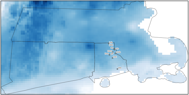
PRISM US mean daily temperature raster, clipped / masked to bounding box of southern New England
Extract Raster Values by Date at Point Locations
In the second script, we begin with reading in the modules and setting paths. I added an option at the top with a variable called temp_many_days; if it’s set to True, it will take the date range below it and retrieve temperatures for x to y days before the observation date in the point file. If it’s False, it will retrieve just the matching date. I also specify the names of columns in the input point observation shapefile that contain a unique ID number, name, and date. In this case the input data consists of ten sample points and dates that I’ve concocted, labeled alfa through juliett, all located in Rhode Island and stored as a shapefile.
import os,csv,rasterio
import matplotlib.pyplot as plt
import geopandas as gpd
from rasterio.plot import show
from datetime import datetime as dt
from datetime import timedelta
from datetime import date

#Calculate temps over multiple previous days from observation
temp_many_days=True # True or False
date_range=(1,7) # Range of past dates

#Inputs
point_file=os.path.join('input_points','test_obsv.shp')
raster_dir=os.path.join('input_raster','clipped')
outfolder='output'
if not os.path.exists(outfolder):
    os.makedirs(outfolder)

# Column names in point file that contain: unique ID, name, and date
obnum='OBS_NUM'
obname='OBS_NAME'
obdate='OBS_DATE'
Next, we loop through the folder of clipped raster files, and for each raster (ending in .tif) we grab the file name and extract the date from it. We take that date and store it in Python’s standard date format. The date becomes a key, and the path to the raster its value, which get added to a dictionary called rf_dict. For example, if we split the file name clipped_PRISM_tmean_stable_4kmD2_20200131_bil.tif using the underscores, counting from zero we get the date in the 5th position, 20200131. Converting that to the standard datetime format gives us datetime.date(2020, 1, 31).
rf_dict={} # Create dictionary of dates and raster file names

for rf in os.listdir(raster_dir):
    if rf.endswith('.tif'):
        rfdatestr=rf.split('_')[5]
        rfdate=dt.strptime(rfdatestr,'%Y%m%d').date() #format of dates is 20200131
        rfpath=os.path.join(raster_dir,rf)
        rf_dict[rfdate]=rfpath
    else:
        pass
Then we read the observation point shapefile into a geodataframe, create an empty result_list that will hold each of our extracted values, and construct the header row for the list. If we are grabbing temperatures for multiple days, we generate extra header values to add to that row.
#open point shapefile
point_data = gpd.read_file(point_file)

result_list=[]
result_list.append(['OBS_NUM','OBS_NAME','OBS_DATE','RASTER_ROW','RASTER_COL','RASTER_FILE','TEMP'])

if temp_many_days==True:
    for d in range(date_range[0],date_range[1]):
        tcol='TMINUS_'+str(d)
        result_list[0].append(tcol)
    result_list[0].append('TEMP_RANGE')
    result_list[0].append('AVG_TEMP')
    temp_ftype='multiday_'
else:
    temp_ftype='singleday_'
Now the preliminaries are out of the way, and processing can begin. This post and tutorial helped me to grasp the basics of the process. We loop through the point data in the geodataframe (we indicate point.data.index because these are dataframe records we’re looping through). We get the observation date for the point and store that it the standard Python date format. Then we take that date, compare it to the dictionary, and get the path to the corresponding temperature raster for that date. We open that raster with rasterio, isolate the x and y coordinate from the geometry of the point observation, and retrieve the corresponding row and column for that coordinate pair from the raster. Then we read the value that’s associated with the grid cell at those coordinates. We take some info from the observation points (the number, name, and date) and the raster data we’ve retrieved (the row, column, file name, and temperature from the raster) and add it to a list called record.
#Pull out and format the date, and use date to look up file
for idx in point_data.index:
    obs_date=dt.strptime(point_data[obdate][idx],'%m/%d/%Y').date() #format of dates is 1/31/2020
    obs_raster=rf_dict.get(obs_date)
    if obs_raster == None:
        print('No raster available for observation and date',
              point_data[obnum][idx],point_data[obdate][idx])
    #Open raster for matching date, overlay point coordinates, get cell location and value
    else:
        raster=rasterio.open(obs_raster)
        xcoord=point_data['geometry'][idx].x
        ycoord=point_data['geometry'][idx].y
        row, col = raster.index(xcoord,ycoord)
        tempval=raster.read(1)[row,col]
        rfile=os.path.split(obs_raster)[1]
        record=[point_data[obnum][idx],point_data[obname][idx],
                point_data[obdate][idx],row,col,rfile,tempval]
If we had specified that we wanted a single day (option near the top of the script), we’d skip down to the bottom of the next block, append the record to the main result_list, and continue iterating through the observation points. Else, if we wanted multiple dates, we enter into a sub-loop to get data from a range of previous dates. The datetime timedelta function allows us to do date subtraction; if we subtract 1 from the current date, we get the previous day. We loop through and get rasters and the temperature values for the points from each previous date in the range and append them to an old_temps list; we also build in a safety mechanism in case we don’t have a raster file for a particular date. Once we have all the dates, we do some calculations to get the average temperature and range for that entire period. We do this on a copy of old_temps called all_temps, where we delete null values and add the current observation date. Then we add the average and range to old_temps, and old_temps to our record list for this point observation, and when finished we append the observation record to our main result_list, and proceed to the next observation.
       # Optional block, if pulling past dates
        if temp_many_days==True:
            old_temps=[]
            for d in range(date_range[0],date_range[1]):
                past_date=obs_date-timedelta(days=d) # iterate through days, subtracting
                past_raster=rf_dict.get(past_date)
                if past_raster == None: # if no raster exists for that date
                    old_temps.append(None)
                else:
                    old_raster=rasterio.open(past_raster)
                    # Assumes rasters from previous dates are identical in structure to 1st date
                    past_temp=old_raster.read(1)[row,col]
                    old_temps.append(past_temp)
            # Calculate avg and range, must exclude None values and include obs day
            all_temps=[t for t in old_temps if t is not None]
            all_temps.append(tempval)
            temp_range=max(all_temps)-min(all_temps)
            avg_temp=sum(all_temps)/len(all_temps)
            old_temps.extend([temp_range,avg_temp])
            record.extend(old_temps)
            result_list.append(record)
        else: # if NOT doing many days, just append data for observation day
            result_list.append(record)
    if (idx+1)%200==0:
        print('Processed',idx+1,'records so far...')
Once the loop is complete, we plot the last point and raster to the screen just to check that it looks good, and we write the results out to a CSV.
#Plot the points over the final raster that was processed
fig, ax = plt.subplots(figsize=(12,12))
point_data.plot(ax=ax, color='black')
show(raster, ax=ax)

today=str(date.today()).replace('-','_')
outfile='temp_observations_'+temp_ftype+today+'.csv'
outpath=os.path.join(outfolder,outfile)

with open(outpath, 'w', newline='') as writefile:
    writer=csv.writer(writefile, quoting=csv.QUOTE_MINIMAL, delimiter=',')
    writer.writerows(result_list)

print('Done. {} observations in input file, {} records in results'.format(len(point_data),len(result_list)-1))
CSV output from script, temperatures extracted from raster by date for observation points
Results and Wrap-up
Visit the GitHub repo for full copies of the scripts, plus input and output data. In creating test observation points, I purposefully added some locations that had identical coordinates, identical dates, dates that varied by a single day, and dates for which there would be no corresponding raster file in the sample data if we went one week back in time. I looked up single dates for all point observations manually, and a sample of multi-day selections as well, and they matched the output of the script. The scripts ran quickly, and the overall process seemed intuitive to me; resetting the metadata for rasters after masking is the one part that wouldn’t have occurred to me, and took a little bit of time to figure out. This solution worked well for this case, and I would definitely apply geospatial Python to a problem like this again. An alternative would have been to use a spatial database like PostGIS; this would be an attractive option if we were working with a bigger dataset and processing time became an issue. The benefit of using this Python approach is that it’s easier to share the script and replicate the process without having to set up a database.
Observation points plotted on temperature raster with single-day output temperatures in QGIS


You must be logged in to post a comment.