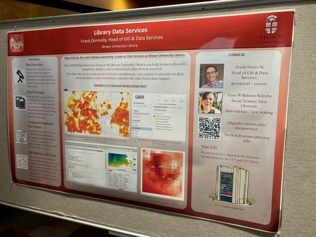
I presented a poster last April on the library’s GIS and Data Services at the CHAIRS-C conference at the Brown School of Public Health. CHAIRS-C is an acronym for Center on Heat, Health, and Aging Innovation and Research Solutions for Communities; it’s a small cluster whose members are interested in heat-related research, and the impact of extreme heat on vulnerable communities. I provided some examples in the poster of heat-related datasets and research that I’ve supported over the last few years. I thought I’d share a summary of these datasets in this post that include air conditioning, heat indices, and sources that provide climate-related rasters with variable that include temperature and precipitation. Most of these examples are US-based, the last one is global.
Local Air Conditioning Estimates (LACE)
The Local Air Conditioning Estimates (LACE) is a new, experimental dataset produced by the US Census Bureau. It includes estimates of occupied housing units that have air conditioning at the national, state, county, and census tract levels. The estimates are published with margins of error at a 90% confidence level, and represent the year 2023. Each record includes the census summary level / fips GEOID, so you can readily match them to vector boundary files for GIS mapping.
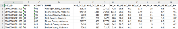
Questions about air conditioning are regularly collected as part of the American Housing Survey (AHS), but the sample size isn’t large enough to publish reliable estimates below the state and metropolitan area levels. To create LACE, the Census Bureau employed machine learning in a process called cross survey modeling, and triangulated the AHS with some other datasets to create small-area estimates. Summary documentation is included on the LACE website if you want to learn more, and there are links to working papers that go into greater detail.
The concept is similar to what the CDC has done in taking data from the Behavioral Risk Factor Surveillance System and using models to create small area estimates for the PLACES project. LACE fills a vital data gap for studying heat; most small-area sources for AC are a patchwork series of parcel data published by individual municipalities. I attended a couple of presentations given by the Census Bureau at FedGeoDay back in April, and they suggested that they will increasingly move in a modeling direction that draws on administrative data and smaller surveys, given declining response rates to large sample surveys like the ACS. Of course, this was before the current administration made the bonkers decision to ban the use of injecting noise into statistical datasets (a basic practice for protecting the privacy of survey participants), so who knows what will happen next.
Urban Heat Severity Index
Research has shown that temperature varies considerably over small areas, especially in cities. So if you are looking at the temperature reported for an entire city, or even at gridded data where the cells are large, both will mask a good deal of geographic variability. The absence of trees and green space, an abundance of impervious surfaces, and concentrated emissions from vehicles and air conditioners can dramatically increase the temperature of urban areas, creating “heat islands”.
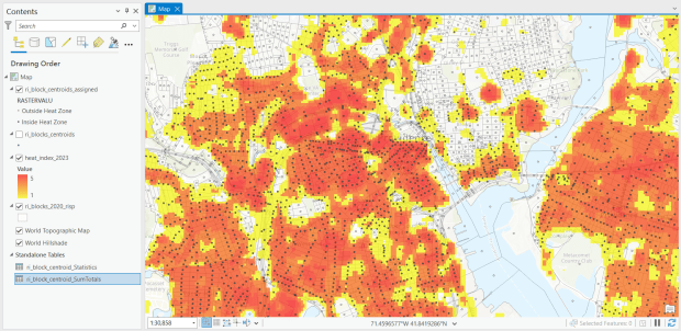
The Trust for Public Land has been publishing the annual Heat Severity Urban Areas index for the past few years; originally the dataset covered just incorporated places but was expanded to include the entire US. Index values from 1 to 5 indicate the severity of a heat island, measured relative to the average summer temperature for the city or place where each grid cell is located. The data is published as a grid at 30m resolution (matching the resolution of LANDSAT imagery used in their workflow) and is distributed via an ESRI hub site. You can search for it within the Living Atlas in the data catalog in ArcGIS Pro to add it to a project, or grab the url from the hub site to render it as a web mapping service in QGIS or another package. In order to use it in an analysis, you’ll need to export and save the raster locally. To save time and space, you can clip the layer to a polygon or extent of the screen, and then save the result.
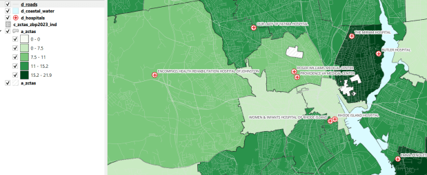
For one project, I had to estimate the number of people in Rhode Island who were living within an urban heat island. I used census block boundaries from the 2020 census, which include total population and housing units as attributes, calculated the centroid of the blocks, and overlaid them on the grid and assigned the intersecting grid value to each point. Then I summed the population by the index values; a value of null indicated that the center of the block fell outside a heat cell.
US Gridded Climate Data: PRISM
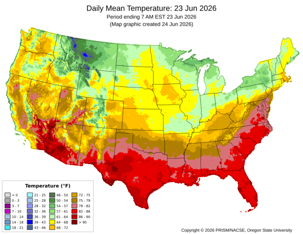
For rasters of climate data on temperature and precipitation, I’ve often turned to PRISM at Oregon State University. They work with the USDA to generate the maps for plant hardiness zones, and have developed a model to generate gridded climate data. The public data is available at 4km resolution, but researchers with project proposals can submit requests to access 800m resolution data. They publish mean daily, monthly, and annual values, as well as normals. Each raster is stored in one file, where the file represents one observation for one time period. I have written about PRISM in the past as I used it for several projects, writing Python scripts to pull a raster file for specific dates that match attributes in a point file, in order to determine what the temperature was for that date for each point, based on the grid cell the point fell within. PRISM has updated some of their products since I’ve run that analysis, specifically replacing the older raster file formats with tifs.
US County Climate Data: NCEI Climate at a Glance
For certain statistical analyses, it can be helpful to have climate data summarized for an entire geographic area so that it aligns with other variables that are published for that area. NOAA’s National Center for Environmental Information (NCEI) employs a model that takes their gridded data product (derived from the U.S. Climate Divisional Database) to produce monthly state and county-level estimates for the US, from 1895 to the present. I wrote a post that summarizes how to download, interpret, and parse these files so that you can start using them; if you’re seeking the entire dataset you’ll skip the web-based interface for creating summary charts and maps and go right to the FTP site to download data in bulk.
Since our current government doesn’t like the weather, this is one of the datasets that I’ve archived in DataLumos as part of the Data Rescue Project, in case it vanishes one day.
Global Climate Data: ERA5
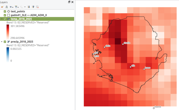
How about the rest of the world? ERA5 is produced by the European Centre for Medium-Range Weather Forecasts, which publishes gridded climate data at 1/4 degree resolution, modeled from 1940 to present. You can choose hourly, daily, or monthly estimates (accessed via separate web pages), and at the download stage you can provide bounding box coordinates to clip the data (so you don’t have to download the entire planet). The data is packaged in a GRIB file, where variables are stored in separate bands. So if you download monthly data for one variable, each month is stored sequentially; if you download two or more variables, they are sorted by variable and then by time period. Similar to my US project with PRISM, I wrote a Python script that extracts ERA5’s monthly gridded data for specific point locations, but in this case I pulled all dates for each point (with an option to highlight a specific month for a matching date). I wrote a detailed post that describes the dataset and process.


You must be logged in to post a comment.