I recently revisited a project from a few years ago, where I needed to extract temperature and precipitation data from a raster at specific points on specific dates. I used python to iterate through the points and pull up a raster for matching attribute dates, and Rasterio to overlay the raster and extract the climate data at those points. I was working with PRISM’s daily climate rasters for the US, where each nation-wide file represented a specific variable and date, and the date was embedded in the filename. I wrote a separate program to clip the raster to my area of interest prior to processing.
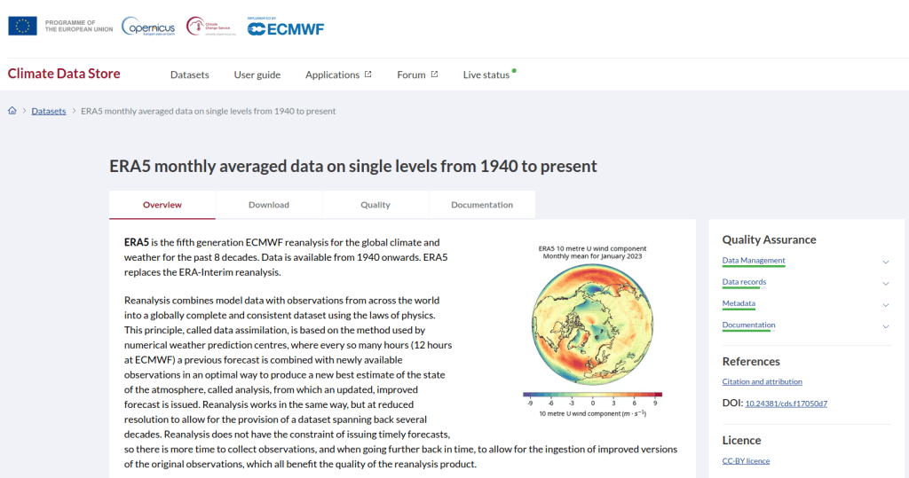
This time around, I am working with global climate data from ERA5, produced by the European Centre for Medium-Range Weather Forecasts (ECMWF). I needed to extract all monthly mean temperature and total precipitation values for a series of points within a range of years. Each point also had a specific date associated with it, and I had to store the month / year in which that date fell in a dedicated column. The ERA5 data is packaged in a single GRIB file, where each observation is stored in sequential bands. So if you download two full years worth of data, band 1 would contain January of year 1, while band 24 holds December of year 2. This process was going to be a bit simpler than my previous project, with a few new things to learn.
I’ll walk through the code; you can find the script with sample data in my GitHub repo.
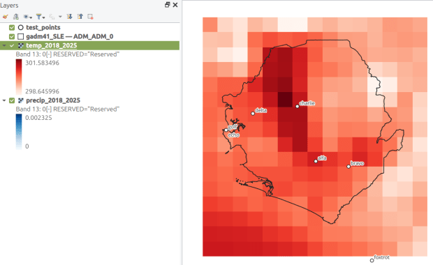
There are multiple versions of ERA5; I was using the monthly averages but you can also get daily and hourly versions. The cell resolution was 1/4 of a degree, and the CRS is WGS 84. When downloading the data, you have the option to grab multiple variables at once, so you could combine temperature and precipitation in one raster and they’d be stored in sequence (all temperature values first, all precipitation values second). To make the process a little more predictable, I opted for two downloads and stored the variables in separate files. The download interface gives you the option to clip the global image to bounding coordinates, which is quite convenient and saves you some extra work. This project is in Sierra Leone in Africa, and I eyeballed a web map to get appropriate bounds.
I follow my standard approach, creating separate input and output folders for storing the data, and placing variables that need to be modified prior to execution at the top of the script. The point file can be a geopackage or shapefile in the WGS 84 CRS, and we specify which raster to read and mark whether it’s temperature or precipitation. The point file must have three variables: a unique ID, a label of some kind, and a date. We store the date of the first observation in the raster as a separate variable, and create a boolean variable where we specify the format of the date in the point file; standard_date is True if the date is stored as YYYY-MM-DD or False if it’s DD-MM-YYYY.
import os,csv,sys,rasterio
import numpy as np
import matplotlib.pyplot as plt
import geopandas as gpd
from rasterio.plot import show
from rasterio.crs import CRS
from datetime import datetime as dt
from datetime import date

""" VARIABLES - MUST UPDATE THESE VALUES """

# Point file, raster file, name of the variable in the raster
point_file='test_points.gpkg'
raster_file='temp_2018_2025_sl.grib'
varname='temp' # 'temp' or 'precip'

# Column names in point file that contain: unique ID, name, and date
obnum='OBS_NUM'
obname='OBS_NAME'
obdate='OBS_DATE'

 #The first period in the ERA data write as YYYY-MM
startdate='2018-01' # YYYY-MM

# True means dates in point file are YYYY-MM-DD, False means DD-MM-YYYY
standard_date=False # True or False
I wrote a function to convert the units of the raster’s temperature (Kelvin to Celsius) and precipitation (meters to millimeters) values. We establish all the paths for reading and writing files, and read the point file into a Geopandas geodataframe (see my earlier post for a basic Geopandas introduction). If the column with the unique identifier is not unique, we bail out of the program. We do likewise if the variable name is incorrect.
""" MAIN PROGRAM """

def convert_units(varname,value):
    # Convert temperature from Kelvin to Celsius
    if varname=='temp':
        newval=value-272.15
    # Convert precipitation from meters to millimeters
    elif varname=='precip':
        newval=value*1000
    else:
        newval=value
    return newval

# Estabish paths, read files
yearmonth=np.datetime64(startdate)
point_path=os.path.join('input',point_file)
raster_path=os.path.join('input',raster_file)
outfolder='output'
if not os.path.exists(outfolder):
    os.makedirs(outfolder)
point_data = gpd.read_file(point_path)

# Conditions for exiting the program
if point_data[obnum].is_unique is True:
    pass
else:
    print('\n FAIL: unique ID column in the input file contains duplicate values, cannot proceed.')
    sys.exit()

if varname in ('temp','precip'):
    pass
else:
    print('\n FAIL: variable name must be set to either "temp" or "precip"')
    sys.exit()
We’re going to use Rasterio to pull the climate value from the raster row and column that each point intersects. Since each band has an identical structure, we only need to find the matching row and column once, and then we can apply it for each band. We create a dictionary to hold our results, open the raster, and iterate through the points, getting the X and Y coordinates from each point and using them to look up the row and column. We add a record to our result dictionary, where the key is the unique ID of the point, and the value is another dictionary with several key / value pairs (observation name, observation date, raster row, and raster column).
# Dictionary holds results, key is unique ID from point file, value is
# another dictionary with column and observation names as keys
result_dict={}

# Identify and save the raster row and column for each point
with rasterio.open(raster_path,'r+') as raster:
    raster.crs = CRS.from_epsg(4326)
    for idx in point_data.index:
        xcoord=point_data['geometry'][idx].x
        ycoord=point_data['geometry'][idx].y
        row, col = raster.index(xcoord,ycoord)
        result_dict[point_data[obnum][idx]]={
            obname:point_data[obname][idx],
            obdate:point_data[obdate][idx],
            'RASTER_ROW':row,
            'RASTER_COL':col}
Now, we can open the raster and iterate through each band. For each band, we loop through the keys (the points) in the results dictionary and get the raster row and column number. If the row or column falls outside the raster’s bounds (i.e. the point is not in our study area), we save the year/month climate value as None. Otherwise, we obtain the climate value for that year/month (remember we hardcoded our start date at the top of the script), convert the units and save it. The year/month becomes the key with the prefix ‘YM-‘, so YM-2019-01 (this data will ultimately be stored in a table, and best practice dictates that column names should be strings and should not begin with integers). Before we move to the next band, we update our year / month value by 1 so we can proceed to the next one; Python’s timedelta function allows us to do math on dates, so if we add 1 month to 2019-12 the result is 2020-01.
# Iterate through raster bands, extract the climate value,
# store in column named for Year-Month, handle points outside the raster
with rasterio.open(raster_path,'r+') as raster:
    raster.crs = CRS.from_epsg(4326)
    for band_index in range(1, raster.count + 1):
        for k,v in result_dict.items():
            rrow=v['RASTER_ROW']
            rcol=v['RASTER_COL']
            if any ([rrow < 0, rrow >= raster.height,
                    rcol < 0, rcol >= raster.width]):
                result_dict[k]['YM-'+str(yearmonth)]=None
            else:
                climval=raster.read(band_index)[rrow,rcol]
                climval_new=round(convert_units(varname,climval.item()),4)
                result_dict[k]['YM-'+str(yearmonth)]=climval_new
        yearmonth=yearmonth+np.timedelta64(1, 'M')
The next block identifies the year/month that matches the date for each point, and saves that value in a dedicated column. We identify whether we are using a standard date or not (specified at the top of the script). If it was not standard (DD-MM-YYYY), we convert it to standard (YYYY-MM-DD). We use the datetime function to get just the year / month from the observation date, so we can look it up in our results dictionary and pull the matching value. If our observation date falls outside the range of our raster data, we record None.
# Iterate through results, find matching climate value for the
# observation date in the point file, handle dates outside the raster
for k,v in result_dict.items():
    if standard_date is False: # handles dd-mm-yyyy dates
        formatdate=dt.strptime(v[obdate].strip(),'%m/%d/%Y').date()
        numdate=np.datetime64(formatdate)
    else:
        numdate=v[obdate] # handles yyyy-mm-dd dates
    obyrmonth='YM-'+np.datetime_as_string(numdate, unit='M').item()
    if obyrmonth in v:
        matchdate=v[obyrmonth]
    else:
        matchdate=None
    result_dict[k]['MATCH_VALUE']=matchdate
Here’s a sample of the first record in the results dictionary:
{0:{'OBS_NAME': 'alfa', 'OBS_DATE': '1/1/2019', 'RASTER_ROW': 9, 'RASTER_COL': 7, 'YM-2018-01': 28.4781, 'YM-2018-02': 29.6963, 'YM-2018-03': 28.9622, ... 'YM-2025-12': 26.6185, 'MATCH_VALUE': 28.7401}, }
The last bit writes our output. We want to use the keys in our dictionary as our header row, but they are repeated for every point and we only need them once. So we pull the first entry out of the dictionary and convert its keys to a list, and then insert the name of the observation variable as the first list element (since it doesn’t appear in our dictionary). Then we proceed to flatten our dictionary out to a list, with one record for each point. We do a quick plot of the points and the first band (just for show), and use the CSV module to write the data out. We name the output file using the variable’s name (provided at the beginning) and today’s date.
# Converts dictionary to list for output
firstkey=next(iter(result_dict))
header=list(result_dict[firstkey].keys())
header.insert(0,obnum)
result_list=[header]
for k,v in result_dict.items():
    record=[k]
    for k2, v2 in v.items():
        record.append(v2)
    result_list.append(record)

# Plot the points over the first raster that was processed to see visual
with rasterio.open(raster_path,'r+') as raster:
    raster.crs = CRS.from_epsg(4326)
    fig, ax = plt.subplots(figsize=(12,12))
    point_data.plot(ax=ax, color='black')
    show((raster,1), ax=ax)

# Output results to CSV file
today=str(date.today())
outfile=varname+'_'+today+'.csv'
outpath=os.path.join(outfolder,outfile)
with open(outpath, 'w', newline='') as writefile:
    writer=csv.writer(writefile, quoting=csv.QUOTE_MINIMAL, delimiter=',')
    writer.writerows(result_list)

count_r=len(result_list)
count_c=len(result_list[0])
print('\n Done, wrote {} rows with {} values for {} data to {}'.format(count_r,count_c,varname,outpath))
Here’s a sample of the CSV output:
OBS_NUM OBS_NAME OBS_DATE RASTER_ROW RASTER_COL YM-2018-01 YM-2018-02 YM-2018-030 alfa 1/1/2019 9 7 28.4781 29.6963 28.96221 bravo 7/15/2021 9 9 27.8433 29.1553 28.3196
This gives us temperature; the next step would be to modify the variables at the top of the script to read in and process the precipitation raster. Geospatial python makes it super easy to automate these tasks and perform them quickly. My use of desktop GIS was limited to examining the GRIB file at the beginning so I could understand how it was structured, and creating a visualization at the end so I could verify my results (see the QGIS screenshot in the header of this post).


You must be logged in to post a comment.