I posted the latest version of my Introduction to GIS with QGIS tutorial manual, updated for QGIS 3.44 Solothurn. The manual and sample data are freely available from my lab’s tutorials page.
This year’s changes are minor, as there weren’t major software updates that would impact the exercises. I updated the sample data as it was growing a bit stale, which necessitated updating screenshots and references in the text. I also updated the source LaTeX code to ensure the PDF meets the new federal WCAG guidelines for digital accessibility. I added a brief troubleshooting section on using QGIS with a Mac to the Introduction, as there have been a creeping number of annoying problems that have thrown my workshops off kilter (MacOS security blocking installation and writing of files to the user’s documents folder, and UI issues with the default color scheme and hiding menus in the background).
It’s hard to believe this is the 16th edition of this manual. When I wrote the first version back in 2011 (it was originally called Introduction to GIS Using Open Source Software), there was relatively little documentation on QGIS. In launching a workshop series and on-going support for it, I felt that I needed to create a basic guidebook. QGIS was far more primitive back then; converting the CRS for a GIS file required a separate command-line program, and you had to calculate natural breaks by hand! QGIS has certainly come a long way since then, and has been widely adopted. I’ve updated my materials as the software has evolved, but overall I’ve stuck to the same plan in terms of content, with modifications to the examples:
Introduction: a general overview of the workbook, goals for the material and workshop, and updates to the manual since the previous version.
An Overview of GIS: a short narrative that describes basic GIS concepts, and open source software.
Exploring the Interface: explanation of the interface, adding vector data and viewing and selecting features, adding raster data, web base maps, and project files.
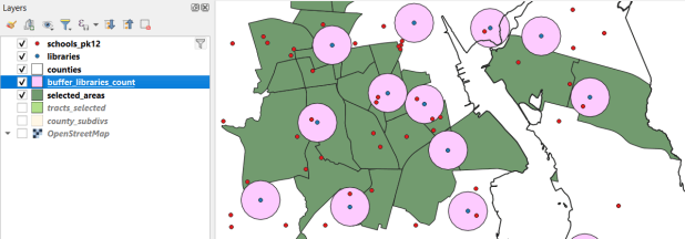
Geographic Analysis: a cohesive case study that illustrates the process for doing an analysis while showcasing fundamental operations including: tables joins, plotting coordinate data, selecting, filtering, and deleting features, and geoprocessing tools like intersection and buffering. My original case study was locating a new comic book store in NYC, subsequently modified to locating a coffee shop, and more recently identifying public libraries in Rhode Island that met criteria for a grant to host an after school program.
Thematic Mapping: exercise for understanding coordinate reference systems and how they function in QGIS, transforming systems, classifying data, and creating a final map layout. The original example was mapping healthcare sector employment by US state, but eventually switched to voter participation in federal elections.
Data and Educational Resources: strategies and suggestions for finding GIS data, and recommendations for learning more through tutorials and workshops.
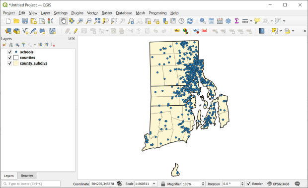
QGIS 3.44 Solothurn interface in Windows 11, used for the 16th edition of the manual in 2026
I’ve always used a follow-the-leader approach in teaching the workshop, where we stay together and the group does the material step by step. Everyone is a little fatigued by the end of the day, so for the thematic mapping piece we pivot to using the workbook; I demo the material and folks work on their own. I primarily wrote the book as a takeaway, so people could refer back to it after the session was over. It was also useful for self-directed learning, and the act of writing and updating it helps me internalize the material.
The last couple of years have been challenging though, and I have been thinking about what I could do differently. There have been a number of articles recently that discuss declining attention spans and students’ diminishing ability to thoughtfully engage with text (for example, in The Economist and The Atlantic). My own experiences bear this out. Increasingly, participants have a hard time following me in the session, and when I have student employees do the tutorial on their own as part of orientation, it takes them much longer and they struggle to finish. I have other workshops where I don’t use the follow-the leader approach, and instead I demo the material and everyone works on their own using the text, and once everyone finishes we move on to the next part. This works no better, as many participants wander away (mentally and physically) from the exercises and struggle to relate the text to what’s on the screen. Now, a good deal of success hinges on having good instructions, but I update them every year, and have used the same system and material in earlier years to good effect.
I have considered creating a more interactive web version of the workbook, or creating videos. The problem with both is that updating them each year would be far more time consuming; in contrast, updating the text and images in the workbook is pretty straightforward. I had one colleague suggest that my “old school” workbook fills an important niche in terms of structure and format, and is useful “as is” for deep learners. A professor I work with, who has had similar experiences in the classroom, expressed that there’s a limit to what an instructor can do; we can only simplify the material so much, and it’s up to students to rise to the occasion.
Reflecting on how I learn, I have gradually moved to videos to learn new material: whether it’s understanding a particular GIS method or tool, mastering a video game, or figuring out how to replace the belt on my clothes drier. Nothing beats a book for getting a comprehensive introduction to a topic, but the videos are helpful for targeted, stand-alone tasks. They can be comprehensive too, if they’re thoughtfully designed as part of a series. I’m definitely going to keep the workbook manual going, but am considering a video version for the future. I’ll wait until the 4.x version of QGIS becomes the new long term release (early next year) before I head in that direction, as the jump from 3.x to 4.x is more likely to come with some interface and functional changes.
The workbook has gotten a lot of miles these past 16 years, and I know others have used it for their own workshops and courses. Feel free to reach out if you have any suggestions.
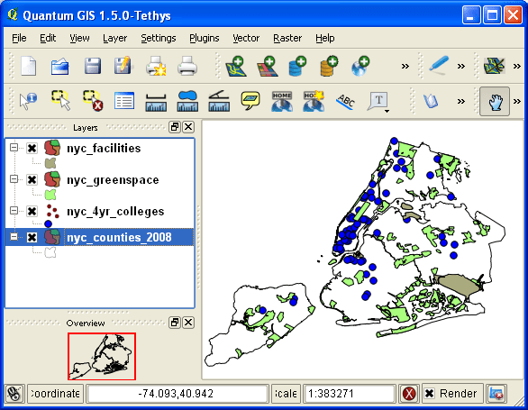
QGIS 1.5 Tethys interface in Windows XP, used for the 1st edition of the manual in 2011
I’m fortunate to be on sabbatical for much of this summer, and am working on a project where I’m measuring the effectiveness of comparing census American Community Survey estimates over time. I’ve written a lot of Python code over the past six weeks, and thought I’d share some general tips for working with bigger datasets.
For my project, I’m looking at 317 variables stored in 25 tables for over 406,000 individual geographic areas; approximately 129.5 million data points. Multiply that by two, as I’m comparing two time periods. While this wouldn’t fall into the realm of what data scientists would consider as ‘big data’, it is big enough that you have to think strategically about how handle it, so you don’t run out of memory or have to wait hours while tasks grind away. While you could take advantage of parallel processing, or find access to a high performance computer, with this amount of data you can stick with a decent laptop, if you take steps to ensure that it doesn’t go kaput.
While the following suggestions may seem obvious to experienced programmers, it should be helpful to novices. I work with a lot of students whose exposure to Python programming is using Google Colab with Pandas. While that’s a fine place to start, the basic approaches you learn in an intro course will fall flat once you start working with datasets that are this big.
Don’t use a notebook. Ipython notebooks like Jupyter or Colab are popular, and are great for doing iterative analysis, visualization, and annotation of your work. But they run via web browsers which introduce extra overhead memory-wise. Iterative notebooks are unnecessary if you’re processing lots of data and don’t need to see step by step results. Use a traditional development environment instead (Spyder is my favorite – see the pic in this post’s header).
Don’t rely so much on Pandas DataFrames. They offer convenience as you can explicitly reference rows and columns, and reading and writing data to and from files is straightforward. But DataFrames can hog memory, and processing them can be inefficient (depending on what you’re doing). Instead of loading all your data from a file into a frame, and then making a copy of it where you filter out records you don’t need, it’s more efficient to read a file line by line and omit records while reading. Appending records to a DataFrame one at a time is terribly slow. Instead, use Python’s basic CSV module for reading and append records to nested lists. When you reach the point where a DataFrame would be easier for subsequent steps, you can convert the nested list to a frame. The basic Python data structures – lists, dictionaries, and sets – give you a lot of power at less cost. Novices would benefit from learning how to use these structures effectively, rather than relying on DataFrames for everything. Case in point: after loading a csv file with 406,000 records and 49 columns into a Pandas DataFrame, the frame consumed 240 MB of memory. Loading that same file with the csv module into a nested list, the list consumed about 3 MB.
Reads a file, skips the header row, adds a key / value pair to a dictionary for each row using the first and second value (assuming the key value is unique).
import os, csv

keep_ids={}
with open(recskeep_file,'r') as csv_file:
    reader=csv.reader(csv_file,delimiter='\t')
    next(reader)
    for row in reader:
        keep_ids[row[0]]=row[1]
Or, save all the records as a list in a nested list, while keeping the header row in a separate list.
records=[]
with open(recskeep_file,'r') as csv_file:
    reader=csv.reader(csv_file,delimiter='\t')
    header=next(reader)
    for row in reader:
        records.append(row)]
Delete big variables when you’re done with them. The files I was reading were segmented in twos: one file for estimates, and one for margins of error for those same estimates. I read each into separate, nested lists while filtering for records I wanted. I had to associate each set with a header row, filter by columns, and then join the two together. Arguably that part was easier to do with DataFrames, so at that stage I read both into separate frames, filtered by column, and joined the two. Once I had the joined frame as a distinct copy, I deleted the two individual frames to save memory.
Take out the garbage. Python automatically frees up memory when it can, but you can force the issue by emptying deleted objects from memory by calling the garbage collection module. After I deleted the two DataFrames in the previous step, I explicitly called gc.collect() to free up the space.
...
del est_df
del moe_df
gc.collect()
Write as you read. There’s no way I could read all my data in and hold it in memory before writing it all out. Instead I had to iterate – in my case the data is segmented by data tables, which were logical collections of variables. After I read and processed one table, I wrote it out as a file, then moved on to the next one. The variable that held the table was overwritten each time by the next table, and never grew in size beyond the table I was actively processing.
Take a break. You can use the sleep module to build in brief pauses between big operations. This can give your program time to “catch up”, finishing one task and freeing up some juice before proceeding to the next one.
time.sleep(3)
Write several small scripts, not one big one. The process for reading, processing, and writing my files was going to be one of the longer processes that I had to run. It’s also one that I’d likely not have to repeat if all went well. In contrast, there were subsequent analytical tasks that I knew would require a lot of back and forth, and revision. So I wrote several scripts to handle individual parts of the process, to avoid having to repeat a lot of long, unnecessary tasks.
Lean on a database for heavy stuff. Relational databases can handle large, structured data more efficiently compared to scripts reading data from text files. I installed PostgreSQL on my laptop to operate as a localhost database server. After I created my filtered, processed CSV files, I wrote a second program that loaded them into the database using Psycopg2, a Python module that interacts with PostgreSQL (this is a good tutorial that demonstrates how it works). SQL statements can be long, but you can use Python to iteratively write the statements for you, by building strings and filling placeholders in with the format method. This gives you two options. Option 1, you execute the SQL statements from within Python. This is what I did when I loaded my processed CSV files; I used Python to iterate and read the files into memory, wrote CREATE TABLE and INSERT statements in the script, and then inserted the data from Python’s data structures into the database. Option 2, is you can use Python to write a SQL transaction statement, save the transaction as a SQL text file, and then load it in the database and run it. I followed this approach later in my process, where I had to iterate through two sets of 25 tables for each year, and perform calculations to create a host of new variables. It was much quicker to do these operations within the database rather than have Python do them, and executing the SQL script as a separate process made it easier for me to debug problems.
Connect to a database, save SQL statement as a string, loops through a list of variables IDs, and for each variable format the string by passing the values in as parameters, execute the statement and fetch the result – fetchone() in this case, but could also fetchmany():
# Database connection parameters
pgdb='acs_timeseries'
pguser='postgres'
pgpswd='password'
pgport='5432'
pghost='localhost'
pgschema='public'

conpg = psycopg2.connect(database=pgdb, user=pguser, password=pgpswd,
                             host=pghost, port=pgport)
curpg=conpg.cursor()

sql_varname="SELECT var_lbl from acs{}_variables_mod WHERE var_id='{}'"
year='2019'

for v in varids:
    # Get labels associated with variables
    qvarname=sql_varname.format(year, v)
    curpg.execute(qvarname)
    vname=curpg.fetchone()[0]
... #do stuff...

curpg.close()
When using Psycopg2, don’t use the executemany() function. When performing an INSERT statement, you can have the module executeone() statement at a time, or executemany(). But the latter was excruciatingly slow – in my case it ran overnight before it finished. Instead I found this trick called mogrify, where you convert your INSERT arguments into one enormous string, and pass that to the mogrify() function. This was lightning fast, but because the text string is massive I ran out of memory if my tables were too big. My solution was to split tables in half if the number of columns exceeded a certain number, and pass them in one after the other.
Use the database and script for what they do best. Once I finished my processing, I was ready to begin analyzing. I needed to do several different cross-tabulations on the entire dataset, which was segmented into 25 tables. PostgreSQL is able to summarize data quickly, but it would be cumbersome to union all these tables together, and calculating percent totals in SQL for groups of data is a pain. Python with Pandas would be much better at the latter, but there’s no way I could load a giant flat file of my data into Python to use as the basis for all my summaries. So, I figured out the minimal level of grouping that I would need to do, which would still allow me to run summaries on the output for different combinations of groups (i.e. in total and by types of geography, tables, types of variables, and by variables). I used Python to write and execute GROUP BY statements in the database, iterating over each table and appending the result to a nested list, where one record represented a summary count for a variable by table and geography type. This gave me a manageable number of records. Since the GROUP BY operation took some time, I did that in one script to produce output files. Creating different summaries and reports was a more iterative process that required many revisions, but was quick to execute, so I performed those operations in a subsequent script.
Instead of 386 mil records for (406k geographies * 317 variables * 3 categories), about 18k summary counts for 19 groups of geography
Lastly, while writing and perfecting your script, run it against a sample of your data and not the entire dataset! This will save you time and needless frustration. If I have to iterate through hundreds of files, I’ll begin by creating a list that has a couple of file names in it and iterate over those. If I have a giant nested list of records to loop through, I’ll take a slice and just go through the first ten. Once I’m confident that all is well, then I’ll go back and make changes to execute the program on everything.
Last month I cobbled together bits and pieces of geospatial Python code I’ve written in various scripts into one cohesive example. You can script, automate, and document a lot of GIS operations with Python, and if you use a combination of Pandas, GeoPandas, and Shapely you don’t even need to have desktop GIS software installed (packages like ArcPy and PyQGIS rely on their underlying base software).
I’ve created a GitHub repository that contains sample data, a basic Python script, and a Jupyter Notebook (same code and examples, in two different formats). The script covers these fundamental operations: reading shapefiles into a geodataframe, reading coordinate data into a dataframe and creating geometry, getting coordinate reference system (CRS) information and transforming the CRS of a geodataframe, generating line geometry from groups and sequences of points, measuring length, spatially joining polygons and points to assign the attributes of one to the other, plotting geodataframes to create a basic map, and exporting geodataframes out as shapefiles.
A Pandas dataframe is a Python structure for tabular data that allows you to store and manipulate data in rows and columns. Like a database, Pandas columns are assigned explicit data types (text, integers, decimals, dates, etc). A GeoPandas geodataframe adds a special geometry column for holding and manipulating coordinate data that’s encoded as point, line, or polygon objects (either single or multi). Similar to a spatial database, the geometry column is referenced with standard coordinate reference system definitions, and there are many different spatial functions that you can apply to the geometry. GeoPandas allows you to work with vector GIS datasets; there are wholly different third-party modules for working with rasters (Rasterio for instance – see this post for examples).
First, you’ll likely have to install the packages Pandas, GeoPandas, and Shapely with pip or your distro’s package handler. Then you can import them. The Shapely package is used for building geometry from other geometry. Matplotlib is used for plotting, but isn’t strictly necessary depending on how detailed you want your plots to be (you could simply use Panda’s own plot library).
import os, pandas as pd
import geopandas as gpd
from shapely.geometry import LineString
import matplotlib.pyplot as plt
%matplotlib inline
Reading a shapefile into a geodataframe is a piece of cake with read_file. We use path.join from the os module to build paths that work in any operating system. Reading in a polygon file of Rhode Island counties:
If you have coordinate data in a CSV file, there’s a two step process where you load the coordinates as numbers into a dataframe, and then convert the dataframe and coordinates into a geodataframe with actual point geometry. Pandas / GeoPandas makes assumptions about the column types when you read a CSV, but you have the option to explicitly define them. In this example I define the Census Bureau’s IDs as strings to avoid dropping leading zeros (an annoying and perennial problem). The points_from_xy function takes the longitude and latitude (in that order!) and creates the points; you also have to define what system the coordinates are presently in. This sample data came from the US Census Bureau, so they’re in NAD 83 (EPSG 4269) which is what most federal agencies use. For other modern coordinate data, WGS 84 (EPSG 4326) is usually a safe bet. GeoPandas relies on the EPSG / ESRI CRS library, and familiarity with these codes is a must for working with spatial data.
In the output below, you can see the distinction between the coordinates, stored separately in two numeric columns, and point-based geometry in the geometry column. The sample data consists of eleven point locations, ten in Rhode Island and one in Connecticut, labeled alfa through kilo. Each point is assigned to a group labeled a, b, or c.
You can obtain the CRS metadata for a geodataframe with this simple command:
gdf_cnty.crs
You can also get the bounding box for the geometry:
gdf_cnty.total_bounds
These commands are helpful for determining whether different geodataframes share the same CRS. If they don’t, you can transform the CRS of one to match the other. The geometry in the frames must share the same CRS if you want to interact with the data. In this example, we transform our points from NAD 83 to the RI State Plane zone that the counties are in with to_crs; the EPSG code is 3438.
gdf_pnts.to_crs(3438,inplace=True)
gdf_pnts.crs
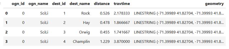
If our points represent a sequence of events, we can do a points to lines operation to create paths. In this example our points are ordered in the correct sequence; if this was not the case, we’d sort the frame on a sequence column first. If there are different events or individuals in the table that have an identifying field, we use this as the group field to create distinct lines. We use lambda to repeat Shapely’s LineString function across the points to build the lines, and then assign them to a new geodataframe. Then we add a column where we compute the length of the lines; this RI CRS uses feet for units, so we divide by 5,280 feet to get miles. The Panda’s loc function grabs all the rows and a subset of the columns to display them on the screen (we could save them to a new geodataframe if we wanted to subset rows or columns).
To assign every point the attributes of the polygon (county) that it intersects with , we do a spatial join with the sjoin function. Here we take all attributes from the points frame, and a select number of columns from the polygon frame; we have to take the geometry from both frames to do the join. In this example we do a left join, keeping all the points on the left regardless of whether they have a matching polygon on the right. There’s one point that falls oustide of RI, so it will be assigned null values on the right. We rename a few of the columns, and use loc again to display a subset of them to the screen.
To see what’s going on, we can generate a basic plot to display the polygons, points, and lines. I used matplotlib to create a figure and axes, and then placed each layer one on top of the other. We could opt to simply use Pandas / GeoPandas internal plotting instead as illustrated in this tutorial, which works for basic plots. If we want more flexibility or need additional functions we can call on matplotlib. In this example the default placement for the tick marks (coordinates in the state plane system) was bad, and the only way I could fix them was by rotating the labels, which required matplotlib.
Exporting the results out a shapefiles is also pretty straightforward with to_file. Shapefiles come with many limitations, such as a limit on ten characters for column names. You can opt to export to a variety of other vector formats, such a geopackages or geoJSON.
In this post I’ll demonstrate one method for assigning random colors to features on a Folium map, with specific consideration for plotting features from a geopandas geodataframe. I’m picking up where I left off in my previous post, where we plotted routes from a file of origins and destinations using the OpenRouteService. I wrote a regular Python script where I made a simple plot of the points and lines using geopanda’s plot, but in a Jupyter Notebook version I went a step further and used Folium to plot the features on the OpenStreetMap.
Folium is a Python port of Leaflet, a popular javascript library for making basic interactive web maps. I’m not going to cover the basics in this post, so for starters you can view Folium’s documentation: there’s a basic getting started tutorial, and a more detailed user guide. Geopanda’s documentation includes Folium examples that illustrate how you can work with the two packages in tandem.
One important concept to grasp, is that many of the basic examples assume you are working with latitude and longitude coordinates that are either hard-coded as variables, stored in lists, or stored in dedicated columns in a dataframe as attributes. But if you are working with actual geometry stored in a geodataframe, to display features you need to use the folium.GeoJson function instead. For example, this tutorial illustrates how to render points stored in a dedicated geometry column, and not as coordinates stored as numeric attributes in separate columns.
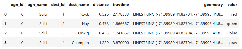
In my example, I have the following geodataframe, where each record is a route with linear geometry, with a sequential integer as the index value:
All I wanted to do was assign random colors to each line to depict them differently on the map – and I could not find a straightforward way to do that! In odd contrast, making a choropleth map (i.e. values shaded by quantity) seems easy. I found a couple posts on stack exchange, here and here, that demonstrated how to create and assign colors by randomly creating hexadecimal color strings. Another post illustrated how to assign specific non-random colors, and this thorough blog post walked through assigning colors to categorical data (where each category gets a distinct color).
I pooled aspects of the last two solutions together to come up with the following:
# Get colors for lines
gdfcount=len(gdf) # number of routes
colors=['red','green','blue','gray','purple','brown']
clist=[] # list of colors, one per route
c=0
for i in range(gdfcount):
    clist.append(colors[c])
    c=c+1
    if c>len(colors)-1:
        c=0 # if we run out of colors, start over
color_series = pd.Series(clist,name='color') # create series in order to...
gdf_c=pd.merge(gdf, color_series, left_index=True,right_index=True) # join to routes on seq index #
gdf_c
I get the number of features in my geodataframe, and create a list with a set number of colors. I iterate through my colors list, generating a new list with one color for each record in my frame. If I cycle through all the colors, I reset a counter and cycle through again from the beginning. When finished, I turn the list into a pandas series, which generates a sequential integer index paired with the color. Then I merge the series with my geodataframe (called gdf) using the sequential index, so the color is now part of each record:
Then I can create the map. When creating a Folium map you need to provide a location on which the map will be centered. I used Geopanda’s total_bounds method to get the bounding box of my features, which returns a list of coordinates: min X, min Y, max X, max Y. I sum the appropriate coordinates for X and Y and divide each by two, which gives me the coordinate pair for the center of the bounding box.
Next, I generate the map using those coordinates (the name of the map object in the example is “m”). I create a popup menu first, specifying which fields from the geodataframe to display when you click on a line. Then I add the actual geodataframe to the map, applying a style_function parameter to apply the colors and popup to each feature. The lambda business is necessary here, apparently when you’re applying styles that differ for each feature you have to iterate over the features. I guess this is the norm when you’re styling a GeoJSON file (but is at odds with how you would normally operate in a dataframe or GIS environment).
Once the lines are added to the map, we can continue to add additional features. I use folium.GeoJson twice more to plot my origin and destination points. It took me quite a bit of searching around to get the syntax right, so I could change the icon and color. This tutorial helped me identify the possibilities, but again the basic iteration examples don’t work if you’re using GeoJSON or geometry in a geodataframe. If you’re assigning several different colors you have to apply lambda, as in this example in the Folium docs. In my case I just wanted to change the default icon and color and apply them uniformly to all symbols, so I didn’t need to iterate. Once you’ve added everything to the map, you can finally display it!
folium.GeoJson(ogdf,marker=folium.Marker(icon=folium.Icon(icon='home',color='black'))).add_to(m)
folium.GeoJson(dgdf,marker=folium.Marker(icon=folium.Icon(icon='star',color='lightgray'))).add_to(m)
m.fit_bounds(m.get_bounds()) # zoom to bounding box
m
A static screenshot of the result follows, as I can’t embed Folium maps into my WordPress site. Everything works perfectly when using the notebook locally, but GitHub won’t display the map either, even if the Notebook is saved as a trusted source. If you open the notebook in the nbviewer, it renders just fine (scroll to the bottom of the notebook to see the map and interact).
Undoubtedly there are other options for achieving this same result. I saw examples where people had embedded all the styles they needed within a dedicated dataframe column as code and applied them, or wrote a function for applying the styles. I have rarely worked with javascript or coded my own web maps, so I expect there may be aspects of doings things in that world that were ported over to Folium that aren’t intuitive to me. But not being able to readily apply a random color scheme is bizarre, and is a big shortcoming of the module.
I’d certainly benefit from a more formal introduction to Folium / Leaflet, as scattered blog posts and stack exchange solutions can only take you so far. But here’s hoping that this post has added some useful scraps to your knowledge!
In this post I’ll demonstrate how to create least cost paths using QGIS and GRASS GIS, and in doing so will describe how a cost surface is constructed. In a surface analysis, you model movement across a grid whose values represent friction encountered in moving across it. In computing a least cost path, you’re seeking an optimal route from an origin to the closest destination, where ‘close’ incorporates distance and ease of movement across that surface. These kinds of analyses are often conducted in the environmental sciences, in modeling the movement of water across terrain, and in zoology in predicting migration paths for land-based animals.
In this example the idea was to chart the origin of settlements and possible trade routes in ancient history. In applications where we’re studying human activity, network analysis is typically used instead. Networks use geometry, where a node is a place or person, and connections between nodes are indicated with lines. Lines typically have a value associated with them that identify either the strength of a connection, or conversely friction associated with moving between nodes. The idea for this project was to identify how networks formed, so the surface analysis served as a proto-network analysis. While there were roads and maritime routes in pre-modern times, these networks were weaker and less dense. Charting movement over a surface representing terrain could provide a decent approximation of routes (but if you’re interested in ancient Roman network routing, check out the ORBIS project at Stanford).
This example stems from a project I was helping a PhD student with; I don’t want to replicate his specific study, so I’ve modified the data sources and area of focus to model movement between large settlements and stone quarries in the ancient Roman world. My goal is to demonstrate the methods with a plausible example; if we were doing this as part of an actual study, we would need to be more discriminating in selecting and processing our data.
Preliminary Work
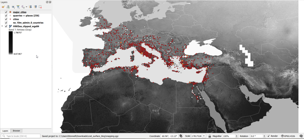
The Pleiades project will serve as our source for destinations; it’s an academic gazetteer that includes locations and place names for the ancient and early medieval world, stretching from Europe and North Africa through the Middle East to India. It’s published in many forms, and I’ve downloaded the Pleiades Data for GIS in a CSV format. Using QGIS, I used the Add Delimited Text tool to plot the places.csv to get all of the locations, and joined that file to the places_place_type.csv file which contains different categories of places. I used Select by Attributes to get locations classified as quarries, and exported the selection out to a geopackage.
The Pleiades data includes a category for settlements, but there are about ten thousand of these and there isn’t an easy way to create a subset of the largest places. So I opted to use Hanson’s dataset of the largest settlements in the ancient Roman world to serve as our source for origins (about 1,400 places). This data was packaged in an Excel file; I plotted the coordinates using the Create Points Layer from Table tool in QGIS and converted the result to a geopackage. For testing purposes, I selected a subset of ten major cities and saved them in a separate layer: Athenae, Alexandria (Aegyptus), Antiochia (Syria), Byzantium, Carthago, Ephesus, Lugdunum, Ostia, Pergamum, Roma.
For the friction grid, I downloaded a geoTIFF of the Human Mobility Index by Ozak. The description from the project:
“The Human Mobility Index (HMI) estimates the potential minimum travel time across the globe (measured in hours) accounting for human biological constraints, as well as geographical and technological factors that determined travel time before the widespread use of steam power.”
There are three separate grids that vary in extent based on the availability of seafaring technology. I chose the grid that incorporates seafaring prior to the advent of ocean-going ships, which is appropriate for the Mediterranean world during the classical era. The HMI is a global grid at 925 meter resolution. To minimize processing time, I clipped it to a bounding box that encompasses the area of study. The grid is in the World Cylindrical Equal Area system; I reprojected it to WGS 84 to match the rest of the layers. As long as we’re not measuring actual distances, we don’t need to worry about the system we’re using (but if we were, we’d use an equidistant system). Since the range of values is small and it’s hard to see differences in cell values, I symbolized the grid as single-band psuedo color and used a quantiles classification scheme with 12 categories.
Lastly, I grabbed some modern country boundaries from Natural Earth to serve as a general frame of reference. A screenshot of the workspace is below:
Least Cost Path in QGIS
QGIS has a third-party plug-in for doing a least cost path analysis, which works fine as long as you don’t have too many origin points. Go to Plugins > Manage and Install Plugins > Least Cost Path to turn it on. Then open the Processing toolbox and it will be listed at the bottom. See the screenshot below for the tool’s menu. The Cost raster layer is the friction surface, so the human mobility index in this example. The start points are the ten major cities and the end points are the quarries. The start-point layer dialog only accepts a single point; if you have multiple points, hit the green circular arrow button to iterate across all of them. There’s a checkbox for connecting the start point to just the nearest end point (as opposed to all of them). Save the output to a geopackage.
It took about five minutes to run the analysis and iterate across all ten points. Each path is saved in a separate file, but since they have an identical structure I subsequently used Vector > Data Management Tools > Merge Vector Layers to combine them into one file. The attribute table records the end point ID (for the quarry) and the accumulated cost, but does not include the origin ID; this ID is the number 1 repeated each time, as the tool was iterating over the origin points. We can see the result below; for Athens and Ephesus in the south, land routes were shortest, whereas for Pergamum and Byzantium in the north it was easier (distance and friction-wise) to move across the sea.
While this worked fine for ten cities, it would take a considerable amount of time to compute paths for all 1,400. The problem here is that the plugin was designed for one point at a time. Let’s outline the process so we can understand how alternatives would work.
Cost Surface Analysis
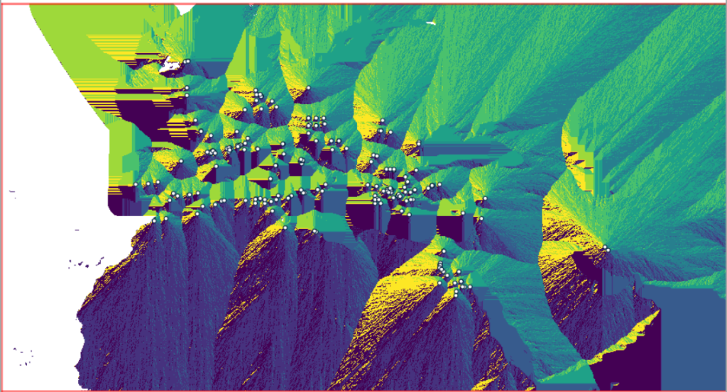
To calculate a least cost path, the first step is to create a cost surface, where we take our friction grid and the destinations and calculate the total cost of movement across all cells to the nearest destination. First, the destinations are placed on the grid, and they become the grid sources. Then, the accumulated cost of moving from each source to its adjacent cells is calculated. For horizontal and vertical movement, it’s the sum of the friction values divided by two, and for diagonal movement it’s the sum of the friction values divided by two then multiplied by 1.4142. Once those calculations are performed, those adjacent cells are assigned to each source. Next, the lowest accumulated cost cell in the grid is identified, the cost for moving to its unassigned neighbors is calculated, and these cells are assigned to the same source. This process is repeated by cycling through the lowest accumulated value until all calculations for the grid are finished. Illustrated in the example below, which I derived from Lloyd’s Spatial Data Analysis (2010) pp. 165-168.
For each cell, three items are recorded, and are saved either as separate bands in one raster, or in three separate raster files:
Accumulated cost of moving to that cell from the nearest source
Assignment or allocation of the cell to its source (the nearest one to which it “belongs”)
A vector that indicates direction from that source
With these cost surfaces, we can take the second step of calculating the least cost path. We place a number of starting points onto this surface, and each point is assigned to the closest destination based on where its grid cell was allocated. The direction to that destination is traced backward using the direction grid, and the total cost of movement is taken from the accumulated cost surface.
Knowing how this process works, there are two practical conclusions we can draw. First, when computing the cost surface, you use your destinations (not the origins) as the source for the cost surface. You use the origins as the start points for the least cost path. Second, there’s no need to recalculate the cost surface for every origin point; you only need to do this once. That’s why the QGIS plugin took so long; it was recomputing the cost surface each time. Knowing this, we can use GRASS GIS to compute the paths, as it’s designed to compute the surface just once (and it’s data structure will also boost performance a bit).
Cost Surface Analysis in GRASS
GRASS GIS comes bundled with QGIS. While it’s possible to run a number of GRASS tools directly within QGIS, it’s a bit undesirable as you’re not able to access the full range of parameters or options for each GRASS command. I opted to create the GRASS environment in QGIS, and loaded all the necessary data into the GRASS format. Then, I flipped over to the GRASS GUI to do the analysis.
GRASS uses a distinct database structure and file format, and we need to create a GRASS workspace and load our data into that database in order to use the cost surface tools. I followed the steps in the QGIS manual for creating a GRASS environment and loading data into a GRASS database. Once you create the database and mapset, you use the QGIS Browser to browse to the grassdata folder and designate your new mapset as your working mapset (mapsets have the little green grass icon beside them). With the GRASS tools open, I used v.in.ogr.qgis to load my my cities and quarries layers into this mapset, and r.in.gdal.qgis to load the mobility index (if these layers weren’t already in your QGIS project, you’d use the tools that don’t have the qgis suffix, i.e. v.in.ogr).
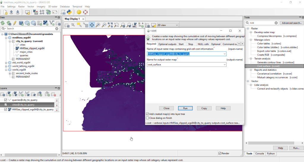
After exiting QGIS and launching GRASS, you select the mapset under the grassdata database at the top, right click and choose Switch mapset, and choose the mapset you want to work with (if you don’t see it, hit the database icon to browse and connect to the grassdata folder). You can display the layers in the GRASS window to visualize them, but it’s not necessary for running the tools. In the tool menu on the right, search for the Cost surface tool, r.cost, and choose the following options:
Required: input raster map with grid cell cost is the human mobility index, and output raster is cost_surface
Optional outputs: output raster with nearest start point as allocation_surface, output raster with movement as direction_surface
Start: vector starting points for the cost surface are the destinations, the quarries
Optional: check verbose output (to get more details on errors)
Running this operation on all 1,400 cities took a matter of seconds, and all three rasters described in the previous section were generated: cost, allocation, direction (shown below).
Using these outputs, we can run the Least cost route or flow tool, which is called r.drain (as it’s often used in earth sciences to chart the path that water will drain based on elevation).
Required: Name of input elevation or cost surface raster is cost_surface, Name of output raster path: is path_raster
Cost surface: check the Input raster map is a cost surface box, Name of input movement direction raster is direction_surface
Start: Name of starting points vector map: are the origins (cities)
Path settings: choose ONE option that you’d like to record (or none)
Optional: check Verbose mode, Name for output drain vector is path_vector
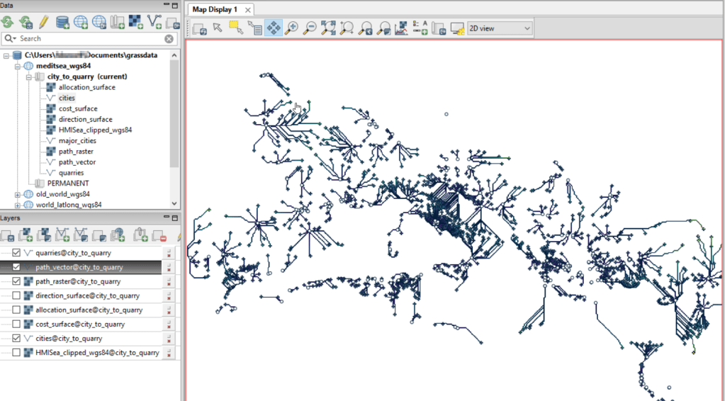
This also took mere seconds to complete (!) and generated the paths from each origin (city) to the closet destination (quarry) over the surface as both raster cells and vector lines. The output in GRASS is shown below.
At this stage, we can hop back into QGIS, and load these output paths into our original project to symbolize and study what’s going on. Notice the settlements in northeastern Italy and along the Dalmatian coast; for many of them the least cost path is to a quarry across the sea rather than through rugged mountainous terrain. Even though some quarries in the mountains may be closer in actual distance, it’s a tougher path to travel.
Conclusion
The benefit of using GRASS is that we can run these processes fairly quickly for large datasets. The GRASS commands can also be compiled into a batch script, so you can create a documented and automated process instead of having to drill through multiple menus.
A big downside of the GRASS tools for this analysis is that the resulting vector paths contain no information about the origin or destination points, and only the raster path output carries along values. You might be able to generate this information through some extra steps; using the QGIS field calculator, you can get the coordinates for the start point and end point of each path and add them explicitly to the attribute table. Then take those coordinates, and for the start point of the line select the closest city and get its attributes, and for the end point select the closet quarry and get its attributes. I say “closest” because the vector paths don’t snap perfectly to the start and end points. Modifying the resolution of the human mobility index to make it coarser (fewer cells) might help to resolve this, or converting the origin and destination points to a raster of the same resolution as the index. Alternatively, if you incorporate the GRASS commands into a Python script, you could iterate over the origins in the least cost path analysis and record the origin IDs as you step through.
I haven’t worked all the pieces, but hopefully this will be useful for those of you who are interested in conducting a basic cost surface analysis in open source. The student I was helping was interested in measuring the density of the paths across a grid, so this process worked for him as he didn’t need to associate the paths with origins and destinations. Beyond FOSS GIS, ArcGIS Pro has a full suite of tools for cost surface analysis, and the underlying methods and logic are the same.
I’ve written a number of spatial Python posts over the past few months; I’ll cap off this series with a short one on using PyProj to convert coordinates from one spatial reference system to another. PyProj is Python’s interface to PROJ, a library of coordinate system functions that power projection handling in many open source GIS and spatial packages.
A few months back I geocoded a large batch addresses against the Rhode Island DOT’s geocoding API, which returns coordinates in the local state plane system in feet. I decided to run the non-matching addresses against the Census Bureau’s Batch Geocoder, which returns coordinates in NAD 83 longitude and latitude. You can upload a CSV file of 10k addresses and get nearly instant results (one of my students recently wrote a tutorial on how to use it). So I split the unmatched records from my original CSV, uploaded it to the Census geocoder, and got matches.
Next, I needed to get the results from both processes into the same spatial reference system back in one unified file. The kludgy way to do this would be to plot each file separately in their respective systems in QGIS or ArcGIS, convert the NAD 83 plot to the state plane system, and merge the two vector files together. I used PyProj instead, to convert the NAD 83 coordinate data in the CSV to state plane, added that data to my main address CSV file, and plotted them all at once in the state plane system.
PyProj’s Transformer function does the job. I pass the EPSG / WKID codes for the input and output systems (4269 for NAD 83 and 3438 for NAD 83 RI State Plane ft-US) to Transformer.from_crs, and specify that I’m working with XY coordinates. I open the CSV file that contains the results from the Census Geocoder and read it in as a nested list, with each record as a sublist. Here are some sample records:
Then I iterate through the records; in my example any record with less than 3 variables was a non-match, so I skip those. The Census geocoder returns longitude and latitude in the 5th position, in the same field separated with a comma (notice quotes around the coordinates in the example above, indicating that these are part of the same field so the comma is not used as a delimiter). I split this value on the comma, read the longitude as x1 and latitude as y1. The output of the transformer function returns coordinates x2 and y2 in the new system. I tack these new coordinates on to the existing record. Once the loop is finished, I write the result out as a new CSV; I used the name of the input file and tacked “stateplane” plus today’s date to the end. Here are the results for the same records:
That’s it! I took the resulting CSV and tacked it to end of my primary CSV, which contained the successful matches from the RIDOT geocoder, in such a way that matching fields lined up. I can still identify which results came from what geocoder, as a few of the fields are different.
import csv
from datetime import date
from pyproj import Transformer

reproject = Transformer.from_crs(4269,3438,always_xy=True)

records=[]

addfile='GeocodeResults.csv'
with open(addfile,'r') as infile:
    reader = csv.reader(infile)
    for row in reader:
        records.append(row)

for r in records:
    if len(r)>3:
        x1,y1=r[5].split(',')
        x2,y2=reproject.transform(float(x1),float(y1))
        r.extend([str(x2),str(y2)])

today=str(date.today())

outfile=addfile.split('.')[0]+'_stateplane_'+today+'.csv'
with open(outfile, 'w', newline='') as writefile:
    writer = csv.writer(writefile, quoting=csv.QUOTE_ALL, delimiter=',')
    writer.writerows(records)

print('Done')










You must be logged in to post a comment.