open source

PRISM Temperature Raster and Test Points Jan 15, 2020

Clipping Rasters and Extracting Values with Geospatial Python

In an earlier post, I described how to summarize and extract raster temperature data using GIS. In this post I’ll demonstrate some alternate methods using spatial Python. I’ll describe some scripts I wrote for batch clipping rasters, overlaying them with point locations, and extracting raster values (mean temperature) at those locations based on attributes of the points (a matching date). I used a number of third party modules, including geopandas (storing vector data in a tabular form), rasterio (working with raster grids), shapely (building vector geometry), matplotlib (plotting), and datetime (working with date data types). Using Anaconda Python, I searched for and added each of these modules via its package handler. I opted for this modular approach instead of using something like ArcPy, because I don’t want the scripts to be wedded to a specific software package. My scripts and sample data are available in GitHub; I’ll add snippets of code to this post for illustration purposes. The repo includes the full batch scripts that I’ll describe here, plus some earlier, shorter, sample scripts that are not batch-based and are useful for basic experimentation.

Overview

I was working with a medical professor who had point observations of where patients lived, which included a date attribute of when they had visited a clinic to receive certain treatment. For the study we needed to know what the mean temperature was on that day, as well as the temperature of each day of the preceding week. We opted to use daily temperature data from the PRISM Climate Group at Oregon State, where you can download a raster of the continental US for a given day that has the mean temperature (degrees Celsius) in one band, at 4km resolution. There are separate files for min and max temperature, as well as precipitation. You can download a year’s worth of data in one go, with one file per date.

Our challenge was that we had thousands of observations than spanned five years, so doing this one by one in GIS wasn’t going to be feasible. A custom script in Python seemed to be the best solution. Each raster temperature file has the date embedded in the file name. If we iterate through the point observations, we could grab its observation date, and using string manipulation grab the raster with the matching date in its file name, and then do the overlay and extraction. We would need to use Python’s datetime module to convert each date to a common format, and use a function to iterate over dates from the previous week.

Prior to doing that, we needed to clip or mask the rasters to the study area, which consists of the three southern New England states (Connecticut, Rhode Island, and Massachusetts). The PRISM rasters cover the lower 48 states, and clipping them to our small study area would speed processing time. I downloaded the latest Census TIGER file for states, and extracted the three SNE states. ArcGIS Pro does have batch clipping tools, but I found they were terribly slow. I opted to write one Python script to do the clipping, and a second to do the overlay and extraction.

Batch Clipping Rasters

I downloaded a sample of PRISM’s raster data that included two full months of daily mean temperature files, from Jan and Feb 2020. At the top of the clipper script, we import all the modules we need, and set our input and output paths. It’s best to use the path.join method from the os module to construct cross platform paths, so we don’t encounter the forward / backward \ slash issues between Mac and Linux versus Windows. Using geopandas I read in the shapefile of the southern New England (SNE) states into a geodataframe.

import os
import matplotlib.pyplot as plt
import geopandas as gpd
import rasterio
from rasterio.mask import mask
from shapely.geometry import Polygon
from rasterio.plot import show

#Inputs
clip_file=os.path.join('input_raster','mask','states_southern_ne.shp')
# new file created by script:
box_file=os.path.join('input_raster','mask','states_southern_ne_bbox.shp') 
raster_path=os.path.join('input_raster','to_clip')
out_folder=os.path.join('input_raster','clipped')

clip_area = gpd.read_file(clip_file)

Next, I create a new geodataframe that represents the bounding box for the SNE states. The total_bounds method provides a list of the four coordinates (west, south, east, north) that form a minimum bounding rectangle for the states. Using shapely, I build polygon geometry from those coordinates by assigning them to pairs, beginning with the northwest corner. This data is from the Census Bureau, so the coordinates are in NAD83. Why bother with the bounding box when we can simply mask the raster using the shapefile itself? Since the bounding box is a simple rectangle, the process will go much faster than if we used the shapefile that contains thousands of coordinate pairs.

corners=clip_area.total_bounds
minx=corners[0]
miny=corners[1]
maxx=corners[2]
maxy=corners[3]
areabbox = gpd.GeoDataFrame({'geometry':Polygon([(minx,maxy),
                                                (maxx,maxy),
                                                (maxx,miny),
                                                (minx,miny),
                                                (minx,maxy)])},index=[0],crs="EPSG:4269")

Once we have the bounding box as geometry, we proceed to iterate through the rasters in the folder in a loop, reading in each raster (PRISM files are in the .bil format) using rasterio, and its mask function to clip the raster to the bounding box. The PRISM rasters and the TIGER states both use NAD83, so we didn’t need to do any coordinate reference system (CRS) transformation prior to doing the mask (if they were in different systems, we’d have to convert one to match the other). In creating a new raster, we need to specify metadata for it. We copy the metadata from the original input file to the output file, and update specific attributes for the output file (such as the pixel height and width, and the output CRS). Here’s a mask example and update from the rasterio docs. Once that’s done, we write the new file out as a simple GeoTIFF, using the name of the input raster with the prefix “clipped_”.

idx=0
for rf in os.listdir(raster_path):
    if rf.endswith('.bil'):
        raster_file=os.path.join(raster_path,rf)
        in_raster=rasterio.open(raster_file)
        # Do the clip operation
        out_raster, out_transform = mask(in_raster, areabbox.geometry, filled=False, crop=True)
        # Copy the metadata from the source and update the new clipped layer 
        out_meta=in_raster.meta.copy() 
        out_meta.update({
            "driver":"GTiff",
            "height":out_raster.shape[1], # height starts with shape[1]
            "width":out_raster.shape[2], # width starts with shape[2]
            "transform":out_transform})  
        # Write output to file
        out_file=rf.split('.')[0]+'.tif'
        out_path=os.path.join(out_folder,'clipped_'+out_file)
        with rasterio.open(out_path,'w',**out_meta) as dest:
            dest.write(out_raster)
        idx=idx+1
        if idx % 20 ==0:
            print('Processed',idx,'rasters so far...')
    else:
        pass
    
print('Finished clipping',idx,'raster files to bounding box: \n',corners)

Just to see some evidence that things worked, outside of the loop I take the last raster that was processed, and plot that to the screen. I also export the bounding box out as a shapefile, to verify what it looks like in GIS.

#Show last clipped raster
fig, ax = plt.subplots(figsize=(12,12))
areabbox.plot(ax=ax, facecolor='none', edgecolor='black', lw=1.0)
show(in_raster,ax=ax)

fig, ax = plt.subplots(figsize=(12,12))
show(out_raster,ax=ax)

# Write bbox to shapefile 
areabbox.to_file(box_file)
Clipped raster with bounding box
PRISM US mean daily temperature raster, clipped / masked to bounding box of southern New England

Extract Raster Values by Date at Point Locations

In the second script, we begin with reading in the modules and setting paths. I added an option at the top with a variable called temp_many_days; if it’s set to True, it will take the date range below it and retrieve temperatures for x to y days before the observation date in the point file. If it’s False, it will retrieve just the matching date. I also specify the names of columns in the input point observation shapefile that contain a unique ID number, name, and date. In this case the input data consists of ten sample points and dates that I’ve concocted, labeled alfa through juliett, all located in Rhode Island and stored as a shapefile.

import os,csv,rasterio
import matplotlib.pyplot as plt
import geopandas as gpd
from rasterio.plot import show
from datetime import datetime as dt
from datetime import timedelta
from datetime import date

#Calculate temps over multiple previous days from observation
temp_many_days=True # True or False
date_range=(1,7) # Range of past dates 

#Inputs
point_file=os.path.join('input_points','test_obsv.shp')
raster_dir=os.path.join('input_raster','clipped')
outfolder='output'
if not os.path.exists(outfolder):
    os.makedirs(outfolder)

# Column names in point file that contain: unique ID, name, and date
obnum='OBS_NUM'
obname='OBS_NAME'
obdate='OBS_DATE'

Next, we loop through the folder of clipped raster files, and for each raster (ending in .tif) we grab the file name and extract the date from it. We take that date and store it in Python’s standard date format. The date becomes a key, and the path to the raster its value, which get added to a dictionary called rf_dict. For example, if we split the file name clipped_PRISM_tmean_stable_4kmD2_20200131_bil.tif using the underscores, counting from zero we get the date in the 5th position, 20200131. Converting that to the standard datetime format gives us datetime.date(2020, 1, 31).

rf_dict={} # Create dictionary of dates and raster file names

for rf in os.listdir(raster_dir):
    if rf.endswith('.tif'):
        rfdatestr=rf.split('_')[5]
        rfdate=dt.strptime(rfdatestr,'%Y%m%d').date() #format of dates is 20200131
        rfpath=os.path.join(raster_dir,rf)
        rf_dict[rfdate]=rfpath
    else:
        pass

Then we read the observation point shapefile into a geodataframe, create an empty result_list that will hold each of our extracted values, and construct the header row for the list. If we are grabbing temperatures for multiple days, we generate extra header values to add to that row.

#open point shapefile
point_data = gpd.read_file(point_file)

result_list=[]
result_list.append(['OBS_NUM','OBS_NAME','OBS_DATE','RASTER_ROW','RASTER_COL','RASTER_FILE','TEMP'])

if temp_many_days==True:
    for d in range(date_range[0],date_range[1]):
        tcol='TMINUS_'+str(d)
        result_list[0].append(tcol)
    result_list[0].append('TEMP_RANGE')
    result_list[0].append('AVG_TEMP')
    temp_ftype='multiday_'
else:
    temp_ftype='singleday_'

Now the preliminaries are out of the way, and processing can begin. This post and tutorial helped me to grasp the basics of the process. We loop through the point data in the geodataframe (we indicate point.data.index because these are dataframe records we’re looping through). We get the observation date for the point and store that it the standard Python date format. Then we take that date, compare it to the dictionary, and get the path to the corresponding temperature raster for that date. We open that raster with rasterio, isolate the x and y coordinate from the geometry of the point observation, and retrieve the corresponding row and column for that coordinate pair from the raster. Then we read the value that’s associated with the grid cell at those coordinates. We take some info from the observation points (the number, name, and date) and the raster data we’ve retrieved (the row, column, file name, and temperature from the raster) and add it to a list called record.

#Pull out and format the date, and use date to look up file
for idx in point_data.index:
    obs_date=dt.strptime(point_data[obdate][idx],'%m/%d/%Y').date() #format of dates is 1/31/2020
    obs_raster=rf_dict.get(obs_date)
    if obs_raster == None:
        print('No raster available for observation and date',
              point_data[obnum][idx],point_data[obdate][idx])
    #Open raster for matching date, overlay point coordinates, get cell location and value
    else:
        raster=rasterio.open(obs_raster)
        xcoord=point_data['geometry'][idx].x
        ycoord=point_data['geometry'][idx].y
        row, col = raster.index(xcoord,ycoord)
        tempval=raster.read(1)[row,col]
        rfile=os.path.split(obs_raster)[1]
        record=[point_data[obnum][idx],point_data[obname][idx],
                point_data[obdate][idx],row,col,rfile,tempval]

If we had specified that we wanted a single day (option near the top of the script), we’d skip down to the bottom of the next block, append the record to the main result_list, and continue iterating through the observation points. Else, if we wanted multiple dates, we enter into a sub-loop to get data from a range of previous dates. The datetime timedelta function allows us to do date subtraction; if we subtract 1 from the current date, we get the previous day. We loop through and get rasters and the temperature values for the points from each previous date in the range and append them to an old_temps list; we also build in a safety mechanism in case we don’t have a raster file for a particular date. Once we have all the dates, we do some calculations to get the average temperature and range for that entire period. We do this on a copy of old_temps called all_temps, where we delete null values and add the current observation date. Then we add the average and range to old_temps, and old_temps to our record list for this point observation, and when finished we append the observation record to our main result_list, and proceed to the next observation.

       # Optional block, if pulling past dates
        if temp_many_days==True:
            old_temps=[]
            for d in range(date_range[0],date_range[1]):
                past_date=obs_date-timedelta(days=d) # iterate through days, subtracting
                past_raster=rf_dict.get(past_date)
                if past_raster == None: # if no raster exists for that date
                    old_temps.append(None)
                else:
                    old_raster=rasterio.open(past_raster)
                    # Assumes rasters from previous dates are identical in structure to 1st date
                    past_temp=old_raster.read(1)[row,col]
                    old_temps.append(past_temp)
            # Calculate avg and range, must exclude None values and include obs day
            all_temps=[t for t in old_temps if t is not None]
            all_temps.append(tempval)
            temp_range=max(all_temps)-min(all_temps)
            avg_temp=sum(all_temps)/len(all_temps)
            old_temps.extend([temp_range,avg_temp])
            record.extend(old_temps)
            result_list.append(record)
        else: # if NOT doing many days, just append data for observation day
            result_list.append(record)
    if (idx+1)%200==0:
        print('Processed',idx+1,'records so far...')

Once the loop is complete, we plot the last point and raster to the screen just to check that it looks good, and we write the results out to a CSV.

#Plot the points over the final raster that was processed    
fig, ax = plt.subplots(figsize=(12,12))
point_data.plot(ax=ax, color='black')
show(raster, ax=ax)

today=str(date.today()).replace('-','_')
outfile='temp_observations_'+temp_ftype+today+'.csv'
outpath=os.path.join(outfolder,outfile)

with open(outpath, 'w', newline='') as writefile:
    writer=csv.writer(writefile, quoting=csv.QUOTE_MINIMAL, delimiter=',')
    writer.writerows(result_list)  

print('Done. {} observations in input file, {} records in results'.format(len(point_data),len(result_list)-1))
Output data for script
CSV output from script, temperatures extracted from raster by date for observation points

Results and Wrap-up

Visit the GitHub repo for full copies of the scripts, plus input and output data. In creating test observation points, I purposefully added some locations that had identical coordinates, identical dates, dates that varied by a single day, and dates for which there would be no corresponding raster file in the sample data if we went one week back in time. I looked up single dates for all point observations manually, and a sample of multi-day selections as well, and they matched the output of the script. The scripts ran quickly, and the overall process seemed intuitive to me; resetting the metadata for rasters after masking is the one part that wouldn’t have occurred to me, and took a little bit of time to figure out. This solution worked well for this case, and I would definitely apply geospatial Python to a problem like this again. An alternative would have been to use a spatial database like PostGIS; this would be an attractive option if we were working with a bigger dataset and processing time became an issue. The benefit of using this Python approach is that it’s easier to share the script and replicate the process without having to set up a database.

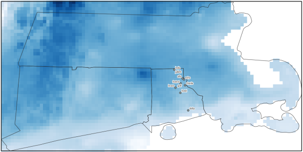
Observation points on raster in QGIS
Observation points plotted on temperature raster with single-day output temperatures in QGIS
QGIS Example

QGIS 3.16 Tutorial Workbook

I just released a new edition of my introductory QGIS manual for QGIS 3.16 Hannover (the current long term release), and as always I’m providing it under Creative Commons for classroom use and self-directed learning. I’ve also updated my QGIS FAQs handout, which is useful for new folks as a quick reference. This material will eventually move to a Brown University website, but when that happens I’ll still hold on to my page and will link to the new spot. I’m also leaving the previous version of the tutorial written for QGIS 3.10 A Coruna up alongside it, but will pull that down when the fall semester begins.

The new edition has a new title. When I first wrote Introduction to GIS Using Open Source Software, free and open source (FOSS) GIS was a novelty in higher ed. QGIS was a lot simpler, and I had to pull in several different tools to accomplish basic tasks like CRS transformations and calculating natural breaks. Ten years later, many university libraries and labs with GIS services either reference or support QGIS, and the package is infinitely more robust. So a name change to simply Introduction to GIS with QGIS seemed overdue.

My move from Baruch CUNY to Brown prompted me to make several revisions in this version. The biggest change was swapping the NYC-based business site selection example with a Rhode Island-based public policy one in chapters 2 and 3. The goal of the new hypothetical example is to identify public libraries in RI that meet certain criteria that would qualify them to receive funding for after school programs for K-12 public school students (replacing the example of finding an optimal location for a new coffee shop in NYC). In rethinking the examples I endeavored to introduce the same core concepts: attribute table joins, plotting coordinates, and geoprocessing. In this version I do a better job of illustrating and differentiating between creating subsets of features by: selecting by attributes and location, filtering (a new addition), and deleting features. I also managed to add spatial joins and calculated fields to the mix.

Changes to chapter 4 (coordinate reference systems and thematic mapping) were modest; I swapped out the 2016 voter participation data with 2020 data. I slimmed down Chapter 5 on data sources and tutorials, but added an appendix that lists web mapping services that you can add as base maps. Some material was shuffled between chapters, and all in all I cut seven pages from the document to slim it down a bit.

As always, there were minor modifications to be made due to changes between software versions. There were two significant changes. First, QGIS no longer supports 32 bit operating systems for Windows; it’s 64 bit or nothing, but that seems to be fairly common these days. Second, the Windows installer file is much bigger (and thus slower to download), but it helps insure that all dependencies are there. Otherwise, the differences between 3.16 and 3.10 are not that great, at least for the basic material I cover. In the past there was occasionally a lack of consistency regarding basic features and terminology that you’d think would be well settled, but thankfully things are pretty stable this time around.

If you have any feedback or spot errors feel free to let me know. I imagine I’ll be treading this ground again after the next long term release take’s 3.16’s place in Feb / Mar 2022. For the sake of stability I always stick with the long term release and forego the latest ones; if you’re going to use this tutorial I’d recommend downloading the LTR version and not the latest one.

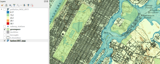
QGIS 3.10 Screenshot

QGIS 3.10 Tutorial Workbook

I just posted an updated version of my QGIS tutorial / workbook manual, Introduction to GIS Using Open Source Software. This version was written for QGIS 3.10 A Coruña, which recently superseded QGIS 3.4 Madeira as the current Long Term Release (LTR). The LTR is intended to be more stable than the current releases and is supported for at least a year.

The workbook was designed to accompany a day-long introductory workshop that I teach and is divided into five chapters. Chapter 1 is a broad and concise overview of GIS, chapters 2 to 4 are hands-on exercises that cover: the basics of using the interface and the difference between vectors and rasters (chapter 2), a site selection analysis that demonstrates geoprocessing, spatial selection, table joins, coordinate plotting, expressions, and spatial analysis (chapter 3), and a thematic mapping example that illustrates coordinate reference systems (CRS), data classification, and mapping (chapter 4). Chapter 5 summarizes data sources and resources for learning more about GIS. In chapters 2 to 4 the steps for doing the exercises are kept concise with many screenshots, while detailed commentary explaining how everything works follows.

The manual and tutorial data are freely available for personal and classroom use under a Creative Commons license. I’m providing the material for both 3.10 A Coruna and 3.4 Madeira for now, but will take down the latter at the end of the spring semester (late May 2020).

The changes between 3.4 and 3.10 are not dramatic as far as the basic tools and principles that I cover in the book go, but I thought an update was worthwhile as there are just enough changes that could trip up new users (see the 3.10 visual change log for a full list of software updates).  In addition to incorporating changes to the interface, I also took the opportunity to tighten up and condense the material. In particular, I consolidated the coordinate reference system (CRS) exercises in chapter 4 from two sections to one, because in practice I found that it was overkill for a one-day session.

Here are a few noteworthy changes to the tutorial and software that impact novice users:

  1. The default setting for the toolbar buttons is rather small, so during the setup phase in chapter 2 I inserted an optional step to make them bigger. Go to: Settings > Options > General tab, and under the Application section change the icon size from 16 to 24.
  2. In 3.10, when new files are generated from geoprocessing operations and added to your project, the layers appear in the layers panel with the name you give them. In 3.4 they were assigned generic aliases like “Clipped” and “Buffer” based on the process you ran.
  3. In 3.10 the “Quantiles” classification scheme has been replaced with “Equal Counts”. Same scheme, different terminology.
  4. There’s now a dedicated north arrow button in the map layout screen. In 3.4 and earlier versions you added an arrow by selecting the add image button.
  5. In 3.10, every time you add a layer with a CRS that doesn’t match the existing CRS of the window, you’re presented with a datum transformation screen to modify the file you’re adding. This is a helpful warning if you already have existing layers in your project that match the window and your new file doesn’t, but it’s annoying when you’re trying to add files to a blank window in a new project. You can turn this feature off under: Options > Settings > CRS tab, under Default Datum Transformations uncheck the box for Ask for datum transformation.

It’s hard to believe that this is the 10th edition I’ve published in the past ten years. QGIS has certainly come a long way during that time. For a trip down memory lane, look at the 1st edition I wrote for QGIS 1.5 Tethys in 2011! Back then I wrote the whole thing in HTML… thankfully I “discovered” LaTeX a year later, and have used it for writing tutorials ever since.

If you wanted to learn GIS in general and QGIS in particular, spend a day with the manual and work through the exercises and you’ll have a good foundation. All the basics are there, as well as best practices and the “gotchas” that tend to trip people up.

Census Book

Exploring the US Census Book Published!

My book, Exploring the US Census: Your Guide to America’s Data, has been published! You can purchase it directly from SAGE Publishing or from Barnes and Nobles, Amazon, or your bookstore of choice (it’s currently listed for pre-order on Amazon but its availability there is imminent). It’s $45 for the paperback, $36 for the ebook. Data for the exercises and supplemental material is available on the publisher’s website, and I’ve created a landing page for the book on this site.

Exploring the US Census is the definitive researcher’s guide to working with census data. I place the census within the context of: US society, the open data movement, and the big data universe, provide a crash course on using the new data.census.gov, and introduce the fundamental concepts of census geography and subject categories (aka universes). One chapter is devoted to each of the primary datasets: decennial census (with details about the 2020 census that’s just over the horizon), American Community Survey, Population Estimates Program, and business data from the Business Patterns, Economic Census, and BLS. Subsequent chapters demonstrate how to: integrate census data into writing and research, map census data in GIS, create derivative measures, and work with historic data and microdata with a focus on the Current Population Survey.

I wrote the book as a hybrid between a techie guidebook and an academic text. I provide hands-on exercises so that you learn by doing (techie) while supplying sufficient context so you can understand and evaluate why you’re doing it (academic). I demonstrate how to find and download data from several different sources, and how to work with the data using free and open source software: spreadsheets (LibreOffice Calc), SQL databases (DB Browser for SQLite), and GIS (QGIS). I point out the major caveats and pitfalls of working with the census, along with many helpful tools and resources.

The US census data ecosystem provides us with excellent statistics for describing, studying, and understanding our communities and our nation. It is a free and public domain resource that’s a vital piece of the country’s social, political, and economic infrastructure and a foundational element of American democracy. This book is your indispensable road map for navigating the census. Have a good trip!

See the series – census book tag for posts about the content of the book, additional material that expands on that content (but didn’t make it between the covers), and the writing process.

Updated QGIS Tutorial for 3.4

I recently released an updated version of the manual and data I use for my day-long GIS Practicum, Introduction to GIS Using Open Source Software (Using QGIS). The manual has five chapters: a summary overview of GIS, basics of using the QGIS interface, GIS analysis that includes several geoprocessing and analysis functions, thematic mapping and map layout, and a summary of where to find data and resources for learning more. Chapters 2, 3, and 4 are broken down into sections with clear steps, followed by commentary that explains what we did and why. We cover much of the material in a single day, although you can space the lessons out into two days if desired.

I updated this version to move us from QGIS 2.18 Las Palmas to 3.4 Madeira, which are the former and current long term service releases. While the move from 2.x to 3.x involved a major rewrite of the code base (see the change log for details), most of the basics remain the same. While veteran users can easily navigate through the differences, it can be a stumbling block for new users if they are trying to learn a new version using an old tutorial with screens and tools that are slightly different. So it was time for an update!

My goal for this edition was to keep my examples in place but revise the steps based on changes in the interface. Most of the screenshots are new, and the substantive changes include: using the Data Manager for adding layers rather than the toolbar with tons of buttons, better support for xlsx and ods files which allowed me to de-emphasize xls and dbf files for attribute table joins, the addition of geopackages to the vector data mix, the loss of the Open Layers plugin and my revision to the web mapping section using OSM XYZ tiles, the disappearance of the setting that allowed you to disable on the fly projection, and the discontinuation of the stand-alone Data Browser. There were also changes to some tools (fixed distance and variable buffer tools are now united under one tool) and names of menus (Style menu has once again become the Symbology menu).

It’s hard to believe that this is my ninth edition of this tutorial. I try to update it once a year to keep in sync with the latest long term release, but fell a bit behind this year. QGIS 2.18 also survived for a bit longer than other releases, as the earlier 3.x versions went through lots of testing before ending up at 3.4. When it comes time for my tenth edition I may change the thematic mapping example in chapter 4 to something that’s global instead of US national, and in doing streamline the content. We’ll see if I have some time this summer.

Since I’m in update mode, I also fixed several links on the Resources page to cure creeping link rot.

SQLite Logo

Looking for a Good SQLite GUI?

Goodbye SQLite Manager…

Late last year, I discovered that my favorite SQLite GUI was defunct. The SQLite Manager was a plugin for Firefox that allowed you to create and interact with SQLite databases with a simple yet highly functional interface. It had good support for importing and exporting csv files, color coding of cells based on data types, and a convenient feature for cycling back and forth between your SQL statements. Since it was a Firefox plugin it was guaranteed to work on any operating system, and since Firefox is installed on machines across my campus I knew I could rely on it for creating data extracts for students and faculty – I’d package data up in SQLite and send it to them along with a link to the plugin.

Firefox goes through about a million versions a year these days, and after a major upgrade last fall (to Firefox Quantum) most of the existing plugins, including the SQLite Manager, were no longer compatible. An upgrade it highly unlikely, as a few things changed under the hood of Firefox that makes the plugin unusable. While it still works on the Firefox Extended Support Release, in the long run the writing is on the wall.

Hello DB Browser for SQLite!

After searching through many alternatives I discovered the DB Browser for SQLite. It runs on Windows, Mac, and Linux and there’s a version for mobile. It was easy to install and has a clean interface. It provides a number of convenient tools and menus that you can use in place of writing SQL DDL, and in some cases it expands the functionality of SQLite by enabling a number of ALTER TABLE commands that are not part of SQLite SQL (like renaming and dropping columns). The Browse Data window makes it easy to quickly thumb through, sort, and filter records and to edit individual values by hand. The Execute SQL window has auto-complete and color-coded syntax, and you can see the database schema in one tab as you write your SQL in another (making it easy to reference table and column names). You can import and export data as CSV (or any delimited text file) or SQL files, and you can save the results of SELECT queries as CSV.

One interesting addition is that there’s actually a Save (Write Changes) and Undo button. So when you create, modify, or drop records, columns, or tables you see the result, but the act isn’t final until you commit the changes. A nice safety feature, especially for db novices.

DB Browser for SQLite - Browse

Browse Data

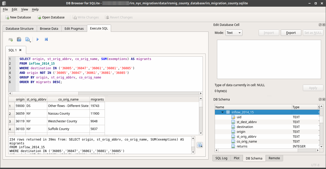
DB Browser for SQLite - SQL

Execute SQL and View DB Schema

I encountered a few quirks, but nothing insurmountable. I was using the nightly build version without realizing it, and when importing a CSV file the database takes a best guess as to what the data types for the columns should be. Even though the import screen gives you the option to specify that values are quoted, my quoted numeric fields were still saved as numbers and not text. As a result, ID codes like FIPS or ZIP Codes lose their leading zeros and are saved as integers.

The project is managed on github, so I went ahead and posted an issue. The developers were super responsive, and a discussion ensued over whether this behavior was desirable or not. We found two work-arounds. First, if you build an empty table with the desired structure, and then go to import the CSV, if you provide the name of that empty table as the new table name the db will import your data into that table. Alternatively, if I went and downloaded the latest stable release (3.10.1) the default behavior is that all columns are imported as text, which is a safer bet. You can use the GUI to change the types after import. The issue was marked as a bug, and will be addressed in a future release – one possible solution is to provide an option to turn the autodetect feature on (to determine what the types should be) or off (to import everything as text).

The browser also has a feature to attach a database to the current database, but when you do the attachment it appears like nothing happened – you can’t see  or browse the objects in database number two. But it IS attached (you can see every statement that’s been executed in a helpful log window) and you can copy a table from one db to the other like this:

CREATE TABLE sometable AS
SELECT *
FROM database2.sometable;

You run this within the current database, and database2 is the attached database (when you attach a db you provide an alias for referencing it).

These are minor quibbles. The DB Browser for SQLite is cross-platform, stable, has a clean interface with nice features, and is actively developed by a responsive and friendly team. I’ll be using it for all my SQLite tasks and projects, and will recommend it to others.

Spatialite?

An alternative I considered was to simply use the Spatialite GUI for both regular and spatial databases. It also has a simple, solid, and functional interface and supports spatial SQL, giving you the best of both worlds. So why not? While it works great for my own purposes it’s not something I can recommend to new users who are not GIS folks, either in my work or in the census data book I’m writing. Just figuring out where to download it from the website is overly complex, and while there are binaries for MS Windows there are none for Mac users. You’d have to install it from the source files, which is over the top for novices. Linux users may get lucky and find it in their software repos (it’s included for Debian and Ubuntu). The database browser in QGIS has matured in recent years, so that’s another option for GIS users who want to work with Spatialite or PostGIS.

Now if we only had a good GUI for PostgreSQL… I tried pgAdmin 4 about a year ago, and it was so bad that I’m still clinging to pgAdmin III as long as it still lives. But this is a different story, and one I’ll return to and investigate fully when it comes time to teach my spatial database course next year.