data rescue

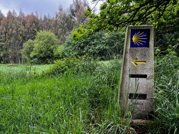
The Camino Primitivo with a Way Marker

Talks and Travels: Conferences and the Camino

I haven’t been keeping up with posting, as these past few months have been atypical. April was devoted to attending conferences and giving presentations. Much of this was prompted by my recent work with the Data Rescue Project, and the HIFLD Open rescue initiative in particular. The month began with a panel at Brown’s Data Science Institute, where the topic was Trust in Data. A few days later, I joined local colleagues at the Northeast Higher Ed GIS Facilitators Meet Up in Worcester, MA. I was honored to serve as the keynote speaker for the annual Big 10 GIS Conference (held virtually), where I presented on preserving federal datasets and the HIFLD Open rescue initiative. Shortly thereafter, I traveled to the Census Bureau’s headquarters just outside of DC for FedGeoDay 2026 and served on a panel of non-federal data providers who are contributing to the national data ecosystems. I came back to Providence just in time to give a poster presentation on our GIS and Data Services at the CHAIRS-C conference (Center on Heat, Health, and Aging Innovation and Research Solutions for Communities at the Brown University School of Public Health).

Then in May, I went off the grid. My wife and I traveled to Northwestern Spain to walk the Camino de Santiago, or Way of St. James. Established in the Middle Ages, the Camino is a series of routes that drew Christian pilgrims from throughout Europe to the Cathedral in Santiago de Compestella, which is believed to be the resting place of the apostle St James, brother of St John. We walked the Camino Primitivo, which is the “original” route established by King Alfonso II circa 814 AD. It’s also considered to be the most challenging of the routes, as it climbs through mountains and forests before descending into farmland. It’s not considered a “wilderness” hike however, as all of the routes follow a mix of unpaved and paved roads between towns and villages. A map of the primary routes (from Wikipedia) is below. The French Way is considered the primary route and is the most heavily traveled. The Portuguese and Northern Ways are also popular, followed by the Primitivo.
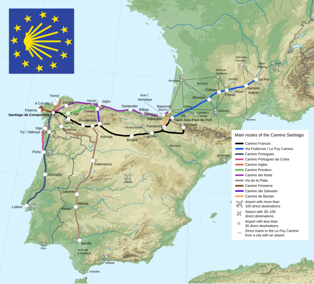
Map of the Primary Camino Routes
By WikiPate – credit to Sémhur, and for the logo: Manfred Zentgraf, CC BY-SA 4.0, Map from Wikimedia

The paths are marked at regular intervals, and whenever you have to turn or change direction. You look for a white or grey stone marker with a scallop shell, a symbol of St. James and of the Camino, to guide you. In places where a marker stone isn’t feasible, a blue and yellow tile of the shell is embedded in a wall or building to point the way. The system was so good that we rarely needed our phones; we used nothing more than our eyes and an excellent guidebook with detailed topographic maps of each stage of the journey, elevation diagrams, and a directory of landmarks and places to stay (the Village to Village Camino Guides – highly recommended).
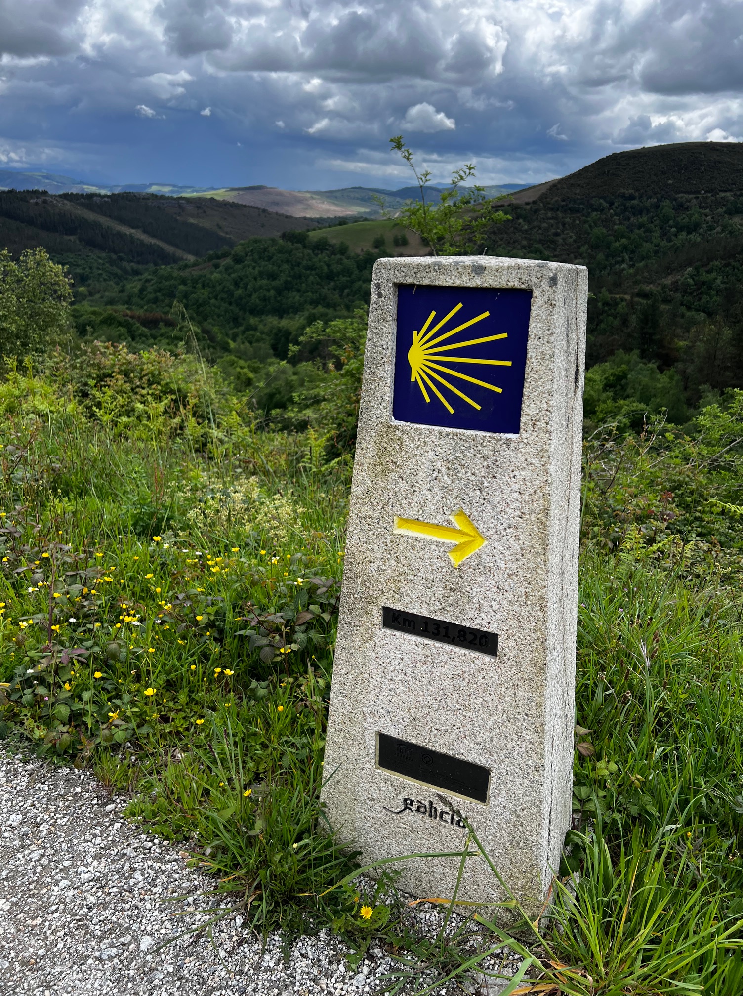
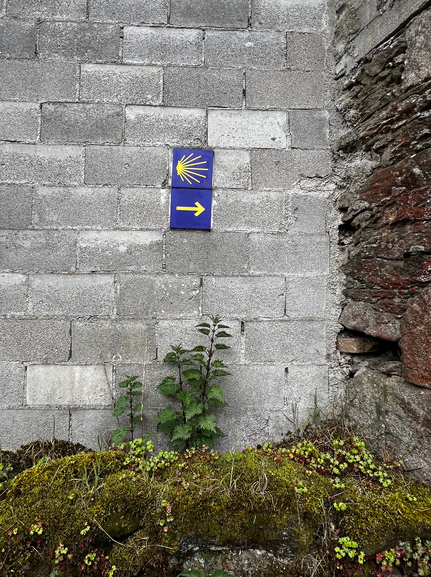
The routes run into the hundreds of kilometers; the Primitivo is a shorter trek that covers about 320 km between Oviedo and Santiago, but in exchange for the shorter distances you have greater changes in elevation. As this was our first attempt at something like this, we opted to do half the route, beginning in a town called Grandas de Salime, located at a large dam and reservoir as you leave the region of Asturias and enter Galicia.
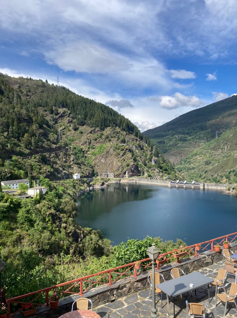
Embalse de Salime
Our starting point: view of the Embalse de Salime from the Hotel Las Grandas

Accommodations and cafes serve pilgrims throughout the route; albergues offer a mix of hostel-like rooms (bunk beds in shared rooms) and single rooms, and there are also basic hotels. Our 183 km walk took us 9 days (3 days walking / 1 rest day in Lugo / 5 days walking). You are issued a pilgrim’s credential or passport when you begin, which grants you access to pilgrim-reserved accommodations and resources. On your journey, you need to get your passport stamped twice a day to verify that you are doing the walk. You always get a stamp at the places you stay, and in-between you can pick up others at cafes and restaurants, churches, museums, visitor centers, and even certain stores (we managed to get one at a cheese shop). Once you reach the cathedral in Santiago, you visit the pilgrim’s office (essentially the Camino DMV), where you present your passport to receive the Compostella, the official document that certifies that you finished the pilgrimage. You need to walk 100km minimum (200km if you’re biking) to qualify.
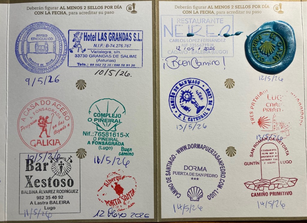
Camino Passport Stamps
A Selection of Stamps from my Pilgrim’s Credential or Passport

It was a deeply moving experience, retracing the steps that countless pilgrims took over a thousand years, and ending in front of the statue and tomb of St James behind the high altar in the cathedral, receiving the Eucharist at the Pilgrim’s mass. It was a relief to disconnect from technology and work, boiling life down to the singular goal of getting from point A to B each day. It was physically satisfying, pushing my body to walk 10 to 20 miles a day in rough terrain in all kinds of weather. It was wonderful to meet new friends; there is a cohort of people who happen to begin their journey simultaneously with you, and you see them throughout the walk, sharing the road for a time or a meal at the end of the day at the albergue. And it was a lot of fun, for a geographer who enjoys navigating a landscape with no digital do-dads, and who loves collecting stamps!

An experience like this alters your perspective, and it’s been difficult to transition back to my normal routines. It has strengthened my belief that it’s time for me to consider new possibilities and next stages in my career. Please reach out (via LinkedIn or email in the sidebar) to share opportunities. My resume is available on the About page.

Stay tuned for some heat and climate-related dataset suggestions in my next post; resources I compiled for the heat conference, and new ones I’ve learned about at FedGeoDay.
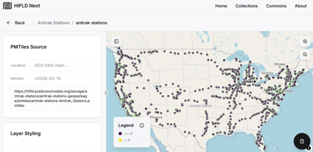
HIFLD Next Map Preview

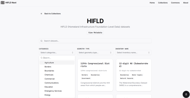
HIFLD Next GIS Data Catalog

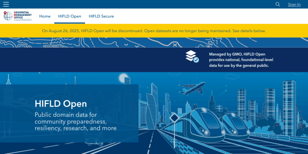
Last December, the Data Rescue Project (DRP) finished an initiative to download and archive over 400 geospatial data layers from the defunct HIFLD Open repository to DataLumos, an ICPSR-sponsored repository for federal government datasets. I wrote this brief post that summarized our work.

The Public Environmental Data Partners and Fulton Ring have launched a new community-shaped hub for finding, previewing and downloading GIS data collections, and its debut HIFLD Next collection is built on this rescued dataset. The portal increases the accessibility of the HIFLD Open data, with enhanced options for searching, previewing attribute tables and layers, and downloading or streaming data in a number of different formats. Beyond publishing a website, the group is hoping to build a community of practitioners around this project to support and sustain it, and to provide updated datasets and additional collections in the future.

They are keen to solicit feedback from GIS data users, and particularly from librarians and data specialists who provide active user support and who would potentially refer to the portal as a source. After you’ve explored the portal, feel free to submit feedback via their survey.

To learn more about the project, you can read this press release from the PEDP and this announcement from the DRP. The project is likely to be a primary topic of discussion at FedGeoDay 2026, which takes place in late April in Washington DC.

HIFLD Open DataLumos Archive

HIFLD Open Data Archived in DataLumos

Some good news to end the year: the Data Rescue Project has finished archiving all of the GIS data layers that were in the HIFLD Open portal, which was decommissioned at the end of summer. I wrote a post for the DRP that summarized the work we did, and you can find all the layers in ICPSR’s DataLumos repository, where you can search for and download layers one by one. I also archived the index for the series and a crosswalk that DHS published for locating updated versions of the data from the individual federal agencies that created them. If you wanted to download the entire set in bulk, it can be transferred from the Brown University Library’s GLOBUS endpoint; there are instructions for doing this on our library’s Data Rescue GitHub repo.

This project was an archival one, in that we were taking a final snapshot of what was in the repository before it went offline. In the coming year, I’ll be thinking about approaches for consistently capturing updates, and there are some folks who are interested in creating a community-driven portal to replace the defunct government site. Stay tuned!

2025 has been a tough year. Wishing you all the best for the year to come. – Frank

DataLumos HIFLD Open Archive

Census Bureau Website Shutdown

Alternative Sources for US Census Data

Just when we thought the US government couldn’t possibly become more dysfunctional, it shut down completely on Sept 30, 2025. Government websites are not being updated, and many have gone offline. I’ve had trouble accessing data.census.gov; access has been intermittent, and sometimes it has worked with some web browsers but not with others.

In this post I’ll summarize some solid, alternative portals for accessing US census data. I’ve sorted the free resources from the simplest and most basic to the most exhaustive and complex, and I mention a couple of commercial sources at the end. These are websites; the Census Bureau’s API is still working (for now), so if you are using scripts that access its API or use R packages like tidycensus you should still be in business.

Free and Public

Census Reporter
https://censusreporter.org/
Focus: the latest American Community Survey (ACS) data

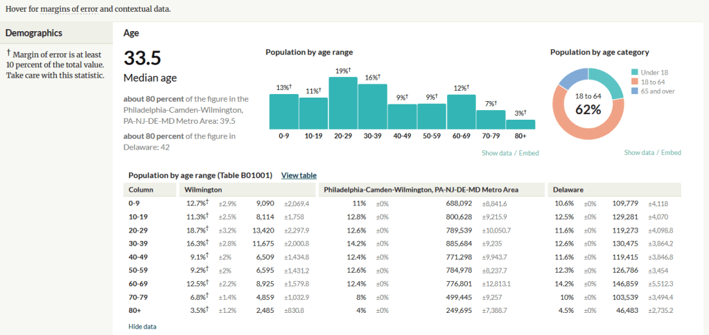
A non-profit project originally created by journalists, the Census Reporter provides just the most recent ACS data, making it easy to access the latest statistics. Search for a place to get a broad profile with interactive summaries and charts, or search for a topic to download specific tables that include records for all geographies of a particular type, within a specific place. There are also basic mapping capabilities.

Census Reporter Showing ACS Data for Wilmington, DE

Missouri Census Data Center Profiles and Trends
https://mcdc.missouri.edu/
Focus: data from the ACS and decennial profile tables for the entire US

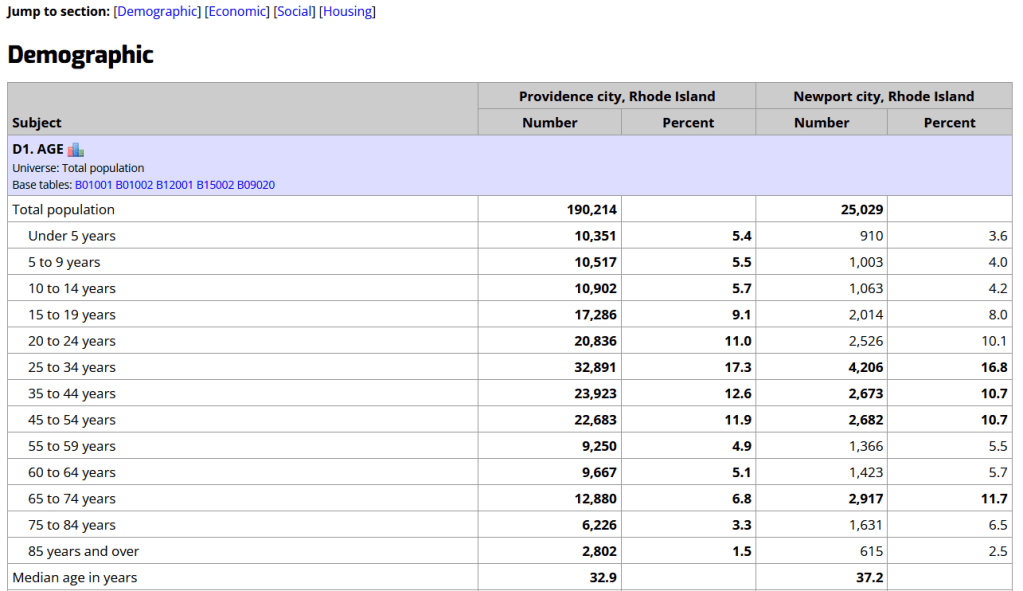
The Census Bureau publishes four profile tables for the ACS and one for the decennial census that are designed to capture a wide selection of variables that are of broad interest to most researchers. The MCDC makes these readily available through a simple interface where you select the time period, summary level, and up to four places to compare in one table, which you can download as a spreadsheet. There are also several handy charts, and separate applications for studying short term trends. Access the apps from the menu on the right-hand side of the page.

Missouri Census Data Center ACS Profiles Showing Data for Providence and Newport, RI

State and Local Government Data Pages
Focus: extracts and applications for that particular area

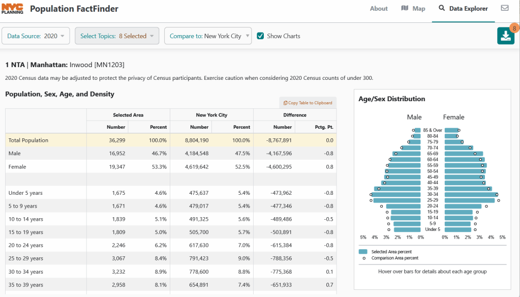
Hundreds of state, regional, county, and municipal governments create extracts of census data and republish them on their websites, to provide local residents with accessible summaries for their jurisdictions. In most cases these are in spreadsheets or reports, but some places have rich applications, and may recompile census data for geographies of local interest such as neighborhoods. Search for pages for planning agencies, economic development orgs, and open data portals. New York City is a noteworthy example; not only do they provide detailed spreadsheets, they also have the excellent map-based Population FactFinder application. Fairfax County, VA provides spreadsheets, reports, an interactive map, and spreadsheet tools and macros that facilitate working with ACS data.

NYC Population Factfinder Showing ACS Data for Inwood in Northern Manhattan

IPUMS NHGIS
https://www.nhgis.org/
Focus: all contemporary and historic tables and GIS boundary files for the ACS and decennial census

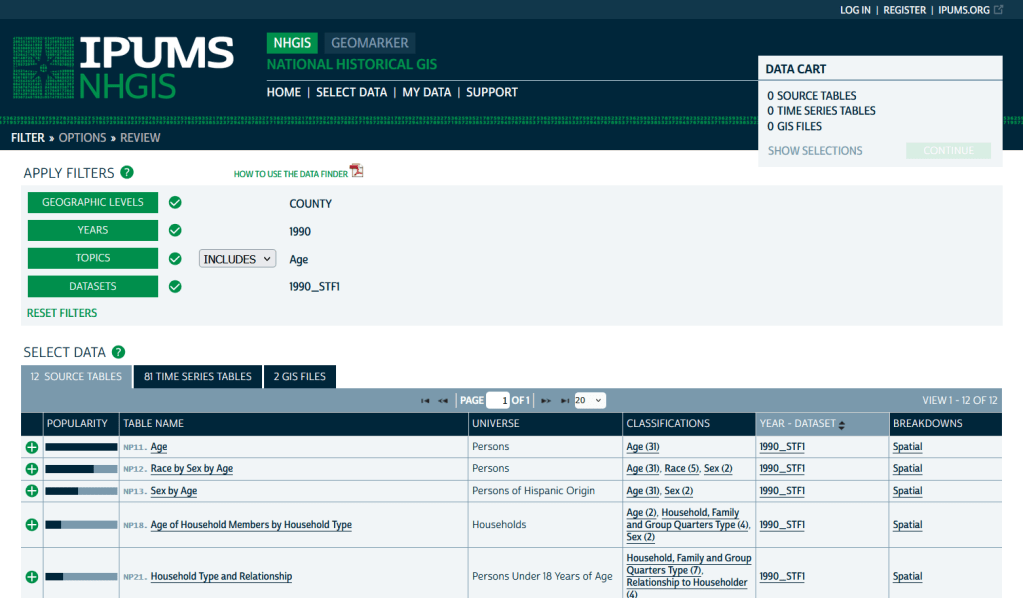
If you need access to everything, this is the place to go. The National Historic Geographic Information System uses an interface similar to the old American Factfinder (or the Advanced Search for data.census.gov). Choose your dataset, survey, year, topic, and geographies, and access all the tables as they were originally published. There is also a limited selection of historical comparison tables (which I’ve written about previously). Given the volume of data, the emphasis is on selecting and downloading the tables; you can see variable definitions, but you can’t preview the statistics. This is also your best option to download GIS boundary files, past and present. You must register to use NHGIS, but accounts are free and the data is available for non-commercial purposes. For users who prefer scripting, there is an API.

IPUMS NHGIS Filtered to Show County Data on Age from the 1990 Census

MCDC Uexplore / Dexter
https://mcdc.missouri.edu/applications/uexplore.html
Focus: create targeted extracts of ACS data and the decennial census back to 1980

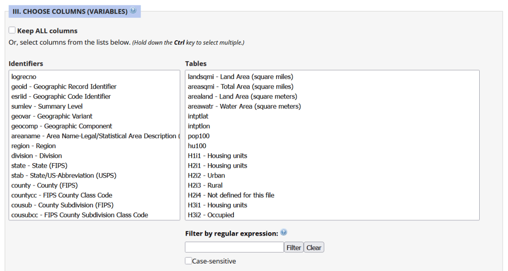
Unlike other applications where you download data that’s prepackaged in tables, Uexplore allows you to create targeted, customized extracts where you can pick and choose variables from multiple tables. While the interface looks daunting at first, it’s not bad once you get the hang of it, and it offers tremendous flexibility and ample documentation to get you started. This is a good option for folks who want customized extracts, but are not coders or API users.

Portion of the Filter Interface for MCDC Uexplore / Dexter

Commercial Products

There are some commercial products that are quite good; they add value by bundling data together and utilizing interactive maps for exploration, visualization, and access. The upsides are they are feature rich and easy to use, while the downsides are they hide the fuzziness of ACS estimates by omitting margins of error (making it impossible to gauge reliability), and they require a subscription. Many academic libraries, as well as a few large public ones, do subscribe, so check the list of library databases at your institution to see if they subscribe (the links below take you to the product website, where you can view samples of the applications).


PolicyMap
https://www.policymap.com/
Focus: mapping contemporary census and US government data

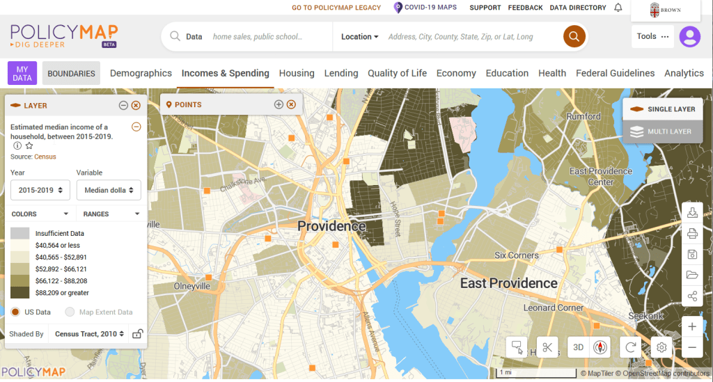
PolicyMap bundles 21st century census data, datasets from several government agencies, and a few proprietary series, and lets you easily create thematic maps. You can generate broad reports for areas or custom regions you define, and can download comparison tables by choosing a variable and selecting all geographies within a broader area. It also incorporates some basic analytical GIS functions, and enables you to upload your own coordinate point data.

PolicyMap Displaying ACS Income Data for Providence, RI

Social Explorer
https://www.socialexplorer.com/
Focus: mapping contemporary and historic US census data

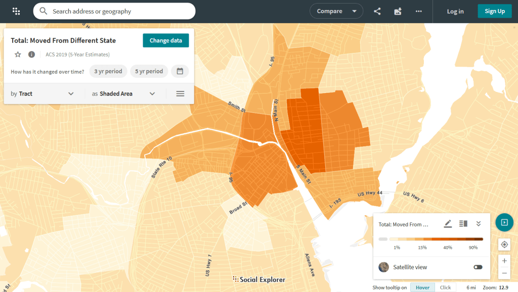
Social Explorer allows you to effortlessly create thematic maps of census data from 1790 to the present. You can create a single map, side by side maps for showing comparisons over time, and swipe maps to move back and forth from one period to the other to identify change. You can also compile data for customized regions and generate a variety of reports. There is a separate interface for downloading comparison tables. Beyond the US demographic module are a handful of modules for other datasets (election data for example), as well as census data for other countries, such as Canada and the UK.

Social Explorer Map Displaying ACS Migration Data for Providence, RI

HIFLD Open Shutting Down

HIFLD Open GIS Portal Shuts Down Aug 26 2025

HIFLD Open, a key repository for accessing US GIS datasets on infrastructure, is shutting down on August 26, 2025. This is a revision from a previous announcement, which said that it would be live until at least Sept 30. The portal provided national layers for schools, power lines, flood plains, and more from one convenient location. DHS provides no sensible explanation for dismantling it, other than saying that hosting the site is no longer a priority for their mission (here’s a copy of an official announcement). In other words, “Public domain data for community preparedness, resiliency, research, and more” is no longer a DHS priority.

The 300 plus datasets in Open HIFLD are largely created and hosted by other agencies, and Open HIFLD was aggregating different feeds into one portal. So, much of the data will still be accessible from the original sources. It will just be harder to find.

DHS has published a crosswalk with links to alternative portals and the source feeds for each dataset, so you can access most of the data once Open HIFLD goes offline. I’ve saved a copy here, in case it also disappears. Most of these sources use ESRI REST APIs. Using ArcGIS Online or Pro, and even QGIS (for example), you can connect to these feeds, get a listing in your contents pane, and drag and drop layers into a project (many of the layers are also available via ArcGIS Online or the Living Atlas if you’re using Arc). Once you’ve added a layer to a project, you can export and save local copies.

QGIS ESRI Rest Services
Adding ArcGIS Rest Server for US Army Corps of Engineers Data in QGIS

If you want to download copies directly from Open HIFLD before it vanishes on Aug 26, I’ve created this spreadsheet with direct links to download pages, and to metadata records when available (some datasets don’t have metadata, and the links will bring you to an empty placeholder). Some datasets have multiple layers, and you’ll need to click on each one in a list to get to it’s download page. In some cases there won’t be a direct download link, and you’ll need to go to the source (a useful exercise, as you’ll need to remember where it is in the future). Alternatively, you can connect to the REST server (before Aug 26, 2025) in QGIS or ArcGIS, drag and drop the layers you want, and then export:

https://services1.arcgis.com/Hp6G80Pky0om7QvQ/ArcGIS/rest/services

I’m coordinating with the Data Rescue Project, and we’re working on downloading copies of everything on Open HIFLD and hosting it elsewhere. I’ll provide an update once this work is complete. Even though most of these datasets will still be available from the original sources, better safe than sorry. There’s no telling what could disappear tomorrow.

The secure HIFLD site for registered users will remain available, but many of the open layers aren’t being migrated there (see the crosswalk for details). The secure site is available to DHS partners, and there are restrictions on who can get an account. It’s not exactly clear what they are, but it seems unlikely that most Open users will be eligible: “These instructions [for accessing a secure account] are for non-DHS users who support a homeland security or homeland defense mission AND whose role requires access to the Geospatial Information Infrastructure (GII) and/or any geospatial dashboards, data, or tools housed on the GII…

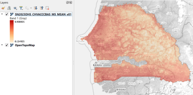
USAID raster of vaccinated children in Senegal

GIS Data Sources Spring Roundup

It’s been awhile since I’ve written a post that showcases different GIS datasets. So in this one, I’ll provide an overview of some free and open data sources that I’ve learned about and worked with this past spring semester. The topics in these series include: global land use and land cover, US heat and temperature, detailed population data for India, and public health in low and middle income countries.

GLAD Global Land Analysis and Discovery

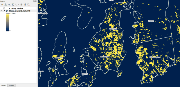
The GLAD lab at the Department of Geographical Sciences at the University of Maryland produces over a dozen GIS datasets related to global land use, land cover, and change in land surface over time. Last semester I had folks who were interested in looking at recent global change in cropland and forest. GLAD publishes rasters that include point-in-time coverage, period averages, and net change and loss over the period 2000 to 2020. Much of the data is generated from LANDSAT, and resolution varies from 30m to 3km. Other series include tropical forest cover and change, tree canopies, forest lost due to fires, a few non-global datasets that focus on specific regions, and LANDSAT imagery that’s been processed so it’s ready for LULC analysis.

Most of the sets have been divided up into tiles and segmented based on what they’re depicting (change in crops, forest, etc). The download process is basic point and click, and for larger sets they provide a list of tifs in a text file so you can automate downloading by writing a basic script. Alternatively, they also publish datasets via Google Earth Engine.

GLAD cropland in Rhode Island
GLAD Cropland Extent in 2019 in QGIS, Zoomed in to Optimal Resolution in SE Rhode Island

US Heat Severity Index

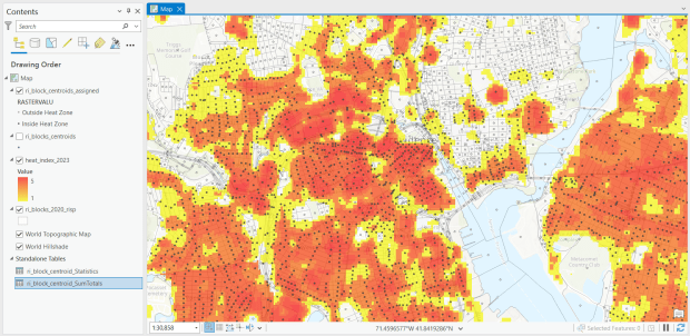
For the past few years, the Trust for Public Land has published an annual heat severity index. This layer represents the relative heat severity for 30m pixels for every city in the United States; depicting where areas of cities are hotter than the average temperature for that same city as a whole (i.e. the surface temperature for each pixel relative to the general air temperature reading for the entire city). Severity is measured on a scale of 1 to 5, with 1 being a relatively mild and 5 being severe heat. The index is generated from a Heat Anomalies raster which they also provide; it contains the relative degrees Fahrenheit difference between any given pixel and the mean heat value for the city in which the pixel is located. Both datasets are generated from 30-meter Landsat 8 imagery, band 10 (ground-level thermal sensor) from summertime images.

The dataset is published as an ArcGIS image service. The easiest way to access it is by to adding it from the Living Atlas to ArcGIS Pro (or Online), and then export the service from there as a raster feature class (while doing so, you can also clip the layer to a smaller area of interest). It’s possible that you can also connect to it as an ArcGIS REST Server in QGIS, but I haven’t tried. While there are files that go back to 2019, the methodology has changed over time, so studying this as a national, annual time series is not appropriate. The coverage area expanded from just large, incorporated cities in earlier years to the entire US in recent years.

US Heat Index in Rhode Island
US Heat Severity Index 2023 in ArcGIS Pro, Providence and Adjacent Areas with Census Blocks

SHRUG – India

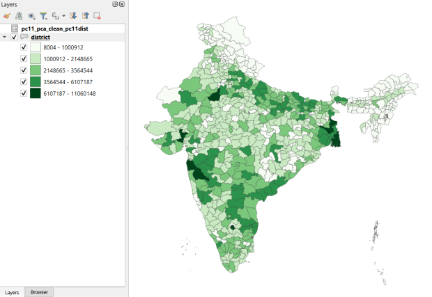
Created and hosted by the Development Data Lab (a collaborative project created by academic researchers from several universities), the Socioeconomic High-resolution Rural-Urban Geographic Platform for India (SHRUG) is an open access repository consisting of datasets for India’s medium to small geographies (districts, subdistricts, constituencies, towns, and villages), linked together with a set of common geographic IDs. Getting geographically detailed census data for India is challenging as you have to purchase it through 3rd party vendors, and comparing data across time is tough given the complex sets of administrative subdivisions and constant revisions to geographic identifiers. SHRUG makes it easy and open source, providing boundaries from the 2011 census and a unique ID that links geographies together and across time, back to 1991. In addition to the census, there are also environmental and election datasets.

Polygon boundaries can be downloaded as shapefiles or geopackages, and tabular data is available in CSV and DTA (STATA) formats. Researchers can also contribute data created from their own research to the repository.

SHRUG India District Data
SHRUG India Districts Total Population Data from 2011 Census in QGIS

USAID Spatial Data and Population Indicators

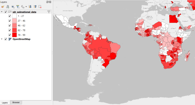
USAID published the detailed Demographic and Health Surveys (DHS) as far back as the mid 1980s for many of the world’s low and middle income countries. The surveys captured information about fertility, family planning, maternal and child health, gender, HIV/AIDS, literacy, malaria, nutrition, and sanitation. A selection of different countries were surveyed each year, and for most countries data was captured at two or three different points in time over a 40 year period. While researchers had to submit proposals and request access to the microdata (individual person and household level responses), the agency generated population-level estimates for countries and country subdivisions that were readily downloadable. They also generated rasters that interpolated certain variables across the surface of a country (the header image for this post is a raster of Senegal in 2023, illustrating the percentage of children aged 12-36 months who are vaccinated for eight fundamental diseases, including measles and polio). The rasters, boundary files, and a selection of survey indicators pre-joined to country and subdivision boundaries were published in their Spatial Data Repository. You could access the full range of population indicators as tables from a point and click website, or alternatively via API.

I’m writing in the past tense, as USAID has been decimated and de-funded by DOGE. There is currently no way to request access to the microdata. The summary data is still available on the USAID website (via links in the previous paragraph), but who knows for how long. As part of the Data Rescue Project, I captured both the Spatial Data Repository and the Indicators data, and posted them on DataLumos, an archive of archived federal government datasets. You can download these datasets in bulk from DataLumos, from the links under the title for this section. Unfortunately this series is now an archive of data that will be frozen in time, with no updates expected. The loss of these surveys is not only detrimental to researchers and policymakers, but to millions of the world’s most vulnerable people, whose health and well-being were secured and improved thanks to the information this data provided.

USAID Spatial Indicators Data
USAID Country Subdivisions in QGIS where Recent Data is Available on % Children who are Vaccinated