series – census book

Comparing ACS Estimates Over Time: Are They Really Different?

I often get questions about comparing American Community Survey (ACS) estimates from the US Census Bureau over time. This process is more complicated than you’d think, as the ACS wasn’t designed as a time series dataset. The Census Bureau does publish comparative profile tables that compare two period estimates (in data.census.gov), but for a limited number of geographies (states, counties, metro areas).

For me, this question often takes the form of comparing change at the census tract-level for mapping and GIS projects. In this post, we’ll look at the primary considerations for comparing estimates over time, and I will walk through an example with spreadsheet formulas for calculating: change and percent change (estimates and margins of error), coefficients of variation, and tests for statistical difference. We’ll conclude with examples of mapping this data.

Primary considerations

  1. The ACS is published in 1-year and 5-year period estimates. 1-year estimates are only available for areas that have at least 65,000 people, which means if you’re looking at small geographies (census tracts, ZCTAs) or rural areas that have small populations (most counties, county subdivisions, places) you will need to use the 5-year series. When comparing 5-year estimates, you should only compare non-overlapping time periods. For example, you would not compare the 2021 ACS (2017-2021) with the 2020 ACS (2016-2020) as these estimates have four years of sample data in common. In contrast, 2021 and 2016 (2012-2016) could be compared as they do not overlap…
  2. …but, census geography changes over time. All statistical areas (block groups, tracts, ZCTAs, PUMAs, census designated-places, etc.) are updated every ten years with each decennial census. Areas can be re-numbered, aggregated, subdivided, or modified as populations change. This complicates comparisons; 2021 data uses geography created in 2020, while 2016 data uses geography from 2010. The only non-overlapping ACS periods with identical geographic areas would be 2014 (2010-2014) and 2019 (2015-2019). The only other alternative would be to use normalized census data, which involves additional work. While most legal areas (states, counties) can change at any time, they are generally more stable and you can make comparisons over a longer-period with modest adjustments.
  3. All ACS estimates are fuzzy, representing a midpoint within a possible range of values (indicated with a margin of error) at a 90% confidence level. Because of sampling variability, any difference that you see between one time period and the next could be noise and not actual change. If you’re working with small geographies or small population groups, you’ll encounter large margins of error and it will be difficult to measure actual change. In addition, it’s often difficult to detect change in any area that isn’t experiencing either substantive growth or decline.

ACS Formulas

Let’s look at an example where we’ll use formulas to: calculate change over time, measure the reliability of a difference estimate, and determine whether two estimates are significantly different. I downloaded table B25064 Median Gross Rent (dollars) from the 5-year 2014 (2010-2014) and 2019 (2015-2019) ACS for all census tracts in Providence County, RI, and stitched them together into one spreadsheet. In this post I’ve replaced the cell references with an abbreviated label that indicates what should be referenced (i.e. Est1_MOE is the margin of error for the first estimate). You can download a copy of the spreadsheet with these examples.

  1. To calculate the change / difference for an estimate, subtract one from the other.
  2. To calculate the margin of error for this difference, take the square root of the sum of the squares for each estimate’s margin of error (MOE):
=ROUND(SQRT((Est1_MOE^2)+(Est2_MOE^2)),0)
Spreadsheet with ACS formula to compute margin of error for change / difference
  1. To calculate percent change, divide the difference by the earliest estimate (Est1), and multiply by 100.
  2. To calculate the margin of error for the percent change, use the ACS formula for computing a ratio:
=ROUND(((SQRT(Est2_MOE^2+((Est2/Est1)^2*Est1_MOE^2)))/Est1)100,1)

Divide the 2nd estimate by the 1st and square it, multiply that by the square of the 1st estimate’s MOE, add that to the square of the 2nd estimate’s MOE. Take the square root of that result, then divide by the 1st estimate and multiply by 100. Note that this is formula for percent change is different from the one used for calculating a percent total (the latter uses the formula for a proportion; switch the plus symbol under the square root to a minus for percent totals).

Spreadsheet with ACS formula to compute margin of error for percent change / difference
  1. To characterize the overall accuracy of the new difference estimate, calculate its coefficient of variation (CV):
=ROUND(ABS((Est_MOE/1.645)/Est)*100,0)

Divide the MOE for the difference by 1.645, which is the Z-value for a 90% confidence interval. Divide that by the difference itself, and multiply by 100. Since we can have positive or negative change, we take the absolute value of the result.

Spreadsheet with ACS formula to compute coefficient of variation
  1. To convert the CV into the generally recognized reliability categories:
=IF(CV<=12,"high",IF(CV>=35,"low","medium"))

If the CV value is between 0 to 12, then it’s considered to be highly reliable, else if the CV value is greater than or equal to 35 it’s considered to be of low reliability, else it is considered to be of medium reliability (between 13 and 34). Note: this is a conservative range; search around and you’ll find more liberal examples that use 0-15, 16-40, 41+.

  1. To measure whether two estimates are significantly different from each other, use the statistical difference formula:
=ROUND(ABS((Est2-Est1)/(SQRT((Est1_MOE/1.645)^2+(Est2_MOE/1.645)^2))),3)

Divide the MOE for both the 1st and 2nd estimate by 1.645 (Z value for 90% confidence), take the sum of their squares, and then square root. Subtract the 1st estimate from the 2nd, and then divide. Again in this case, since we could have a positive or negative value we take the absolute value.

Spreadsheet with ACS formula to compute significant difference
  1. To create a boolean significant or not value:
=IF(SigDif>1.645,1,0)

If the significant difference value is greater than 1.645, then the two estimates are significantly different from each other (TRUE 1), implying that some actual change occurred. Otherwise, the estimates are not significantly different (FALSE 0), which means any difference is likely the result of variability in the sample, or any true difference is hidden by this variability.

ALWAYS CHECK YOUR WORK! It’s easy to put parentheses in the wrong place or transpose a cell reference. Take one or two examples and plug them into Cornell PAD’s ACS Calculator, or into Fairfax County VA’s ACS Tools (spreadsheets with formulas – bottom of page). The Census Bureau also provides a spreadsheet that lets you test multiple values for significant difference. Caveat: for the Cornell calculator use the ratio option instead of change when testing. For some reason its change formula never matches my results, but the Fairfax spreadsheets do. I’ve also checked my formulas against the Census Bureau’s ACS Handbooks, and they clearly say to use the ratio formula for percent change.

Interpreting Results

Let’s take a look at a few of the records to understand the results. In Census Tract 1.01, median gross rent increased from $958 (+/- 125) in 2014 to $1113 (+/- 73) in 2019, a change of $155 (+/- 145) and a percent change of 16.2% (+/- 17%). The CV for the change estimate was 57, indicating that this estimate has low reliability; the margin of error is almost equal to the estimate, and the change could have been as little as $10 or as great as $300! The rent estimates for 2014 and 2019 are statistically different but not by much (1.761, higher than 1.645). The margins of error for the two estimates do overlap slightly (with $1,083 being the highest possible value in 2014 and $1,040 the lowest possible value in 2019).

Spreadsheet comparing values for different census tracts

In Census Tract 4, rent increased from $863 (+/- 122) to $1003 (+/- 126), a change of $140 (+/- 175) and percent change of 16.2% (+/- 22%). The CV for the change estimate was 76, indicating very low reliability; indeed the MOE exceeds the value of the estimate. With a score of 1.313 the two estimates for 2014 / 2019 are not significantly different from each other, so any difference here is clouded by sample noise.

In Census Tract 9, rent increased from $875 (+/- 56) to $1083 (+/- 62), a change of $208 (+/- 84) or 23.8% (+/- 10.6%). Compared to the previous examples, these MOEs are much lower than the estimates, and the CV value for the difference is 25, indicating medium reliability. With a score of 4.095, these two estimates are significantly different from each other, indicating substantive change in rent in this tract. The highest possible value in 2014 was $931, and the lowest possible value in 2019 was $1021, so there is no overlap in the value ranges over time.

Mapping Significant Difference and CVs

I grabbed the Census Cartographic Boundary File for tracts for Rhode Island in 2019, and selected out just the tracts for Providence County. I made a copy of my worksheet where I saved the data as text and values in a separate sheet (removing the formulas and encoding the actual outputs), and joined this sheet to the shapefile using the AFFGEOID. The City of Providence and surrounding cities and suburban areas appear in the southeast corner of the county.

The map on the left displays simple percent change over time. In the map on the right, I applied a filter to select just tracts where change was significantly different (the non-significant tracts are symbolized with hash marks). In the screenshots, the count of the number of tracts in each class appears in brackets; I used natural breaks, then modified to place all negative values in the same class. Of the 141 tracts, only 49 had statistically different values. The first map is a gross misrepresentation, as change for most of the tracts can’t be distinguished from sampling variability.

Map of difference on left, significant difference on right
Percent Change in Median Gross Rent 2010-14 to 2015-19: Change on Left, Change Where Both Rent Estimates were Significantly Different on Right

A refined version of the map on the right appears below. In this one, I converted the tracts from polygons to points in a new layer, applied a filter to select significantly different tracts, and symbolized the points by their CV category. Of the 49 statistically different tracts, the actual estimate of change was of low reliability for 32 and medium reliability for the rest. So even if the difference is significant, the precision of most of these estimates is poor.
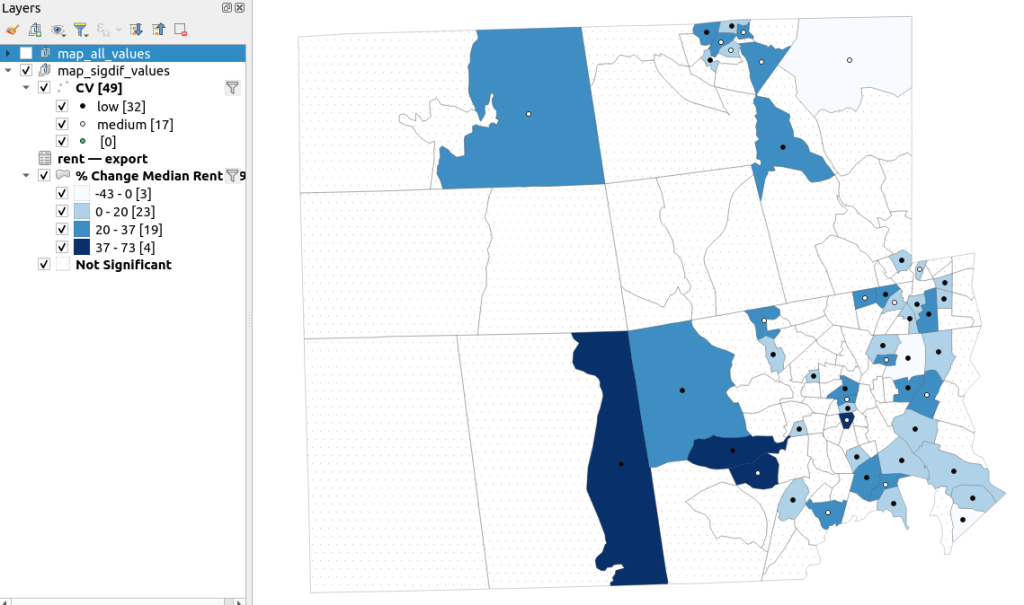
Providence County, Significant Difference in Median Rent Map
Percent Change in Median Gross Rent 2010-14 to 2015-19 with CV Values, for Tracts with Significantly Different Estimates, Providence County RI

Conclusion

Comparing change over time for ACS estimates is complex, time consuming, and yields many dubious results. What can you do? The size of the MOE relative to the estimate tends to decline as you look at either larger or more populous areas, or larger and fewer subcategories (i.e. 4 income brackets instead of 8). You could also look at two period estimates that are further apart, making it more likely that you’ll see changes; say 2005-2009 compared to 2016-2020. But – you’ll have to cope with normalizing the data. Places that are rapidly changing will exhibit more difference than places that aren’t. If you are studying basic demographics (age / sex / race / tenure) and not socio-economic indicators, use the decennial census instead, as that’s a count and not a sample survey. Ultimately, it’s important to address these issues, and be honest. There’s a lot of bad research where people ignore these considerations, and thus make faulty claims.

For more information, visit the Census Bureau’s page on Comparing ACS Data. Chapter 6 of my book Exploring the US Census covers the American Community Survey and has additional examples of these formulas. As luck would have it, it’s freely accessible as a preview chapter from my publisher, SAGE.

Final caveat: dollar values in the ACS are based on the release year of the period estimate, so 2010-2014 rent is in 2014 dollars, and 2015-2019 is in 2019 dollars. When comparing dollar values over time you should adjust for inflation; I skipped that here to keep the examples a bit simpler. Inflation in the 2010s was rather modest compared to the 2020s, but still could push tracts that had small changes in rent to none when accounted for.

US Census Data ALA Tech Report

ALA Tech Report on Using Census Data for Research

I have written a new report that’s just been released: US Census Data: Concepts and Applications for Supporting Research, was published as the May / June 2022 issue of the American Library Association’s Library and Technology Reports. It’s available for purchase digitally or in hard copy from the ALA from now through next year. It will also be available via EBSCOhost as full text, sometime this month. One year from now, the online version will transition to become a free and open publication available via the tech report archives.

The report was designed to be a concise primer (about 30 pages) for librarians who want to be knowledgeable with assisting researchers and students with finding, accessing, and using public summary census data, or who want to apply it to their own work as administrators or LIS researchers. But I also wrote it in such a way that it’s relevant for anyone who is interested in learning more about the census. In some respects it’s a good distillation of my “greatest hits”, drawing on work from my book, technical census-related blog posts, and earlier research that used census data to study the distribution of public libraries in the United States.

Chapter Outline

  1. Introduction
  2. Roles of the Census: in American society, the open data landscape, and library settings
  3. Census Concepts: geography, subject categories, tables and universes
  4. Datasets: decennial census, American Community Survey, Population Estimates, Business Establishments
  5. Accessing Data: data.census.gov, API with python, reports and data summaries
  6. GIS, historical research, and microdata: covers these topics plus the Current Population Survey
  7. The Census in Library Applications: overview of the LIS literature on site selection analysis and studying library access and user populations

I’m pleased with how it turned out, and in particular I hope that it will be used by MLIS students in data services and government information courses.

Although… I must express my displeasure with the ALA. The editorial team for the Library Technology Reports was solid. But once I finished the final reviews of the copy edits, I was put on the spot to write a short article for the American Libraries magazine, primarily to promote the report. This was not part of the contract, and I was given little direction and a month at a busy time of the school year to turn it around. I submitted a draft and never heard about it again – until I saw it in the magazine last week. They cut and revised it to focus on a narrow aspect of the census that was not the original premise, and they introduced errors to boot! As a writer I have never had an experience where I haven’t been given the opportunity to review revisions. It’s thoroughly unprofessional, and makes it difficult to defend the traditional editorial process as somehow being more accurate or thorough compared to the web posting and tweeting masses. They were apologetic, and are posting corrections. I was reluctant to contribute to the magazine to begin with, as I have a low opinion of it and think it’s deteriorated in recent years, but that’s a topic for a different discussion.

Stepping off the soapbox… I’ll be attending the ALA annual conference in DC later this month, to participate on a panel that will discuss the 2020 census, and to reconnect with some old colleagues. So if you want to talk about the census, you can buy me some coffee (or beer) and check out the report.

A final research and publication related note – the map that appears at the top of my post on the distribution of US public libraries from several years back has also made it into print. It appears on page 173 of The Argument Toolbox by K.J. Peters, published by Broadview Press. It was selected as an example of using visuals for communicating research findings, making compelling arguments in academic writing, and citing underlying sources to establish credibility. I’m browsing through the complimentary copy I received and it looks excellent. If you’re an academic librarian or a writing center professional and are looking for core research method guides, I would recommend checking it out.

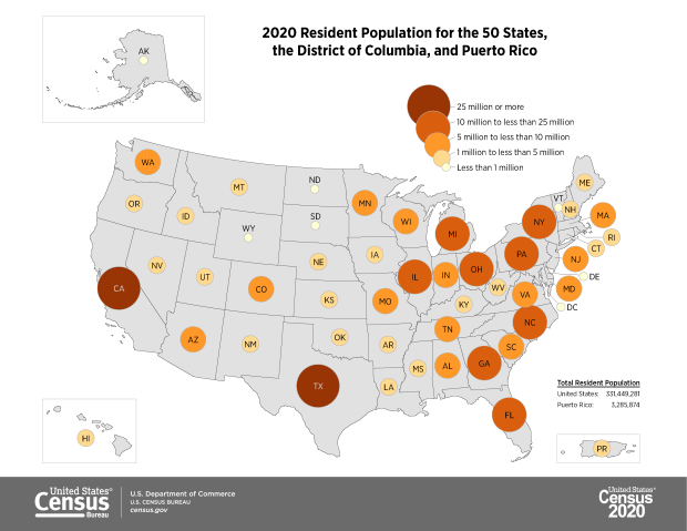
2020 Resident Population Map

2020 Census Updates

In late summer and early fall I was hammering out the draft for an ALA Tech Report on using census data for research (slated for release early 2022). The earliest 2020 census figures have been released and there are several issues surrounding this, so I’ll provide a summary of what’s happening here. Throughout this post I link to Census Bureau data sources, news bulletins, and summaries of trends, as well as analysis on population trends from Bill Frey at Brookings and reporting from Hansi Lo Wang and his colleagues at NPR.

Count Result and Reapportionment Numbers

The re-apportionment results were released back in April 2020, which provided the population totals for the US and each of the states that are used to reallocate seats in Congress. This data is typically released at the end of December of the census year, but the COVID-19 pandemic and political interference in census operations disrupted the count and pushed all the deadlines back.

Despite these disruptions, the good news is that the self-response rate, which is the percentage of households who submit the form on their own without any prompting from the Census Bureau, was 67%, which is on par with the 2010 census. This was the first decennial census where the form could be submitted online, and of the self-responders 80% chose to submit via the internet as opposed to paper or telephone. Ultimately, the Bureau said it reached over 99% of all addresses in its master address file through self-response and non-response follow-ups.

The bad news is that the rate of non-response to individual questions was much higher in 2020 than in 2010. Non-responses ranged from a low of 0.52% for the total population count to a high of 5.95% for age or date of birth. This means that a higher percentage of data will have to be imputed, but this time around the Bureau will rely more on administrative records to fill the gaps. They have transparently posted all of the data about non-response for researchers to scrutinize.

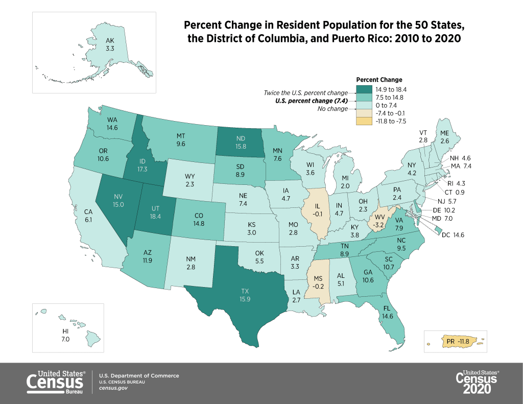
The apportionment results showed that the population of the US grew from approximately 309 million in 2010 to 331 million in 2020, a growth rate of 7.35%. This is the lowest rate of population growth since the 1940 census that followed the Great Depression. Three states lost population (West Virginia, Mississippi, and Illinois), which is the highest number since the 1980 census. The US territory of Puerto Rico lost almost twelve percent of its population. Population growth continues to be stronger in the West and South relative to the Northeast and Midwest, and the fastest growing states are in the Mountain West.

https://www.census.gov/library/visualizations/2021/dec/2020-percent-change-map.html

Public Redistricting Data

The first detailed population statistics were released as part of the redistricting data file, PL 94-171. Data in this series is published down to the block level, the smallest geography available, so that states can redraw congressional and other voting districts based on population change. Normally released at the end of March, this data was released in August 2021. This is a small package that contains the following six tables:

  • P1. Race (includes total population count)
  • P2. Hispanic or Latino, and Not Hispanic or Latino by Race
  • P3. Race for the Population 18 Years and Over
  • P4. Hispanic or Latino, and Not Hispanic or Latino by Race for the Population 18 Years and
    Over
  • P5. Group Quarters Population by Major Group Quarters Type
  • H1. Occupancy Status (includes total housing units)

The raw data files for each state can be downloaded from the 2020 PL 94-171 page and loaded into stats packages or databases. That page also provides infographics (including the maps embedded in this post) and data summaries. Data tables can be readily accessed via data.census.gov, or via IPUMS NHGIS.

The redistricting files illustrate the increasing diversity of the United States. The number of people identifying as two or more races has grown from 2.9% of the total population in 2010 to 10.2% in 2020. Hispanics and Latinos continue to be the fastest growing population group, followed by Asians. The White population actually shrank for the first time in the nation’s history, but as NPR reporter Hansi-Lo Wang and his colleagues illustrate this interpretation depends on how one measures race; as race alone (people of a single race) or persons of any race (who selected white and another race), and whether or not Hispanic-whites are included with non-Hispanic whites (as Hispanic / Latino is not a race, but is counted separately as an ethnicity, and most Hispanics identify their race as White or Other). The Census Bureau has also provided summaries using the different definitions. Other findings: the nation is becoming progressively older, and urban areas outpaced rural ones in population growth. Half of the counties in the US lost population between 2010 and 2020, mostly in rural areas.

https://www.census.gov/library/visualizations/2021/dec/percent-change-county-population.html

2020 Demographic and Housing Characteristics and the ACS

There still isn’t a published timeline for the release of the full results in the Demographic and Housing Characteristics File (DHC – known as Summary File 1 in previous censuses, I’m not sure if the DHC moniker is replacing the SF1 title or not). There are hints that this file is going to be much smaller in terms of the number of tables, and more limited in geographic detail compared to the 2010 census. Over the past few years there’s been a lot of discussion about the new differential privacy mechanisms, which will be used to inject noise into the data. The Census Bureau deemed this necessary for protecting people’s privacy, as increased computing power and access to third party datasets have made it possible to reverse engineer the summary census data to generate information on individuals.

What has not been as widely discussed is that many tables will simply not be published, or will only be summarized down to the county-level, also for the purpose of protecting privacy. The Census Bureau has invited the public to provide feedback on the new products and has published a spreadsheet crosswalking products from 2010 and 2020. IPUMS also released a preliminary list of tables that could be cut or reduced in specificity (derived from the crosswalk), which I’m republishing at the bottom of this post. This is still preliminary, but if all these changes are made it would drastically reduce the scope and specificity of the decennial census.

And then… there is the 2020 American Community Survey. Due to COVID-19 the response rates to the ACS were one-third lower than normal. As such, the sample is not large or reliable enough to publish the 1-year estimate data, which is typically released in September. Instead, the Census will publish a smaller series of experimental tables for a more limited range of geographies at the end of November 2021. There is still no news regarding what will happen with the 5-year estimate series that is typically released in December.

Needless to say, there’s no shortage of uncertainty regarding census data in 2020.

Tables in 2010 Summary File 1 that Would Have Less Geographic Detail in 2020 (Proposed)

Table NameProposed 2020 Lowest Level of Geography2010 Lowest Level of Geography
Hispanic or Latino Origin of Householder by Race of HouseholderCountyBlock
Household Size by Household Type by Presence of Own ChildrenCountyBlock
Household Type by Age of HouseholderCountyBlock
Households by Presence of People 60 Years and Over by Household TypeCountyBlock
Households by Presence of People 60 Years and Over, Household Size, and Household TypeCountyBlock
Households by Presence of People 75 Years and Over, Household Size, and Household TypeCountyBlock
Household Type by Household SizeCountyBlock
Household Type by Household Size by Race of HouseholderCountyBlock
Relationship by Age for the Population Under 18 YearsCountyBlock
Household Type by Relationship for the Population 65 Years and OverCountyBlock
Household Type by Relationship for the Population 65 Years and Over by RaceCountyBlock
Family Type by Presence and Age of Own ChildrenCountyBlock
Family Type by Presence and Age of Own Children by Race of HouseholderCountyBlock
Age of Grandchildren Under 18 Years Living with A Grandparent HouseholderCountyBlock
Household Type by Relationship by RaceCountyBlock
Average Household Size by AgeTo be determinedBlock
Household Type for the Population in HouseholdsTo be determinedBlock
Household Type by Relationship for the Population Under 18 YearsTo be determinedBlock
Population in Families by AgeTo be determinedBlock
Average Family Size by AgeTo be determinedBlock
Family Type and Age for Own Children Under 18 YearsTo be determinedBlock
Total Population in Occupied Housing Units by TenureTo be determinedBlock
Average Household Size of Occupied Housing Units by TenureTo be determinedBlock
Sex by Age for the Population in HouseholdsCountyTract
Sex by Age for the Population in Households by RaceCountyTract
Presence of Multigenerational HouseholdsCountyTract
Presence of Multigenerational Households by Race of HouseholderCountyTract
Coupled Households by TypeCountyTract
Nonfamily Households by Sex of Householder by Living Alone by Age of HouseholderCountyTract
Group Quarters Population by Sex by Age by Group Quarters TypeStateTract

Tables in 2010 Summary File 1 That Would Be Eliminated in 2020 (Proposed)

Population in Households by Age by Race of Householder
Average Household Size by Age by Race of Householder
Households by Age of Householder by Household Type by Presence of Related Children
Households by Presence of Nonrelatives
Household Type by Relationship for the Population Under 18 Years by Race
Household Type for the Population Under 18 Years in Households (Excluding Householders, Spouses, and Unmarried Partners)
Families*
Families by Race of Householder*
Population in Families by Age by Race of Householder
Average Family Size by Age by Race of Householder
Family Type by Presence and Age of Related Children
Family Type by Presence and Age of Related Children by Race of Householder
Group Quarters Population by Major Group Quarters Type*
Population Substituted
Allocation of Population Items
Allocation of Race
Allocation of Hispanic or Latino Origin
Allocation of Sex
Allocation of Age
Allocation of Relationship
Allocation of Population Items for the Population in Group Quarters
American Indian and Alaska Native Alone with One Tribe Reported for Selected Tribes
American Indian and Alaska Native Alone with One or More Tribes Reported for Selected Tribes
American Indian and Alaska Native Alone or in Combination with One or More Other Races and with One or More Tribes Reported for Selected Tribes
American Indian and Alaska Native Alone or in Combination with One or More Other Races
Asian Alone with One Asian Category for Selected Groups
Asian Alone with One or More Asian Categories for Selected Groups
Asian Alone or in Combination with One or More Other Races, and with One or More Asian Categories for Selected Groups
Native Hawaiian and Other Pacific Islander Alone with One Native Hawaiian and Other Pacific Islander Category for Selected Groups
Native Hawaiian and Other Pacific Islander Alone with One or More Native Hawaiian and Other Pacific Islander Categories for Selected Groups
Native Hawaiian and Other Pacific Islander Alone or in Combination with One or More Races, and with One or More Native Hawaiian and Other Pacific Islander Categories for Selected Groups
Hispanic or Latino by Specific Origin
Sex by Single Year of Age by Race
Household Type by Number of Children Under 18 (Excluding Householders, Spouses, and Unmarried Partners)
Presence of Unmarried Partner of Householder by Household Type for the Population Under 18 Years in Households (Excluding Householders, Spouses, and Unmarried Partners)
Nonrelatives by Household Type
Nonrelatives by Household Type by Race
Group Quarters Population by Major Group Quarters Type by Race
Group Quarters Population by Sex by Major Group Quarters Type for the Population 18 Years and Over by Race
Total Races Tallied for Householders
Hispanic or Latino Origin of Householders by Total Races Tallied
Total Population in Occupied Housing Units by Tenure by Race of Householder
Average Household Size of Occupied Housing Units by Tenure
Average Household Size of Occupied Housing Units by Tenure by Race of Householder
Occupied Housing Units Substituted
Allocation of Vacancy Status
Allocation of Tenure
Tenure by Presence and Age of Related Children
* Counts for these tables are available in other proposed DHC tables. For example, the count of families is available in the Household Type table, which will be available at the block level in the 2020 DHC. 
Rank Change Grid

Creating Heatmaps to Show Change in Rank Over Time with Python

In this post I’ll demonstrate how I created annotated heatmaps (or what I’m calling a rank change grid) showing change in rank over time using Python and Matplotlib’s imshow plots. I was writing a report on population trends and internal migration using the IRS county to county migration dataset, and wanted to depict the top origins and destinations of migrants for New York City and the New York Metropolitan Area and how they changed from year to year.

I hit upon this idea based on an example in the Matplotlib documentation using the imshow plot. Imshow was designed for manipulating and creating images, but since images are composed of rows and columns of pixels you can use this function to create grids (for GIS folks, think of a raster). The rows can indicate rank from 1 to N, while the columns could represent time, which in my case is years. I could label each grid cell with the name of a place (i.e. origin or destination), and if a place changes ranks over time I could assign the cell a color indicating increase or decrease; otherwise I’d assign a neutral color indicating no change. The idea is that you could look at place at a given rank in year 1 and follow it across the chart by looking at the label. If a new place appears in a given position, the color change clues you in, and you can quickly scan to see whether a given place went up or down.

The image below shows change in rank for the top metro area destinations for migrants leaving the NYC metro from 2011 to 2018. You can see that metro Miami was the top destination for several years, up until 2016-17 when it flips positions with metro Philadelphia, which had been the number 2 destination. The sudden switch from a neutral color indicates that the place occupying this rank is new. You can also follow how 3rd ranked Bridgeport falls to 4th place in the 2nd year (displaced by Los Angeles), remains in 4th place for a few years, and then falls to 5th place (again bumped by Los Angeles, which falls from 3rd to 4th as it’s bumped by Poughkeepsie).

NYC Metro Outflow Grid
Annual Change in Ranks for Top Destinations for NYC Metro Migrants (Metro Outflows)

I opted for this over a more traditional approach called a bump chart (also referred to a slope chart or graph), with time on the x-axis and ranks on the y-axis, and observations labeled at either the first or last point in time. Each observation is assigned a specific color or symbol, and lines connect each observation to its changing position in rank so you can follow it along the chart. Interpreting these charts can be challenging; if there are frequent changes in rank the whole thing begins to look like spaghetti, and the more observations you have the tougher it gets to interpret. Most of the examples I found depicted a small and finite number of observations. I have hundreds of observations and only want to see the top ten, and if observations fall in and out of the top N ranks you get several discontinuous lines which look odd. Lastly, neither Matplotlib or Pandas have a default function for creating bump charts, although I found a few examples where you could create your own.

Creating the rank change grids was a three-part process that required: taking the existing data and transforming it into an array of the top or bottom N values that you want to show, using that array to generate an array that shows change in ranks over time, and generating a plot using both arrays, one for the value and the other for the labels. I’ll tackle each piece in this post. I’ve embedded the functions at the end of each explanation; you can also look at my GitHub repo that has the Jupyter Notebook I used for the analysis for the paper (to be published in Sept 2020).

Create the Initial Arrays

In the paper I was studying flows between NYC and other counties, and the NYC metro area and other metropolitan statisical areas. I’ll refer just to the metro areas as my example in this post, but my functions were written to handle both types of places, stored in separate dataframes. I began with a large dataframe with every metro that exchanged migrants with the NYC metro. There is a row for each metro where the index is the Census Bureau’s unique FIPS code, and columns that show inflows, outflows, and net flows year by year (see image below). There are some rows that represent aggregates, such as flows to all non-metro areas and the sum of individual metro flows that could not be disclosed due to privacy regulations.

Initial Dataframe
Initial Dataframe

The first step is to create an array that has just the top or bottom N places that I want to depict, just for one flow variable (in, out, or net). Why an array? Arrays are pretty solid structures that allow you to select specific rows and columns, and they mesh nicely with imshow charts as each location in the matrix can correspond with the same location in the chart. Most of the examples I looked at used arrays. It’s possible to use other structures but it’s more tedious; nested Python lists don’t have explicit rows and columns so a lot of looping and slicing is required, and with dataframes there always seems to be some catch with data types, messing with the index versus the values, or something else. I went with NumPy’s array type.

I wrote a function where I pass in the dataframe, the type of variable (in, out, or net flow), the number of places I want, whether they are counties or metro areas, and whether I want the top or bottom N records (true or false). Two arrays are returned: the first shows the FIPS unique ID numbers of each place, while the second returns the labels. You don’t have to do anything to calculate actual ranks, because once the data is sorted the ranks become implicit; each row represents ranks 1 through 10, each column represents a year, and the ID or label for a place that occupies each position indicates its rank for that year.

In my dataframe, the names of the columns are prefixed based on the type of variable (inflow, outflow, or net flow), followed by the year, i.e. inflows_2011_12. In the function, I subset the dataframe by selecting columns that start with the variable I want. I have to deal with different issues based on whether I’m looking at counties or metro areas, and I need to get rid of any IDs that are for summary values like the non-metro areas; these IDS are stored in a list called suppressed, and the ~df.indexisin(suppressed) is pandaesque for taking anything that’s not in this list (the tilde acts as not). Then, I select the top or bottom values for each year, and append them to lists in a nested list (each sub-list represents the top / bottom N places in order for a given year). Next, I get the labels I want by creating a dictionary that relates all ID codes to label names, pull out the labels for the actual N values that I have, and format them before appending them to lists in a nested list. For example, the metro labels are really long and won’t fit in the chart, so I split them and grab just the first piece: Albany-Schenectady-Troy, NY becomes Albany (split using the dash) while Akron, OH becomes Akron (if no dash is present, split at comma). At the end, I use np.array to turn the nested lists into arrays, and transpose (T) them so rows become ranks and years become values. The result is below:

ID Array
Function and Result for Creating Array of IDs Top N Places
# Create array of top N geographies by flow type, with rows as ranks and columns as years
# Returns 2 arrays with values for geographies (id codes) and place names
# Must specify: number of places to rank, counties or metros, or sort by largest or smallest (True or False)
def create_arrays(df,flowtype,nsize,gtype,largest):
    geogs=[]
    cols=[c for c in df if c.startswith(flowtype)]
    for c in cols:
        if gtype=='counties':
            row=df.loc[~df.index.isin(suppressed),[c]]
        elif gtype=='metros':
            row=df.loc[~df.index.isin(msuppressed),[c]]
        if largest is True:
            row=row[c].nlargest(nsize)
        elif largest is False:
            row=row[c].nsmallest(nsize)
        idxs=list(row.index)
        geogs.append(idxs)

    if gtype=='counties':
        fips=df.to_dict()['co_name']
    elif gtype=='metros':
        fips=df.to_dict()['mname']
    labels=[]
    for row in geogs:
        line=[]
        for uid in row:
            if gtype=='counties':
                if fips[uid]=='District of Columbia, DC':
                    line.append('Washington\n DC')
                else:
                    line.append(fips[uid].replace('County, ','\n')) #creates short labels
            elif gtype=='metros':
                if '-' in fips[uid]:
                    line.append(fips[uid].split('-')[0]) #creates short labels
                else:
                    line.append(fips[uid].split(',')[0])
        labels.append(line)

    a_geogs=np.array(geogs).T
    a_labels=np.array(labels).T

    return a_geogs, a_labels

Change in Rank Array

Using the array of geographic ID codes, I can feed this into function number two to create a new array that indicates change in rank over time. It’s better to use the ID code array as we guarantee that the IDs are unique; labels (place names) may not be unique and pose all kinds of formatting issues. All places are assigned a value of 0 for the first year, as there is no previous year to compare them to. Then, for each subsequent year, we look at each value (ID code) and compare it to the value in the same position (rank) in the previous column (year). If the value is the same, that place holds the same rank and is assigned a 0. Otherwise, if it’s different we look at the new value and see what position it was in in the previous year. If it was in a higher position last year, then it has declined and we assign -1. If it was in a lower position last year or was not in the array in that column (i.e. below the top 10 in that year) it has increased and we assign it a value of 1. This result is shown below:

Rank Change Array
Function and Result for Creating Change in Rank Array
# Create array showing how top N geographies have changed ranks over time, with rows as rank changes and
# columns as years. Returns 1 array with values: 0 (no change), 1 (increased rank), and -1 (descreased rank)
def rank_change(geoarray):
    rowcount=geoarray.shape[0]
    colcount=geoarray.shape[1]

    # Create a number of blank lists
    changelist = [[] for _ in range(rowcount)]

    for i in range(colcount):
        if i==0:
            # Rank change for 1st year is 0, as there is no previous year
            for j in range(rowcount):
                changelist[j].append(0)
        else:
            col=geoarray[:,i] #Get all values in this col
            prevcol=geoarray[:,i-1] #Get all values in previous col
            for v in col:
                array_pos=np.where(col == v) #returns array
                current_pos=int(array_pos[0]) #get first array value
                array_pos2=np.where(prevcol == v) #returns array
                if len(array_pos2[0])==0: #if array is empty, because place was not in previous year
                    previous_pos=current_pos+1
                else:
                    previous_pos=int(array_pos2[0]) #get first array value
                if current_pos==previous_pos:
                    changelist[current_pos].append(0)
                    #No change in rank
                elif current_posprevious_pos: #Larger value = smaller rank
                    changelist[current_pos].append(-1)
                    #Rank has decreased
                else:
                    pass

    rankchange=np.array(changelist)
    return rankchange 

Create the Plot

Now we can create the actual chart! The rank change array is what will actually be charted, but we will use the labels array to display the names of each place. The values that occupy the positions in each array pertain to the same place. The chart function takes the names of both these arrays as input. I do some fiddling around at the beginning to get the labels for the x and y axis the way I want them. Matplotlib allows you to modify every iota of your plot, which is in equal measures flexible and overwhelming. I wanted to make sure that I showed all the tick labels, and changed the default grid lines to make them thicker and lighter. It took a great deal of fiddling to get these details right, but there were plenty of examples to look at (Matplotlib docs, cookbook, Stack Overflow, and this example in particular). For the legend, shrinking the colorbar was a nice option so it’s not ridiculously huge, and I assign -1, 0, and 1 to specific colors denoting decrease, no change, and increase. I loop over the data values to get their corresponding labels, and depending on the color that’s assigned I can modify whether the text is dark or light (so you can see it against the background of the cell). The result is what you saw at the beginning of this post for outflows (top destinations for migrants leaving the NY metro). The function call is below:

Function for Creating Rank Change Grid
# Create grid plot based on an array that shows change in ranks and an array of cell labels
def rank_grid(rank_change,labels):
    alabels=labels
    xlabels=[yr.replace('_','-') for yr in years]
    ranklabels=['1st','2nd','3rd','4th','5th','6th','7th','8th','9th','10th',
               '11th','12th','13th','14th','15th','16th','17th','18th','19th','20th']
    nsize=rank_change.shape[0]
    ylabels=ranklabels[:nsize]

    mycolors = colors.ListedColormap(['#de425b','#f7f7f7','#67a9cf'])
    fig, ax = plt.subplots(figsize=(10,10))
    im = ax.imshow(rank_change, cmap=mycolors)

    # Show all ticks...
    ax.set_xticks(np.arange(len(xlabels)))
    ax.set_yticks(np.arange(len(ylabels)))
    # ... and label them with the respective list entries
    ax.set_xticklabels(xlabels)
    ax.set_yticklabels(ylabels)

    # Create white grid.
    ax.set_xticks(np.arange(rank_change.shape[1]+1)-.5, minor=True)
    ax.set_yticks(np.arange(rank_change.shape[0]+1)-.5, minor=True)
    ax.grid(which="minor", color="w", linestyle='-', linewidth=3)
    ax.grid(which="major",visible=False)

    cbar = ax.figure.colorbar(im, ax=ax, ticks=[1,0,-1], shrink=0.5)
    cbar.ax.set_yticklabels(['Increased','No Change','Decreased'])

    # Loop over data dimensions and create text annotations.
    for i in range(len(ylabels)):
        for j in range(len(xlabels)):
            if rank_change[i,j] &amp;amp;lt; 0:
                text = ax.text(j, i, alabels[i, j],
                           ha="center", va="center", color="w", fontsize=10)
            else:
                text = ax.text(j, i, alabels[i, j],
                           ha="center", va="center", color="k", fontsize=10)

    #ax.set_title("Change in Rank Over Time")
    plt.xticks(fontsize=12)
    plt.yticks(fontsize=12)
    fig.tight_layout()
    plt.show()
    return ax 

Conclusions and Alternatives

I found that this approach worked well for my particular circumstances, where I had a limited number of data points to show and the ranks didn’t fluctuate much from year to year. The charts for ten observations displayed over seven points in time fit easily onto standard letter-sized paper; I could even get away with adding two additional observations and an eighth point in time if I modified the size and placement of the legend. However, beyond that you can begin to run into trouble. I generated charts for the top twenty places so I could see the results for my own analysis, but it was much too large to create a publishable graphic (at least in print). If you decrease the dimensions for the chart or reduce the size of the grid cells, the labels start to become unreadable (print that’s too small or overlapping labels).

There are a number of possibilities for circumventing this. One would be to use shorter labels; if we were working with states or provinces we can use the two-letter postal codes, or ISO country codes in the case of countries. Not an option in my example. Alternatively, we could move the place names to the y-axis (sorted alphabetically or by first or final year rank) and then use the rank as the annotation label. This would be a fundamentally different chart; you could see how one place changes in rank over time, but it would be tougher to discern which places were the most important source / destination for the area you’re studying (you’d have to skim through the whole chart). Or, you could keep ranks on the y-axis and assign each place a unique color in the legend, shade the grid cells using that color, and thus follow the changing colors with your eye. But this flops is you have too many places / colors.

A different caveat is this approach doesn’t work so well if there is a lot of fluctuation in ranks from year to year. In this example, the top inflows and outflows were relatively stable from year to year. There were enough places that held the same rank that you could follow the places that changed positions. We saw the example above for outflows, below is an example for inflows (i.e. the top origins or sources of migrants moving to the NY metro):

NYC Metro Inflow Grid
Annual Change in Ranks for Top Origins for NYC Metro Migrants (Metro Inflows)

In contrast, the ranks for net flows were highly variable. There was so much change that the chart appears as a solid block of colors with few neutral (unchanged) values, making it difficult to see what’s going on. An example of this is below, representing net flows for the NYC metro area. This is the difference between inflows and outflows, and the chart represents metros that receive more migrants from New York than they send (i.e. net receivers of NY migrants). While I didn’t use the net flow charts in my paper, it was still worth generating as it made it clear to me that net flow ranks fluctuate quite a bit, which was a fact I could state in the text.

NYC Metro Net Flow Grid
Annual Change in Ranks for Net Receivers of NYC Metro Migrants (Metro Net Flows)

There are also a few alternatives to using imshow. Matplotlib’s pcolor plot can produce similar effects but with rectangles instead of square grid cells. That could allow for more observations and longer labels. I thought it was less visually pleasing than the equal grid, and early on I found that implementing it was clunkier so I went no further. My other idea was to create a table instead of a chart. Pandas has functions for formatting dataframes in a Jupyter Notebook, and there are options for exporting the results out to HTML. Formatting is the downside – if you create a plot as an image, you export it out and can then embed it into any document format you like. When you’re exporting tables out of a notebook, you’re only exporting the content and not the format. With a table, the content and formatting is separate, and the latter is often tightly bound to the publication format (Word, LaTeX, HTML, etc.) You can design with this in mind if you’re self-publishing a blog post or report, but this is not feasible when you’re submitting something for publication where an editor or designer will be doing the layout.

I really wanted to produce something that I could code and run automatically in many different iterations, and was happy with this solution. It was an interesting experiment, as I grappled with taking something that seemed intuitive to do the old-fashioned way (see below) and reproducing it in a digital, repeatable format.

Copybook Chart
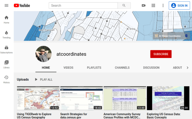
atcoordinates YouTube Channel

Video Tutorials for Finding US Census Data

I have recently created an atcoordinates YouTube channel that features a series of how-to videos on finding and accessing US census data using a variety of websites and tools. I explain basic census concepts while demonstrating how to access data. At this point there are four videos:

  1. Exploring US Census Data: Basic Concepts. This is a narrated slide show where I cover the essential choices you need to make and concepts you need to understand in order to access census data, regardless of the tool or platform: data set, time period, subjects or topics, and geography. I discuss the decennial census, American Community Survey, and population estimates. This video is intended as a prerequisite for viewing the others, so I don’t have to explain the same concepts each time and can focus on demonstrating each particular application.
  2. American Community Survey Census Profiles with MCDC Apps. This screencast illustrates how you can quickly and easily access census profiles for any place in the US using the Missouri Census Data Center’s profile applications. It’s also a good introduction to census data in general, if you’re unfamiliar with the scope of data that’s available.
  3. Search Strategies for data.census.gov. I demonstrate how to use the Census Bureau’s primary application for accessing current census data, using the advanced search tool and filters.
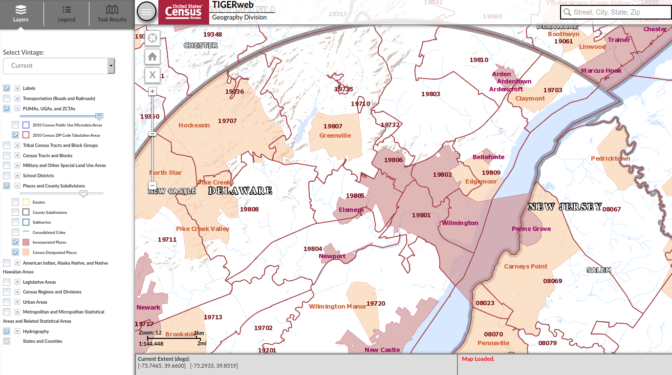
  4. Using TIGERweb to Explore US Census Geography. I show you how to use this web map application for viewing census geography, while explaining what some of the small-area census geographies are.

I plan on adding additional videos every month or so. The pandemic lock down and uncertainty over whether classes will be back in session this fall inspired me to do this. While I prefer written tutorials, I find that I’ve been watching YouTube more often for learning how to do certain tasks with particular software, so I thought this would be useful for others. The videos average about 10 to 15 minutes in length, although the introductory one is a bit longer. The length is intentional; I wanted to explain the concepts and describe why you’re making certain choices, instead of simply pointing and clicking without any explanation.

Feel free to spread the news, share and embed the videos in research guides or web pages, and use them in classes or workshops. Of course, for a more in-depth look at US census data, check out my book: Exploring the US Census: Your Guide to America’s Data published by SAGE.

USPS mailbox

The Trouble with ZIP Codes: Solutions for Data Analysis and Mapping

Since the COVID-19 pandemic began, I’ve received several questions about finding census data and boundary files for ZIP Codes (aka US postal codes), as many states are publishing ZIP Code-level data for cases and deaths. ZIP Codes are commonly used for summarizing address data, as it’s easy to do and most Americans are familiar with them. However, there are a number of challenges associated with using ZIP Codes as a unit of analysis that most people are unaware of (until they start using them). In this post I’ll summarize these challenges and provide some solutions.

The short story is: you can get boundary files and census data from the decennial census and 5-year American Community Survey (ACS) for ZIP Code Tabulation Areas (ZCTAs, pronounced zicktas) which are approximations of ZIP Codes that have delivery areas. Use any census data provider to get ZCTA data: data.census.gov, Census Reporter, Missouri Census Data Center, NHGIS, or proprietary library databases like PolicyMap or the Social Explorer. The longer story: if you’re trying to associate ZIP Code-level data with census ZCTA boundary files or demographic data, there are caveats. I’ll cover the following issues in detail:

  1. ZIP Codes are actually not areas with defined boundaries, and there are no official USPS ZIP Code maps. Areas must be derived using address files. The Census Bureau has done this in creating ZIP Code Tabulation Areas (ZCTAs).
  2. The Census Bureau publishes population data by ZCTA and boundary files for them. But ZCTAs are not strictly analogous with ZIP Codes; there isn’t a ZCTA for every ZIP Code, and if you try to associate ZIP data with them some of your records won’t match. You need to crosswalk your ZIP Code data to the ZCTA-level to prevent this.
  3. ZCTAs do not nest or fit within any other census geographies, and the postal city name associated with a ZIP Code does not correlate with actual legal or municipal areas. This can make selecting and downloading ZIP Code data for a given area difficult.
  4. ZIP Codes were designed for delivering mail, not for studying populations. They vary tremendously in size, shape, and population.
  5. Analyzing data at either the ZIP Code or ZCTA level over time is difficult to impossible.
  6. ZIP Code and ZCTA numbers must be saved as text in data files, and not as numbers. Otherwise codes that have leading zeros get truncated, and the code becomes incorrect.

ZIP Codes versus ZCTAs and Boundaries

Contrary to popular belief, ZIP Codes are not areas and the US Postal Service does not delineate boundaries for them. They are simply numbers assigned to ranges of addresses along street segments, and the codes are associated with a specific post office. When we see ZIP Code boundaries (on Google Maps for example), these have been derived by creating areas where most addresses share the same ZIP Code.

The US Census Bureau creates areal approximations for ZIP Codes called ZIP Code Tabulation Areas or ZCTAs. The Bureau assigns census blocks to a ZIP number based on the ZIP that’s used by a majority of the addresses within each block, and aggregates blocks that share the same ZIP to form a ZCTA. After this initial assignment, they make some modifications to aggregate or eliminate orphaned blocks that share the same ZIP number but are not contiguous. ZCTAs are delineated once every ten years in conjunction with the decennial census, and data from the decennial census and the 5-year American Community Survey (ACS) are published at the ZCTA-level. You can download ZCTA boundaries from the TIGER / Line Shapefiles page, and there is also a generalized cartographic boundary file for them.

Crosswalking ZIP Code Data to ZCTAs

There isn’t a ZCTA for every ZIP Code. Some ZIP Codes represent large clusters of Post Office boxes or are assigned to large organizations that process lots of mail. As census blocks are aggregated into ZCTAs based on the predominate ZIP Code for addresses within the block, these non-areal ZIPs fall out of the equation and we’re left with ZCTAs that approximate ZIP Codes for delivery areas.

As a result, if you’re trying to match either your own summarized address data or sources that use ZIP Codes as the summary level (such as the Census Bureau’s Business Patterns and Economic Census datasets), some ZIP Codes will not have a matching ZCTA and will fall out of your dataset.

To prevent this from happening, you can aggregate your ZIP Code data to ZCTAs prior to joining it to boundary files or other datasets. The UDS Mapper project publishes a ZIP Code to ZCTA Crosswalk file that lists every ZIP Code and the ZCTA it is associated with. For the ZIP Codes that don’t have a corresponding area (the PO Box clusters and large organizations), these essentially represent points that fall within ZCTA polygons. Join your ZIP-level data to the ZIP Code ID in the crosswalk file, and then group or summarize the data using the ZCTA number in the crosswalk. Then you can match this ZCTA-summarized data to boundaries or census demographic data at the ZCTA-level.

ZIP Code to ZCTA Crosswalk

UDS ZIP Code to ZCTA Crosswalk. ZIP Code 99501 is an areal ZIP Code with a corresponding ZCTA number, 99501. ZIP Code 99520 is a post office or large volume customer that falls inside ZCTA 99501, and thus is assigned to that ZCTA.

Identifying ZIPs and ZCTAs within Other Areas

ZCTAs are built from census blocks and nest within the United States; they do not fit within any other geographies like cities and towns, counties, or even states. The boundaries of a ZCTA will often cross these other boundaries, so for example a ZCTA may fall within two or three different counties. This makes it challenging to select and download census data for all ZCTAs in a given area.

You can get lists of ZIP Codes for places, for example by using the MCDC’s ZIP Code Lookup. The problem is, the postal city that appears in addresses and is affiliated with a ZIP Code does not correspond with cities as actual legal entities, so you can’t count on the name to select all ZIPs within a specific place. For example, my hometown of Claymont, Delaware has its own ZIP Code, even though Claymont is not an incorporated city with formal, legal boundaries. Most of the ZIP Codes around Claymont are affiliated with Wilmington as a place, even though they largely cover suburbs outside the City of Wilmington; the four ZIP Codes that do cover the city cross the city boundary and include outside areas. In short, if you select all the ZIP Codes that have Wilmington, DE as their place name, they actually cover an area that’s much larger than the City of Wilmington. The Census Bureau does not associate ZCTAs with place names.

ZCTAs and Places in northern Delaware

Lack of correspondence between postal city names and actual city boundaries. Most ZCTAs with the prefix 198 are assigned to Wilmington as a place name, even though many are partially or fully outside the city.

So how can you determine which ZIP Codes fall within a certain area? Or how they do (or don’t) intersect with other areas? You can overlay and eyeball the areas in TIGERweb to get a quick idea. For something more detailed, here are three options:

  1. The Missouri Census Data Center’s Geocorr application lets you calculate overlap between a source geography and a target geography using either total population or land area for any census geographies. So in a given state, if you select ZCTAs as a source, and counties as the target, you’ll get a list that displays every ZCTA that falls wholly or partially within each county. An allocation factor indicates the percentage of the ZCTA (population or land) that’s inside and outside a county, and you can make decisions as to whether to include a given ZCTA in your study area or not. If a ZCTA falls wholly inside one county, there will be only one record with an allocation factor of 1. If it intersects more than one county, there will be a record with an allocation factor for each county.
  2. The US Department of Housing and Urban Development (HUD) publishes a series of ZIP Code crosswalk files that associates ZIP Codes with census tracts, counties, CBSAs (metropolitan areas), and congressional districts. They create these files by geocoding all addresses and calculating the ratio of residential, business, and other addresses that fall within each of these areas and that share the same ZIP Code. The files are updated quarterly. You can use them to select, assign, or apportion ZIP Codes to a given area. There’s a journal article that describes this resource in detail.
  3. Some websites allow you to select all ZCTAs that fall within a given geography when downloading data, essentially by selecting all ZCTAs that are fully or partially within the area. The Census Reporter allows you to do this: search for a profile for an area, click on a table of interest, and then subdivide the areas by smaller areas. You can even look at a map to see what’s been selected. data.census.gov currently does not provide this option; you have to select ZCTAs one by one (or if you’re using the census API, you’ll need to create a list of ZCTAs to retrieve).

MCDC Geocorr

Sample output from MCDC Geocorr. ZCTAs 08251 and 08260 fall completely within Cape May County, NJ. ZCTA 08270’s population is split between Cape May (92.4%) and Atlantic (7.6%) counties. The ZCTA names are actually postal place names; these ZCTAs cover areas that are larger than these places.

Do You Really Need to Use ZIP Codes?

ZIP Codes were an excellent mid-20th century solution for efficiently processing and delivering mail that continues to be useful for that purpose. They are less ideal for studying populations or other forms of human activity. They vary tremendously in size, shape, and population which makes them inconsistent as a unit of analysis. They have no legal or administrative meaning or function, other than delivering mail. While all American’s are familiar with them, they do not have any relevant social meaning. They don’t represent neighborhoods, and when you ask someone where they’re from, they won’t say “19703”.

So what are your other options?

  1. If you don’t have to use ZIP Code or ZCTA data for your project, don’t. For the United States as a whole, consider using counties, PUMAs, or metropolitan areas. Within states: counties, PUMAs, and county subdivisions. For smaller areas: municipalities, census tracts, or aggregates of census tracts.
  2. If you have the raw, address-based data, consider geocoding it. Once you geocode an address, you can use GIS to assign it to any type of geography that you have a boundary file for (spatial join), and then you can aggregate it to that geography. Some geocoders even provide geographies like counties or tracts in the match result. If your data is sensitive, strip all the attributes out except for the address and a serial integer to use as an ID, and after geocoding you can associate the results back to your original data using that ID. The Census Geocoder is free, requires no log in, allows you to do batches of 1,000 addresses at a time, and forces you to use these safety precautions. For bigger jobs, there’s an API.
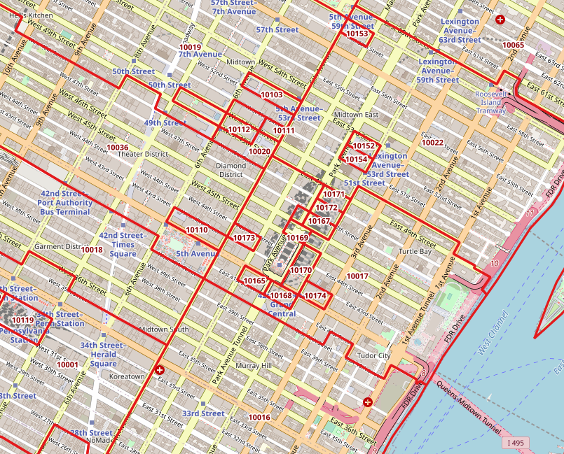
  3. Sometimes you’ll have no choice and must use ZIP Code / ZCTA data, if what you’re interested in studying is only provided in that summary form, or if there are privacy concerns around geocoding the raw address data. You may want to modify the ZCTA geography for your area to aggregate smaller ZCTAs into larger ones surrounding them, for both visual display and statistical analysis. For example, in New York City there are several ZCTAs that cover only one city and census block, as they’re occupied by one large office building that processes a lot of mail (and thus have their own ZIP number). Also, unlike most census geographies, ZCTAs have large holes in them. Any area that does not have streets and thus no addresses isn’t included in a ZCTA. In urban areas, this means large parks and cemeteries. In rural areas, vast tracts of unpopulated forest, desert, or mountain terrain. And large bodies of water in every place.

Midtown ZCTAs

One-block ZCTAs in Midtown Manhattan, NYC that have either low or zero population.

Analyzing ZIP Code Data Over Time…

In short – forget it. The Census Bureau introduced ZCTAs in the year 2000, and in 2010 they modified their process for creating them. For a variety of reasons, they’re not strictly compatible. ACS data for ZCTAs wasn’t published until 2013. Even the economic datasets don’t go that far back; the ZIP Code Business Patterns didn’t appear until the early 1990s. Use areas that have more longevity and are relatively stable: counties, census tracts.

Why Do my ZIP Codes Look Wrong in Excel?

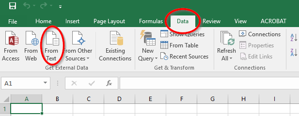
Regardless of whether you’re using a spreadsheet, database, or scripting language, always make sure to define ZIP / ZCTA columns as strings or text, and not as numeric types. ZIP Codes and ZCTAs begin with zeros in several states. Columns that contain ZIP / ZCTA codes must be saved as text to preserve the 5-digit code. If they’re saved as numbers, the leading zeros are dropped and the numbers are rendered incorrectly. This often happens if you’re working with data in a CSV file and you click on it to open it in Excel. In parsing the CSV, Excel assumes the ZIP / ZCTA field is a number and saves it as a number, which drops the zero and truncates the code. To prevent this from happening: open Excel to a blank project, go to the Data ribbon, click the button to import text data, choose delimited text on the import screen, choose the delimiter (comma or tab, etc), and when prompted you can select the ZIP / ZCTA column and designate it as text so that it imports properly.

Importing text files in Excel

To import CSV files in Excel, go to the Data ribbon and under Get External Data select From Text.

Conclusion

That’s all you ever (or maybe never) wanted to know about ZIP Codes and ZCTAs! For more information see the Census Bureau’s page about ZCTAs, a thorough write up by the Missouri Census Data Center, and these informative and fun blog posts from PolicyMap (complete with photos of Mr. ZIP). I wrote an article a few years back that demonstrates how to use some of these resources (the UDS mapper file, Geocorr) to process ZIP data with SQL and python. And of course, check out my book, Exploring the U.S. Census: Your Guide to America’s Data, to explore these concepts and resources in greater detail with hands-on exercises.