nyc

Noise Complaint Kernels and Contours

Kernel Density and Contours in QGIS: Noisy NYC

In spatial analysis, kernel density estimation (colloquially referred to as a type of “hot spot analysis”) is used to explore the intensity or clustering of point-based events. Crimes, parking tickets, traffic accidents, bird sightings, forest fires, incidents of infections disease, anything that you can plot as a point at a specific period in time can be studied using KDE. Instead of looking at these features as a distribution of discrete points, you generate a raster that represents a continuous surface of values. You can either measure the density of the incidents themselves, or the concentration of a specific attribute that is tied to those incidents (like the dollar amount of parking tickets or the number of injuries in traffic accidents).

In this post I’ll demonstrate how to do a KDE analysis in QGIS, but you can easily implement KDE in other software like ArcGIS Pro or R. Understanding the inputs you have to provide to produce a meaningful result is more important than the specific tool. This YouTube video produced by the SEER Lab at the University of Florida helped me understand what these inputs are. They used the SAGA kernel tool within QGIS, but I’ll discuss the regular QGIS tool and will cover some basic data preparation steps when working with coordinate data. The video illustrates a KDE based on a weight, where there were single points that had a count-based attribute they wanted to interpolate (number of flies in a trap). In this post I’ll cover simple density based on the number of incidents (individual noise complaints), and will conclude by demonstrating how to generate contour lines from the KDE raster.

For a summary of how KDE works, take a look at the entry for “Kernel” in the Encyclopedia of Geographic Information Science (2007) p 247-248. For a fuller treatment, I always recommend Christopher Lloyd’s Spatial Data Analysis: An Introduction to GIS Users (2010) p 93-97 by Oxford Press. There’s also an explanation in the ArcGIS Pro documentation.

Data Preparation

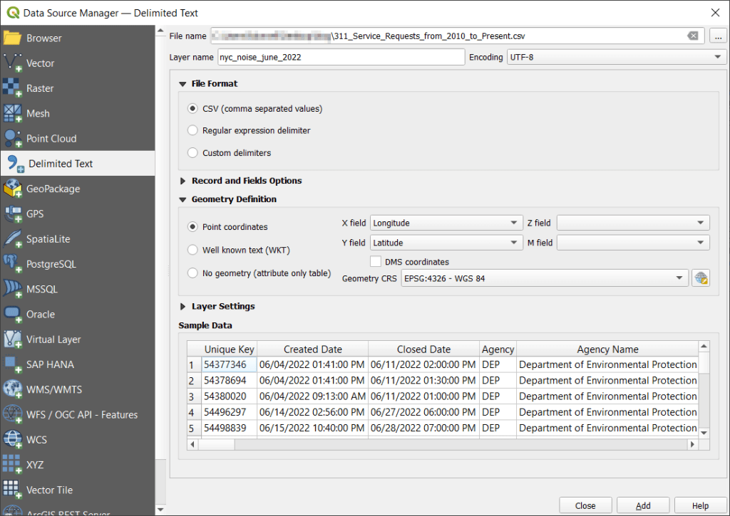
I visited the NYC Open Data page and pulled up the entry for 311 Service Requests. When previewing the data I used the filter option to narrow the records down to a small subset; I chose complaints that were created between June 1st and 30th 2022, where the complaint type began with “Noise”, which gave me about 75,000 records (it’s a noisy town). Then I hit the Export button and chose one of the CSV formats. CSV is a common export option from open data portals; as long as you have columns that contain latitude and longitude coordinates, you will be able to plot the records. The NYC portal allows you to filter up front; other data portals like the ones in Philly and DC package data into sets of CSV files for each year, so if you wanted to apply filters you’d use the GIS or stats package to do that post-download. If shapefiles or geoJSON are provided, that will save you the step of having to plot coordinates from a CSV.

NYC Open Data 311 Service Requests

With the CSV, I launched QGIS, went to the Data Source Manager, and selected Delimited Text. Browsed for the file I downloaded, gave the layer a common sense name, and under geometry specified Point coordinates, and confirmed that the X field was my longitude column and the Y field was latitude. Ran the tool, and the points were plotted in the basic WGS 84 longitude / latitude system in degrees, which is the system the coordinates in the data file were in (generally a safe bet for modern coordinate data, but not always the case).

QGIS Add Delimited Text and Plot Coordinates

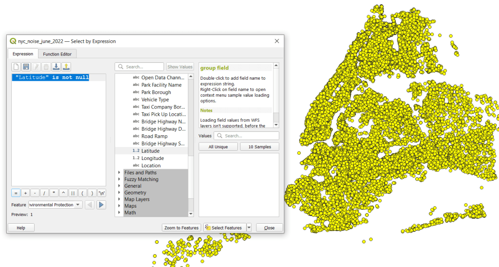
The next step was to save these plotted points in a file format that stores geometry and allows us to do spatial analysis. In doing that step, I recommend taking two additional ones. First, verify that all of the plotted data have coordinates – if there are any records where lat and long are missing, those records will be carried along into the spatial file but there will be no geometry for them, which will cause problems. I used the Select Features by Expression tool, and in the expression window typed “Latitude” is not null to select all the features that have coordinates.

QGIS Select by Expression

Second, transform the coordinate reference system (CRS) of the layer to a projected system that uses meters or feet. When we run the kernel tool, it will ask us to specify a radius for defining the density, as well as the size of the pixels for the output raster. Using degrees doesn’t make sense, as it’s hard for us to conceptualize distances in degrees, and they are not a constant unit of measurement. If you’ve googled around and read Stack Exchange posts or watched videos where a person says “You just have to experiment and adjust these numbers until your map looks Ok”, they were working with units in fractions of degrees. This is not smart. Transform the system of your layers!

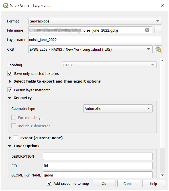
I selected the layer, right clicked, Export, Save Selected Features As. The default output is a geopackage, which is fine. Otherwise you could select ESRI shapefile, both are vector formats that store geometry. For file name I browse … and save the file in a specific folder. Beside CRS I hit the globe button, and in the CRS Selector window typed NAD83 Long Island in the filter at the top, and at the bottom I selected the NAD83 / New York Long Island (ftUS) EPSG 2263 option system in the list. Every state in the US has one or more state plane zones that you can select for making optimal maps for that area, in feet or meters. Throughout the world, you could choose an appropriate UTM zone that covers your area in meters. For countries or continents, look for an equidistant projection (meters again).

QGIS Export – Save As

Clicked a series of Oks to create the new file. To reset my map window to match CRS of the new file, I selected that file, right clicked, Layer CRS, Set Project CRS from Layer. Removed my original CSV to avoid confusion, and saved my project.

QGIS Noise Complaints in Projected CRS

Kernel Density Estimation

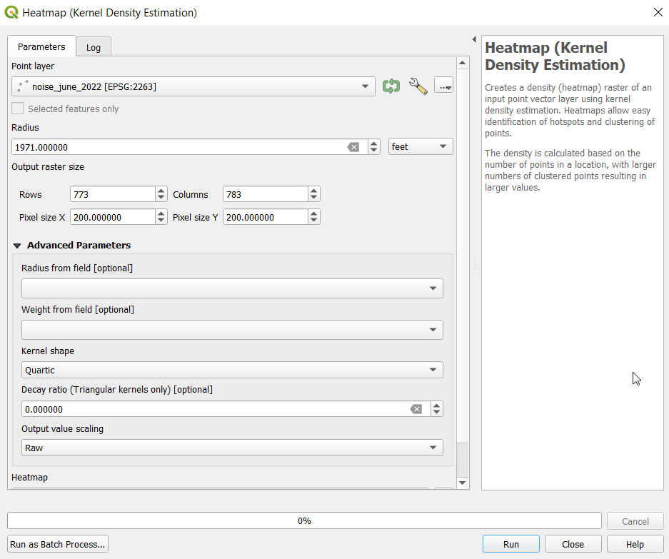
Now our data is ready. Under the Processing menu I opened the toolbox and searched for kernel to find Heatmap (Kernel Density Estimation) under the Interpolation tools. The tool asks for an input point layer, and then a radius. The radius is used to define an area for calculating a local density estimate around each point. We can use a formula to determine an ideal radius; the hopt method seems to be commonly employed for this purpose.

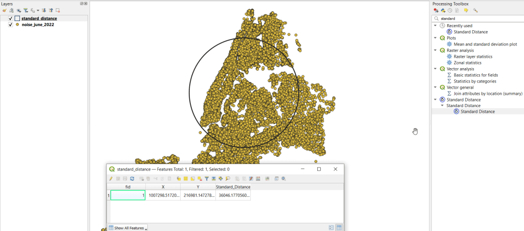
To use the hopt formula, we need to know the standard distance for our layer, which measures the degree to which features are dispersed around the spatial mean or center of the distribution. A nice 3rd party plugin was created for calculating this. I went to the the plugins menu, searched for the Standard Distance plugin, and added it. Searched for it in the Processing toolbox and launched it. I provided my point layer for input, and specified an output file. The other fields are optional (if we were measuring an attribute of the points instead of the density of the points, we could specify the attribute as a weight column). The output layer consists of a circle where the center is the mean center of the distribution, and the circle represents the standard deviation. The attribute table contains one record, with the standard distance attribute of 36,046.18 feet (if no feature was created, the likely problem is you have records in the point file that don’t have geometry – delete them and try again).

Output from the Standard Distance Plugin

Knowing this, I used the hopt formula:

=((2/(3N))^0.25)SD

Where N is the number of features and SD is the standard distance. I used Excel to plug in these values and do the calculation.

((2/(374526))^0.25)36046.18 = 1971.33

Finally, I launched the heatmap kernel tool, specified my noise points as input, and the radius as 1,971 feet. The output raster size does take some experimentation. The larger the pixel size, the coarser or more general the resolution will be. You want to choose something that makes sense based on the size of the area, the number of points, and / or some other contextual information. Just like the radius, the units are based on the map units of your layer. If I type in 100 feet for Pixel X, I see I’ll have a raster with 1,545 rows and 1,565 columns. Change it to 200 feet, and I get 773 by 783. I’ll go with 200 feet (the distance between a “standard” numbered street block in midtown Manhattan). I kept the defaults for the other options.

QGIS Heatmap Kernel Density Estimation Window

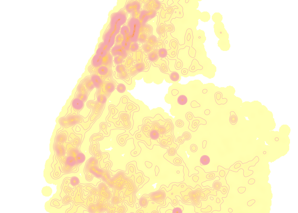
The resulting raster was initially displayed in black and white. I opened the properties and symbology menu and changed the render type from Singleband gray to Singleband pseudocolor, and kept the default yellow to red scheme. Voila!

Kernel Density Estimate of NYC Noise Complaints June 2022

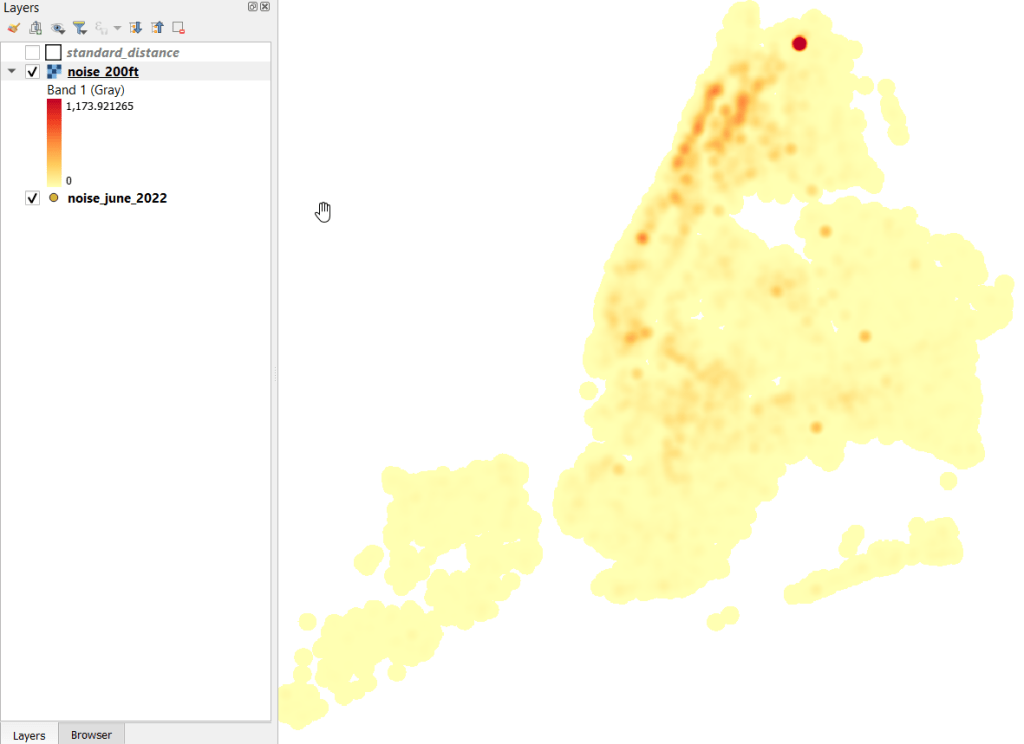
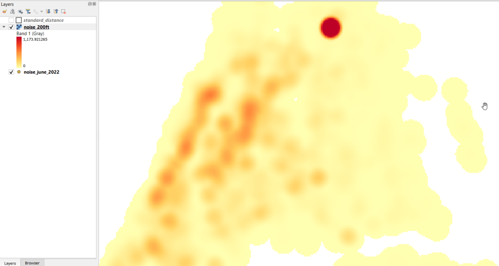
In June 2022 there were high clusters of noise complaints in north central Brooklyn, northern Manhattan, and the southwest portion of the Bronx. There’s a giant red hot spot in the north central Bronx that looks like the storm on planet Jupiter. What on earth is going on there? I flipped back to the noise point layer and selected points in that area, and discovered a single address where over 2,700 noise complaints about a loud party were filed on June 18 and 19! There’s also an address on the adjacent block that registered over 900 complaints. And yet the records do not appear to be duplicates, as they have different time stamps and closing dates. A mistake in coding this address, multiple times? A vengeful person spamming the 311 system? Or just one helluva loud party? It’s hard to say, but beware of garbage in, garbage out. Beyond this demo, I would spend more time investigating, would try omitting these complaints as outliers and run the heatmap tool again, and compare this output to different months. It’s also worth experimenting with the color classification scheme, and some different pixel sizes.

Kernel Results Zoomed In

Contour Lines

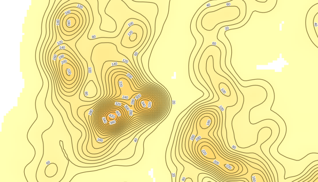
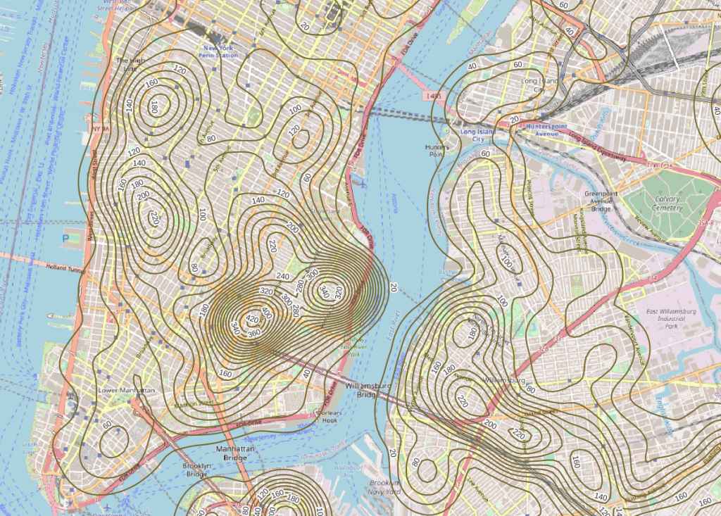
Another interesting way to visualize this data would be to generate contour lines based on the kernel output. I did a search for contour in the processing toolbox, and in the contour tool I provided the kernel noise raster as the input. For intervals between contour lines I tried 20 feet, and changed the attribute name to reflect what the contour represents: COMPLAINT instead of ELEV. Generated the new file, overlaid on top of the kernel, and now you can see how it represents the “elevation” of complaints.

Noise Complaint Kernel Density with Contour Lines

Switch the kernel off, symbolize the contours and add some labels, and throw the OpenStreetMap underneath, and now you can explore New York’s hills and valleys of noise. Or more precisely, the hills and valleys of noise complainers! In looking at these contours, it’s important to remember that they’re generated from the kernel raster’s grid cells and not from the original point layer. The raster is a generalization of the point layer, so it’s possible that if you look within the center of some of the denser circles you may not find, say, 340 or 420 actual point complaints. To generate a more precise set of contours, you would need to decrease the pixel size in the kernel tool (from say 200 feet to 100).

Noise Complaint Contours in Lower Manhattan, Northwest Brooklyn, and Long Island City

It’s interesting what you can create with just one set of points as input. Happy mapping!

Python API Code

Geocoding with the NYC Geoclient API and Python

Even though I’ve left New York, there are still occasions where I refer back to NYC resources in order to help students and faculty here with NYC-based research. Most recently I’ve revisited NYC DOITT’s Geoclient API for geocoding addresses, and I discovered a number of things have changed since I’ve last used it a few years ago. I’ll walk through my latest geocoding script in this post.

First and foremost: if you landed on this page because you’re trying to figure out how to get your Geoclient API key to work, the answer is:

&subscription-key=YOURKEYHERE

This replaces the old format that required you to pass an app id and key. I searched through two websites and scanned through hundreds of pages of documentation, only to find this solution in a cached Google search result, as the new docs don’t mention this change and the old docs still have the previous information and examples of the application ID and key. So – hopefully this should save you some hours of frustration.

I was working with someone who needed to geocode a subset of the city’s traffic violation data from the open data portal, as the data lacks coordinates. It’s also missing postal city names and ZIP Codes, which precludes using most geocoders that rely on this information. Even if we had these fields, I’ve found that many geocoders struggle with the hyphenated addresses used throughout Queens, and some work-around is needed to get matches. NYC’s geoclient is naturally able to handle those Queens addresses, and can use the borough name or code for locating addresses in lieu of ZIP Codes. The traffic data uses pseudo-county codes, but it’s easy to replace those with the corresponding borough codes.

The older documentation is still solid for illustrating the different APIs and the variables that are returned; you can search for a parsed or non-parsed street address, street intersections, places of interest or landmarks, parcel blocks and lots, and a few others.

I wrote some Python code that I’ve pasted below for geocoding addresses that have house numbers, street, and borough stored in separate fields using the address API, and if the house number is missing we try again by doing an intersection search, as an intersecting street is stored in a separate field in the traffic data. In the past I used a thin client for accessing the API, but I’m skipping that as it’s simpler to just build the URLs directly with the requests module.

The top of the script has the standard stuff: the name of the input file, the column locations (counting from zero) in the input file that contain each of the four address components, the base URL for the API, a time function for progress updates, reading the API key in from a file, and looping through the input CSV with the addressees to save the header row in one list and the records in a nested list. I created a list of fields that are returned from the API that I want to hold on to and add them to the header row, along with a final variable that records the results of the match. In addition to longitude and latitude you can also get xCoordinate and yCoordinate, which are in the NY State Plane Long Island (ft-US) map projection. I added a counts dictionary to keep track of the result of each match attempt.

Then we begin a long loop – this is a bit messy and if I had more time I’d collapse much of this into a series of functions, as there is repetitive code. I loop through the index and value of each record beginning with the first one. The loop is in a try / except block, so in the event that something goes awry it should exit cleanly and write out the data that was captured. We take the base url and append the address request, slicing the record to get the values for house, street, and borough into the URL. An example of a URL after passing address components in:

https://api.nyc.gov/geo/geoclient/v1/address.json?houseNumber=12345&street=CONEY ISLAND AVE&borough=BROOKLYN&subscription-key=KEYGOESHERE

Pass that URL to the requests module and get a response back. If an address is returned, the JSON resembles a Python dictionary, with ‘address’ as the key and the value as another dictionary with key value pairs of several variables. Otherwise, we get an error message that something was wrong with the request.

An address dictionary with sub-dictionaries returned by the NYC Geoclient
A successful address match returns an address dictionary, with a sub-dictionary of keys and values

The loop logic:

  • If the package contains an ‘address’ key, flatten to get the sub-dictionary
    • If ‘longitude’ is present as a key, a match is returned, get the relevant fields and append to the record
    • Else if the dictionary contains a ‘message’ key with a value that the house number was missing, do an intersection match
      • If the package contains an ‘intersection’ key, flatten to get the sub-dictionary
        • If ‘longitude’ is present as a key, a match is returned, get the relevant fields and append to the record
        • If not, there was no intersection match, just get the messages and append blanks for each value to the record
      • If not, an error was returned, capture the error and append blanks for each value to the record, and continue
    • If not, there was no address match, just get the messages and append blanks for each value to the record
  • If not, an error was returned, capture the error and append blanks for each value to the record, and continue

The API has limits of 2500 matches per minute and 500k per day, so after 2000 records I built in a pause of 15 seconds. Once the process finishes, successfully or not, the records are written out to a CSV file, header row first followed by the records. If the process bailed prematurely, the last record and its index are printed to the screen. This allows you to rerun the script where you left off, by changing the start index in the variables list at the top of the script from 0 to the last record that was read. When it comes time to write output, the previous file is appended rather than overwritten and the header row isn’t written again.

It took about 90 minutes to match a file of 25,000 records. I’d occasionally get an error message that the API key was bad for a given record; the error would be recorded and the script continued. It’s likely that there are illegal characters in the input fields for the address that end up creating a URL where the key parameter can’t be properly interpreted. I thought the results were pretty good; beyond streets it was able to recognize landmarks like large parks and return matched coordinates with relevant error messages (example below). Most of the flops were, not surprisingly, due to missing borough codes or house numbers.

Output from the NYC Geoclient
Output fields from the NYC Geoclient written to CSV

To use this code you’ll need to sign up for an NYC Developer API account, and then you can request a key for the NYC Geoclient service. Store the key in a text file in the same folder as the script. I’m also storing inputs and outputs in the same folder, but with a few functions from the os module you can manipulate paths and change directories. If I get time over the winter break I may try rewriting to incorporate this, plus functions to simplify the loops. An alternative to the API would be to download the LION street network geodatabase, and you could set up a local address locator in ArcGIS Pro. Might be worth doing if you had tons of matches to do. I quickly got frustrated with with the ArcGIS documentation and after a number of failed attempts I opted to use the Geoclient instead.

"""
Match addresses to NYC Geoclient using house number, street name, and borough
Frank Donnelly / GIS and Data Librarian / Brown University
11/22/2021 - Python 3.7
"""

import requests, csv, time

#Variables
addfile='parking_nov2021_nyc.csv' #Input file with addresses
matchedfile=addfile[:-4]+'_output.csv' #Output file with matched data
keyfile='nycgeo_key.txt' #File with API key
start_idx=0 #If program breaks, change this to pick up with record where you left off
#Counting from 0, positions in the CSV that contain the address info 
hous_idx=23
st_idx=24
boro_idx=21
inter_idx=25
base_url='https://api.nyc.gov/geo/geoclient/v1/'

def get_time():
    time_now = time.localtime() # get struct_time
    pretty_time = time.strftime("%m/%d/%Y, %H:%M:%S", time_now)
    return pretty_time

print('*** Process launched at', get_time())

#Read api key in from file
with open(keyfile) as key:
    api_key=key.read().strip()

records=[]

with open(addfile,'r') as infile:
    reader = csv.reader(infile)
    header = next(reader) # Capture column names as separate list
    for row in reader:
        records.append(row)

# Fields returned by the API to capture
# https://maps.nyc.gov/geoclient/v1/doc
fields=['message','message2','houseNumber','firstStreetNameNormalized',
        'uspsPreferredCityName','zipCode','longitude','latitude','xCoordinate',
        'yCoordinate']
header.extend(fields)
header.append('match_result')
datavals=len(fields)-2 # Number of fields that are not messages
counts={'address match':0, 'intersection match':0,
        'failed address':0, 'failed intersection':0,
        'error':0}

print('Finished reading data from', addfile)
print('*** Geocoding process launched at',get_time())

for i,v in enumerate(records[start_idx:]):
    try:
        data_url = f'{base_url}address.json?houseNumber={v[hous_idx]}&street={v[st_idx]}&borough={v[boro_idx]}&subscription-key={api_key}'
        response=requests.get(data_url)
        package=response.json()
        # If an address is returned, continue
        if 'address' in package:
            result=package['address']     
            # If longitude is returned, grab data
            if 'longitude' in result:
                for f in fields:
                    item=result.get(f,'')
                    v.append(item)
                v.append('address match')
                counts['address match']=counts['address match']+1
            # If there was no house number, try street intersection match instead
            elif 'message' in result and result['message']=='INPUT CONTAINS NO ADDRESS NUMBER' and v[inter_idx] not in ('',None):
                try:
                    data_url = f'{base_url}intersection.json?crossStreetOne={v[st_idx]}&crossStreetTwo={v[inter_idx]}&borough={v[boro_idx]}&subscription-key={api_key}'
                    response=requests.get(data_url)
                    package=response.json()
                    # If an intersection is returned, continue
                    if 'intersection' in package:
                        result=package['intersection']
                        # If longitude is returned, grab data
                        if 'longitude' in result:
                            for f in fields:
                                item=result.get(f,'')
                                v.append(item)
                            v.append('intersection match')
                            counts['intersection match']=counts['intersection match']+1
                        # Intersection match fails, append messages and blank values
                        else:
                            v.append(result.get('message',''))
                            v.append(result.get('message2',''))
                            v.extend(['']*datavals)
                            v.append('failed intersection')
                            counts['failed intersection']=counts['failed intersection']+1
                    # Error returned instead of intersection
                    else:
                        v.append(package.get('message',''))
                        v.append(package.get('message2',''))
                        v.extend(['']*datavals)
                        v.append('error')
                        counts['error']=counts['error']+1
                        print(package.get('message',''))
                        print('Geocoder error at record',i,'continuing the matching process...')
                except Exception as e:
                     print(str(e))
            # Address match fails, append messages and blank values
            else:
                v.append(result.get('message',''))
                v.append(result.get('message2',''))
                v.extend(['']*datavals)
                v.append('failed address')
                counts['failed address']=counts['failed address']+1
        # Error is returned instead of address
        else:
            v.append(package.get('message',''))
            v.append(package.get('message2',''))
            v.extend(['']*datavals)
            v.append('error')
            counts['error']=counts['error']+1
            print(package.get('message',''))
            print('Geocoder error at record',i,'continuing the matching process...')
        if i%2000==0:
            print('Processed',i,'records so far...')
            time.sleep(15)         
    except Exception as e:
        print(str(e))

# First attempt, write to new file, but if break happened, append to existing file
if start_idx==0:
    wtype='w' 
else:
    wtype='a'

end_idx=start_idx+i

with open(matchedfile,wtype,newline='') as outfile:
    writer = csv.writer(outfile, delimiter=',', quotechar='"',
                        quoting=csv.QUOTE_MINIMAL)
    if wtype=='w':
        writer.writerow(header)
        writer.writerows(records[start_idx:end_idx])
    else:
        writer.writerows(records[start_idx:end_idx])
print('Wrote',i+1,'records to file',matchedfile)
print('Final record written was number',i,':\n',v)
for k,val in counts.items():
    print(k,val)
print('*** Process finished at',get_time())

NYC and NYMA Pop Change Graph 2000 to 2019

New York’s Population and Migration Trends in the 2010s

The Weissman Center for International Business at Baruch College just published my paper, “New York’s Population and Migration Trends in the 2010s“, as part of their Occasional Paper Series. In the paper I study population trends over the last ten years for both New York City (NYC) and the greater New York Metropolitan Area (NYMA) using annual population estimates from the Census Bureau (vintage 2019), county to county migration data (2011-2018) from the IRS SOI, and the American Community Survey (2014-2018). I compare NYC to the nine counties that are home to the largest cities in the US (cities with population greater than 1 million) and the NYMA to the 13 largest metro areas (population over 4 million) to provide some context. I conclude with a brief discussion of the potential impact of COVID-19 on both the 2020 census count and future population growth. Most of the analysis was conducted using Python and Pandas in Jupyter Notebooks available on my GitHub. I discussed my method for creating rank change grids, which appear in the paper’s appendix and illustrate how the sources and destinations for migrants change each year, in my previous post.

Terminology

  • Natural increase: the difference between births and deaths
  • Domestic migration: moves between two points within the United States
  • Foreign migration: moves between the United States and a US territory or foreign country
  • Net migration: the difference between in-migration and out-migration (measured separately for domestic and foreign)
  • NYC: the five counties / boroughs that comprise New York City
  • NYMA: the New York Metropolitan Area as defined by the Office of Management and Budget in Sept 2018, consists of 10 counties in NY State (including the 5 NYC counties), 12 in New Jersey, and one in Pennsylvania
Map of the New York Metropolitan Area
The New York-Newark-Jersey City, NY-NJ-PA Metropolitan Area

Highlights

  • Population growth in both NYC and the NYMA was driven by positive net foreign migration and natural increase, which offset negative net domestic migration.
  • Population growth for both NYC and the NYMA was strong over the first half of the decade, but population growth slowed as domestic out-migration increased from 2011 to 2017.
  • NYC and the NYMA began experiencing population loss from 2017 forward, as both foreign migration and natural increase began to decelerate. Declines in foreign migration are part of a national trend; between 2016 and 2019 net foreign migration for the US fell by 43% (from 1.05 million to 595 thousand).
  • The city and metro’s experience fit within national trends. Most of the top counties in the US that are home to the largest cities and many of the largest metropolitan areas experienced slower population growth over the decade. In addition to NYC, three counties: Cook (Chicago), Los Angeles, and Santa Clara (San Jose) experienced actual population loss towards the decade’s end. The New York, Los Angeles, and Chicago metro areas also had declining populations by the latter half of the decade.
  • Most of NYC’s domestic out-migrants moved to suburban counties within the NYMA (representing 38% of outflows and 44% of net out-migration), and to Los Angeles County, Philadelphia County, and counties in Florida. Out-migrants from the NYMA moved to other large metros across the country, as well as smaller, neighboring metros like Poughkeepsie NY, Fairfield CT, and Trenton NJ. Metro Miami and Philadelphia were the largest sources of both in-migrants and out-migrants.
  • NYC and the NYMA lack any significant relationships with other counties and metro areas where they are net receivers of domestic migrants, receiving more migrants from those places than they send to those places.
  • NYC and the NYMA are similar to the cities and metros of Los Angeles and Chicago, in that they rely on high levels foreign migration and natural increase to offset high levels of negative domestic migration, and have few substantive relationships where they are net receivers of domestic migrants. Academic research suggests that the absolute largest cities and metros behave this way; attracting both low and high skilled foreign migrants while redistributing middle and working class domestic migrants to suburban areas and smaller metros. This pattern of positive foreign migration offsetting negative domestic migration has characterized population trends in NYC for many decades.
  • During the 2010s, most of the City and Metro’s foreign migrants came from Latin America and Asia. Compared to the US as a whole, NYC and the NYMA have slightly higher levels of Latin American and European migrants and slightly lower levels of Asian and African migrants.
  • Given the Census Bureau’s usual residency concept and the overlap in the onset the of COVID-19 pandemic lock down with the 2020 Census, in theory the pandemic should not alter how most New Yorkers identify their usual residence as of April 1, 2020. In practice, the pandemic has been highly disruptive to the census-taking process, which raises the risk of an under count.
  • The impact of COVID-19 on future domestic migration is difficult to gauge. Many of the pandemic destinations cited in recent cell phone (NYT and WSJ) and mail forwarding (NYT) studies mirror the destinations that New Yorkers have moved to between 2011 and 2018. Foreign migration will undoubtedly decline in the immediate future given pandemic disruptions, border closures, and restrictive immigration policies. The number of COVID-19 deaths will certainly push down natural increase for 2020.

Rank Change Grid

Creating Heatmaps to Show Change in Rank Over Time with Python

In this post I’ll demonstrate how I created annotated heatmaps (or what I’m calling a rank change grid) showing change in rank over time using Python and Matplotlib’s imshow plots. I was writing a report on population trends and internal migration using the IRS county to county migration dataset, and wanted to depict the top origins and destinations of migrants for New York City and the New York Metropolitan Area and how they changed from year to year.

I hit upon this idea based on an example in the Matplotlib documentation using the imshow plot. Imshow was designed for manipulating and creating images, but since images are composed of rows and columns of pixels you can use this function to create grids (for GIS folks, think of a raster). The rows can indicate rank from 1 to N, while the columns could represent time, which in my case is years. I could label each grid cell with the name of a place (i.e. origin or destination), and if a place changes ranks over time I could assign the cell a color indicating increase or decrease; otherwise I’d assign a neutral color indicating no change. The idea is that you could look at place at a given rank in year 1 and follow it across the chart by looking at the label. If a new place appears in a given position, the color change clues you in, and you can quickly scan to see whether a given place went up or down.

The image below shows change in rank for the top metro area destinations for migrants leaving the NYC metro from 2011 to 2018. You can see that metro Miami was the top destination for several years, up until 2016-17 when it flips positions with metro Philadelphia, which had been the number 2 destination. The sudden switch from a neutral color indicates that the place occupying this rank is new. You can also follow how 3rd ranked Bridgeport falls to 4th place in the 2nd year (displaced by Los Angeles), remains in 4th place for a few years, and then falls to 5th place (again bumped by Los Angeles, which falls from 3rd to 4th as it’s bumped by Poughkeepsie).

NYC Metro Outflow Grid
Annual Change in Ranks for Top Destinations for NYC Metro Migrants (Metro Outflows)

I opted for this over a more traditional approach called a bump chart (also referred to a slope chart or graph), with time on the x-axis and ranks on the y-axis, and observations labeled at either the first or last point in time. Each observation is assigned a specific color or symbol, and lines connect each observation to its changing position in rank so you can follow it along the chart. Interpreting these charts can be challenging; if there are frequent changes in rank the whole thing begins to look like spaghetti, and the more observations you have the tougher it gets to interpret. Most of the examples I found depicted a small and finite number of observations. I have hundreds of observations and only want to see the top ten, and if observations fall in and out of the top N ranks you get several discontinuous lines which look odd. Lastly, neither Matplotlib or Pandas have a default function for creating bump charts, although I found a few examples where you could create your own.

Creating the rank change grids was a three-part process that required: taking the existing data and transforming it into an array of the top or bottom N values that you want to show, using that array to generate an array that shows change in ranks over time, and generating a plot using both arrays, one for the value and the other for the labels. I’ll tackle each piece in this post. I’ve embedded the functions at the end of each explanation; you can also look at my GitHub repo that has the Jupyter Notebook I used for the analysis for the paper (to be published in Sept 2020).

Create the Initial Arrays

In the paper I was studying flows between NYC and other counties, and the NYC metro area and other metropolitan statisical areas. I’ll refer just to the metro areas as my example in this post, but my functions were written to handle both types of places, stored in separate dataframes. I began with a large dataframe with every metro that exchanged migrants with the NYC metro. There is a row for each metro where the index is the Census Bureau’s unique FIPS code, and columns that show inflows, outflows, and net flows year by year (see image below). There are some rows that represent aggregates, such as flows to all non-metro areas and the sum of individual metro flows that could not be disclosed due to privacy regulations.

Initial Dataframe
Initial Dataframe

The first step is to create an array that has just the top or bottom N places that I want to depict, just for one flow variable (in, out, or net). Why an array? Arrays are pretty solid structures that allow you to select specific rows and columns, and they mesh nicely with imshow charts as each location in the matrix can correspond with the same location in the chart. Most of the examples I looked at used arrays. It’s possible to use other structures but it’s more tedious; nested Python lists don’t have explicit rows and columns so a lot of looping and slicing is required, and with dataframes there always seems to be some catch with data types, messing with the index versus the values, or something else. I went with NumPy’s array type.

I wrote a function where I pass in the dataframe, the type of variable (in, out, or net flow), the number of places I want, whether they are counties or metro areas, and whether I want the top or bottom N records (true or false). Two arrays are returned: the first shows the FIPS unique ID numbers of each place, while the second returns the labels. You don’t have to do anything to calculate actual ranks, because once the data is sorted the ranks become implicit; each row represents ranks 1 through 10, each column represents a year, and the ID or label for a place that occupies each position indicates its rank for that year.

In my dataframe, the names of the columns are prefixed based on the type of variable (inflow, outflow, or net flow), followed by the year, i.e. inflows_2011_12. In the function, I subset the dataframe by selecting columns that start with the variable I want. I have to deal with different issues based on whether I’m looking at counties or metro areas, and I need to get rid of any IDs that are for summary values like the non-metro areas; these IDS are stored in a list called suppressed, and the ~df.indexisin(suppressed) is pandaesque for taking anything that’s not in this list (the tilde acts as not). Then, I select the top or bottom values for each year, and append them to lists in a nested list (each sub-list represents the top / bottom N places in order for a given year). Next, I get the labels I want by creating a dictionary that relates all ID codes to label names, pull out the labels for the actual N values that I have, and format them before appending them to lists in a nested list. For example, the metro labels are really long and won’t fit in the chart, so I split them and grab just the first piece: Albany-Schenectady-Troy, NY becomes Albany (split using the dash) while Akron, OH becomes Akron (if no dash is present, split at comma). At the end, I use np.array to turn the nested lists into arrays, and transpose (T) them so rows become ranks and years become values. The result is below:

ID Array
Function and Result for Creating Array of IDs Top N Places
# Create array of top N geographies by flow type, with rows as ranks and columns as years
# Returns 2 arrays with values for geographies (id codes) and place names
# Must specify: number of places to rank, counties or metros, or sort by largest or smallest (True or False)
def create_arrays(df,flowtype,nsize,gtype,largest):
    geogs=[]
    cols=[c for c in df if c.startswith(flowtype)]
    for c in cols:
        if gtype=='counties':
            row=df.loc[~df.index.isin(suppressed),[c]]
        elif gtype=='metros':
            row=df.loc[~df.index.isin(msuppressed),[c]]
        if largest is True:
            row=row[c].nlargest(nsize)
        elif largest is False:
            row=row[c].nsmallest(nsize)
        idxs=list(row.index)
        geogs.append(idxs)

    if gtype=='counties':
        fips=df.to_dict()['co_name']
    elif gtype=='metros':
        fips=df.to_dict()['mname']
    labels=[]
    for row in geogs:
        line=[]
        for uid in row:
            if gtype=='counties':
                if fips[uid]=='District of Columbia, DC':
                    line.append('Washington\n DC')
                else:
                    line.append(fips[uid].replace('County, ','\n')) #creates short labels
            elif gtype=='metros':
                if '-' in fips[uid]:
                    line.append(fips[uid].split('-')[0]) #creates short labels
                else:
                    line.append(fips[uid].split(',')[0])
        labels.append(line)

    a_geogs=np.array(geogs).T
    a_labels=np.array(labels).T

    return a_geogs, a_labels

Change in Rank Array

Using the array of geographic ID codes, I can feed this into function number two to create a new array that indicates change in rank over time. It’s better to use the ID code array as we guarantee that the IDs are unique; labels (place names) may not be unique and pose all kinds of formatting issues. All places are assigned a value of 0 for the first year, as there is no previous year to compare them to. Then, for each subsequent year, we look at each value (ID code) and compare it to the value in the same position (rank) in the previous column (year). If the value is the same, that place holds the same rank and is assigned a 0. Otherwise, if it’s different we look at the new value and see what position it was in in the previous year. If it was in a higher position last year, then it has declined and we assign -1. If it was in a lower position last year or was not in the array in that column (i.e. below the top 10 in that year) it has increased and we assign it a value of 1. This result is shown below:

Rank Change Array
Function and Result for Creating Change in Rank Array
# Create array showing how top N geographies have changed ranks over time, with rows as rank changes and
# columns as years. Returns 1 array with values: 0 (no change), 1 (increased rank), and -1 (descreased rank)
def rank_change(geoarray):
    rowcount=geoarray.shape[0]
    colcount=geoarray.shape[1]

    # Create a number of blank lists
    changelist = [[] for _ in range(rowcount)]

    for i in range(colcount):
        if i==0:
            # Rank change for 1st year is 0, as there is no previous year
            for j in range(rowcount):
                changelist[j].append(0)
        else:
            col=geoarray[:,i] #Get all values in this col
            prevcol=geoarray[:,i-1] #Get all values in previous col
            for v in col:
                array_pos=np.where(col == v) #returns array
                current_pos=int(array_pos[0]) #get first array value
                array_pos2=np.where(prevcol == v) #returns array
                if len(array_pos2[0])==0: #if array is empty, because place was not in previous year
                    previous_pos=current_pos+1
                else:
                    previous_pos=int(array_pos2[0]) #get first array value
                if current_pos==previous_pos:
                    changelist[current_pos].append(0)
                    #No change in rank
                elif current_posprevious_pos: #Larger value = smaller rank
                    changelist[current_pos].append(-1)
                    #Rank has decreased
                else:
                    pass

    rankchange=np.array(changelist)
    return rankchange 

Create the Plot

Now we can create the actual chart! The rank change array is what will actually be charted, but we will use the labels array to display the names of each place. The values that occupy the positions in each array pertain to the same place. The chart function takes the names of both these arrays as input. I do some fiddling around at the beginning to get the labels for the x and y axis the way I want them. Matplotlib allows you to modify every iota of your plot, which is in equal measures flexible and overwhelming. I wanted to make sure that I showed all the tick labels, and changed the default grid lines to make them thicker and lighter. It took a great deal of fiddling to get these details right, but there were plenty of examples to look at (Matplotlib docs, cookbook, Stack Overflow, and this example in particular). For the legend, shrinking the colorbar was a nice option so it’s not ridiculously huge, and I assign -1, 0, and 1 to specific colors denoting decrease, no change, and increase. I loop over the data values to get their corresponding labels, and depending on the color that’s assigned I can modify whether the text is dark or light (so you can see it against the background of the cell). The result is what you saw at the beginning of this post for outflows (top destinations for migrants leaving the NY metro). The function call is below:

Function for Creating Rank Change Grid
# Create grid plot based on an array that shows change in ranks and an array of cell labels
def rank_grid(rank_change,labels):
    alabels=labels
    xlabels=[yr.replace('_','-') for yr in years]
    ranklabels=['1st','2nd','3rd','4th','5th','6th','7th','8th','9th','10th',
               '11th','12th','13th','14th','15th','16th','17th','18th','19th','20th']
    nsize=rank_change.shape[0]
    ylabels=ranklabels[:nsize]

    mycolors = colors.ListedColormap(['#de425b','#f7f7f7','#67a9cf'])
    fig, ax = plt.subplots(figsize=(10,10))
    im = ax.imshow(rank_change, cmap=mycolors)

    # Show all ticks...
    ax.set_xticks(np.arange(len(xlabels)))
    ax.set_yticks(np.arange(len(ylabels)))
    # ... and label them with the respective list entries
    ax.set_xticklabels(xlabels)
    ax.set_yticklabels(ylabels)

    # Create white grid.
    ax.set_xticks(np.arange(rank_change.shape[1]+1)-.5, minor=True)
    ax.set_yticks(np.arange(rank_change.shape[0]+1)-.5, minor=True)
    ax.grid(which="minor", color="w", linestyle='-', linewidth=3)
    ax.grid(which="major",visible=False)

    cbar = ax.figure.colorbar(im, ax=ax, ticks=[1,0,-1], shrink=0.5)
    cbar.ax.set_yticklabels(['Increased','No Change','Decreased'])

    # Loop over data dimensions and create text annotations.
    for i in range(len(ylabels)):
        for j in range(len(xlabels)):
            if rank_change[i,j] < 0:
                text = ax.text(j, i, alabels[i, j],
                           ha="center", va="center", color="w", fontsize=10)
            else:
                text = ax.text(j, i, alabels[i, j],
                           ha="center", va="center", color="k", fontsize=10)

    #ax.set_title("Change in Rank Over Time")
    plt.xticks(fontsize=12)
    plt.yticks(fontsize=12)
    fig.tight_layout()
    plt.show()
    return ax 

Conclusions and Alternatives

I found that this approach worked well for my particular circumstances, where I had a limited number of data points to show and the ranks didn’t fluctuate much from year to year. The charts for ten observations displayed over seven points in time fit easily onto standard letter-sized paper; I could even get away with adding two additional observations and an eighth point in time if I modified the size and placement of the legend. However, beyond that you can begin to run into trouble. I generated charts for the top twenty places so I could see the results for my own analysis, but it was much too large to create a publishable graphic (at least in print). If you decrease the dimensions for the chart or reduce the size of the grid cells, the labels start to become unreadable (print that’s too small or overlapping labels).

There are a number of possibilities for circumventing this. One would be to use shorter labels; if we were working with states or provinces we can use the two-letter postal codes, or ISO country codes in the case of countries. Not an option in my example. Alternatively, we could move the place names to the y-axis (sorted alphabetically or by first or final year rank) and then use the rank as the annotation label. This would be a fundamentally different chart; you could see how one place changes in rank over time, but it would be tougher to discern which places were the most important source / destination for the area you’re studying (you’d have to skim through the whole chart). Or, you could keep ranks on the y-axis and assign each place a unique color in the legend, shade the grid cells using that color, and thus follow the changing colors with your eye. But this flops is you have too many places / colors.

A different caveat is this approach doesn’t work so well if there is a lot of fluctuation in ranks from year to year. In this example, the top inflows and outflows were relatively stable from year to year. There were enough places that held the same rank that you could follow the places that changed positions. We saw the example above for outflows, below is an example for inflows (i.e. the top origins or sources of migrants moving to the NY metro):

NYC Metro Inflow Grid
Annual Change in Ranks for Top Origins for NYC Metro Migrants (Metro Inflows)

In contrast, the ranks for net flows were highly variable. There was so much change that the chart appears as a solid block of colors with few neutral (unchanged) values, making it difficult to see what’s going on. An example of this is below, representing net flows for the NYC metro area. This is the difference between inflows and outflows, and the chart represents metros that receive more migrants from New York than they send (i.e. net receivers of NY migrants). While I didn’t use the net flow charts in my paper, it was still worth generating as it made it clear to me that net flow ranks fluctuate quite a bit, which was a fact I could state in the text.

NYC Metro Net Flow Grid
Annual Change in Ranks for Net Receivers of NYC Metro Migrants (Metro Net Flows)

There are also a few alternatives to using imshow. Matplotlib’s pcolor plot can produce similar effects but with rectangles instead of square grid cells. That could allow for more observations and longer labels. I thought it was less visually pleasing than the equal grid, and early on I found that implementing it was clunkier so I went no further. My other idea was to create a table instead of a chart. Pandas has functions for formatting dataframes in a Jupyter Notebook, and there are options for exporting the results out to HTML. Formatting is the downside – if you create a plot as an image, you export it out and can then embed it into any document format you like. When you’re exporting tables out of a notebook, you’re only exporting the content and not the format. With a table, the content and formatting is separate, and the latter is often tightly bound to the publication format (Word, LaTeX, HTML, etc.) You can design with this in mind if you’re self-publishing a blog post or report, but this is not feasible when you’re submitting something for publication where an editor or designer will be doing the layout.

I really wanted to produce something that I could code and run automatically in many different iterations, and was happy with this solution. It was an interesting experiment, as I grappled with taking something that seemed intuitive to do the old-fashioned way (see below) and reproducing it in a digital, repeatable format.

Copybook Chart
A-Train Classic

Neighborhood Research and the Census for Undergrads

Each semester I visit several undergraduate classes in public affairs and journalism, to introduce students to census data. They’re researching or reporting on particular issues and trends in neighborhoods in New York City, and they are looking for statistics to either support their work or generate ideas for a story. I usually showcase the NYC Population Factfinder as a starting point, mention the Census Reporter for areas outside the city , and provide background info on the decennial census, American Community Survey, and census geography and subjects. This year I included two new examples toward the beginning of the lecture to spark their interest.

I recently helped reporter Susannah Jacob navigate census data for an article she wrote on hyper-gentrification in the West Village for the New York Review of Books. A perfect example, as it’s what the students are expected to do for their assignment! Like any good journalist (and human geographer), Susannah pounded the pavement of the neighborhood, interviewing residents and small businesses and observing and documenting the urban landscape and how it was changing. But she also wanted to see what the data could tell her, and whether it would corroborate or refute what she was seeing and hearing.

NYRB Article on the West Village

Source: Jacob & Roye, New York Review of Books, Oct 2019. https://www.nybooks.com/daily/2019/10/09/what-happened-to-the-west-village/

We used the NYC Population Factfinder to assemble census tracts to approximate the neighborhood, and I did a little legwork to pull data from the County / ZIP Code Business Patterns so we could see how the business landscape was changing. The most surprising stat we discovered was that the number of 1-unit detached homes had doubled. This wouldn’t be odd in many rapidly growing places in the US, but it’s unusual for an old, built-out urban neighborhood. A 1-unit detached home is a free-standing single family structure that doesn’t share walls with other buildings. Most homes in Manhattan are either attached (row houses / town houses) or units in multi-unit buildings (apartments / condos / co-ops). How could this be? Uber-wealthy people are buying up adjoining row homes, knocking down the walls, and turning them into urban mansions. Seems extraordinary, but apparently is part of a trend.

We certainly ran up against the limitations of ACS data. The estimates for tracts have large margins of error, and when comparing two short time frames it’s difficult to detect actual change, as differences in estimates are clouded by sampling noise. Even after aggregating several tracts, many of the estimates for change weren’t reliable enough to report. When they were (as in the housing example) you could only say that there has been a relative increase without becoming wedded to a precise number. In this case, from 214 (+/- 127) detached units in 2006-2010 to 627 (+/-227) in 2013-2017, an increase of 386 (+/- 260). Not great estimates, but you can say it’s an increase as the low end for change is still positive at 126 units. Considering the time frame and character of the neighborhood, that’s still noteworthy (bearing in mind we’re working with a 90% confidence interval). In cases where the differences overlap and could represent either an increase or decrease there are few claims you can make, and it’s best to walk away (or look at larger area). I always discuss the margin of error with students and caution them about treating these numbers as counts.

While census data is invaluable for describing and studying individual places, it’s inherent geographic nature also allows us to study places in relation to each other, and to illustrate geographic patterns. For my second example, I zoom out and show them this map of racial-ethnic distribution in the United States:

Map of US Racial and Ethnic Diversity

Source: William H. Frey analysis of US Census population estimates, 2018. https://www.brookings.edu/research/americas-racial-diversity-in-six-maps/

This is one of a series of six maps by demographer William Frey at the Brookings Institute that highlights the geographic diversity of the United States. In this map, each county is shaded for a particular race / ethnicity if the population of that group in that county is greater than that group’s share of the national population. For example, Hispanics / Latinos represent 18.3% of the total US population, so counties where they represent more than this percentage are shaded.

For the purpose of the class, it helps make the census ‘pop’ and gets the students to think about the statistics as geospatial datasets that they can see and relate to, and that can form the basis for interesting research.

Some footnotes – if you like Frey’s maps, I highly recommend his book Diversity Explosion: How New Racial Demographics are Remaking America. It explores the evolving demographic and geographic landscape of the US with clear, accessible writing and more of these great maps (in color).

I used the pic at the top of this post as the background for my intro slide. It’s a screenshot of a city from A-Train, a 1992 city-building train simulator that was ported from Japan to the world by Artdink and Maxis, following the success of something called SimCity. It wasn’t nearly as successful, but I always liked the graphics which have now attained a retro-gaming vibe.

Census Workshop Recap

I’ve been swamped these past few months, revising my census book, teaching a spatial database course, and keeping the GIS Lab running. Thus, this will be a shorter post!

Last week I taught a workshop on understanding, finding, and accessing US Census Data at the Metropolitan Library Council of New York. If you couldn’t make it, here are the presentation slides and the group exercise questions.

Most of the participants were librarians who were interested in learning how to help patrons find and understand census data, but there were also some data analysts in the crowd. We began with an overview of how the census is structured by dataset, geography, and subject categories. I always cover the differences between the decennial census and the ACS, with a focus on how to interpret ACS estimates and gauge their reliability.

For workshops I think it’s best to start with searching for profiles (lots of different data for one place). This gives new users a good overview of the breadth and depth of the types of variables that are available in the census. Since this was a New York City-centric crowd we looked at the City’s excellent NYC Population Factfinder first. The participants formed small groups and searched through the application to answer a series of fact-finding questions that I typically receive. Beyond familiarizing themselves with the applications and data, the exercises also helped to spark additional questions about how the census is structured and organized.

Then we switched over to the Missouri Census Data Center’s profile and trends applications (listed on the right hand side of their homepage) to look up data for other parts of the country, and in doing so we were able to discuss the different census geographies that are available for different places. Everyone appreciated the simple and easy to use interface and the accessible tables and graphics. The MCDC doesn’t have a map-based search, so I did a brief demo of TIGERweb for viewing census geography across the country.

Once everyone had this basic exposure, we hopped into the American Factfinder to search for comparison tables (a few pieces of data for many places). We discussed how census data is structured in tables and what the difference between the profile, summary, and detailed tables are. We used the advanced search and I introduced my tried and true method of filtering by dataset, geography, and topic to find what we need. I mentioned the Census Reporter as good place to go for ACS documentation, and as an alternate source of data. Part of my theme was that there are many tools that are suitable for different needs and skill levels, and you can pick your favorite or determine what’s suitable for a particular purpose.

We took a follow-the-leader approach for the AFF, where I stepped through the website and the process for downloading two tables and importing them into a spreadsheet, high-lighting gotchas along the way. We did some basic formulas for aggregating ACS estimates to create new margins of error, and a VLOOKUP for tying data from two tables together.

We wrapped up the morning with a foreshadowing of what’s to come with the new data.census.gov (which will replace the AFF) and the 2020 census. While there’s still much uncertainty around the citizenship question and fears of an under count, the structure of the dataset won’t be too different from 2010 and the timeline for release should be similar.