I presented a poster last April on the library’s GIS and Data Services at the CHAIRS-C conference at the Brown School of Public Health. CHAIRS-C is an acronym for Center on Heat, Health, and Aging Innovation and Research Solutions for Communities; it’s a small cluster whose members are interested in heat-related research, and the impact of extreme heat on vulnerable communities. I provided some examples in the poster of heat-related datasets and research that I’ve supported over the last few years. I thought I’d share a summary of these datasets in this post that include air conditioning, heat indices, and sources that provide climate-related rasters with variable that include temperature and precipitation. Most of these examples are US-based, the last one is global.
Local Air Conditioning Estimates (LACE)
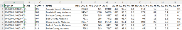
The Local Air Conditioning Estimates (LACE) is a new, experimental dataset produced by the US Census Bureau. It includes estimates of occupied housing units that have air conditioning at the national, state, county, and census tract levels. The estimates are published with margins of error at a 90% confidence level, and represent the year 2023. Each record includes the census summary level / fips GEOID, so you can readily match them to vector boundary files for GIS mapping.
Sample records from the Local Air Conditioning Estimates for census tracts
Questions about air conditioning are regularly collected as part of the American Housing Survey (AHS), but the sample size isn’t large enough to publish reliable estimates below the state and metropolitan area levels. To create LACE, the Census Bureau employed machine learning in a process called cross survey modeling, and triangulated the AHS with some other datasets to create small-area estimates. Summary documentation is included on the LACE website if you want to learn more, and there are links to working papers that go into greater detail.
The concept is similar to what the CDC has done in taking data from the Behavioral Risk Factor Surveillance System and using models to create small area estimates for the PLACES project. LACE fills a vital data gap for studying heat; most small-area sources for AC are a patchwork series of parcel data published by individual municipalities. I attended a couple of presentations given by the Census Bureau at FedGeoDay back in April, and they suggested that they will increasingly move in a modeling direction that draws on administrative data and smaller surveys, given declining response rates to large sample surveys like the ACS. Of course, this was before the current administration made the bonkers decision to ban the use of injecting noise into statistical datasets (a basic practice for protecting the privacy of survey participants), so who knows what will happen next.
Urban Heat Severity Index
Research has shown that temperature varies considerably over small areas, especially in cities. So if you are looking at the temperature reported for an entire city, or even at gridded data where the cells are large, both will mask a good deal of geographic variability. The absence of trees and green space, an abundance of impervious surfaces, and concentrated emissions from vehicles and air conditioners can dramatically increase the temperature of urban areas, creating “heat islands”.
The Trust for Public Land has been publishing the annual Heat Severity Urban Areas index for the past few years; originally the dataset covered just incorporated places but was expanded to include the entire US. Index values from 1 to 5 indicate the severity of a heat island, measured relative to the average summer temperature for the city or place where each grid cell is located. The data is published as a grid at 30m resolution (matching the resolution of LANDSAT imagery used in their workflow) and is distributed via an ESRI hub site. You can search for it within the Living Atlas in the data catalog in ArcGIS Pro to add it to a project, or grab the url from the hub site to render it as a web mapping service in QGIS or another package. In order to use it in an analysis, you’ll need to export and save the raster locally. To save time and space, you can clip the layer to a polygon or extent of the screen, and then save the result.
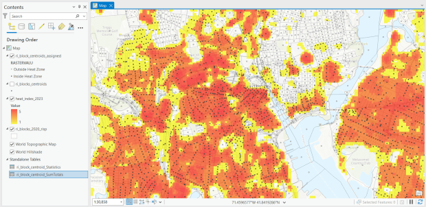
For one project, I had to estimate the number of people in Rhode Island who were living within an urban heat island. I used census block boundaries from the 2020 census, which include total population and housing units as attributes, calculated the centroid of the blocks, and overlaid them on the grid and assigned the intersecting grid value to each point. Then I summed the population by the index values; a value of null indicated that the center of the block fell outside a heat cell.
Urban Heat Severity Index overlayed with census blocks in Providence, RI in ArcGIS Pro
US Gridded Climate Data: PRISM
For rasters of climate data on temperature and precipitation, I’ve often turned to PRISM at Oregon State University. They work with the USDA to generate the maps for plant hardiness zones, and have developed a model to generate gridded climate data. The public data is available at 4km resolution, but researchers with project proposals can submit requests to access 800m resolution data. They publish mean daily, monthly, and annual values, as well as normals. Each raster is stored in one file, where the file represents one observation for one time period. I have written about PRISM in the past as I used it for several projects, writing Python scripts to pull a raster file for specific dates that match attributes in a point file, in order to determine what the temperature was for that date for each point, based on the grid cell the point fell within. PRISM has updated some of their products since I’ve run that analysis, specifically replacing the older raster file formats with tifs.
US County Climate Data: NCEI Climate at a Glance
For certain statistical analyses, it can be helpful to have climate data summarized for an entire geographic area so that it aligns with other variables that are published for that area. NOAA’s National Center for Environmental Information (NCEI) employs a model that takes their gridded data product (derived from the U.S. Climate Divisional Database) to produce monthly state and county-level estimates for the US, from 1895 to the present. I wrote a post that summarizes how to download, interpret, and parse these files so that you can start using them; if you’re seeking the entire dataset you’ll skip the web-based interface for creating summary charts and maps and go right to the FTP site to download data in bulk.
Since our current government doesn’t like the weather, this is one of the datasets that I’ve archived in DataLumos as part of the Data Rescue Project, in case it vanishes one day.
Global Climate Data: ERA5
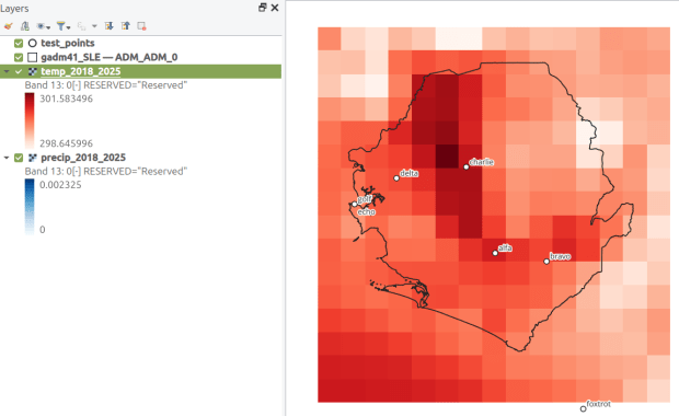
How about the rest of the world? ERA5 is produced by the European Centre for Medium-Range Weather Forecasts, which publishes gridded climate data at 1/4 degree resolution, modeled from 1940 to present. You can choose hourly, daily, or monthly estimates (accessed via separate web pages), and at the download stage you can provide bounding box coordinates to clip the data (so you don’t have to download the entire planet). The data is packaged in a GRIB file, where variables are stored in separate bands. So if you download monthly data for one variable, each month is stored sequentially; if you download two or more variables, they are sorted by variable and then by time period. Similar to my US project with PRISM, I wrote a Python script that extracts ERA5’s monthly gridded data for specific point locations, but in this case I pulled all dates for each point (with an option to highlight a specific month for a matching date). I wrote a detailed post that describes the dataset and process.
ERA5 mean monthly temperature data for Sierra Leone in QGIS
There’s been a lot of turmoil emanating from Washington DC lately. One development that’s been more under the radar than others has been the modification or removal of US federal government datasets from the internet (for some news, see these articles in the New Yorker, Salon, Forbes, and CEN). In some cases, this is the intentional scrubbing or deletion of datasets that focus on topics the current administration doesn’t particularly like, such as climate and public health. In other cases, the dismemberment of agencies and bureaus makes data unavailable, as there’s no one left to maintain or administer it. While most government data is still available via functioning portals, most of the faculty and researchers I work with can identify at least a few series they rely on that have disappeared.
Librarians, archivists, researchers, professors, and non-profits across the country (and even in other parts of the world), have established rescue projects, where they are actively downloading and saving data in repositories. I’ve been participating in these efforts since January, and will outline some of the initiatives in this post.
The Internet Archive
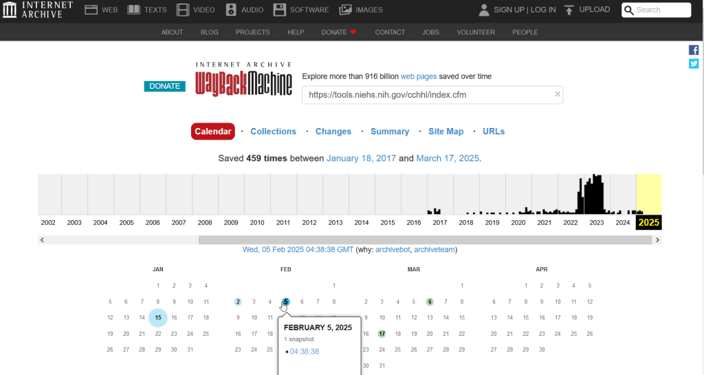
The place of last resort for finding deleted web content is the Internet Archive. This large, non-profit project has been around as long as the web has existed, with the goal of creating a historic archive of the internet. It uses web crawlers or spiders to creep across the web and make copies of websites. With the Wayback Machine, you can enter a URL and find previous copies of web pages, including sites that no longer exist. You’re presented with a calendar page where you can scroll by year and month to select a date when a page was captured, which opens up a copy.
This allows you to see the content, navigate through the old website, and in many cases download files that were stored on those pages. It’s a great resource, but it can’t capture everything; given the variety and complexity of web pages and evolving web technologies, some websites can’t be saved in working order (either partially or entirely). Content that was generated and presented dynamically with JavaScript, or was pulled and presented from a database, is often not preserved, as are restricted pages that required log-ins.
An archived copy of the NIEHS page (the actual website was deleted in mid February 2025)
The Internet Archive also hosts a number of special collections where folks have saved documents, images, sound and video, and software. For example, you can find many research articles that are available in PubMed from the PubMed Central collection, a ton of documents from the USDA’s National Agricultural Library, and about 100 GB of data someone captured from the CDC in January 2025. A large project called the End of Term Archive was launched in 2008 to capture what federal government websites looked like at the end of each presidential term. The pages are saved in a special collection in the IA.
Data Rescue Project
Dozens of new data archiving projects were launched at the end of 2024 and beginning of 2025 with the intention of saving federal datasets. The Data Rescue Project is one of the larger efforts, which has been driven by data librarians and archivists with non-profit partners. Professional groups including IASSIST, ICPSR, RDAP, the Data Curation Network, and the Safeguarding Research & Culture project have been active organizers and participators. While this will be an oversimplification, I’ll summarize the project as having two goals
The first goal is to keep track of what the other archiving projects are, and what they have saved. To this end, they created the Data Rescue Tracker, which has two modules. The Downloads List is an archive of datasets that have been saved, with details about where the data came from and locations of archived copies. The Maintainers List is a catalog of all the different preservation projects, with links to their home pages. There is also a narrative page with a comprehensive list of links to the various rescue efforts, data repositories, alternate sources for government data, and tools and resources you can use to save and archive data.
The Data Rescue Tracker Downloads List
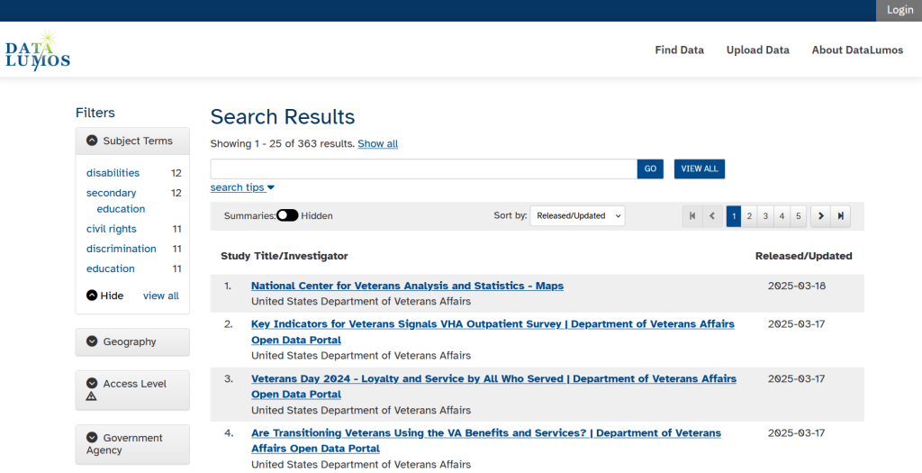
The second goal is to contribute to the effort of saving and archiving data. The team maintains an online spreadsheet with tabs for agencies that contain lists of datasets and URLs that are currently prioritized for saving. Volunteers sign up for a dataset, and then go out and get it. Some folks are manually downloading and saving files (pointing and clicking), while others write short screen scraping scripts to automate the process. The Data Rescue Project has partnered with ICPSR, a preeminent social science research center and repository in the US, at the University of Michigan. They created a repository called DataLumos, which was launched specifically for hosting extracts of US federal government data. Once data is captured, volunteers organize it and generate metadata records prior to submitting it to DataLumos (provided that the datasets are not too big).
DataLumos archive for federal government datasets, maintained by ICPSR
Most of the datasets that DRP is focused on are related to the social sciences and public policy. The Data Rescue Project coordinates with the Environmental and Government Data Initiative and the Public Environmental Data Partners (which I believe are driven by non-profit and academic partners), who are saving data related to the environment and health. They have their own workflows and internal tracking spreadsheets, and are archiving datasets in various places depending on how large they are. Data may be submitted to the Internet Archive, the Harvard Dataverse, GitHub, SciOp, and Zenodo (you can find out where in the Data Rescue Tracker Download’s List).
Mega Projects
There are different approaches for tackling these data preservation efforts. For the Data Rescue Project and related efforts, it’s like attacking the problem with millions of ants. Individual people are coordinating with one another in thousands of manual and semi-automated download efforts. A different approach would be to attack the problem with a small herd of elephants, who can employ larger resources and an automated approach.
For example, the Harvard Law School Library Innovation Lab launched the Archive of data.gov, a large project to crawl and download everything that’s in data.gov, the US federal government’s centralized data repository. It mirrors all the data files stored there and is updated regularly. The benefit of this approach is that it captures a comprehensive amount of data in one go, and can be readily updated. The primary limitation is that there are many cases where a dataset is not actually stored in data.gov, but is referenced in a catalog record with a link that goes out to a specific agency’s website. These datasets are not captured with this approach.
If trying to find back-ups is a bit bewildering, there’s a tool that can help. Boston University’s School of Public Health and Center for Health Data Science have created a find lost* data search engine, which crawls across the Harvard Project, DataLumos, the Data Rescue Project, and others.
Beyond the immediate data preservation projects that have sprung up recently, there are a number of large, on-going projects that serve as repositories for current and historical datasets. Some, like IPUMS at the University of Minnesota and the Election Lab at MIT focus on specific datasets (census data for the former, election results data for the latter). There are also more heterogeneous repositories like ICPSR (including OpenICPSR which doesn’t require a subscription), and university-based repositories like the Harvard Dataverse (which includes some special collections of federal data extracts, like CAFE). There are also private-sector partners that have an equal stake in preserving and providing access to government data, including PolicyMap and the Social Explorer.
Wrap-up
I’ve been practicing my Python screen scraping skills these past few months, and will share some tips in a subsequent post. I’ve been busy contributing data to these projects and coordinating a response on my campus. We’ve created a short list of data archives and alternative sources, which captures many of the sources I’ve mentioned here plus a few others. My library colleagues in the health and medical sciences have created a list of alternatives to government medical databases including PubMed and ClinicalTrials.gov
Having access to a public and robust federal statistical system is a non-partisan issue that we should all be concerned about. Our Constitution justifies (in several sections) that we should have such a system, and we have a large body of federal laws that require it. Like many other public goods, the federal statistical system contributes to providing a solid foundation on which our society and economy rest, and helps drive innovation in business, policy, science, and medicine. It’s up to us to protect and preserve it.
I often get questions about comparing American Community Survey (ACS) estimates from the US Census Bureau over time. This process is more complicated than you’d think, as the ACS wasn’t designed as a time series dataset. The Census Bureau does publish comparative profile tables that compare two period estimates (in data.census.gov), but for a limited number of geographies (states, counties, metro areas).
For me, this question often takes the form of comparing change at the census tract-level for mapping and GIS projects. In this post, we’ll look at the primary considerations for comparing estimates over time, and I will walk through an example with spreadsheet formulas for calculating: change and percent change (estimates and margins of error), coefficients of variation, and tests for statistical difference. We’ll conclude with examples of mapping this data.
Primary considerations
The ACS is published in 1-year and 5-year period estimates. 1-year estimates are only available for areas that have at least 65,000 people, which means if you’re looking at small geographies (census tracts, ZCTAs) or rural areas that have small populations (most counties, county subdivisions, places) you will need to use the 5-year series. When comparing 5-year estimates, you should only compare non-overlapping time periods. For example, you would not compare the 2021 ACS (2017-2021) with the 2020 ACS (2016-2020) as these estimates have four years of sample data in common. In contrast, 2021 and 2016 (2012-2016) could be compared as they do not overlap…
…but, census geography changes over time. All statistical areas (block groups, tracts, ZCTAs, PUMAs, census designated-places, etc.) are updated every ten years with each decennial census. Areas can be re-numbered, aggregated, subdivided, or modified as populations change. This complicates comparisons; 2021 data uses geography created in 2020, while 2016 data uses geography from 2010. The only non-overlapping ACS periods with identical geographic areas would be 2014 (2010-2014) and 2019 (2015-2019). The only other alternative would be to use normalized census data, which involves additional work. While most legal areas (states, counties) can change at any time, they are generally more stable and you can make comparisons over a longer-period with modest adjustments.
All ACS estimates are fuzzy, representing a midpoint within a possible range of values (indicated with a margin of error) at a 90% confidence level. Because of sampling variability, any difference that you see between one time period and the next could be noise and not actual change. If you’re working with small geographies or small population groups, you’ll encounter large margins of error and it will be difficult to measure actual change. In addition, it’s often difficult to detect change in any area that isn’t experiencing either substantive growth or decline.
ACS Formulas
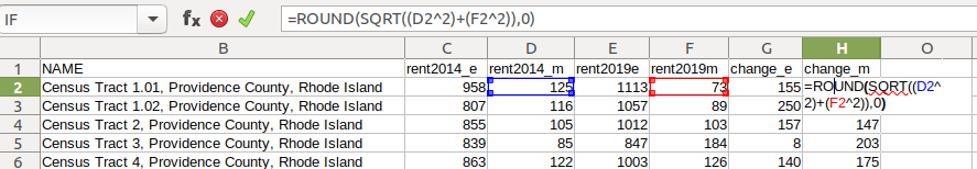
Let’s look at an example where we’ll use formulas to: calculate change over time, measure the reliability of a difference estimate, and determine whether two estimates are significantly different. I downloaded table B25064 Median Gross Rent (dollars) from the 5-year 2014 (2010-2014) and 2019 (2015-2019) ACS for all census tracts in Providence County, RI, and stitched them together into one spreadsheet. In this post I’ve replaced the cell references with an abbreviated label that indicates what should be referenced (i.e. Est1_MOE is the margin of error for the first estimate). You can download a copy of the spreadsheet with these examples.
To calculate the change / difference for an estimate, subtract one from the other.
To calculate the margin of error for this difference, take the square root of the sum of the squares for each estimate’s margin of error (MOE):
=ROUND(SQRT((Est1_MOE^2)+(Est2_MOE^2)),0)
To calculate percent change, divide the difference by the earliest estimate (Est1), and multiply by 100.
To calculate the margin of error for the percent change, use the ACS formula for computing a ratio:
Divide the 2nd estimate by the 1st and square it, multiply that by the square of the 1st estimate’s MOE, add that to the square of the 2nd estimate’s MOE. Take the square root of that result, then divide by the 1st estimate and multiply by 100. Note that this is formula for percent change is different from the one used for calculating a percent total (the latter uses the formula for a proportion; switch the plus symbol under the square root to a minus for percent totals).
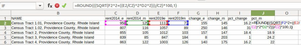
To characterize the overall accuracy of the new difference estimate, calculate its coefficient of variation (CV):
=ROUND(ABS((Est_MOE/1.645)/Est)*100,0)
Divide the MOE for the difference by 1.645, which is the Z-value for a 90% confidence interval. Divide that by the difference itself, and multiply by 100. Since we can have positive or negative change, we take the absolute value of the result.
To convert the CV into the generally recognized reliability categories:
=IF(CV<=12,"high",IF(CV>=35,"low","medium"))
If the CV value is between 0 to 12, then it’s considered to be highly reliable, else if the CV value is greater than or equal to 35 it’s considered to be of low reliability, else it is considered to be of medium reliability (between 13 and 34). Note: this is a conservative range; search around and you’ll find more liberal examples that use 0-15, 16-40, 41+.
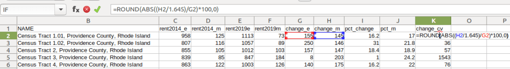
To measure whether two estimates are significantly different from each other, use the statistical difference formula:
Divide the MOE for both the 1st and 2nd estimate by 1.645 (Z value for 90% confidence), take the sum of their squares, and then square root. Subtract the 1st estimate from the 2nd, and then divide. Again in this case, since we could have a positive or negative value we take the absolute value.
To create a boolean significant or not value:
=IF(SigDif>1.645,1,0)
If the significant difference value is greater than 1.645, then the two estimates are significantly different from each other (TRUE 1), implying that some actual change occurred. Otherwise, the estimates are not significantly different (FALSE 0), which means any difference is likely the result of variability in the sample, or any true difference is hidden by this variability.
ALWAYS CHECK YOUR WORK! It’s easy to put parentheses in the wrong place or transpose a cell reference. Take one or two examples and plug them into Cornell PAD’s ACS Calculator, or into Fairfax County VA’s ACS Tools (spreadsheets with formulas – bottom of page). The Census Bureau also provides a spreadsheet that lets you test multiple values for significant difference. Caveat: for the Cornell calculator use the ratio option instead of change when testing. For some reason its change formula never matches my results, but the Fairfax spreadsheets do. I’ve also checked my formulas against the Census Bureau’s ACS Handbooks, and they clearly say to use the ratio formula for percent change.
Interpreting Results
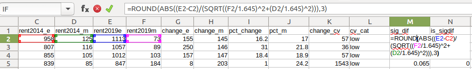
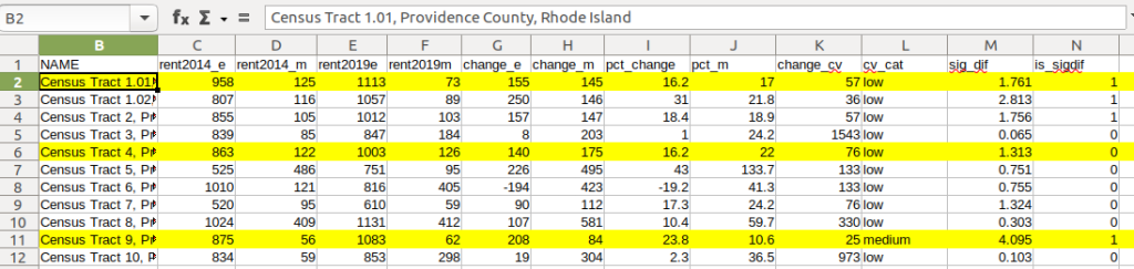
Let’s take a look at a few of the records to understand the results. In Census Tract 1.01, median gross rent increased from $958 (+/- 125) in 2014 to $1113 (+/- 73) in 2019, a change of $155 (+/- 145) and a percent change of 16.2% (+/- 17%). The CV for the change estimate was 57, indicating that this estimate has low reliability; the margin of error is almost equal to the estimate, and the change could have been as little as $10 or as great as $300! The rent estimates for 2014 and 2019 are statistically different but not by much (1.761, higher than 1.645). The margins of error for the two estimates do overlap slightly (with $1,083 being the highest possible value in 2014 and $1,040 the lowest possible value in 2019).
In Census Tract 4, rent increased from $863 (+/- 122) to $1003 (+/- 126), a change of $140 (+/- 175) and percent change of 16.2% (+/- 22%). The CV for the change estimate was 76, indicating very low reliability; indeed the MOE exceeds the value of the estimate. With a score of 1.313 the two estimates for 2014 / 2019 are not significantly different from each other, so any difference here is clouded by sample noise.
In Census Tract 9, rent increased from $875 (+/- 56) to $1083 (+/- 62), a change of $208 (+/- 84) or 23.8% (+/- 10.6%). Compared to the previous examples, these MOEs are much lower than the estimates, and the CV value for the difference is 25, indicating medium reliability. With a score of 4.095, these two estimates are significantly different from each other, indicating substantive change in rent in this tract. The highest possible value in 2014 was $931, and the lowest possible value in 2019 was $1021, so there is no overlap in the value ranges over time.
Mapping Significant Difference and CVs
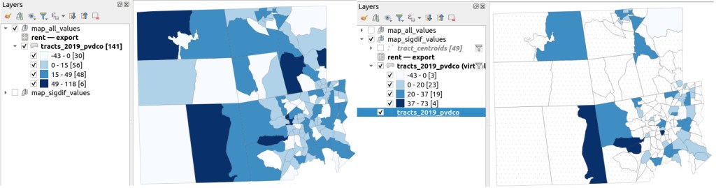
I grabbed the Census Cartographic Boundary File for tracts for Rhode Island in 2019, and selected out just the tracts for Providence County. I made a copy of my worksheet where I saved the data as text and values in a separate sheet (removing the formulas and encoding the actual outputs), and joined this sheet to the shapefile using the AFFGEOID. The City of Providence and surrounding cities and suburban areas appear in the southeast corner of the county.
The map on the left displays simple percent change over time. In the map on the right, I applied a filter to select just tracts where change was significantly different (the non-significant tracts are symbolized with hash marks). In the screenshots, the count of the number of tracts in each class appears in brackets; I used natural breaks, then modified to place all negative values in the same class. Of the 141 tracts, only 49 had statistically different values. The first map is a gross misrepresentation, as change for most of the tracts can’t be distinguished from sampling variability.
Percent Change in Median Gross Rent 2010-14 to 2015-19: Change on Left, Change Where Both Rent Estimates were Significantly Different on Right
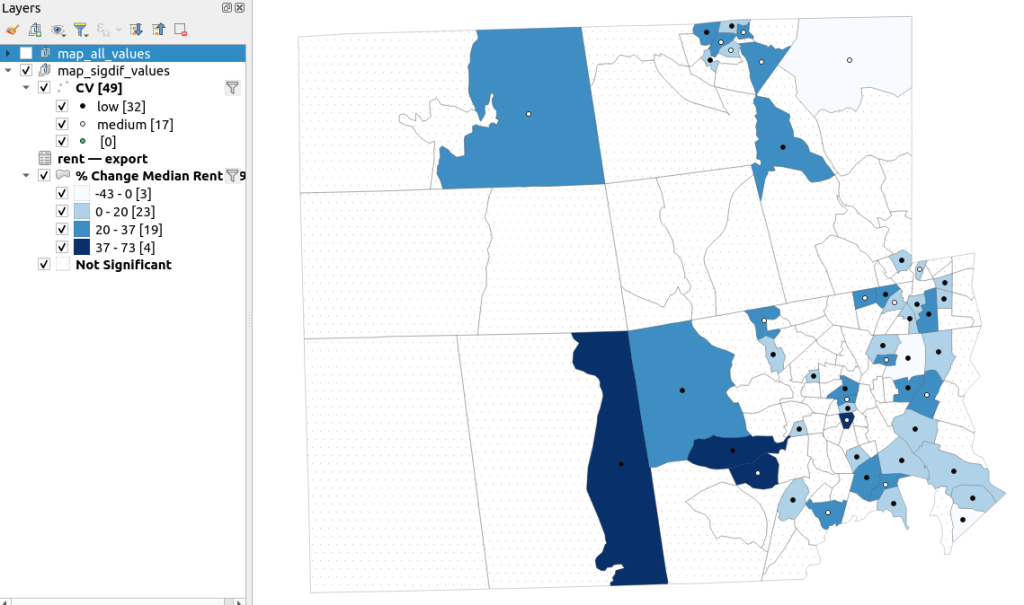
A refined version of the map on the right appears below. In this one, I converted the tracts from polygons to points in a new layer, applied a filter to select significantly different tracts, and symbolized the points by their CV category. Of the 49 statistically different tracts, the actual estimate of change was of low reliability for 32 and medium reliability for the rest. So even if the difference is significant, the precision of most of these estimates is poor.
Percent Change in Median Gross Rent 2010-14 to 2015-19 with CV Values, for Tracts with Significantly Different Estimates, Providence County RI
Conclusion
Comparing change over time for ACS estimates is complex, time consuming, and yields many dubious results. What can you do? The size of the MOE relative to the estimate tends to decline as you look at either larger or more populous areas, or larger and fewer subcategories (i.e. 4 income brackets instead of 8). You could also look at two period estimates that are further apart, making it more likely that you’ll see changes; say 2005-2009 compared to 2016-2020. But – you’ll have to cope with normalizing the data. Places that are rapidly changing will exhibit more difference than places that aren’t. If you are studying basic demographics (age / sex / race / tenure) and not socio-economic indicators, use the decennial census instead, as that’s a count and not a sample survey. Ultimately, it’s important to address these issues, and be honest. There’s a lot of bad research where people ignore these considerations, and thus make faulty claims.
For more information, visit the Census Bureau’s page on Comparing ACS Data. Chapter 6 of my book Exploring the US Census covers the American Community Survey and has additional examples of these formulas. As luck would have it, it’s freely accessible as a preview chapter from my publisher, SAGE.
Final caveat: dollar values in the ACS are based on the release year of the period estimate, so 2010-2014 rent is in 2014 dollars, and 2015-2019 is in 2019 dollars. When comparing dollar values over time you should adjust for inflation; I skipped that here to keep the examples a bit simpler. Inflation in the 2010s was rather modest compared to the 2020s, but still could push tracts that had small changes in rent to none when accounted for.
In an earlier post, I described how to summarize and extract raster temperature data using GIS. In this post I’ll demonstrate some alternate methods using spatial Python. I’ll describe some scripts I wrote for batch clipping rasters, overlaying them with point locations, and extracting raster values (mean temperature) at those locations based on attributes of the points (a matching date). I used a number of third party modules, including geopandas (storing vector data in a tabular form), rasterio (working with raster grids), shapely (building vector geometry), matplotlib (plotting), and datetime (working with date data types). Using Anaconda Python, I searched for and added each of these modules via its package handler. I opted for this modular approach instead of using something like ArcPy, because I don’t want the scripts to be wedded to a specific software package. My scripts and sample data are available in GitHub; I’ll add snippets of code to this post for illustration purposes. The repo includes the full batch scripts that I’ll describe here, plus some earlier, shorter, sample scripts that are not batch-based and are useful for basic experimentation.
Overview
I was working with a medical professor who had point observations of where patients lived, which included a date attribute of when they had visited a clinic to receive certain treatment. For the study we needed to know what the mean temperature was on that day, as well as the temperature of each day of the preceding week. We opted to use daily temperature data from the PRISM Climate Group at Oregon State, where you can download a raster of the continental US for a given day that has the mean temperature (degrees Celsius) in one band, at 4km resolution. There are separate files for min and max temperature, as well as precipitation. You can download a year’s worth of data in one go, with one file per date.
Our challenge was that we had thousands of observations than spanned five years, so doing this one by one in GIS wasn’t going to be feasible. A custom script in Python seemed to be the best solution. Each raster temperature file has the date embedded in the file name. If we iterate through the point observations, we could grab its observation date, and using string manipulation grab the raster with the matching date in its file name, and then do the overlay and extraction. We would need to use Python’s datetime module to convert each date to a common format, and use a function to iterate over dates from the previous week.
Prior to doing that, we needed to clip or mask the rasters to the study area, which consists of the three southern New England states (Connecticut, Rhode Island, and Massachusetts). The PRISM rasters cover the lower 48 states, and clipping them to our small study area would speed processing time. I downloaded the latest Census TIGER file for states, and extracted the three SNE states. ArcGIS Pro does have batch clipping tools, but I found they were terribly slow. I opted to write one Python script to do the clipping, and a second to do the overlay and extraction.
Batch Clipping Rasters
I downloaded a sample of PRISM’s raster data that included two full months of daily mean temperature files, from Jan and Feb 2020. At the top of the clipper script, we import all the modules we need, and set our input and output paths. It’s best to use the path.join method from the os module to construct cross platform paths, so we don’t encounter the forward / backward \ slash issues between Mac and Linux versus Windows. Using geopandas I read in the shapefile of the southern New England (SNE) states into a geodataframe.
import os
import matplotlib.pyplot as plt
import geopandas as gpd
import rasterio
from rasterio.mask import mask
from shapely.geometry import Polygon
from rasterio.plot import show

#Inputs
clip_file=os.path.join('input_raster','mask','states_southern_ne.shp')
# new file created by script:
box_file=os.path.join('input_raster','mask','states_southern_ne_bbox.shp')
raster_path=os.path.join('input_raster','to_clip')
out_folder=os.path.join('input_raster','clipped')

clip_area = gpd.read_file(clip_file)
Next, I create a new geodataframe that represents the bounding box for the SNE states. The total_bounds method provides a list of the four coordinates (west, south, east, north) that form a minimum bounding rectangle for the states. Using shapely, I build polygon geometry from those coordinates by assigning them to pairs, beginning with the northwest corner. This data is from the Census Bureau, so the coordinates are in NAD83. Why bother with the bounding box when we can simply mask the raster using the shapefile itself? Since the bounding box is a simple rectangle, the process will go much faster than if we used the shapefile that contains thousands of coordinate pairs.
Once we have the bounding box as geometry, we proceed to iterate through the rasters in the folder in a loop, reading in each raster (PRISM files are in the .bil format) using rasterio, and its mask function to clip the raster to the bounding box. The PRISM rasters and the TIGER states both use NAD83, so we didn’t need to do any coordinate reference system (CRS) transformation prior to doing the mask (if they were in different systems, we’d have to convert one to match the other). In creating a new raster, we need to specify metadata for it. We copy the metadata from the original input file to the output file, and update specific attributes for the output file (such as the pixel height and width, and the output CRS). Here’s a mask example and update from the rasterio docs. Once that’s done, we write the new file out as a simple GeoTIFF, using the name of the input raster with the prefix “clipped_”.
idx=0
for rf in os.listdir(raster_path):
    if rf.endswith('.bil'):
        raster_file=os.path.join(raster_path,rf)
        in_raster=rasterio.open(raster_file)
        # Do the clip operation
        out_raster, out_transform = mask(in_raster, areabbox.geometry, filled=False, crop=True)
        # Copy the metadata from the source and update the new clipped layer
        out_meta=in_raster.meta.copy()
        out_meta.update({
            "driver":"GTiff",
            "height":out_raster.shape[1], # height starts with shape[1]
            "width":out_raster.shape[2], # width starts with shape[2]
            "transform":out_transform})
        # Write output to file
        out_file=rf.split('.')[0]+'.tif'
        out_path=os.path.join(out_folder,'clipped_'+out_file)
        with rasterio.open(out_path,'w',**out_meta) as dest:
            dest.write(out_raster)
        idx=idx+1
        if idx % 20 ==0:
            print('Processed',idx,'rasters so far...')
    else:
        pass

print('Finished clipping',idx,'raster files to bounding box: \n',corners)
Just to see some evidence that things worked, outside of the loop I take the last raster that was processed, and plot that to the screen. I also export the bounding box out as a shapefile, to verify what it looks like in GIS.
PRISM US mean daily temperature raster, clipped / masked to bounding box of southern New England
Extract Raster Values by Date at Point Locations
In the second script, we begin with reading in the modules and setting paths. I added an option at the top with a variable called temp_many_days; if it’s set to True, it will take the date range below it and retrieve temperatures for x to y days before the observation date in the point file. If it’s False, it will retrieve just the matching date. I also specify the names of columns in the input point observation shapefile that contain a unique ID number, name, and date. In this case the input data consists of ten sample points and dates that I’ve concocted, labeled alfa through juliett, all located in Rhode Island and stored as a shapefile.
import os,csv,rasterio
import matplotlib.pyplot as plt
import geopandas as gpd
from rasterio.plot import show
from datetime import datetime as dt
from datetime import timedelta
from datetime import date

#Calculate temps over multiple previous days from observation
temp_many_days=True # True or False
date_range=(1,7) # Range of past dates

#Inputs
point_file=os.path.join('input_points','test_obsv.shp')
raster_dir=os.path.join('input_raster','clipped')
outfolder='output'
if not os.path.exists(outfolder):
    os.makedirs(outfolder)

# Column names in point file that contain: unique ID, name, and date
obnum='OBS_NUM'
obname='OBS_NAME'
obdate='OBS_DATE'
Next, we loop through the folder of clipped raster files, and for each raster (ending in .tif) we grab the file name and extract the date from it. We take that date and store it in Python’s standard date format. The date becomes a key, and the path to the raster its value, which get added to a dictionary called rf_dict. For example, if we split the file name clipped_PRISM_tmean_stable_4kmD2_20200131_bil.tif using the underscores, counting from zero we get the date in the 5th position, 20200131. Converting that to the standard datetime format gives us datetime.date(2020, 1, 31).
rf_dict={} # Create dictionary of dates and raster file names

for rf in os.listdir(raster_dir):
    if rf.endswith('.tif'):
        rfdatestr=rf.split('_')[5]
        rfdate=dt.strptime(rfdatestr,'%Y%m%d').date() #format of dates is 20200131
        rfpath=os.path.join(raster_dir,rf)
        rf_dict[rfdate]=rfpath
    else:
        pass
Then we read the observation point shapefile into a geodataframe, create an empty result_list that will hold each of our extracted values, and construct the header row for the list. If we are grabbing temperatures for multiple days, we generate extra header values to add to that row.
#open point shapefile
point_data = gpd.read_file(point_file)

result_list=[]
result_list.append(['OBS_NUM','OBS_NAME','OBS_DATE','RASTER_ROW','RASTER_COL','RASTER_FILE','TEMP'])

if temp_many_days==True:
    for d in range(date_range[0],date_range[1]):
        tcol='TMINUS_'+str(d)
        result_list[0].append(tcol)
    result_list[0].append('TEMP_RANGE')
    result_list[0].append('AVG_TEMP')
    temp_ftype='multiday_'
else:
    temp_ftype='singleday_'
Now the preliminaries are out of the way, and processing can begin. This post and tutorial helped me to grasp the basics of the process. We loop through the point data in the geodataframe (we indicate point.data.index because these are dataframe records we’re looping through). We get the observation date for the point and store that it the standard Python date format. Then we take that date, compare it to the dictionary, and get the path to the corresponding temperature raster for that date. We open that raster with rasterio, isolate the x and y coordinate from the geometry of the point observation, and retrieve the corresponding row and column for that coordinate pair from the raster. Then we read the value that’s associated with the grid cell at those coordinates. We take some info from the observation points (the number, name, and date) and the raster data we’ve retrieved (the row, column, file name, and temperature from the raster) and add it to a list called record.
#Pull out and format the date, and use date to look up file
for idx in point_data.index:
    obs_date=dt.strptime(point_data[obdate][idx],'%m/%d/%Y').date() #format of dates is 1/31/2020
    obs_raster=rf_dict.get(obs_date)
    if obs_raster == None:
        print('No raster available for observation and date',
              point_data[obnum][idx],point_data[obdate][idx])
    #Open raster for matching date, overlay point coordinates, get cell location and value
    else:
        raster=rasterio.open(obs_raster)
        xcoord=point_data['geometry'][idx].x
        ycoord=point_data['geometry'][idx].y
        row, col = raster.index(xcoord,ycoord)
        tempval=raster.read(1)[row,col]
        rfile=os.path.split(obs_raster)[1]
        record=[point_data[obnum][idx],point_data[obname][idx],
                point_data[obdate][idx],row,col,rfile,tempval]
If we had specified that we wanted a single day (option near the top of the script), we’d skip down to the bottom of the next block, append the record to the main result_list, and continue iterating through the observation points. Else, if we wanted multiple dates, we enter into a sub-loop to get data from a range of previous dates. The datetime timedelta function allows us to do date subtraction; if we subtract 1 from the current date, we get the previous day. We loop through and get rasters and the temperature values for the points from each previous date in the range and append them to an old_temps list; we also build in a safety mechanism in case we don’t have a raster file for a particular date. Once we have all the dates, we do some calculations to get the average temperature and range for that entire period. We do this on a copy of old_temps called all_temps, where we delete null values and add the current observation date. Then we add the average and range to old_temps, and old_temps to our record list for this point observation, and when finished we append the observation record to our main result_list, and proceed to the next observation.
       # Optional block, if pulling past dates
        if temp_many_days==True:
            old_temps=[]
            for d in range(date_range[0],date_range[1]):
                past_date=obs_date-timedelta(days=d) # iterate through days, subtracting
                past_raster=rf_dict.get(past_date)
                if past_raster == None: # if no raster exists for that date
                    old_temps.append(None)
                else:
                    old_raster=rasterio.open(past_raster)
                    # Assumes rasters from previous dates are identical in structure to 1st date
                    past_temp=old_raster.read(1)[row,col]
                    old_temps.append(past_temp)
            # Calculate avg and range, must exclude None values and include obs day
            all_temps=[t for t in old_temps if t is not None]
            all_temps.append(tempval)
            temp_range=max(all_temps)-min(all_temps)
            avg_temp=sum(all_temps)/len(all_temps)
            old_temps.extend([temp_range,avg_temp])
            record.extend(old_temps)
            result_list.append(record)
        else: # if NOT doing many days, just append data for observation day
            result_list.append(record)
    if (idx+1)%200==0:
        print('Processed',idx+1,'records so far...')
Once the loop is complete, we plot the last point and raster to the screen just to check that it looks good, and we write the results out to a CSV.
#Plot the points over the final raster that was processed
fig, ax = plt.subplots(figsize=(12,12))
point_data.plot(ax=ax, color='black')
show(raster, ax=ax)

today=str(date.today()).replace('-','_')
outfile='temp_observations_'+temp_ftype+today+'.csv'
outpath=os.path.join(outfolder,outfile)

with open(outpath, 'w', newline='') as writefile:
    writer=csv.writer(writefile, quoting=csv.QUOTE_MINIMAL, delimiter=',')
    writer.writerows(result_list)

print('Done. {} observations in input file, {} records in results'.format(len(point_data),len(result_list)-1))
CSV output from script, temperatures extracted from raster by date for observation points
Results and Wrap-up
Visit the GitHub repo for full copies of the scripts, plus input and output data. In creating test observation points, I purposefully added some locations that had identical coordinates, identical dates, dates that varied by a single day, and dates for which there would be no corresponding raster file in the sample data if we went one week back in time. I looked up single dates for all point observations manually, and a sample of multi-day selections as well, and they matched the output of the script. The scripts ran quickly, and the overall process seemed intuitive to me; resetting the metadata for rasters after masking is the one part that wouldn’t have occurred to me, and took a little bit of time to figure out. This solution worked well for this case, and I would definitely apply geospatial Python to a problem like this again. An alternative would have been to use a spatial database like PostGIS; this would be an attractive option if we were working with a bigger dataset and processing time became an issue. The benefit of using this Python approach is that it’s easier to share the script and replicate the process without having to set up a database.
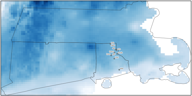
Observation points plotted on temperature raster with single-day output temperatures in QGIS
This month’s post will be brief, but helpful for anyone who wants to learn Stata. I wrote a short tutorial called First Steps with Stata for an introductory social science data course I visited earlier this month. It’s intended for folks who have never used a statistical package or a command-driven interface, and represents initial steps prior to doing any statistical analysis:
Loading and viewing Stata dta files
Describing and summarizing data
Modifying and recoding data
Batch processing with Do files / scripts
Importing data from other formats
I chose the data that I used in my examples to illustrate the difference between census microdata and summary data, using sample data from the Current Population Survey to illustrate the former, and a table from the American Community Survey to represent the latter.
I’m not a statistician by training; I know the basics but rely on Python, databases, Excel, or GIS packages instead of stats packages. I learned a bit of Stata on my own in order to maintain some datasets I’m responsible for hosting, but to prepare more comprehensively to write this tutorial I relied on Using Stata for Quantitative Analysis, which I highly recommend. There’s also an excellent collection of Stata learning modules created by UCLA’s Advance Research Computing Center. Stata’s official user documentation is second to none for clearly introducing and explaining the individual commands and syntax.
In my years working in higher ed, the social science and public policy faculty I’ve met have all sworn by Stata over the alternatives. A study of citations in the health sciences, where stats packages used for the research were referenced in the texts, illustrates that SPSS is employed most often, but that Stata and R have increased in importance / usage over the last twenty years, while SAS has declined. I’ve had some students tell me that Stata commands remind them of R. In searching through the numerous shallow reviews and comparisons on the web, I found this post from a data science company that compares R, Python, SPSS, SAS, and Stata to be comprehensive and even-handed in summarizing the strengths and weaknesses of each. In short, I thought Stata was fairly intuitive, and the ability to batch script commands in Do files and to capture all input / output in logs makes it particularity appealing for creating reproducible research. It’s also more affordable than the other proprietary stats packages and runs on all operating systems.
Example – print the first five records of the active dataset to the screen for specific variables:
list statefip age sex race cinethp in f/5
     +-------------------------------------------+
     | statefip   age      sex    race   cinethp |
     |-------------------------------------------|
  1. |  alabama    76   female   white       yes |
  2. |  alabama    68   female   black       yes |
  3. |  alabama    24     male   black        no |
  4. |  alabama    56   female   black        no |
  5. |  alabama    80   female   white       yes |
     |-------------------------------------------|
I have written a new report that’s just been released: US Census Data: Concepts and Applications for Supporting Research, was published as the May / June 2022 issue of the American Library Association’s Library and Technology Reports. It’s available for purchase digitally or in hard copy from the ALA from now through next year. It will also be available via EBSCOhost as full text, sometime this month. One year from now, the online version will transition to become a free and open publication available via the tech report archives.
The report was designed to be a concise primer (about 30 pages) for librarians who want to be knowledgeable with assisting researchers and students with finding, accessing, and using public summary census data, or who want to apply it to their own work as administrators or LIS researchers. But I also wrote it in such a way that it’s relevant for anyone who is interested in learning more about the census. In some respects it’s a good distillation of my “greatest hits”, drawing on work from my book, technical census-related blog posts, and earlier research that used census data to study the distribution of public libraries in the United States.
Chapter Outline
Introduction
Roles of the Census: in American society, the open data landscape, and library settings
Census Concepts: geography, subject categories, tables and universes
Datasets: decennial census, American Community Survey, Population Estimates, Business Establishments
Accessing Data: data.census.gov, API with python, reports and data summaries
GIS, historical research, and microdata: covers these topics plus the Current Population Survey
The Census in Library Applications: overview of the LIS literature on site selection analysis and studying library access and user populations
I’m pleased with how it turned out, and in particular I hope that it will be used by MLIS students in data services and government information courses.
Although… I must express my displeasure with the ALA. The editorial team for the Library Technology Reports was solid. But once I finished the final reviews of the copy edits, I was put on the spot to write a short article for the American Libraries magazine, primarily to promote the report. This was not part of the contract, and I was given little direction and a month at a busy time of the school year to turn it around. I submitted a draft and never heard about it again – until I saw it in the magazine last week. They cut and revised it to focus on a narrow aspect of the census that was not the original premise, and they introduced errors to boot! As a writer I have never had an experience where I haven’t been given the opportunity to review revisions. It’s thoroughly unprofessional, and makes it difficult to defend the traditional editorial process as somehow being more accurate or thorough compared to the web posting and tweeting masses. They were apologetic, and are posting corrections. I was reluctant to contribute to the magazine to begin with, as I have a low opinion of it and think it’s deteriorated in recent years, but that’s a topic for a different discussion.
Stepping off the soapbox… I’ll be attending the ALA annual conference in DC later this month, to participate on a panel that will discuss the 2020 census, and to reconnect with some old colleagues. So if you want to talk about the census, you can buy me some coffee (or beer) and check out the report.
A final research and publication related note – the map that appears at the top of my post on the distribution of US public libraries from several years back has also made it into print. It appears on page 173 of The Argument Toolbox by K.J. Peters, published by Broadview Press. It was selected as an example of using visuals for communicating research findings, making compelling arguments in academic writing, and citing underlying sources to establish credibility. I’m browsing through the complimentary copy I received and it looks excellent. If you’re an academic librarian or a writing center professional and are looking for core research method guides, I would recommend checking it out.


You must be logged in to post a comment.