I haven’t been keeping up with posting, as these past few months have been atypical. April was devoted to attending conferences and giving presentations. Much of this was prompted by my recent work with the Data Rescue Project, and the HIFLD Open rescue initiative in particular. The month began with a panel at Brown’s Data Science Institute, where the topic was Trust in Data. A few days later, I joined local colleagues at the Northeast Higher Ed GIS Facilitators Meet Up in Worcester, MA. I was honored to serve as the keynote speaker for the annual Big 10 GIS Conference (held virtually), where I presented on preserving federal datasets and the HIFLD Open rescue initiative. Shortly thereafter, I traveled to the Census Bureau’s headquarters just outside of DC for FedGeoDay 2026 and served on a panel of non-federal data providers who are contributing to the national data ecosystems. I came back to Providence just in time to give a poster presentation on our GIS and Data Services at the CHAIRS-C conference (Center on Heat, Health, and Aging Innovation and Research Solutions for Communities at the Brown University School of Public Health).
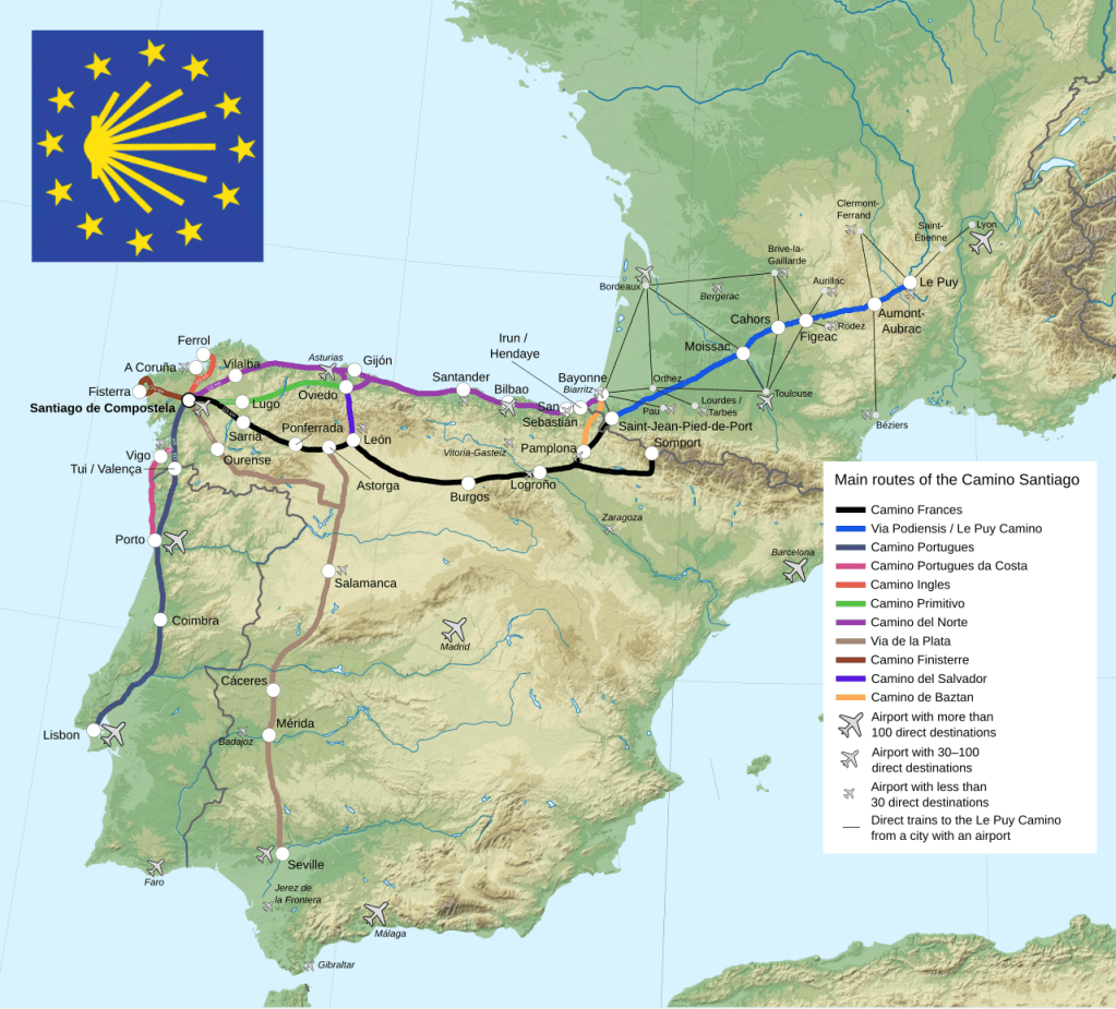
Then in May, I went off the grid. My wife and I traveled to Northwestern Spain to walk the Camino de Santiago, or Way of St. James. Established in the Middle Ages, the Camino is a series of routes that drew Christian pilgrims from throughout Europe to the Cathedral in Santiago de Compestella, which is believed to be the resting place of the apostle St James, brother of St John. We walked the Camino Primitivo, which is the “original” route established by King Alfonso II circa 814 AD. It’s also considered to be the most challenging of the routes, as it climbs through mountains and forests before descending into farmland. It’s not considered a “wilderness” hike however, as all of the routes follow a mix of unpaved and paved roads between towns and villages. A map of the primary routes (from Wikipedia) is below. The French Way is considered the primary route and is the most heavily traveled. The Portuguese and Northern Ways are also popular, followed by the Primitivo.
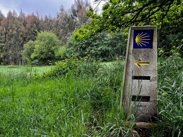
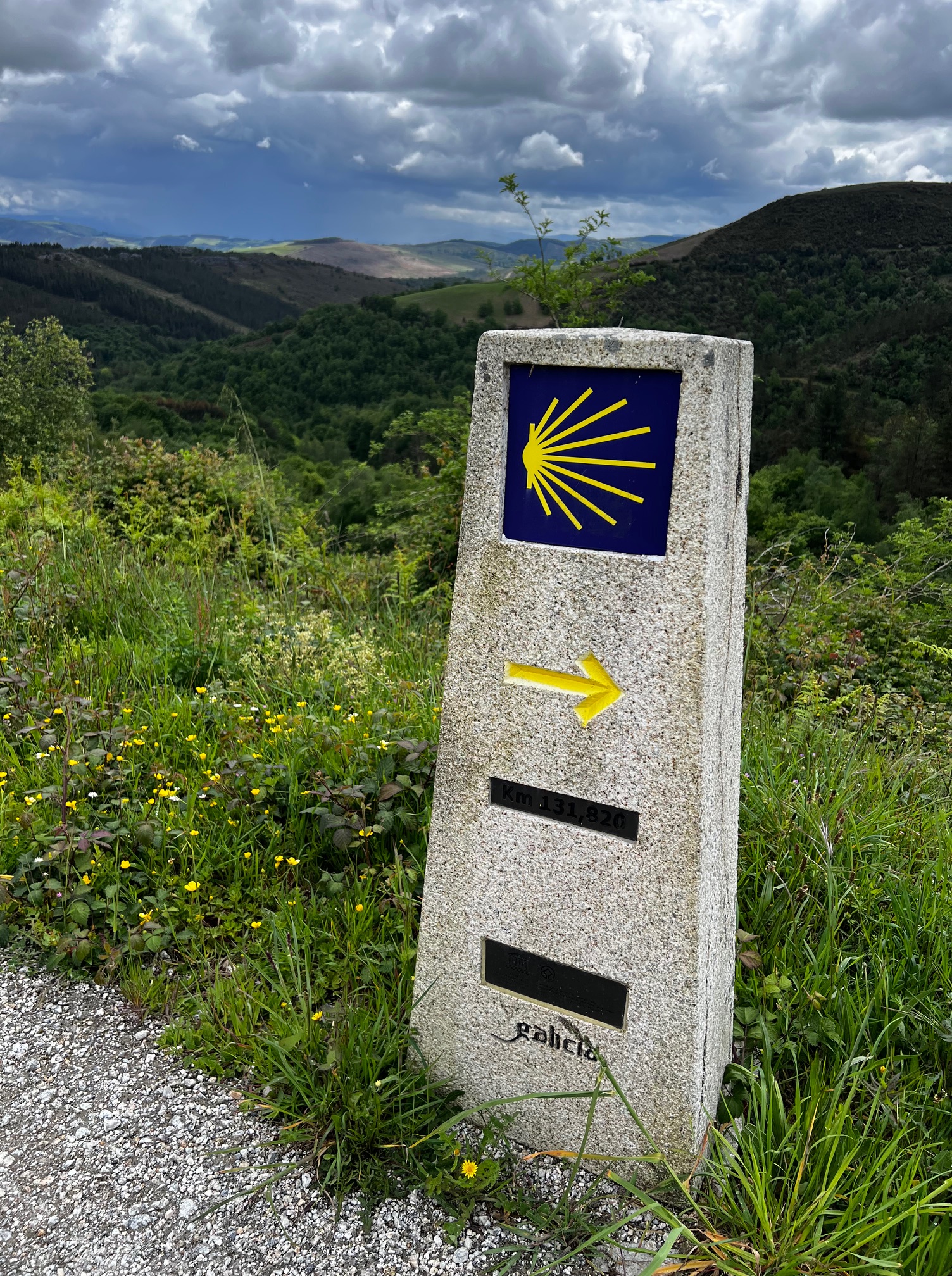
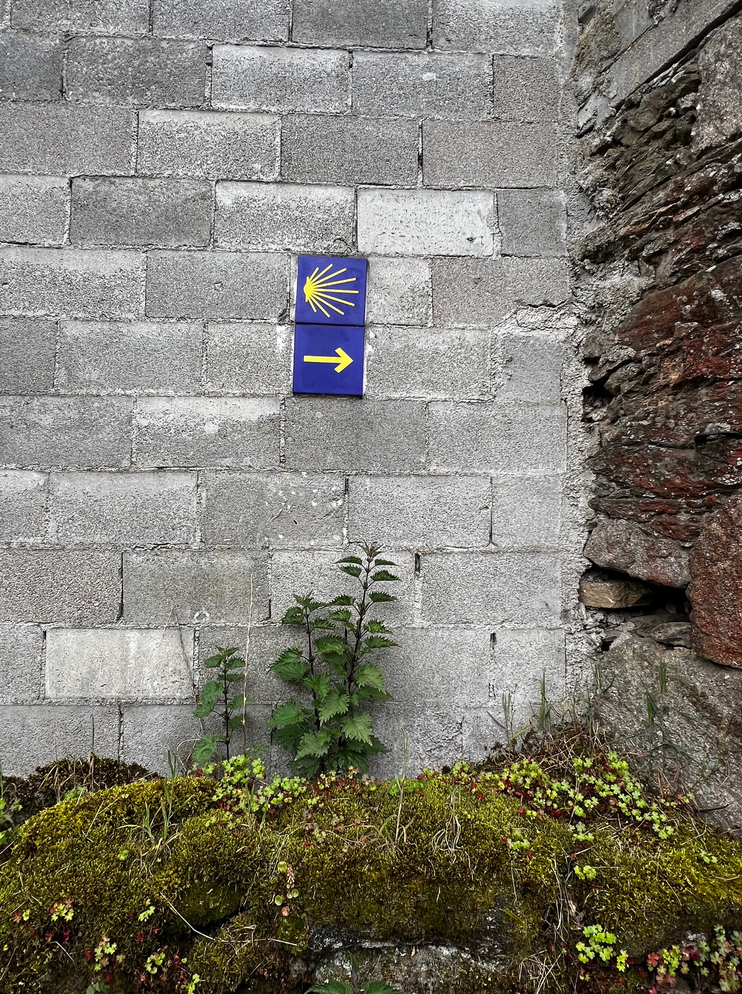
The paths are marked at regular intervals, and whenever you have to turn or change direction. You look for a white or grey stone marker with a scallop shell, a symbol of St. James and of the Camino, to guide you. In places where a marker stone isn’t feasible, a blue and yellow tile of the shell is embedded in a wall or building to point the way. The system was so good that we rarely needed our phones; we used nothing more than our eyes and an excellent guidebook with detailed topographic maps of each stage of the journey, elevation diagrams, and a directory of landmarks and places to stay (the Village to Village Camino Guides – highly recommended).
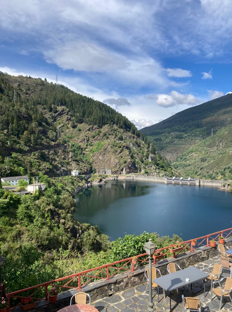
The routes run into the hundreds of kilometers; the Primitivo is a shorter trek that covers about 320 km between Oviedo and Santiago, but in exchange for the shorter distances you have greater changes in elevation. As this was our first attempt at something like this, we opted to do half the route, beginning in a town called Grandas de Salime, located at a large dam and reservoir as you leave the region of Asturias and enter Galicia.
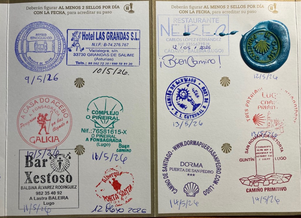
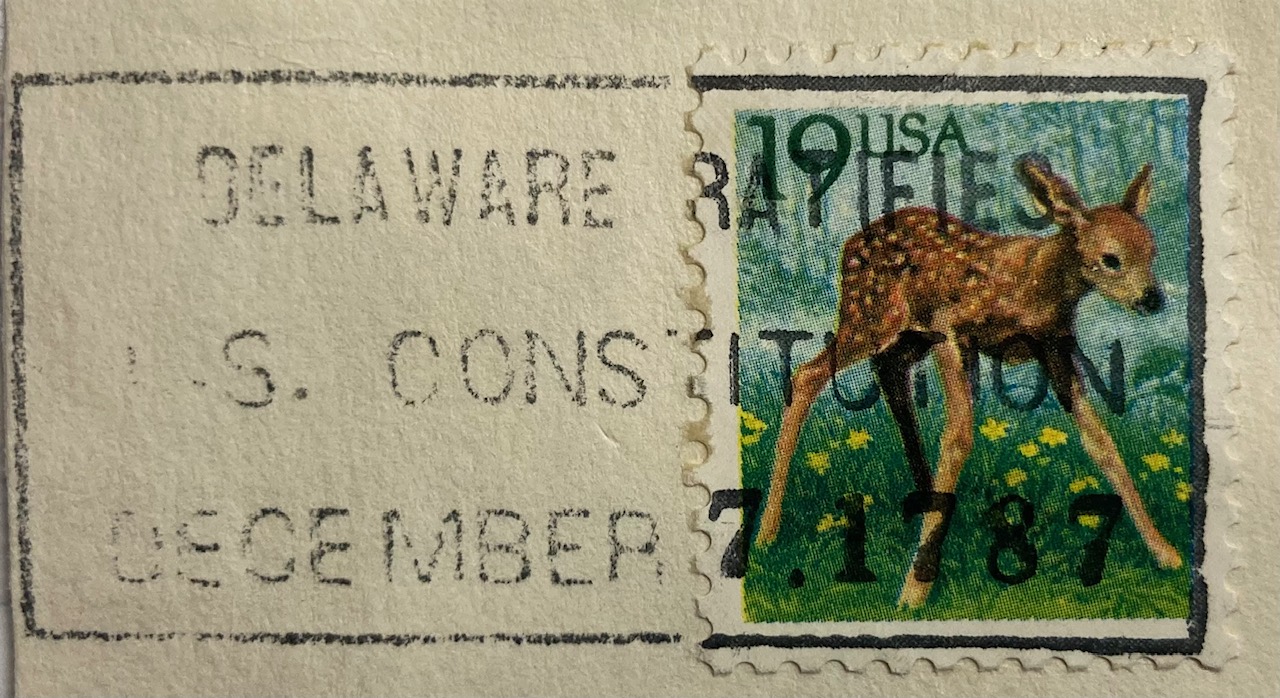
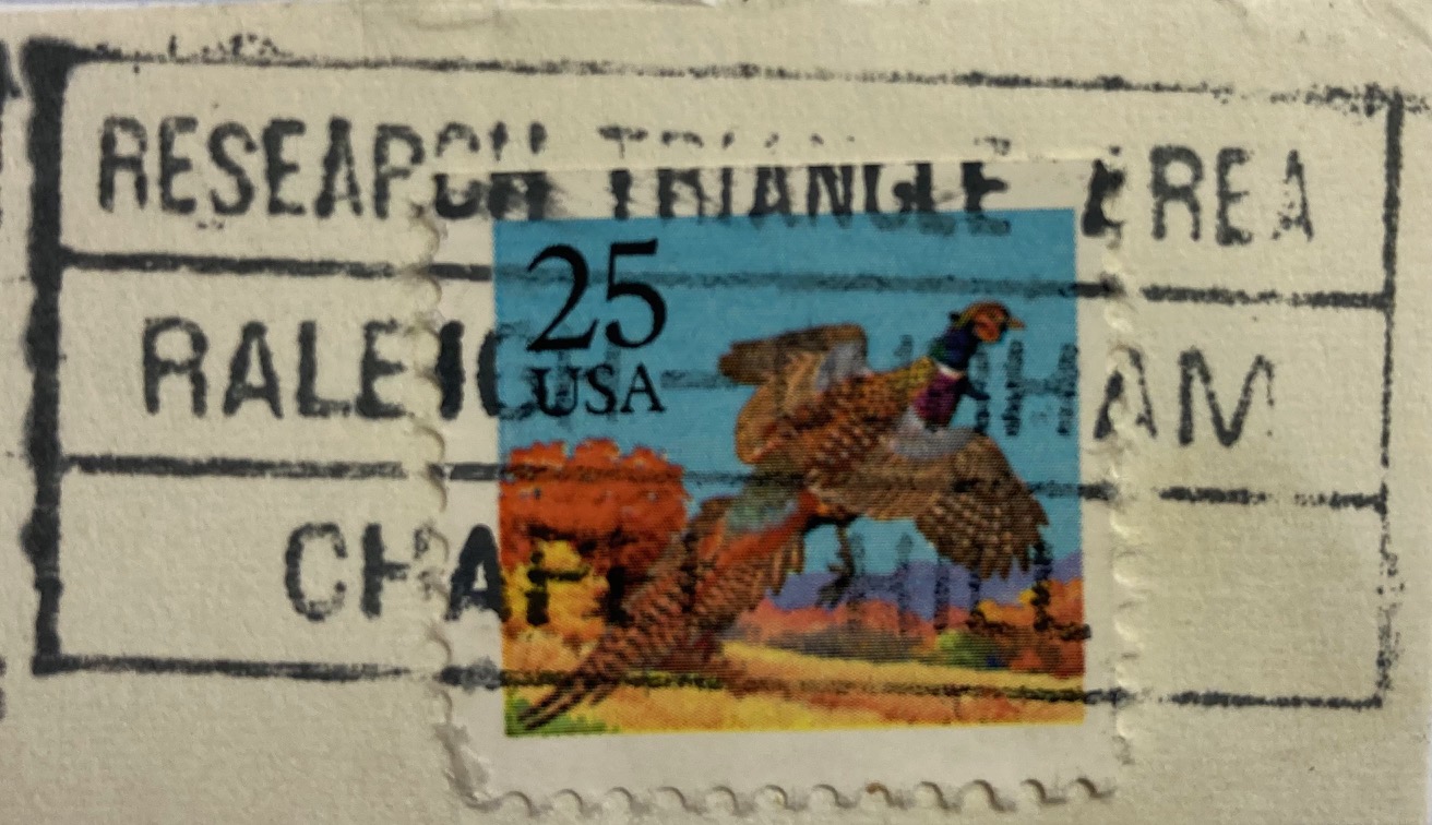
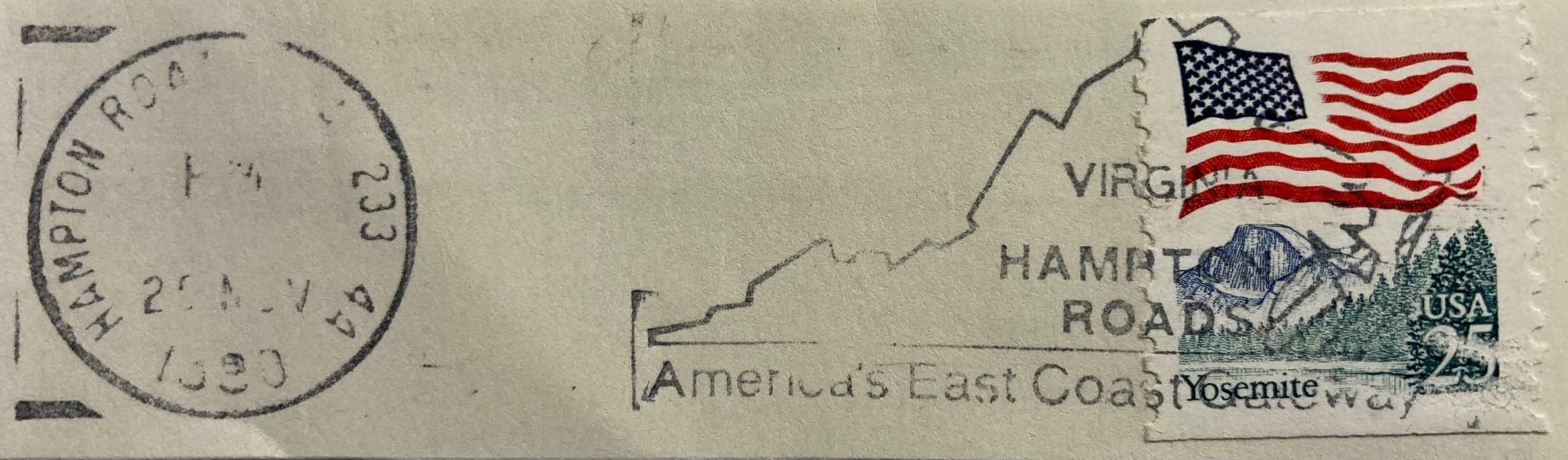
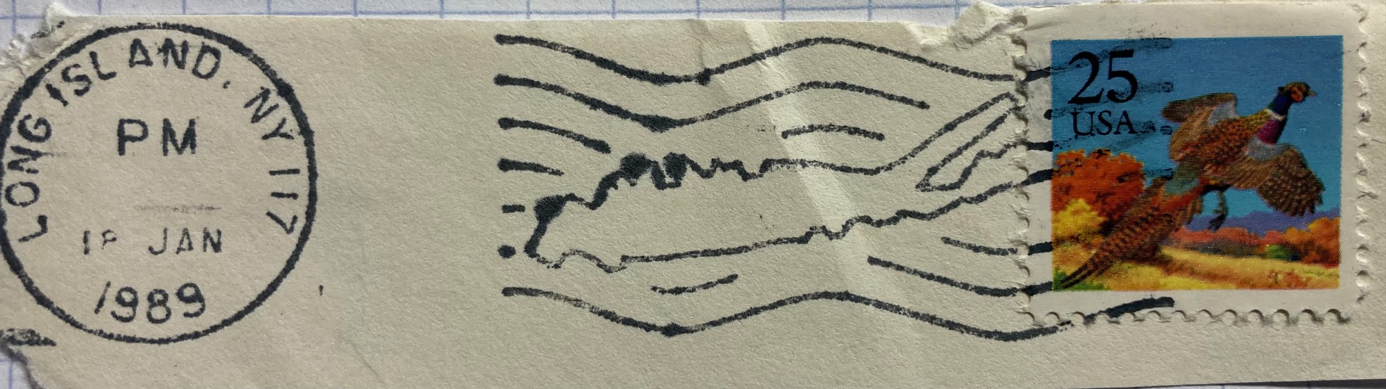
Accommodations and cafes serve pilgrims throughout the route; albergues offer a mix of hostel-like rooms (bunk beds in shared rooms) and single rooms, and there are also basic hotels. Our 183 km walk took us 9 days (3 days walking / 1 rest day in Lugo / 5 days walking). You are issued a pilgrim’s credential or passport when you begin, which grants you access to pilgrim-reserved accommodations and resources. On your journey, you need to get your passport stamped twice a day to verify that you are doing the walk. You always get a stamp at the places you stay, and in-between you can pick up others at cafes and restaurants, churches, museums, visitor centers, and even certain stores (we managed to get one at a cheese shop). Once you reach the cathedral in Santiago, you visit the pilgrim’s office (essentially the Camino DMV), where you present your passport to receive the Compostella, the official document that certifies that you finished the pilgrimage. You need to walk 100km minimum (200km if you’re biking) to qualify.
It was a deeply moving experience, retracing the steps that countless pilgrims took over a thousand years, and ending in front of the statue and tomb of St James behind the high altar in the cathedral, receiving the Eucharist at the Pilgrim’s mass. It was a relief to disconnect from technology and work, boiling life down to the singular goal of getting from point A to B each day. It was physically satisfying, pushing my body to walk 10 to 20 miles a day in rough terrain in all kinds of weather. It was wonderful to meet new friends; there is a cohort of people who happen to begin their journey simultaneously with you, and you see them throughout the walk, sharing the road for a time or a meal at the end of the day at the albergue. And it was a lot of fun, for a geographer who enjoys navigating a landscape with no digital do-dads, and who loves collecting stamps!
An experience like this alters your perspective, and it’s been difficult to transition back to my normal routines. It has strengthened my belief that it’s time for me to consider new possibilities and next stages in my career. Please reach out (via LinkedIn or email in the sidebar) to share opportunities. My resume is available on the About page.
Stay tuned for some heat and climate-related dataset suggestions in my next post; resources I compiled for the heat conference, and new ones I’ve learned about at FedGeoDay.


You must be logged in to post a comment.