Just when we thought the US government couldn’t possibly become more dysfunctional, it shut down completely on Sept 30, 2025. Government websites are not being updated, and many have gone offline. I’ve had trouble accessing data.census.gov; access has been intermittent, and sometimes it has worked with some web browsers but not with others.
In this post I’ll summarize some solid, alternative portals for accessing US census data. I’ve sorted the free resources from the simplest and most basic to the most exhaustive and complex, and I mention a couple of commercial sources at the end. These are websites; the Census Bureau’s API is still working (for now), so if you are using scripts that access its API or use R packages like tidycensus you should still be in business.
Free and Public
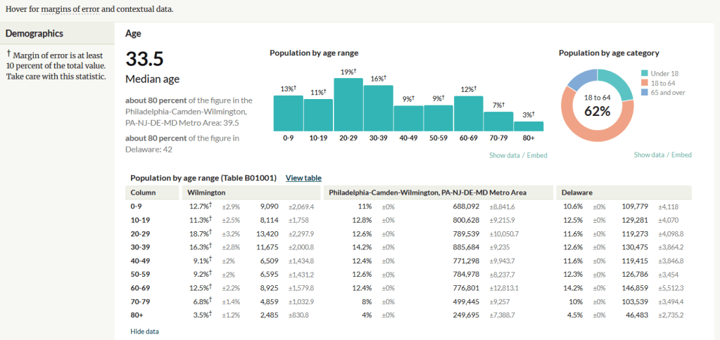
Census Reporter
https://censusreporter.org/
Focus: the latest American Community Survey (ACS) data
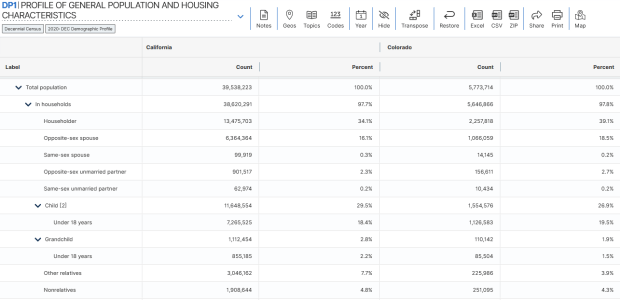
A non-profit project originally created by journalists, the Census Reporter provides just the most recent ACS data, making it easy to access the latest statistics. Search for a place to get a broad profile with interactive summaries and charts, or search for a topic to download specific tables that include records for all geographies of a particular type, within a specific place. There are also basic mapping capabilities.
Missouri Census Data Center Profiles and Trends
https://mcdc.missouri.edu/
Focus: data from the ACS and decennial profile tables for the entire US
The Census Bureau publishes four profile tables for the ACS and one for the decennial census that are designed to capture a wide selection of variables that are of broad interest to most researchers. The MCDC makes these readily available through a simple interface where you select the time period, summary level, and up to four places to compare in one table, which you can download as a spreadsheet. There are also several handy charts, and separate applications for studying short term trends. Access the apps from the menu on the right-hand side of the page.
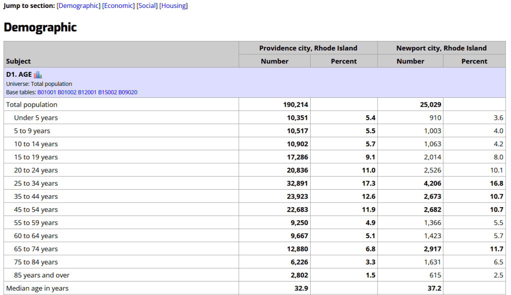
State and Local Government Data Pages
Focus: extracts and applications for that particular area
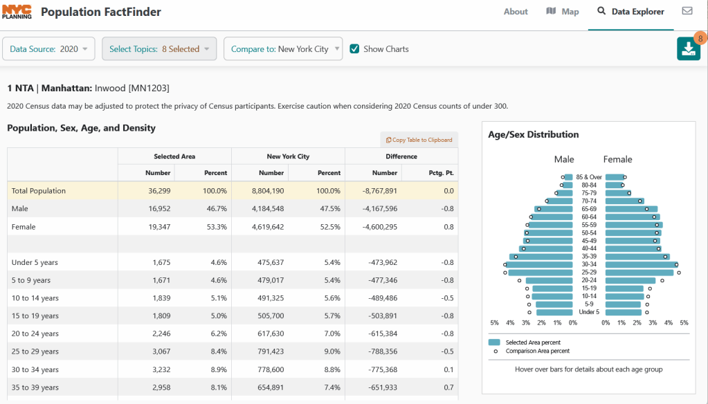
Hundreds of state, regional, county, and municipal governments create extracts of census data and republish them on their websites, to provide local residents with accessible summaries for their jurisdictions. In most cases these are in spreadsheets or reports, but some places have rich applications, and may recompile census data for geographies of local interest such as neighborhoods. Search for pages for planning agencies, economic development orgs, and open data portals. New York City is a noteworthy example; not only do they provide detailed spreadsheets, they also have the excellent map-based Population FactFinder application. Fairfax County, VA provides spreadsheets, reports, an interactive map, and spreadsheet tools and macros that facilitate working with ACS data.
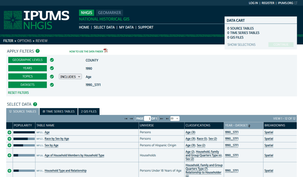
IPUMS NHGIS
https://www.nhgis.org/
Focus: all contemporary and historic tables and GIS boundary files for the ACS and decennial census
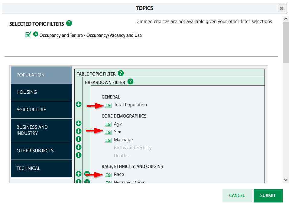
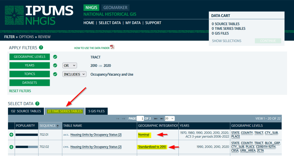
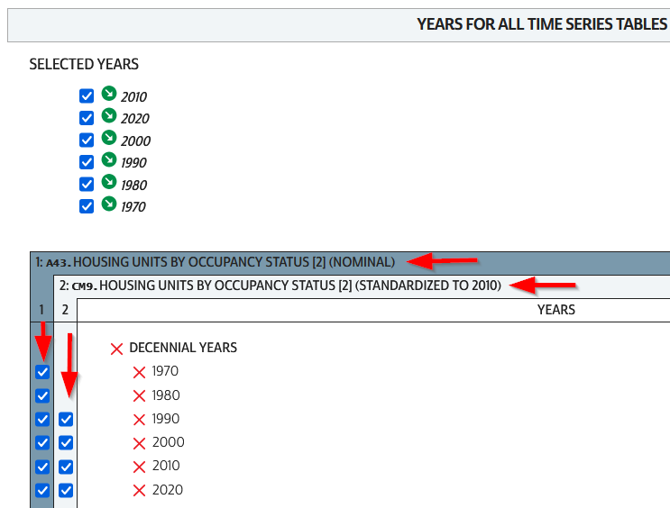
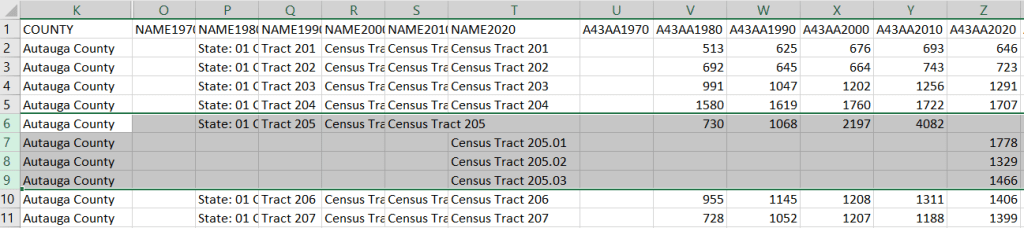
If you need access to everything, this is the place to go. The National Historic Geographic Information System uses an interface similar to the old American Factfinder (or the Advanced Search for data.census.gov). Choose your dataset, survey, year, topic, and geographies, and access all the tables as they were originally published. There is also a limited selection of historical comparison tables (which I’ve written about previously). Given the volume of data, the emphasis is on selecting and downloading the tables; you can see variable definitions, but you can’t preview the statistics. This is also your best option to download GIS boundary files, past and present. You must register to use NHGIS, but accounts are free and the data is available for non-commercial purposes. For users who prefer scripting, there is an API.
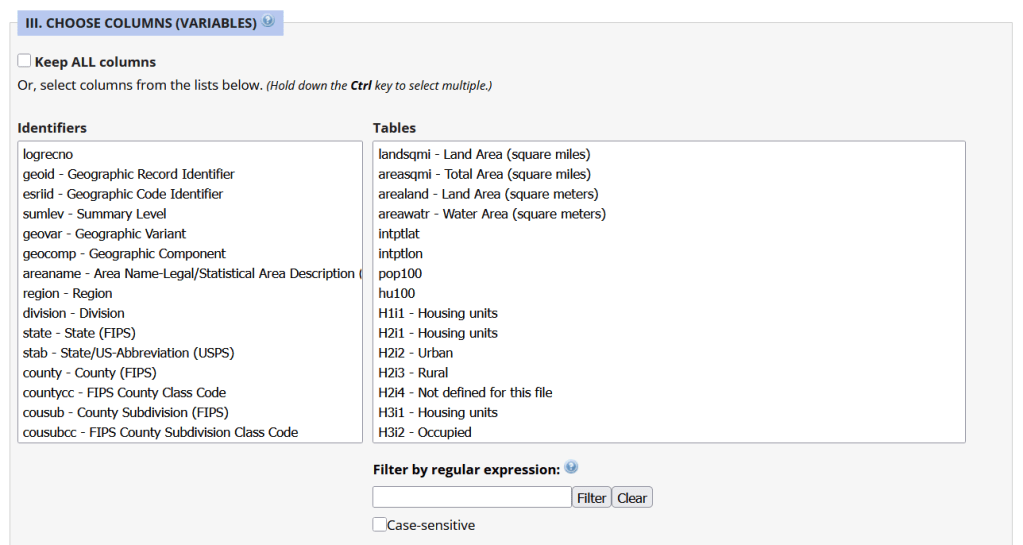
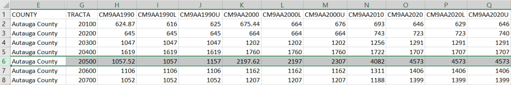
MCDC Uexplore / Dexter
https://mcdc.missouri.edu/applications/uexplore.html
Focus: create targeted extracts of ACS data and the decennial census back to 1980
Unlike other applications where you download data that’s prepackaged in tables, Uexplore allows you to create targeted, customized extracts where you can pick and choose variables from multiple tables. While the interface looks daunting at first, it’s not bad once you get the hang of it, and it offers tremendous flexibility and ample documentation to get you started. This is a good option for folks who want customized extracts, but are not coders or API users.
Commercial Products
There are some commercial products that are quite good; they add value by bundling data together and utilizing interactive maps for exploration, visualization, and access. The upsides are they are feature rich and easy to use, while the downsides are they hide the fuzziness of ACS estimates by omitting margins of error (making it impossible to gauge reliability), and they require a subscription. Many academic libraries, as well as a few large public ones, do subscribe, so check the list of library databases at your institution to see if they subscribe (the links below take you to the product website, where you can view samples of the applications).
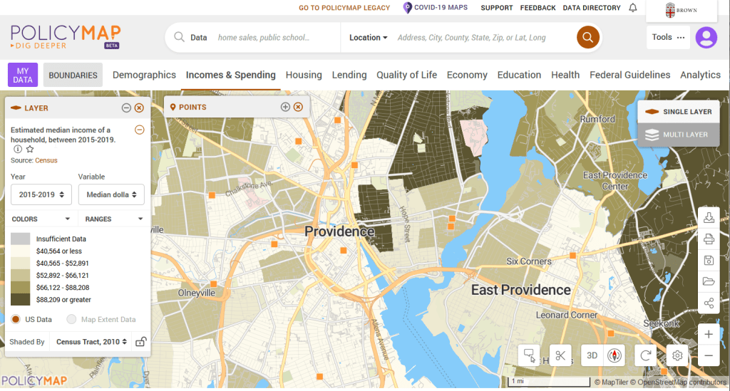
PolicyMap
https://www.policymap.com/
Focus: mapping contemporary census and US government data
PolicyMap bundles 21st century census data, datasets from several government agencies, and a few proprietary series, and lets you easily create thematic maps. You can generate broad reports for areas or custom regions you define, and can download comparison tables by choosing a variable and selecting all geographies within a broader area. It also incorporates some basic analytical GIS functions, and enables you to upload your own coordinate point data.
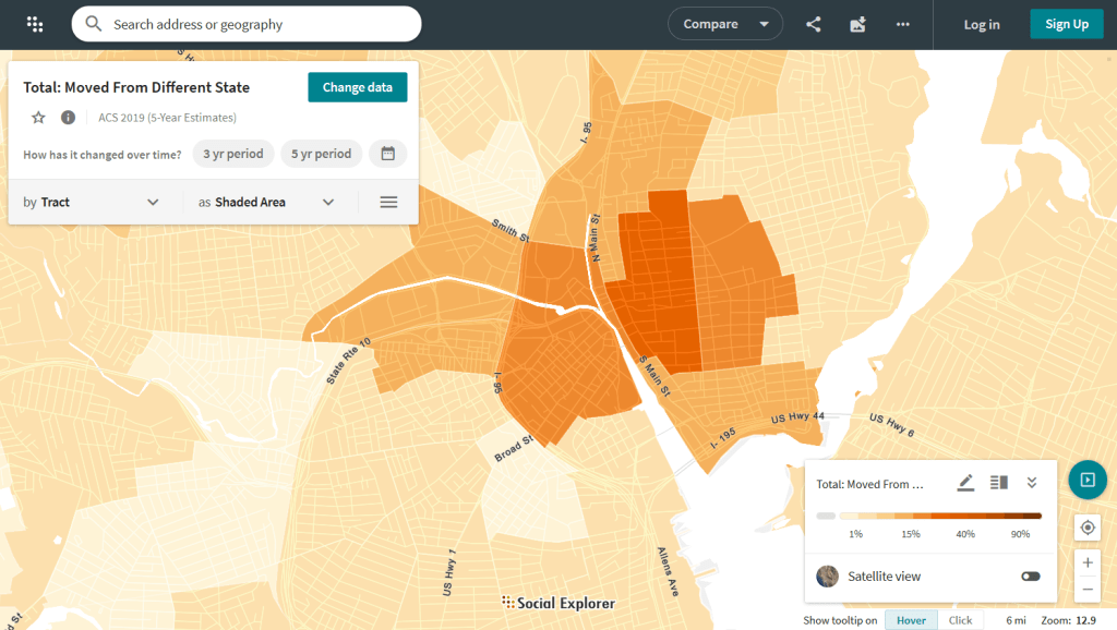
Social Explorer
https://www.socialexplorer.com/
Focus: mapping contemporary and historic US census data
Social Explorer allows you to effortlessly create thematic maps of census data from 1790 to the present. You can create a single map, side by side maps for showing comparisons over time, and swipe maps to move back and forth from one period to the other to identify change. You can also compile data for customized regions and generate a variety of reports. There is a separate interface for downloading comparison tables. Beyond the US demographic module are a handful of modules for other datasets (election data for example), as well as census data for other countries, such as Canada and the UK.


You must be logged in to post a comment.