sql

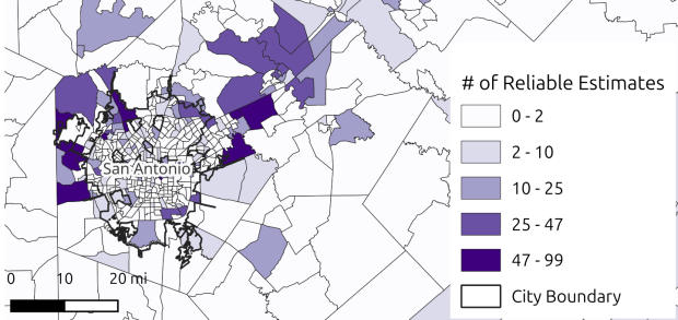
Map of San Antonio Showing Reliable Estimates by census tract

Comparing 5-year ACS Estimates Over Time

My article on comparing American Community Survey (ACS) estimates over time was published earlier this month. It will take another 6 to 12 months before it’s slotted into a actual volume and issue, but until then it’s available online via the link in this citation:

Donnelly, F. P. (2026). The Feasibility of Comparing 5-Year American Community Survey Estimates Over Time. Journal of the American Planning Association, 1–14. https://doi.org/10.1080/01944363.2026.2709860

Unfortunately it’s not open access; if you don’t have a subscription, you can read the article in the publisher’s e-pub platform; this link only works for the first 100 clicks, then it’s kaput. I’ll eventually post the pre-published version of the article on this website, as I can freely share it. Much of the summary data from the research and the scripts I wrote for processing and analyzing the data are available on GitHub.

Background

The idea for the paper sprang from my work helping graduate students compare estimates over time when making maps in GIS. I wrote a post about these early experiences, where I described the fairly involved process we had to take to prepare and assess the estimates, only to discover that statistically they were not comparable (you couldn’t discern actual change from sample variability), or if they were comparable they were too imprecise to be useful. I wondered, how feasible is it to compare estimates over time – is going through all of these steps ever worthwhile?

To answer this question, I chose 25 detailed tables that captured a broad range of variables and represented basic, fundamental tables that many researchers would likely use. These tables included over 300 individual variables. For example, table B01001 included 49 variables: total population, total population that was male and that was female, and then 5-year age cohorts by sex (male population aged 0-4, male population aged 5-9, etc). I chose 19 geographic summary levels that represented the most essential geographies, from the nation down to census block groups. I compared estimates for these variables from the 2010-2014 to the 2015-2019 ACS for approximately 400,000 individual geographic areas; I chose these two 5-year periods as they do not overlap, and they are drawn from the same geographic vintage (2010) so I would not have to account for geographic boundary changes that occur with each decennial census.

ACS TABLES INCLUDED IN THE STUDY

Table IDTable NameVariablesObservations (M)% Total
B01001Sex by Age4919.918.0%
B01002Median Age by Sex31.21.1%
B02001Race104.13.7%
B03002Hispanic or Latino Origin by Race218.57.7%
B05002Place of Birth by Nativity and Citizenship*15†2.82.5%
B07204Geographical Mobility in the Past Year*19†3.53.2%
B08006Workers by Means of Transportation to Work*17†3.12.8%
B11001Household Type (Including Living Alone)93.73.3%
B13002Women Who Had a Birth in the Past 12 Months*193.53.2%
B14001School Enrollment by Level of School*101.81.7%
B15002Sex by Educational Attainment3514.212.9%
C17002Ratio of Income to Poverty Level83.22.9%
B19001Household Income (Dollars)176.96.2%
B19013Median Household Income (Dollars)10.40.4%
B19083Gini Index of Income Inequality*10.20.2%
B23025Employment Status72.82.6%
C24030Sex by Industry for Employed Civilians29†11.810.6%
B25002Occupancy Status31.21.1%
B25003Tenure31.21.1%
B25010Average Household Size of Occupied Housing Units31.21.1%
B25063Gross Rent24†9.78.8%
B25064Median Gross Rent (Dollars)10.40.4%
B25070Gross Rent as a Percentage of Household Income114.54.0%
B25077Median Home Value (Dollars)10.40.4%
B26001Group Quarters Population*10.20.2%

* Data for block groups and tribal block groups is not published for this table
† Value represents a subset of the total variables in the table; some variables were excluded

I opted against randomly sampling the variables, which would have allowed me to statistically analyze the results and make “firmer” assumptions. The primary audience for the paper is a practitioner-based one, for whom it’s more meaningful to have complete results for all geographies, for all or most variables in tables that people commonly use. The variables I chose also represent relatively broad swaths of the population. A random sample would have yielded many variables for small populations from disparate tables, which would be of limited interest.

I calculated change and percent change for each pair of estimates from the two time periods. I applied the test for significant difference, to determine if the estimates from both time periods were truly different from another, or if any difference was likely the result of sampling variation. If the estimates were significantly different, I calculated the coefficient of variation, to determine how reliable the estimates were. I summarized the results by variable, table, and geographic summary level. Ultimately, I had a dataset with 110.5 million individual data points that represented change for a variable between two time periods for a given place, of which 107.5 mil­lion were distinct (i.e. variables included in more than one table were only counted once).

Results

The results were surprising. Approximately 90% of the time, estimates from the two time periods were not statistically different from each other, and thus could not be reliably compared to compute change over time. The estimates that were significantly different were of low precision approximately 90% of the time (a CV value higher than 30). In short, it’s usually not worth investing the effort that’s involved with comparing two, consecutive 5-year period ACS estimates over time.

That being said, there are exceptions. Not surprisingly, the larger a population was, or the larger the sample size, the more likely it was that the estimates would be comparable and reliable. For the nation as a whole, estimates were comparable about 94% of the time, and of those that were comparable, estimates were of reliable precision about 98% of the time (a CV value less than 30). Both of these values fall to 73% for states, to 28% and 34% for counties, and 12% and 6% for census tracts. When considering all estimates regardless of geography, variables that represented large segments of the population were also more comparable and reliable. For example, estimates for the total population, median home value, population not enrolled in school, and workers 16 years and older were comparable 25% to 30% of the time and reliable 22% to 33% of the time.

There were some interesting divergences. Estimates for workers who take various forms of public transit to work ranked low in terms of being statistically comparable, but of the estimates that were comparable, they tended to be the most reliable. While this population is small or zero in many parts of the country, it is large and highly clustered in dense urban areas, so when the values are comparable they are of high precision. So if you were doing research in New York City or Chicago, you would have good estimates to work with (but not so if you were looking at all tracts / places / ZCTAs in New York State or Illinois).

Beyond the relationship between population and sample size, areas or populations that experienced a large degree of growth or decline were also more likely to be comparable and reliable, as these large shifts outweighed any sample noise. These two time periods experienced dramatic growth in home value (adjusted for inflation) and decline in unemployment. Median home value was consistently ranked as one of the most comparable and reliable estimates, while the unemployed labor force was ranked as one of the most comparable (despite the fact that this population is relatively small). The map in the header of this post depicts census tracts in and around San Antonio, TX. Rapidly growing exurban tracts tended to have a higher number of reliable estimates (CV values less than 30).

As a data librarian, I was equally interested in the means to the end, as a large part of my mission is to support students and faculty with this process. During the data collection and analysis phase, I wrote a post that provided tips on working with big(ger) datasets when your computing power is limited to your laptop. I relied on a PostgreSQL database to efficiently store the data and generate the calculations, and I had to be thoughtful in how to use Python so that I didn’t run out of memory, eschewing popular tools that make things easy in favor of approaches that were more efficient, and using SQL and Python in tandem to do the work that each was best suited for.

While the ACS isn’t well suited for short-term historical comparisons, it remains a valuable and indispensable dataset. Its strength is that it gives us a detailed snapshot of our present circumstances, at a fine degree of geographic and temporal resolution that is unmatched by any other US government dataset. We should not confuse shortcomings with the data with calls to curtail or eliminate it. The current administration’s attempts to sabotage the federal statistical system are detrimental to our country’s economic and social well being. As data practitioners we need to support and protect our nation’s datasets, while collaborating with agencies to improve them.

Python Spyder IDE

Python Tips for Somewhat Bigger Data

I’m fortunate to be on sabbatical for much of this summer, and am working on a project where I’m measuring the effectiveness of comparing census American Community Survey estimates over time. I’ve written a lot of Python code over the past six weeks, and thought I’d share some general tips for working with bigger datasets.

For my project, I’m looking at 317 variables stored in 25 tables for over 406,000 individual geographic areas; approximately 129.5 million data points. Multiply that by two, as I’m comparing two time periods. While this wouldn’t fall into the realm of what data scientists would consider as ‘big data’, it is big enough that you have to think strategically about how handle it, so you don’t run out of memory or have to wait hours while tasks grind away. While you could take advantage of parallel processing, or find access to a high performance computer, with this amount of data you can stick with a decent laptop, if you take steps to ensure that it doesn’t go kaput.

While the following suggestions may seem obvious to experienced programmers, it should be helpful to novices. I work with a lot of students whose exposure to Python programming is using Google Colab with Pandas. While that’s a fine place to start, the basic approaches you learn in an intro course will fall flat once you start working with datasets that are this big.

  • Don’t use a notebook. Ipython notebooks like Jupyter or Colab are popular, and are great for doing iterative analysis, visualization, and annotation of your work. But they run via web browsers which introduce extra overhead memory-wise. Iterative notebooks are unnecessary if you’re processing lots of data and don’t need to see step by step results. Use a traditional development environment instead (Spyder is my favorite – see the pic in this post’s header).
  • Don’t rely so much on Pandas DataFrames. They offer convenience as you can explicitly reference rows and columns, and reading and writing data to and from files is straightforward. But DataFrames can hog memory, and processing them can be inefficient (depending on what you’re doing). Instead of loading all your data from a file into a frame, and then making a copy of it where you filter out records you don’t need, it’s more efficient to read a file line by line and omit records while reading. Appending records to a DataFrame one at a time is terribly slow. Instead, use Python’s basic CSV module for reading and append records to nested lists. When you reach the point where a DataFrame would be easier for subsequent steps, you can convert the nested list to a frame. The basic Python data structures – lists, dictionaries, and sets – give you a lot of power at less cost. Novices would benefit from learning how to use these structures effectively, rather than relying on DataFrames for everything. Case in point: after loading a csv file with 406,000 records and 49 columns into a Pandas DataFrame, the frame consumed 240 MB of memory. Loading that same file with the csv module into a nested list, the list consumed about 3 MB.

Reads a file, skips the header row, adds a key / value pair to a dictionary for each row using the first and second value (assuming the key value is unique).

import os, csv

keep_ids={}
with open(recskeep_file,'r') as csv_file:
    reader=csv.reader(csv_file,delimiter='\t')
    next(reader)
    for row in reader:        
        keep_ids[row[0]]=row[1]

Or, save all the records as a list in a nested list, while keeping the header row in a separate list.

records=[]
with open(recskeep_file,'r') as csv_file:
    reader=csv.reader(csv_file,delimiter='\t')
    header=next(reader)
    for row in reader:        
        records.append(row)]
  • Delete big variables when you’re done with them. The files I was reading were segmented in twos: one file for estimates, and one for margins of error for those same estimates. I read each into separate, nested lists while filtering for records I wanted. I had to associate each set with a header row, filter by columns, and then join the two together. Arguably that part was easier to do with DataFrames, so at that stage I read both into separate frames, filtered by column, and joined the two. Once I had the joined frame as a distinct copy, I deleted the two individual frames to save memory.
  • Take out the garbage. Python automatically frees up memory when it can, but you can force the issue by emptying deleted objects from memory by calling the garbage collection module. After I deleted the two DataFrames in the previous step, I explicitly called gc.collect() to free up the space.
...
del est_df
del moe_df
gc.collect()
  • Write as you read. There’s no way I could read all my data in and hold it in memory before writing it all out. Instead I had to iterate – in my case the data is segmented by data tables, which were logical collections of variables. After I read and processed one table, I wrote it out as a file, then moved on to the next one. The variable that held the table was overwritten each time by the next table, and never grew in size beyond the table I was actively processing.
  • Take a break. You can use the sleep module to build in brief pauses between big operations. This can give your program time to “catch up”, finishing one task and freeing up some juice before proceeding to the next one.
time.sleep(3)
  • Write several small scripts, not one big one. The process for reading, processing, and writing my files was going to be one of the longer processes that I had to run. It’s also one that I’d likely not have to repeat if all went well. In contrast, there were subsequent analytical tasks that I knew would require a lot of back and forth, and revision. So I wrote several scripts to handle individual parts of the process, to avoid having to repeat a lot of long, unnecessary tasks.
  • Lean on a database for heavy stuff. Relational databases can handle large, structured data more efficiently compared to scripts reading data from text files. I installed PostgreSQL on my laptop to operate as a localhost database server. After I created my filtered, processed CSV files, I wrote a second program that loaded them into the database using Psycopg2, a Python module that interacts with PostgreSQL (this is a good tutorial that demonstrates how it works). SQL statements can be long, but you can use Python to iteratively write the statements for you, by building strings and filling placeholders in with the format method. This gives you two options. Option 1, you execute the SQL statements from within Python. This is what I did when I loaded my processed CSV files; I used Python to iterate and read the files into memory, wrote CREATE TABLE and INSERT statements in the script, and then inserted the data from Python’s data structures into the database. Option 2, is you can use Python to write a SQL transaction statement, save the transaction as a SQL text file, and then load it in the database and run it. I followed this approach later in my process, where I had to iterate through two sets of 25 tables for each year, and perform calculations to create a host of new variables. It was much quicker to do these operations within the database rather than have Python do them, and executing the SQL script as a separate process made it easier for me to debug problems.

Connect to a database, save SQL statement as a string, loops through a list of variables IDs, and for each variable format the string by passing the values in as parameters, execute the statement and fetch the result – fetchone() in this case, but could also fetchmany():

# Database connection parameters
pgdb='acs_timeseries'
pguser='postgres'
pgpswd='password'
pgport='5432'
pghost='localhost'
pgschema='public'

conpg = psycopg2.connect(database=pgdb, user=pguser, password=pgpswd,
                             host=pghost, port=pgport)
curpg=conpg.cursor()

sql_varname="SELECT var_lbl from acs{}_variables_mod WHERE var_id='{}'"
year='2019'

for v in varids:
    # Get labels associated with variables
    qvarname=sql_varname.format(year, v)
    curpg.execute(qvarname)
    vname=curpg.fetchone()[0]
... #do stuff...

curpg.close()
  • When using Psycopg2, don’t use the executemany() function. When performing an INSERT statement, you can have the module executeone() statement at a time, or executemany(). But the latter was excruciatingly slow – in my case it ran overnight before it finished. Instead I found this trick called mogrify, where you convert your INSERT arguments into one enormous string, and pass that to the mogrify() function. This was lightning fast, but because the text string is massive I ran out of memory if my tables were too big. My solution was to split tables in half if the number of columns exceeded a certain number, and pass them in one after the other.
  • Use the database and script for what they do best. Once I finished my processing, I was ready to begin analyzing. I needed to do several different cross-tabulations on the entire dataset, which was segmented into 25 tables. PostgreSQL is able to summarize data quickly, but it would be cumbersome to union all these tables together, and calculating percent totals in SQL for groups of data is a pain. Python with Pandas would be much better at the latter, but there’s no way I could load a giant flat file of my data into Python to use as the basis for all my summaries. So, I figured out the minimal level of grouping that I would need to do, which would still allow me to run summaries on the output for different combinations of groups (i.e. in total and by types of geography, tables, types of variables, and by variables). I used Python to write and execute GROUP BY statements in the database, iterating over each table and appending the result to a nested list, where one record represented a summary count for a variable by table and geography type. This gave me a manageable number of records. Since the GROUP BY operation took some time, I did that in one script to produce output files. Creating different summaries and reports was a more iterative process that required many revisions, but was quick to execute, so I performed those operations in a subsequent script.
SQL GROUP BY Output
Instead of 386 mil records for (406k geographies * 317 variables * 3 categories), about 18k summary counts for 19 groups of geography

Lastly, while writing and perfecting your script, run it against a sample of your data and not the entire dataset! This will save you time and needless frustration. If I have to iterate through hundreds of files, I’ll begin by creating a list that has a couple of file names in it and iterate over those. If I have a giant nested list of records to loop through, I’ll take a slice and just go through the first ten. Once I’m confident that all is well, then I’ll go back and make changes to execute the program on everything.

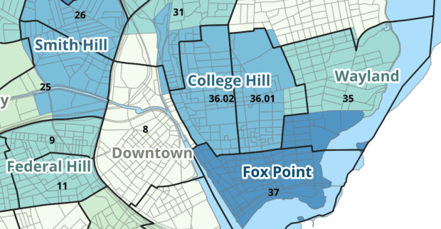
Providence Census Geography Map

Crosswalking Census Data to Neighborhood Geographies

Last semester we completed a project to create a crosswalk between census geographies and local geographies in Providence, RI. Crosswalks are used for relating two disparate sets of geography, so that you can compile data that’s published for one set of geography in another. Many cities have locally-defined jurisdictions like wards or community districts, as well as informally defined areas like neighborhoods. When you’re working with US Census data, you use small statistical areas that the Bureau defines and publishes data for; blocks, block groups, census tracts, and perhaps ZCTAs and PUMAs. A crosswalk allows you to apportion data that’s published for census areas, to create estimates for local areas (there are also crosswalks that are used for relating census geography that changes over time, such as the IPUMS crosswalks).

How the Crosswalk Works

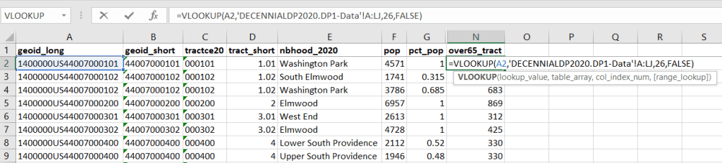
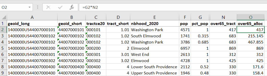
For example, in the Providence Census Geography Crosswalk we have two crosswalks that allow you to take census tract data, and convert it to either neighborhoods or wards. I’ll refer to the neighborhoods in this post. In the crosswalk table, there is one record for each portion of a tract that overlaps a neighborhood. For each record, there are attribute columns that indicate the count and the percentage of a tract’s population, housing units, land area, and total area that fall within a given neighborhood. If a tract appears just once in the table, that means it is located entirely within one neighborhood. In the image below, we see that tract 1.01 appears in the table once, and its population percentage is 1. That means that it falls entirely within the Washington Park neighborhood, and 100% of its population is in that neighborhood. In contrast, tract 1.02 appears in the table twice, which means it’s split between two neighborhoods. Its pct_pop column indicates that 31.5% of its population is in South Elmwood, while 68.5% is in Washington Park. The population count represents the number of people from that tract that are in that neighborhood.

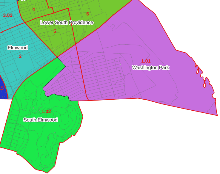
Looking at the map below, we can see that census tract 1.01 falls entirely within Washington Park, and tract 1.02 is split between Washington Park and South Elmwood. To generate estimates for Washington Park, we would sum data for tract 1.01 and the portion of tract 1.02 that falls within it. Estimates for South Elmwood would be based solely on the portion of tract 1.02 that falls within it. With the crosswalk, “portion” can be defined as the percentage of the tract’s population, housing units, land area, or total area that falls within a neighborhood.

The primary purpose of the crosswalk is to generate census data estimates for neighborhoods. You apportion tract data to neighborhoods using an allocation factor (population, housing units, or area) and aggregate the result. For example, if we have a census tract table from the 2020 census with the population that’s 65 years and older, we can use the crosswalk to generate neighborhood-level estimates of the 65+ population. To do that, we would:

  1. Join the data table to the crosswalk using the tract’s unique ID; the crosswalk has both the long and short form of the GEOIDs used by the Census Bureau. So for each crosswalk record, we would associate the 65+ population for the entire tract with it.
  2. Multiply the 65+ population by one of the allocation columns – the percent population in this example. This would give us an estimate of the 65+ population that live in that tract / neighborhood piece.
  3. Group or aggregate this product by the neighborhood name, to obtain a neighborhood-level table of the 65+ population.
  4. Round decimals to whole numbers.

To do the calculations in a spreadsheet, you would import the appropriate crosswalk sheet into the workbook that contains the census data that you want to apportion, so that they appear as separate sheets in the same workbook. In the crosswalk worksheet, use the VLOOKUP formula and reference the GEOID to “join” the census tract data to the crosswalk. The formula requires: cell containing the ID value you wish to look up, the range of cells in a worksheet that you will search through, the number of the column that contains the value you wish to retrieve (column A is 1, Z is 26, etc.), and the parameter “FALSE” to get an exact match. It is assumed that the look up value in the target table (the matching ID) appears in the first column (A).

The tract data is now repeated for each tract / neighborhood segment. Next, use formulas to multiply the allocation percentage (pct_pop in this example) by the census data value (over 65 pop for the entire tract) to create an allocated estimate for each tract / neighborhood piece.

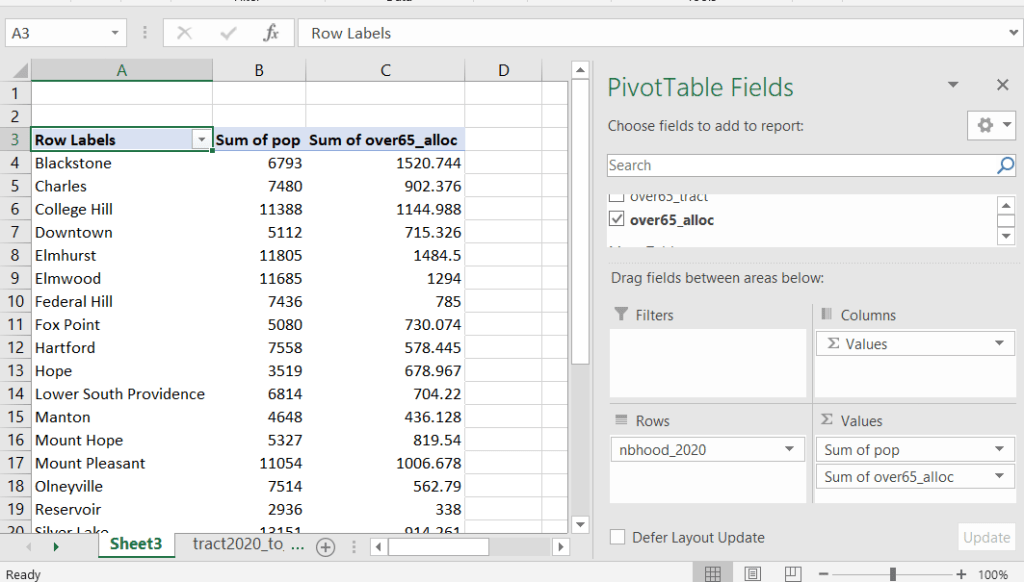
Then you can generate a pivot table (on the Insert ribbon in Excel) where you group and sum that allocated result by neighborhood (neighborhoods as rows, census data as summed values in columns). Final step is to round the estimates.

This process is okay for small projects where you have a few estimates you want to quickly tabulate, but it doesn’t scale well. I’d use a relational database instead; import the crosswalk and census data table into SQLite, where you can easily do a left join, calculated field, and then a group by statement. Or, use the joining / calculating / aggregating equivalents in Python or R.

I used the percentage of population as the allocation factor in this example. If the census data you’re apportioning pertains to housing units, you could use the housing units percentage instead. In any case, there is an implicit assumption that the data you are apportioning has the same distribution as the allocation factor. In reality this may not be true; the distribution of children, seniors, homeowners, people in poverty etc. may vary from the total population’s distribution. It’s important to bear in mind that you’re creating an estimate. If you are apportioning American Community Survey data this process gets more complicated, as the ACS statistics are fuzzy estimates. You’d also need to apportion the margin of error (MOE) and create a new MOE for the neighborhood-level estimates.

The Providence crosswalk has some additional sheets that allow you to go from tracts, ZCTAs, or blocks to neighborhoods or wards. The tract crosswalk is by far the most useful. The ZCTA crosswalk was an exercise in futility; I created it to demonstrate the complete lack of correlation between ZCTAs and the other geographies, and recommend against using it (we also produced a series of maps to visually demonstrate the relationship between all the geographies). There is a limited amount of data published at the block level, but I included it in the crosswalk for another reason…

Creating the Crosswalk

I used census blocks to create the crosswalk. They are the smallest unit of census geography, and nest within all other census geographies. I used GIS to assign each block to a neighborhood or ward based on the geography the block fell within, and then aggregated the blocks into distinct tract / ward and tract / neighborhood combinations. Then I calculated the allocation factors, the percentage of the tract’s total attributes that fell in a particular neighborhood or ward. This operation was straightforward for the wards; the city constructed them using 2020 census blocks, so the blocks nested or fit perfectly within the wards.

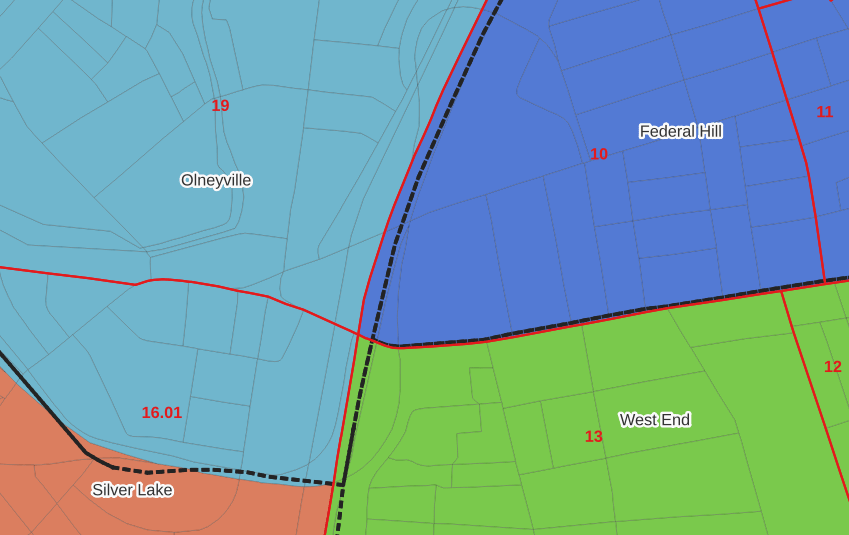
The neighborhoods were more complicated, as these were older boundaries that didn’t correspond to the 2020 blocks, and there were many instances where blocks were split between neighborhoods. My approach was to create a new set of neighborhood boundaries based on the 2020 blocks, and then use those new boundaries to create the crosswalk. I began with a spatial join, assigning each block a neighborhood ID based on where the center of the block fell. Then, I manually inspected the borders between each neighborhood, to determine whether I should manually re-assign a block. In almost all instances, blocks I reassigned were unpopulated and consisted of slivers that contained large highways, or blocks of greenspace or water. I struck a balance between remaining as faithful to the original boundaries as possible, while avoiding the separation of unpopulated blocks from a tract IF the rest of the blocks in that tract fell entirely within one neighborhood. In two cases where I had to assign a populated block, I used satellite imagery to determine that the population of the block lived entirely on one side of a neighborhood boundary, and made the assignment accordingly.

In the example below, 2020 tract boundaries are shown in red, 2020 block boundaries are light grey, original neighborhood boundaries are shown with dotted black lines, and reconstituted neighborhoods using 2020 blocks are shown in different colors. The boundaries of Federal Hill and the West End are shifted west, to incorporate thin unpopulated blocks that contain expressways. These empty blocks are part of tracts (10 and 13) that fall entirely within these neighborhoods; so splitting them off to adjacent Olneyville and Silver Lake didn’t make sense (as there would be no population or homes to apportion). Reassigning them doesn’t change the fact that the true boundary between these neighborhoods is still the expressway. We also see an example between Olneyville and Silver Lake where the old neighborhood boundary was just poorly aligned, and in this case blocks are assigned based on where the center of the block fell.

Creating the crosswalk from the ground up with blocks was the best approach for accounting how population is distributed within larger areas. It was primarily an aggregation-based approach, where I could sum blocks that fell within geographies. This approach allowed me to generate allocation factors for population and housing units, since this data was published with the blocks and could be carried along.

Conversely, in GIS 101 you would learn how to calculate the percentage of an area that falls within another area. You could use that approach to create a tract-level crosswalk based on area, i.e. if a tract’s area is split 50/50 between two neighborhoods, we’ll apportion its population 50/50. While this top down approach is simpler to implement, it’s far less ideal because you often can’t assume that population and area are equally distributed. Reconsider the example we began with: 31.5% of tract 1.02’s population is in South Elmwood, while 68.5% is in Washington Park. In contrast, 75.3% of tract 1.02’s land area is in South Elmwood, versus only 24.7% in Washington Park! If we apportioned our census data by area instead of population, we’d get a dramatically different, and less accurate, result. Roger Williams Park is primarily located in the portion of tract 1.02 that falls within Elmwood; it covers a lot of land but includes zero people.

Why can’t we just simply aggregate block-level census data to neighborhoods and skip the whole apportionment step? The answer is that there isn’t much data published at the block level. There’s a small set of tables that capture basic demographic variables as part of the decennial census, and that’s it. There was a sharp reduction in the number of block-level tables in the 2020 census due to new privacy regulations, and the ACS isn’t published at the block-level at all. While you can use the block-level table in the crosswalk to join and aggregate block data, in most cases you’ll need to work with tract-data and apportion it.

I used spatial SQL to create the crosswalks in Spatialite and QGIS , and if you’re interested in seeing all the gory details you can look at the code and spatial database in source folder of the project’s GitHub repo. I always prefer SQL for spatial join and aggregation operations, as I can write a single block of code instead of running 4 or 5 different of desktop GIS tools in a sequence. I’ll be updating the project this semester to include additional geographies (block groups – the level between blocks and tracts), and perhaps an introductory tutorial for using it (there are some basic docs at present).

SQL View

SQL Views to Excel and Back with Pandas

I had lists of businesses that I queried from a large table and saved in individual views in SQLite, where each view contained related businesses based on their industrial classification code (NAICS). There were about 8,000 records in total. Another team needed to review these records and verify whether we needed to keep them in the study or not. The simplest approach was to segment the businesses based on activity, grab a subset of the necessary columns from the main table into a SQL view, and export them to individual Google Sheets so that everyone could access and edit the files. When they were finished, I had to re-aggregate the sheets and get them back into the database, to use a filter for records to keep. I wrote two python / pandas scripts for doing this, which I’ll walk through here.

Since I had already written and saved SQL views in the database (see sample image in the post’s header), I wanted to simply access those using pandas, rather than having to write the queries all over again in pandas. My solution is below. At the top I establish variables that specify file names and paths using the os module. I have an Excel file that will serve as my template; it contains one metadata README sheet that will be the same each year. Next, I create a list of the views, plus a list of new columns that I want to add to each sheet that the team will use for verifying the records. Since this is a process I will need to run each year, I provide the year as a variable and insert it into the output files and the view names rather than hard coding it. For example, ‘convenience_stores’ is formatted to ‘v_2023_convenience_stores’ to retrieve the current view from the database.

The work happens in the loop. I iterate through the list of views, and build a query string where I insert the view name. I use pandas.read_sql to execute a SELECT statement, and the result is saved in a dataframe; the result is essentially the result of the view when its executed. Then I iterate through a list of new columns that the reviewers will use, inserting them one by one. They will appear at the front of the worksheet, in the reverse order in which they appear in the list. I use pandas.ExcelWriter and the append mode so I can insert multiple sheets into the workbook template. And that’s it!

import sqlite3, os, pandas as pd

# CHANGE THE YEAR VARIABLE to reflect year we are processing
year='2022' # must be a string - quote!
outfolder='yr{}'.format(year)
vsuffix='v_{}_'.format(year)
outfile='business_lists_{}.xlsx'.format(year)

outpath=os.path.join('business_output',outfolder,outfile)
con = sqlite3.connect('project_db.sqlite') 

# views within the database that contain business lists
views=['convenience_stores','department_stores','drinking_places',
       'food_manufacturing', 'gas_stations', 'grocery_stores',
       'liquor_stores','pharmacies','restaurants',
       'specialty_food_stores', 'variety_stores','wholesale_clubs']

# blank columns to insert in each sheet to hold verification
newcols=['notes','maps_verified','recategorize','remove']

for v in views:
    vname=vsuffix+v # creates the actual name of the view in the db
    query='SELECT * FROM {}'.format(vname)
    df=pd.read_sql(query, con)
    for n in newcols:
        df.insert(0,n,'')
    with pd.ExcelWriter(outpath, mode='a') as writer:  
        df.to_excel(writer, sheet_name=v, index=False)
    print('Wrote',v,'to output')

print('Done')
con.close()

The final step is to upload the Excel workbook into Google Sheets, and then manually apply some formatting. I looked at some options for writing to Google Sheets directly and skipping Excel as an intermediary, but decided that it looked like more trouble than it was worth. You can’t trust that Google isn’t going to suddenly change something without notice, so this intermediary approach seemed safer.

Once the records have been verified, I needed to combine these sheets into one file and get them back into the database again, where I can use the results to filter the original business table and pull the records we want to keep. My solution for this part is below.

First, I download the finished Google spreadsheet as an Excel file, and provide that as input. Again, I set up input and output paths at the top. I use pandas.read_excel to read the sheets into a dictionary, where the key is the name of the sheet and the value is a dataframe that contains everything in that sheet. I loop through the dictionary, skip the metadata README sheet, and create a list of the dataframes where I add the name of the sheet as a dedicated column. Next, I compare the column names and number of columns in the first dataframe / sheet to each of the others to ensure they are the same in terms or order, name, and number. Lastly, I concatenate all the sheets into one and write them out to a CSV file.

import os, csv, pandas as pd

# CHANGE THE YEAR VARIABLE to reflect year we are processing
year='2022' # must be a string - quote!
folder='yr{}'.format(year)
infile='business_lists_{}.xlsx'.format(year)
outfile='checked_biz_{}.csv'.format(year)

inpath=os.path.join(folder,infile)
outpath=os.path.join(folder,outfile)

# Read sheets to dict, key sheet name and value df
# read all vals as strings to preserve ID codes
sheets_dict = pd.read_excel(inpath, sheet_name=None, dtype=str)

all_sheets_dfs = [] # a list of dataframes, one df per worksheet
for name, sheet in sheets_dict.items():
    if name !='README': # don't include the readme sheet
        sheet['biz_category'] = name # add the sheet name to the data
        all_sheets_dfs.append(sheet)

# This block checks number of columns and names of all sheets against the first one
f=all_sheets_dfs[0]
for i,s in enumerate(all_sheets_dfs):
    check_cols = (s.columns == f.columns).all() and s.shape[1] == f.shape[1]
    if check_cols is False:  
        print('Warning: difference in column names or number between first worksheet and number:',i)
    else:
        pass

# Block creates single dataframe of all records and writes to CSV
biz_df = pd.concat(all_sheets_dfs)
biz_df.reset_index(inplace=True, drop=True)
biz_df.to_csv(outpath, index=True, index_label='pid')

print('Done, record count:',len(biz_df))

With that, I can launch the database (using the DB Browser for SQLite), import that CSV to a table, and proceed to join it back to my original table and filter. Alternatively, I could have written the concatenated dataframe directly into the database, but in a pinch this works fine. It’s been a hectic semester and as soon as I get something working I polish it off and move on to the next thing…

SQL in QGIS Database Manager

Spatial SQL with Spatialite and QGIS

I’ve recently given a few presentations on the Ocean State Spatial Database, which is a basic geodatabase for Rhode Island that we’ve created in our lab. The database was designed so that new and experienced users alike could easily access a curated collection of foundational layers and data tables for thematic mapping and geospatial analysis. The database is available for download on GitHub, and there is documentation that describes the layers and tables that are included. The database comes in two formats: SQLite/ Spatialite that’s great for QGIS, and a File Geoadatabase version for ArcGIS Pro users.

One of the big advantages of using the Spatialite database in QGIS is that you can take advantage of the Database Manager, and write SQL and spatial SQL queries for selecting records and doing spatial analysis. Instead of using a series of point and click tools that create a bunch of new files, you can write a single block of code to perform an entire operation, and you can save that code to document your work. Access the Database Manager above the toolbars at the top of the QGIS interface. Once you’re in, you can select the Spatialite option, right click and then browse your file system to point to the database to establish a connection. At the top of the DB Manager is a button (piece of paper with wrench) to open a SQL query window.

Database Manager in QGIS with SQL Window Open

The following commands are basic SQL: SELECT some columns FROM some tables WHERE some criteria is met. This returns all rows and columns from the public libraries layer in the database:

SELECT *
FROM d_public_libraries;

This returns just some of the columns for all rows:

SELECT libid, libname, city, cnty
FROM d_public_libraries;

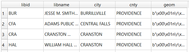
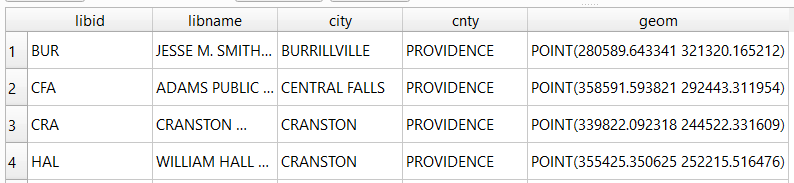
While this returns some of the columns and rows that meet specific criteria, in this case where libraries are located in Providence County, RI:

SELECT libid, libname, city, cnty, geom
FROM d_public_libraries
WHERE cnty='PROVIDENCE'
ORDER BY city;

Traditional database column types include strings (aka text), integers, and decimal numbers, which limit the values that can be stored in the column, and allow specific functions that can operate on values of that type (math on numeric columns, string operations on text columns). Beyond the basic data types, many databases have special ones, such as date types that allow you to store and manipulate dates and times as distinct objects.

Spatial databases incorporate special columns for storing the geometry of features as strings of coordinates, and provide functions that can operate on that geometry. In the example above, the values stored in the geometry column were returned in a binary format. But we can apply a spatial function called ST_AsText to display the geometry as readable text:

SELECT libid, libname, city, cnty, ST_AsText(geom) AS geom
FROM d_public_libraries
WHERE cnty='PROVIDENCE'
ORDER BY city;

We can see that this is point geometry (as opposed to lines or polygons), and we have an X and Y coordinate for each point. The layers in this database are in the Rhode Island State Plane System, so the coordinates that are returned are in that system. We can convert these to longitude and latitude using the ST_Transform function:

SELECT libid, libname, city, cnty, ST_AsText(ST_Transform(geom,4269)) AS geom
FROM d_public_libraries
WHERE cnty='PROVIDENCE'
ORDER BY city;

This illustrates that the functions can be nested, first we transform the geometry and then display the result of that function as text. The number in the transform function is the unique identifier of the spatial reference system that we wish to transform the geometry to. In the open source world these are EPSG codes, and 4269 is the identifier for NAD 83, the basic long / lat system for North America (alternatively, we could use 4326 for WGS 84, the standard global long / lat system). The geometry column in a spatial table is connected to a series of internal tables that store all the definitions of the spatial reference systems. You can view the spatial reference system table:

SELECT * from spatial_ref_sys;

You can also get a read out of all the spatial tables in the database which include their type of geometry and the spatial reference system (3438 is the EPSG code for the RI State Plane zone, geometry of type 6 is a multipolygon, while type 1 is a point):

SELECT * from geometry_columns;

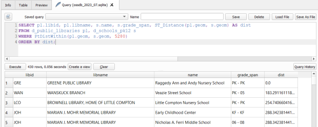
With a spatial database, you perform operations within and between tables by running functions against the geometry columns. For example, to return all public libraries and schools that are within a mile of a library while measuring the distance:

SELECT pl.libid, pl.libname, s.name, s.grade_span, ST_Distance(pl.geom, s.geom) AS dist
FROM d_public_libraries pl, d_schools_pk12 s
WHERE PtDistWithin(pl.geom, s.geom, 5280)
ORDER BY dist;

The ST_Distance function returns the actual distance in a new column, while the PtDistWithin function only returns libraries that have a school within one mile (5,280 feet – we have to express the measurement in the units used by the spatial reference system of both layers). In the FROM statement we provide aliases after each table name, so we can use those as shorthand (if our statement includes multiple tables, we need to indicate which table each column comes from).

You can also do summaries, like you would in standard SQL using GROUP BY. To count the number of schools that are within a mile of every library:

SELECT pl.libid, pl.libname, CAST(COUNT (s.name) AS integer) AS school_count, pl.geom
FROM d_public_libraries pl, d_schools_pk12 s
WHERE PtDistWithin(pl.geom, s.geom, 5280)
GROUP BY pl.libid, pl.libname, pl.geom
ORDER BY school_count DESC;

The rule for GROUP BY is that every column in the select statement must be used as a grouping variable, or has an aggregate function applied to it (COUNT, SUM, MEAN, etc). In this example we added the CAST function, which defines the data type for new columns that you create. Unless we explicitly declare it as an integer or real (decimal), values are returned as strings.

You can save your statements as views, by adding CREATE VIEW [view name] AS followed by the statement. Views are saved statements that appear as objects in the database; by opening a view, the statement is rerun and the result is returned. This approach works if you want to save a non-spatial view, i.e. a table without geometry. To save a spatial one with geometry, omit the VIEW statement and hit the Create a view button below the SQL window (each record must have a unique identifier and the geometry column in order for this to work). That registers the geometry column of the view in the database. Then, you can return to the main QGIS window, add the view and symbolize it. Alternatively, there is a Load as new layer button at the bottom of the screen, which allows you to see a temporary result without saving anything (while you can see features and records returned, you won’t be able to symbolize or manipulate the layer).

Count schools within 1 mile of libraries, and save as a spatial view
Symbolize the spatial query out in the main QGIS window

One of the primary reasons to use a database is to join related data stored in separate tables. This statement has two joins: a tabular join between the census tracts and an ACS data table, and a spatial join between the geometry of public libraries and tracts:

SELECT pl.libid, pl.libname, a.geoidshort, a.name, c.hshd01_e, c.hshd01_m
FROM d_public_libraries pl, a_census_tracts a
INNER JOIN c_tracts_acs2021_socecon c
ON a.geoidlong=c.geoidlong
WHERE ST_Intersects(pl.geom, a.geom);

This returns all public libraries and their intersecting tracts based on the relationship between their two geometries (could also have done ST_Within in this case to get the same result). Spatialite supports most of the spatial relationship functions defined by the OGC. The estimated number of households for these tracts are returned based on the shared unique census identifier between the two census tract tables.

You can visit the following references for a full list of SQLite functions and Spatialite functions. As it’s designed to be “Lite”, SQLite contains a smaller subset of the SQL standard. Spatialite contains a pretty full range of OGC spatial SQL functions, but there are instances where it deviates from the standard. PostgreSQL / PostGIS provides a greater range of functions that adhere more closely to the standard; it also provides you with greater storage, efficiency, and processing power. As a file-based database, SQLite / Spatialite’s strengths are that it’s compact and transportable, and gives you the option to write SQL rather than relying solely on the point and click tools of a desktop GIS package.

In addition to the QGIS DB Manager, you could also use the Spatialite command line tools provided by the developer, and the Spatialite GUI (graphic user interface) that gives you a standard, stand-alone database interface. Downloading it is a bit confusing; Windows users can grab one of the binaries at the bottom of this page. If you’re a Linux person, search for it in your package manager. Mac users can get it via Homebrew.

Calculate margin of error for ratio (mean income)

Calculating Mean Income for Groups of Geographies with Census ACS Data

When aggregating small census geographies to larger ones (census tracts to neighborhoods for example) when you’re working with American Community Survey (ACS) data, you need to sum estimates and calculate new margins of error. This is straightforward for most estimates; you simply sum them, and take the square root of the sum of squares for the margins of error (MOEs) for each estimate that you’re aggregating. But what if you need to group and summarize derived estimates like means or medians? In this post, I’ll demonstrate how to calculate mean household income by aggregating ZCTAs to United Hospital Fund neighborhoods (UHF), which is a type of public health area in NYC created by aggregating ZIP Codes.

I’m occasionally asked how to summarize median household income from tracts to neighborhood-like areas. You can’t simply add up the medians and divide them, the result would be completely erroneous. Calculating a new median requires us to sort individual household-level records and choose the middle-value, which we cannot do as those records are confidential and not public. There are a few statistical interpolation methods that we can use with interval data (number of households summarized by income brackets) to estimate a new median and MOE, but the calculations are rather complex. The State Data Center in California provides an excellent tutorial that demonstrates the process, and in my new book I’ll walk through these steps in the supplemental material.

While a mean isn’t as desirable as a median (as it can be skewed by outliers), it’s much easier to calculate. The ACS includes tables on aggregate income, including the sum of all income earned by households and other population group (like families or total population). If we sum aggregate household income and number of households for our small geographic areas, we can divide the total income by total households to get mean income for the larger area, and can use the ACS formula for computing the MOE for ratios to generate a new MOE for the mean value. The Census Bureau publishes all the ACS formulas in a detailed guidebook for data users, and I’ll cover many of them in the ACS chapter of my book (to be published by the end of 2019).

Calculating a Derived Mean in Excel

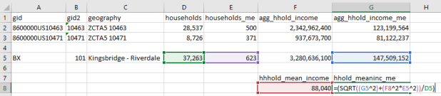
Let’s illustrate this with a simple example. I’ve gathered 5-year 2017 ACS data on number of households (table B11001) and aggregate household income (table B19025) by ZCTA, and constructed a sheet to correlate individual ZCTAs to the UHF neighborhoods they belong to. UHF 101 Kingsbridge-Riverdale in the Bronx is composed of just two ZCTAs, 10463 and 10471. We sum the households and aggregate income to get totals for the neighborhood. To calculate a new MOE, we take the square root of the sum of squares for each of the estimate’s MOEs:

Calculate margin of error for new sum

Calculate margin of error for new sum

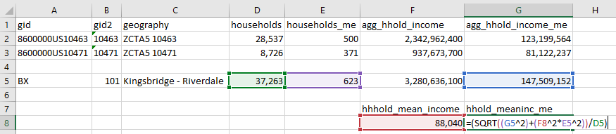
To calculate mean income, we simply divide the total aggregate household income by total households. Calculating the MOE is more involved. We use the ACS formula for derived ratios, where aggregate income is the numerator of the ratio and households is the denominator. We multiply the square of the ratio (mean income) by the square of the MOE of the denominator (households MOE), add that product to the square of the MOE of the numerator (aggregate income MOE), take the square root, and divide the result by the denominator (households):

=(SQRT((moe_ratio_numerator^2)+(ratio^2*moe_ratio_denominator^2))/ratio_denominator)

Calculate margin of error for ratio (mean income)

Calculate margin of error for ratio (mean income)

The 2013-2017 mean household income for UHF 101 is $88,040, +/- $4,223. I always check my math using the Cornell Program on Applied Demographic’s ACS Calculator to make sure I didn’t make a mistake.

This is how it works in principle, but life is more complicated. When I downloaded this data I had number of households by ZCTA and aggregate household income by ZCTA in two different sheets, and the relationship between ZCTAs and UHFs in a third sheet. There are 42 UHF neighborhoods and 211 ZCTAs in the city, of which 182 are actually assigned to UHFs; the others have no household population. I won’t go into the difference between ZIP Codes and ZCTAs here, as it isn’t a problem in this particular example.

Tying them all together would require using the ZCTA in the third sheet in a VLOOKUP formula to carry over the data from the other two sheets. Then I’d have to aggregate the data to UHF using a pivot table. That would easily give me sum of households and aggregate income by UHF, but getting the MOEs would be trickier. I’d have to square them all first, take the sum of these squares when pivoting, and take the square root after the pivot to get the MOEs. Then I could go about calculating the means one neighborhood at a time.

Spreadsheet-wise there might be a better way of doing this, but I figured why do that when I can simply use a database? PostgreSQL to the rescue!

Calculating a Derived Mean in PostgreSQL

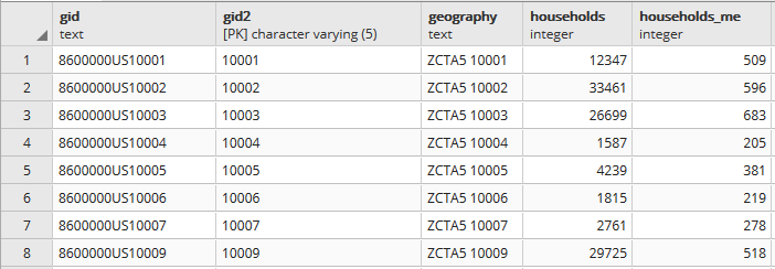
In PostgreSQL I created three empty tables for: households, aggregate income, and the ZCTA to UHF relational table, and used pgAdmin to import ZCTA-level data from CSVs into those tables (alternatively you could use SQLite instead of PostgreSQL, but you would need to have the optional math module installed as SQLite doesn’t have the capability to do square roots).

Portion of households table. A separate aggregate household income table is structured the same way, with income stored as bigint type.

Portion of households table. A separate aggregate household income table is structured the same way, with income stored as bigint type.

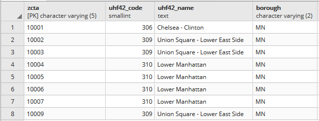
Portion of the ZCTA to UHF relational table.

Portion of the ZCTA to UHF relational table.

In my first run through I simply tried to join the tables together using the 5-digit ZCTA to get the sum of households and aggregate incomes. I SUM the values for both and use GROUP BY to do the aggregation to UHF. In PostgreSQL pipe-forward slash: |/ is the operator for square root. I sum the squares for each ZCTA MOE and take the root of the total to get the UHF MOEs. I omit ZCTAs that have zero households so they’re not factored into the formulas:

SELECT z.uhf42_code, z.uhf42_name, z.borough,
    SUM(h.households) AS hholds,
    ROUND(|/(SUM(h.households_me^2))) AS hholds_me,
    SUM(a.agg_hhold_income) AS agghholds_inc,
    ROUND(|/(SUM(a.agg_hhold_income_me^2))) AS agghholds_inc_me
FROM zcta_uhf42 z, hsholds h, agg_income a
WHERE z.zcta=h.gid2 AND z.zcta=a.gid2 AND h.households !=0
GROUP BY z.uhf42_code, z.uhf42_name, z.borough
ORDER BY uhf42_code;

Portion of query result, households and income aggregated from ZCTA to UHF district.

Portion of query result, households and income aggregated from ZCTA to UHF district.

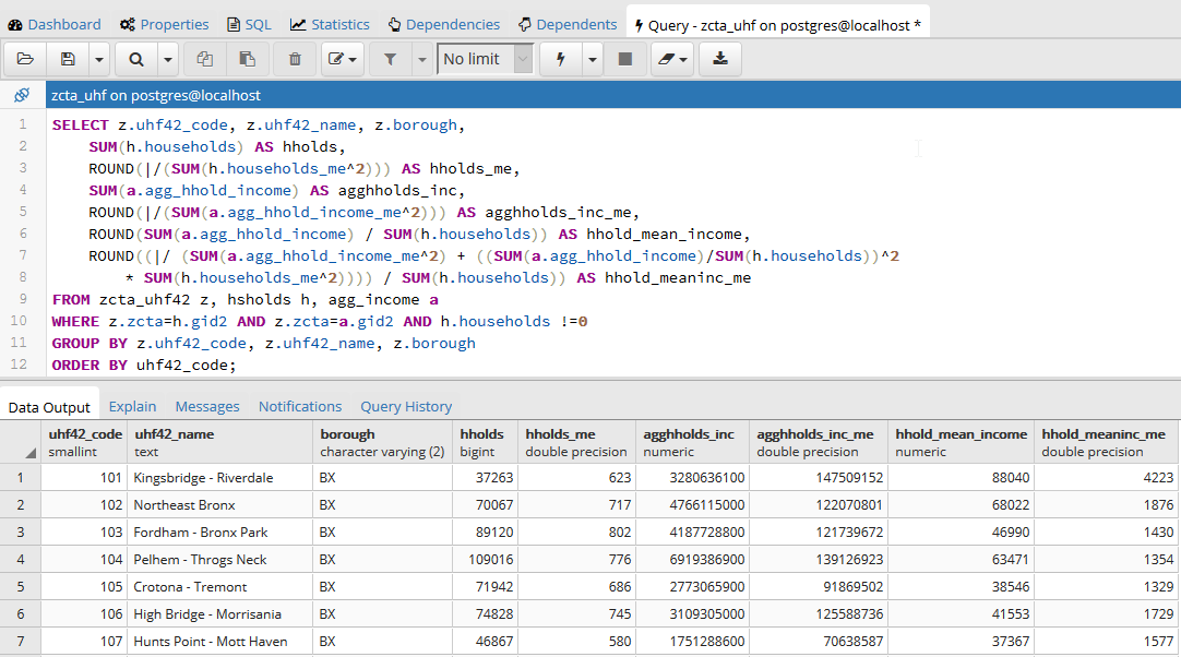
Once that was working, I modified the statement to calculate mean income. Calculating the MOE for the mean looks pretty rough, but it’s simply because we have to repeat the calculation for the ratio over again within the formula. This could be avoided if we turned the above query into a temporary table, and then added two columns and populated them with the formulas in an UPDATE – SET statement. Instead I decided to do everything in one go, and just spent time fiddling around to make sure I got all the parentheses in the right place. Once I managed that, I added the ROUND function to each calculation:

SELECT z.uhf42_code, z.uhf42_name, z.borough,
    SUM(h.households) AS hholds,
    ROUND(|/(SUM(h.households_me^2))) AS hholds_me,
    SUM(a.agg_hhold_income) AS agghholds_inc,
    ROUND(|/(SUM(a.agg_hhold_income_me^2))) AS agghholds_inc_me,
    ROUND(SUM(a.agg_hhold_income) / SUM(h.households)) AS hhold_mean_income,
    ROUND((|/ (SUM(a.agg_hhold_income_me^2) + ((SUM(a.agg_hhold_income)/SUM(h.households))^2 * SUM(h.households_me^2)))) / SUM(h.households)) AS hhold_meaninc_me
FROM zcta_uhf42 z, hsholds h, agg_income a
WHERE z.zcta=h.gid2 AND z.zcta=a.gid2 AND h.households !=0
GROUP BY z.uhf42_code, z.uhf42_name, z.borough
ORDER BY uhf42_code;

Query in pgAdmin and portion of result for calculating mean household income

Query in pgAdmin and portion of result for calculating mean household income

I chose a couple examples where a UHF had only one ZCTA, and another that had two, and tested them in the Cornell ACS calculator to insure the results were correct. Once I got it right, I added:

CREATE VIEW household_sums AS

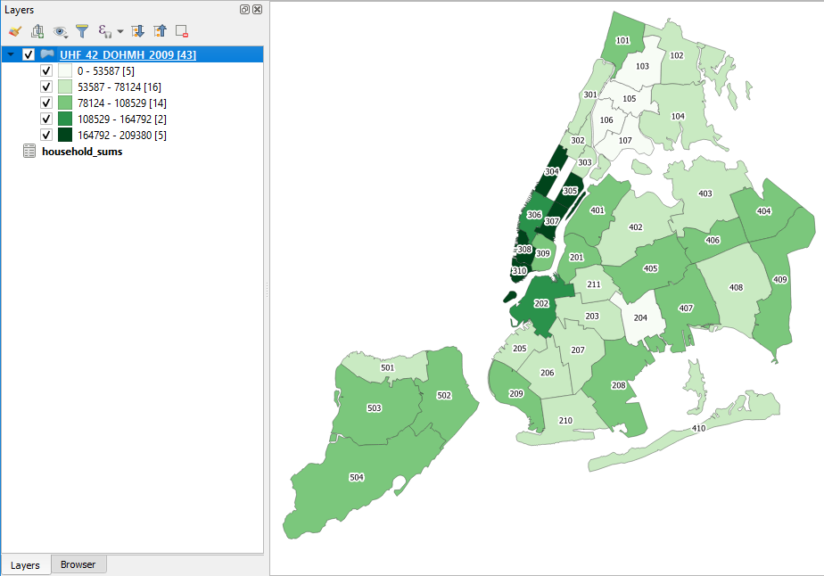
To the top of the statement and executed again to save it as a view. Mission accomplished! To make doubly sure that the values were correct, I connected my db to QGIS and joined this view to a UHF shapefile to visually verify that the results made sense (could also have imported the shapefile into the DB as a spatial table and incorporated it into the query).

Mean household income by UHF neighborhood in QGIS

Mean household income by UHF neighborhood in QGIS

Conclusion

While it would be preferable to have a median, calculating a new mean for an aggregated area is a fair alternative, if you simply need some summary value for the variable and don’t have the time to spend doing statistical interpolation. Besides income, the Census Bureau also publishes aggregate tables for other variables like: travel time to work, hours worked, number of vehicles, rooms, rent, home value, and various subsets of income (earnings, wages or salary, interest and dividends, social security, public assistance, etc) that makes it possible to calculate new means for aggregated areas. Just make sure you use the appropriate denominator, whether it’s total population, households, owner or renter occupied housing units, etc.