I visit courses to guest lecture on census data every semester, and one of the primary topics is immigrant or ethnic communities in the US. There are many different variables in the Census Bureau’s American Community Survey (ACS) that can be used to study different groups: Race, Hispanic or Latino Origin, Ancestry, Place of Birth, and Residency. Each category captures different aspects of identity, and many of these variables are cross-tabulated with others such as citizenship status, education, language, and income. It can be challenging to pull statistics together on ethnic groups, given the different questions the data are drawn from, and the varying degrees of what’s available for one group versus another.
But you learn something new every day. This week, while helping a student I stumbled across summary table S0201, which is the Selected Population Profile table. It is designed to provide summary overviews of specific race, Hispanic origin, ancestry, and place of birth subgroups. It’s published as part of the 1-year ACS, for large geographic areas that have at least 500,000 people (states, metropolitan areas, large counties, big cities), and where the size of the specific population group is at least 65,000. The table includes a broad selection of social, economic, and demographic statistics for each particular group.
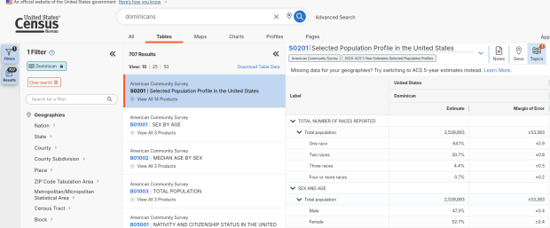
We discovered these tables by typing in the name of a group (Cuban, Nigerian, or Polish for example) in the search box for data.census.gov. Table S0201 appeared at the top of the table results, and clicking on it opened the summary table for the group for the entire US for the most recent 1-year dataset (2024 at the time I’m writing this). The name of the group appears in the header row of the table. Clicking on the dataset name and year in the grey box at the top of the table allows you to select previous years.
Selected Population Profile for Dominicans in the US
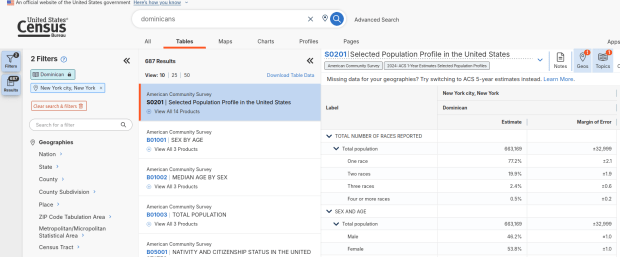
Using the Filters on the left, you can narrow the data down to a specific geography and year. You may get no results if either the geographic area or the ethnic or racial group is too small. Besides table S0201, additional detailed tables appear for a few, isolated years (the most recent being 2021).
Selected Population Profile for Dominicans in NYC
A more formal approach, which is better for seeing and understanding the full set of possibilities for ethnic groups and their data availability:
At data.census.gov, search for S0201, and select that table. You’ll get the totals for the entire US.
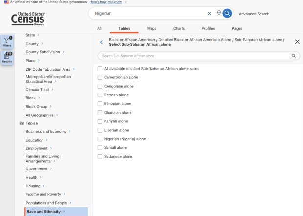
Using the filters on the left, choose Race and Ethnicity – then a racial or ethnic group – then a detailed race or group – then specific categories until you reach a final menu. This gives you the US-wide table for that group (if available).
Alternatively – you could choose Populations and People – Ancestry instead of Race to filter for certain groups. See my explanation below.
Use the filters again to select a specific geographic area (if available) and years.
With either approach, once you have your table, click the More Tools button (…) and download the data. Alternatively, like all of the ACS tables S0201 can be accessed via the Census Bureau’s API.
Filter Menu for Race and Ethnicity – Detailed Options
Where does this data come from? It can be generated from several questions on the ACS survey: Hispanic and Race (respectively, with respondents self-identifying a category), Place of Birth (specifically captures first-generation immigrants), and Ancestry (an open ended question about who your ancestors were).
The documentation I found provided just a cursory overview. I discovered additional information that describes recent changes in the race and ancestry questions. Persons identifying as Native American, Asian, or Pacific Islander as a race, or as Hispanic as an ethnicity, have long been able to check or write in a specific ethnic, national, or tribal group (Chinese, Japanese, Cuban, Mexican, Samoan, Apache, etc). People who identified as Black or White did not have this option until the 2020 census, and it looks like the ACS is now catching up with this. This page links to a document that provides an overview of the overlap between race and ancestry in different ACS tables.
The final paragraph in that document describes table S0201, which I’ll quote here in full:
Table S0201 is iterated by both race and ancestry groups. Group names containing the words “alone” or “alone or in any combination” are based on race data, while group names without “alone” or “alone or in any combination” are based on ancestry data. For example, “German alone or in any combination” refers to people who reported one or more responses to the race question such as only German or German and Austrian. “German” (without any further text in the group name) refers to people who reported German in response to the ancestry question.
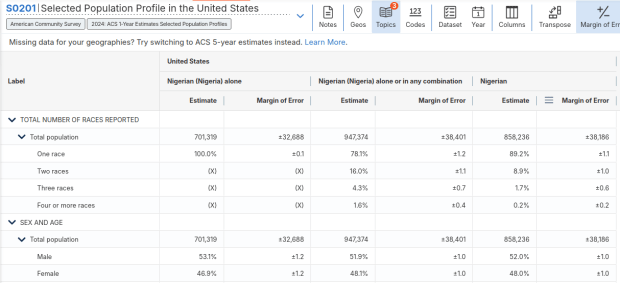
For example, when I used my first approach and simply searched for Nigerians as a group, the name appeared in the 2024 ACS table simply as Nigerian. This indicates that the data was drawn from the ancestry question. I was also able to flip back to earlier years. But in my second approach, when I searched for the table by its ID number and subsequently chose a racial group, the name appeared as Nigerian (Nigeria) alone, which means the data came from the race table. I couldn’t flip back to earlier periods, as Nigerian wasn’t captured in the race question prior to 2024.
Consider the screenshot below to evaluate the differences. Nigerian alone indicates people who chose just one race (Black) and wrote in Nigerian under their race. Nigerian alone or in any combination indicates any person who wrote Nigerian as a race, could be Black and Nigerian, or Black and White and Nigerian, etc. Finally, Nigerian refers to the ancestry question, where people are asked to identify who their ancestors are, regardless of whether they or their parents have a direct connection to the given place where that group originates.
Comparison of Race alone, Race Alone or in Combination, and Ancestry for Nigerians
Here’s where it gets confusing. If you search for the S0201 table first, and then try filtering by ancestry, the only options that appear are for ethnic or national groups that would traditionally be considered as Black or White within a US context. Places in Europe, Africa, the Middle East, and Central Asia, as well as parts of the world that were initially colonized by these populations (the non-Spanish Caribbean, Australia, Canada, etc). Options for Asians (south, southeast, and east Asia), Pacific Islanders, Native Americans, and any person who identifies as Hispanic or Latino do not appear as ancestry options, as the data for these groups is pulled from elsewhere. So when I tried searching for Chinese, Chinese alone appears in the table, as this data is drawn from the race table. When I searched for Dominican, the term Dominican appears in the table… Hispanic or Latino is not a race, but a separate ethnic category, and Dominican may identify a person of any race who also identifies as Hispanic. This data comes from the Hispanic / Latino origin table.
My interpretation is that data for Table S0201 is drawn from:
The ancestry table (prior to 2024), and either the race or ancestry table (from 2024 forward), for any group that is Black or White within the US context.
The race table for any group that is Asian, Pacific Islander, or Native American (although for smaller groups, ancestry may have been used prior to 2022 or 2023).
The Hispanic / Latino origin table for any group that is of Hispanic ethnicity, regardless of their race.
Place of birth isn’t used for defining groups, but appears as a set of variables within the table so you can identify how many people in the group are first-generation immigrants who were born abroad.
That’s my best guess, based on the available documentation and my interpretation of the estimates as they appear for different groups in this table. I did some traditional web searching, and then also tried asking ChatGPT. After pressing it to answer my question rather than just returning links to the Census Bureau’s standard documentation, it did provide a detailed explanation for the table’s sources. But when I prompted it to provide me with links to documentation from which its explanation was sourced, it froze and did nothing. So much for AI.
Despite this complexity, the Selected Population Profile tables are incredibly useful for obtaining summary statistics for different ethnic groups, and was perfect for the introductory sociology class I visited that was studying immigration and ancestry. Just bear in mind that the availability of S0201 is limited by size of the geographic area as a whole, and the size of the group within that area.
I’ve also received a number of questions this semester about animal observation and tracking data. Since I usually study people and not animals, I was a bit out of my element and had some homework to do. If you’ve ever watched nature shows, you’ve seen scientists tagging animals with collars or bands to track them by radio or satellite, or setting up cameras to record them. Many scientists upload their GPS coordinate data into publicly accessible repositories for others to download and use.
I’ve written a short, three-part document that I’ve posted on our tutorials page: GIS Data Sources for Wildlife Tutorial. In the first part, I provide summaries, links, and guidance on using large portals like Movebank and Zoatrack* that include many species from all over the world (wild and domestic), as well a government repositories including NOAA’s National Center for Environment Information Geoportal and the National Park Service’s Data Store. The second part focuses on search strategies, crawling the web and combing through academic literature in library databases to find additional data. Since these datasets are highly diffuse, it’s worth going beyond the portals to see what else you can discover.
I describe how you can add and visualize this data in QGIS and ArcGIS Pro in the third and final part. Wildlife data comes packaged in a number of formats; in some cases you’ll find shapefiles or geodatabases that you can readily add and visualize, but more often than not the data is packaged in a plain CSV / TXT format. This requires you to plot the coordinates (X for longitude, Y for latitude) to create a dot map of the observations. Data files will often contain a number of individual animals, which can be uniquely identified with a tag ID, allowing you to symbolize the points by category so you have a different color or symbol for each individual. Alternatively, there might be separate data files for each individual, that you could add and symbolize differently. The files will contain either a sequential integer or a timestamp that indicates the order of the observations. With one field that indicates the order and another that identifies each individual, you can use a Points to Line or Points to Path tool to generate lines (tracks or trajectories) from the points (observations or detections).
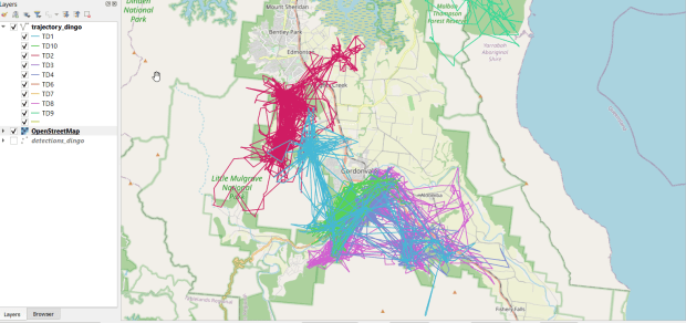
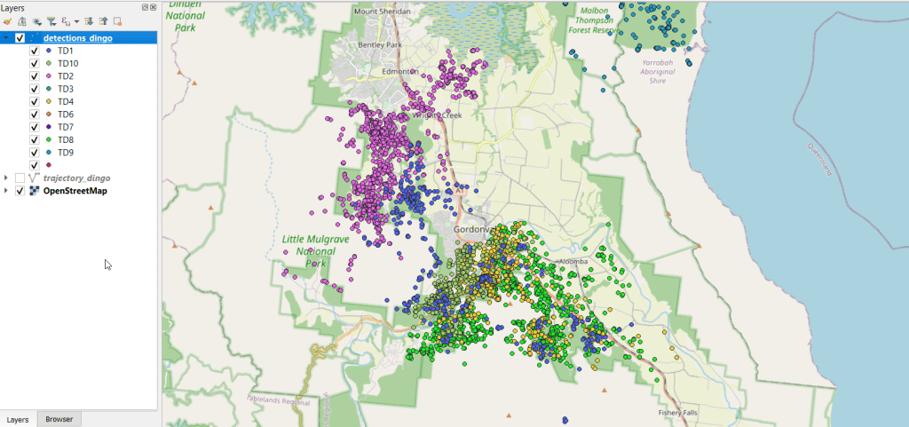
You can see where dingos in Queensland, Australia are going in the screenshot below, which displays individual observation points, and the screenshot in the header of this post where the points were connected to form paths. I obtained the data from ZoaTrack and used QGIS for mapping. Check out the tutorial for details on how to find and map your favorite animals.
* NOTE: ZoaTrack went offline in July 2024. You can still access an archive of the site and its datasets via the Internet Archive’s Wayback Machine. Here is a cached version of Zoatrack from June 2024. The tutorial will be updated to reflect this change soon.
Last week, the Census Bureau released the latest 5-year estimates for the American Community Survey for 2016-2020. This latest dataset uses the new 2020 census geography, which means if you’re focused on using the latest data, you can finally move away from the 2010-based geography which had been used for the ACS from 2010 to 2019 (with some caveats: 2020 ZCTAs won’t be utilized until the 2021 ACS, and 2020 PUMAs until 2022). As always, mappers have a choice between the TIGER Line files that depict the precise boundaries, or the generalized cartographic boundary files with smoothed lines and large sections of coastal water bodies removed to depict land areas. The 2016-2020 ACS data is available via data.census.gov and the ACS API.
This release is over 3 months late (compared to normal), and there was some speculation as to whether it would be released at all. The pandemic (chief among several other disruptive events) hampered 2020 decennial census and ACS operations. The 1-year 2020 ACS numbers were released over 2 months later than usual, in late November 2021, and were labeled as an experimental release. Instead of the usual 1,500 plus tables in 40 subject areas for all geographic areas with over 65,000 people, only 54 tables were released for the 50 states plus DC. This release is only available from the experimental tables page and is not being published via data.census.gov.
What happened? The details were published in a working paper, but in summary fewer addresses were sampled and the normal mail out and follow-up procedures were disrupted (pg 8). The overall sample size fell from 3.5 to 2.9 million addresses due to reduced mailing between April and June 2020 (pg 18), and total interviews fell from 2 million to 1.4 million with most of the reductions occurring in spring and summer (pg 18). The overall housing unit response rate for 2020 was 71%, down from 86% in 2019 and 92% in 2018 (pg 20). The response rate for the group quarters population fell from 91% in 2019 to 47% in 2020 (pg 21). Responses were differential, varying by time period (with the lowest rates during the peak pandemic months) and geography. Of the 818 counties that meet the 65k threshold, response rates in some were below 50% (pg 21). The data contained a large degree of non-response bias, where people who did respond to the survey had significantly different social, economic and housing characteristics from those who didn’t. As a consequence of all of this, margins of error for the data increased by 20 to 30% over normal (pg 18).
Thus, 2020 will represent a hole in the ACS estimates series. The Bureau made adjustments to weighting mechanisms to produce the experimental 1-year estimates, but is generally advising policy makers and researchers who normally use this series to choose alternatives: either the 1-year 2019 ACS, or the 5-year 2016-2020 ACS. The Bureau was able to make adjustments to produce satisfactory 5-year estimates to reduce non-response bias, and the 5-year pool of samples is balanced somewhat by having at least 4 years of good data.
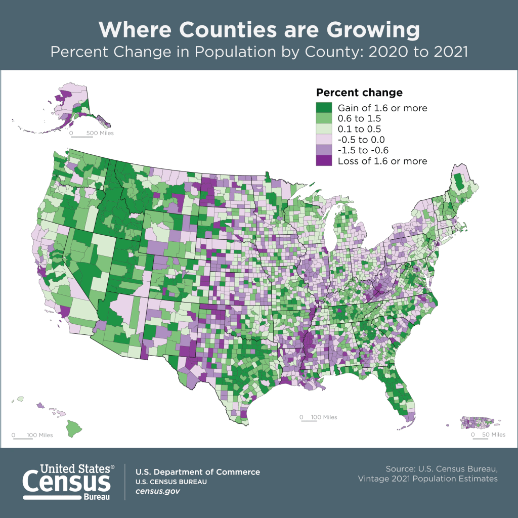
The Population Estimates Program has also released its latest series of vintage 2021 estimates for counties and metropolitan areas. This dataset gives us a pretty sharp view of how the pandemic affected the nation’s population. Approximately 73% of all counties experienced natural decrease in 2021 (between July 1st 2020 and 2021), where the number of deaths outnumbered births. In contrast, 56% of counties had natural decrease in 2020 and 46% in 2019. Declining birth rates and increasing death rates are long term trends, but COVID-19 magnified them, given the large number of excess deaths on one hand and families postponing child birth due to the virus on the other hand. Net foreign migration continued its years-long decline, but net domestic migration increased in a number of places, reflecting pandemic moves. Medium to small counties benefited most, as did large counties in the Sunbelt and Mountain West. The biggest losers in overall population were counties in California (Los Angeles, San Francisco, and Alameda), Cook County (Chicago), and the counties that constitute the boroughs of NYC.
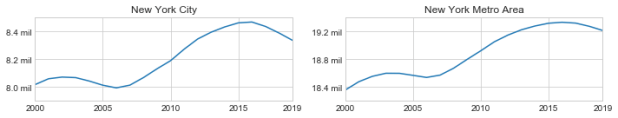
The Weissman Center for International Business at Baruch College just published my paper, “New York’s Population and Migration Trends in the 2010s“, as part of their Occasional Paper Series. In the paper I study population trends over the last ten years for both New York City (NYC) and the greater New York Metropolitan Area (NYMA) using annual population estimates from the Census Bureau (vintage 2019), county to county migration data (2011-2018) from the IRS SOI, and the American Community Survey (2014-2018). I compare NYC to the nine counties that are home to the largest cities in the US (cities with population greater than 1 million) and the NYMA to the 13 largest metro areas (population over 4 million) to provide some context. I conclude with a brief discussion of the potential impact of COVID-19 on both the 2020 census count and future population growth. Most of the analysis was conducted using Python and Pandas in Jupyter Notebooks available on my GitHub. I discussed my method for creating rank change grids, which appear in the paper’s appendix and illustrate how the sources and destinations for migrants change each year, in my previous post.
Terminology
Natural increase: the difference between births and deaths
Domestic migration: moves between two points within the United States
Foreign migration: moves between the United States and a US territory or foreign country
Net migration: the difference between in-migration and out-migration (measured separately for domestic and foreign)
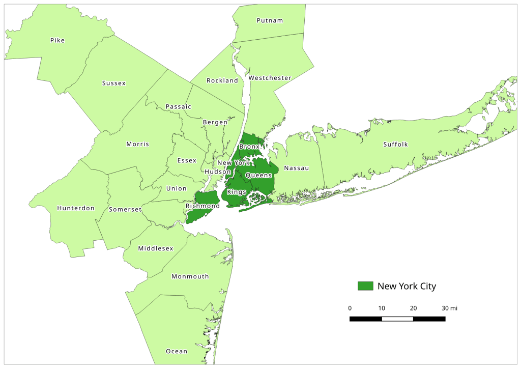
NYC: the five counties / boroughs that comprise New York City
NYMA: the New York Metropolitan Area as defined by the Office of Management and Budget in Sept 2018, consists of 10 counties in NY State (including the 5 NYC counties), 12 in New Jersey, and one in Pennsylvania
The New York-Newark-Jersey City, NY-NJ-PA Metropolitan Area
Highlights
Population growth in both NYC and the NYMA was driven by positive net foreign migration and natural increase, which offset negative net domestic migration.
Population growth for both NYC and the NYMA was strong over the first half of the decade, but population growth slowed as domestic out-migration increased from 2011 to 2017.
NYC and the NYMA began experiencing population loss from 2017 forward, as both foreign migration and natural increase began to decelerate. Declines in foreign migration are part of a national trend; between 2016 and 2019 net foreign migration for the US fell by 43% (from 1.05 million to 595 thousand).
The city and metro’s experience fit within national trends. Most of the top counties in the US that are home to the largest cities and many of the largest metropolitan areas experienced slower population growth over the decade. In addition to NYC, three counties: Cook (Chicago), Los Angeles, and Santa Clara (San Jose) experienced actual population loss towards the decade’s end. The New York, Los Angeles, and Chicago metro areas also had declining populations by the latter half of the decade.
Most of NYC’s domestic out-migrants moved to suburban counties within the NYMA (representing 38% of outflows and 44% of net out-migration), and to Los Angeles County, Philadelphia County, and counties in Florida. Out-migrants from the NYMA moved to other large metros across the country, as well as smaller, neighboring metros like Poughkeepsie NY, Fairfield CT, and Trenton NJ. Metro Miami and Philadelphia were the largest sources of both in-migrants and out-migrants.
NYC and the NYMA lack any significant relationships with other counties and metro areas where they are net receivers of domestic migrants, receiving more migrants from those places than they send to those places.
NYC and the NYMA are similar to the cities and metros of Los Angeles and Chicago, in that they rely on high levels foreign migration and natural increase to offset high levels of negative domestic migration, and have few substantive relationships where they are net receivers of domestic migrants. Academic research suggests that the absolute largest cities and metros behave this way; attracting both low and high skilled foreign migrants while redistributing middle and working class domestic migrants to suburban areas and smaller metros. This pattern of positive foreign migration offsetting negative domestic migration has characterized population trends in NYC for many decades.
During the 2010s, most of the City and Metro’s foreign migrants came from Latin America and Asia. Compared to the US as a whole, NYC and the NYMA have slightly higher levels of Latin American and European migrants and slightly lower levels of Asian and African migrants.
Given the Census Bureau’s usual residency concept and the overlap in the onset the of COVID-19 pandemic lock down with the 2020 Census, in theory the pandemic should not alter how most New Yorkers identify their usual residence as of April 1, 2020. In practice, the pandemic has been highly disruptive to the census-taking process, which raises the risk of an under count.
The impact of COVID-19 on future domestic migration is difficult to gauge. Many of the pandemic destinations cited in recent cell phone (NYT and WSJ) and mail forwarding (NYT) studies mirror the destinations that New Yorkers have moved to between 2011 and 2018. Foreign migration will undoubtedly decline in the immediate future given pandemic disruptions, border closures, and restrictive immigration policies. The number of COVID-19 deaths will certainly push down natural increase for 2020.
In this post I’ll demonstrate how I created annotated heatmaps (or what I’m calling a rank change grid) showing change in rank over time using Python and Matplotlib’s imshow plots. I was writing a report on population trends and internal migration using the IRS county to county migration dataset, and wanted to depict the top origins and destinations of migrants for New York City and the New York Metropolitan Area and how they changed from year to year.
I hit upon this idea based on an example in the Matplotlib documentation using the imshow plot. Imshow was designed for manipulating and creating images, but since images are composed of rows and columns of pixels you can use this function to create grids (for GIS folks, think of a raster). The rows can indicate rank from 1 to N, while the columns could represent time, which in my case is years. I could label each grid cell with the name of a place (i.e. origin or destination), and if a place changes ranks over time I could assign the cell a color indicating increase or decrease; otherwise I’d assign a neutral color indicating no change. The idea is that you could look at place at a given rank in year 1 and follow it across the chart by looking at the label. If a new place appears in a given position, the color change clues you in, and you can quickly scan to see whether a given place went up or down.
The image below shows change in rank for the top metro area destinations for migrants leaving the NYC metro from 2011 to 2018. You can see that metro Miami was the top destination for several years, up until 2016-17 when it flips positions with metro Philadelphia, which had been the number 2 destination. The sudden switch from a neutral color indicates that the place occupying this rank is new. You can also follow how 3rd ranked Bridgeport falls to 4th place in the 2nd year (displaced by Los Angeles), remains in 4th place for a few years, and then falls to 5th place (again bumped by Los Angeles, which falls from 3rd to 4th as it’s bumped by Poughkeepsie).
Annual Change in Ranks for Top Destinations for NYC Metro Migrants (Metro Outflows)
I opted for this over a more traditional approach called a bump chart (also referred to a slope chart or graph), with time on the x-axis and ranks on the y-axis, and observations labeled at either the first or last point in time. Each observation is assigned a specific color or symbol, and lines connect each observation to its changing position in rank so you can follow it along the chart. Interpreting these charts can be challenging; if there are frequent changes in rank the whole thing begins to look like spaghetti, and the more observations you have the tougher it gets to interpret. Most of the examples I found depicted a small and finite number of observations. I have hundreds of observations and only want to see the top ten, and if observations fall in and out of the top N ranks you get several discontinuous lines which look odd. Lastly, neither Matplotlib or Pandas have a default function for creating bump charts, although I found a few examples where you could create your own.
Creating the rank change grids was a three-part process that required: taking the existing data and transforming it into an array of the top or bottom N values that you want to show, using that array to generate an array that shows change in ranks over time, and generating a plot using both arrays, one for the value and the other for the labels. I’ll tackle each piece in this post. I’ve embedded the functions at the end of each explanation; you can also look at my GitHub repo that has the Jupyter Notebook I used for the analysis for the paper (to be published in Sept 2020).
Create the Initial Arrays
In the paper I was studying flows between NYC and other counties, and the NYC metro area and other metropolitan statisical areas. I’ll refer just to the metro areas as my example in this post, but my functions were written to handle both types of places, stored in separate dataframes. I began with a large dataframe with every metro that exchanged migrants with the NYC metro. There is a row for each metro where the index is the Census Bureau’s unique FIPS code, and columns that show inflows, outflows, and net flows year by year (see image below). There are some rows that represent aggregates, such as flows to all non-metro areas and the sum of individual metro flows that could not be disclosed due to privacy regulations.
Initial Dataframe
The first step is to create an array that has just the top or bottom N places that I want to depict, just for one flow variable (in, out, or net). Why an array? Arrays are pretty solid structures that allow you to select specific rows and columns, and they mesh nicely with imshow charts as each location in the matrix can correspond with the same location in the chart. Most of the examples I looked at used arrays. It’s possible to use other structures but it’s more tedious; nested Python lists don’t have explicit rows and columns so a lot of looping and slicing is required, and with dataframes there always seems to be some catch with data types, messing with the index versus the values, or something else. I went with NumPy’s array type.
I wrote a function where I pass in the dataframe, the type of variable (in, out, or net flow), the number of places I want, whether they are counties or metro areas, and whether I want the top or bottom N records (true or false). Two arrays are returned: the first shows the FIPS unique ID numbers of each place, while the second returns the labels. You don’t have to do anything to calculate actual ranks, because once the data is sorted the ranks become implicit; each row represents ranks 1 through 10, each column represents a year, and the ID or label for a place that occupies each position indicates its rank for that year.
In my dataframe, the names of the columns are prefixed based on the type of variable (inflow, outflow, or net flow), followed by the year, i.e. inflows_2011_12. In the function, I subset the dataframe by selecting columns that start with the variable I want. I have to deal with different issues based on whether I’m looking at counties or metro areas, and I need to get rid of any IDs that are for summary values like the non-metro areas; these IDS are stored in a list called suppressed, and the ~df.indexisin(suppressed) is pandaesque for taking anything that’s not in this list (the tilde acts as not). Then, I select the top or bottom values for each year, and append them to lists in a nested list (each sub-list represents the top / bottom N places in order for a given year). Next, I get the labels I want by creating a dictionary that relates all ID codes to label names, pull out the labels for the actual N values that I have, and format them before appending them to lists in a nested list. For example, the metro labels are really long and won’t fit in the chart, so I split them and grab just the first piece: Albany-Schenectady-Troy, NY becomes Albany (split using the dash) while Akron, OH becomes Akron (if no dash is present, split at comma). At the end, I use np.array to turn the nested lists into arrays, and transpose (T) them so rows become ranks and years become values. The result is below:
Function and Result for Creating Array of IDs Top N Places
# Create array of top N geographies by flow type, with rows as ranks and columns as years
# Returns 2 arrays with values for geographies (id codes) and place names
# Must specify: number of places to rank, counties or metros, or sort by largest or smallest (True or False)
def create_arrays(df,flowtype,nsize,gtype,largest):
    geogs=[]
    cols=[c for c in df if c.startswith(flowtype)]
    for c in cols:
        if gtype=='counties':
            row=df.loc[~df.index.isin(suppressed),[c]]
        elif gtype=='metros':
            row=df.loc[~df.index.isin(msuppressed),[c]]
        if largest is True:
            row=row[c].nlargest(nsize)
        elif largest is False:
            row=row[c].nsmallest(nsize)
        idxs=list(row.index)
        geogs.append(idxs)

    if gtype=='counties':
        fips=df.to_dict()['co_name']
    elif gtype=='metros':
        fips=df.to_dict()['mname']
    labels=[]
    for row in geogs:
        line=[]
        for uid in row:
            if gtype=='counties':
                if fips[uid]=='District of Columbia, DC':
                    line.append('Washington\n DC')
                else:
                    line.append(fips[uid].replace('County, ','\n')) #creates short labels
            elif gtype=='metros':
                if '-' in fips[uid]:
                    line.append(fips[uid].split('-')[0]) #creates short labels
                else:
                    line.append(fips[uid].split(',')[0])
        labels.append(line)

    a_geogs=np.array(geogs).T
    a_labels=np.array(labels).T

    return a_geogs, a_labels
Change in Rank Array
Using the array of geographic ID codes, I can feed this into function number two to create a new array that indicates change in rank over time. It’s better to use the ID code array as we guarantee that the IDs are unique; labels (place names) may not be unique and pose all kinds of formatting issues. All places are assigned a value of 0 for the first year, as there is no previous year to compare them to. Then, for each subsequent year, we look at each value (ID code) and compare it to the value in the same position (rank) in the previous column (year). If the value is the same, that place holds the same rank and is assigned a 0. Otherwise, if it’s different we look at the new value and see what position it was in in the previous year. If it was in a higher position last year, then it has declined and we assign -1. If it was in a lower position last year or was not in the array in that column (i.e. below the top 10 in that year) it has increased and we assign it a value of 1. This result is shown below:
Function and Result for Creating Change in Rank Array
# Create array showing how top N geographies have changed ranks over time, with rows as rank changes and
# columns as years. Returns 1 array with values: 0 (no change), 1 (increased rank), and -1 (descreased rank)
def rank_change(geoarray):
    rowcount=geoarray.shape[0]
    colcount=geoarray.shape[1]

    # Create a number of blank lists
    changelist = [[] for _ in range(rowcount)]

    for i in range(colcount):
        if i==0:
            # Rank change for 1st year is 0, as there is no previous year
            for j in range(rowcount):
                changelist[j].append(0)
        else:
            col=geoarray[:,i] #Get all values in this col
            prevcol=geoarray[:,i-1] #Get all values in previous col
            for v in col:
                array_pos=np.where(col == v) #returns array
                current_pos=int(array_pos[0]) #get first array value
                array_pos2=np.where(prevcol == v) #returns array
                if len(array_pos2[0])==0: #if array is empty, because place was not in previous year
                    previous_pos=current_pos+1
                else:
                    previous_pos=int(array_pos2[0]) #get first array value
                if current_pos==previous_pos:
                    changelist[current_pos].append(0)
                    #No change in rank
                elif current_posprevious_pos: #Larger value = smaller rank
                    changelist[current_pos].append(-1)
                    #Rank has decreased
                else:
                    pass

    rankchange=np.array(changelist)
    return rankchange
Create the Plot
Now we can create the actual chart! The rank change array is what will actually be charted, but we will use the labels array to display the names of each place. The values that occupy the positions in each array pertain to the same place. The chart function takes the names of both these arrays as input. I do some fiddling around at the beginning to get the labels for the x and y axis the way I want them. Matplotlib allows you to modify every iota of your plot, which is in equal measures flexible and overwhelming. I wanted to make sure that I showed all the tick labels, and changed the default grid lines to make them thicker and lighter. It took a great deal of fiddling to get these details right, but there were plenty of examples to look at (Matplotlib docs, cookbook, Stack Overflow, and this example in particular). For the legend, shrinking the colorbar was a nice option so it’s not ridiculously huge, and I assign -1, 0, and 1 to specific colors denoting decrease, no change, and increase. I loop over the data values to get their corresponding labels, and depending on the color that’s assigned I can modify whether the text is dark or light (so you can see it against the background of the cell). The result is what you saw at the beginning of this post for outflows (top destinations for migrants leaving the NY metro). The function call is below:
Function for Creating Rank Change Grid
# Create grid plot based on an array that shows change in ranks and an array of cell labels
def rank_grid(rank_change,labels):
    alabels=labels
    xlabels=[yr.replace('_','-') for yr in years]
    ranklabels=['1st','2nd','3rd','4th','5th','6th','7th','8th','9th','10th',
               '11th','12th','13th','14th','15th','16th','17th','18th','19th','20th']
    nsize=rank_change.shape[0]
    ylabels=ranklabels[:nsize]

    mycolors = colors.ListedColormap(['#de425b','#f7f7f7','#67a9cf'])
    fig, ax = plt.subplots(figsize=(10,10))
    im = ax.imshow(rank_change, cmap=mycolors)

    # Show all ticks...
    ax.set_xticks(np.arange(len(xlabels)))
    ax.set_yticks(np.arange(len(ylabels)))
    # ... and label them with the respective list entries
    ax.set_xticklabels(xlabels)
    ax.set_yticklabels(ylabels)

    # Create white grid.
    ax.set_xticks(np.arange(rank_change.shape[1]+1)-.5, minor=True)
    ax.set_yticks(np.arange(rank_change.shape[0]+1)-.5, minor=True)
    ax.grid(which="minor", color="w", linestyle='-', linewidth=3)
    ax.grid(which="major",visible=False)

    cbar = ax.figure.colorbar(im, ax=ax, ticks=[1,0,-1], shrink=0.5)
    cbar.ax.set_yticklabels(['Increased','No Change','Decreased'])

    # Loop over data dimensions and create text annotations.
    for i in range(len(ylabels)):
        for j in range(len(xlabels)):
            if rank_change[i,j] < 0:
                text = ax.text(j, i, alabels[i, j],
                           ha="center", va="center", color="w", fontsize=10)
            else:
                text = ax.text(j, i, alabels[i, j],
                           ha="center", va="center", color="k", fontsize=10)

    #ax.set_title("Change in Rank Over Time")
    plt.xticks(fontsize=12)
    plt.yticks(fontsize=12)
    fig.tight_layout()
    plt.show()
    return ax
Conclusions and Alternatives
I found that this approach worked well for my particular circumstances, where I had a limited number of data points to show and the ranks didn’t fluctuate much from year to year. The charts for ten observations displayed over seven points in time fit easily onto standard letter-sized paper; I could even get away with adding two additional observations and an eighth point in time if I modified the size and placement of the legend. However, beyond that you can begin to run into trouble. I generated charts for the top twenty places so I could see the results for my own analysis, but it was much too large to create a publishable graphic (at least in print). If you decrease the dimensions for the chart or reduce the size of the grid cells, the labels start to become unreadable (print that’s too small or overlapping labels).
There are a number of possibilities for circumventing this. One would be to use shorter labels; if we were working with states or provinces we can use the two-letter postal codes, or ISO country codes in the case of countries. Not an option in my example. Alternatively, we could move the place names to the y-axis (sorted alphabetically or by first or final year rank) and then use the rank as the annotation label. This would be a fundamentally different chart; you could see how one place changes in rank over time, but it would be tougher to discern which places were the most important source / destination for the area you’re studying (you’d have to skim through the whole chart). Or, you could keep ranks on the y-axis and assign each place a unique color in the legend, shade the grid cells using that color, and thus follow the changing colors with your eye. But this flops is you have too many places / colors.
A different caveat is this approach doesn’t work so well if there is a lot of fluctuation in ranks from year to year. In this example, the top inflows and outflows were relatively stable from year to year. There were enough places that held the same rank that you could follow the places that changed positions. We saw the example above for outflows, below is an example for inflows (i.e. the top origins or sources of migrants moving to the NY metro):
Annual Change in Ranks for Top Origins for NYC Metro Migrants (Metro Inflows)
In contrast, the ranks for net flows were highly variable. There was so much change that the chart appears as a solid block of colors with few neutral (unchanged) values, making it difficult to see what’s going on. An example of this is below, representing net flows for the NYC metro area. This is the difference between inflows and outflows, and the chart represents metros that receive more migrants from New York than they send (i.e. net receivers of NY migrants). While I didn’t use the net flow charts in my paper, it was still worth generating as it made it clear to me that net flow ranks fluctuate quite a bit, which was a fact I could state in the text.
Annual Change in Ranks for Net Receivers of NYC Metro Migrants (Metro Net Flows)
There are also a few alternatives to using imshow. Matplotlib’s pcolor plot can produce similar effects but with rectangles instead of square grid cells. That could allow for more observations and longer labels. I thought it was less visually pleasing than the equal grid, and early on I found that implementing it was clunkier so I went no further. My other idea was to create a table instead of a chart. Pandas has functions for formatting dataframes in a Jupyter Notebook, and there are options for exporting the results out to HTML. Formatting is the downside – if you create a plot as an image, you export it out and can then embed it into any document format you like. When you’re exporting tables out of a notebook, you’re only exporting the content and not the format. With a table, the content and formatting is separate, and the latter is often tightly bound to the publication format (Word, LaTeX, HTML, etc.) You can design with this in mind if you’re self-publishing a blog post or report, but this is not feasible when you’re submitting something for publication where an editor or designer will be doing the layout.
I really wanted to produce something that I could code and run automatically in many different iterations, and was happy with this solution. It was an interesting experiment, as I grappled with taking something that seemed intuitive to do the old-fashioned way (see below) and reproducing it in a digital, repeatable format.
I’m in the home stretch for getting the last chapter of the first draft of my census book completed. The next to last chapter of the book provides an overview of a number of derivatives that you can create from census data, and one of them is the daytime population.
There are countless examples of using census data for site selection analysis and for comparing and ranking places for locating new businesses, providing new public services, and generally measuring potential activity or population in a given area. People tend to forget that census data measures people where they live. If you were trying to measure service or business potential for residents, the census is a good source.
Counts of residents are less meaningful if you wanted to gauge how crowded or busy a place was during the day. The population of an area changes during the day as people leave their homes to go to work or school, or go shopping or participate in social activities. Given the sharp divisions in the US between residential, commercial, and industrial uses created by zoning, residential areas empty out during the weekdays as people travel into the other two zones, and then fill up again at night when people return. Some places function as job centers while others serve as bedroom communities, while other places are a mixture of the two.
The Census Bureau provides recommendations for calculating daytime population using a few tables from the American Community Survey (ACS). These tables capture where workers live and work, which is the largest component of the daytime population.
Using these tables from the ACS:
Total resident population
B01003: Total Population
Total workers living in area and Workers who lived and worked in same area
B08007: Sex of Workers by Place of Work–State and County Level (‘Total:’ line and ‘Worked in county of residence’ line)
B08008: Sex of Workers by Place of Work–Place Level (‘Total:’ line and ‘Worked in place of residence’ line)
B08009: Sex of Workers by Place of Work–Minor Civil Division Level (‘Total:’ line and ‘Worked in MCD of residence’ line)
Total workers working in area
B08604: Total Workers for Workplace Geography
They propose two different approaches that lead to the same outcome. The simplest approach: add the total resident population to the total number of workers who work in the area, and then subtract the total resident workforce (workers who live in the area but may work inside or outside the area):
Daytime Population = Total Residents + Total Workers in Area - Total Resident Workers
For example, according to the 2017 ACS Washington DC had an estimated 693,972 residents (from table B01003), 844,345 (+/- 11,107) people who worked in the city (table B08604), and 375,380 (+/- 6,102) workers who lived in the city. We add the total residents and total workers, and subtract the total workers who live in the city. The subtraction allows us to avoid double counting the residents who work in the city (as they are already included in the total resident population) while omitting the residents who work outside the city (who are included in the total resident workers). The result:
693,972 + 844,345 - 375,380 = 1,162,937
And to get the new margin of error:
SQRT(0^2 + 11,107^2 + 6,102^2) = 12,673
So the daytime population of DC is approx 468,965 people (68%) higher than its resident population. The district has a high number of jobs in the government, non-profit, and education sectors, but has a limited amount of expensive real estate where people can live. In contrast, I did the calculation for Philadelphia and its daytime population is only 7% higher than its resident population. Philadelphia has a much higher proportion of resident workers relative to total workers. Geographically the city is larger than DC and has more affordable real estate, and faces stiffer suburban competition for private sector jobs.
The variables in the tables mentioned above are also cross-tabulated in other tables by age, sex, race, Hispanic origin , citizenship status, language, poverty, and tenure, so it’s possible to estimate some characteristics of the daytime population. Margins of error will limit the usefulness of estimates for small population groups, and overall the 5-year period estimates are a better choice for all but the largest areas. Data for workers living in an area who lived and worked in the same area is reported for states, counties, places (incorporated cities and towns), and municipal civil divisions (MCDs) for the states that have them.
Data for the total resident workforce is available for other, smaller geographies but is reported for those larger places, i.e. we know how many people in a census tract live and work in their county or place of residence, but not how many live and work in their tract of residence. In contrast, data on the number of workers from B08604 is not available for smaller geographies, which limits the application of this method to larger areas.


You must be logged in to post a comment.