I visit courses to guest lecture on census data every semester, and one of the primary topics is immigrant or ethnic communities in the US. There are many different variables in the Census Bureau’s American Community Survey (ACS) that can be used to study different groups: Race, Hispanic or Latino Origin, Ancestry, Place of Birth, and Residency. Each category captures different aspects of identity, and many of these variables are cross-tabulated with others such as citizenship status, education, language, and income. It can be challenging to pull statistics together on ethnic groups, given the different questions the data are drawn from, and the varying degrees of what’s available for one group versus another.
But you learn something new every day. This week, while helping a student I stumbled across summary table S0201, which is the Selected Population Profile table. It is designed to provide summary overviews of specific race, Hispanic origin, ancestry, and place of birth subgroups. It’s published as part of the 1-year ACS, for large geographic areas that have at least 500,000 people (states, metropolitan areas, large counties, big cities), and where the size of the specific population group is at least 65,000. The table includes a broad selection of social, economic, and demographic statistics for each particular group.
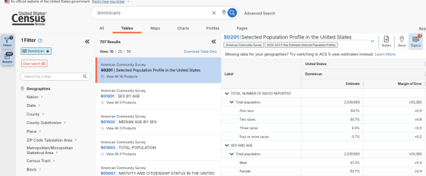
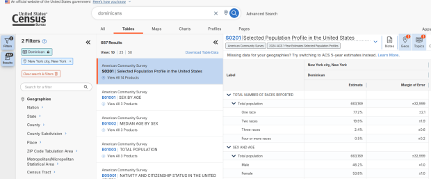
We discovered these tables by typing in the name of a group (Cuban, Nigerian, or Polish for example) in the search box for data.census.gov. Table S0201 appeared at the top of the table results, and clicking on it opened the summary table for the group for the entire US for the most recent 1-year dataset (2024 at the time I’m writing this). The name of the group appears in the header row of the table. Clicking on the dataset name and year in the grey box at the top of the table allows you to select previous years.
Using the Filters on the left, you can narrow the data down to a specific geography and year. You may get no results if either the geographic area or the ethnic or racial group is too small. Besides table S0201, additional detailed tables appear for a few, isolated years (the most recent being 2021).
A more formal approach, which is better for seeing and understanding the full set of possibilities for ethnic groups and their data availability:
- At data.census.gov, search for S0201, and select that table. You’ll get the totals for the entire US.
- Using the filters on the left, choose Race and Ethnicity – then a racial or ethnic group – then a detailed race or group – then specific categories until you reach a final menu. This gives you the US-wide table for that group (if available).
- Alternatively – you could choose Populations and People – Ancestry instead of Race to filter for certain groups. See my explanation below.
- Use the filters again to select a specific geographic area (if available) and years.
With either approach, once you have your table, click the More Tools button (…) and download the data. Alternatively, like all of the ACS tables S0201 can be accessed via the Census Bureau’s API.
Where does this data come from? It can be generated from several questions on the ACS survey: Hispanic and Race (respectively, with respondents self-identifying a category), Place of Birth (specifically captures first-generation immigrants), and Ancestry (an open ended question about who your ancestors were).
The documentation I found provided just a cursory overview. I discovered additional information that describes recent changes in the race and ancestry questions. Persons identifying as Native American, Asian, or Pacific Islander as a race, or as Hispanic as an ethnicity, have long been able to check or write in a specific ethnic, national, or tribal group (Chinese, Japanese, Cuban, Mexican, Samoan, Apache, etc). People who identified as Black or White did not have this option until the 2020 census, and it looks like the ACS is now catching up with this. This page links to a document that provides an overview of the overlap between race and ancestry in different ACS tables.
The final paragraph in that document describes table S0201, which I’ll quote here in full:
Table S0201 is iterated by both race and ancestry groups. Group names containing the words “alone” or “alone or in any combination” are based on race data, while group names without “alone” or “alone or in any combination” are based on ancestry data. For example, “German alone or in any combination” refers to people who reported one or more responses to the race question such as only German or German and Austrian. “German” (without any further text in the group name) refers to people who reported German in response to the ancestry question.
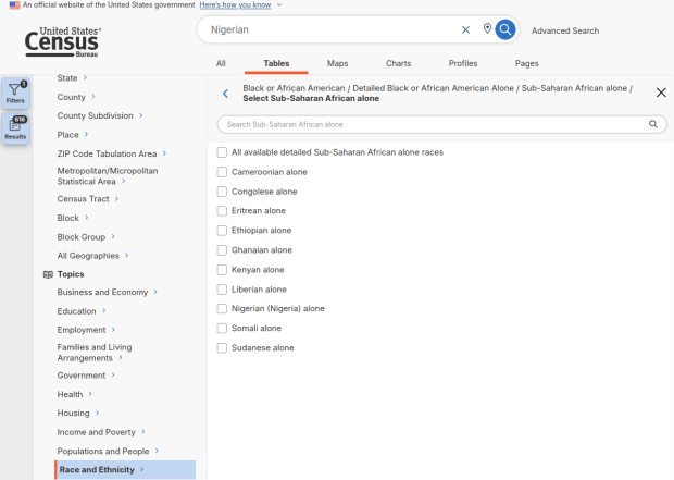
For example, when I used my first approach and simply searched for Nigerians as a group, the name appeared in the 2024 ACS table simply as Nigerian. This indicates that the data was drawn from the ancestry question. I was also able to flip back to earlier years. But in my second approach, when I searched for the table by its ID number and subsequently chose a racial group, the name appeared as Nigerian (Nigeria) alone, which means the data came from the race table. I couldn’t flip back to earlier periods, as Nigerian wasn’t captured in the race question prior to 2024.
Consider the screenshot below to evaluate the differences. Nigerian alone indicates people who chose just one race (Black) and wrote in Nigerian under their race. Nigerian alone or in any combination indicates any person who wrote Nigerian as a race, could be Black and Nigerian, or Black and White and Nigerian, etc. Finally, Nigerian refers to the ancestry question, where people are asked to identify who their ancestors are, regardless of whether they or their parents have a direct connection to the given place where that group originates.
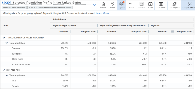
Here’s where it gets confusing. If you search for the S0201 table first, and then try filtering by ancestry, the only options that appear are for ethnic or national groups that would traditionally be considered as Black or White within a US context. Places in Europe, Africa, the Middle East, and Central Asia, as well as parts of the world that were initially colonized by these populations (the non-Spanish Caribbean, Australia, Canada, etc). Options for Asians (south, southeast, and east Asia), Pacific Islanders, Native Americans, and any person who identifies as Hispanic or Latino do not appear as ancestry options, as the data for these groups is pulled from elsewhere. So when I tried searching for Chinese, Chinese alone appears in the table, as this data is drawn from the race table. When I searched for Dominican, the term Dominican appears in the table… Hispanic or Latino is not a race, but a separate ethnic category, and Dominican may identify a person of any race who also identifies as Hispanic. This data comes from the Hispanic / Latino origin table.
My interpretation is that data for Table S0201 is drawn from:
- The ancestry table (prior to 2024), and either the race or ancestry table (from 2024 forward), for any group that is Black or White within the US context.
- The race table for any group that is Asian, Pacific Islander, or Native American (although for smaller groups, ancestry may have been used prior to 2022 or 2023).
- The Hispanic / Latino origin table for any group that is of Hispanic ethnicity, regardless of their race.
- Place of birth isn’t used for defining groups, but appears as a set of variables within the table so you can identify how many people in the group are first-generation immigrants who were born abroad.
That’s my best guess, based on the available documentation and my interpretation of the estimates as they appear for different groups in this table. I did some traditional web searching, and then also tried asking ChatGPT. After pressing it to answer my question rather than just returning links to the Census Bureau’s standard documentation, it did provide a detailed explanation for the table’s sources. But when I prompted it to provide me with links to documentation from which its explanation was sourced, it froze and did nothing. So much for AI.
Despite this complexity, the Selected Population Profile tables are incredibly useful for obtaining summary statistics for different ethnic groups, and was perfect for the introductory sociology class I visited that was studying immigration and ancestry. Just bear in mind that the availability of S0201 is limited by size of the geographic area as a whole, and the size of the group within that area.


You must be logged in to post a comment.