I was working with a graduate student last month who was looking for contour lines for specific towns within the US, for large-scale (small area) mapping and analysis. They were specifically interested in elevation for landfills, and some of the contour data they found didn’t map these as they aren’t natural features. We looked at current USGS topographic maps, and they do indeed map contours for landfills. But the topo maps are raster images, and they wanted vectors. Is it possible to access the underlying GIS data that was used to create the topo maps?
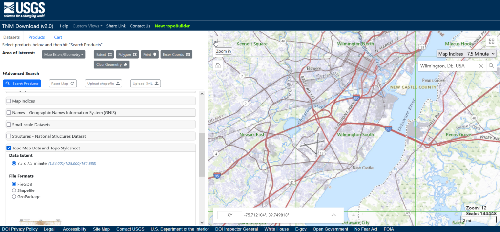
Indeed, it is! Option 1 is to use the National Map Download app. Search for a place name to zoom into your area of interest. Use the Show Map Index dropdown menu to draw the quad boundaries for the topo scale you’re interested in on the map; the 7.5 minute / 1:24,000 series is the USGS topo scale that most people are familiar with. Adjust the zoom so your area of interest fits within the map window; that way when you search in the Datasets tab on the left, the default search looks within this map extent.
Next, choose the specific data product you’re interested in. Here’s a list and description of all the National Map Datasets. For example, if you just wanted contour lines, you can select that under Small-scaleDatasets. Note that raster imagery and data that’s used to derive the vectors is also available for download. If you want all the vector features that appear on a particular topo map, check the Topo Map Data and Topo Stylesheet option. Once you check a product, you can choose a file format for the data. Given the size of these datasets, the FileGDB option is probably best.
The National Map Download Interface, Showing the Datasets Tab for Selecting and Searching
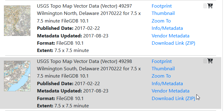
Then, click the blue Search Products button. That flips you to the Products tab, and displays data available within the extent of the map view. If you chose Topo Map Data and Topo Stylesheet, the results will be maps of individual quads. You can add a bunch of maps to your shopping cart by clicking on the little cart icon, or download one immediately by clicking the Download Link (ZIP).
On the Product Tab, click Download Link (ZIP) to get data for a specific map
Option 2 for downloading data: skip the map interface and use the Stage Products Directory. This no frills option is good if you know exactly which products you’re looking for. For example, you can drill down through TopoMapVector, then by state, and then data format to get to the same files you would have downloaded via option 1. You would need to know the name of the quad that encompasses the area you want; consult an index to figure it out.
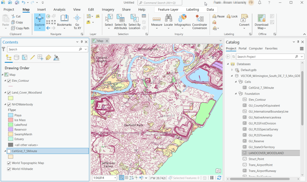
Once you download and unzip the file, you can launch your desktop GIS package to connect to the database and view the contents. In ArcGIS Pro, use the Catalog Pane, select the Databases option, right click, and Add Database. Browse to the location where you unzipped it, and select it. Then hit the dropdown for the newly added database and browse the contents, which are divided into schemas or groups. Foundation and Hydrography contain most of the features. GazVector has place name labels not captured in other features, and Cells contains outlines of the quad grid cells. Drag them into the Map Pane to view them.
USGS Topo Map Vector Data in ArcGIS Pro
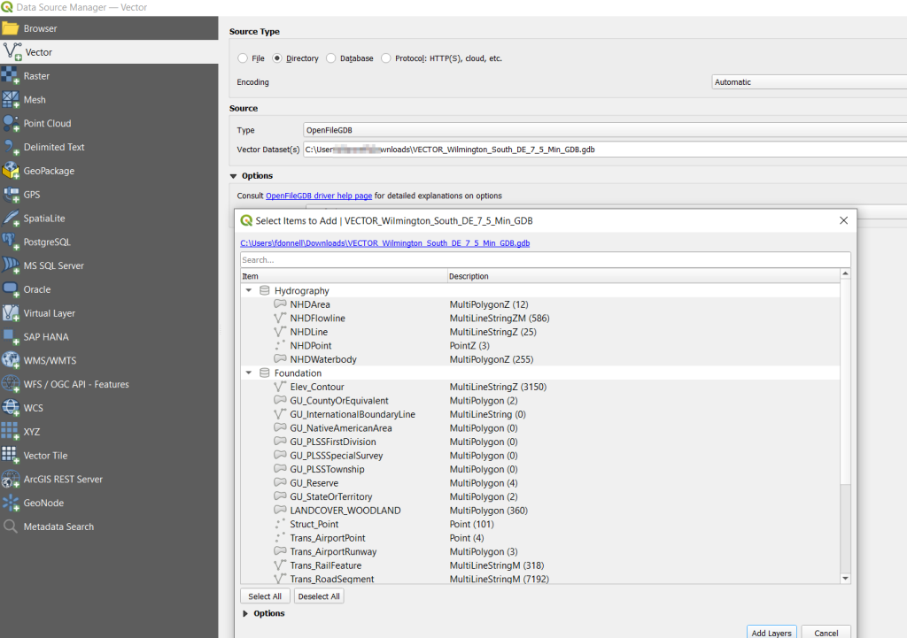
QGIS users can use the Data Source Manager. With the Vector option selected, change the Source Type from File to Directory, and in the Type dropdown choose OpenFileGDB. Then hit the dots button to browse your file system and select the database folder. Click Add, and you’ll be prompted to choose layers and tables to add to a project. You’ll see the same schema organization described previously, and you can use the CTRL and / or Shift keys to select what you want. Add the Layers, hit OK, and close the Manager.
Adding File Geodatabase Features in the QGIS Data Source Manager
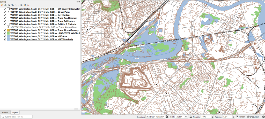
From there, it takes some artful manipulation of the overlays, color schemes, and labels to clearly symbolize the features. Both ArcGIS and QGIS have default symbol styles for topographic features that you can choose from. Apparently there’s a stylesheet packaged with the data, but I haven’t dug in enough yet to find and apply it. The attributes for the features seem fairly rich; the table includes columns that indicate the original data source for each feature, dates when records were added or updated, and a number of identifiers, labels, and categories. Some of the features, like bodies of water and county boundaries, extend beyond the quad cell for the map, as the USGS opted to keep whole features rather than clipping them. If the area you’re interested in happens to fall across two maps, you can download the topo map vector data for both quads, and use the Merge tool to combine them. The default CRS is un-projected NAD83 (EPSG 4269). You’ll probably want to reproject to a state plane or UTM zone that’s appropriate for your area. These post that describe styling and labeling contour lines in QGIS and ArcGIS Pro are helpful. Happy mapping!
In this post I’ll share a process for getting geo-located tweets from Twitter, using large files of tweets archived by the Internet Archive. These are tweets where the user opted to have their phone or device record the longitude and latitude coordinates for their location, at the time of the tweet. I’ve created some straightforward scripts in Python without any 3rd party modules for processing a daily file of tweets. Given all the turmoil at Twitter in early 2023, most of the tried and true solutions for scraping tweets or using their APIs no longer function. What I’m presenting here is one, simple solution.
Social media data is not my forte, as I specialize in working with official government datasets. When such questions turn up from students, I’ve always turned to the great Web Scraping Toolkit developed by our library’s Center for Digital Scholarship. But the graduate student I was helping last week and I discovered that both the Twint and TAGS tools no longer function due to changes in Twitter’s developer policies. Surely there must be another solution – there are millions of posts on the internet that show how easy it is to grab tweets via R or Python! Alas, we tried several alternatives to no avail. Many of these projects rely on third party modules that are deprecated or dodgy (or both), and even if you can escape from dependency hell and get everything working, the changed policies rendered them moot.
You can register under Twitter’s new API policy and get access to a paltry number of records. But I thought – surely, someone else has scraped tons of tweets for academic research purposes and has archived them somewhere – could we just access those? Indeed, the folks at Harvard have. They have an archive of geolocated tweets in their dataverse repository, and another one for political tweets. They are also affiliated with a much larger project called DocNow with other schools that have different tweet archives. But alas, there are rules to follow, and to comply with Twitter’s license agreement Harvard and these institutions can’t directly share the raw tweets with anyone outside their institutions. You can search and get IDs to the tweets, using their Hydrator application, which you can use in turn to get the actual tweets. But then in small print:
“Twitter’s changes to their API which greatly reduce the amount of read-only access means that the Hydrator is no longer a useful application. The application keys, which functioned for the last 7 years, have been rescinded by Twitter.”
Fortunately, there is the Internet Archive, which has been working to preserve pieces of the internet for posterity for several decades. Their Twitter Stream Grab consists of monthly collections of daily files for the past few years, from 2016 to 2022. This project is no longer active, but there’s a newer one called the Twitter Archiving Project which has data from 2017 to now. I didn’t investigate this latter one, because I wasn’t sure if it provided the actual tweets or just metadata about them, while the older project definitely did. The IA describes the Stream Grab as the “spritzer” version of Twitter grabs (as opposed to a sprinkler or garden hose). Thanks to the internet, it’s easy to find statistics but hard to find reliable ones – this one, credible looking source (the GDELT Project) suggests that there are between 400 and 500 million tweets a day in recent years. The file I downloaded from IA for one day had over 4 million tweets, so that’s about 1% of all tweets.
I went into the November 2022 collection and downloaded the file for Nov 1st. It’s a TAR file that’s about 3 GB. Unzipping it gives you a folder for that data named for the date, with hundreds of gz ZIP files. Unzip those, and you have tons of JSON Line files. These are JSON files where each JSON record has been collapsed into one line.
Python to the rescue. See GitHub for the full scripts – I’ll just add some snippets here for illustration. I wrote two scripts: the first reads in and aggregates all the tweets from the JSONL files, parses them into a Python dictionary, and writes out the geo-located records into regular JSON. The second reads in that file, selects the elements and values that we want into a list format, and writes those out to a CSV. The rationale was to separate importing and parsing from making these selections, as we’re not going to want to repeat the time-consuming first part while we’re tweaking and modifying the second part.
In the sample data I used for 11/01/2022, unzipping the downloaded TAR file gave me a date folder, and in that date folder were hundreds of gz ZIP files. Unzipping those revealed the JSONL files. I wrote the script to look in that date folder, one level below the folder that holds the scripts, and read in anything that ended with .json. Not all of the Internet Archive’s stream’s are structured this way; if your downloads are structured differently, you can simply move all the unzipped json files to one directory below the script to read them. Or, you can modify the script to iterate through sub-directories.
Because the data was stored as JSONL, I wasn’t able to read it in as regular JSON. I read each line as a string that I appended to a list, iterated through that list to convert it into a dictionary, pulled out the records that had geo-located elements, and added those records to a larger dictionary where I used an identifier in the record as a key and the value as a dictionary with all elements and values for a tweet. This gets written out as regular JSON at the end. Reading the data in didn’t take long; parsing the strings into dictionaries was the time consuming part. Originally, I wanted to parse and save all 4 million records, but the process stalled around 750k as I ran out of memory. Since so few records are geo-located, just selecting these circumvented this problem. If you wanted to modify this part to get other kinds of records, you would need to apply some filter, or implement a more efficient process than what I’m using.
json_list=[] # list of lists, each sublist has 1 string element = 1 line

for f in os.listdir(json_dir):
    if f.endswith('.json'):
        json_file=os.path.join(json_dir,f)
        with open(json_file,'r',encoding='utf-8') as jf:
            jfile_list = list(jf) # create list with one element, a line saved as a string
            json_list.extend(jfile_list)
            print('Processed file',f,'...')

geo_dict={} # dictionary of dicts, each dict has line parsed into keys / values
i=0
for json_str in json_list:
    result = json.loads(json_str) # convert line / string to dict
    if result.get('geo')!=None: # only take records that were geocoded
        geo_dict[result['id']]=result
    i=i+1
    if i%100000==0:
        print('Processed',i,'records...')
The second script reads the JSON output from the first, and simply iterates through the dictionary and chooses the elements and values I want and assigns them to variables. Some of these are straightforward, such as grabbing the timestamp and tweet. Others required additional work. The source element provides HTML code with a source link and name, so I split and strip this value to get them separately. The coordinates are stored as a list, so to get longitude and latitude as separate values I indicate the list position. In cases where I’m delving into a sub-dictionary to get a value (like the coordinates), I added if statements to set values to None if they don’t exist in the JSON, otherwise you get an error. Once I finish iterating, I append all these variables to a list, and add this list to the main one that captures every record. I create a matching header row list, and both are written out as a CSV.
with open(input_json) as json_file:
    twit_data = json.load(json_file)

twit_list=[]

# In this block, select just the keys / values to save
for k,v in twit_data.items():
    tweet_id=k
    timestamp=v.get('created_at')
    tweet=v.get('text')
    # Source is in HTML with anchors. Separate the link and source name
    source=v.get('source') # This is in HTML
    source_url=source.split('"')[1] # This gets the url
    source_name=source.strip('</a>').split('>')[-1] # This gets the name
    lang=v.get('lang')
    # Value for long / lat is stored in a list, must specify position
    if v['geo'] !=None:
        longitude=v.get('geo').get('coordinates')[1]
        latitude=v.get('geo').get('coordinates')[0]
    else:
        longitude=None
        latitude=None
...
My code could use improvement – much of this could be abstracted into a function to avoid repetition. We were in a hurry, and I’m also working with folks who need data but aren’t necessarily familiar with Python, so something that’s inefficient but understandable is okay (although I will polish this up in the future).
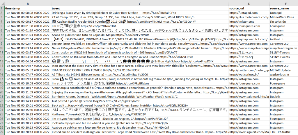
I provide the output in GitHub, examples of the final CSV appear below. Every language in the world is captured in these tweets, so Windows users need to import the CSV into Excel (Data – From Text/CSV) and choose UTF-8 encoding. Double-clicking the CSV to open it in Excel in Windows will render most of the text as junk, in the default Windows-1252 encoding.
Tweets extracted from Internet Archive with timestamp, tweets, and source informationTweets extracted from Internet Archive, showing geo-located information
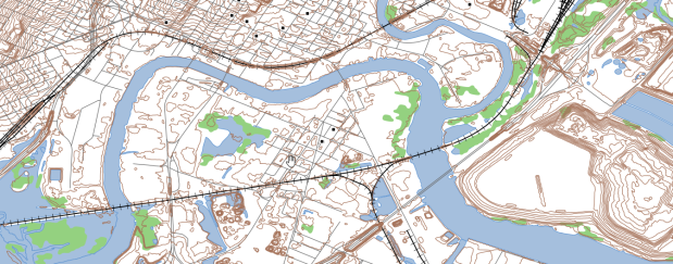
So, is this data actually useful? That’s an open question. Of the 4 million tweets in this file, just over 1,158 were geo-located! I checked and this is not a mistake. The metadata record for the Harvard geolocated tweets mentions that only 1% to 2% of all tweets are geo-located. So of the 400 million daily tweets, only 4 million. And out of our daily 4 million sample from IA, just 1,158 (less than 1%). What we ended up with does give you a sense of variety and global coverage (see map at the top of the post, showing sample of tweets by language Nov 1, 2022). In this sample, the top five countries represented were: US (35%), Japan (17%), Brazil (4%), UK (4%), Mexico and Turkey (tied 3%). For languages, the top five: English (51%), Japanese (17%), Spanish (9%), Portuguese (5%), and Turkish (3%).
In many cases, I think you’d need a larger sample than a single day, assuming you’re interested in just geo-located records. Perhaps 4 million is large enough for certain non-spatial research? Again, not my area of expertise, but you would want to be aware of events that happened on a certain date that would influence what was tweeted. My graduate student wanted to see differences in certain kinds of tweets in the LA metro area versus the rest of the US, but this sample includes less than 20 tweets from LA. To do anything meaningful, she’d have to download and process a whole month of tweets (at least). Even then, there are certain tweeters that show up repeatedly in given areas. In NYC, most of the tweets on this date were from the 511 service, warning people where that day’s potholes were.
Beyond the location of the tweet, there is a lot of information about the user, including their self-reported location. This data is available in all tweets (not just the geo-located ones). But there are a lot problems with this attribute: the user isn’t necessarily tweeting from that location, as it represents their “static” home. This location is not geocoded, and it’s self reported and uncontrolled. In this example, some users dutifully reported their home as ‘Cleveland, OH’ or ‘New York City’. Other folks listed ‘NYC – LA – ATL – MIA’, ‘CIUDAD DE LAS BAJAS PASIONES’, ‘H E L L’, and ‘Earth. For now’.
Even for research that incorporated geo-located tweets from other, larger data sources that were previously accessible, how representative are all those studies when the data represents only 1% of the total tweet volume? I am skeptical. Also consider the information from the good folks at the Pew Research Center, that tells us that only one in five US adults use Twitter, and that the minority of Twitter users generate the vast majority of tweets: “The top 25% of US users by tweet volume produce 97% of all tweets, while the bottom 75% of users produce just 3%” (10 Facts About Americans and Twitter May 5, 2022).
For what’s it worth, if you need access to Twitter data for academic, non-commercial research purposes and the old methods aren’t working, perhaps the Internet Archive’s data and the solution posed here will fit the bill. You can see the geo-located output (JSON and CSV) from this example in the GitHub repo’s output folder. There is also a samples folder, which contains JSON and CSV for about 77k records that include both geo-located and non-geolocated examples. Looking at the examples can help you decide how to modify the scripts, to pull out different elements and values of interest.
When I’m making global thematic maps, I usually turn to Natural Earth. They provide country polygons and boundary lines, as well as features like cities and rivers, at several different scales. I always reference it in workshops that I teach, including the 2-week GIS Institute that I participated in earlier this month. It’s a solid, free data source and a good example for illustrating how scale and generalization work in cartography. It’s a “natural choice”, as they provide boundaries that depict the way the world actually looks.
I also discussed aesthetics and map design during the Institute. What if you don’t necessarily care about representing the boundaries exactly the way they are? If you rely on the map reader’s knowledge of the relative shape of the countries and their position on the globe, and you employ good labeling, you can choose boundaries that are more artistic and fun (provided that your only goal is making a basic thematic map and it’s not being published in a stodgy journal).
Project Linework is part of Something About Maps, an excellent blog by Daniel Huffman. The project consists of different series of public domain boundary files that have been generalized to provide interesting and visually attractive alternatives to standard features. The gallery contains a sample image and brief description of each series, including details on geographic coverage. Most of the series cover just North America or select portions of the world.
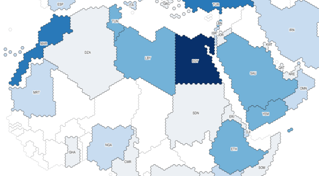
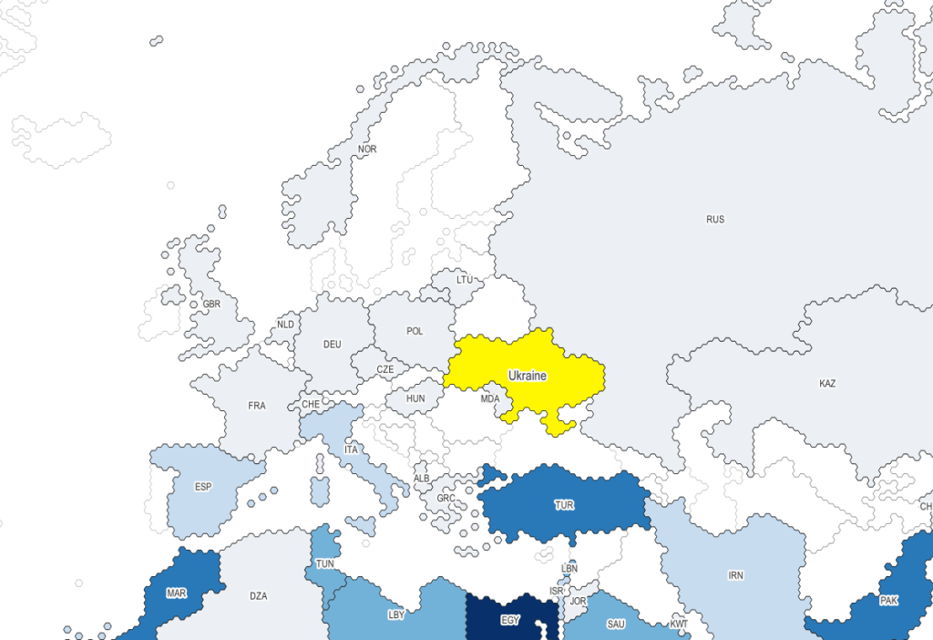
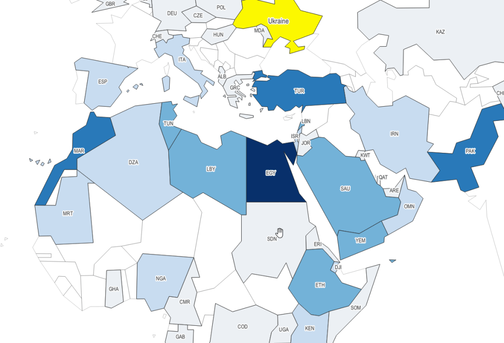
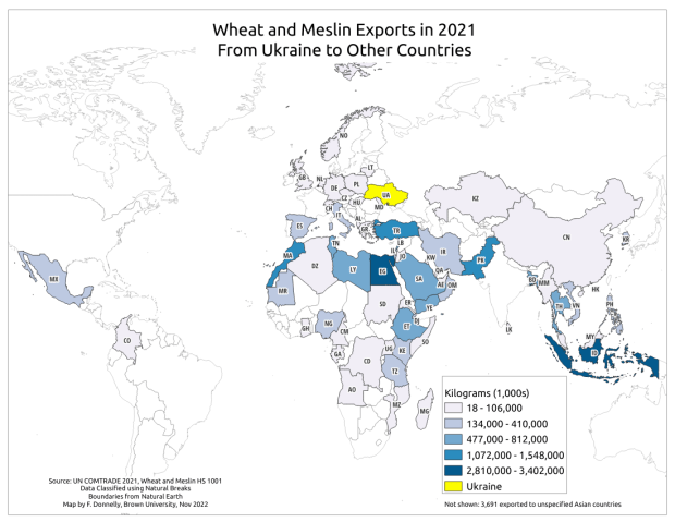
The three I’ll mention below are global in coverage. They come in shapefile and geojson formats, are projected in World Gall Stereographic (ESRI 54016), and include line and polygon coverages. The attribute tables have fields for ISO country codes, which are standard unique identifiers that allow for table joins for thematic mapping. I took my map of Wheat and Meslin Exports from Ukraine from an earlier post to create the following examples.
With the Wargames series, the world has been rendered using the little hexagon grids familiar to many war board gamers, and plenty of non-war gamers for that matter (think Settlers of Catan). Hexes are a an alternative to grids for determining adjacency.
Project Linework: Wargames
Moriarty Hand is a more whimsical interpretation. It was drawn by hand by tracing line work from Natural Earth. The end result is more organic compared to Wargames. It comes in two scales, small and large (with an example of the latter below):
Project Linework: Moriarty Hand
My personal favorite is 1981. It’s inspired by the basic polygon shapes that you would have seen in early computer graphics. When I was little I remember loading a DOS-based atlas program from a floppy disk, and slowly panning across a CGA monochrome screen as the machine chunked away to render countries that looked like these. Good if you’re looking for a retro vibe.
I’ve also received a number of questions this semester about animal observation and tracking data. Since I usually study people and not animals, I was a bit out of my element and had some homework to do. If you’ve ever watched nature shows, you’ve seen scientists tagging animals with collars or bands to track them by radio or satellite, or setting up cameras to record them. Many scientists upload their GPS coordinate data into publicly accessible repositories for others to download and use.
I’ve written a short, three-part document that I’ve posted on our tutorials page: GIS Data Sources for Wildlife Tutorial. In the first part, I provide summaries, links, and guidance on using large portals like Movebank and Zoatrack* that include many species from all over the world (wild and domestic), as well a government repositories including NOAA’s National Center for Environment Information Geoportal and the National Park Service’s Data Store. The second part focuses on search strategies, crawling the web and combing through academic literature in library databases to find additional data. Since these datasets are highly diffuse, it’s worth going beyond the portals to see what else you can discover.
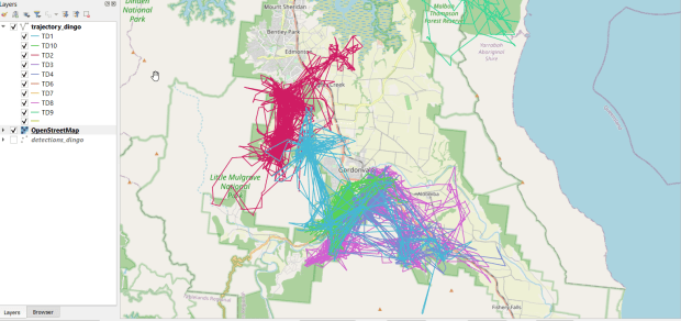
I describe how you can add and visualize this data in QGIS and ArcGIS Pro in the third and final part. Wildlife data comes packaged in a number of formats; in some cases you’ll find shapefiles or geodatabases that you can readily add and visualize, but more often than not the data is packaged in a plain CSV / TXT format. This requires you to plot the coordinates (X for longitude, Y for latitude) to create a dot map of the observations. Data files will often contain a number of individual animals, which can be uniquely identified with a tag ID, allowing you to symbolize the points by category so you have a different color or symbol for each individual. Alternatively, there might be separate data files for each individual, that you could add and symbolize differently. The files will contain either a sequential integer or a timestamp that indicates the order of the observations. With one field that indicates the order and another that identifies each individual, you can use a Points to Line or Points to Path tool to generate lines (tracks or trajectories) from the points (observations or detections).
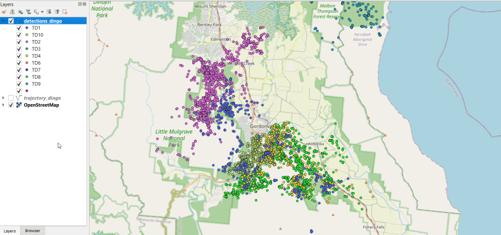
You can see where dingos in Queensland, Australia are going in the screenshot below, which displays individual observation points, and the screenshot in the header of this post where the points were connected to form paths. I obtained the data from ZoaTrack and used QGIS for mapping. Check out the tutorial for details on how to find and map your favorite animals.
* NOTE: ZoaTrack went offline in July 2024. You can still access an archive of the site and its datasets via the Internet Archive’s Wayback Machine. Here is a cached version of Zoatrack from June 2024. The tutorial will be updated to reflect this change soon.
I’ve been receiving more questions about geospatial data sources as the semester draws to a close. I’ll describe some sources that I haven’t used extensively before in the next couple of posts, beginning with data on bilateral trade: imports and exports between countries. We’ll look at the IMF’s Direction of Trade Statistics (DOTS) and the UN’s COMTRADE database. Both sources provide web-based portals, APIs, and bulk downloading. I’ll focus on the portals.
IMF Direction of Trade Statistics
IMF DOTS provides monthly, quarterly, and annual import and export data, represented as total dollar values for all goods exchanged. The annual data goes back to 1947, while the monthly / quarterly data goes back to 1960. All countries that are part of the IMF are included, plus a few others. Data for exports are published on a Free and On Board (FOB) price basis, while imports are published on a Cost, Insurance, Freight (CIF) price basis. Here are definitions for each term, quoted directly from the OECD’s Statistical Glossary:
The f.o.b. price (free on board price) of exports and imports of goods is the market value of the goods at the point of uniform valuation, (the customs frontier of the economy from which they are exported). It is equal to the c.i.f. price less the costs of transportation and insurance charges, between the customs frontier of the exporting (importing) country and that of the importing (exporting) country.
The c.i.f. price (i.e. cost, insurance and freight price) is the price of a good delivered at the frontier of the importing country, including any insurance and freight charges incurred to that point, or the price of a service delivered to a resident, before the payment of any import duties or other taxes on imports or trade and transport margins within the country.
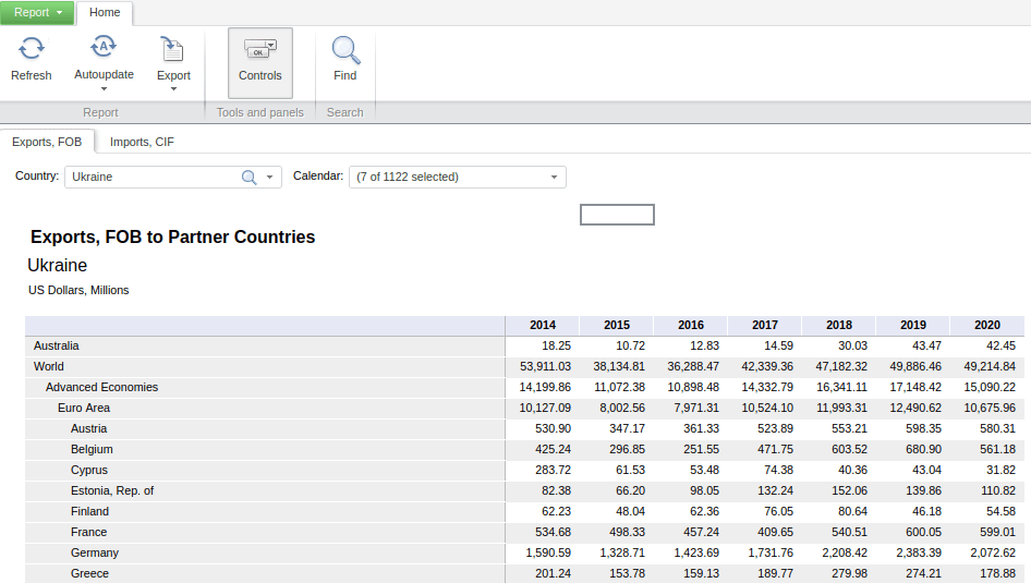
There are a few different ways to browse and search for data. Start with the Data Tables tab at the top, and Exports and Imports by Areas and Countries. The default table displays monthly exports by region and country for the entire world (you could switch to imports by selecting the Imports CIF tab beside the Export sFOB tab). Hitting the Calendar dropdown allows you to change the date range and frequency. Hitting the Country dropdown lets you select a specific region or country. In the example below, I’ve changed the calendar from months to years, and the country to Ukraine. By doing so, the table now depicts the total US dollar value of exports and imports between Ukraine and all other countries. The Export button at the top allows you to save the report in a number of formats, Excel being the most data friendly option.
IMF DOTS Basic Report – Total Value of Exports from Ukraine, Last Five Years
While this is the quickest option, it comes with some downsides; the biggest one is that there are no unique identifiers for the countries, which is important if you wanted to join this table to a GIS vector file for mapping, or another country-level table in a database.
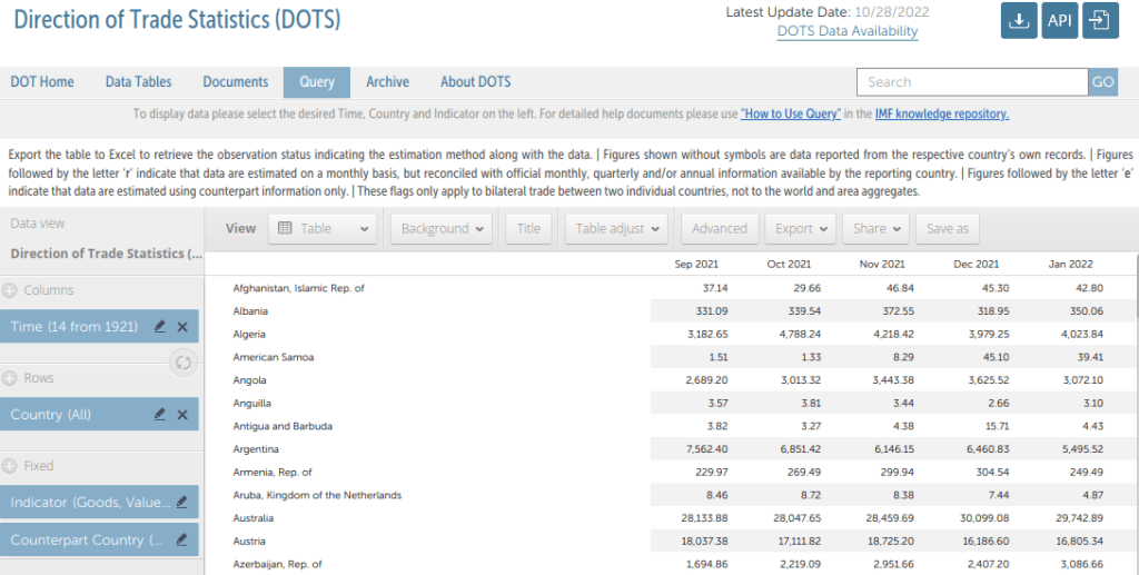
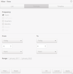
A better approach is to return to the home page and use the Query tab, which allows you to get a unique identifier and filter out countries and regions that are not of interest.
DOTS Query Tab
Under Columns, select the time frame and interval. For example, check Years for Frequency at the top, and change the dropdowns at the bottom from Months to Years. From -5 to 0 would give you the last five years in ascending order.
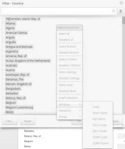
Rows allows you to filter out countries or regions that you don’t want to see in the results. You can also change the attribute that is displayed. Once the menu is open, right click in an empty area and choose Attribute. Here you can choose a variant country name, or an ISO country code. ISO codes are commonly used for uniquely identifying countries.
Indicator lets you choose Exports (FOB), Imports (CIF or FOB), or Trade Balance, all in US dollars.
Counterpart country is the country or region that you want to show trade for, such as Ukraine in our previous example.
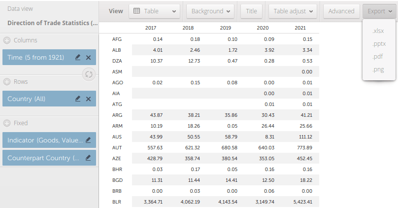
The tabs along the top allow you to produce graphs instead of a table (View – Table), to pivot the table (Adjust), and calculate summaries like sums or averages (Advanced).
Export to produce an Excel file. By choosing the ISO codes you’ll lose the country names, but you can join the result to another country data table or shapefile and grab the names from there.
Modify Time
Modify Rows – Country – Change Attribute
DOTS Modified Table to Export: Total Value of Exports from Ukraine Last Five Years
UN COMTRADE
If you want data on the exchange of specific goods and services, quantities in addition to dollar values, and exchanges beyond simple imports and exports, then the UN’s COMTRADE database will be your source. You need to register to download data, but you can generate previews without having to log in. There is an extensive wiki that describes how to use the different database tools, and summaries of technical terms that you need to know for extracting and interpreting the data. You’ll need some understanding of the different systems for classifying commodities and goods. Your options (the links that follow lead to documentation and code lists) are: the Harmonized Classification System (HC), the Standard Industrial Trade Classification (SITC), and the Broad Economic Categories (BEC). What’s the difference? Here are some summaries, quoted directly from a UN report on the BEC:
The HS classification is maintained by the World Customs Organization. Its main purpose is to classify goods crossing the border for import tariffs or for application of some non-tariff measures for safety or health reasons. The HS classification is revised on a five-year cycle (p. 18)
The original SITC was designed in the 1950s as a tool for collection and dissemination of international merchandise trade statistics that would help in establishing internationally comparable trade statistics. By its introduction in 1988, the HS took over as collection and dissemination tool, and SITC was thereon used mostly as an analytical tool. (p. 19)
The Classification by Broad Economic Categories (BEC) is an international product classification. Its main purpose is to provide a set of broad product categories for the analysis of trade statistics. Since its adoption in 1971, statistical offices around the world have used BEC to report trade statistics in a concise and meaningful way (p. iii). The broad economic categories of BEC include all subheadings of the HS classification. Therefore, the total trade in terms of HS equals the total trade of the goods side of BEC. (p. 18)
In short, go with the BEC if you’re interested in high-level groupings, or the HS if you need detailed subdivisions. The SITC would be useful if you need to go further back in time, or if it facilitates looking at certain subdivisions or groupings that the other systems don’t capture.
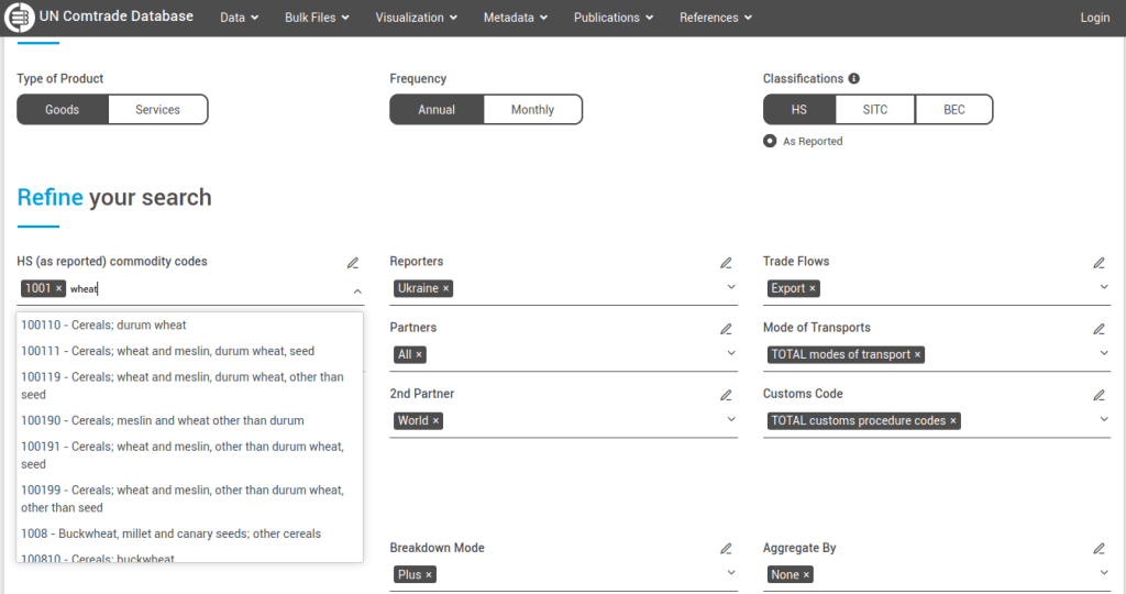
From COMTRADE’s homepage, I suggest leaving the defaults in place and doing a basic, preliminary search for all global exports for the most recent year, so you can see basic output on the next screen. Then you can apply filters for a narrower search.
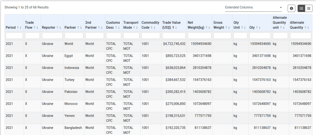
For example, let’s look at annual exports of wheat from Ukraine to other countries. Under the HS filter, remove the TOTAL code. Start typing wheat, and you’ll see various product categories: 6-digit codes are the most specific, while 4-digit codes are broader groups that encapsulate the 6-digit categories. We’ll choose wheat and meslin 1001. We’ll select Ukraine as the Reporter (the country that supplied the statistics and represents the origin point), and for the 1st partner we’ll choose All to get a list of all countries that Ukraine exported wheat to. The 2nd partner country we’ll leave as World (alternatively, you would add specific countries here if you wanted to know if there were intermediary nations between the origin and destination).
UN COMTARDE Refine Search with Filters
Hit Preview to see the results. You can click on a heading to sort by dollar value, weight, or country name. Like IMF DOTS, UN COMTRADE measures dollar amounts of exports as FOB and imports as CIF. At this point, you would need to log in to download the data as a CSV (creating an account is free). You would also need to be logged in if you generated an extract that has more than 500 records, otherwise the results will be truncated. You could always copy and paste data for shorter extracts directly from the screen to a spreadsheet, but you wouldn’t get any of the extra metadata fields that come with download, like ISO Country Codes and the classification codes for goods and merchandise.
COMTRADE Filtered Results – Exports of Wheat and Meslin from Ukraine 2021Data Exported from COMTRADE to CSV with Identifiers
Mapping
For data from either source, if you wanted to map it you’d need to have a data table where there is one row for each country with columns of attributes, and with one column that has the ISO country code to serve as a unique identifier. Save the data table in an Excel file or as a table in a database. Download a country shapefile from Natural Earth. Add the shapefile and data table to a project and join them using the ISO code. Natural Earth shapefiles have several different ISO code columns that represent nations, sovereigns, and parent – child relationships; be sure you select the right one. Data table records that represent regions or groupings of countries (i.e. the EU, ASEAN, sum of smaller countries per continent not enumerated, etc.) will fall out of the dataset, as they won’t have a matching feature in the country shapefile. The map at the top of this post was created in QGIS, using COMTRADE and Natural Earth.
This semester we launched a project to inventory our USGS topographic map collection. Our holdings include tens of thousands (probably over a 100,000) of these maps that depict the nation’s physical terrain and built environment in great detail. One of my former students wrote a Python program using the tkinter module to create a GUI, which we’re using to filter a list of published maps in a SQLite database to match ones that we have in hand. Here’s a short guide that documents our process.
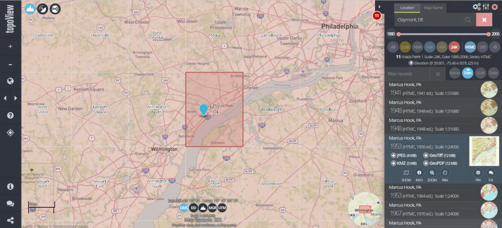
The list we’re using as our base table is what powers USGS topoView, which allows you to browse and download over 200,000 historic topos (1880 to 2006) that have been digitized and georferenced. The application also includes maps produced from 2009 forward that are part of the newer US Topo project; these maps are created on an on-going basis by pulling together a number of existing government data sources (unlike the historic maps, which were created by manual field surveys and updated over time using aerial photographs and satellite imagery).
You can search topoView using the name of a location or quadrangle (the grid cell that represents the area of each map, named after the most prominent feature in that area) to find all available maps for that location. There’s a set of filters that allows you to focus on the Historic Topographic Map Collection (HTMC) versus the US Topo Collection (2009 to present), or a specific scale. Choose a scale and zoom in, and you’ll see the grid cells for that series so you can identify map coverage. The 24k scale is the most familiar series; as the largest scale / smallest area maps that the USGS produced, it provides the most detail and covers every state and US territory. Each map covers an area of 7.5 x 7.5 minutes (think of a degree as 60 mins) and an inch on these maps represents 2,000 feet. This scale was introduced in the late 1940s, and replaced both the 63k scale map (a 15 x 15 minute map where 1 inch = 1 mile) that was the previous standard, and the less common 48k scale.
There are also smaller scale maps, which cover larger areas. The 100k series was introduced in the mid 1970s and covers the lower 48 states and Hawaii. Each map covers an area of 30 x 60 minutes and uses metric units (1 inch = 1.6 miles). The 250k series was introduced in the 1940s by the US Army Map Service and was eventually taken over by the USGS. These maps include all 50 states, cover an area of 1 x 2 degrees, and use imperial units (1 inch = 4 miles). There are about 1,800 quads for the 100k series and only 900 or so for the 250k, versus over 60,000 for the 24k series.
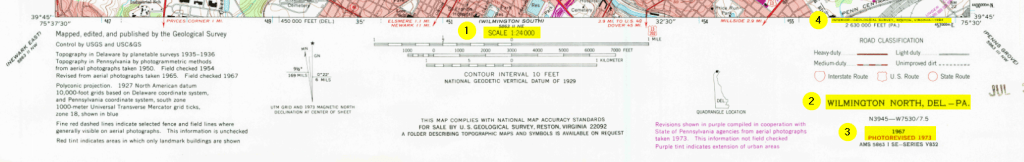
Once you search for an area or click on a quad, you’ll see all the maps available in that area over time. Applying the scale filter shows you just maps at that scale, plus some similar but odd scale maps that are not numerous enough to get their own filter. The predominate year listed for each record is the “map year”, which is when field work was done to either create the map or substantively update it. There’s also an edition or “print year” that indicates when the map was printed. If you look at the metadata (use the info button) or preview the map, there may be an edit or photo revision year, indicating if the map was updated back at headquarters using air photos or imagery. The image below illustrates where you can find this information on a standard 24k scale map.
1: Map Scale 2: Quad Name 3: Map Year and Revision Year 4: Print Year
Clicking on the thumbnail of the map in the results gives you a quick full screen preview. There are several download options, including a JPEG if you want a small compressed image, or a GeoTiff if you want a lossless format with the best resolution, and if you want to use it in GIS software as a raster layer.
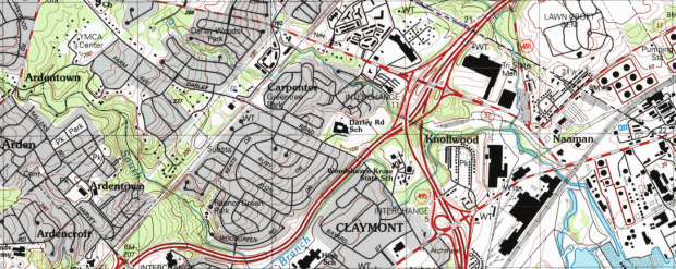
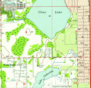
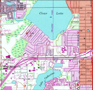
The changes you can see over time on these maps can be striking, illustrating the suburban sprawl of the 20th century. Consider the snippets from a 24k map of the Orlando West, Florida quadrangle below.
Orlando West 1956
Orlando West 1980
While many people are familiar with the topographic series, the USGS also publishes a number of other map and report series that cover topics like hydrography, oil and gas exploration, mining, land use and land cover, and special scientific investigations. They have digitized (but not georeferenced) many of these maps, from the 1950s to present. You can browse through a list of all these publications, or you can search across them in the Publications Warehouse. If you search, try the Advanced Search and specify publication type and subtype as filters. Most of the maps are classified as publication type: Report, and subtype: USGS Numbered Series.
For example, the IMAP series includes special investigation maps that cover tectonic, geologic, mineral, topographic, and bathymetric maps of specific small or regional areas in the US. They also include maps of Antarctica, special investigations in other countries, the moon, and other planets and moons. Every report / map has a landing page with a permanent URL and doi that uses the series number of the map, with links to a PDF of the map as well as a Dublin Core metadata record. For example, here’s a Geologic Map of Io from 1992, part of the IMAP series.
Portion of a Geologic Map of the Jovian Moon Io
This is great, as you can use these records and metadata for building other interactive finding aids, and can link directly to individual maps. The USGS has created different portals for accessing subsets of these materials, such as this special topics page for identifying different planetary maps in the SIM and IMAP series.
Some other gems I’ve discovered stashed away in the publications warehouse: a poster of map projections (with a flip side portrait of Gerardus Merctor) which should be familiar to most 1990s university geography students; it was often hung in classrooms and provided as an insert in cartography textbooks. Also, a digitized copy of the book Maps for America. Originally published for the USGS centenary in 1979, this book provides a comprehensive history and overview of the topographic map series. The scanned copy is the 3rd edition, printed in 1987. If you suddenly find yourself in the position of having to curate a hundred thousand 20th century topo maps, there is no better guide than this book.


You must be logged in to post a comment.