census data

US Census data, or official census for other countries

2020 Census Demographic Profile

2020 Census Data Wrap-up

Right before the semester began, I updated the Rhode Island maps on my census research guide so that they link to the recently released Demographic Profile tables from the 2020 Census. I feel like the release of the 2020 census has flown lower on the radar compared to 2010 – it hasn’t made it into the news or social media feeds to the same degree. It has been released much later than usual for a variety of reasons, including the COVID pandemic and political upheaval and shenanigans. At this point in Sept 2023, most of what we can expect has been released, and is available via data.census.gov and the census APIs.

Here are the different series, and what they include.

  • Apportionment data. Released in Apr 2021. Just the total population counts for each state, used to reapportion seats in Congress.
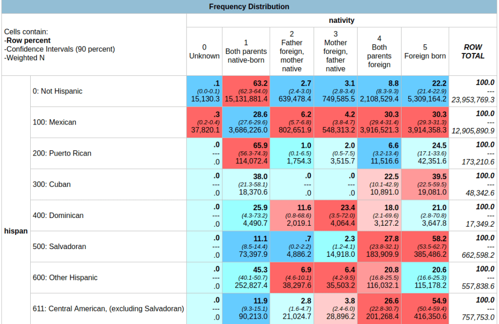
  • Redistricting data. Released in Aug 2021. Also known as PL 91-171 (for the law that requires it), this data is intended for redrawing congressional and legislative districts. It includes just six tables, available for several geographies down to the block level. This was our first detailed glimpse of the count. The dataset contains population counts by race, Hispanic and Latino ethnicity, the 18 and over population, group quarters, and housing unit occupancy. Here are the six US-level tables.
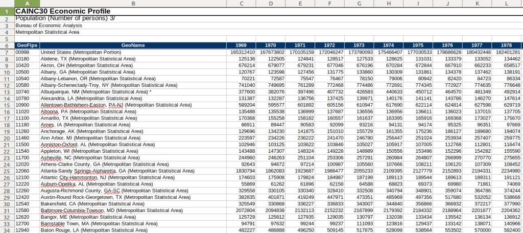
  • Demographic and Housing Characteristics File. Released in May 2023. In the past, this series was called Summary File 1. It is the “primary” decennial census dataset that most people will use, and contains the full range of summary data tables for the 2020 census for practically all census geographies. There are fewer tables overall relative to the 2010 census, and fewer that provide a geographically granular level of detail (ostensibly due to privacy and cost concerns). The Data Table Guide is an Excel spreadsheet that lists every table and the variables they include.
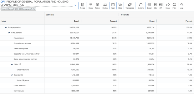
  • Demographic Profile. Released in May 2023. This is a single table, DP1, that provides a broad cross-section of the variables included in the 2020 census. If you want a summary overview, this is the table you’ll consult. It’s an easily accessible option for folks who don’t want or need to compile data from several tables in the DHC. Here is the state-level table for all 50 states plus.
  • Detailed Demographic and Housing Characteristics File A. Released in Sept 2023. In the past, this series was called Summary File 2. It is a subset of the data collected in the DHC that includes more detailed cross-tabulations for race and ethnicity categories, down to the census tract level. It is primarily used by researchers who are specifically studying race, and the multiracial population.
  • Detailed Demographic and Housing Characteristics File B. Not released yet. This will be a subset of the data collected in the DHC that includes more detailed cross-tabulations on household relationships and tenure, down to the census tract level. Primarily of interest to researchers studying these characteristics.

There are a few aspects of the 2020 census data that vary from the past – I’ll link to some NPR stories that provide a good overview. Respondents were able to identify their race or ethnicity at a more granular level. In addition to checking the standard OMB race category boxes, respondents could write in additional details, which the Census Bureau standardized against a list of races, ethnicities, and national origins. This is particularly noteworthy for the Black and White populations, for whom this had not been an option in the recent past. It’s now easier to identify subgroups within these groups, such as Africans and Afro-Caribbeans within the Black population, and Middle Eastern and North Africans (MENA) within the White population. Another major change is that same-sex marriages and partnerships are now explicitly tabulated. In the past, same-sex marriages were all counted as unmarried partners, and instead of having clearly identifiable variables for same-sex partners, researchers had to impute this population from other variables.

Another major change was the implementation of the differential privacy mechanism, which is a complex statistical process to inject noise into the summary data to prevent someone from reverse engineering it to reveal information about individual people (in violation of laws to protect census respondent’s privacy). The social science community has been critical of the application of this procedure, and IPUMS has published research to study possible impacts. One big takeaway is that published block-level population data is less reliable than in the past (housing unit data on the other hand is not impacted, as it is not subjected to the mechanism).

When would you use decennial census data versus other census data? A few considerations – when you:

  • Want or need to work with actual counts rather than estimates
  • Only need basic demographic and housing characteristics
  • Need data that provides detailed cross-tabulations of race, which is not available elsewhere
  • Need a detailed breakdown of the group quarters population, which is not available elsewhere
  • Are explicitly working with voting and redistricting
  • Are making historical comparisons relative to previous 10-year censuses

In contrast, if you’re looking for detailed socio-economic characteristics of the population, you would need to look elsewhere as the decennial census does not collect this information. The annual American Community Survey or monthly Current Population Survey would be likely alternatives. If you need basic, annual population estimates or are studying the components of population change, the Population and Housing Unit Estimates Program is your best bet.

Stata splash screen

Introduction to Stata Tutorial

This month’s post will be brief, but helpful for anyone who wants to learn Stata. I wrote a short tutorial called First Steps with Stata for an introductory social science data course I visited earlier this month. It’s intended for folks who have never used a statistical package or a command-driven interface, and represents initial steps prior to doing any statistical analysis:

  1. Loading and viewing Stata dta files
  2. Describing and summarizing data
  3. Modifying and recoding data
  4. Batch processing with Do files / scripts
  5. Importing data from other formats

I chose the data that I used in my examples to illustrate the difference between census microdata and summary data, using sample data from the Current Population Survey to illustrate the former, and a table from the American Community Survey to represent the latter.

I’m not a statistician by training; I know the basics but rely on Python, databases, Excel, or GIS packages instead of stats packages. I learned a bit of Stata on my own in order to maintain some datasets I’m responsible for hosting, but to prepare more comprehensively to write this tutorial I relied on Using Stata for Quantitative Analysis, which I highly recommend. There’s also an excellent collection of Stata learning modules created by UCLA’s Advance Research Computing Center. Stata’s official user documentation is second to none for clearly introducing and explaining the individual commands and syntax.

In my years working in higher ed, the social science and public policy faculty I’ve met have all sworn by Stata over the alternatives. A study of citations in the health sciences, where stats packages used for the research were referenced in the texts, illustrates that SPSS is employed most often, but that Stata and R have increased in importance / usage over the last twenty years, while SAS has declined. I’ve had some students tell me that Stata commands remind them of R. In searching through the numerous shallow reviews and comparisons on the web, I found this post from a data science company that compares R, Python, SPSS, SAS, and Stata to be comprehensive and even-handed in summarizing the strengths and weaknesses of each. In short, I thought Stata was fairly intuitive, and the ability to batch script commands in Do files and to capture all input / output in logs makes it particularity appealing for creating reproducible research. It’s also more affordable than the other proprietary stats packages and runs on all operating systems.

Example – print the first five records of the active dataset to the screen for specific variables:

list statefip age sex race cinethp in f/5
     +-------------------------------------------+
     | statefip   age      sex    race   cinethp |
     |-------------------------------------------|
  1. |  alabama    76   female   white       yes |
  2. |  alabama    68   female   black       yes |
  3. |  alabama    24     male   black        no |
  4. |  alabama    56   female   black        no |
  5. |  alabama    80   female   white       yes |
     |-------------------------------------------|
IPUMS CPS Table

Creating Geographic Estimates with the IPUMS CPS Online Data Analysis System

Introduction

In this post I’ll demonstrate how to use the IPUMS CPS Online Data Analysis System to generate summary data from the US Census Bureau’s Current Population Survey (CPS). The tool employs the Survey Documentation and Analysis system (SDA) created at UC Berkeley.

The CPS is a monthly stratified sample survey of 60k households. It includes a wide array of statistics, some captured routinely each month, others at various intervals (such as voter registration and participation, captured every November in even-numbered years). The same households are interviewed over a four-month period, then rotated out for four months, then rotated back in for a final four months. Given its consistency, breadth, high response rate and accuracy (interviews are conducted in-person and over the phone), researchers use the CPS microdata (individual responses to surveys that have been de-identified) to study demographic and socio-economic trends among and between different population groups. It captures many of the same variables as the American Community Survey, but includes a fair number that are not.

I think the CPS is used less often by geographers, as the sample size is too small to produce reliable estimates below the state or metropolitan area levels. I find that students and researchers who are only familiar with working with summary data often don’t use it; generating your own estimates from microdata records can be time consuming.

The IPUMS project provides an online analyzer that lets you generate summary estimates from the CPS without having to handle the individual sample records. I’ve used it in undergraduate courses where students want to generate extracts of data at the regional or state level, and who are interested in variables not collected in the ACS, such as generational households for immigrants. The online analyzer doesn’t include the full CPS, but only the data that’s collected in March as part of the core CPS series, and the Annual Social & Economic Supplement (ASEC). It includes data from 1962 to the present.

To access any of the IPUMS tools, you must register and create an account, but it’s free and non-commercial. They provide an ample amount of documentation; I’ll give you the highlights for generating a basic geographic-based extract in this post.

Creating a Basic Geographic Summary Table

Once you launch the tool, the first thing you need to do is select some variables. You can use the drill-down folder menus at the bottom left, but I find it’s easier to hit the Codebook button and peruse the alphabetical list. Let’s say we want to generate state-level estimates for nativity for a recent year. If we go into the codebook and look-up nativity, we see it captures foreign birthplace or parentage. Also in the list is a variable called statefip, which are the two-digit codes that uniquely identify every state.

Codebook for Nativity – Foreign Birthplace or Parentage

Back on the main page for the Analyzer in the tables tab, we provide the following inputs:

  1. Row represents our records or observations. We want a record for every state, so we enter the variable: statefip.
  2. Column represents our attributes or variables. In this example, it’s: nativity.
  3. Selection filter is used to specify that we want to generate estimates from a subset of all the responses. To generate estimates for the most recent year, we enter year as the variable and specify the filter value in parentheses: year(2020). If we didn’t specify a year, the program would use all the responses back to 1962 to generate the estimates.
  4. Weight is the value that’s used to weight the samples to generate the estimates. The supplemental person weight sdawt is what we’ll use, as nativity is measured for individual persons. There is a separate weight for household-level variables.
  5. Under the output option dropdown, we change the Percentaging option from column to row. Row calculates the percentage of the population in each nativity category within the state (row). The column option would provide the percentage of the population in each nativity category between the states. In this example, the row option makes more sense.
  6. For the confidence interval, check the box to display it, as this will help us gauge the precision of the estimate. The default level is 95%; I often change this to 90% as that’s what the American Community Survey uses.
  7. At the bottom of the screen, run the table to see the result.
CPS Online Analyzer – Generate Basic Extract for Nativity by State for a Single Year

In the result, the summary of your parameters appears at the top, with the table underneath. At the top of the table, the Cells contain legend lists what appears in each of the cells in order. In this example, the row percent is first, in bold. For the first cell in Alabama: 91.0% of the total population have parents who were both born in the US, the confidence interval is 90.2% to 91.8% (and we’re 90% confident that the true value falls within this range), and the large number at the bottom is the estimated number of cases that fall in this category. Since we filtered our observations for one year, this represents the total population in that category for that year (if we check the totals in the last column against published census data, they are roughly equivalent to the total population of each state).

Output Table – Nativity by State in 2020

Glancing through the table, we see that Alabama and Alaska have more cases where both parents are born in the US (91.0% and 85.1%) relative to Arizona (68.7%). Arizona has a higher percentage of cases where both parents are foreign born, or the persons themselves are foreign-born. The color coding indicates the Z value (see bottom of the table for legend), which indicates how far a variable deviates from the mean, with dark red being higher than the expected mean and dark blue being lower than expected. Not surprisingly, states with fewer immigrants have higher than average values for both parents native born (Alabama, Alaska, Arkansas) while this value is lower than average for more diverse states (Arizona, California).

To capture the table, you could highlight / copy and paste the screen from the website into a spreadsheet. Or, if you return to the previous tab, at the bottom of the screen before running the table, you can choose the option to export to CSV.

Variations for Creating Detailed Crosstabs

To generate a table to show nativity for all races:

Input Parameters – Generate Tables for Nativity by State for each Race

In the control box, type the variable race. The control box will generate separate tables in the results for each category in the control variable. In this case, one nativity table per racial group.

To generate a table for nativity specifically Asians:

Input Parameters – Generate Table for Nativity by State for Asians

Remove race from the control box, and add it in the filter box after the year. In parentheses, enter the race code for Asians; you can find this in the codebook for race: year(2020), race(651).

Now that we’re drilling down to smaller populations, the reliability of the estimates is declining. For example, in Arkansas the estimate for Asians for both parents foreign born is 32.4%, but the value could be as low as 22.2% or as high as 44.5%. The confidence interval for California is much narrower, as the Asian population is much larger there. How can we get a better estimate?

Output Table – Nativity by State for Asians in 2020

Generate a table for nativity for Asians over a five year period:

Input Parameters – Generate Table for Nativity by State for Asians for 5-year Period

Add more years in the year filter, separated by commas. In this version, our confidence intervals are much narrower; notice for Asians for both parents foreign born in Arkansas is now 19.2% with a range of 14.1% to 25.6%. By increasing the sample pool with more years of data, we’ve increased the precision of the estimate at the cost of accepting a broader time period. One big caveat here: the Weighted N represents the total number of estimated cases, but since we are looking at five years of data instead of one it no longer represents a total population value for a single year. If we wanted to get an average annual estimate for this 5-year time period (similar to what the ACS produces), we’d have to divide each of estimates by five for a rough approximation. You can download the table and do these calculations in a spreadsheet or stats program.

Output Table – Nativity by State for Asians between 2016-2020 (weighted N = estimate of total cases over 5 years, not an average annual value)

You can also add control variables to a crosstab. For example, if you added sex as a control variable, you would generate separate female and male tables for the nativity by state for the Asian population over a given time period,

Example of a Profile Table

If we wanted to generate a profile for a given place as opposed to a comparison table, we can swap the variables we have in the rows and columns. For example, to see nativity for all Hispanic subgroups within California for a single year:

Input Parameters – Generate a Profile Table for California of Nativity by Hispanic Groups in 2020

In this case, you could opt to calculate percentages by column instead of row, if you wanted to see percent totals across groups for the categories. You could show both in the same chart, but I find it’s difficult to read. In this last example, note the large confidence intervals and thus lower precision for smaller Hispanic groups in California (Cuban, Dominican) versus larger groups (Mexican, Salvadoran).

Output Table – Nativity by Hispanic Groups in California 2020 (confidence interval is much larger for smaller groups)

In short – this is handy tool if you want to generate some quick estimates and crosstabs from the CPS without having to download and weight microdata records yourself. You can create geographic data for regions, divisions, states, and metro areas. Just be mindful of confidence intervals as you drill down to smaller subgroups; you can aggregate by year, geography, or category / group to get better precision. What I’ve demonstrated is the tip of the iceberg; read the documentation and experiment with creating charts, statistical summaries, and more.

BEA Population Change Map

Population and Economic Time Series Data from the BEA

In this post, I’ll demonstrate how to access and download multiple decades of annual population data for US states, counties, and metropolitan areas in a single table. Last semester, I was helping a student in a GIS course find data on tuberculosis cases by state and metro area that stretched back several decades. In order to make meaningful comparisons, we needed to calculate rates, which meant finding an annual time series for total population. Using data directly from the Census Bureau is tough going, as they don’t focus on time series and you’d have to stitch together several decades of population estimates. Metropolitan areas add more complexity, as they are modified at least a few times each decade.

In searching for alternatives, I landed at the Bureau of Economic Analysis (BEA). As part of their charge is studying the economy over time, they gather data from the Census Bureau, Bureau of Labor Statistics, and others to build time series, and they update them as geography and industrial classification schemes change. They publish national, state, metropolitan area, and county-level GDP, employment, income, wage, and population tables that span multiple decades. Their economic profile table for metros and counties covers 1969 to present, while the state profile table goes back to 1958. Metropolitan areas are aggregates of counties. As metro boundaries change, the BEA normalizes the data, adjusting the series by taking older county-level data and molding it to fit the most recent metro definitions.

Finding the population data was a bit tricky, as it is embedded as one variable in the Economic Profile table (identified as CAINC30) that includes multiple indicators. Here’s the path to get it:

  • From the BEA website, choose Tools – Interactive Data.
  • From the options on the next page, choose Regional from the National, Industry, International or Regional data options. There’s also a link to a video that illustrates how to use the BEA interactive data tool.
  • From the Regional Data page, click “Begin using the data” (but note you can alternatively “Begin mapping the data” to make some basic web maps too, like the one in the header of this post).
  • On the next page are categories, and under each category are data tables for specific series. In this case, Personal Income and Employment by County and Metropolitan Area was what I wanted, and under that the Economic Profile CAINC30 table (states appear under a different heading, but there’s a comparable Economic Profile table for them, SAINC30).
  • On the multi-screen table builder, you choose a type of geography (county or different metro area options), and on the next tab you can choose individual places, hold down CTRL and select several, or grab them all with the option at the top of the dropdown. Likewise for the Statistic, choose Population (persons), or grab a selection, or take all the stats. Under the Unit of Measure dropdown, Levels gives you the actual statistic, but you can also choose percent change, index values, and more. On the next tab, choose your years.
  • On the final page, if your selection is small enough you can preview the result and then download. In this case it’s too large, so you’re prompted to grab an Excel or CSV file to download.

And there you have it! One table with 50+ years of annual population data, using current metro boundaries. The footnotes at the bottom of the file indicate that the latest years of population data are based on the most recent vintage estimates from the Census Bureau’s population estimates. Once the final intercensal estimates for the 2010s are released, the data for that decade will be replaced a final time, and the estimates from the 2020s will be updated annually as each new vintage is released until we pass the 2030 census. Their documentation is pretty thorough.

BEA 5-decade Time Series of Population Data by Metro Area

The Interactive Data table approach allows you to assemble your series step by step. If you wanted to skip all the clicking you can grab everything in one download (all years for all places for all stats in a given table). Of course, that means some filtering and cleaning post-download to isolate what you need. There’s also an API, and several other data series and access options to explore. The steps for creating the map that appears at the top of this post were similar to the steps for building the table.

US Census Data ALA Tech Report

ALA Tech Report on Using Census Data for Research

I have written a new report that’s just been released: US Census Data: Concepts and Applications for Supporting Research, was published as the May / June 2022 issue of the American Library Association’s Library and Technology Reports. It’s available for purchase digitally or in hard copy from the ALA from now through next year. It will also be available via EBSCOhost as full text, sometime this month. One year from now, the online version will transition to become a free and open publication available via the tech report archives.

The report was designed to be a concise primer (about 30 pages) for librarians who want to be knowledgeable with assisting researchers and students with finding, accessing, and using public summary census data, or who want to apply it to their own work as administrators or LIS researchers. But I also wrote it in such a way that it’s relevant for anyone who is interested in learning more about the census. In some respects it’s a good distillation of my “greatest hits”, drawing on work from my book, technical census-related blog posts, and earlier research that used census data to study the distribution of public libraries in the United States.

Chapter Outline

  1. Introduction
  2. Roles of the Census: in American society, the open data landscape, and library settings
  3. Census Concepts: geography, subject categories, tables and universes
  4. Datasets: decennial census, American Community Survey, Population Estimates, Business Establishments
  5. Accessing Data: data.census.gov, API with python, reports and data summaries
  6. GIS, historical research, and microdata: covers these topics plus the Current Population Survey
  7. The Census in Library Applications: overview of the LIS literature on site selection analysis and studying library access and user populations

I’m pleased with how it turned out, and in particular I hope that it will be used by MLIS students in data services and government information courses.

Although… I must express my displeasure with the ALA. The editorial team for the Library Technology Reports was solid. But once I finished the final reviews of the copy edits, I was put on the spot to write a short article for the American Libraries magazine, primarily to promote the report. This was not part of the contract, and I was given little direction and a month at a busy time of the school year to turn it around. I submitted a draft and never heard about it again – until I saw it in the magazine last week. They cut and revised it to focus on a narrow aspect of the census that was not the original premise, and they introduced errors to boot! As a writer I have never had an experience where I haven’t been given the opportunity to review revisions. It’s thoroughly unprofessional, and makes it difficult to defend the traditional editorial process as somehow being more accurate or thorough compared to the web posting and tweeting masses. They were apologetic, and are posting corrections. I was reluctant to contribute to the magazine to begin with, as I have a low opinion of it and think it’s deteriorated in recent years, but that’s a topic for a different discussion.

Stepping off the soapbox… I’ll be attending the ALA annual conference in DC later this month, to participate on a panel that will discuss the 2020 census, and to reconnect with some old colleagues. So if you want to talk about the census, you can buy me some coffee (or beer) and check out the report.

A final research and publication related note – the map that appears at the top of my post on the distribution of US public libraries from several years back has also made it into print. It appears on page 173 of The Argument Toolbox by K.J. Peters, published by Broadview Press. It was selected as an example of using visuals for communicating research findings, making compelling arguments in academic writing, and citing underlying sources to establish credibility. I’m browsing through the complimentary copy I received and it looks excellent. If you’re an academic librarian or a writing center professional and are looking for core research method guides, I would recommend checking it out.

Census ACS 2020 and Pop Estimates 2021

Last week, the Census Bureau released the latest 5-year estimates for the American Community Survey for 2016-2020. This latest dataset uses the new 2020 census geography, which means if you’re focused on using the latest data, you can finally move away from the 2010-based geography which had been used for the ACS from 2010 to 2019 (with some caveats: 2020 ZCTAs won’t be utilized until the 2021 ACS, and 2020 PUMAs until 2022). As always, mappers have a choice between the TIGER Line files that depict the precise boundaries, or the generalized cartographic boundary files with smoothed lines and large sections of coastal water bodies removed to depict land areas. The 2016-2020 ACS data is available via data.census.gov and the ACS API.

This release is over 3 months late (compared to normal), and there was some speculation as to whether it would be released at all. The pandemic (chief among several other disruptive events) hampered 2020 decennial census and ACS operations. The 1-year 2020 ACS numbers were released over 2 months later than usual, in late November 2021, and were labeled as an experimental release. Instead of the usual 1,500 plus tables in 40 subject areas for all geographic areas with over 65,000 people, only 54 tables were released for the 50 states plus DC. This release is only available from the experimental tables page and is not being published via data.census.gov.

What happened? The details were published in a working paper, but in summary fewer addresses were sampled and the normal mail out and follow-up procedures were disrupted (pg 8). The overall sample size fell from 3.5 to 2.9 million addresses due to reduced mailing between April and June 2020 (pg 18), and total interviews fell from 2 million to 1.4 million with most of the reductions occurring in spring and summer (pg 18). The overall housing unit response rate for 2020 was 71%, down from 86% in 2019 and 92% in 2018 (pg 20). The response rate for the group quarters population fell from 91% in 2019 to 47% in 2020 (pg 21). Responses were differential, varying by time period (with the lowest rates during the peak pandemic months) and geography. Of the 818 counties that meet the 65k threshold, response rates in some were below 50% (pg 21). The data contained a large degree of non-response bias, where people who did respond to the survey had significantly different social, economic and housing characteristics from those who didn’t. As a consequence of all of this, margins of error for the data increased by 20 to 30% over normal (pg 18).

Thus, 2020 will represent a hole in the ACS estimates series. The Bureau made adjustments to weighting mechanisms to produce the experimental 1-year estimates, but is generally advising policy makers and researchers who normally use this series to choose alternatives: either the 1-year 2019 ACS, or the 5-year 2016-2020 ACS. The Bureau was able to make adjustments to produce satisfactory 5-year estimates to reduce non-response bias, and the 5-year pool of samples is balanced somewhat by having at least 4 years of good data.

The Population Estimates Program has also released its latest series of vintage 2021 estimates for counties and metropolitan areas. This dataset gives us a pretty sharp view of how the pandemic affected the nation’s population. Approximately 73% of all counties experienced natural decrease in 2021 (between July 1st 2020 and 2021), where the number of deaths outnumbered births. In contrast, 56% of counties had natural decrease in 2020 and 46% in 2019. Declining birth rates and increasing death rates are long term trends, but COVID-19 magnified them, given the large number of excess deaths on one hand and families postponing child birth due to the virus on the other hand. Net foreign migration continued its years-long decline, but net domestic migration increased in a number of places, reflecting pandemic moves. Medium to small counties benefited most, as did large counties in the Sunbelt and Mountain West. The biggest losers in overall population were counties in California (Los Angeles, San Francisco, and Alameda), Cook County (Chicago), and the counties that constitute the boroughs of NYC.

Census Bureau 2021 Population Estimates Map