I received several questions during the spring semester about redlining maps; where to find them, and how many were made. Known officially as Residential Security Maps, they were created by the Home Owners Loan Corporation in the 1930s to grade the level of security or risk for making home loans in residential portions of urban areas throughout the US. This New Deal program was intended to help people refinance mortgages and prevent foreclosures, while increasing buying opportunities to expand home ownership.
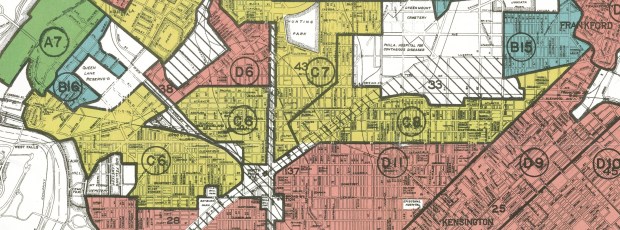
Areas were evaluated by lenders, developers, and appraisers and graded from A to D to indicate their desirability or risk level. Grade A was best (green), B still desirable (blue), C definitely declining (yellow), and D hazardous (red). The yellow and red areas were primarily populated by minorities, immigrants, and low income groups, and current research suggests that this program had a long reaching negative impact by enforcing and cementing segregation, disinvestment, and poverty in these areas.
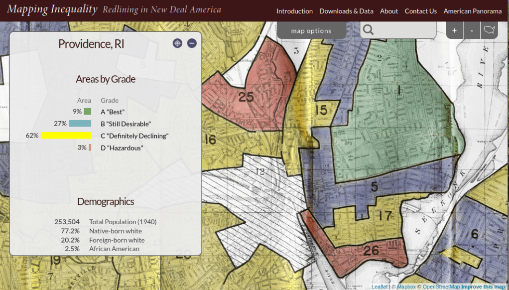
The definitive digital source for these maps is the Mapping Inequality : Redlining in New Deal America project created at the University of Richmond’s Digital Scholarship Lab. They provide a solid history and summary of these maps and a good bibliography. The main portal is an interactive map of the US that allows you to zoom in and preview maps in different cities. You can click on individually zoned areas and get the original assessor or evaluator’s notes (when available). If you switch to the Downloads page you get a list of maps sorted alphabetically by state and city that you can download as: a jpeg of the original scanned map, a georeferenced image that can be added to GIS software as a raster, and a GIS vector polygon file (shapefile or geojson). In many cases there is also a scanned copy of the evaluators description and notes. You also have the option for downloading a unified vector file for the entire US as a shapefile or geojson. All of the data is provided under a Creative Commons Attribution Sharealike License.
There are a few other sources to choose from, but none of them are as complete. I originally thought of the National Archives which I thought would be the likely holder of the original paper maps, but only a fraction have been digitized. The PolicyMap database has most (but not all) of the maps available as a feature you can overlay in their platform. If you’re doing a basic web search this Slate article is among the first resources you’ll encounter, but most of the links are broken (which says something about the ephemeral nature of these kinds of digital projects).
How many maps were made? Amy Hillier’s work was among the earlier studies that examined these maps, and her case study of Philadelphia includes a detailed summary of the history of the HOLC program with references to primary source material. According to her research, 239 of these maps were made and she provides a list of each of the cities in the appendix. I was trying to discover how many maps were available in Rhode Island and found this list wasn’t complete; it only included Providence, while the Mapping Inequality project has maps for Providence, Pawtucket & Central Falls, and Woonsocket. I counted 202 maps based on unique names on Mapping Inequality, but some several individual maps include multiple cities.
She mentions that a population of 40,000 people was used as a cut-off for deciding which places to map, but noted that there were exceptions; Washington DC was omitted entirely, while there are several maps for urban counties in New Jersey as opposed to cities. In some case cities that were below the 40k threshold that were located beside larger ones were included. I checked the 1930 census against the three cities in Rhode Island that had maps, and indeed they were the only RI cities at that time that had more than 40k people (Central Falls had less than 40k but was included with Pawtucket as they’re adjacent). So this seemed to provide reasonable assurance that these were the only ones in existence for RI.
Finding the population data for the cities was another surprise. I had assumed this data was available in the NHGIS, but it wasn’t. The NHGIS includes data for places (Census Places) back to the 1970 census, which was the beginning of the period where a formal, bounded census place geography existed. Prior to this time, the Census Bureau published population count data for cities using other means, and the NHGIS is still working to include this information. It does exist (as you can find it in Wikipedia articles for most major cities) but is buried in old PDF reports on the Census Bureau’s website.
If you’re interested in learning more about the redlining maps beyond the documentation provided by Mapping Inequality, these articles provide detailed overviews of the HOLC and the residential security maps program, as well as their implications to the present day. You’ll need to access them through a library database:
Hillier, A.E. (2005). “Residential Security Maps and Neighborhood Appraisals: The Home Owners’ Loan Corporation and the Case of Philadelphia.” Social Science History, 29(2): 207-233.
Greer, J. (2012). “The Home Owners’ Loan Corporation and the Development of the Residential Security Maps“. Journal of Urban History, 39(2): 275-296.


You must be logged in to post a comment.