Right before the semester began, I updated the Rhode Island maps on my census research guide so that they link to the recently released Demographic Profile tables from the 2020 Census. I feel like the release of the 2020 census has flown lower on the radar compared to 2010 – it hasn’t made it into the news or social media feeds to the same degree. It has been released much later than usual for a variety of reasons, including the COVID pandemic and political upheaval and shenanigans. At this point in Sept 2023, most of what we can expect has been released, and is available via data.census.gov and the census APIs.
Here are the different series, and what they include.
Redistricting data. Released in Aug 2021. Also known as PL 91-171 (for the law that requires it), this data is intended for redrawing congressional and legislative districts. It includes just six tables, available for several geographies down to the block level. This was our first detailed glimpse of the count. The dataset contains population counts by race, Hispanic and Latino ethnicity, the 18 and over population, group quarters, and housing unit occupancy. Here are the six US-level tables.
Demographic and Housing Characteristics File. Released in May 2023. In the past, this series was called Summary File 1. It is the “primary” decennial census dataset that most people will use, and contains the full range of summary data tables for the 2020 census for practically all census geographies. There are fewer tables overall relative to the 2010 census, and fewer that provide a geographically granular level of detail (ostensibly due to privacy and cost concerns). The Data Table Guide is an Excel spreadsheet that lists every table and the variables they include.
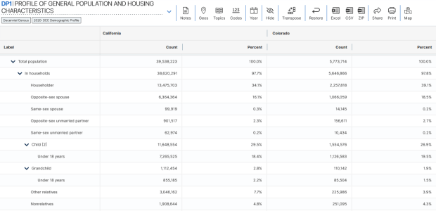
Demographic Profile. Released in May 2023. This is a single table, DP1, that provides a broad cross-section of the variables included in the 2020 census. If you want a summary overview, this is the table you’ll consult. It’s an easily accessible option for folks who don’t want or need to compile data from several tables in the DHC. Here is the state-level table for all 50 states plus.
Detailed Demographic and Housing Characteristics File A. Released in Sept 2023. In the past, this series was called Summary File 2. It is a subset of the data collected in the DHC that includes more detailed cross-tabulations for race and ethnicity categories, down to the census tract level. It is primarily used by researchers who are specifically studying race, and the multiracial population.
Detailed Demographic and Housing Characteristics File B. Not released yet. This will be a subset of the data collected in the DHC that includes more detailed cross-tabulations on household relationships and tenure, down to the census tract level. Primarily of interest to researchers studying these characteristics.
There are a few aspects of the 2020 census data that vary from the past – I’ll link to some NPR stories that provide a good overview. Respondents were able to identify their race or ethnicity at a more granular level. In addition to checking the standard OMB race category boxes, respondents could write in additional details, which the Census Bureau standardized against a list of races, ethnicities, and national origins. This is particularly noteworthy for the Black and White populations, for whom this had not been an option in the recent past. It’s now easier to identify subgroups within these groups, such as Africans and Afro-Caribbeans within the Black population, and Middle Eastern and North Africans (MENA) within the White population. Another major change is that same-sex marriages and partnerships are now explicitly tabulated. In the past, same-sex marriages were all counted as unmarried partners, and instead of having clearly identifiable variables for same-sex partners, researchers had to impute this population from other variables.
Another major change was the implementation of the differential privacy mechanism, which is a complex statistical process to inject noise into the summary data to prevent someone from reverse engineering it to reveal information about individual people (in violation of laws to protect census respondent’s privacy). The social science community has been critical of the application of this procedure, and IPUMS has published research to study possible impacts. One big takeaway is that published block-level population data is less reliable than in the past (housing unit data on the other hand is not impacted, as it is not subjected to the mechanism).
When would you use decennial census data versus other census data? A few considerations – when you:
Want or need to work with actual counts rather than estimates
Only need basic demographic and housing characteristics
Need data that provides detailed cross-tabulations of race, which is not available elsewhere
Need a detailed breakdown of the group quarters population, which is not available elsewhere
Are explicitly working with voting and redistricting
Are making historical comparisons relative to previous 10-year censuses
In contrast, if you’re looking for detailed socio-economic characteristics of the population, you would need to look elsewhere as the decennial census does not collect this information. The annual American Community Survey or monthly Current Population Survey would be likely alternatives. If you need basic, annual population estimates or are studying the components of population change, the Population and Housing Unit Estimates Program is your best bet.
I was working with a graduate student last month who was looking for contour lines for specific towns within the US, for large-scale (small area) mapping and analysis. They were specifically interested in elevation for landfills, and some of the contour data they found didn’t map these as they aren’t natural features. We looked at current USGS topographic maps, and they do indeed map contours for landfills. But the topo maps are raster images, and they wanted vectors. Is it possible to access the underlying GIS data that was used to create the topo maps?
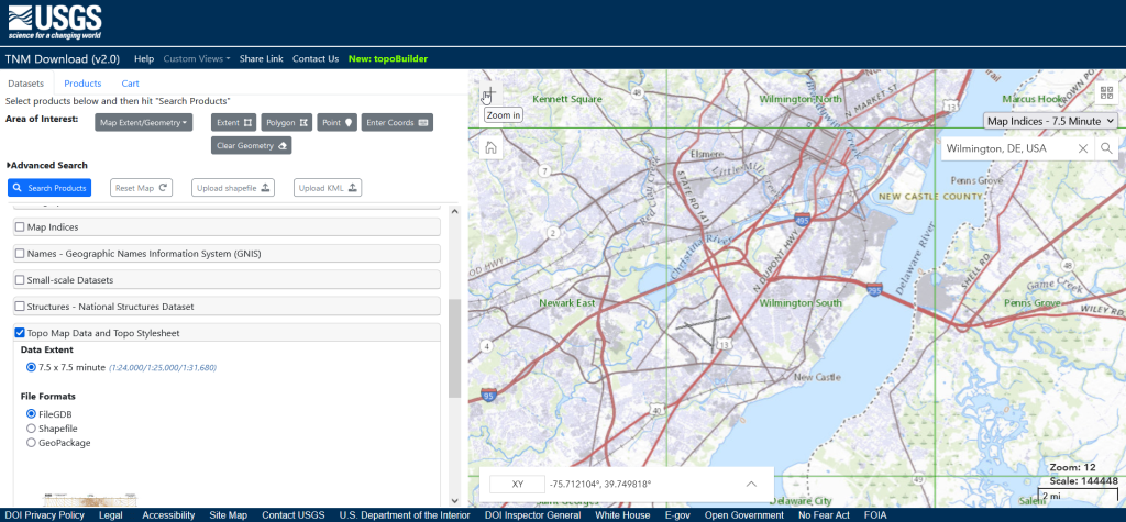
Indeed, it is! Option 1 is to use the National Map Download app. Search for a place name to zoom into your area of interest. Use the Show Map Index dropdown menu to draw the quad boundaries for the topo scale you’re interested in on the map; the 7.5 minute / 1:24,000 series is the USGS topo scale that most people are familiar with. Adjust the zoom so your area of interest fits within the map window; that way when you search in the Datasets tab on the left, the default search looks within this map extent.
Next, choose the specific data product you’re interested in. Here’s a list and description of all the National Map Datasets. For example, if you just wanted contour lines, you can select that under Small-scaleDatasets. Note that raster imagery and data that’s used to derive the vectors is also available for download. If you want all the vector features that appear on a particular topo map, check the Topo Map Data and Topo Stylesheet option. Once you check a product, you can choose a file format for the data. Given the size of these datasets, the FileGDB option is probably best.
The National Map Download Interface, Showing the Datasets Tab for Selecting and Searching
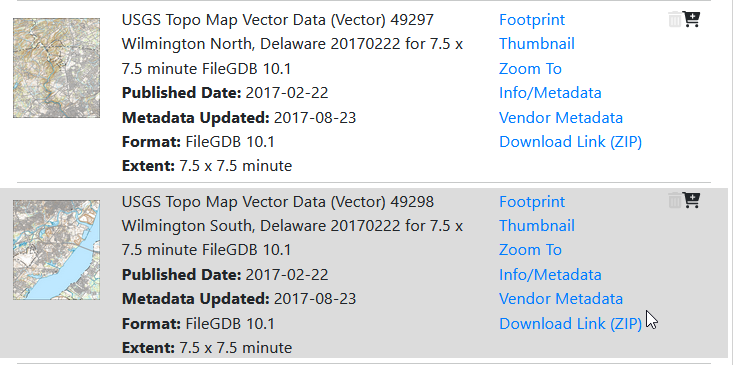
Then, click the blue Search Products button. That flips you to the Products tab, and displays data available within the extent of the map view. If you chose Topo Map Data and Topo Stylesheet, the results will be maps of individual quads. You can add a bunch of maps to your shopping cart by clicking on the little cart icon, or download one immediately by clicking the Download Link (ZIP).
On the Product Tab, click Download Link (ZIP) to get data for a specific map
Option 2 for downloading data: skip the map interface and use the Stage Products Directory. This no frills option is good if you know exactly which products you’re looking for. For example, you can drill down through TopoMapVector, then by state, and then data format to get to the same files you would have downloaded via option 1. You would need to know the name of the quad that encompasses the area you want; consult an index to figure it out.
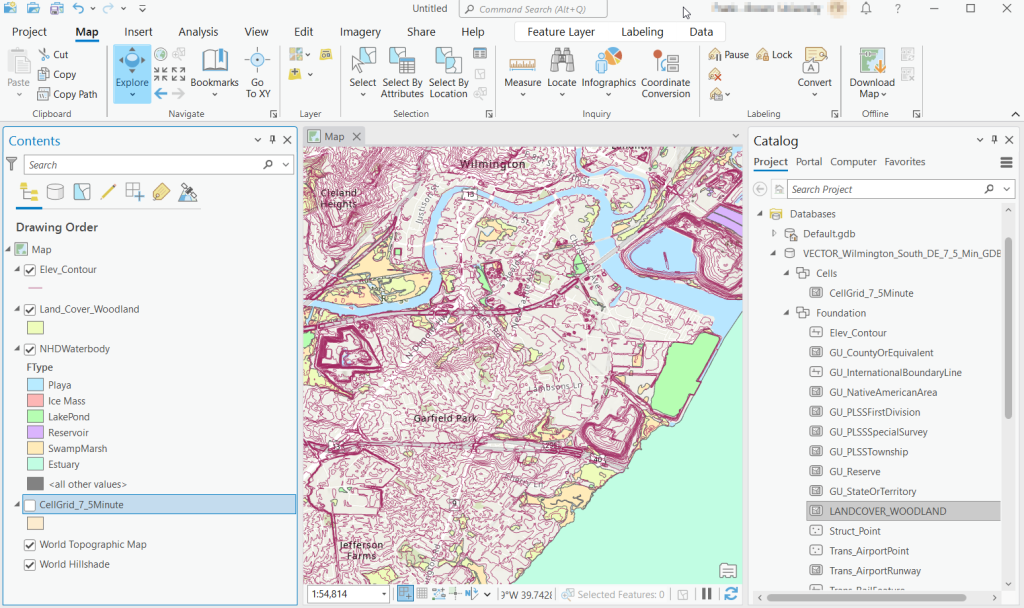
Once you download and unzip the file, you can launch your desktop GIS package to connect to the database and view the contents. In ArcGIS Pro, use the Catalog Pane, select the Databases option, right click, and Add Database. Browse to the location where you unzipped it, and select it. Then hit the dropdown for the newly added database and browse the contents, which are divided into schemas or groups. Foundation and Hydrography contain most of the features. GazVector has place name labels not captured in other features, and Cells contains outlines of the quad grid cells. Drag them into the Map Pane to view them.
USGS Topo Map Vector Data in ArcGIS Pro
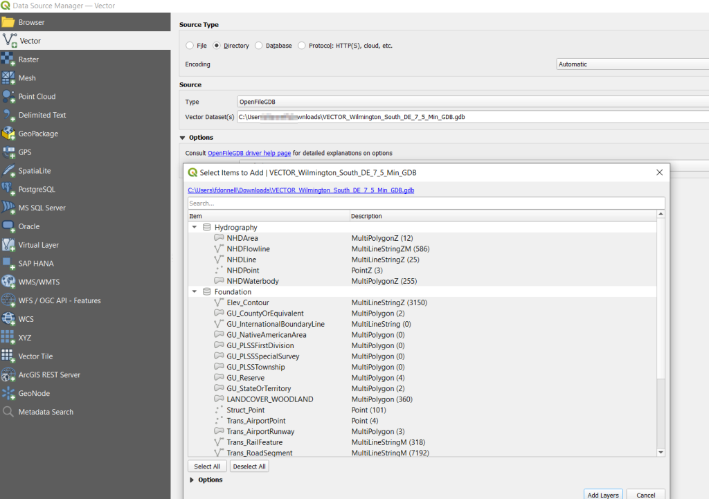
QGIS users can use the Data Source Manager. With the Vector option selected, change the Source Type from File to Directory, and in the Type dropdown choose OpenFileGDB. Then hit the dots button to browse your file system and select the database folder. Click Add, and you’ll be prompted to choose layers and tables to add to a project. You’ll see the same schema organization described previously, and you can use the CTRL and / or Shift keys to select what you want. Add the Layers, hit OK, and close the Manager.
Adding File Geodatabase Features in the QGIS Data Source Manager
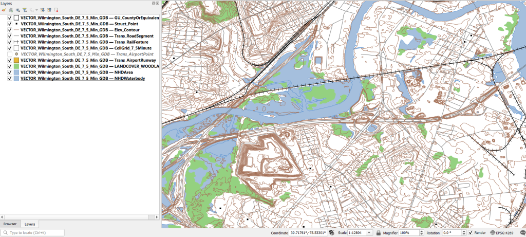
From there, it takes some artful manipulation of the overlays, color schemes, and labels to clearly symbolize the features. Both ArcGIS and QGIS have default symbol styles for topographic features that you can choose from. Apparently there’s a stylesheet packaged with the data, but I haven’t dug in enough yet to find and apply it. The attributes for the features seem fairly rich; the table includes columns that indicate the original data source for each feature, dates when records were added or updated, and a number of identifiers, labels, and categories. Some of the features, like bodies of water and county boundaries, extend beyond the quad cell for the map, as the USGS opted to keep whole features rather than clipping them. If the area you’re interested in happens to fall across two maps, you can download the topo map vector data for both quads, and use the Merge tool to combine them. The default CRS is un-projected NAD83 (EPSG 4269). You’ll probably want to reproject to a state plane or UTM zone that’s appropriate for your area. These post that describe styling and labeling contour lines in QGIS and ArcGIS Pro are helpful. Happy mapping!
I’ve written a number of spatial Python posts over the past few months; I’ll cap off this series with a short one on using PyProj to convert coordinates from one spatial reference system to another. PyProj is Python’s interface to PROJ, a library of coordinate system functions that power projection handling in many open source GIS and spatial packages.
A few months back I geocoded a large batch addresses against the Rhode Island DOT’s geocoding API, which returns coordinates in the local state plane system in feet. I decided to run the non-matching addresses against the Census Bureau’s Batch Geocoder, which returns coordinates in NAD 83 longitude and latitude. You can upload a CSV file of 10k addresses and get nearly instant results (one of my students recently wrote a tutorial on how to use it). So I split the unmatched records from my original CSV, uploaded it to the Census geocoder, and got matches.
Next, I needed to get the results from both processes into the same spatial reference system back in one unified file. The kludgy way to do this would be to plot each file separately in their respective systems in QGIS or ArcGIS, convert the NAD 83 plot to the state plane system, and merge the two vector files together. I used PyProj instead, to convert the NAD 83 coordinate data in the CSV to state plane, added that data to my main address CSV file, and plotted them all at once in the state plane system.
PyProj’s Transformer function does the job. I pass the EPSG / WKID codes for the input and output systems (4269 for NAD 83 and 3438 for NAD 83 RI State Plane ft-US) to Transformer.from_crs, and specify that I’m working with XY coordinates. I open the CSV file that contains the results from the Census Geocoder and read it in as a nested list, with each record as a sublist. Here are some sample records:
Then I iterate through the records; in my example any record with less than 3 variables was a non-match, so I skip those. The Census geocoder returns longitude and latitude in the 5th position, in the same field separated with a comma (notice quotes around the coordinates in the example above, indicating that these are part of the same field so the comma is not used as a delimiter). I split this value on the comma, read the longitude as x1 and latitude as y1. The output of the transformer function returns coordinates x2 and y2 in the new system. I tack these new coordinates on to the existing record. Once the loop is finished, I write the result out as a new CSV; I used the name of the input file and tacked “stateplane” plus today’s date to the end. Here are the results for the same records:
That’s it! I took the resulting CSV and tacked it to end of my primary CSV, which contained the successful matches from the RIDOT geocoder, in such a way that matching fields lined up. I can still identify which results came from what geocoder, as a few of the fields are different.
import csv
from datetime import date
from pyproj import Transformer

reproject = Transformer.from_crs(4269,3438,always_xy=True)

records=[]

addfile='GeocodeResults.csv'
with open(addfile,'r') as infile:
    reader = csv.reader(infile)
    for row in reader:
        records.append(row)

for r in records:
    if len(r)>3:
        x1,y1=r[5].split(',')
        x2,y2=reproject.transform(float(x1),float(y1))
        r.extend([str(x2),str(y2)])

today=str(date.today())

outfile=addfile.split('.')[0]+'_stateplane_'+today+'.csv'
with open(outfile, 'w', newline='') as writefile:
    writer = csv.writer(writefile, quoting=csv.QUOTE_ALL, delimiter=',')
    writer.writerows(records)

print('Done')
In an earlier post, I described how to summarize and extract raster temperature data using GIS. In this post I’ll demonstrate some alternate methods using spatial Python. I’ll describe some scripts I wrote for batch clipping rasters, overlaying them with point locations, and extracting raster values (mean temperature) at those locations based on attributes of the points (a matching date). I used a number of third party modules, including geopandas (storing vector data in a tabular form), rasterio (working with raster grids), shapely (building vector geometry), matplotlib (plotting), and datetime (working with date data types). Using Anaconda Python, I searched for and added each of these modules via its package handler. I opted for this modular approach instead of using something like ArcPy, because I don’t want the scripts to be wedded to a specific software package. My scripts and sample data are available in GitHub; I’ll add snippets of code to this post for illustration purposes. The repo includes the full batch scripts that I’ll describe here, plus some earlier, shorter, sample scripts that are not batch-based and are useful for basic experimentation.
Overview
I was working with a medical professor who had point observations of where patients lived, which included a date attribute of when they had visited a clinic to receive certain treatment. For the study we needed to know what the mean temperature was on that day, as well as the temperature of each day of the preceding week. We opted to use daily temperature data from the PRISM Climate Group at Oregon State, where you can download a raster of the continental US for a given day that has the mean temperature (degrees Celsius) in one band, at 4km resolution. There are separate files for min and max temperature, as well as precipitation. You can download a year’s worth of data in one go, with one file per date.
Our challenge was that we had thousands of observations than spanned five years, so doing this one by one in GIS wasn’t going to be feasible. A custom script in Python seemed to be the best solution. Each raster temperature file has the date embedded in the file name. If we iterate through the point observations, we could grab its observation date, and using string manipulation grab the raster with the matching date in its file name, and then do the overlay and extraction. We would need to use Python’s datetime module to convert each date to a common format, and use a function to iterate over dates from the previous week.
Prior to doing that, we needed to clip or mask the rasters to the study area, which consists of the three southern New England states (Connecticut, Rhode Island, and Massachusetts). The PRISM rasters cover the lower 48 states, and clipping them to our small study area would speed processing time. I downloaded the latest Census TIGER file for states, and extracted the three SNE states. ArcGIS Pro does have batch clipping tools, but I found they were terribly slow. I opted to write one Python script to do the clipping, and a second to do the overlay and extraction.
Batch Clipping Rasters
I downloaded a sample of PRISM’s raster data that included two full months of daily mean temperature files, from Jan and Feb 2020. At the top of the clipper script, we import all the modules we need, and set our input and output paths. It’s best to use the path.join method from the os module to construct cross platform paths, so we don’t encounter the forward / backward \ slash issues between Mac and Linux versus Windows. Using geopandas I read in the shapefile of the southern New England (SNE) states into a geodataframe.
import os
import matplotlib.pyplot as plt
import geopandas as gpd
import rasterio
from rasterio.mask import mask
from shapely.geometry import Polygon
from rasterio.plot import show

#Inputs
clip_file=os.path.join('input_raster','mask','states_southern_ne.shp')
# new file created by script:
box_file=os.path.join('input_raster','mask','states_southern_ne_bbox.shp')
raster_path=os.path.join('input_raster','to_clip')
out_folder=os.path.join('input_raster','clipped')

clip_area = gpd.read_file(clip_file)
Next, I create a new geodataframe that represents the bounding box for the SNE states. The total_bounds method provides a list of the four coordinates (west, south, east, north) that form a minimum bounding rectangle for the states. Using shapely, I build polygon geometry from those coordinates by assigning them to pairs, beginning with the northwest corner. This data is from the Census Bureau, so the coordinates are in NAD83. Why bother with the bounding box when we can simply mask the raster using the shapefile itself? Since the bounding box is a simple rectangle, the process will go much faster than if we used the shapefile that contains thousands of coordinate pairs.
Once we have the bounding box as geometry, we proceed to iterate through the rasters in the folder in a loop, reading in each raster (PRISM files are in the .bil format) using rasterio, and its mask function to clip the raster to the bounding box. The PRISM rasters and the TIGER states both use NAD83, so we didn’t need to do any coordinate reference system (CRS) transformation prior to doing the mask (if they were in different systems, we’d have to convert one to match the other). In creating a new raster, we need to specify metadata for it. We copy the metadata from the original input file to the output file, and update specific attributes for the output file (such as the pixel height and width, and the output CRS). Here’s a mask example and update from the rasterio docs. Once that’s done, we write the new file out as a simple GeoTIFF, using the name of the input raster with the prefix “clipped_”.
idx=0
for rf in os.listdir(raster_path):
    if rf.endswith('.bil'):
        raster_file=os.path.join(raster_path,rf)
        in_raster=rasterio.open(raster_file)
        # Do the clip operation
        out_raster, out_transform = mask(in_raster, areabbox.geometry, filled=False, crop=True)
        # Copy the metadata from the source and update the new clipped layer
        out_meta=in_raster.meta.copy()
        out_meta.update({
            "driver":"GTiff",
            "height":out_raster.shape[1], # height starts with shape[1]
            "width":out_raster.shape[2], # width starts with shape[2]
            "transform":out_transform})
        # Write output to file
        out_file=rf.split('.')[0]+'.tif'
        out_path=os.path.join(out_folder,'clipped_'+out_file)
        with rasterio.open(out_path,'w',**out_meta) as dest:
            dest.write(out_raster)
        idx=idx+1
        if idx % 20 ==0:
            print('Processed',idx,'rasters so far...')
    else:
        pass

print('Finished clipping',idx,'raster files to bounding box: \n',corners)
Just to see some evidence that things worked, outside of the loop I take the last raster that was processed, and plot that to the screen. I also export the bounding box out as a shapefile, to verify what it looks like in GIS.
PRISM US mean daily temperature raster, clipped / masked to bounding box of southern New England
Extract Raster Values by Date at Point Locations
In the second script, we begin with reading in the modules and setting paths. I added an option at the top with a variable called temp_many_days; if it’s set to True, it will take the date range below it and retrieve temperatures for x to y days before the observation date in the point file. If it’s False, it will retrieve just the matching date. I also specify the names of columns in the input point observation shapefile that contain a unique ID number, name, and date. In this case the input data consists of ten sample points and dates that I’ve concocted, labeled alfa through juliett, all located in Rhode Island and stored as a shapefile.
import os,csv,rasterio
import matplotlib.pyplot as plt
import geopandas as gpd
from rasterio.plot import show
from datetime import datetime as dt
from datetime import timedelta
from datetime import date

#Calculate temps over multiple previous days from observation
temp_many_days=True # True or False
date_range=(1,7) # Range of past dates

#Inputs
point_file=os.path.join('input_points','test_obsv.shp')
raster_dir=os.path.join('input_raster','clipped')
outfolder='output'
if not os.path.exists(outfolder):
    os.makedirs(outfolder)

# Column names in point file that contain: unique ID, name, and date
obnum='OBS_NUM'
obname='OBS_NAME'
obdate='OBS_DATE'
Next, we loop through the folder of clipped raster files, and for each raster (ending in .tif) we grab the file name and extract the date from it. We take that date and store it in Python’s standard date format. The date becomes a key, and the path to the raster its value, which get added to a dictionary called rf_dict. For example, if we split the file name clipped_PRISM_tmean_stable_4kmD2_20200131_bil.tif using the underscores, counting from zero we get the date in the 5th position, 20200131. Converting that to the standard datetime format gives us datetime.date(2020, 1, 31).
rf_dict={} # Create dictionary of dates and raster file names

for rf in os.listdir(raster_dir):
    if rf.endswith('.tif'):
        rfdatestr=rf.split('_')[5]
        rfdate=dt.strptime(rfdatestr,'%Y%m%d').date() #format of dates is 20200131
        rfpath=os.path.join(raster_dir,rf)
        rf_dict[rfdate]=rfpath
    else:
        pass
Then we read the observation point shapefile into a geodataframe, create an empty result_list that will hold each of our extracted values, and construct the header row for the list. If we are grabbing temperatures for multiple days, we generate extra header values to add to that row.
#open point shapefile
point_data = gpd.read_file(point_file)

result_list=[]
result_list.append(['OBS_NUM','OBS_NAME','OBS_DATE','RASTER_ROW','RASTER_COL','RASTER_FILE','TEMP'])

if temp_many_days==True:
    for d in range(date_range[0],date_range[1]):
        tcol='TMINUS_'+str(d)
        result_list[0].append(tcol)
    result_list[0].append('TEMP_RANGE')
    result_list[0].append('AVG_TEMP')
    temp_ftype='multiday_'
else:
    temp_ftype='singleday_'
Now the preliminaries are out of the way, and processing can begin. This post and tutorial helped me to grasp the basics of the process. We loop through the point data in the geodataframe (we indicate point.data.index because these are dataframe records we’re looping through). We get the observation date for the point and store that it the standard Python date format. Then we take that date, compare it to the dictionary, and get the path to the corresponding temperature raster for that date. We open that raster with rasterio, isolate the x and y coordinate from the geometry of the point observation, and retrieve the corresponding row and column for that coordinate pair from the raster. Then we read the value that’s associated with the grid cell at those coordinates. We take some info from the observation points (the number, name, and date) and the raster data we’ve retrieved (the row, column, file name, and temperature from the raster) and add it to a list called record.
#Pull out and format the date, and use date to look up file
for idx in point_data.index:
    obs_date=dt.strptime(point_data[obdate][idx],'%m/%d/%Y').date() #format of dates is 1/31/2020
    obs_raster=rf_dict.get(obs_date)
    if obs_raster == None:
        print('No raster available for observation and date',
              point_data[obnum][idx],point_data[obdate][idx])
    #Open raster for matching date, overlay point coordinates, get cell location and value
    else:
        raster=rasterio.open(obs_raster)
        xcoord=point_data['geometry'][idx].x
        ycoord=point_data['geometry'][idx].y
        row, col = raster.index(xcoord,ycoord)
        tempval=raster.read(1)[row,col]
        rfile=os.path.split(obs_raster)[1]
        record=[point_data[obnum][idx],point_data[obname][idx],
                point_data[obdate][idx],row,col,rfile,tempval]
If we had specified that we wanted a single day (option near the top of the script), we’d skip down to the bottom of the next block, append the record to the main result_list, and continue iterating through the observation points. Else, if we wanted multiple dates, we enter into a sub-loop to get data from a range of previous dates. The datetime timedelta function allows us to do date subtraction; if we subtract 1 from the current date, we get the previous day. We loop through and get rasters and the temperature values for the points from each previous date in the range and append them to an old_temps list; we also build in a safety mechanism in case we don’t have a raster file for a particular date. Once we have all the dates, we do some calculations to get the average temperature and range for that entire period. We do this on a copy of old_temps called all_temps, where we delete null values and add the current observation date. Then we add the average and range to old_temps, and old_temps to our record list for this point observation, and when finished we append the observation record to our main result_list, and proceed to the next observation.
       # Optional block, if pulling past dates
        if temp_many_days==True:
            old_temps=[]
            for d in range(date_range[0],date_range[1]):
                past_date=obs_date-timedelta(days=d) # iterate through days, subtracting
                past_raster=rf_dict.get(past_date)
                if past_raster == None: # if no raster exists for that date
                    old_temps.append(None)
                else:
                    old_raster=rasterio.open(past_raster)
                    # Assumes rasters from previous dates are identical in structure to 1st date
                    past_temp=old_raster.read(1)[row,col]
                    old_temps.append(past_temp)
            # Calculate avg and range, must exclude None values and include obs day
            all_temps=[t for t in old_temps if t is not None]
            all_temps.append(tempval)
            temp_range=max(all_temps)-min(all_temps)
            avg_temp=sum(all_temps)/len(all_temps)
            old_temps.extend([temp_range,avg_temp])
            record.extend(old_temps)
            result_list.append(record)
        else: # if NOT doing many days, just append data for observation day
            result_list.append(record)
    if (idx+1)%200==0:
        print('Processed',idx+1,'records so far...')
Once the loop is complete, we plot the last point and raster to the screen just to check that it looks good, and we write the results out to a CSV.
#Plot the points over the final raster that was processed
fig, ax = plt.subplots(figsize=(12,12))
point_data.plot(ax=ax, color='black')
show(raster, ax=ax)

today=str(date.today()).replace('-','_')
outfile='temp_observations_'+temp_ftype+today+'.csv'
outpath=os.path.join(outfolder,outfile)

with open(outpath, 'w', newline='') as writefile:
    writer=csv.writer(writefile, quoting=csv.QUOTE_MINIMAL, delimiter=',')
    writer.writerows(result_list)

print('Done. {} observations in input file, {} records in results'.format(len(point_data),len(result_list)-1))
CSV output from script, temperatures extracted from raster by date for observation points
Results and Wrap-up
Visit the GitHub repo for full copies of the scripts, plus input and output data. In creating test observation points, I purposefully added some locations that had identical coordinates, identical dates, dates that varied by a single day, and dates for which there would be no corresponding raster file in the sample data if we went one week back in time. I looked up single dates for all point observations manually, and a sample of multi-day selections as well, and they matched the output of the script. The scripts ran quickly, and the overall process seemed intuitive to me; resetting the metadata for rasters after masking is the one part that wouldn’t have occurred to me, and took a little bit of time to figure out. This solution worked well for this case, and I would definitely apply geospatial Python to a problem like this again. An alternative would have been to use a spatial database like PostGIS; this would be an attractive option if we were working with a bigger dataset and processing time became an issue. The benefit of using this Python approach is that it’s easier to share the script and replicate the process without having to set up a database.
Observation points plotted on temperature raster with single-day output temperatures in QGIS
In this post I’ll share a process for getting geo-located tweets from Twitter, using large files of tweets archived by the Internet Archive. These are tweets where the user opted to have their phone or device record the longitude and latitude coordinates for their location, at the time of the tweet. I’ve created some straightforward scripts in Python without any 3rd party modules for processing a daily file of tweets. Given all the turmoil at Twitter in early 2023, most of the tried and true solutions for scraping tweets or using their APIs no longer function. What I’m presenting here is one, simple solution.
Social media data is not my forte, as I specialize in working with official government datasets. When such questions turn up from students, I’ve always turned to the great Web Scraping Toolkit developed by our library’s Center for Digital Scholarship. But the graduate student I was helping last week and I discovered that both the Twint and TAGS tools no longer function due to changes in Twitter’s developer policies. Surely there must be another solution – there are millions of posts on the internet that show how easy it is to grab tweets via R or Python! Alas, we tried several alternatives to no avail. Many of these projects rely on third party modules that are deprecated or dodgy (or both), and even if you can escape from dependency hell and get everything working, the changed policies rendered them moot.
You can register under Twitter’s new API policy and get access to a paltry number of records. But I thought – surely, someone else has scraped tons of tweets for academic research purposes and has archived them somewhere – could we just access those? Indeed, the folks at Harvard have. They have an archive of geolocated tweets in their dataverse repository, and another one for political tweets. They are also affiliated with a much larger project called DocNow with other schools that have different tweet archives. But alas, there are rules to follow, and to comply with Twitter’s license agreement Harvard and these institutions can’t directly share the raw tweets with anyone outside their institutions. You can search and get IDs to the tweets, using their Hydrator application, which you can use in turn to get the actual tweets. But then in small print:
“Twitter’s changes to their API which greatly reduce the amount of read-only access means that the Hydrator is no longer a useful application. The application keys, which functioned for the last 7 years, have been rescinded by Twitter.”
Fortunately, there is the Internet Archive, which has been working to preserve pieces of the internet for posterity for several decades. Their Twitter Stream Grab consists of monthly collections of daily files for the past few years, from 2016 to 2022. This project is no longer active, but there’s a newer one called the Twitter Archiving Project which has data from 2017 to now. I didn’t investigate this latter one, because I wasn’t sure if it provided the actual tweets or just metadata about them, while the older project definitely did. The IA describes the Stream Grab as the “spritzer” version of Twitter grabs (as opposed to a sprinkler or garden hose). Thanks to the internet, it’s easy to find statistics but hard to find reliable ones – this one, credible looking source (the GDELT Project) suggests that there are between 400 and 500 million tweets a day in recent years. The file I downloaded from IA for one day had over 4 million tweets, so that’s about 1% of all tweets.
I went into the November 2022 collection and downloaded the file for Nov 1st. It’s a TAR file that’s about 3 GB. Unzipping it gives you a folder for that data named for the date, with hundreds of gz ZIP files. Unzip those, and you have tons of JSON Line files. These are JSON files where each JSON record has been collapsed into one line.
Python to the rescue. See GitHub for the full scripts – I’ll just add some snippets here for illustration. I wrote two scripts: the first reads in and aggregates all the tweets from the JSONL files, parses them into a Python dictionary, and writes out the geo-located records into regular JSON. The second reads in that file, selects the elements and values that we want into a list format, and writes those out to a CSV. The rationale was to separate importing and parsing from making these selections, as we’re not going to want to repeat the time-consuming first part while we’re tweaking and modifying the second part.
In the sample data I used for 11/01/2022, unzipping the downloaded TAR file gave me a date folder, and in that date folder were hundreds of gz ZIP files. Unzipping those revealed the JSONL files. I wrote the script to look in that date folder, one level below the folder that holds the scripts, and read in anything that ended with .json. Not all of the Internet Archive’s stream’s are structured this way; if your downloads are structured differently, you can simply move all the unzipped json files to one directory below the script to read them. Or, you can modify the script to iterate through sub-directories.
Because the data was stored as JSONL, I wasn’t able to read it in as regular JSON. I read each line as a string that I appended to a list, iterated through that list to convert it into a dictionary, pulled out the records that had geo-located elements, and added those records to a larger dictionary where I used an identifier in the record as a key and the value as a dictionary with all elements and values for a tweet. This gets written out as regular JSON at the end. Reading the data in didn’t take long; parsing the strings into dictionaries was the time consuming part. Originally, I wanted to parse and save all 4 million records, but the process stalled around 750k as I ran out of memory. Since so few records are geo-located, just selecting these circumvented this problem. If you wanted to modify this part to get other kinds of records, you would need to apply some filter, or implement a more efficient process than what I’m using.
json_list=[] # list of lists, each sublist has 1 string element = 1 line

for f in os.listdir(json_dir):
    if f.endswith('.json'):
        json_file=os.path.join(json_dir,f)
        with open(json_file,'r',encoding='utf-8') as jf:
            jfile_list = list(jf) # create list with one element, a line saved as a string
            json_list.extend(jfile_list)
            print('Processed file',f,'...')

geo_dict={} # dictionary of dicts, each dict has line parsed into keys / values
i=0
for json_str in json_list:
    result = json.loads(json_str) # convert line / string to dict
    if result.get('geo')!=None: # only take records that were geocoded
        geo_dict[result['id']]=result
    i=i+1
    if i%100000==0:
        print('Processed',i,'records...')
The second script reads the JSON output from the first, and simply iterates through the dictionary and chooses the elements and values I want and assigns them to variables. Some of these are straightforward, such as grabbing the timestamp and tweet. Others required additional work. The source element provides HTML code with a source link and name, so I split and strip this value to get them separately. The coordinates are stored as a list, so to get longitude and latitude as separate values I indicate the list position. In cases where I’m delving into a sub-dictionary to get a value (like the coordinates), I added if statements to set values to None if they don’t exist in the JSON, otherwise you get an error. Once I finish iterating, I append all these variables to a list, and add this list to the main one that captures every record. I create a matching header row list, and both are written out as a CSV.
with open(input_json) as json_file:
    twit_data = json.load(json_file)

twit_list=[]

# In this block, select just the keys / values to save
for k,v in twit_data.items():
    tweet_id=k
    timestamp=v.get('created_at')
    tweet=v.get('text')
    # Source is in HTML with anchors. Separate the link and source name
    source=v.get('source') # This is in HTML
    source_url=source.split('"')[1] # This gets the url
    source_name=source.strip('</a>').split('>')[-1] # This gets the name
    lang=v.get('lang')
    # Value for long / lat is stored in a list, must specify position
    if v['geo'] !=None:
        longitude=v.get('geo').get('coordinates')[1]
        latitude=v.get('geo').get('coordinates')[0]
    else:
        longitude=None
        latitude=None
...
My code could use improvement – much of this could be abstracted into a function to avoid repetition. We were in a hurry, and I’m also working with folks who need data but aren’t necessarily familiar with Python, so something that’s inefficient but understandable is okay (although I will polish this up in the future).
I provide the output in GitHub, examples of the final CSV appear below. Every language in the world is captured in these tweets, so Windows users need to import the CSV into Excel (Data – From Text/CSV) and choose UTF-8 encoding. Double-clicking the CSV to open it in Excel in Windows will render most of the text as junk, in the default Windows-1252 encoding.
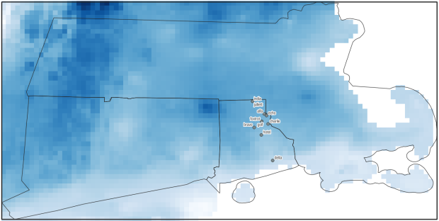
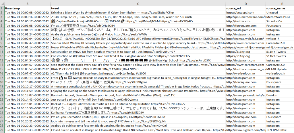
Tweets extracted from Internet Archive with timestamp, tweets, and source informationTweets extracted from Internet Archive, showing geo-located information
So, is this data actually useful? That’s an open question. Of the 4 million tweets in this file, just over 1,158 were geo-located! I checked and this is not a mistake. The metadata record for the Harvard geolocated tweets mentions that only 1% to 2% of all tweets are geo-located. So of the 400 million daily tweets, only 4 million. And out of our daily 4 million sample from IA, just 1,158 (less than 1%). What we ended up with does give you a sense of variety and global coverage (see map at the top of the post, showing sample of tweets by language Nov 1, 2022). In this sample, the top five countries represented were: US (35%), Japan (17%), Brazil (4%), UK (4%), Mexico and Turkey (tied 3%). For languages, the top five: English (51%), Japanese (17%), Spanish (9%), Portuguese (5%), and Turkish (3%).
In many cases, I think you’d need a larger sample than a single day, assuming you’re interested in just geo-located records. Perhaps 4 million is large enough for certain non-spatial research? Again, not my area of expertise, but you would want to be aware of events that happened on a certain date that would influence what was tweeted. My graduate student wanted to see differences in certain kinds of tweets in the LA metro area versus the rest of the US, but this sample includes less than 20 tweets from LA. To do anything meaningful, she’d have to download and process a whole month of tweets (at least). Even then, there are certain tweeters that show up repeatedly in given areas. In NYC, most of the tweets on this date were from the 511 service, warning people where that day’s potholes were.
Beyond the location of the tweet, there is a lot of information about the user, including their self-reported location. This data is available in all tweets (not just the geo-located ones). But there are a lot problems with this attribute: the user isn’t necessarily tweeting from that location, as it represents their “static” home. This location is not geocoded, and it’s self reported and uncontrolled. In this example, some users dutifully reported their home as ‘Cleveland, OH’ or ‘New York City’. Other folks listed ‘NYC – LA – ATL – MIA’, ‘CIUDAD DE LAS BAJAS PASIONES’, ‘H E L L’, and ‘Earth. For now’.
Even for research that incorporated geo-located tweets from other, larger data sources that were previously accessible, how representative are all those studies when the data represents only 1% of the total tweet volume? I am skeptical. Also consider the information from the good folks at the Pew Research Center, that tells us that only one in five US adults use Twitter, and that the minority of Twitter users generate the vast majority of tweets: “The top 25% of US users by tweet volume produce 97% of all tweets, while the bottom 75% of users produce just 3%” (10 Facts About Americans and Twitter May 5, 2022).
For what’s it worth, if you need access to Twitter data for academic, non-commercial research purposes and the old methods aren’t working, perhaps the Internet Archive’s data and the solution posed here will fit the bill. You can see the geo-located output (JSON and CSV) from this example in the GitHub repo’s output folder. There is also a samples folder, which contains JSON and CSV for about 77k records that include both geo-located and non-geolocated examples. Looking at the examples can help you decide how to modify the scripts, to pull out different elements and values of interest.
It’s been a busy few months, but I have a few days to catch my breath now that it’s spring break and most people (except me) have gone away! One question that’s come up quite a bit this semester is how to associate raster data with coinciding vector data. I’ll summarize some approaches in this post using ArcGIS Pro and QGIS, to summarize raster values for polygons (zonal statistics) and to assign raster values to points (aka raster sampling).
Zonal Statistics: Summarize Rasters by Area
Imagine that you have quantitative values such as temperature or a vegetation index in a raster grid, and you want to use this data to calculate an average for counties or metro areas. The goal is to have a new attribute column in the vector layer that contains the summarized raster value, perhaps because you want to make thematic maps of that value, or you want to use it in conjunction with other variables to run spatial statistics, or you just want a plain and simple summary for given places.
The term zonal statistics is used to define any operation that calculates statistics on cell values of a raster within an area or zone defined by another dataset, either a raster or a vector. The ArcGIS Pro toolbox has a Zonal Statistics tool where the output is a new raster file with cells that are summarized by the input zones. That’s not desirable for the use case I’m presenting here; the better choice is the Zonal Statistics as Table tool. The output is a table containing the unique identifiers of the raster and vector, the summary stats you’ve generated (average, sum, min, max, etc), and a count of the number of cells used to generate the summary. You can join this resulting table back to the vector file using their common unique identifier in a table join.
In the example below, I’m using counties from the census TIGER files for southern New England as my Input Feature Zone, the AFFGEOID (Census ANSI / FIPS code) to identify the Zone Field, and a temperature grid for January 1, 2020 from PRISM as the Input Value Raster. I’m calculating the mean temperature for the counties on that day.
ArcGIS Pro Zonal Statistics as Table; Temperature Grid and Southern New England Counties
The output table consists of one record for each zone / county, with the count of the cells used to create the average, and the mean temperature (in degrees Celsius). This table can be joined back to the original vector feature (select the county feature in the Contents, right click, Joins and Relates – Join) to thematically map the average temp.
ArcGIS Pro Zonal Statistics; Table Output and Join to Show Average Temperature per County
In QGIS, this tool is simply called Zonal Statistics; search for it in the Processing toolbox. The vector with the zones is the Input layer, and the Raster layer is the grid with the values. By default the summary stats are the count, sum, and mean, but you can check the Statistics to calculate box to select others. Unlike ArcGIS, QGIS allows you to write output as a table or a new shapefile / geopackage, which carries along the feature geometry from the Input zones and adds the summaries, allowing you to skip the step of having to do a table join (if you opted to create a table, you could join it to the zones using the Joins tab under the Properties menu for the vector features).
QGIS Zonal Statistics
Extract Raster Values for Point Features
Zonal stats allows you to summarize raster data within a polygon. But what if you had point features, and wanted to assign each point the value of the raster cell that it falls within? In ArcGIS Pro, search the toolbox for the Extract Values to Points tool. You select your input points and raster, and a new point feature that will include the raster values. The default is to take the value for the cell that the point falls within, but there is an Interpolate option that will calculate the value from adjacent cells. The output point feature contains a new column called RASTERVALU. I created some phony point data and used it to generate the output below.
ArcGIS Pro Extract Values to Points (assign raster cell values to points)
In QGIS the name of this tool is Sample raster values, which you can find in the Processing toolbox. Input the points, choose a raster layer, and write the output to a new vector point file. Unlike ArcGIS, there isn’t an option for interpolation from surrounding cells; you simply get the value for the cell that the point falls within. If you needed to interpolate, you can go to the Plugins menu, enable the SAGA plugin, and in the Processing toolbox try the SAGA tool Raster Values to Points instead.
QGIS Sample Raster Values (assign raster cell values to points)
A variation on this theme would be to create and assign an average value around each point at a given distance, such as the average temperature within five miles. One way to achieve this would be to use the buffer tools in either ArcGIS or QGIS to create distinct buffers around each point at the specified distance. The buffer will automatically carry over all the attributes from the point features, including unique identifiers. Then you can run the zonal statistics tools against the buffer polygons and raster to compute the average, and if need be do a table join between the output table and the original point layer using their common identifier.
Wrap-up
In using any of these tools, it’s important to consider the resolution of the raster (i.e. the size of the grid cell):
1. Relative to the size of the zonal areas or number of points, and
2. In relation to the phenomena that you’re studying.
When larger grid cells or zonal areas are used for measurement, any phenomena becomes more generalized, and any variations within these large areas become masked. The temperature grid cells in this example had a resolution of 2.5 miles, which was suitable for creating county summaries. Summarizing data for census tracts at this resolution would be less ideal, as the tracts are much smaller than the cells, with the cell value characterizing a much larger area. This might be okay in the case of temperature, which tends not to vary considerably over a distance of a few miles. In contrast, averaging temperature data for states is not worthwhile, as states vary considerably in size and most are large enough that they contain multiple ecosystems and elevation levels.
The solutions I’ve described here are the desktop GIS solutions. You could also use either spatial SQL in a geodatabase or a spatial extension in a scripting language like Python or R to perform similar operations. In both cases a basic overlay and intersection statement is used, in conjunction with some grouping function for calculating summaries. I’ve been doing a lot more spatial Python work with geopandas these past few months – perhaps a topic for a subsequent post…


You must be logged in to post a comment.