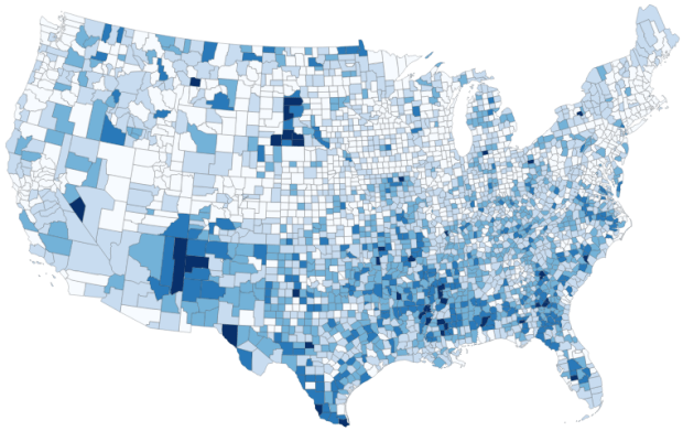
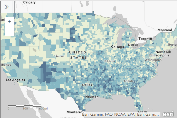
gis

Anything about GIS software

QGIS 3.10 Screenshot

QGIS 3.10 Tutorial Workbook

I just posted an updated version of my QGIS tutorial / workbook manual, Introduction to GIS Using Open Source Software. This version was written for QGIS 3.10 A Coruña, which recently superseded QGIS 3.4 Madeira as the current Long Term Release (LTR). The LTR is intended to be more stable than the current releases and is supported for at least a year.

The workbook was designed to accompany a day-long introductory workshop that I teach and is divided into five chapters. Chapter 1 is a broad and concise overview of GIS, chapters 2 to 4 are hands-on exercises that cover: the basics of using the interface and the difference between vectors and rasters (chapter 2), a site selection analysis that demonstrates geoprocessing, spatial selection, table joins, coordinate plotting, expressions, and spatial analysis (chapter 3), and a thematic mapping example that illustrates coordinate reference systems (CRS), data classification, and mapping (chapter 4). Chapter 5 summarizes data sources and resources for learning more about GIS. In chapters 2 to 4 the steps for doing the exercises are kept concise with many screenshots, while detailed commentary explaining how everything works follows.

The manual and tutorial data are freely available for personal and classroom use under a Creative Commons license. I’m providing the material for both 3.10 A Coruna and 3.4 Madeira for now, but will take down the latter at the end of the spring semester (late May 2020).

The changes between 3.4 and 3.10 are not dramatic as far as the basic tools and principles that I cover in the book go, but I thought an update was worthwhile as there are just enough changes that could trip up new users (see the 3.10 visual change log for a full list of software updates).  In addition to incorporating changes to the interface, I also took the opportunity to tighten up and condense the material. In particular, I consolidated the coordinate reference system (CRS) exercises in chapter 4 from two sections to one, because in practice I found that it was overkill for a one-day session.

Here are a few noteworthy changes to the tutorial and software that impact novice users:

  1. The default setting for the toolbar buttons is rather small, so during the setup phase in chapter 2 I inserted an optional step to make them bigger. Go to: Settings > Options > General tab, and under the Application section change the icon size from 16 to 24.
  2. In 3.10, when new files are generated from geoprocessing operations and added to your project, the layers appear in the layers panel with the name you give them. In 3.4 they were assigned generic aliases like “Clipped” and “Buffer” based on the process you ran.
  3. In 3.10 the “Quantiles” classification scheme has been replaced with “Equal Counts”. Same scheme, different terminology.
  4. There’s now a dedicated north arrow button in the map layout screen. In 3.4 and earlier versions you added an arrow by selecting the add image button.
  5. In 3.10, every time you add a layer with a CRS that doesn’t match the existing CRS of the window, you’re presented with a datum transformation screen to modify the file you’re adding. This is a helpful warning if you already have existing layers in your project that match the window and your new file doesn’t, but it’s annoying when you’re trying to add files to a blank window in a new project. You can turn this feature off under: Options > Settings > CRS tab, under Default Datum Transformations uncheck the box for Ask for datum transformation.

It’s hard to believe that this is the 10th edition I’ve published in the past ten years. QGIS has certainly come a long way during that time. For a trip down memory lane, look at the 1st edition I wrote for QGIS 1.5 Tethys in 2011! Back then I wrote the whole thing in HTML… thankfully I “discovered” LaTeX a year later, and have used it for writing tutorials ever since.

If you wanted to learn GIS in general and QGIS in particular, spend a day with the manual and work through the exercises and you’ll have a good foundation. All the basics are there, as well as best practices and the “gotchas” that tend to trip people up.

Percentage of Children in Households Without the Internet

Kids with No Internet at Home: Data Processing for US Census Mapping

In this post I’ll demonstrate some essential data processing steps prior to joining census American Community Survey (ACS) tables downloaded from data.census.gov to TIGER shapefiles, in order to create thematic maps. I thought this would be helpful for students in my university who are now doing GIS-related courses from home, due to COVID-19. I’ll illustrate the following with Excel and QGIS: choosing an appropriate boundary file for making your map, manipulating geographic id codes (GEOIDs) to insure you can match data file to shapefile, prepping your spreadsheet to insure that the join will work, and calculating new summaries and percent totals with ACS formulas. Much of this info is drawn from the chapters in my book that cover census geography (chapter 3), ACS data (chapter 6), and GIS (chapter 10). I’m assuming that you already have some basic spreadsheet, GIS, and US census knowledge.

For readers who are not interested in the technical details, you still may be interested in the map we’ll create in this example: how many children under 18 lack access to a computer with internet access at home? With COVID-19 there’s a sudden expectation that all school children will take classes remotely from home. There are 73.3 million children living in households in the US, and approximately 9.3 million (12.7%) either have no computer at home, or have a computer but no internet access. The remaining children have a computer with either broadband or dial-up at home. Click on the map below to explore the county distribution of the under 18 population who lack internet access at home, or follow this link: https://arcg.is/0TrGTy.

arcgis_webmap

Click on the Map to View Full Screen and Interact

Preliminaries

First, we need to get some ACS data. Read this earlier post to learn how to use data.census.gov (or for a shortcut download the files we’re using here). I downloaded ACS table B28005 Age by Presence of a Computer and Types of Internet Subscription in Household at the county-level. This is one of the detailed tables from the latest 5-year ACS from 2014-2018. Since many counties in the US have less than 65,000 people, we need to use the 5-year series (as opposed to the 1-year) to get data for all of them. The universe for this table is the population living in households; it does not include people living in group quarters (dormitories, barracks, penitentiaries, etc.).

Second, we need a boundary file of counties. You could go to the TIGER Line Shapefiles, which provides precise boundaries of every geographic area. Since we’re using this data to make a thematic map, I suggest using the Cartographic Boundary Files (CBF) instead, which are generalized versions of TIGER. Coastal water has been removed and boundaries have been smoothed to make the file smaller and less detailed. We don’t need all the detail if we’re making a national-scale map of the US that’s going on a small screen or an 8 1/2 by 11 piece of paper. I’m using the medium (5m) generalized county file for 2018. Download the files, put them together in a new folder on your computer, and unzip them.

TIGER Line shapefile

TIGER Line shapefile

CBF shapefile

CBF shapefile

GEOIDs

Downloads from data.census.gov include three csv files per table that contain: the actual data (data_with_overlays), metadata (list of variable ids and names), and a description of the table (table_title). There are some caveats when opening csv files with Excel, but they don’t apply to this example (see addendum to this post for details). Open your csv file in Excel, and save it as an Excel workbook (don’t keep it in a csv format).

The first column contains the GEOID, which is a code that uniquely identifies each piece of geography in the US. In my file, 0500000US28151 is the first record. The part before ‘US’ indicates the summary level of the data, i.e. what the geography is and where it falls in the census hierarchy. The 050 indicates this is a county. The part after the ‘US’ is the specific identifier for the geography, known as an ANSI / FIPS code: 28 is the state code for Mississippi, and 151 is the county code for Washington County, MS. You will need to use this code when joining this data to your shapefile, assuming that the shapefile has the same code. Will it?

That depends. There are two conventions for storing these codes; the full code 0500000US28151 can be used, or just the ANSI / FIPS portion, 28151. If your shapefile uses just the latter (find out by adding the shapefile in GIS and opening its attribute table), you won’t have anything to base the join on. The regular 2018 TIGER file uses just the ANSI / FIPS, but the 2018 CBF has both the full GEOID and the ANSI FIPS. So in this case we’re fine, but for the sake of argument if you needed to create the shorter code it’s easy to do using Excel’s RIGHT formula:

Excel formula: RIGHT

The formulas RIGHT, LEFT, and MID are used to return sub-strings of text

The formulas reads X characters from the right side of the value in the cell you reference and returns the result. You just have to count the number of characters up to the “S’ in the “US”. Copy and paste the formula all the way down the column. Then, select the entire column, right click and chose copy, select it again, right click and choose Paste Special and Values (in Excel, the little clipboard image with numbers on top of it). This overwrites all the formulas in the column with the actual result of the formula. You need to do this, as GIS can’t interpret your formulas. Put some labels in the two header spaces, like GEO_ID2 and id2.

Excel: Paste Special

Copy a column, and use Paste Special – Values on top of that column to overwrite formulas with values

Subsets and Headers

It’s common that you’ll download census tables that have more variables than you need for your intended purpose. In this example we’re interested in children (people under 18) living in households. We’re not going to use the other estimates for the population 18 to 64 and 65 and over. Delete all the columns you don’t need (if you ever needed them, you’ve got them saved in your csv as a backup).

Notice there are two header rows: one has a variable ID and the other has a label. In ACS tables the variables always come in pairs, where the first is the estimate and the second is the margin of error (MOE). For example, in Washington County, Mississippi there are 46,545 people living in households +/- 169. Columns are arranged and named to reflect how values nest: Estimate!!Total is the total number of people in households, Estimate!!Total!!Under 18 years is the number people under 18 living in households, which is a subset of the total estimate.

The rub here is that we’re not allowed to have two header rows when we join this table to our shapefile – we can only have one. We can’t keep the labels because they’re too long – once joined, the labels will be truncated to 10 characters and will be indistinguishable from each other. We’ll have to delete that row, leaving us with the cryptic variable IDs. We can choose to keep those IDs – remember we have a separate metadata csv file where we can look up the labels – or we can rename them. The latter is feasible if we don’t have too many. If you do rename them, you have to keep them short, no more than 10 characters or they’ll be truncated. You can’t use spaces (underscores are ok), any punctuation, and can’t begin variables names with a number. In this example I’m going to keep the variable IDs.

Two odd gotchas: first, find the District of Columbia in your worksheet and look at the MOE for total persons in households (variable 001M). There is a footnote for this value, five asterisks *****. Replace it with a zero. Keep an eye out for footnotes, as they wreak havoc. If you ever notice that a numeric column gets saved as text in GIS, it’s probably because there’s a footnote somewhere. Second, change the label for the county name from NAME to GEO_NAME (our shapefile already has a column called NAME, and it will cause problems if we have duplicates). If you save your workbook now, it’s ready to go if you want to map the data in it. But in this example we have some more work to do.

Create New ACS Values

We want to map the percentage of children that do not have access to either a computer or the internet at home. In this table these estimates are distinct for children with a computer and no internet (variable 006), and without a computer (variable 007). We’ll need to aggregate these two. For most thematic maps it doesn’t make sense to map whole counts or estimates; naturally places that have more people are going to have more computers. We need to normalize the data by calculating a percent total. We could do this work in the GIS package, but I think it’s easier to use the spreadsheet.

To calculate a new estimate for children with no internet access at home, we simply add the two values together (006_E and 007_E). To calculate a new margin of error, we take the square root of the sum of the squares for the MOEs that we’re combining (006_M and 007_M). We also use the ROUND formula so our result is a whole number. Pretty straightforward:

Excel Sum of Squares

When summing ACS estimates, take the square root of the sum of the squares for each MOE to calculate a MOE for the new estimate.

To calculate a percent total, divide our new estimate by the number of people under 18 in households (002_E). The formula for calculating a MOE for a percent total is tougher: square the percent total and the MOE for the under 18 population (002_M), multiply them, subtract that result from the MOE for the under 18 population with no internet, take the square root of that result and divide it by the under 18 population (002_E):

MOE for percentage

The formula for calculating the MOE for a proportion includes: the percentage, MOE for the subset population (numerator), and the estimate and MOE for the total population (denominator)

In Washington County, MS there are 3,626 +/- 724 children that have no internet access at home. This represents 29.4% +/- 5.9% of all children in the county who live in a household. It’s always a good idea to check your math: visit the ACS Calculator at Cornell’s Program for Applied Demographics and punch in some values to insure that your spreadsheet formulas are correct.

You should scan the results for errors. In this example, there is just one division by zero error for Kalawao County in Hawaii. In this case, replace the formula with 0 for both percentage values. In some cases it’s also possible that the MOE proportion formula will fail for certain values. Not a problem in our example, but if it does the solution is to modify the formula for the failed cases to calculate a ratio instead. Replace the percentage in the formula with the ratio (the total population divided by the subset population) AND change the minus sign under the square root to a plus sign.

Some of these MOE’s look quite high relative to the estimate. If you’d like to quantify this, you can calculate a coefficient of variation for the estimate (not the percentage). This formula is straightforward: divide the MOE by 1.645, divide that result by the estimate, and multiply by 100:

Calculate coefficient of variation

A CV can be used to gauge the reliability of an estimate

Generally speaking, a CV value between 0-15 indicates that as estimate is highly reliable, 12-34 is of medium reliability, and 35 and above is low reliability.

That’s it!. Make sure to copy the columns that have the formulas we created, and do a paste-special values over top of them to replace the formulas with the actual values. Some of the CV values have errors because of division by zero. Select the CV column and do a find and replace, to find #DIV/0! and replace it with nothing. Then save and close the workbook.

For more guidance on working with ACS formulas, take a look at this Census Bureau guidebook, or review Chapter 6 in my book.

Add Data to QGIS and Join

In QGIS, we select the Data Source Manager buttonQGIS Data Source Manager
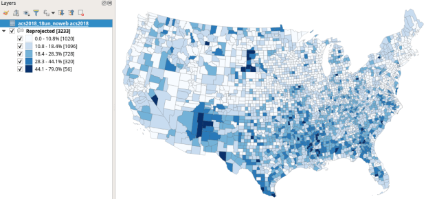
, and in the vector menu add the CBF shapefile. All census shapefiles are in the basic NAD83 system by default, which is not great for making a thematic map.  Go to the Vector Menu – Data Management Tools – Reproject Layer. Hit the little globe beside Target CRS. In the search box type ‘US National’, select the US National Atlas Equal Area option in the results, and hit OK. Lastly, we press the little ellipses button beside the Reprojected box, Save to File, and save the file in a good spot. Hit Run to create the file.

In the layers menu, we remove the original counties file, then select the new one (listed as Reprojected), right click, Set CRS, Set Project CRS From Layer. That resets our window to match the map projection of this layer. Now we have a projected counties layer that looks better for a thematic map. If we right click the layer and open its attribute table, we can see that there are two columns we could use for joining: AFFGEOID is the full census code, and GEOID is the shorter ANSI / FIPS.

Hit the Data Source Manager button again, stay under the vector menu, and browse to add the Excel spreadsheet. If our workbook had multiple sheets we’d be prompted to choose which one. Close the menu and we’ll see the table in the layers panel. Open it up to insure it looks ok.

To do a join, select the counties layer, right click, and choose properties. Go to the Joins tab. Hit the green plus symbol at the bottom. Choose the spreadsheet as the join layer, GEO_ID as the join field in the spreadsheet, and AFFGEOID as the target field in the counties file. Go down and check Custom Field Name, and delete what’s in the box. Hit OK, and OK again in the Join properties. Open the attribute table for the shapefile, scroll over and we should see the fields from the spreadsheet at the end (if you don’t, check and verify that you chose the correct IDs in the join menu).

QGIS Join Menu

QGIS Map

We’re ready to map. Right click the counties and go to the properties. Go to the Symbology tab and flip the dropdown from Single symbol to Graduated. This lets us choose a Column (percentage of children in households with no internet access) and create a thematic map. I’ve chosen Natural Breaks as the Mode and changed the colors to blues. You can artfully manipulate the legend to show the percentages as whole numbers by typing *100 in the Column box beside the column name, and adding a % at the end of the Legend format string. I also prefer to alter the default settings for boundary thickness: click the Change button beside Symbol, select Simple fill, and reduce the width of the boundaries from .26 to .06, and hit OK.

QGIS Symbology Menu

There we have a map! If you right click on the counties in the layers panel and check the Show Feature Count box, you’ll see how many counties fall in each category. Of course, to make a nice finished map with title, legend, and inset maps for AK, HI, and PR, you’d go into the Print Layout Manager. To incorporate information about uncertainty, you can add the county layer to your map a second time, and style it differently – maybe apply crosshatching for all counties that have a CV over 34. Don’t forget to save your project.

QGIS Map

Percentage of Children in Households without Internet Access by County 2014-2018

How About that Web Map?

I used my free ArcGIS Online account to create the web map at the top of the page. I followed all the steps I outlined here, and at the end exported the shapefile that had my data table joined to it out as a new shapefile; in doing so the data became fused to the new shapefile. I uploaded the shapefile to ArcGIS online, chose a base map, and re-applied the styling and classification for the county layer. The free account includes a legend editor and expression builder that allowed me to show my percentages as fractions of 100 and to modify the text of the entries. The free account does not allow you to do joins, so you have to do this prep work in desktop GIS. ArcGIS Online is pretty easy to learn if you’re already familiar with GIS. For a brief run through check out the tutorial Ryan and I wrote as part of my lab’s tutorial series.

Addendum – Excel and CSVs

While csv files can be opened in Excel with one click, csv files are NOT Excel files. Excel interprets the csv data (plain text values separated by commas, with records separated by line breaks) and parses it into rows and columns for us. Excel also makes assumptions about whether values represents text or numbers. In the case of ID codes like GEOIDs or ZIP Codes, Excel guesses wrong and stores these codes as numbers. If the IDs have leading zeros, the zeros are dropped and the codes become incorrect. If they’re incorrect, when you join them to a shapefile the join will fail. Since data.census.gov uses the longer GEOID this doesn’t happen, as the letters ‘US’ are embedded in the code, which forces Excel to recognize it as text. But if you ever deal with files that use the shorter ANSI / FIPS you’ll run into trouble.

Instead of clicking on csvs to open them in Excel: launch Excel to a blank workbook, go to the data ribbon and choose import text files, select your csv file from your folder system, indicate that it’s a delimited text file, and select your ID column and specify that it’s text. This will import the csv and save it correctly in Excel.

Map of Windham High Peak hike

From Survey Markers to GPS Coordinates

Here’s a fun post to close out the year. During GIS-based research consultations, I often help people understand the importance of coordinate reference systems (or spatial reference systems if you prefer, aka “map projections”). These systems essentially make GIS “work”; they are standards that allow you to overlay different spatial layers. You transform layers from one system to another in order to get them to align, perform specific operations that require a specific system, or preserve one aspect of the earth’s properties for a certain analysis you’re conducting or a map you’re making.

Wrestling with these systems is a conceptual issue that plays out when dealing with digital data, but I recently stumbled across a physical manifestation purely by accident. During the last week of October my wife and I rented a tiny home up in the Catskill Mountains in NY State, and decided to go for a day hike. The Catskills are home to 35 mountains known collectively as the Catskill High Peaks, which all exceed 3,500 feet in elevation. After consulting a thorough blog on upstate walks and hikes (Walking Man 24 7), we decided to try Windham High Peak, which was the closest mountain to where we were staying. We were rewarded with this nice view upon reaching the summit:

View from Summit of Windham High Peak

While poking around on the peak, we discovered a geodetic survey marker from 1942 affixed to the face of a rock. These markers were used to identify important topographical features, and to serve as control points in manual surveying to measure elevation; this particular marker (first pic below) is a triangulation marker that was used for that purpose. It looks like a flat, round disk, but it’s actually more like the head of a large nail that’s been driven into the rock. A short distance away was a second marker (second pic below) with a little arrow pointing toward the triangulation marker. This is a reference marker, which points to the other marker to help people locate it, as dirt or shrubbery can obscure the markers over time. Traditional survey methods that utilized this marker system were used for creating the first detailed sets of topographic maps and for establishing what the elevations and contours were for most of the United States. There’s a short summary of the history of the marker’s here, and a more detailed one here. NOAA provides several resources for exploring the history of the national geodetic system.

Triangulation Survey Marker

Triangulation Survey Marker

Reference Survey Marker

Reference Survey Marker

When we returned home I searched around to learn more about them, and discovered that NOAA has an app that allows you to explore all the markers throughout the US, and retrieve information about them. Each data sheet provides the longitude and latitude coordinates for the marker in the most recent reference system (NAD 83), plus previous systems that were originally used (NAD 27), a detailed physical description of the location (like the one below), and a list of related markers. It turns out there were two reference markers on the peak that point to the topographic one (we only found the first one). The sheet also references a distant point off of the peak that was used for surveying the height (the azimuth mark). There’s even a recovery form for submitting updated information and photographs for any markers you discover.

NA2038’DESCRIBED BY COAST AND GEODETIC SURVEY 1942 (GWL)
NA2038’STATION IS ON THE HIGHEST POINT AND AT THE E END OF A MOUNTAIN KNOWN
NA2038’AS WINDHAM HIGH PEAK. ABOUT 4 MILES, AIR LINE, ENE OF HENSONVILLE
NA2038’AND ON PROPERTY OWNED BY NEW YORK STATE. MARK, STAMPED WINDHAM
NA2038’1942, IS SET FLUSH IN THE TOP OF A LARGE BOULDER PROTRUDING
NA2038’ABOUT 1 FOOT, 19 FEET SE OF A LONE 10-INCH PINE TREE. U.S.
NA2038’GEOLOGICAL SURVEY STATION WINDHAM HIGH PEAK, A DRILL HOLE IN A
NA2038’BOULDER, LOCATED ON THIS SAME MOUNTAIN WAS NOT RECOVERED.

For the past thirty plus years or so we’ve used satellites to measure elevation and topography.  I used my new GPS unit on this hike; I still chose a simple, bare-bones model (a Garmin eTrex 10), but it was still an upgrade as it uses a USB connection instead of a clunky serial port. The default CRS is WGS 84, but you can change it to NAD 83 or another geographic system that’s appropriate for your area. By turning on the tracking feature you can record your entire route as a line file. Along the way you can save specific points as way points, which records the time and elevation.

Moving the data from the GPS unit to my laptop was a simple matter of plugging it into the USB port and using my operating system’s file navigator to drag and drop the files. One file contained the tracks and the other the way points, stored in a Garmin format called a gpx file (a text-based XML format). While QGIS has a number of tools for working with GPS data, I didn’t need to use any of them. QGIS 3.4 allows you to add gpx files as vector files. Once they’re plotted you can save them as shapefiles or geopackages, and in the course of doing so reproject them to a projected coordinate system that uses meters or feet. I used the field calculator to add a new elevation column to the way points to calculate elevation in feet (as the GPS recorded units in meters), and to modify the track file to delete a line; apparently I turned the unit on back at our house and the first line connected that point to the first point of our hike. By entering an editing mode and using the digitizing tool, I was able to split the features, delete the segments that weren’t part of the hike, and merge the remaining segments back together.

Original plot with line mistake

Original way points and track plotted in QGIS, with erroneous line

Using methods I described in an earlier post, I added a USGS topo map as a WMTS layer for background and modified the symbology of the points to display elevation labels, and voila! We can see all eight miles of our hike as we ascended from a base of 1,791 to a height of 3,542 feet (covering 1,751 feet from min to max). We got some solid exercise, were rewarded with some great views, and experienced a mix of old and new cartography. Happy New Year – I hope you have some fun adventures in the year to come!

Map of Windham High Peak hike

Stylized way points with elevation labels and track displayed on top of USGS topo map in QGIS

GIS consultations by status chart

Plotting Library GIS Services with Pandas

With the dawn of a new academic year I usually spend a little time looking back at the previous one. Since I began my position as Geospatial Data Librarian at Baruch College I’ve logged my questions, consultations, course visits, and workshops in a spreadsheet that I’ve used for creating summaries and charts. I spent a good chunk of this summer improving my Pandas skills, and put them to the test by summarizing and plotting my services data in a Jupyter Notebook instead.

Pandas is a data science module for Python that adds so many new components that it’s like a language all by itself. Its big selling point is that it adds a grid-like data structure to Python. In vanilla Python, you typically read data files into a list of lists where the big list represents the file, the individual lists represent rows, and the list elements represent values. There are no columns; to manipulate data you iterate through the sub-lists and elements by their position number. In well-structured datasets, elements in the same position in each sub-list represent attributes that would be stored in the same column.

In contrast, Pandas provides a true row and column structure called a dataframe, where you access each row by its index (a unique id) and columns by name or position. Furthermore, methods and functions that you apply to the data are automatically applied to entire rows and columns, and in some cases even to the entire dataframe, so that looping through data element by element is largely unnecessary. You’re able to treat a dataframe as if it were a spreadsheet or database table, in that you can concatenate dataframes together, merge them on their index numbers, and group records by values.

Using Pandas in concert with a Jupyter Notebook allows for an iterative approach to exploring and manipulating data, and is particularly conducive to creating plots and charts. You can use Python’s tried and true matplotlib module to build your chart bit by bit, or you can use Panda’s own plotting functions, which are wrappers around matplotlib that allow you to quickly create charts with fewer lines of code. Another plotting module called Seaborn offers a third approach.

This cheat sheet has become my indispensable reference for keeping track of the different Pandas functions and methods, and for helping me mentally navigate the different ways of doing things in Pandas versus regular Python. Plotting was a struggle at first, as I tried to figure out when to use Pandas versus matplotlib versus Seaborn. The fact that it’s possible to use all three at once to create the same plot added to my confusion! This visualization flowchart helped me sort things out. For simple stuff, I used the Pandas plot functions, but if the chart required additional customization I used matplotlib to generate the extra pieces, or the whole thing. In essence, use matplotlib for super detailed control over customization, and use Pandas plot functions as shortcuts for writing more concise code.

Preamble

I’ve stored my notebook and the data file on github (still a work in progress) if you’d like to take a closer look (the notebook is the ipynb file). I’m going to address a portion of what’s in the notebook in this post.

First and foremost you need to import pandas and matplotlib’s pyplot. The %matplotlib inline trick tells the notebook to display all charts that you generate with matplotlib; otherwise it just creates them without displaying them. The plt.style.use() lets you apply a global style (chart colors, background, grid lines etc) to all plots in your notebook. This convenient style sheet reference demonstrates what they all look like.

%matplotlib inline
import pandas as pd
import matplotlib.pyplot as plt
plt.style.use('seaborn-muted')

Web Stats

I’ll start with the simplest example. My spreadsheet doesn’t contain web stats, so I needed to hard code these into the notebook. To create a dataframe you build it column by column, and add the index last. In a notebook you don’t need to use a print function to see the data, you simply enter the name of the object that you want to display:

geoportal=pd.DataFrame({'Page Views' : [29500, 37254, 40421, 33527],
'Unique Views' : [23052, 29285, 31668, 26418],
'Downloads' : [3561, 6807, 6682, 5208]},
index=['2015.16','2016.17','2017.18','2018.19'])
geoportal

Dataframe in Jupyter Notebook

The plot was pretty darn simple, using Panda’s DataFrame.plot you specify the type of chart (bar in this case), pass in a few arguments, and voila! Pandas automatically uses the index for the x axis (academic years in this case) and will attempt to plot all columns on the y axis. If this isn’t desirable you can set x and y in the arguments. The default legend placement isn’t ideal in this example, but we’ll see how to change it later. plt.savefig() saves the chart as an image file outside the notebook.

geoportal.plot.bar(rot=0, title='Baruch Geoportal')
plt.savefig('webfig.png')

Baruch Geoportal Web Stats

Questions and Consultations

The rest of my data is stored in an Excel spreadsheet. You can quickly read spreadsheets into a dataframe by specifying the file and sheet, and the head() command previews the top records.

questions = pd.read_excel('RefLog.xlsx', sheet_name='Questions')
questions.head()

Dataframe of questions

I used the groupby method to summarize the number of questions by semester, indicating what column to use for grouping, and how to aggregate. In this example I use .size() which counts all records (another method called count is similar except it does not count null values). Since this result returns just a single column, Pandas returns a data type called a sequence, which is a single-column dataframe with an index (similar to a dictionary key-value pair in vanilla Python). If I want a new dataframe, I can explicitly feed in the columns, reset the index and set it to the year. You can plot data from either type.

#Summarize as a series
questions_sem=questions.groupby(by='Semester').size()

#Summarize as a dataframe
questions_yr=questions[['Year','Question']].groupby(by='Year').size().reset_index(name='Questions').set_index('Year')
questions_yr

Dataframe of questions summarized

As before, the plot is pretty simple, but in this case when saving the figure I specify bounding box tight so the labels don’t get cut off (I rotated them 45 degrees for legibility).

questions_yr.plot.bar(rot=45, legend=None, title="GIS Questions")
plt.savefig('questions.png',bbox_inches='tight')

GIS questions chart

To create a stacked bar chart that shows the number of questions and the status of the person who asked them, I can create a new dataframe where I group by both year and status. One of the initial challenges in learning how to plot data is figuring out what structure is appropriate. After some experimentation, I figured out that each status needs to be as column in order to plot it. I used the following with the unstack method to pivot the data:

 questions_status2=questions[['Year','Question','Status']]\
.groupby(by=['Year','Status']).size().unstack() questions_status2

Dataframe questions unstacked

questions_status2[['Student','Faculty','Staff','CUNY','Public']]\
.plot.bar(stacked=True, rot=45, title="GIS Questions")
plt.savefig('questions_status.png',bbox_inches='tight')

GIS questions by status chart

Explicitly stating the columns isn’t necessary, but it allows you to specify the order in which they appear in the chart. I have another worksheet that lists my consultations, that I read in, transform, and plot using the same statements:

GIS consultations by status chart

Questions represent emails or phone calls that I’ve received, while consultations are in- person, one-on-one sessions. Both the questions and consultations are specific to demographic, geospatial, or GIS-related topics. Students, faculty, and staff refer to people affiliated with my college (Baruch), while the CUNY category captures affiliates from all the other schools in the university regardless of their status. Public captures anyone outside the university.

The initial patterns are similar: the number of questions was low for my initial three years, and then began to take off in the 2010-11 academic year. This coincided with my movement out of the library’s Information Services Division and into the Graduate Services Division, where I was able to devote more time to providing my specialized services and less time providing general ones (i.e. the reference desk, visiting freshmen English composition classes). 2010-11 was also the year I introduced my day-long introductory GIS workshops which led to an increase in business, particularly from other CUNY campuses.

Another turning point was 2014-15 but the data diverges; the number of questions dips and hasn’t returned to to the peak I hit in 2013-14, while consultations remain consistently high. This is the year that I moved into the GIS Lab, and was able to provide better on-going in-person support. It was also the year I received tenure and promotion, which immediately resulted in a heavy increase in service commitments, i.e. serving on various college committees that took me away from my work (while I have graduate assistants that help with consultations, questions are sent directly to me). 2017-18 is a big divot on both charts as this was the year I was away on sabbatical to write my book (my grad assistant Janine held down the fort at the lab while I monitored questions from home), but there was a solid rebound in 2018-19.

Course Visits and Workshop Stats

I frequently visit public policy, journalism, and other courses to give lectures on census data and GIS, and for these charts I wanted to show the number of classes I visited and attendance on one chart. After loading my teaching data in, I excluded records that represented my GIS workshops by using the query method. Since I wanted to create two different aggregates – a count and a sum – I applied the .agg method after using groupby:

 classes_yr=classes[['Year','Class','Attendance']].groupby('Year').agg({'Class':'count', 'Attendance':'sum'})
classes_yr

Courses dataframe

As best as I could tell, the Pandas plot function couldn’t handle a line and bar on the same chart with a secondary Y axis, so I used matplotlib instead, building the chart one piece at a time:

plt.figure()

ax = classes_yr['Attendance'].plot(secondary_y=True, marker='o', color='orange')
ax = classes_yr['Class'].plot(kind='bar', title='Course Visits', rot=45)
ax.set_ylabel('Courses')
plt.ylabel('Attendance')

plt.savefig('courses.png',bbox_inches='tight')

Course Visits chart

The courses I visit are consistently mid-sized with about 20 students a piece, so visits and attendance track pretty closely. The pattern is similar to my questions and consultations, initially low, rising as I gained independence, dropping once I hit tenure and service commitments, then gradually rising until the 2017-18 sabbatical year.

For the GIS workshops (stored in greater detail in a separate worksheet) I wanted to create two charts: a summary of attendance for each year by status, and another showing the schools that participants came from. Since attendance will vary by the number of workshops, I also wanted to incorporate the number of sessions into the first chart. After loading in the data:

Workshops dataframe
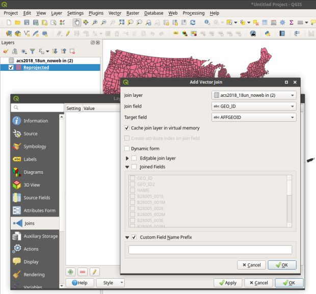
and creating a grouped summary:

Dataframe workshops summary

I created an independent sequence for the labels using string methods:

Sequence lables

and I used matplotlib so I could set different tick labels and move the legend, as the default placement blocked portions of the bars:

plt.figure()
ax=gis_yr[['Undergrad','Grad Stdt','Faculty','Staff','Other']].plot.bar\
(stacked=True, rot=25, title="GIS Workshops")

ax.set_xticklabels(gis_label)
ax.set_xlabel('Year (# Sessions)')
ax.set_ylabel('Attendance')
plt.legend(loc='upper center', bbox_to_anchor=(1, 1))

plt.savefig('workshops.png',bbox_inches='tight')

GIS workshops chart

For the workshops, the status includes all CUNY members regardless of school, while Other is anyone not affiliated with CUNY. Graduate students have always comprised the largest share of participants. Once again, there is the tenure dip in 2014-15 (fewer sessions) and no sessions during 2017-18 sabbatical. 2016-17 was an exceptional year as one of our sessions was held at the FOSS4G conference, so there are lots of participants from the Other category. The latest year was disappointing, as bad weather impacted attendance at two of the sessions.

I wanted to create a pie chart to show participation by CUNY school, but to make it aesthetically pleasing I needed to remove schools with few participants and add them to an Other CUNY category. Otherwise there would be tiny wedges with unreadable labels. After creating a subset of the workshops dataframe that summed values only for the school columns, I iterated through the schools to sum attendance to a variable, dropped those schools, and added the sum to the other category (see the notebook for details). I used the Pandas plot function to create the pie chart, and used the autopct argument to display percentages in the wedges. I also specified a figure size, which you can do for any chart (and becomes important when you decide to embed them in documents):

gis_total=gis_schools.sum()

gis_schools.plot.pie(legend=False, figsize=(6,6), \
title='Workshop Participants by School \n ({} Participants in Total)'.format(gis_total), autopct='%i%%')
plt.ylabel("")
plt.savefig('schools.png',bbox_inches='tight')

Pie chart showing workshop participation

One-third of participants were from my college, and one-fourth were from the Graduate Center, which is our nearest CUNY neighbor with a large population of master’s and PhD students who are keenly interested in learning GIS. The next biggest contributors are Hunter and Lehman Colleges, which are the two CUNY schools that have geography departments with GIS programs; Hunter is also close to Baruch, and we took a road trip to offer some sessions on Lehman’s campus.

Wrap Up

What I like about this approach is that you can summarize and reconfigure data without messing with the original source, and you can clearly see what your formulas are as they’re not hidden beneath the resulting values. These are both hazards when working directly within spreadsheets. While it takes time to learn these new functions and to grapple with finding work-arounds for exceptions, I don’t think it’s any less difficult than trying to accomplish the same things in a spreadsheet. I’ve always found spreadsheet charting to be rather clumsy, where you’re forced to cycle through numerous windows or to click on minuscule pieces of a chart to access hidden settings that you need.  The Pandas / notebook approach makes a lot of sense for iterative data exploration, summation, and visualization, although I’ll continue to rely on regular Python for projects that fall outside this specific domain.

Updated QGIS Tutorial for 3.4

I recently released an updated version of the manual and data I use for my day-long GIS Practicum, Introduction to GIS Using Open Source Software (Using QGIS). The manual has five chapters: a summary overview of GIS, basics of using the QGIS interface, GIS analysis that includes several geoprocessing and analysis functions, thematic mapping and map layout, and a summary of where to find data and resources for learning more. Chapters 2, 3, and 4 are broken down into sections with clear steps, followed by commentary that explains what we did and why. We cover much of the material in a single day, although you can space the lessons out into two days if desired.

I updated this version to move us from QGIS 2.18 Las Palmas to 3.4 Madeira, which are the former and current long term service releases. While the move from 2.x to 3.x involved a major rewrite of the code base (see the change log for details), most of the basics remain the same. While veteran users can easily navigate through the differences, it can be a stumbling block for new users if they are trying to learn a new version using an old tutorial with screens and tools that are slightly different. So it was time for an update!

My goal for this edition was to keep my examples in place but revise the steps based on changes in the interface. Most of the screenshots are new, and the substantive changes include: using the Data Manager for adding layers rather than the toolbar with tons of buttons, better support for xlsx and ods files which allowed me to de-emphasize xls and dbf files for attribute table joins, the addition of geopackages to the vector data mix, the loss of the Open Layers plugin and my revision to the web mapping section using OSM XYZ tiles, the disappearance of the setting that allowed you to disable on the fly projection, and the discontinuation of the stand-alone Data Browser. There were also changes to some tools (fixed distance and variable buffer tools are now united under one tool) and names of menus (Style menu has once again become the Symbology menu).

It’s hard to believe that this is my ninth edition of this tutorial. I try to update it once a year to keep in sync with the latest long term release, but fell a bit behind this year. QGIS 2.18 also survived for a bit longer than other releases, as the earlier 3.x versions went through lots of testing before ending up at 3.4. When it comes time for my tenth edition I may change the thematic mapping example in chapter 4 to something that’s global instead of US national, and in doing streamline the content. We’ll see if I have some time this summer.

Since I’m in update mode, I also fixed several links on the Resources page to cure creeping link rot.

OSM Merida

Extracting OpenStreetMap Data in QGIS 3

The OpenStreetMap (OSM) can be a good source of geospatial data for all sorts of features, particularly for countries where the government doesn’t provide publicly accessible GIS data, and for features that most governments don’t publish data for. In this post I’ll demonstrate how to download a specific feature set for a relatively small area using QGIS 3.x. Instead of simply adding OSM as a web service base map we’ll extract features from OSM to create vector layers.

In the past I followed some straightforward instructions for doing this in QGIS 2.x, but of course with the movement to 3.x the core OSM plugin I previously used is no longer included, and no updated version was released. It’s a miracle that anyone can figure out what’s going on between one version of QGIS and the next. Fortunately, there’s another plugin called QuickOSM that’s quite good, and works fine with 3.x.

Use QuickOSM to Extract Features

Let’s say that we want to create a layer of churches for the city Merida in Mexico. First we launch QGIS, go to the Plugins menu, and choose Manage and Install plugins. Select plugins that are not installed, do a search for QuickOSM, select it, and install it. This adds a couple buttons to the plugins toolbar and a new sub-menu under the Vector menu called Quick OSM.

Next, we add a layer to serve as a frame of reference. We’re going to use the extent of the QGIS window to grab OSM features that fall within that area. We could download some vector files from GADM or Natural Earth; GADM provides several layers of administrative divisions which can be useful for locating and delineating our area. Or we can add a web service like OSM and simply zoom in to our area of interest. Adjust the zoom so that the entire city of Merida fits within the window.

Merida in QGIS

OSM XYZ Tiles in QGIS – Zoomed into Merida

Now we can launch the Quick OSM tool. The default tab is Quick query, which allows us to select features directly from an OSM server (you need to be connected to the internet to do this). OSM data is stored in an XML format, so to extract the data we want we’ll need to specify the correct elements and tags. Ample documentation for all the map features is available. In our example, churches are referred to as places of worship and are classified as an amenity. So we choose amenity as the key and place_of_worship as the value. The drop down box allows us to search for features in or around a place, but as discussed in my previous post place names can be ambiguous. Choose the option for canvas extent, and that will capture any churches in our map window. Hit the advanced drop down arrow, and you have the option to select specific types of geometry (keep them all). Hit the run query button to execute.

Quick OSM Interface

Quick OSM Interface

We’ll see there are two results: one for places of worship that are points, and another for polygons. If you right click on one of these layers and open the attribute table, you’ll see a number of tags that have been extracted and saved as columns, such as the name, religion, and denomination. The Quick query tools pulls a series of pre-selected attributes that are appropriate for the type of feature.

Places of Worship

The data is saved temporarily in memory, so to keep it you need to save each as a shapefile or geopackage (right click, Export, Save Features As). But before we do that – why do have two separate layers to begin with? In some cases the OSM has the full shape of the building saved as a polygon, while in other cases the church is saved as a point feature, with a cross or other religious symbol appropriate for the type of worship space. It simply depends on the level of detail that was available when the feature was added.

Polygon versus Point

Church as polygon (lower left-hand corner) and as point (upper right-hand corner)

If we needed a single unified layer we would need to merge the two, but this process can be a pain. Using the vector menu you can convert the polygons to points using the centroid tool, and then use the merge tool to combine the two point layers. This is problematic as the number of fields in each file is different, and because the centroid tool changes the data type of the polygon’s id number to a type that doesn’t match the points. I think the easiest solution is to load both layers into a Spatialite database and create a unified layer in the DB.

Use SpatiaLite to Create a Single Point Layer

To do that, right click on the SpatiaLite option in the Browser Panel, choose Create Database, and name it (merida_churches). Then select the church point file, right click, export, save features as. Choose SpatiaLite as the format, for the file select the database we just created, and for layer name call it church_points. The default CRS (used by OSM) is WGS 84. Hit OK. Then repeat the steps for the polygons, creating a layer called church_polygons in that same database.

Once the features are database layers, we can write a SQL script (see below) where you create one table that has columns that you want to capture from both tables. You load the data from each of the tables into the unified one, and as you are loading the polygons you convert their geometry to points. The brackets around the names like [addr:full] allows you to overcome the illegal character designation in the original files (you shouldn’t use colons in db column names). I like to manually insert a date so to remember when I downloaded the feature set.

BEGIN;

CREATE TABLE all_churches (
full_id TEXT NOT NULL PRIMARY KEY,
osm_id INTEGER NOT NULL,
osm_type TEXT,
name TEXT,
religion TEXT,
denomination TEXT,
addr_housenumber TEXT,
addr_street TEXT,
addr_city TEXT,
addr_full TEXT,
download_date TEXT);

SELECT AddGeometryColumn('all_churches','geom',4326,'POINT','XY');

INSERT INTO all_churches
SELECT full_id, osm_id, osm_type, name, religion, denomination,
[addr:housenumber], [addr:street], [addr:city], [addr:full],
'02/11/2019', ST_CENTROID(geometry)
FROM church_polygons;

INSERT INTO all_churches
SELECT full_id, osm_id, osm_type, name, religion, denomination,
[addr:housenumber], [addr:street], [addr:city], [addr:full],
'02/11/2019', geometry
FROM church_points;

SELECT CreateSpatialIndex('all_churches', 'geom');

COMMIT;

Unfortunately the QGIS DB Browser does not allow you to run SQL transactions / scripts. You can paste the entire script into the window, highlight the first statement (CREATE TABLE), execute it, then highlight the next one (SELECT AddGeometryColumn), execute it, etc. Alternatively if you use the Spatialite CLI or GUI, you can save your script in a file, load it, and execute it in one go.

QGIS DB Browser

When finished we hit the refresh button and can see the new all_churches layer in the DB. We can preview the table and geometry and add it to the QGIS map window. If you prefer to work with a shapefile or geopackage you can always export it out of the db.

Other Options

The QuickOSM tool has a few other handy features. Under the Quick query tool is a plain old Query tool, which shows you the actual query being passed to the server. If you’re familiar with the map features and XML structure of OSM you can modify this query directly. Under the Query tool is the OSM File tool. Instead of grabbing features from the server, you can download an OSM pbf file (Geofabrik provides data for each country) and use this tool to load data from that file. It loads all features from the file for the geometries you choose, so the process can take awhile. You’ll want to load the data into a temporary file instead of saving in memory, to avoid a crash.