I’ve recently given a few presentations on the Ocean State Spatial Database, which is a basic geodatabase for Rhode Island that we’ve created in our lab. The database was designed so that new and experienced users alike could easily access a curated collection of foundational layers and data tables for thematic mapping and geospatial analysis. The database is available for download on GitHub, and there is documentation that describes the layers and tables that are included. The database comes in two formats: SQLite/ Spatialite that’s great for QGIS, and a File Geoadatabase version for ArcGIS Pro users.
One of the big advantages of using the Spatialite database in QGIS is that you can take advantage of the Database Manager, and write SQL and spatial SQL queries for selecting records and doing spatial analysis. Instead of using a series of point and click tools that create a bunch of new files, you can write a single block of code to perform an entire operation, and you can save that code to document your work. Access the Database Manager above the toolbars at the top of the QGIS interface. Once you’re in, you can select the Spatialite option, right click and then browse your file system to point to the database to establish a connection. At the top of the DB Manager is a button (piece of paper with wrench) to open a SQL query window.

The following commands are basic SQL: SELECT some columns FROM some tables WHERE some criteria is met. This returns all rows and columns from the public libraries layer in the database:
SELECT *
FROM d_public_libraries;
This returns just some of the columns for all rows:
SELECT libid, libname, city, cnty
FROM d_public_libraries;
While this returns some of the columns and rows that meet specific criteria, in this case where libraries are located in Providence County, RI:
SELECT libid, libname, city, cnty, geom
FROM d_public_libraries
WHERE cnty='PROVIDENCE'
ORDER BY city;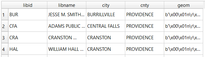
Traditional database column types include strings (aka text), integers, and decimal numbers, which limit the values that can be stored in the column, and allow specific functions that can operate on values of that type (math on numeric columns, string operations on text columns). Beyond the basic data types, many databases have special ones, such as date types that allow you to store and manipulate dates and times as distinct objects.
Spatial databases incorporate special columns for storing the geometry of features as strings of coordinates, and provide functions that can operate on that geometry. In the example above, the values stored in the geometry column were returned in a binary format. But we can apply a spatial function called ST_AsText to display the geometry as readable text:
SELECT libid, libname, city, cnty, ST_AsText(geom) AS geom
FROM d_public_libraries
WHERE cnty='PROVIDENCE'
ORDER BY city;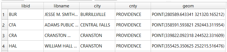
We can see that this is point geometry (as opposed to lines or polygons), and we have an X and Y coordinate for each point. The layers in this database are in the Rhode Island State Plane System, so the coordinates that are returned are in that system. We can convert these to longitude and latitude using the ST_Transform function:
SELECT libid, libname, city, cnty, ST_AsText(ST_Transform(geom,4269)) AS geom
FROM d_public_libraries
WHERE cnty='PROVIDENCE'
ORDER BY city;
This illustrates that the functions can be nested, first we transform the geometry and then display the result of that function as text. The number in the transform function is the unique identifier of the spatial reference system that we wish to transform the geometry to. In the open source world these are EPSG codes, and 4269 is the identifier for NAD 83, the basic long / lat system for North America (alternatively, we could use 4326 for WGS 84, the standard global long / lat system). The geometry column in a spatial table is connected to a series of internal tables that store all the definitions of the spatial reference systems. You can view the spatial reference system table:
SELECT * from spatial_ref_sys;You can also get a read out of all the spatial tables in the database which include their type of geometry and the spatial reference system (3438 is the EPSG code for the RI State Plane zone, geometry of type 6 is a multipolygon, while type 1 is a point):
SELECT * from geometry_columns;
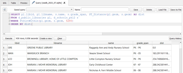
With a spatial database, you perform operations within and between tables by running functions against the geometry columns. For example, to return all public libraries and schools that are within a mile of a library while measuring the distance:
SELECT pl.libid, pl.libname, s.name, s.grade_span, ST_Distance(pl.geom, s.geom) AS dist
FROM d_public_libraries pl, d_schools_pk12 s
WHERE PtDistWithin(pl.geom, s.geom, 5280)
ORDER BY dist;
The ST_Distance function returns the actual distance in a new column, while the PtDistWithin function only returns libraries that have a school within one mile (5,280 feet – we have to express the measurement in the units used by the spatial reference system of both layers). In the FROM statement we provide aliases after each table name, so we can use those as shorthand (if our statement includes multiple tables, we need to indicate which table each column comes from).
You can also do summaries, like you would in standard SQL using GROUP BY. To count the number of schools that are within a mile of every library:
SELECT pl.libid, pl.libname, CAST(COUNT (s.name) AS integer) AS school_count, pl.geom
FROM d_public_libraries pl, d_schools_pk12 s
WHERE PtDistWithin(pl.geom, s.geom, 5280)
GROUP BY pl.libid, pl.libname, pl.geom
ORDER BY school_count DESC;
The rule for GROUP BY is that every column in the select statement must be used as a grouping variable, or has an aggregate function applied to it (COUNT, SUM, MEAN, etc). In this example we added the CAST function, which defines the data type for new columns that you create. Unless we explicitly declare it as an integer or real (decimal), values are returned as strings.
You can save your statements as views, by adding CREATE VIEW [view name] AS followed by the statement. Views are saved statements that appear as objects in the database; by opening a view, the statement is rerun and the result is returned. This approach works if you want to save a non-spatial view, i.e. a table without geometry. To save a spatial one with geometry, omit the VIEW statement and hit the Create a view button below the SQL window (each record must have a unique identifier and the geometry column in order for this to work). That registers the geometry column of the view in the database. Then, you can return to the main QGIS window, add the view and symbolize it. Alternatively, there is a Load as new layer button at the bottom of the screen, which allows you to see a temporary result without saving anything (while you can see features and records returned, you won’t be able to symbolize or manipulate the layer).


One of the primary reasons to use a database is to join related data stored in separate tables. This statement has two joins: a tabular join between the census tracts and an ACS data table, and a spatial join between the geometry of public libraries and tracts:
SELECT pl.libid, pl.libname, a.geoidshort, a.name, c.hshd01_e, c.hshd01_m
FROM d_public_libraries pl, a_census_tracts a
INNER JOIN c_tracts_acs2021_socecon c
ON a.geoidlong=c.geoidlong
WHERE ST_Intersects(pl.geom, a.geom);
This returns all public libraries and their intersecting tracts based on the relationship between their two geometries (could also have done ST_Within in this case to get the same result). Spatialite supports most of the spatial relationship functions defined by the OGC. The estimated number of households for these tracts are returned based on the shared unique census identifier between the two census tract tables.
You can visit the following references for a full list of SQLite functions and Spatialite functions. As it’s designed to be “Lite”, SQLite contains a smaller subset of the SQL standard. Spatialite contains a pretty full range of OGC spatial SQL functions, but there are instances where it deviates from the standard. PostgreSQL / PostGIS provides a greater range of functions that adhere more closely to the standard; it also provides you with greater storage, efficiency, and processing power. As a file-based database, SQLite / Spatialite’s strengths are that it’s compact and transportable, and gives you the option to write SQL rather than relying solely on the point and click tools of a desktop GIS package.
In addition to the QGIS DB Manager, you could also use the Spatialite command line tools provided by the developer, and the Spatialite GUI (graphic user interface) that gives you a standard, stand-alone database interface. Downloading it is a bit confusing; Windows users can grab one of the binaries at the bottom of this page. If you’re a Linux person, search for it in your package manager. Mac users can get it via Homebrew.


You must be logged in to post a comment.