spatial analysis

Comparing ACS Estimates Over Time: Are They Really Different?

I often get questions about comparing American Community Survey (ACS) estimates from the US Census Bureau over time. This process is more complicated than you’d think, as the ACS wasn’t designed as a time series dataset. The Census Bureau does publish comparative profile tables that compare two period estimates (in data.census.gov), but for a limited number of geographies (states, counties, metro areas).

For me, this question often takes the form of comparing change at the census tract-level for mapping and GIS projects. In this post, we’ll look at the primary considerations for comparing estimates over time, and I will walk through an example with spreadsheet formulas for calculating: change and percent change (estimates and margins of error), coefficients of variation, and tests for statistical difference. We’ll conclude with examples of mapping this data.

Primary considerations

  1. The ACS is published in 1-year and 5-year period estimates. 1-year estimates are only available for areas that have at least 65,000 people, which means if you’re looking at small geographies (census tracts, ZCTAs) or rural areas that have small populations (most counties, county subdivisions, places) you will need to use the 5-year series. When comparing 5-year estimates, you should only compare non-overlapping time periods. For example, you would not compare the 2021 ACS (2017-2021) with the 2020 ACS (2016-2020) as these estimates have four years of sample data in common. In contrast, 2021 and 2016 (2012-2016) could be compared as they do not overlap…
  2. …but, census geography changes over time. All statistical areas (block groups, tracts, ZCTAs, PUMAs, census designated-places, etc.) are updated every ten years with each decennial census. Areas can be re-numbered, aggregated, subdivided, or modified as populations change. This complicates comparisons; 2021 data uses geography created in 2020, while 2016 data uses geography from 2010. The only non-overlapping ACS periods with identical geographic areas would be 2014 (2010-2014) and 2019 (2015-2019). The only other alternative would be to use normalized census data, which involves additional work. While most legal areas (states, counties) can change at any time, they are generally more stable and you can make comparisons over a longer-period with modest adjustments.
  3. All ACS estimates are fuzzy, representing a midpoint within a possible range of values (indicated with a margin of error) at a 90% confidence level. Because of sampling variability, any difference that you see between one time period and the next could be noise and not actual change. If you’re working with small geographies or small population groups, you’ll encounter large margins of error and it will be difficult to measure actual change. In addition, it’s often difficult to detect change in any area that isn’t experiencing either substantive growth or decline.

ACS Formulas

Let’s look at an example where we’ll use formulas to: calculate change over time, measure the reliability of a difference estimate, and determine whether two estimates are significantly different. I downloaded table B25064 Median Gross Rent (dollars) from the 5-year 2014 (2010-2014) and 2019 (2015-2019) ACS for all census tracts in Providence County, RI, and stitched them together into one spreadsheet. In this post I’ve replaced the cell references with an abbreviated label that indicates what should be referenced (i.e. Est1_MOE is the margin of error for the first estimate). You can download a copy of the spreadsheet with these examples.

  1. To calculate the change / difference for an estimate, subtract one from the other.
  2. To calculate the margin of error for this difference, take the square root of the sum of the squares for each estimate’s margin of error (MOE):
=ROUND(SQRT((Est1_MOE^2)+(Est2_MOE^2)),0)

Spreadsheet with ACS formula to compute margin of error for change / difference
  1. To calculate percent change, divide the difference by the earliest estimate (Est1), and multiply by 100.
  2. To calculate the margin of error for the percent change, use the ACS formula for computing a ratio:
=ROUND(((SQRT(Est2_MOE^2+((Est2/Est1)^2*Est1_MOE^2)))/Est1)100,1)

Divide the 2nd estimate by the 1st and square it, multiply that by the square of the 1st estimate’s MOE, add that to the square of the 2nd estimate’s MOE. Take the square root of that result, then divide by the 1st estimate and multiply by 100. Note that this is formula for percent change is different from the one used for calculating a percent total (the latter uses the formula for a proportion; switch the plus symbol under the square root to a minus for percent totals).

Spreadsheet with ACS formula to compute margin of error for percent change / difference
  1. To characterize the overall accuracy of the new difference estimate, calculate its coefficient of variation (CV):
=ROUND(ABS((Est_MOE/1.645)/Est)*100,0)

Divide the MOE for the difference by 1.645, which is the Z-value for a 90% confidence interval. Divide that by the difference itself, and multiply by 100. Since we can have positive or negative change, we take the absolute value of the result.

Spreadsheet with ACS formula to compute coefficient of variation
  1. To convert the CV into the generally recognized reliability categories:
=IF(CV<=12,"high",IF(CV>=35,"low","medium"))

If the CV value is between 0 to 12, then it’s considered to be highly reliable, else if the CV value is greater than or equal to 35 it’s considered to be of low reliability, else it is considered to be of medium reliability (between 13 and 34). Note: this is a conservative range; search around and you’ll find more liberal examples that use 0-15, 16-40, 41+.

  1. To measure whether two estimates are significantly different from each other, use the statistical difference formula:
=ROUND(ABS((Est2-Est1)/(SQRT((Est1_MOE/1.645)^2+(Est2_MOE/1.645)^2))),3)

Divide the MOE for both the 1st and 2nd estimate by 1.645 (Z value for 90% confidence), take the sum of their squares, and then square root. Subtract the 1st estimate from the 2nd, and then divide. Again in this case, since we could have a positive or negative value we take the absolute value.

Spreadsheet with ACS formula to compute significant difference
  1. To create a boolean significant or not value:
=IF(SigDif>1.645,1,0)

If the significant difference value is greater than 1.645, then the two estimates are significantly different from each other (TRUE 1), implying that some actual change occurred. Otherwise, the estimates are not significantly different (FALSE 0), which means any difference is likely the result of variability in the sample, or any true difference is hidden by this variability.

ALWAYS CHECK YOUR WORK! It’s easy to put parentheses in the wrong place or transpose a cell reference. Take one or two examples and plug them into Cornell PAD’s ACS Calculator, or into Fairfax County VA’s ACS Tools (spreadsheets with formulas – bottom of page). The Census Bureau also provides a spreadsheet that lets you test multiple values for significant difference. Caveat: for the Cornell calculator use the ratio option instead of change when testing. For some reason its change formula never matches my results, but the Fairfax spreadsheets do. I’ve also checked my formulas against the Census Bureau’s ACS Handbooks, and they clearly say to use the ratio formula for percent change.

Interpreting Results

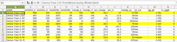
Let’s take a look at a few of the records to understand the results. In Census Tract 1.01, median gross rent increased from $958 (+/- 125) in 2014 to $1113 (+/- 73) in 2019, a change of $155 (+/- 145) and a percent change of 16.2% (+/- 17%). The CV for the change estimate was 57, indicating that this estimate has low reliability; the margin of error is almost equal to the estimate, and the change could have been as little as $10 or as great as $300! The rent estimates for 2014 and 2019 are statistically different but not by much (1.761, higher than 1.645). The margins of error for the two estimates do overlap slightly (with $1,083 being the highest possible value in 2014 and $1,040 the lowest possible value in 2019).
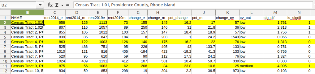
Spreadsheet comparing values for different census tracts

In Census Tract 4, rent increased from $863 (+/- 122) to $1003 (+/- 126), a change of $140 (+/- 175) and percent change of 16.2% (+/- 22%). The CV for the change estimate was 76, indicating very low reliability; indeed the MOE exceeds the value of the estimate. With a score of 1.313 the two estimates for 2014 / 2019 are not significantly different from each other, so any difference here is clouded by sample noise.

In Census Tract 9, rent increased from $875 (+/- 56) to $1083 (+/- 62), a change of $208 (+/- 84) or 23.8% (+/- 10.6%). Compared to the previous examples, these MOEs are much lower than the estimates, and the CV value for the difference is 25, indicating medium reliability. With a score of 4.095, these two estimates are significantly different from each other, indicating substantive change in rent in this tract. The highest possible value in 2014 was $931, and the lowest possible value in 2019 was $1021, so there is no overlap in the value ranges over time.

Mapping Significant Difference and CVs

I grabbed the Census Cartographic Boundary File for tracts for Rhode Island in 2019, and selected out just the tracts for Providence County. I made a copy of my worksheet where I saved the data as text and values in a separate sheet (removing the formulas and encoding the actual outputs), and joined this sheet to the shapefile using the AFFGEOID. The City of Providence and surrounding cities and suburban areas appear in the southeast corner of the county.

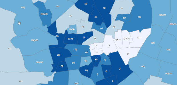
The map on the left displays simple percent change over time. In the map on the right, I applied a filter to select just tracts where change was significantly different (the non-significant tracts are symbolized with hash marks). In the screenshots, the count of the number of tracts in each class appears in brackets; I used natural breaks, then modified to place all negative values in the same class. Of the 141 tracts, only 49 had statistically different values. The first map is a gross misrepresentation, as change for most of the tracts can’t be distinguished from sampling variability.
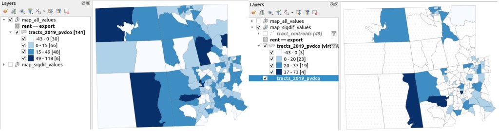
Map of difference on left, significant difference on right
Percent Change in Median Gross Rent 2010-14 to 2015-19: Change on Left, Change Where Both Rent Estimates were Significantly Different on Right

A refined version of the map on the right appears below. In this one, I converted the tracts from polygons to points in a new layer, applied a filter to select significantly different tracts, and symbolized the points by their CV category. Of the 49 statistically different tracts, the actual estimate of change was of low reliability for 32 and medium reliability for the rest. So even if the difference is significant, the precision of most of these estimates is poor.
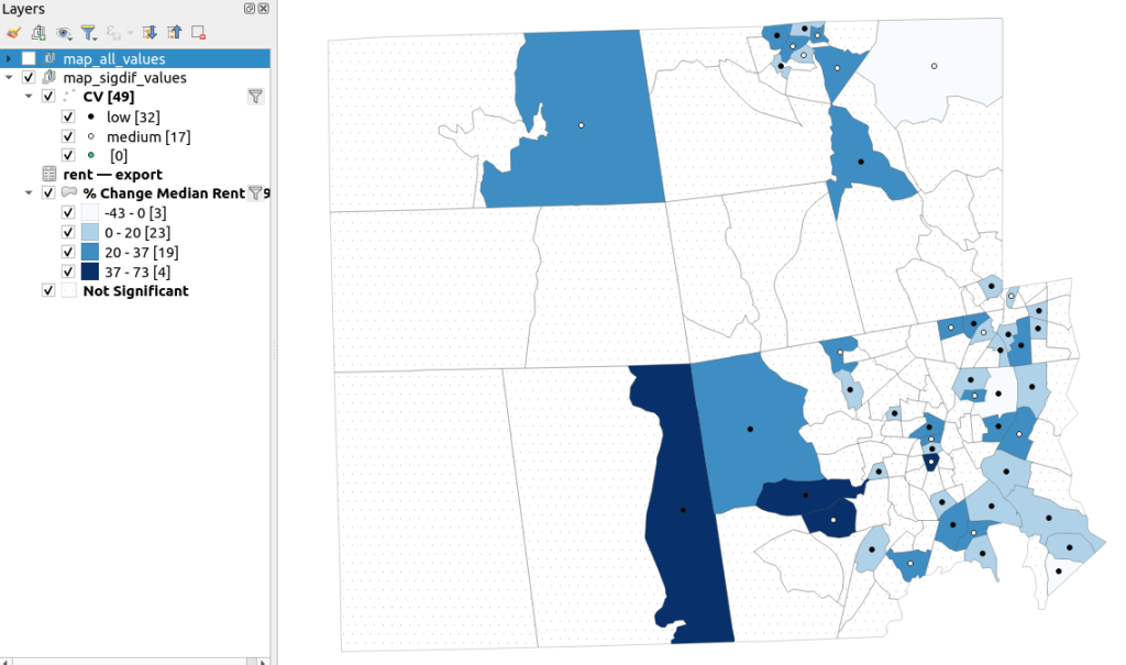
Providence County, Significant Difference in Median Rent Map
Percent Change in Median Gross Rent 2010-14 to 2015-19 with CV Values, for Tracts with Significantly Different Estimates, Providence County RI

Conclusion

Comparing change over time for ACS estimates is complex, time consuming, and yields many dubious results. What can you do? The size of the MOE relative to the estimate tends to decline as you look at either larger or more populous areas, or larger and fewer subcategories (i.e. 4 income brackets instead of 8). You could also look at two period estimates that are further apart, making it more likely that you’ll see changes; say 2005-2009 compared to 2016-2020. But – you’ll have to cope with normalizing the data. Places that are rapidly changing will exhibit more difference than places that aren’t. If you are studying basic demographics (age / sex / race / tenure) and not socio-economic indicators, use the decennial census instead, as that’s a count and not a sample survey. Ultimately, it’s important to address these issues, and be honest. There’s a lot of bad research where people ignore these considerations, and thus make faulty claims.

For more information, visit the Census Bureau’s page on Comparing ACS Data. Chapter 6 of my book Exploring the US Census covers the American Community Survey and has additional examples of these formulas. As luck would have it, it’s freely accessible as a preview chapter from my publisher, SAGE.

Final caveat: dollar values in the ACS are based on the release year of the period estimate, so 2010-2014 rent is in 2014 dollars, and 2015-2019 is in 2019 dollars. When comparing dollar values over time you should adjust for inflation; I skipped that here to keep the examples a bit simpler. Inflation in the 2010s was rather modest compared to the 2020s, but still could push tracts that had small changes in rent to none when accounted for.
PRISM Temperature Raster and Test Points Jan 15, 2020

Clipping Rasters and Extracting Values with Geospatial Python

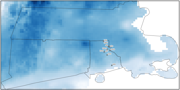
In an earlier post, I described how to summarize and extract raster temperature data using GIS. In this post I’ll demonstrate some alternate methods using spatial Python. I’ll describe some scripts I wrote for batch clipping rasters, overlaying them with point locations, and extracting raster values (mean temperature) at those locations based on attributes of the points (a matching date). I used a number of third party modules, including geopandas (storing vector data in a tabular form), rasterio (working with raster grids), shapely (building vector geometry), matplotlib (plotting), and datetime (working with date data types). Using Anaconda Python, I searched for and added each of these modules via its package handler. I opted for this modular approach instead of using something like ArcPy, because I don’t want the scripts to be wedded to a specific software package. My scripts and sample data are available in GitHub; I’ll add snippets of code to this post for illustration purposes. The repo includes the full batch scripts that I’ll describe here, plus some earlier, shorter, sample scripts that are not batch-based and are useful for basic experimentation.

Overview

I was working with a medical professor who had point observations of where patients lived, which included a date attribute of when they had visited a clinic to receive certain treatment. For the study we needed to know what the mean temperature was on that day, as well as the temperature of each day of the preceding week. We opted to use daily temperature data from the PRISM Climate Group at Oregon State, where you can download a raster of the continental US for a given day that has the mean temperature (degrees Celsius) in one band, at 4km resolution. There are separate files for min and max temperature, as well as precipitation. You can download a year’s worth of data in one go, with one file per date.

Our challenge was that we had thousands of observations than spanned five years, so doing this one by one in GIS wasn’t going to be feasible. A custom script in Python seemed to be the best solution. Each raster temperature file has the date embedded in the file name. If we iterate through the point observations, we could grab its observation date, and using string manipulation grab the raster with the matching date in its file name, and then do the overlay and extraction. We would need to use Python’s datetime module to convert each date to a common format, and use a function to iterate over dates from the previous week.

Prior to doing that, we needed to clip or mask the rasters to the study area, which consists of the three southern New England states (Connecticut, Rhode Island, and Massachusetts). The PRISM rasters cover the lower 48 states, and clipping them to our small study area would speed processing time. I downloaded the latest Census TIGER file for states, and extracted the three SNE states. ArcGIS Pro does have batch clipping tools, but I found they were terribly slow. I opted to write one Python script to do the clipping, and a second to do the overlay and extraction.

Batch Clipping Rasters

I downloaded a sample of PRISM’s raster data that included two full months of daily mean temperature files, from Jan and Feb 2020. At the top of the clipper script, we import all the modules we need, and set our input and output paths. It’s best to use the path.join method from the os module to construct cross platform paths, so we don’t encounter the forward / backward \ slash issues between Mac and Linux versus Windows. Using geopandas I read in the shapefile of the southern New England (SNE) states into a geodataframe.

import os
import matplotlib.pyplot as plt
import geopandas as gpd
import rasterio
from rasterio.mask import mask
from shapely.geometry import Polygon
from rasterio.plot import show

#Inputs
clip_file=os.path.join('input_raster','mask','states_southern_ne.shp')
# new file created by script:
box_file=os.path.join('input_raster','mask','states_southern_ne_bbox.shp') 
raster_path=os.path.join('input_raster','to_clip')
out_folder=os.path.join('input_raster','clipped')

clip_area = gpd.read_file(clip_file)

Next, I create a new geodataframe that represents the bounding box for the SNE states. The total_bounds method provides a list of the four coordinates (west, south, east, north) that form a minimum bounding rectangle for the states. Using shapely, I build polygon geometry from those coordinates by assigning them to pairs, beginning with the northwest corner. This data is from the Census Bureau, so the coordinates are in NAD83. Why bother with the bounding box when we can simply mask the raster using the shapefile itself? Since the bounding box is a simple rectangle, the process will go much faster than if we used the shapefile that contains thousands of coordinate pairs.

corners=clip_area.total_bounds
minx=corners[0]
miny=corners[1]
maxx=corners[2]
maxy=corners[3]
areabbox = gpd.GeoDataFrame({'geometry':Polygon([(minx,maxy),
                                                (maxx,maxy),
                                                (maxx,miny),
                                                (minx,miny),
                                                (minx,maxy)])},index=[0],crs="EPSG:4269")

Once we have the bounding box as geometry, we proceed to iterate through the rasters in the folder in a loop, reading in each raster (PRISM files are in the .bil format) using rasterio, and its mask function to clip the raster to the bounding box. The PRISM rasters and the TIGER states both use NAD83, so we didn’t need to do any coordinate reference system (CRS) transformation prior to doing the mask (if they were in different systems, we’d have to convert one to match the other). In creating a new raster, we need to specify metadata for it. We copy the metadata from the original input file to the output file, and update specific attributes for the output file (such as the pixel height and width, and the output CRS). Here’s a mask example and update from the rasterio docs. Once that’s done, we write the new file out as a simple GeoTIFF, using the name of the input raster with the prefix “clipped_”.

idx=0
for rf in os.listdir(raster_path):
    if rf.endswith('.bil'):
        raster_file=os.path.join(raster_path,rf)
        in_raster=rasterio.open(raster_file)
        # Do the clip operation
        out_raster, out_transform = mask(in_raster, areabbox.geometry, filled=False, crop=True)
        # Copy the metadata from the source and update the new clipped layer 
        out_meta=in_raster.meta.copy() 
        out_meta.update({
            "driver":"GTiff",
            "height":out_raster.shape[1], # height starts with shape[1]
            "width":out_raster.shape[2], # width starts with shape[2]
            "transform":out_transform})  
        # Write output to file
        out_file=rf.split('.')[0]+'.tif'
        out_path=os.path.join(out_folder,'clipped_'+out_file)
        with rasterio.open(out_path,'w',**out_meta) as dest:
            dest.write(out_raster)
        idx=idx+1
        if idx % 20 ==0:
            print('Processed',idx,'rasters so far...')
    else:
        pass
    
print('Finished clipping',idx,'raster files to bounding box: \n',corners)

Just to see some evidence that things worked, outside of the loop I take the last raster that was processed, and plot that to the screen. I also export the bounding box out as a shapefile, to verify what it looks like in GIS.

#Show last clipped raster
fig, ax = plt.subplots(figsize=(12,12))
areabbox.plot(ax=ax, facecolor='none', edgecolor='black', lw=1.0)
show(in_raster,ax=ax)

fig, ax = plt.subplots(figsize=(12,12))
show(out_raster,ax=ax)

# Write bbox to shapefile 
areabbox.to_file(box_file)
Clipped raster with bounding box
PRISM US mean daily temperature raster, clipped / masked to bounding box of southern New England

Extract Raster Values by Date at Point Locations

In the second script, we begin with reading in the modules and setting paths. I added an option at the top with a variable called temp_many_days; if it’s set to True, it will take the date range below it and retrieve temperatures for x to y days before the observation date in the point file. If it’s False, it will retrieve just the matching date. I also specify the names of columns in the input point observation shapefile that contain a unique ID number, name, and date. In this case the input data consists of ten sample points and dates that I’ve concocted, labeled alfa through juliett, all located in Rhode Island and stored as a shapefile.

import os,csv,rasterio
import matplotlib.pyplot as plt
import geopandas as gpd
from rasterio.plot import show
from datetime import datetime as dt
from datetime import timedelta
from datetime import date

#Calculate temps over multiple previous days from observation
temp_many_days=True # True or False
date_range=(1,7) # Range of past dates 

#Inputs
point_file=os.path.join('input_points','test_obsv.shp')
raster_dir=os.path.join('input_raster','clipped')
outfolder='output'
if not os.path.exists(outfolder):
    os.makedirs(outfolder)

# Column names in point file that contain: unique ID, name, and date
obnum='OBS_NUM'
obname='OBS_NAME'
obdate='OBS_DATE'

Next, we loop through the folder of clipped raster files, and for each raster (ending in .tif) we grab the file name and extract the date from it. We take that date and store it in Python’s standard date format. The date becomes a key, and the path to the raster its value, which get added to a dictionary called rf_dict. For example, if we split the file name clipped_PRISM_tmean_stable_4kmD2_20200131_bil.tif using the underscores, counting from zero we get the date in the 5th position, 20200131. Converting that to the standard datetime format gives us datetime.date(2020, 1, 31).

rf_dict={} # Create dictionary of dates and raster file names

for rf in os.listdir(raster_dir):
    if rf.endswith('.tif'):
        rfdatestr=rf.split('_')[5]
        rfdate=dt.strptime(rfdatestr,'%Y%m%d').date() #format of dates is 20200131
        rfpath=os.path.join(raster_dir,rf)
        rf_dict[rfdate]=rfpath
    else:
        pass

Then we read the observation point shapefile into a geodataframe, create an empty result_list that will hold each of our extracted values, and construct the header row for the list. If we are grabbing temperatures for multiple days, we generate extra header values to add to that row.

#open point shapefile
point_data = gpd.read_file(point_file)

result_list=[]
result_list.append(['OBS_NUM','OBS_NAME','OBS_DATE','RASTER_ROW','RASTER_COL','RASTER_FILE','TEMP'])

if temp_many_days==True:
    for d in range(date_range[0],date_range[1]):
        tcol='TMINUS_'+str(d)
        result_list[0].append(tcol)
    result_list[0].append('TEMP_RANGE')
    result_list[0].append('AVG_TEMP')
    temp_ftype='multiday_'
else:
    temp_ftype='singleday_'

Now the preliminaries are out of the way, and processing can begin. This post and tutorial helped me to grasp the basics of the process. We loop through the point data in the geodataframe (we indicate point.data.index because these are dataframe records we’re looping through). We get the observation date for the point and store that it the standard Python date format. Then we take that date, compare it to the dictionary, and get the path to the corresponding temperature raster for that date. We open that raster with rasterio, isolate the x and y coordinate from the geometry of the point observation, and retrieve the corresponding row and column for that coordinate pair from the raster. Then we read the value that’s associated with the grid cell at those coordinates. We take some info from the observation points (the number, name, and date) and the raster data we’ve retrieved (the row, column, file name, and temperature from the raster) and add it to a list called record.

#Pull out and format the date, and use date to look up file
for idx in point_data.index:
    obs_date=dt.strptime(point_data[obdate][idx],'%m/%d/%Y').date() #format of dates is 1/31/2020
    obs_raster=rf_dict.get(obs_date)
    if obs_raster == None:
        print('No raster available for observation and date',
              point_data[obnum][idx],point_data[obdate][idx])
    #Open raster for matching date, overlay point coordinates, get cell location and value
    else:
        raster=rasterio.open(obs_raster)
        xcoord=point_data['geometry'][idx].x
        ycoord=point_data['geometry'][idx].y
        row, col = raster.index(xcoord,ycoord)
        tempval=raster.read(1)[row,col]
        rfile=os.path.split(obs_raster)[1]
        record=[point_data[obnum][idx],point_data[obname][idx],
                point_data[obdate][idx],row,col,rfile,tempval]

If we had specified that we wanted a single day (option near the top of the script), we’d skip down to the bottom of the next block, append the record to the main result_list, and continue iterating through the observation points. Else, if we wanted multiple dates, we enter into a sub-loop to get data from a range of previous dates. The datetime timedelta function allows us to do date subtraction; if we subtract 1 from the current date, we get the previous day. We loop through and get rasters and the temperature values for the points from each previous date in the range and append them to an old_temps list; we also build in a safety mechanism in case we don’t have a raster file for a particular date. Once we have all the dates, we do some calculations to get the average temperature and range for that entire period. We do this on a copy of old_temps called all_temps, where we delete null values and add the current observation date. Then we add the average and range to old_temps, and old_temps to our record list for this point observation, and when finished we append the observation record to our main result_list, and proceed to the next observation.

       # Optional block, if pulling past dates
        if temp_many_days==True:
            old_temps=[]
            for d in range(date_range[0],date_range[1]):
                past_date=obs_date-timedelta(days=d) # iterate through days, subtracting
                past_raster=rf_dict.get(past_date)
                if past_raster == None: # if no raster exists for that date
                    old_temps.append(None)
                else:
                    old_raster=rasterio.open(past_raster)
                    # Assumes rasters from previous dates are identical in structure to 1st date
                    past_temp=old_raster.read(1)[row,col]
                    old_temps.append(past_temp)
            # Calculate avg and range, must exclude None values and include obs day
            all_temps=[t for t in old_temps if t is not None]
            all_temps.append(tempval)
            temp_range=max(all_temps)-min(all_temps)
            avg_temp=sum(all_temps)/len(all_temps)
            old_temps.extend([temp_range,avg_temp])
            record.extend(old_temps)
            result_list.append(record)
        else: # if NOT doing many days, just append data for observation day
            result_list.append(record)
    if (idx+1)%200==0:
        print('Processed',idx+1,'records so far...')

Once the loop is complete, we plot the last point and raster to the screen just to check that it looks good, and we write the results out to a CSV.

#Plot the points over the final raster that was processed    
fig, ax = plt.subplots(figsize=(12,12))
point_data.plot(ax=ax, color='black')
show(raster, ax=ax)

today=str(date.today()).replace('-','_')
outfile='temp_observations_'+temp_ftype+today+'.csv'
outpath=os.path.join(outfolder,outfile)

with open(outpath, 'w', newline='') as writefile:
    writer=csv.writer(writefile, quoting=csv.QUOTE_MINIMAL, delimiter=',')
    writer.writerows(result_list)  

print('Done. {} observations in input file, {} records in results'.format(len(point_data),len(result_list)-1))
Output data for script
CSV output from script, temperatures extracted from raster by date for observation points

Results and Wrap-up

Visit the GitHub repo for full copies of the scripts, plus input and output data. In creating test observation points, I purposefully added some locations that had identical coordinates, identical dates, dates that varied by a single day, and dates for which there would be no corresponding raster file in the sample data if we went one week back in time. I looked up single dates for all point observations manually, and a sample of multi-day selections as well, and they matched the output of the script. The scripts ran quickly, and the overall process seemed intuitive to me; resetting the metadata for rasters after masking is the one part that wouldn’t have occurred to me, and took a little bit of time to figure out. This solution worked well for this case, and I would definitely apply geospatial Python to a problem like this again. An alternative would have been to use a spatial database like PostGIS; this would be an attractive option if we were working with a bigger dataset and processing time became an issue. The benefit of using this Python approach is that it’s easier to share the script and replicate the process without having to set up a database.

Observation points on raster in QGIS
Observation points plotted on temperature raster with single-day output temperatures in QGIS
Raster Temperature Jan 1, 2020 Southern NE

Summarizing Raster Data for Areas and Assigning Values to Points

It’s been a busy few months, but I have a few days to catch my breath now that it’s spring break and most people (except me) have gone away! One question that’s come up quite a bit this semester is how to associate raster data with coinciding vector data. I’ll summarize some approaches in this post using ArcGIS Pro and QGIS, to summarize raster values for polygons (zonal statistics) and to assign raster values to points (aka raster sampling).

Zonal Statistics: Summarize Rasters by Area

Imagine that you have quantitative values such as temperature or a vegetation index in a raster grid, and you want to use this data to calculate an average for counties or metro areas. The goal is to have a new attribute column in the vector layer that contains the summarized raster value, perhaps because you want to make thematic maps of that value, or you want to use it in conjunction with other variables to run spatial statistics, or you just want a plain and simple summary for given places.

The term zonal statistics is used to define any operation that calculates statistics on cell values of a raster within an area or zone defined by another dataset, either a raster or a vector. The ArcGIS Pro toolbox has a Zonal Statistics tool where the output is a new raster file with cells that are summarized by the input zones. That’s not desirable for the use case I’m presenting here; the better choice is the Zonal Statistics as Table tool. The output is a table containing the unique identifiers of the raster and vector, the summary stats you’ve generated (average, sum, min, max, etc), and a count of the number of cells used to generate the summary. You can join this resulting table back to the vector file using their common unique identifier in a table join.

In the example below, I’m using counties from the census TIGER files for southern New England as my Input Feature Zone, the AFFGEOID (Census ANSI / FIPS code) to identify the Zone Field, and a temperature grid for January 1, 2020 from PRISM as the Input Value Raster. I’m calculating the mean temperature for the counties on that day.

ArcGIS Zonal Statistics as Table Tool
ArcGIS Pro Zonal Statistics as Table; Temperature Grid and Southern New England Counties

The output table consists of one record for each zone / county, with the count of the cells used to create the average, and the mean temperature (in degrees Celsius). This table can be joined back to the original vector feature (select the county feature in the Contents, right click, Joins and Relates – Join) to thematically map the average temp.

ArcGIS Zonal Statistics Result
ArcGIS Pro Zonal Statistics; Table Output and Join to Show Average Temperature per County

In QGIS, this tool is simply called Zonal Statistics; search for it in the Processing toolbox. The vector with the zones is the Input layer, and the Raster layer is the grid with the values. By default the summary stats are the count, sum, and mean, but you can check the Statistics to calculate box to select others. Unlike ArcGIS, QGIS allows you to write output as a table or a new shapefile / geopackage, which carries along the feature geometry from the Input zones and adds the summaries, allowing you to skip the step of having to do a table join (if you opted to create a table, you could join it to the zones using the Joins tab under the Properties menu for the vector features).

QGIS Zonal Stats
QGIS Zonal Statistics

Extract Raster Values for Point Features

Zonal stats allows you to summarize raster data within a polygon. But what if you had point features, and wanted to assign each point the value of the raster cell that it falls within? In ArcGIS Pro, search the toolbox for the Extract Values to Points tool. You select your input points and raster, and a new point feature that will include the raster values. The default is to take the value for the cell that the point falls within, but there is an Interpolate option that will calculate the value from adjacent cells. The output point feature contains a new column called RASTERVALU. I created some phony point data and used it to generate the output below.

ArcGIS Extract Values to Points
ArcGIS Pro Extract Values to Points (assign raster cell values to points)

In QGIS the name of this tool is Sample raster values, which you can find in the Processing toolbox. Input the points, choose a raster layer, and write the output to a new vector point file. Unlike ArcGIS, there isn’t an option for interpolation from surrounding cells; you simply get the value for the cell that the point falls within. If you needed to interpolate, you can go to the Plugins menu, enable the SAGA plugin, and in the Processing toolbox try the SAGA tool Raster Values to Points instead.

QGIS Sample Raster Values
QGIS Sample Raster Values (assign raster cell values to points)

A variation on this theme would be to create and assign an average value around each point at a given distance, such as the average temperature within five miles. One way to achieve this would be to use the buffer tools in either ArcGIS or QGIS to create distinct buffers around each point at the specified distance. The buffer will automatically carry over all the attributes from the point features, including unique identifiers. Then you can run the zonal statistics tools against the buffer polygons and raster to compute the average, and if need be do a table join between the output table and the original point layer using their common identifier.

Wrap-up

In using any of these tools, it’s important to consider the resolution of the raster (i.e. the size of the grid cell):

1. Relative to the size of the zonal areas or number of points, and

2. In relation to the phenomena that you’re studying.

When larger grid cells or zonal areas are used for measurement, any phenomena becomes more generalized, and any variations within these large areas become masked. The temperature grid cells in this example had a resolution of 2.5 miles, which was suitable for creating county summaries. Summarizing data for census tracts at this resolution would be less ideal, as the tracts are much smaller than the cells, with the cell value characterizing a much larger area. This might be okay in the case of temperature, which tends not to vary considerably over a distance of a few miles. In contrast, averaging temperature data for states is not worthwhile, as states vary considerably in size and most are large enough that they contain multiple ecosystems and elevation levels.

The solutions I’ve described here are the desktop GIS solutions. You could also use either spatial SQL in a geodatabase or a spatial extension in a scripting language like Python or R to perform similar operations. In both cases a basic overlay and intersection statement is used, in conjunction with some grouping function for calculating summaries. I’ve been doing a lot more spatial Python work with geopandas these past few months – perhaps a topic for a subsequent post…

Noise Complaint Kernels and Contours

Kernel Density and Contours in QGIS: Noisy NYC

In spatial analysis, kernel density estimation (colloquially referred to as a type of “hot spot analysis”) is used to explore the intensity or clustering of point-based events. Crimes, parking tickets, traffic accidents, bird sightings, forest fires, incidents of infections disease, anything that you can plot as a point at a specific period in time can be studied using KDE. Instead of looking at these features as a distribution of discrete points, you generate a raster that represents a continuous surface of values. You can either measure the density of the incidents themselves, or the concentration of a specific attribute that is tied to those incidents (like the dollar amount of parking tickets or the number of injuries in traffic accidents).

In this post I’ll demonstrate how to do a KDE analysis in QGIS, but you can easily implement KDE in other software like ArcGIS Pro or R. Understanding the inputs you have to provide to produce a meaningful result is more important than the specific tool. This YouTube video produced by the SEER Lab at the University of Florida helped me understand what these inputs are. They used the SAGA kernel tool within QGIS, but I’ll discuss the regular QGIS tool and will cover some basic data preparation steps when working with coordinate data. The video illustrates a KDE based on a weight, where there were single points that had a count-based attribute they wanted to interpolate (number of flies in a trap). In this post I’ll cover simple density based on the number of incidents (individual noise complaints), and will conclude by demonstrating how to generate contour lines from the KDE raster.

For a summary of how KDE works, take a look at the entry for “Kernel” in the Encyclopedia of Geographic Information Science (2007) p 247-248. For a fuller treatment, I always recommend Christopher Lloyd’s Spatial Data Analysis: An Introduction to GIS Users (2010) p 93-97 by Oxford Press. There’s also an explanation in the ArcGIS Pro documentation.

Data Preparation

I visited the NYC Open Data page and pulled up the entry for 311 Service Requests. When previewing the data I used the filter option to narrow the records down to a small subset; I chose complaints that were created between June 1st and 30th 2022, where the complaint type began with “Noise”, which gave me about 75,000 records (it’s a noisy town). Then I hit the Export button and chose one of the CSV formats. CSV is a common export option from open data portals; as long as you have columns that contain latitude and longitude coordinates, you will be able to plot the records. The NYC portal allows you to filter up front; other data portals like the ones in Philly and DC package data into sets of CSV files for each year, so if you wanted to apply filters you’d use the GIS or stats package to do that post-download. If shapefiles or geoJSON are provided, that will save you the step of having to plot coordinates from a CSV.

NYC Open Data 311 Service Requests

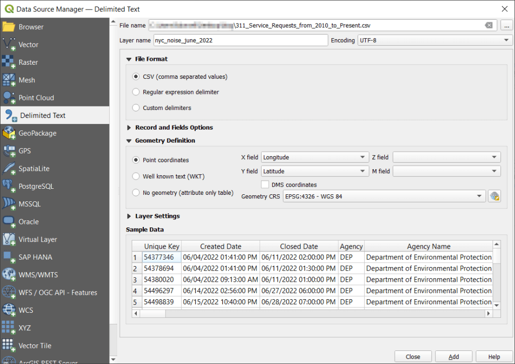
With the CSV, I launched QGIS, went to the Data Source Manager, and selected Delimited Text. Browsed for the file I downloaded, gave the layer a common sense name, and under geometry specified Point coordinates, and confirmed that the X field was my longitude column and the Y field was latitude. Ran the tool, and the points were plotted in the basic WGS 84 longitude / latitude system in degrees, which is the system the coordinates in the data file were in (generally a safe bet for modern coordinate data, but not always the case).

QGIS Add Delimited Text and Plot Coordinates

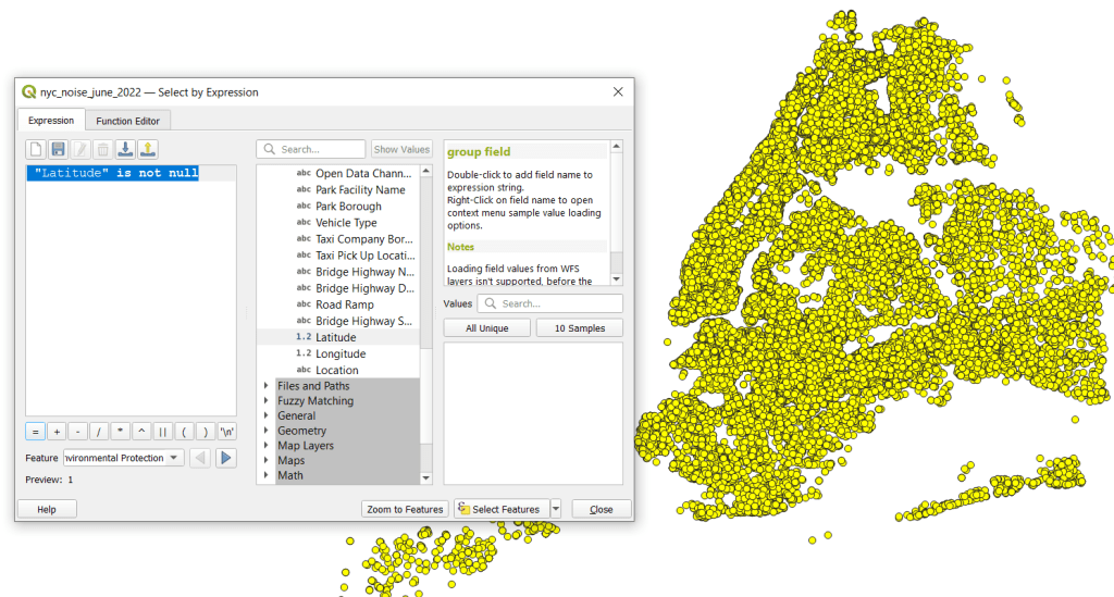
The next step was to save these plotted points in a file format that stores geometry and allows us to do spatial analysis. In doing that step, I recommend taking two additional ones. First, verify that all of the plotted data have coordinates – if there are any records where lat and long are missing, those records will be carried along into the spatial file but there will be no geometry for them, which will cause problems. I used the Select Features by Expression tool, and in the expression window typed “Latitude” is not null to select all the features that have coordinates.

QGIS Select by Expression

Second, transform the coordinate reference system (CRS) of the layer to a projected system that uses meters or feet. When we run the kernel tool, it will ask us to specify a radius for defining the density, as well as the size of the pixels for the output raster. Using degrees doesn’t make sense, as it’s hard for us to conceptualize distances in degrees, and they are not a constant unit of measurement. If you’ve googled around and read Stack Exchange posts or watched videos where a person says “You just have to experiment and adjust these numbers until your map looks Ok”, they were working with units in fractions of degrees. This is not smart. Transform the system of your layers!

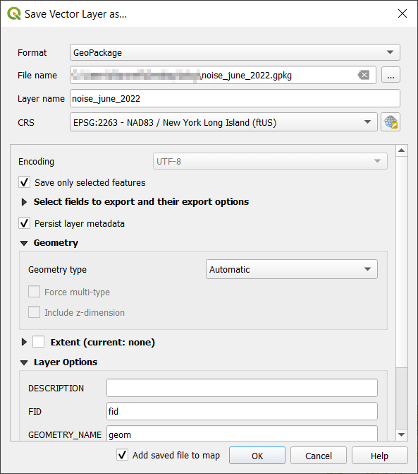
I selected the layer, right clicked, Export, Save Selected Features As. The default output is a geopackage, which is fine. Otherwise you could select ESRI shapefile, both are vector formats that store geometry. For file name I browse … and save the file in a specific folder. Beside CRS I hit the globe button, and in the CRS Selector window typed NAD83 Long Island in the filter at the top, and at the bottom I selected the NAD83 / New York Long Island (ftUS) EPSG 2263 option system in the list. Every state in the US has one or more state plane zones that you can select for making optimal maps for that area, in feet or meters. Throughout the world, you could choose an appropriate UTM zone that covers your area in meters. For countries or continents, look for an equidistant projection (meters again).

QGIS Export – Save As

Clicked a series of Oks to create the new file. To reset my map window to match CRS of the new file, I selected that file, right clicked, Layer CRS, Set Project CRS from Layer. Removed my original CSV to avoid confusion, and saved my project.

QGIS Noise Complaints in Projected CRS

Kernel Density Estimation

Now our data is ready. Under the Processing menu I opened the toolbox and searched for kernel to find Heatmap (Kernel Density Estimation) under the Interpolation tools. The tool asks for an input point layer, and then a radius. The radius is used to define an area for calculating a local density estimate around each point. We can use a formula to determine an ideal radius; the hopt method seems to be commonly employed for this purpose.

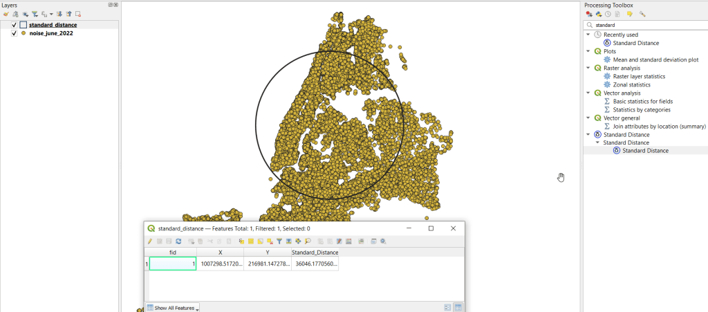
To use the hopt formula, we need to know the standard distance for our layer, which measures the degree to which features are dispersed around the spatial mean or center of the distribution. A nice 3rd party plugin was created for calculating this. I went to the the plugins menu, searched for the Standard Distance plugin, and added it. Searched for it in the Processing toolbox and launched it. I provided my point layer for input, and specified an output file. The other fields are optional (if we were measuring an attribute of the points instead of the density of the points, we could specify the attribute as a weight column). The output layer consists of a circle where the center is the mean center of the distribution, and the circle represents the standard deviation. The attribute table contains one record, with the standard distance attribute of 36,046.18 feet (if no feature was created, the likely problem is you have records in the point file that don’t have geometry – delete them and try again).

Output from the Standard Distance Plugin

Knowing this, I used the hopt formula:

=((2/(3N))^0.25)SD

Where N is the number of features and SD is the standard distance. I used Excel to plug in these values and do the calculation.

((2/(374526))^0.25)36046.18 = 1971.33

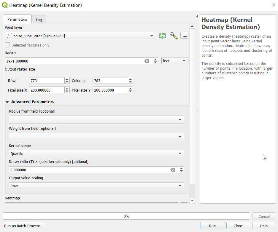
Finally, I launched the heatmap kernel tool, specified my noise points as input, and the radius as 1,971 feet. The output raster size does take some experimentation. The larger the pixel size, the coarser or more general the resolution will be. You want to choose something that makes sense based on the size of the area, the number of points, and / or some other contextual information. Just like the radius, the units are based on the map units of your layer. If I type in 100 feet for Pixel X, I see I’ll have a raster with 1,545 rows and 1,565 columns. Change it to 200 feet, and I get 773 by 783. I’ll go with 200 feet (the distance between a “standard” numbered street block in midtown Manhattan). I kept the defaults for the other options.

QGIS Heatmap Kernel Density Estimation Window

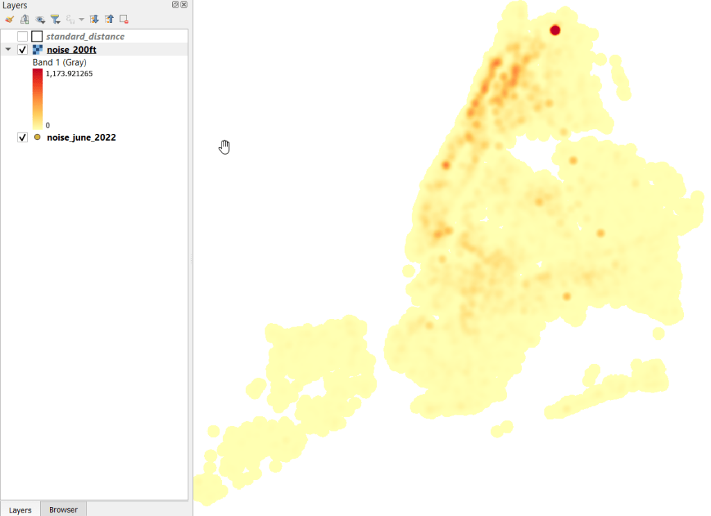
The resulting raster was initially displayed in black and white. I opened the properties and symbology menu and changed the render type from Singleband gray to Singleband pseudocolor, and kept the default yellow to red scheme. Voila!

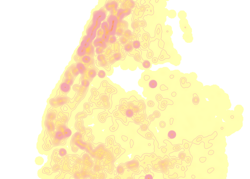
Kernel Density Estimate of NYC Noise Complaints June 2022

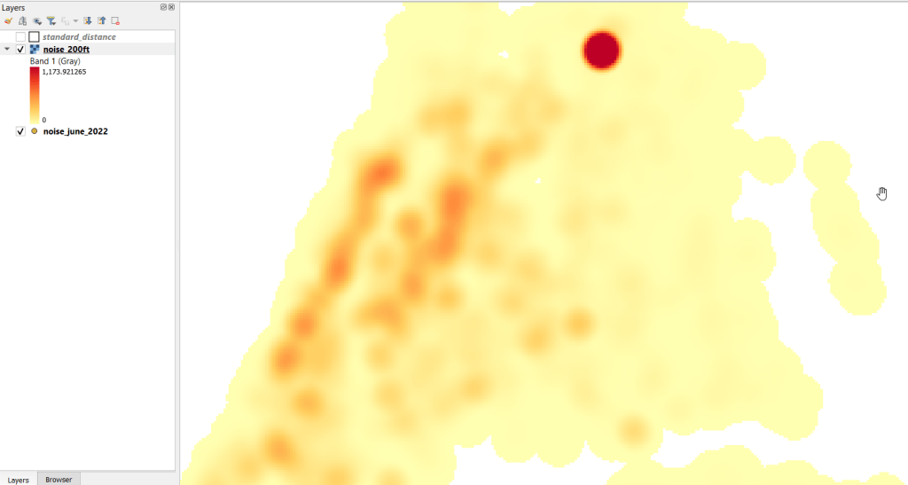
In June 2022 there were high clusters of noise complaints in north central Brooklyn, northern Manhattan, and the southwest portion of the Bronx. There’s a giant red hot spot in the north central Bronx that looks like the storm on planet Jupiter. What on earth is going on there? I flipped back to the noise point layer and selected points in that area, and discovered a single address where over 2,700 noise complaints about a loud party were filed on June 18 and 19! There’s also an address on the adjacent block that registered over 900 complaints. And yet the records do not appear to be duplicates, as they have different time stamps and closing dates. A mistake in coding this address, multiple times? A vengeful person spamming the 311 system? Or just one helluva loud party? It’s hard to say, but beware of garbage in, garbage out. Beyond this demo, I would spend more time investigating, would try omitting these complaints as outliers and run the heatmap tool again, and compare this output to different months. It’s also worth experimenting with the color classification scheme, and some different pixel sizes.

Kernel Results Zoomed In

Contour Lines

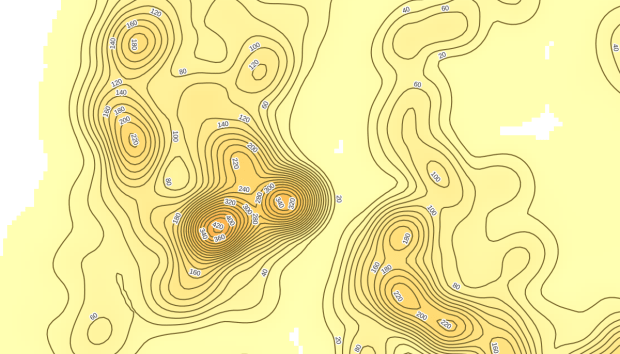
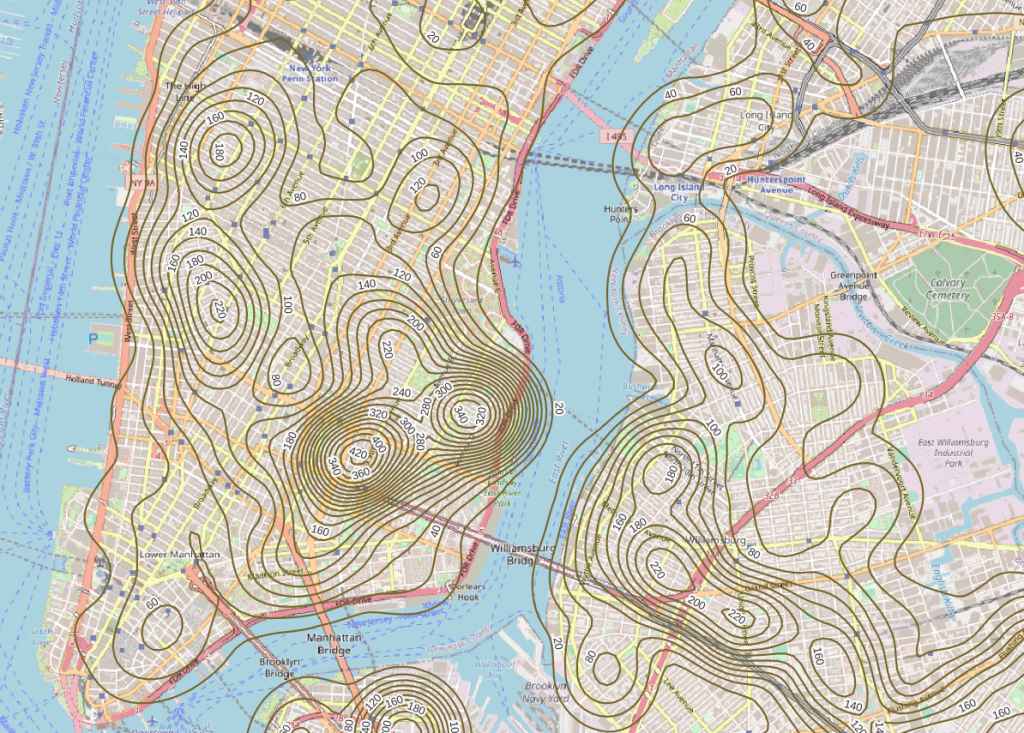
Another interesting way to visualize this data would be to generate contour lines based on the kernel output. I did a search for contour in the processing toolbox, and in the contour tool I provided the kernel noise raster as the input. For intervals between contour lines I tried 20 feet, and changed the attribute name to reflect what the contour represents: COMPLAINT instead of ELEV. Generated the new file, overlaid on top of the kernel, and now you can see how it represents the “elevation” of complaints.

Noise Complaint Kernel Density with Contour Lines

Switch the kernel off, symbolize the contours and add some labels, and throw the OpenStreetMap underneath, and now you can explore New York’s hills and valleys of noise. Or more precisely, the hills and valleys of noise complainers! In looking at these contours, it’s important to remember that they’re generated from the kernel raster’s grid cells and not from the original point layer. The raster is a generalization of the point layer, so it’s possible that if you look within the center of some of the denser circles you may not find, say, 340 or 420 actual point complaints. To generate a more precise set of contours, you would need to decrease the pixel size in the kernel tool (from say 200 feet to 100).

Noise Complaint Contours in Lower Manhattan, Northwest Brooklyn, and Long Island City

It’s interesting what you can create with just one set of points as input. Happy mapping!

Census Tracts

Call for Proposals: Celebrating the Census in the Journal of Maps

I’m serving as a co-editor for a special issue for the Journal of Maps entitled “Celebrating the Census“. The Journal of Maps is an open access, peer reviewed journal published by the Taylor & Francis Group. The journal is distinct in that all articles feature maps and spatial diagrams as the focal point for studying geographic phenomena from both a physical / environmental and social science perspective.

Here’s the official synopsis for this census-themed special issue:

We invite contributions to a special issue of the Journal of Maps focused upon the evolving character and cartographic opportunities offered by traditional census statistics and the impact of transitioning from these sources of population data at a range of spatial scales into a new era of big data assembly. In so doing, the special issue marks two important events taking place in the UK during 2021 in the history of British Censuses and seeks contributions that reflect the past transition of population data cartography through the digital era of the last 50 years and anticipates its transformation into the big data era of the foreseeable future.

While the issue marks the 100th anniversary of the UK census, submissions concerning census mapping from around the world are welcome and encouraged in these topic areas, including but not limited to:

  • Spatial and statistical consistency over time
  • People on the move
  • Mapping people through space and time
  • Mapping morbidity and mortality
  • Politics and population data
  • International comparison of demographic mapping
  • Before and after population mapping using censuses and administrative sources
  • Population data and mapping human-environmental interaction
  • Transition and evolution in population mapping

Visit the special issue announcement for full details. Deadlines:

  • April 30, 2021: a short draft (500-word limit) outlining themes and scope of the paper, preferably with a sample map
  • June 14, 2021: abstracts will be selected by the editorial team by this date
  • Sept 5, 2021: completed paper (4000-word limit) is due

The issue will be published sometime in 2022.

NYC and NYMA Pop Change Graph 2000 to 2019

New York’s Population and Migration Trends in the 2010s

The Weissman Center for International Business at Baruch College just published my paper, “New York’s Population and Migration Trends in the 2010s“, as part of their Occasional Paper Series. In the paper I study population trends over the last ten years for both New York City (NYC) and the greater New York Metropolitan Area (NYMA) using annual population estimates from the Census Bureau (vintage 2019), county to county migration data (2011-2018) from the IRS SOI, and the American Community Survey (2014-2018). I compare NYC to the nine counties that are home to the largest cities in the US (cities with population greater than 1 million) and the NYMA to the 13 largest metro areas (population over 4 million) to provide some context. I conclude with a brief discussion of the potential impact of COVID-19 on both the 2020 census count and future population growth. Most of the analysis was conducted using Python and Pandas in Jupyter Notebooks available on my GitHub. I discussed my method for creating rank change grids, which appear in the paper’s appendix and illustrate how the sources and destinations for migrants change each year, in my previous post.

Terminology

  • Natural increase: the difference between births and deaths
  • Domestic migration: moves between two points within the United States
  • Foreign migration: moves between the United States and a US territory or foreign country
  • Net migration: the difference between in-migration and out-migration (measured separately for domestic and foreign)
  • NYC: the five counties / boroughs that comprise New York City
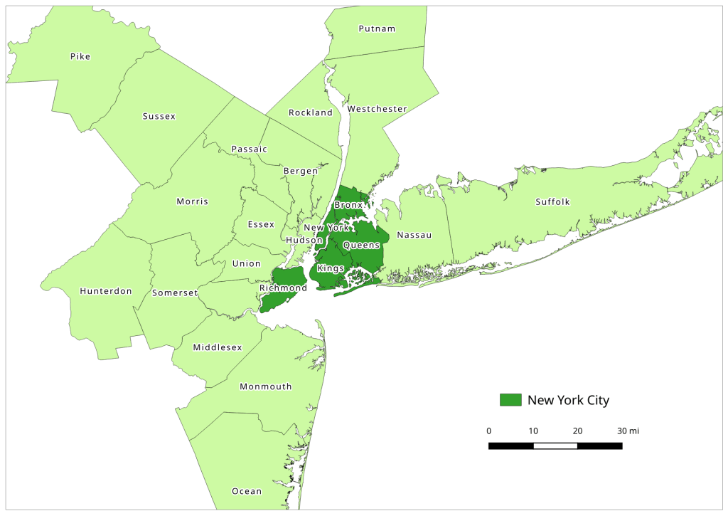
  • NYMA: the New York Metropolitan Area as defined by the Office of Management and Budget in Sept 2018, consists of 10 counties in NY State (including the 5 NYC counties), 12 in New Jersey, and one in Pennsylvania
Map of the New York Metropolitan Area
The New York-Newark-Jersey City, NY-NJ-PA Metropolitan Area

Highlights

  • Population growth in both NYC and the NYMA was driven by positive net foreign migration and natural increase, which offset negative net domestic migration.
  • Population growth for both NYC and the NYMA was strong over the first half of the decade, but population growth slowed as domestic out-migration increased from 2011 to 2017.
  • NYC and the NYMA began experiencing population loss from 2017 forward, as both foreign migration and natural increase began to decelerate. Declines in foreign migration are part of a national trend; between 2016 and 2019 net foreign migration for the US fell by 43% (from 1.05 million to 595 thousand).
  • The city and metro’s experience fit within national trends. Most of the top counties in the US that are home to the largest cities and many of the largest metropolitan areas experienced slower population growth over the decade. In addition to NYC, three counties: Cook (Chicago), Los Angeles, and Santa Clara (San Jose) experienced actual population loss towards the decade’s end. The New York, Los Angeles, and Chicago metro areas also had declining populations by the latter half of the decade.
  • Most of NYC’s domestic out-migrants moved to suburban counties within the NYMA (representing 38% of outflows and 44% of net out-migration), and to Los Angeles County, Philadelphia County, and counties in Florida. Out-migrants from the NYMA moved to other large metros across the country, as well as smaller, neighboring metros like Poughkeepsie NY, Fairfield CT, and Trenton NJ. Metro Miami and Philadelphia were the largest sources of both in-migrants and out-migrants.
  • NYC and the NYMA lack any significant relationships with other counties and metro areas where they are net receivers of domestic migrants, receiving more migrants from those places than they send to those places.
  • NYC and the NYMA are similar to the cities and metros of Los Angeles and Chicago, in that they rely on high levels foreign migration and natural increase to offset high levels of negative domestic migration, and have few substantive relationships where they are net receivers of domestic migrants. Academic research suggests that the absolute largest cities and metros behave this way; attracting both low and high skilled foreign migrants while redistributing middle and working class domestic migrants to suburban areas and smaller metros. This pattern of positive foreign migration offsetting negative domestic migration has characterized population trends in NYC for many decades.
  • During the 2010s, most of the City and Metro’s foreign migrants came from Latin America and Asia. Compared to the US as a whole, NYC and the NYMA have slightly higher levels of Latin American and European migrants and slightly lower levels of Asian and African migrants.
  • Given the Census Bureau’s usual residency concept and the overlap in the onset the of COVID-19 pandemic lock down with the 2020 Census, in theory the pandemic should not alter how most New Yorkers identify their usual residence as of April 1, 2020. In practice, the pandemic has been highly disruptive to the census-taking process, which raises the risk of an under count.
  • The impact of COVID-19 on future domestic migration is difficult to gauge. Many of the pandemic destinations cited in recent cell phone (NYT and WSJ) and mail forwarding (NYT) studies mirror the destinations that New Yorkers have moved to between 2011 and 2018. Foreign migration will undoubtedly decline in the immediate future given pandemic disruptions, border closures, and restrictive immigration policies. The number of COVID-19 deaths will certainly push down natural increase for 2020.