population

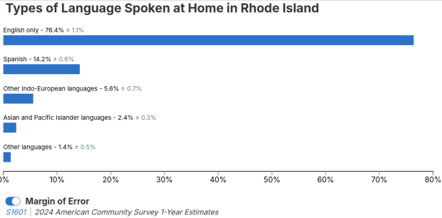
Language Spoken in Rhode Island Chart

Selected Population Profiles: Census Data for Ethnic Groups

I visit courses to guest lecture on census data every semester, and one of the primary topics is immigrant or ethnic communities in the US. There are many different variables in the Census Bureau’s American Community Survey (ACS) that can be used to study different groups: Race, Hispanic or Latino Origin, Ancestry, Place of Birth, and Residency. Each category captures different aspects of identity, and many of these variables are cross-tabulated with others such as citizenship status, education, language, and income. It can be challenging to pull statistics together on ethnic groups, given the different questions the data are drawn from, and the varying degrees of what’s available for one group versus another.

But you learn something new every day. This week, while helping a student I stumbled across summary table S0201, which is the Selected Population Profile table. It is designed to provide summary overviews of specific race, Hispanic origin, ancestry, and place of birth subgroups. It’s published as part of the 1-year ACS, for large geographic areas that have at least 500,000 people (states, metropolitan areas, large counties, big cities), and where the size of the specific population group is at least 65,000. The table includes a broad selection of social, economic, and demographic statistics for each particular group.

We discovered these tables by typing in the name of a group (Cuban, Nigerian, or Polish for example) in the search box for data.census.gov. Table S0201 appeared at the top of the table results, and clicking on it opened the summary table for the group for the entire US for the most recent 1-year dataset (2024 at the time I’m writing this). The name of the group appears in the header row of the table. Clicking on the dataset name and year in the grey box at the top of the table allows you to select previous years.
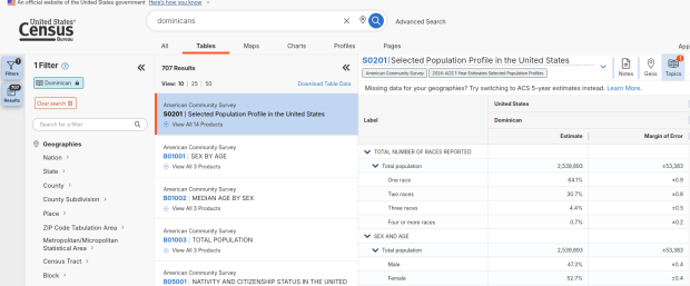
Dominican Population in the US
Selected Population Profile for Dominicans in the US

Using the Filters on the left, you can narrow the data down to a specific geography and year. You may get no results if either the geographic area or the ethnic or racial group is too small. Besides table S0201, additional detailed tables appear for a few, isolated years (the most recent being 2021).
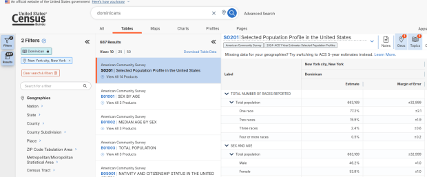
Dominican Population in NYC
Selected Population Profile for Dominicans in NYC

A more formal approach, which is better for seeing and understanding the full set of possibilities for ethnic groups and their data availability:

  1. At data.census.gov, search for S0201, and select that table. You’ll get the totals for the entire US.
  2. Using the filters on the left, choose Race and Ethnicity – then a racial or ethnic group – then a detailed race or group – then specific categories until you reach a final menu. This gives you the US-wide table for that group (if available).
  3. Alternatively – you could choose Populations and People – Ancestry instead of Race to filter for certain groups. See my explanation below.
  4. Use the filters again to select a specific geographic area (if available) and years.

With either approach, once you have your table, click the More Tools button (…) and download the data. Alternatively, like all of the ACS tables S0201 can be accessed via the Census Bureau’s API.
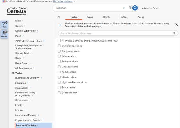
Filter by Race and Detailed Group
Filter Menu for Race and Ethnicity – Detailed Options

Where does this data come from? It can be generated from several questions on the ACS survey: Hispanic and Race (respectively, with respondents self-identifying a category), Place of Birth (specifically captures first-generation immigrants), and Ancestry (an open ended question about who your ancestors were).

The documentation I found provided just a cursory overview. I discovered additional information that describes recent changes in the race and ancestry questions. Persons identifying as Native American, Asian, or Pacific Islander as a race, or as Hispanic as an ethnicity, have long been able to check or write in a specific ethnic, national, or tribal group (Chinese, Japanese, Cuban, Mexican, Samoan, Apache, etc). People who identified as Black or White did not have this option until the 2020 census, and it looks like the ACS is now catching up with this. This page links to a document that provides an overview of the overlap between race and ancestry in different ACS tables.

The final paragraph in that document describes table S0201, which I’ll quote here in full:

Table S0201 is iterated by both race and ancestry groups. Group names containing the words “alone” or “alone or in any combination” are based on race data, while group names without “alone” or “alone or in any combination” are based on ancestry data. For example, “German alone or in any combination” refers to people who reported one or more responses to the race question such as only German or German and Austrian. “German” (without any further text in the group name) refers to people who reported German in response to the ancestry question.

For example, when I used my first approach and simply searched for Nigerians as a group, the name appeared in the 2024 ACS table simply as Nigerian. This indicates that the data was drawn from the ancestry question. I was also able to flip back to earlier years. But in my second approach, when I searched for the table by its ID number and subsequently chose a racial group, the name appeared as Nigerian (Nigeria) alone, which means the data came from the race table. I couldn’t flip back to earlier periods, as Nigerian wasn’t captured in the race question prior to 2024.

Consider the screenshot below to evaluate the differences. Nigerian alone indicates people who chose just one race (Black) and wrote in Nigerian under their race. Nigerian alone or in any combination indicates any person who wrote Nigerian as a race, could be Black and Nigerian, or Black and White and Nigerian, etc. Finally, Nigerian refers to the ancestry question, where people are asked to identify who their ancestors are, regardless of whether they or their parents have a direct connection to the given place where that group originates.
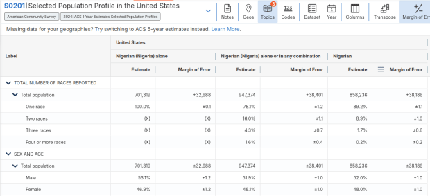
Comparison of Nigerian categories in S0201
Comparison of Race alone, Race Alone or in Combination, and Ancestry for Nigerians

Here’s where it gets confusing. If you search for the S0201 table first, and then try filtering by ancestry, the only options that appear are for ethnic or national groups that would traditionally be considered as Black or White within a US context. Places in Europe, Africa, the Middle East, and Central Asia, as well as parts of the world that were initially colonized by these populations (the non-Spanish Caribbean, Australia, Canada, etc). Options for Asians (south, southeast, and east Asia), Pacific Islanders, Native Americans, and any person who identifies as Hispanic or Latino do not appear as ancestry options, as the data for these groups is pulled from elsewhere. So when I tried searching for Chinese, Chinese alone appears in the table, as this data is drawn from the race table. When I searched for Dominican, the term Dominican appears in the table… Hispanic or Latino is not a race, but a separate ethnic category, and Dominican may identify a person of any race who also identifies as Hispanic. This data comes from the Hispanic / Latino origin table.

My interpretation is that data for Table S0201 is drawn from:

  1. The ancestry table (prior to 2024), and either the race or ancestry table (from 2024 forward), for any group that is Black or White within the US context.
  2. The race table for any group that is Asian, Pacific Islander, or Native American (although for smaller groups, ancestry may have been used prior to 2022 or 2023).
  3. The Hispanic / Latino origin table for any group that is of Hispanic ethnicity, regardless of their race.
  4. Place of birth isn’t used for defining groups, but appears as a set of variables within the table so you can identify how many people in the group are first-generation immigrants who were born abroad.

That’s my best guess, based on the available documentation and my interpretation of the estimates as they appear for different groups in this table. I did some traditional web searching, and then also tried asking ChatGPT. After pressing it to answer my question rather than just returning links to the Census Bureau’s standard documentation, it did provide a detailed explanation for the table’s sources. But when I prompted it to provide me with links to documentation from which its explanation was sourced, it froze and did nothing. So much for AI.

Despite this complexity, the Selected Population Profile tables are incredibly useful for obtaining summary statistics for different ethnic groups, and was perfect for the introductory sociology class I visited that was studying immigration and ancestry. Just bear in mind that the availability of S0201 is limited by size of the geographic area as a whole, and the size of the group within that area.
Census Bureau Website Shutdown

Alternative Sources for US Census Data

Just when we thought the US government couldn’t possibly become more dysfunctional, it shut down completely on Sept 30, 2025. Government websites are not being updated, and many have gone offline. I’ve had trouble accessing data.census.gov; access has been intermittent, and sometimes it has worked with some web browsers but not with others.

In this post I’ll summarize some solid, alternative portals for accessing US census data. I’ve sorted the free resources from the simplest and most basic to the most exhaustive and complex, and I mention a couple of commercial sources at the end. These are websites; the Census Bureau’s API is still working (for now), so if you are using scripts that access its API or use R packages like tidycensus you should still be in business.

Free and Public

Census Reporter
https://censusreporter.org/
Focus: the latest American Community Survey (ACS) data

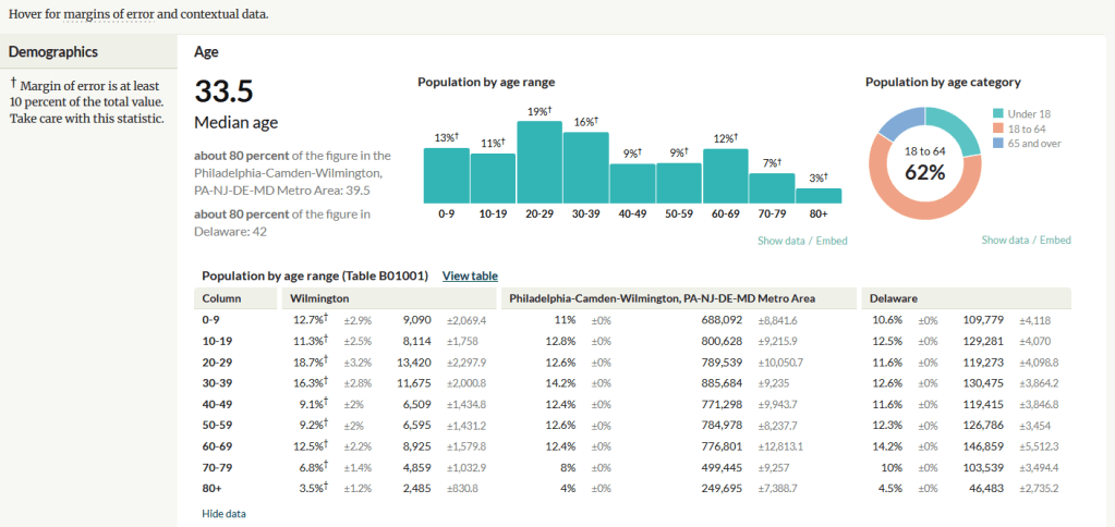
A non-profit project originally created by journalists, the Census Reporter provides just the most recent ACS data, making it easy to access the latest statistics. Search for a place to get a broad profile with interactive summaries and charts, or search for a topic to download specific tables that include records for all geographies of a particular type, within a specific place. There are also basic mapping capabilities.

Census Reporter Showing ACS Data for Wilmington, DE

Missouri Census Data Center Profiles and Trends
https://mcdc.missouri.edu/
Focus: data from the ACS and decennial profile tables for the entire US

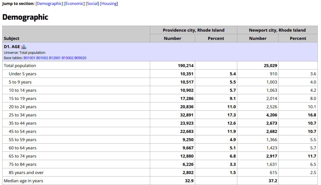
The Census Bureau publishes four profile tables for the ACS and one for the decennial census that are designed to capture a wide selection of variables that are of broad interest to most researchers. The MCDC makes these readily available through a simple interface where you select the time period, summary level, and up to four places to compare in one table, which you can download as a spreadsheet. There are also several handy charts, and separate applications for studying short term trends. Access the apps from the menu on the right-hand side of the page.

Missouri Census Data Center ACS Profiles Showing Data for Providence and Newport, RI

State and Local Government Data Pages
Focus: extracts and applications for that particular area

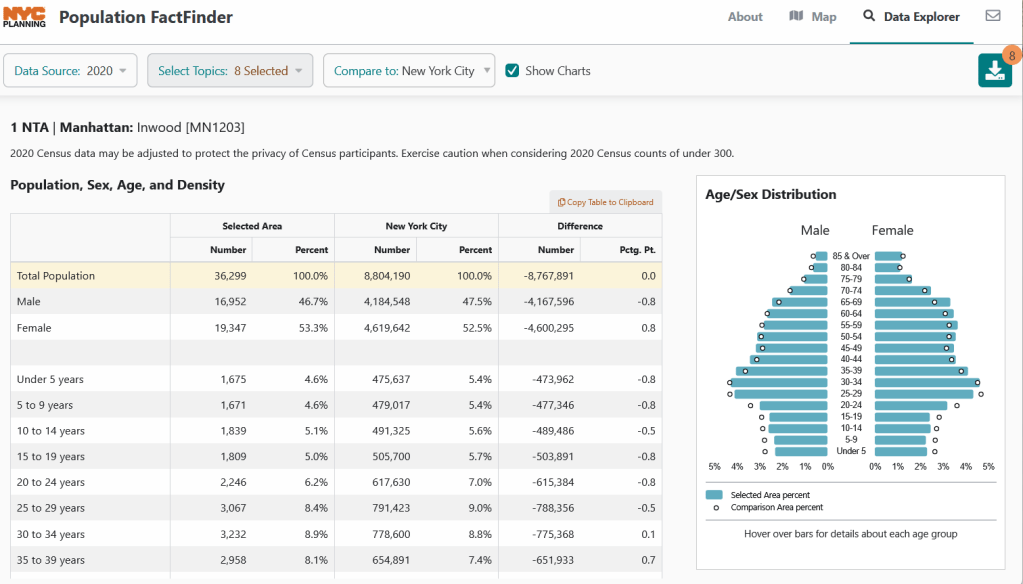
Hundreds of state, regional, county, and municipal governments create extracts of census data and republish them on their websites, to provide local residents with accessible summaries for their jurisdictions. In most cases these are in spreadsheets or reports, but some places have rich applications, and may recompile census data for geographies of local interest such as neighborhoods. Search for pages for planning agencies, economic development orgs, and open data portals. New York City is a noteworthy example; not only do they provide detailed spreadsheets, they also have the excellent map-based Population FactFinder application. Fairfax County, VA provides spreadsheets, reports, an interactive map, and spreadsheet tools and macros that facilitate working with ACS data.

NYC Population Factfinder Showing ACS Data for Inwood in Northern Manhattan

IPUMS NHGIS
https://www.nhgis.org/
Focus: all contemporary and historic tables and GIS boundary files for the ACS and decennial census

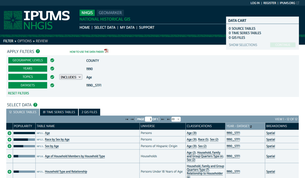
If you need access to everything, this is the place to go. The National Historic Geographic Information System uses an interface similar to the old American Factfinder (or the Advanced Search for data.census.gov). Choose your dataset, survey, year, topic, and geographies, and access all the tables as they were originally published. There is also a limited selection of historical comparison tables (which I’ve written about previously). Given the volume of data, the emphasis is on selecting and downloading the tables; you can see variable definitions, but you can’t preview the statistics. This is also your best option to download GIS boundary files, past and present. You must register to use NHGIS, but accounts are free and the data is available for non-commercial purposes. For users who prefer scripting, there is an API.

IPUMS NHGIS Filtered to Show County Data on Age from the 1990 Census

MCDC Uexplore / Dexter
https://mcdc.missouri.edu/applications/uexplore.html
Focus: create targeted extracts of ACS data and the decennial census back to 1980

Unlike other applications where you download data that’s prepackaged in tables, Uexplore allows you to create targeted, customized extracts where you can pick and choose variables from multiple tables. While the interface looks daunting at first, it’s not bad once you get the hang of it, and it offers tremendous flexibility and ample documentation to get you started. This is a good option for folks who want customized extracts, but are not coders or API users.

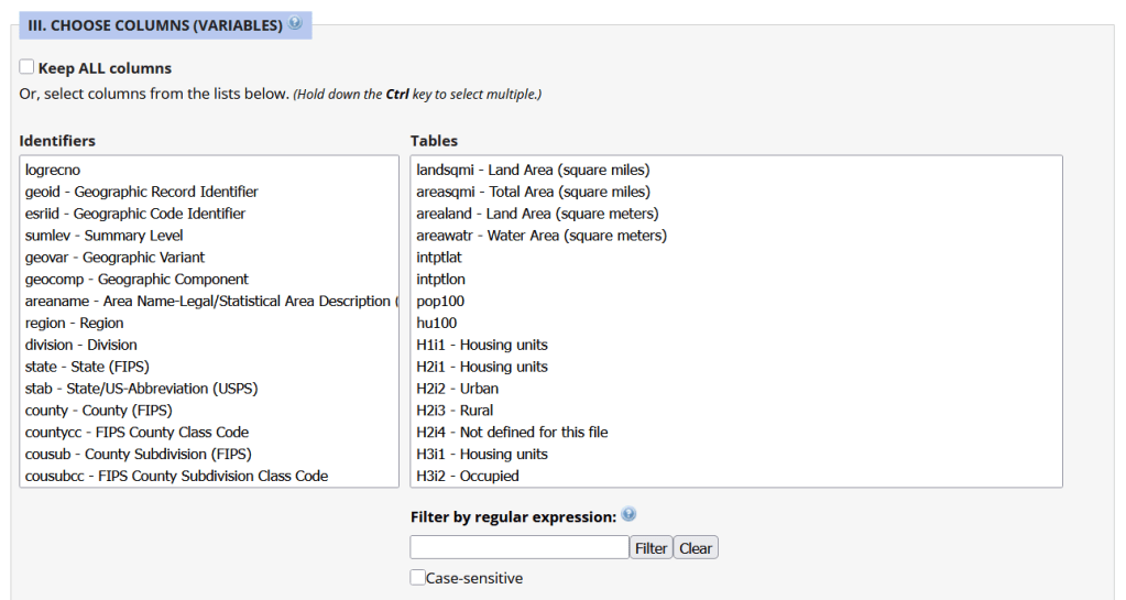
Portion of the Filter Interface for MCDC Uexplore / Dexter

Commercial Products

There are some commercial products that are quite good; they add value by bundling data together and utilizing interactive maps for exploration, visualization, and access. The upsides are they are feature rich and easy to use, while the downsides are they hide the fuzziness of ACS estimates by omitting margins of error (making it impossible to gauge reliability), and they require a subscription. Many academic libraries, as well as a few large public ones, do subscribe, so check the list of library databases at your institution to see if they subscribe (the links below take you to the product website, where you can view samples of the applications).


PolicyMap
https://www.policymap.com/
Focus: mapping contemporary census and US government data

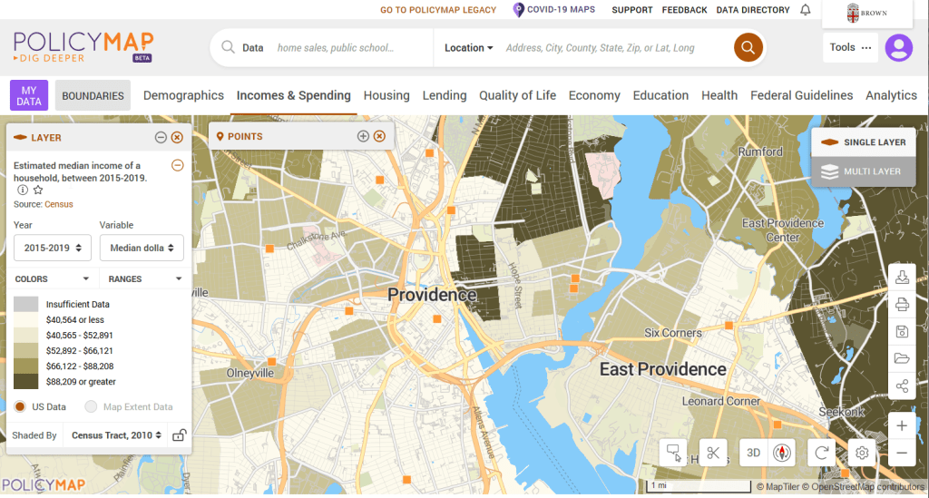
PolicyMap bundles 21st century census data, datasets from several government agencies, and a few proprietary series, and lets you easily create thematic maps. You can generate broad reports for areas or custom regions you define, and can download comparison tables by choosing a variable and selecting all geographies within a broader area. It also incorporates some basic analytical GIS functions, and enables you to upload your own coordinate point data.

PolicyMap Displaying ACS Income Data for Providence, RI

Social Explorer
https://www.socialexplorer.com/
Focus: mapping contemporary and historic US census data

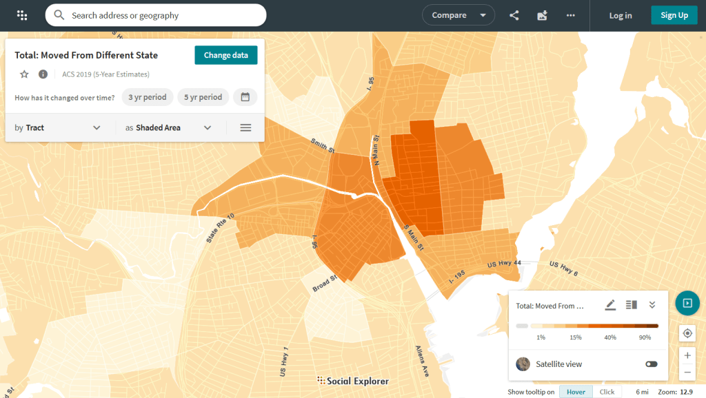
Social Explorer allows you to effortlessly create thematic maps of census data from 1790 to the present. You can create a single map, side by side maps for showing comparisons over time, and swipe maps to move back and forth from one period to the other to identify change. You can also compile data for customized regions and generate a variety of reports. There is a separate interface for downloading comparison tables. Beyond the US demographic module are a handful of modules for other datasets (election data for example), as well as census data for other countries, such as Canada and the UK.

Social Explorer Map Displaying ACS Migration Data for Providence, RI

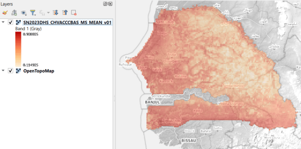
USAID raster of vaccinated children in Senegal

GIS Data Sources Spring Roundup

It’s been awhile since I’ve written a post that showcases different GIS datasets. So in this one, I’ll provide an overview of some free and open data sources that I’ve learned about and worked with this past spring semester. The topics in these series include: global land use and land cover, US heat and temperature, detailed population data for India, and public health in low and middle income countries.

GLAD Global Land Analysis and Discovery

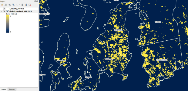
The GLAD lab at the Department of Geographical Sciences at the University of Maryland produces over a dozen GIS datasets related to global land use, land cover, and change in land surface over time. Last semester I had folks who were interested in looking at recent global change in cropland and forest. GLAD publishes rasters that include point-in-time coverage, period averages, and net change and loss over the period 2000 to 2020. Much of the data is generated from LANDSAT, and resolution varies from 30m to 3km. Other series include tropical forest cover and change, tree canopies, forest lost due to fires, a few non-global datasets that focus on specific regions, and LANDSAT imagery that’s been processed so it’s ready for LULC analysis.

Most of the sets have been divided up into tiles and segmented based on what they’re depicting (change in crops, forest, etc). The download process is basic point and click, and for larger sets they provide a list of tifs in a text file so you can automate downloading by writing a basic script. Alternatively, they also publish datasets via Google Earth Engine.

GLAD cropland in Rhode Island
GLAD Cropland Extent in 2019 in QGIS, Zoomed in to Optimal Resolution in SE Rhode Island

US Heat Severity Index

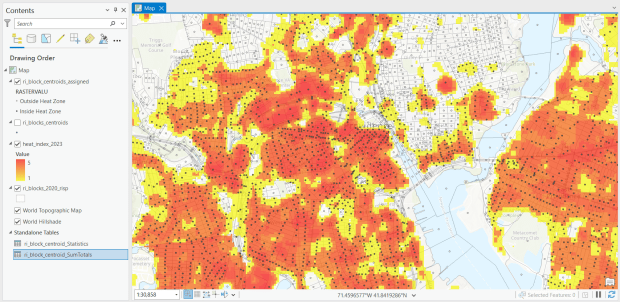
For the past few years, the Trust for Public Land has published an annual heat severity index. This layer represents the relative heat severity for 30m pixels for every city in the United States; depicting where areas of cities are hotter than the average temperature for that same city as a whole (i.e. the surface temperature for each pixel relative to the general air temperature reading for the entire city). Severity is measured on a scale of 1 to 5, with 1 being a relatively mild and 5 being severe heat. The index is generated from a Heat Anomalies raster which they also provide; it contains the relative degrees Fahrenheit difference between any given pixel and the mean heat value for the city in which the pixel is located. Both datasets are generated from 30-meter Landsat 8 imagery, band 10 (ground-level thermal sensor) from summertime images.

The dataset is published as an ArcGIS image service. The easiest way to access it is by to adding it from the Living Atlas to ArcGIS Pro (or Online), and then export the service from there as a raster feature class (while doing so, you can also clip the layer to a smaller area of interest). It’s possible that you can also connect to it as an ArcGIS REST Server in QGIS, but I haven’t tried. While there are files that go back to 2019, the methodology has changed over time, so studying this as a national, annual time series is not appropriate. The coverage area expanded from just large, incorporated cities in earlier years to the entire US in recent years.

US Heat Index in Rhode Island
US Heat Severity Index 2023 in ArcGIS Pro, Providence and Adjacent Areas with Census Blocks

SHRUG – India

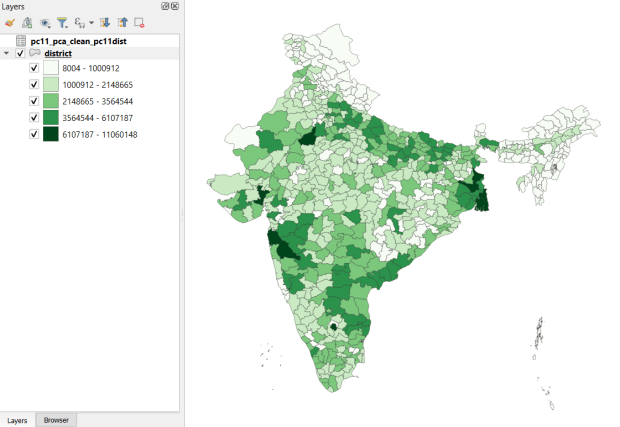
Created and hosted by the Development Data Lab (a collaborative project created by academic researchers from several universities), the Socioeconomic High-resolution Rural-Urban Geographic Platform for India (SHRUG) is an open access repository consisting of datasets for India’s medium to small geographies (districts, subdistricts, constituencies, towns, and villages), linked together with a set of common geographic IDs. Getting geographically detailed census data for India is challenging as you have to purchase it through 3rd party vendors, and comparing data across time is tough given the complex sets of administrative subdivisions and constant revisions to geographic identifiers. SHRUG makes it easy and open source, providing boundaries from the 2011 census and a unique ID that links geographies together and across time, back to 1991. In addition to the census, there are also environmental and election datasets.

Polygon boundaries can be downloaded as shapefiles or geopackages, and tabular data is available in CSV and DTA (STATA) formats. Researchers can also contribute data created from their own research to the repository.

SHRUG India District Data
SHRUG India Districts Total Population Data from 2011 Census in QGIS

USAID Spatial Data and Population Indicators

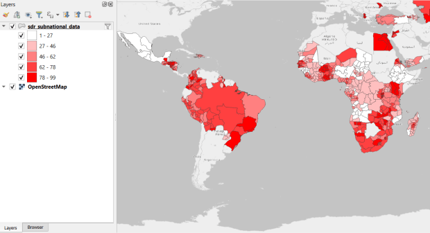
USAID published the detailed Demographic and Health Surveys (DHS) as far back as the mid 1980s for many of the world’s low and middle income countries. The surveys captured information about fertility, family planning, maternal and child health, gender, HIV/AIDS, literacy, malaria, nutrition, and sanitation. A selection of different countries were surveyed each year, and for most countries data was captured at two or three different points in time over a 40 year period. While researchers had to submit proposals and request access to the microdata (individual person and household level responses), the agency generated population-level estimates for countries and country subdivisions that were readily downloadable. They also generated rasters that interpolated certain variables across the surface of a country (the header image for this post is a raster of Senegal in 2023, illustrating the percentage of children aged 12-36 months who are vaccinated for eight fundamental diseases, including measles and polio). The rasters, boundary files, and a selection of survey indicators pre-joined to country and subdivision boundaries were published in their Spatial Data Repository. You could access the full range of population indicators as tables from a point and click website, or alternatively via API.

I’m writing in the past tense, as USAID has been decimated and de-funded by DOGE. There is currently no way to request access to the microdata. The summary data is still available on the USAID website (via links in the previous paragraph), but who knows for how long. As part of the Data Rescue Project, I captured both the Spatial Data Repository and the Indicators data, and posted them on DataLumos, an archive of archived federal government datasets. You can download these datasets in bulk from DataLumos, from the links under the title for this section. Unfortunately this series is now an archive of data that will be frozen in time, with no updates expected. The loss of these surveys is not only detrimental to researchers and policymakers, but to millions of the world’s most vulnerable people, whose health and well-being were secured and improved thanks to the information this data provided.

USAID Spatial Indicators Data
USAID Country Subdivisions in QGIS where Recent Data is Available on % Children who are Vaccinated

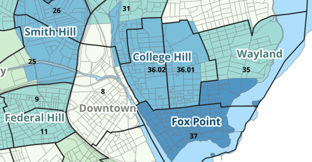
Providence Census Geography Map

Crosswalking Census Data to Neighborhood Geographies

Last semester we completed a project to create a crosswalk between census geographies and local geographies in Providence, RI. Crosswalks are used for relating two disparate sets of geography, so that you can compile data that’s published for one set of geography in another. Many cities have locally-defined jurisdictions like wards or community districts, as well as informally defined areas like neighborhoods. When you’re working with US Census data, you use small statistical areas that the Bureau defines and publishes data for; blocks, block groups, census tracts, and perhaps ZCTAs and PUMAs. A crosswalk allows you to apportion data that’s published for census areas, to create estimates for local areas (there are also crosswalks that are used for relating census geography that changes over time, such as the IPUMS crosswalks).

How the Crosswalk Works

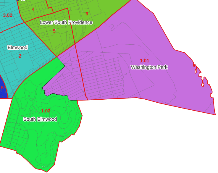
For example, in the Providence Census Geography Crosswalk we have two crosswalks that allow you to take census tract data, and convert it to either neighborhoods or wards. I’ll refer to the neighborhoods in this post. In the crosswalk table, there is one record for each portion of a tract that overlaps a neighborhood. For each record, there are attribute columns that indicate the count and the percentage of a tract’s population, housing units, land area, and total area that fall within a given neighborhood. If a tract appears just once in the table, that means it is located entirely within one neighborhood. In the image below, we see that tract 1.01 appears in the table once, and its population percentage is 1. That means that it falls entirely within the Washington Park neighborhood, and 100% of its population is in that neighborhood. In contrast, tract 1.02 appears in the table twice, which means it’s split between two neighborhoods. Its pct_pop column indicates that 31.5% of its population is in South Elmwood, while 68.5% is in Washington Park. The population count represents the number of people from that tract that are in that neighborhood.

Looking at the map below, we can see that census tract 1.01 falls entirely within Washington Park, and tract 1.02 is split between Washington Park and South Elmwood. To generate estimates for Washington Park, we would sum data for tract 1.01 and the portion of tract 1.02 that falls within it. Estimates for South Elmwood would be based solely on the portion of tract 1.02 that falls within it. With the crosswalk, “portion” can be defined as the percentage of the tract’s population, housing units, land area, or total area that falls within a neighborhood.

The primary purpose of the crosswalk is to generate census data estimates for neighborhoods. You apportion tract data to neighborhoods using an allocation factor (population, housing units, or area) and aggregate the result. For example, if we have a census tract table from the 2020 census with the population that’s 65 years and older, we can use the crosswalk to generate neighborhood-level estimates of the 65+ population. To do that, we would:

  1. Join the data table to the crosswalk using the tract’s unique ID; the crosswalk has both the long and short form of the GEOIDs used by the Census Bureau. So for each crosswalk record, we would associate the 65+ population for the entire tract with it.
  2. Multiply the 65+ population by one of the allocation columns – the percent population in this example. This would give us an estimate of the 65+ population that live in that tract / neighborhood piece.
  3. Group or aggregate this product by the neighborhood name, to obtain a neighborhood-level table of the 65+ population.
  4. Round decimals to whole numbers.

To do the calculations in a spreadsheet, you would import the appropriate crosswalk sheet into the workbook that contains the census data that you want to apportion, so that they appear as separate sheets in the same workbook. In the crosswalk worksheet, use the VLOOKUP formula and reference the GEOID to “join” the census tract data to the crosswalk. The formula requires: cell containing the ID value you wish to look up, the range of cells in a worksheet that you will search through, the number of the column that contains the value you wish to retrieve (column A is 1, Z is 26, etc.), and the parameter “FALSE” to get an exact match. It is assumed that the look up value in the target table (the matching ID) appears in the first column (A).

The tract data is now repeated for each tract / neighborhood segment. Next, use formulas to multiply the allocation percentage (pct_pop in this example) by the census data value (over 65 pop for the entire tract) to create an allocated estimate for each tract / neighborhood piece.

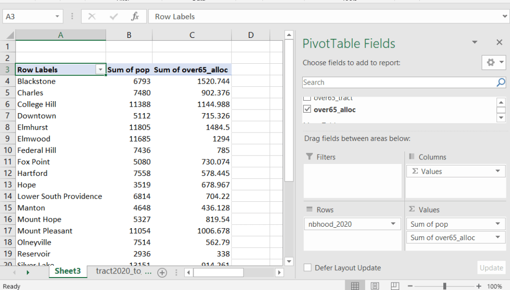
Then you can generate a pivot table (on the Insert ribbon in Excel) where you group and sum that allocated result by neighborhood (neighborhoods as rows, census data as summed values in columns). Final step is to round the estimates.

This process is okay for small projects where you have a few estimates you want to quickly tabulate, but it doesn’t scale well. I’d use a relational database instead; import the crosswalk and census data table into SQLite, where you can easily do a left join, calculated field, and then a group by statement. Or, use the joining / calculating / aggregating equivalents in Python or R.

I used the percentage of population as the allocation factor in this example. If the census data you’re apportioning pertains to housing units, you could use the housing units percentage instead. In any case, there is an implicit assumption that the data you are apportioning has the same distribution as the allocation factor. In reality this may not be true; the distribution of children, seniors, homeowners, people in poverty etc. may vary from the total population’s distribution. It’s important to bear in mind that you’re creating an estimate. If you are apportioning American Community Survey data this process gets more complicated, as the ACS statistics are fuzzy estimates. You’d also need to apportion the margin of error (MOE) and create a new MOE for the neighborhood-level estimates.

The Providence crosswalk has some additional sheets that allow you to go from tracts, ZCTAs, or blocks to neighborhoods or wards. The tract crosswalk is by far the most useful. The ZCTA crosswalk was an exercise in futility; I created it to demonstrate the complete lack of correlation between ZCTAs and the other geographies, and recommend against using it (we also produced a series of maps to visually demonstrate the relationship between all the geographies). There is a limited amount of data published at the block level, but I included it in the crosswalk for another reason…

Creating the Crosswalk

I used census blocks to create the crosswalk. They are the smallest unit of census geography, and nest within all other census geographies. I used GIS to assign each block to a neighborhood or ward based on the geography the block fell within, and then aggregated the blocks into distinct tract / ward and tract / neighborhood combinations. Then I calculated the allocation factors, the percentage of the tract’s total attributes that fell in a particular neighborhood or ward. This operation was straightforward for the wards; the city constructed them using 2020 census blocks, so the blocks nested or fit perfectly within the wards.

The neighborhoods were more complicated, as these were older boundaries that didn’t correspond to the 2020 blocks, and there were many instances where blocks were split between neighborhoods. My approach was to create a new set of neighborhood boundaries based on the 2020 blocks, and then use those new boundaries to create the crosswalk. I began with a spatial join, assigning each block a neighborhood ID based on where the center of the block fell. Then, I manually inspected the borders between each neighborhood, to determine whether I should manually re-assign a block. In almost all instances, blocks I reassigned were unpopulated and consisted of slivers that contained large highways, or blocks of greenspace or water. I struck a balance between remaining as faithful to the original boundaries as possible, while avoiding the separation of unpopulated blocks from a tract IF the rest of the blocks in that tract fell entirely within one neighborhood. In two cases where I had to assign a populated block, I used satellite imagery to determine that the population of the block lived entirely on one side of a neighborhood boundary, and made the assignment accordingly.

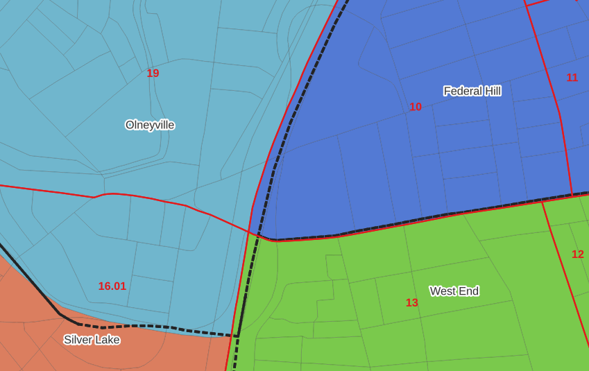
In the example below, 2020 tract boundaries are shown in red, 2020 block boundaries are light grey, original neighborhood boundaries are shown with dotted black lines, and reconstituted neighborhoods using 2020 blocks are shown in different colors. The boundaries of Federal Hill and the West End are shifted west, to incorporate thin unpopulated blocks that contain expressways. These empty blocks are part of tracts (10 and 13) that fall entirely within these neighborhoods; so splitting them off to adjacent Olneyville and Silver Lake didn’t make sense (as there would be no population or homes to apportion). Reassigning them doesn’t change the fact that the true boundary between these neighborhoods is still the expressway. We also see an example between Olneyville and Silver Lake where the old neighborhood boundary was just poorly aligned, and in this case blocks are assigned based on where the center of the block fell.

Creating the crosswalk from the ground up with blocks was the best approach for accounting how population is distributed within larger areas. It was primarily an aggregation-based approach, where I could sum blocks that fell within geographies. This approach allowed me to generate allocation factors for population and housing units, since this data was published with the blocks and could be carried along.

Conversely, in GIS 101 you would learn how to calculate the percentage of an area that falls within another area. You could use that approach to create a tract-level crosswalk based on area, i.e. if a tract’s area is split 50/50 between two neighborhoods, we’ll apportion its population 50/50. While this top down approach is simpler to implement, it’s far less ideal because you often can’t assume that population and area are equally distributed. Reconsider the example we began with: 31.5% of tract 1.02’s population is in South Elmwood, while 68.5% is in Washington Park. In contrast, 75.3% of tract 1.02’s land area is in South Elmwood, versus only 24.7% in Washington Park! If we apportioned our census data by area instead of population, we’d get a dramatically different, and less accurate, result. Roger Williams Park is primarily located in the portion of tract 1.02 that falls within Elmwood; it covers a lot of land but includes zero people.
Why can’t we just simply aggregate block-level census data to neighborhoods and skip the whole apportionment step? The answer is that there isn’t much data published at the block level. There’s a small set of tables that capture basic demographic variables as part of the decennial census, and that’s it. There was a sharp reduction in the number of block-level tables in the 2020 census due to new privacy regulations, and the ACS isn’t published at the block-level at all. While you can use the block-level table in the crosswalk to join and aggregate block data, in most cases you’ll need to work with tract-data and apportion it.

I used spatial SQL to create the crosswalks in Spatialite and QGIS , and if you’re interested in seeing all the gory details you can look at the code and spatial database in source folder of the project’s GitHub repo. I always prefer SQL for spatial join and aggregation operations, as I can write a single block of code instead of running 4 or 5 different of desktop GIS tools in a sequence. I’ll be updating the project this semester to include additional geographies (block groups – the level between blocks and tracts), and perhaps an introductory tutorial for using it (there are some basic docs at present).

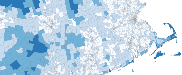
Map Vacant Housing Units

Census Time Series Tables from NHGIS

I’m often asked about what the best approaches are for comparing US census data over time, to account for changes in census geography and to limit the amount of data processing you have to do in stitching data from different census years together. Census geography changes significantly each decade, and by and large the Census Bureau does not compile and publish historical comparison tables.

My primary suggestion is to use the National Historical Geographic Information System or NHGIS (I’ll mention some additional suggestions at the end of this post). Maintained by IPUMS at the University of Minnesota, NHGIS is the repository for all historic US census summary data from 1790 to present. While most of the data in the archive is published nominally (the format and structure in which the data was originally published), they do publish a set of Time Series Tables that compile multiple years of census data in one table. These tables come in two formats:

  • Nominal tables: the data is published “as is”, based on the boundaries that existed at each point in time. If a geography was added or dropped over the course of the years, it falls in or out of the table in the given year that the change occurred. With a few exceptions, the earliest nominal tables begin with the 1970 census and are published for eight geographies: nation, regions, divisions, states, counties, census tracts, county subdivisions, and places.
  • Standardized tables: the data has been normalized, where a geography for a single time period serves as the basis for all data in the table. The NHGIS is currently using 2010 as the basis, so that data prior and subsequent to 2010 has been modified to fit within the 2010 boundaries. This is achieved by aggregating block or block group data from each period to fit within the 2010 boundaries, and apportioning the data in cases where a block or group is split by a boundary. The earliest standardized tables begin with the 1990 census, and cover the basic 100% count data. Data is published for ten geographies: states, counties, census tracts, block groups, county subdivisions, places, congressional districts (as defined for the 110th-112th Congresses, 2007-2013), core based statistical areas (using 2009 metro area definitions), urban areas, and ZIP Code Tabulation Areas (ZCTAs).

Included in the documentation is a full list of time series tables, and whether they are available in nominal or standardized format. The availability of specific time periods and geographies varies. As of late 2024, the availability of standardized tables that include the 2020 census is currently limited to what was published in the early Public Redistricting Files. This will likely change in the near future to include additional 2020 data, and it’s possible that the standardized geography will eventually switch from 2010 to 2020 geography.

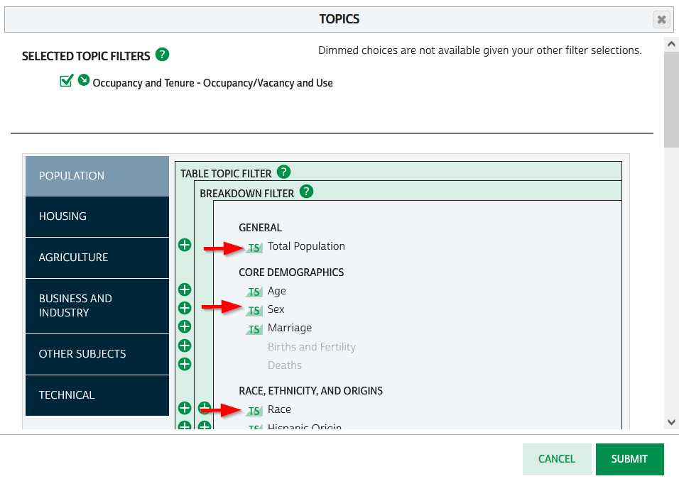
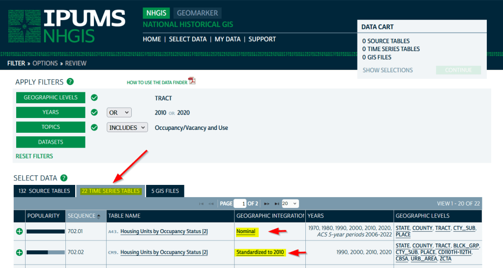
To access the Time Series Tables, you can browse the NHGIS without an account but you’ll need to create one in order to download anything. Once you launch NHGIS click on the Topics filter. In the list of topics, any topic under the Population or Housing category that has a “TS” flag next to it has at least one time series table. In the example below, I’ve used the filters to select census tracts for Geographic Level, 2010 and 2020 for Years, and HousingOccupancy and Vacancy status as my Topic.

NHGIS Time Series flags in topics filter

In the results at the bottom, the original Source Tables from each census are shown in the first tab. The Time Series Tables can be viewed by selecting the adjacent tab. The first two tables in this example are Housing Units by Occupancy Status. Clicking on the name of the tables reveals the variables that are included, and the source for the statistics. The first table is a nominal one that stretches from 1970 to the most recent ACS. The second table is a standardized one that covers 1990 to 2020. I’ve checked both boxes to add these to my cart.

NHGIS Select Time Series Tables

The third tab in the results are GIS Files. If we want to map standardized data, we would choose just the boundaries for the standardized year, as all of the data in the table has been modified to fit these boundaries. If we were mapping nominal data, we would need to download boundary files for each time period and map them separately (unless they were stable geographies like states that haven’t changed since 1970).

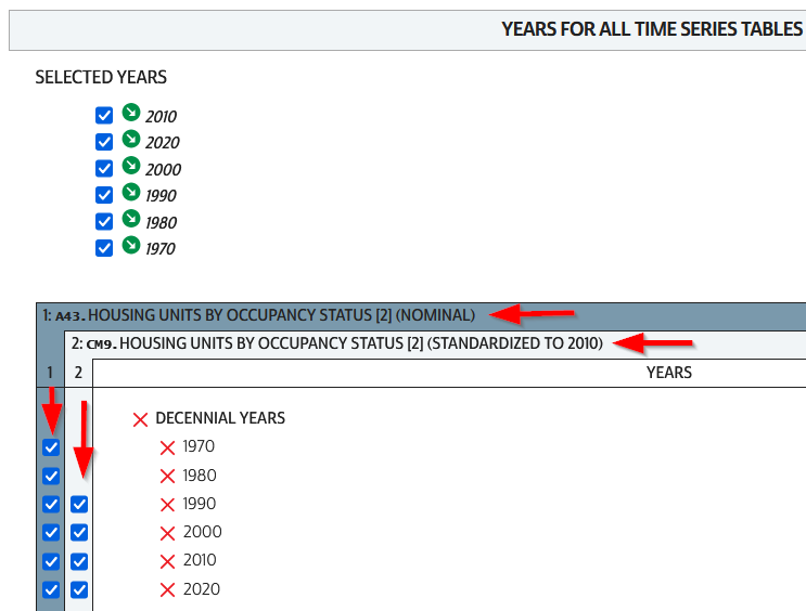
We hit the Continue button in the Cart panel when we’re ready to download. By default the extract will only include years and geographies we have filtered for. To add additional years or geos we can add them on this next screen. I’ve modified my list to get all available decennial years for each table. Note that if you’re going to select 5-year ACS data for nominal tables, choose only a few non-overlapping periods. In most cases you can’t filter geographies (i.e. select tracts within a state), you have to take them all. On the final screen you choose your structure; CSV is usually best, as is Time varies by column. Once you submit your request you’ll be prompted to log in if you haven’t already done so. Wait a bit for the extract to compile, then you can download the table and codebook.

NHGIS Select Years for Time Series

A portion of the nominal table is depicted below. This table includes identifiers and labels for each of the census years. The variables follow, ordered by variable and then by year. In this example, occupied housing units from 1970 to 2020 appear in the first block, and vacant units in the second. All the 1970 census tract values for Autauga County, Alabama are blank (as many rural counties in 1970 were un-tracted). We can see that values for census tract 205 run only from 1980 to 2010, with no value for 2020. The tract was split into three parts in 2020, and we see values for tracts 205.01, .02, and .03 appear in 2020. So in the nominal tables, geographies appear and disappear as they are created or destroyed. However, if geographic boundaries change but the name and designation for the geography do not, that geography persists throughout the time series in spite of the change.

Nominal tract table

A portion of the standardized table is below. This table only includes identifiers and labels for the 2010 census, as all data was modified to fit the tract geography of that year. The values for each census year except 2010 are published in triplicate: an estimate, and a lower and upper bound for the estimate. If the values in these three columns differ, it indicates that a block (or block group) was split and reapportioned to fit within the tract boundary for 2010 (you may also see decimals, indicating a split occurred). You’d use the estimate in your work, while the bounds provide some indication of the estimate’s accuracy. Note in this table, tract 205 in Autauga County persists from 1990 to 2020, as it existed in 2010. Data from the three 2020 tracts was aggregated to fit the 2010 boundary.

Standardized tract table

The crosswalk tables that IPUMS used to create the standardized data are available, if you wanted or needed to generate your own normalized data. The best approach is to proceed from the bottom up, aggregating blocks to reformulate the data to the geography you wish to use. Some decennial census data, and all data from the ACS, is not available at the block level, which necessitates using block groups instead.

There are some alternatives for obtaining or creating time series census data, which could fit the bill depending on your use case (esp if you are looking at larger geographies). There’s also reference material that can help you make sense of changes.

  1. The Longitudinal Tract Database at Brown University provides tract-level crosswalks from 1970 to 2020. They also provide some pre-compiled data tables generated from the crosswalk.
  2. For short term comparisons, the ACS includes Comparison Profile Tables for states, counties, places, and metro areas that compare two non-overlapping time periods. For example, here is the 5-year ACS Comparative Demographic Estimates profile for Providence RI in 2022 (compares 2018-2022 with 2013-2017).
  3. Use an interactive mapping tool like the Social Explorer to make side by side comparison maps from two time periods. They also incorporate some of the NHGIS standardized data into their database. (SE is a subscription-based product; if you’re at a university see if your library subscribes).
  4. The Population and Housing Unit Estimates program publishes annual estimates for states, counties, and metro areas in decade by decade spreadsheets. The MCDC has created some easy to use tools for summarizing and charting this data to show annual population change and changes in demographic characteristics.
  5. I had previously written about pulling population and economic time series tables for states, counties, and metro areas from the Bureau of Economic Analysis data portal.
  6. Counties change more often than you think. The Census Bureau has a running list of changes to counties from 1970 to present. Metro areas change frequently too, but since they are built from counties you can aggregate older county data to fit modern metro boundaries. The census provides delineation files that assign counties to metros.

Comparing ACS Estimates Over Time: Are They Really Different?

I often get questions about comparing American Community Survey (ACS) estimates from the US Census Bureau over time. This process is more complicated than you’d think, as the ACS wasn’t designed as a time series dataset. The Census Bureau does publish comparative profile tables that compare two period estimates (in data.census.gov), but for a limited number of geographies (states, counties, metro areas).

For me, this question often takes the form of comparing change at the census tract-level for mapping and GIS projects. In this post, we’ll look at the primary considerations for comparing estimates over time, and I will walk through an example with spreadsheet formulas for calculating: change and percent change (estimates and margins of error), coefficients of variation, and tests for statistical difference. We’ll conclude with examples of mapping this data.

Primary considerations

  1. The ACS is published in 1-year and 5-year period estimates. 1-year estimates are only available for areas that have at least 65,000 people, which means if you’re looking at small geographies (census tracts, ZCTAs) or rural areas that have small populations (most counties, county subdivisions, places) you will need to use the 5-year series. When comparing 5-year estimates, you should only compare non-overlapping time periods. For example, you would not compare the 2021 ACS (2017-2021) with the 2020 ACS (2016-2020) as these estimates have four years of sample data in common. In contrast, 2021 and 2016 (2012-2016) could be compared as they do not overlap…
  2. …but, census geography changes over time. All statistical areas (block groups, tracts, ZCTAs, PUMAs, census designated-places, etc.) are updated every ten years with each decennial census. Areas can be re-numbered, aggregated, subdivided, or modified as populations change. This complicates comparisons; 2021 data uses geography created in 2020, while 2016 data uses geography from 2010. The only non-overlapping ACS periods with identical geographic areas would be 2014 (2010-2014) and 2019 (2015-2019). The only other alternative would be to use normalized census data, which involves additional work. While most legal areas (states, counties) can change at any time, they are generally more stable and you can make comparisons over a longer-period with modest adjustments.
  3. All ACS estimates are fuzzy, representing a midpoint within a possible range of values (indicated with a margin of error) at a 90% confidence level. Because of sampling variability, any difference that you see between one time period and the next could be noise and not actual change. If you’re working with small geographies or small population groups, you’ll encounter large margins of error and it will be difficult to measure actual change. In addition, it’s often difficult to detect change in any area that isn’t experiencing either substantive growth or decline.

ACS Formulas

Let’s look at an example where we’ll use formulas to: calculate change over time, measure the reliability of a difference estimate, and determine whether two estimates are significantly different. I downloaded table B25064 Median Gross Rent (dollars) from the 5-year 2014 (2010-2014) and 2019 (2015-2019) ACS for all census tracts in Providence County, RI, and stitched them together into one spreadsheet. In this post I’ve replaced the cell references with an abbreviated label that indicates what should be referenced (i.e. Est1_MOE is the margin of error for the first estimate). You can download a copy of the spreadsheet with these examples.

  1. To calculate the change / difference for an estimate, subtract one from the other.
  2. To calculate the margin of error for this difference, take the square root of the sum of the squares for each estimate’s margin of error (MOE):
=ROUND(SQRT((Est1_MOE^2)+(Est2_MOE^2)),0)
Spreadsheet with ACS formula to compute margin of error for change / difference
  1. To calculate percent change, divide the difference by the earliest estimate (Est1), and multiply by 100.
  2. To calculate the margin of error for the percent change, use the ACS formula for computing a ratio:
=ROUND(((SQRT(Est2_MOE^2+((Est2/Est1)^2*Est1_MOE^2)))/Est1)100,1)

Divide the 2nd estimate by the 1st and square it, multiply that by the square of the 1st estimate’s MOE, add that to the square of the 2nd estimate’s MOE. Take the square root of that result, then divide by the 1st estimate and multiply by 100. Note that this is formula for percent change is different from the one used for calculating a percent total (the latter uses the formula for a proportion; switch the plus symbol under the square root to a minus for percent totals).

Spreadsheet with ACS formula to compute margin of error for percent change / difference
  1. To characterize the overall accuracy of the new difference estimate, calculate its coefficient of variation (CV):
=ROUND(ABS((Est_MOE/1.645)/Est)*100,0)

Divide the MOE for the difference by 1.645, which is the Z-value for a 90% confidence interval. Divide that by the difference itself, and multiply by 100. Since we can have positive or negative change, we take the absolute value of the result.

Spreadsheet with ACS formula to compute coefficient of variation
  1. To convert the CV into the generally recognized reliability categories:
=IF(CV<=12,"high",IF(CV>=35,"low","medium"))

If the CV value is between 0 to 12, then it’s considered to be highly reliable, else if the CV value is greater than or equal to 35 it’s considered to be of low reliability, else it is considered to be of medium reliability (between 13 and 34). Note: this is a conservative range; search around and you’ll find more liberal examples that use 0-15, 16-40, 41+.

  1. To measure whether two estimates are significantly different from each other, use the statistical difference formula:
=ROUND(ABS((Est2-Est1)/(SQRT((Est1_MOE/1.645)^2+(Est2_MOE/1.645)^2))),3)

Divide the MOE for both the 1st and 2nd estimate by 1.645 (Z value for 90% confidence), take the sum of their squares, and then square root. Subtract the 1st estimate from the 2nd, and then divide. Again in this case, since we could have a positive or negative value we take the absolute value.

Spreadsheet with ACS formula to compute significant difference
  1. To create a boolean significant or not value:
=IF(SigDif>1.645,1,0)

If the significant difference value is greater than 1.645, then the two estimates are significantly different from each other (TRUE 1), implying that some actual change occurred. Otherwise, the estimates are not significantly different (FALSE 0), which means any difference is likely the result of variability in the sample, or any true difference is hidden by this variability.

ALWAYS CHECK YOUR WORK! It’s easy to put parentheses in the wrong place or transpose a cell reference. Take one or two examples and plug them into Cornell PAD’s ACS Calculator, or into Fairfax County VA’s ACS Tools (spreadsheets with formulas – bottom of page). The Census Bureau also provides a spreadsheet that lets you test multiple values for significant difference. Caveat: for the Cornell calculator use the ratio option instead of change when testing. For some reason its change formula never matches my results, but the Fairfax spreadsheets do. I’ve also checked my formulas against the Census Bureau’s ACS Handbooks, and they clearly say to use the ratio formula for percent change.

Interpreting Results

Let’s take a look at a few of the records to understand the results. In Census Tract 1.01, median gross rent increased from $958 (+/- 125) in 2014 to $1113 (+/- 73) in 2019, a change of $155 (+/- 145) and a percent change of 16.2% (+/- 17%). The CV for the change estimate was 57, indicating that this estimate has low reliability; the margin of error is almost equal to the estimate, and the change could have been as little as $10 or as great as $300! The rent estimates for 2014 and 2019 are statistically different but not by much (1.761, higher than 1.645). The margins of error for the two estimates do overlap slightly (with $1,083 being the highest possible value in 2014 and $1,040 the lowest possible value in 2019).

Spreadsheet comparing values for different census tracts

In Census Tract 4, rent increased from $863 (+/- 122) to $1003 (+/- 126), a change of $140 (+/- 175) and percent change of 16.2% (+/- 22%). The CV for the change estimate was 76, indicating very low reliability; indeed the MOE exceeds the value of the estimate. With a score of 1.313 the two estimates for 2014 / 2019 are not significantly different from each other, so any difference here is clouded by sample noise.

In Census Tract 9, rent increased from $875 (+/- 56) to $1083 (+/- 62), a change of $208 (+/- 84) or 23.8% (+/- 10.6%). Compared to the previous examples, these MOEs are much lower than the estimates, and the CV value for the difference is 25, indicating medium reliability. With a score of 4.095, these two estimates are significantly different from each other, indicating substantive change in rent in this tract. The highest possible value in 2014 was $931, and the lowest possible value in 2019 was $1021, so there is no overlap in the value ranges over time.

Mapping Significant Difference and CVs

I grabbed the Census Cartographic Boundary File for tracts for Rhode Island in 2019, and selected out just the tracts for Providence County. I made a copy of my worksheet where I saved the data as text and values in a separate sheet (removing the formulas and encoding the actual outputs), and joined this sheet to the shapefile using the AFFGEOID. The City of Providence and surrounding cities and suburban areas appear in the southeast corner of the county.

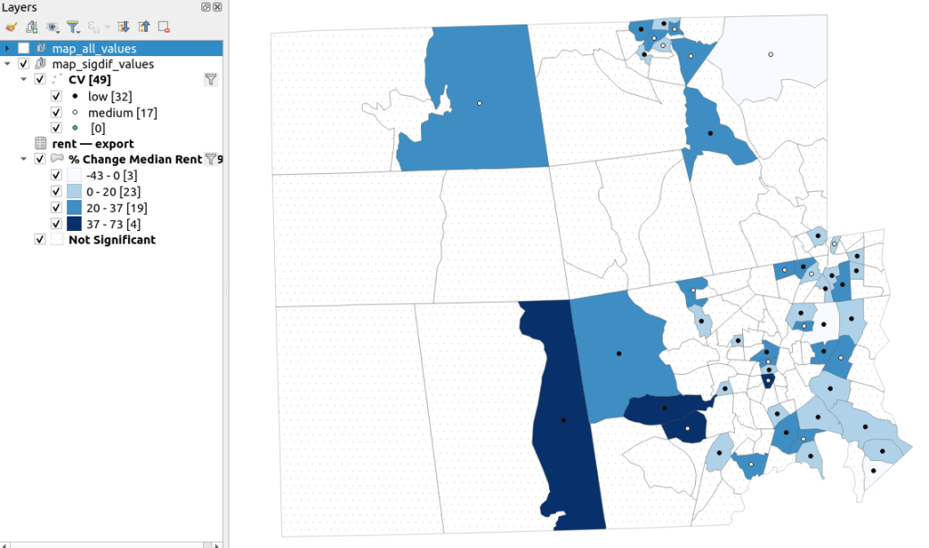
The map on the left displays simple percent change over time. In the map on the right, I applied a filter to select just tracts where change was significantly different (the non-significant tracts are symbolized with hash marks). In the screenshots, the count of the number of tracts in each class appears in brackets; I used natural breaks, then modified to place all negative values in the same class. Of the 141 tracts, only 49 had statistically different values. The first map is a gross misrepresentation, as change for most of the tracts can’t be distinguished from sampling variability.

Map of difference on left, significant difference on right
Percent Change in Median Gross Rent 2010-14 to 2015-19: Change on Left, Change Where Both Rent Estimates were Significantly Different on Right

A refined version of the map on the right appears below. In this one, I converted the tracts from polygons to points in a new layer, applied a filter to select significantly different tracts, and symbolized the points by their CV category. Of the 49 statistically different tracts, the actual estimate of change was of low reliability for 32 and medium reliability for the rest. So even if the difference is significant, the precision of most of these estimates is poor.

Providence County, Significant Difference in Median Rent Map
Percent Change in Median Gross Rent 2010-14 to 2015-19 with CV Values, for Tracts with Significantly Different Estimates, Providence County RI

Conclusion

Comparing change over time for ACS estimates is complex, time consuming, and yields many dubious results. What can you do? The size of the MOE relative to the estimate tends to decline as you look at either larger or more populous areas, or larger and fewer subcategories (i.e. 4 income brackets instead of 8). You could also look at two period estimates that are further apart, making it more likely that you’ll see changes; say 2005-2009 compared to 2016-2020. But – you’ll have to cope with normalizing the data. Places that are rapidly changing will exhibit more difference than places that aren’t. If you are studying basic demographics (age / sex / race / tenure) and not socio-economic indicators, use the decennial census instead, as that’s a count and not a sample survey. Ultimately, it’s important to address these issues, and be honest. There’s a lot of bad research where people ignore these considerations, and thus make faulty claims.

For more information, visit the Census Bureau’s page on Comparing ACS Data. Chapter 6 of my book Exploring the US Census covers the American Community Survey and has additional examples of these formulas. As luck would have it, it’s freely accessible as a preview chapter from my publisher, SAGE.

Final caveat: dollar values in the ACS are based on the release year of the period estimate, so 2010-2014 rent is in 2014 dollars, and 2015-2019 is in 2019 dollars. When comparing dollar values over time you should adjust for inflation; I skipped that here to keep the examples a bit simpler. Inflation in the 2010s was rather modest compared to the 2020s, but still could push tracts that had small changes in rent to none when accounted for.