Last month I cobbled together bits and pieces of geospatial Python code I’ve written in various scripts into one cohesive example. You can script, automate, and document a lot of GIS operations with Python, and if you use a combination of Pandas, GeoPandas, and Shapely you don’t even need to have desktop GIS software installed (packages like ArcPy and PyQGIS rely on their underlying base software).
I’ve created a GitHub repository that contains sample data, a basic Python script, and a Jupyter Notebook (same code and examples, in two different formats). The script covers these fundamental operations: reading shapefiles into a geodataframe, reading coordinate data into a dataframe and creating geometry, getting coordinate reference system (CRS) information and transforming the CRS of a geodataframe, generating line geometry from groups and sequences of points, measuring length, spatially joining polygons and points to assign the attributes of one to the other, plotting geodataframes to create a basic map, and exporting geodataframes out as shapefiles.
A Pandas dataframe is a Python structure for tabular data that allows you to store and manipulate data in rows and columns. Like a database, Pandas columns are assigned explicit data types (text, integers, decimals, dates, etc). A GeoPandas geodataframe adds a special geometry column for holding and manipulating coordinate data that’s encoded as point, line, or polygon objects (either single or multi). Similar to a spatial database, the geometry column is referenced with standard coordinate reference system definitions, and there are many different spatial functions that you can apply to the geometry. GeoPandas allows you to work with vector GIS datasets; there are wholly different third-party modules for working with rasters (Rasterio for instance – see this post for examples).
First, you’ll likely have to install the packages Pandas, GeoPandas, and Shapely with pip or your distro’s package handler. Then you can import them. The Shapely package is used for building geometry from other geometry. Matplotlib is used for plotting, but isn’t strictly necessary depending on how detailed you want your plots to be (you could simply use Panda’s own plot library).
import os, pandas as pd
import geopandas as gpd
from shapely.geometry import LineString
import matplotlib.pyplot as plt
%matplotlib inline
Reading a shapefile into a geodataframe is a piece of cake with read_file. We use path.join from the os module to build paths that work in any operating system. Reading in a polygon file of Rhode Island counties:
If you have coordinate data in a CSV file, there’s a two step process where you load the coordinates as numbers into a dataframe, and then convert the dataframe and coordinates into a geodataframe with actual point geometry. Pandas / GeoPandas makes assumptions about the column types when you read a CSV, but you have the option to explicitly define them. In this example I define the Census Bureau’s IDs as strings to avoid dropping leading zeros (an annoying and perennial problem). The points_from_xy function takes the longitude and latitude (in that order!) and creates the points; you also have to define what system the coordinates are presently in. This sample data came from the US Census Bureau, so they’re in NAD 83 (EPSG 4269) which is what most federal agencies use. For other modern coordinate data, WGS 84 (EPSG 4326) is usually a safe bet. GeoPandas relies on the EPSG / ESRI CRS library, and familiarity with these codes is a must for working with spatial data.
In the output below, you can see the distinction between the coordinates, stored separately in two numeric columns, and point-based geometry in the geometry column. The sample data consists of eleven point locations, ten in Rhode Island and one in Connecticut, labeled alfa through kilo. Each point is assigned to a group labeled a, b, or c.
You can obtain the CRS metadata for a geodataframe with this simple command:
gdf_cnty.crs
You can also get the bounding box for the geometry:
gdf_cnty.total_bounds
These commands are helpful for determining whether different geodataframes share the same CRS. If they don’t, you can transform the CRS of one to match the other. The geometry in the frames must share the same CRS if you want to interact with the data. In this example, we transform our points from NAD 83 to the RI State Plane zone that the counties are in with to_crs; the EPSG code is 3438.
gdf_pnts.to_crs(3438,inplace=True)
gdf_pnts.crs
If our points represent a sequence of events, we can do a points to lines operation to create paths. In this example our points are ordered in the correct sequence; if this was not the case, we’d sort the frame on a sequence column first. If there are different events or individuals in the table that have an identifying field, we use this as the group field to create distinct lines. We use lambda to repeat Shapely’s LineString function across the points to build the lines, and then assign them to a new geodataframe. Then we add a column where we compute the length of the lines; this RI CRS uses feet for units, so we divide by 5,280 feet to get miles. The Panda’s loc function grabs all the rows and a subset of the columns to display them on the screen (we could save them to a new geodataframe if we wanted to subset rows or columns).
To assign every point the attributes of the polygon (county) that it intersects with , we do a spatial join with the sjoin function. Here we take all attributes from the points frame, and a select number of columns from the polygon frame; we have to take the geometry from both frames to do the join. In this example we do a left join, keeping all the points on the left regardless of whether they have a matching polygon on the right. There’s one point that falls oustide of RI, so it will be assigned null values on the right. We rename a few of the columns, and use loc again to display a subset of them to the screen.
To see what’s going on, we can generate a basic plot to display the polygons, points, and lines. I used matplotlib to create a figure and axes, and then placed each layer one on top of the other. We could opt to simply use Pandas / GeoPandas internal plotting instead as illustrated in this tutorial, which works for basic plots. If we want more flexibility or need additional functions we can call on matplotlib. In this example the default placement for the tick marks (coordinates in the state plane system) was bad, and the only way I could fix them was by rotating the labels, which required matplotlib.
Exporting the results out a shapefiles is also pretty straightforward with to_file. Shapefiles come with many limitations, such as a limit on ten characters for column names. You can opt to export to a variety of other vector formats, such a geopackages or geoJSON.
I made my first foray into network routing recently, and drafted a python script and notebook that plots routes using the OpenRouteService (ORS) API. ORS is based on underlying data from the OpenStreetMap (OSM), and was created by the Heidelberg Institute for Geoinformation Technology, at Heidelberg University in Germany. They publish several routing APIs that include directions, isochrones, distance matricies, geocoding, and route optimization. You can access them via a basic REST API, but they also have a dedicated Python wrapper and an R package which makes things a bit easier. For non-programmers, there is a plugin for QGIS.
Regardless of which tool you use, you need to register for an API key first. The standard plan is free for small projects; for example you can make 2,000 direction requests per day with a limit of 40 per minute. If you’re affiliated with higher ed, government, or a non-profit and are doing non-commercial research, you can upgrade to a collaborative plan that ups the limits. It’s also possible to install OSR locally on your own server for large jobs.
I opted for Python and used the openrouteservice Python module, in conjunction with other geospatial modules including geopandas and shapely. In my script / notebook I read in two CSV files, one with origins and the other with destinations. At minimum both files must contain a header row, and attributes for unique identifier, place label, longitude, and latitude in the WGS 84 spatial reference system. The script plots a route between each origin and every destination, and outputs three shapefiles that include the origin points, destination points, and routes. Each line in the route file includes the ID and names of each origin and destination, as well as distance and travel time. The script and notebook are identical, except that the script plots the end result (points and lines) using geopanda’s plot function, while the Jupyter Notebook plots the results on a Folium map (Folium is a Python implementation of the popular Leaflet JS langauge).
After importing the modules, you define several variables that determine the output, including a general label for naming the output file (routename), and several parameters for the API including the mode of travel (driving, walking, cycling, etc), distance units (meters, kilometers, miles), and route preference (fastest or shortest). Next, you provide the positions or “column” locations of attributes in the origin and destination CSV files for the id, name, longitude, and latitude. Lastly, you specify the location of those input files and the file that contains your API key. The location and names of output files are generated automatically based on the input; all will contain today’s date stamp, and the route file name includes route mode and preference. I always use the os module’s path function to ensure the scripts are cross-platform.
import openrouteservice, os, csv, pandas as pd, geopandas as gpd
from shapely.geometry import shape
from openrouteservice.directions import directions
from openrouteservice import convert
from datetime import date
from time import sleep

# VARIABLES
# general description, used in output file
routename='scili_to_libs'
# transit modes: [“driving-car”, “driving-hgv”, “foot-walking”, “foot-hiking”, “cycling-regular”, “cycling-road”,”cycling-mountain”, “cycling-electric”,]
tmode='driving-car'
# distance units: [“m”, “km”, “mi”]
dunits='mi'
# route preference: [“fastest, “shortest”, “recommended”]
rpref='fastest'

# Column positions in csv files that contain: unique ID, name, longitude, latitude
# Origin file
ogn_id=0
ogn_name=1
ogn_long=2
ogn_lat=3
# Destination file
d_id=0
d_name=1
d_long=2
d_lat=3

# INPUTS and OUTPUTS
today=str(date.today()).replace('-','_')

keyfile='ors_key.txt'
origin_file=os.path.join('input','origins.csv') #CSV must have header row
dest_file=os.path.join('input','destinations.csv') #CSV must have header row
route_file=routename+'_'+tmode+'_'+rpref+'_'+today+'.shp'
out_file=os.path.join('output',route_file)
out_origin=os.path.join('output',os.path.basename(origin_file).split('.')[0]+'_'+today+'.shp')
out_dest=os.path.join('output',os.path.basename(dest_file).split('.')[0]+'_'+today+'.shp')
I define some general functions for reading the origin and destination files into nested lists, and for taking those lists and generating shapefiles out of them (by converting them to geopanda’s geodataframes). We read the origin and destination data in, grab the API key, set up a list to hold the routes, and create a header for the eventual output.
# For reading origin and dest files
def file_reader(infile,outlist):
    with open(infile,'r') as f:
        reader = csv.reader(f)
        for row in reader:
            rec = [i.strip() for i in row]
            outlist.append(rec)

# For converting origins and destinations to geodataframes
def coords_to_gdf(data_list,long,lat,export):
    """Provide: list of places that includes a header row,
    positions in list that have longitude and latitude, and
    path for output file.
    """
    df = pd.DataFrame(data_list[1:], columns=data_list[0])
    longcol=data_list[0][long]
    latcol=data_list[0][lat]
    gdf = gpd.GeoDataFrame(df, geometry=gpd.points_from_xy(df[longcol], df[latcol]), crs='EPSG:4326')
    gdf.to_file(export,index=True)
    print('Wrote shapefile',export,'\n')
    return(gdf)

origins=[]
dest=[]
file_reader(origin_file,origins)
file_reader(dest_file,dest)

# Read api key in from file
with open(keyfile) as key:
    api_key=key.read().strip()

route_count=0
route_list=[]
# Column header for route output file:
header=['ogn_id','ogn_name','dest_id','dest_name','distance','travtime','route']
Here are some nested lists from my sample origin and destination CSV files:
Then the API call begins. For every record in the origin list, we iterate through each record in the destination list (in both cases starting at index 1, skipping the header row) and calculate a route. We create a tuple with each pair of origin and destination coordinates (coords), which we supply to the OSR directions API. We pass in the parameters supplied earlier, and specify instructions as False (instructions are the actual turn by turn directions returned as text).
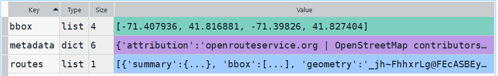
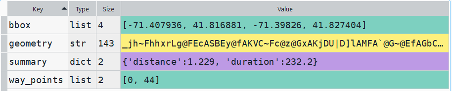
The result is returned as a JSON object, which we can manipulate like a nested Python dictionary. At the first level in the dictionary, we have three keys and values: a bounding box for the route area with a list value, metadata with a dictionary value, and routes with a list value. Dive into route, and the list contains a single dictionary, and inside that dictionary – more dictionaries that contain the values we want!
1st level, dictionary with three keys, the routes key has a single list value2nd level, the routes list has a single element, another dictionary3rd level, inside the dictionary in that list element, four keys with route data
The next step is we extract the values that we need from this container by specifying their location. For example, the distance value is inside the first list of routes, inside summary and inside distance. Travel time is in a similar spot, and we take an extra step of dividing by 60 to get minutes instead of seconds. The geometry is trickier as its encoded in some binary line format. We use OSR’s decoding function to turn it into plain text, and shapely to convert it into WKT text; we’ll need WKT in order to get the geometry into a geodataframe, and eventually output as a shapefile. Once we have the bits we need, we string them together as a list for that origin / destination pair, and append this to our route list.
# API CALL
for ogn in origins[1:]:
    for d in dest[1:]:
        try:
            coords=((ogn[ogn_long],ogn[ogn_lat]),(d[d_long],d[d_lat]))
            client = openrouteservice.Client(key=api_key)
            # Take the returned object, save into nested dicts:
            results = directions(client, coords,
                                profile=tmode,instructions=False, preference=rpref,units=dunits)
            dist = results['routes'][0]['summary']['distance']
            travtime=results['routes'][0]['summary']['duration']/60 # Get minutes
            encoded_geom = results['routes'][0]['geometry']
            decoded_geom = convert.decode_polyline(encoded_geom) #convert from binary to txt
            wkt_geom=shape(decoded_geom).wkt #convert from json polyline to wkt
            route=[ogn[ogn_id],ogn[ogn_name],d[d_id],d[d_name],dist,travtime,wkt_geom]
            route_list.append(route)
            route_count=route_count+1
            if route_count%40==0: # API limit is 40 requests per minute
                print('Pausing 1 minute, processed',route_count,'records...')
                sleep(60)
        except Exception as e:
            print(str(e))

api_key=''
print('Plotted',route_count,'routes...' )
Here is some sample output for the final origin / destination pair, which contains the IDs and labels for the origin and destination, distance in miles, time in minutes, and a string of coordinates that represents the route:
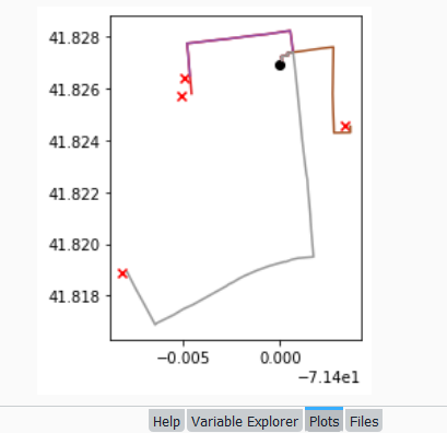
Finally, we can write the output. We convert the nested route list to a pandas dataframe and use the header row for column names, and convert that dataframe to a geodataframe, building the geometry from the WKT string, and write that out. In contrast, the origins and destinations have simple coordinates (not in WKT), and we create XY geometry from those coordinates. Writing the geodataframe out to a shapefile is straightforward, but for debugging purposes it’s helpful to see the result without having to launch GIS. We can use geopandas’s plot function to draw the resulting geometry. I’m using the Spyder IDE, which displays plots in a dedicated window (in my example the coordinate labels for the X axis look strange, as the distances I’m plotting are small).
# Create shapefiles for routes
df = pd.DataFrame(route_list, columns=header)
gdf = gpd.GeoDataFrame(df, geometry=gpd.GeoSeries.from_wkt(df["route"]),crs = 'EPSG:4326')
gdf.drop(['route'],axis=1,inplace=True) # drop the wkt text
gdf.to_file(out_file,index=True)
print('Wrote route shapefile to:',out_file,'\n')

# Create shapefiles for origins and destinations
ogdf=coords_to_gdf(origins,ogn_long,ogn_lat,out_origin)
dgdf=coords_to_gdf(dest,d_long,d_lat,out_dest)

# Plot
base=gdf.plot(column="dest_id", kind='geo',cmap="Set1")
ogdf.plot(ax=base, marker='o',color='black')
dgdf.plot(ax=base, marker='x', color='red');
In a notebook environment we can employ something like Folium more readily, which gives us a basemap and some basic interactivity for zooming around and clicking on features to see attributes. Implementing this was a more complex than I thought it would be, and took me longer to figure out compared to the routing process. I’ll return to those details in a subsequent post…
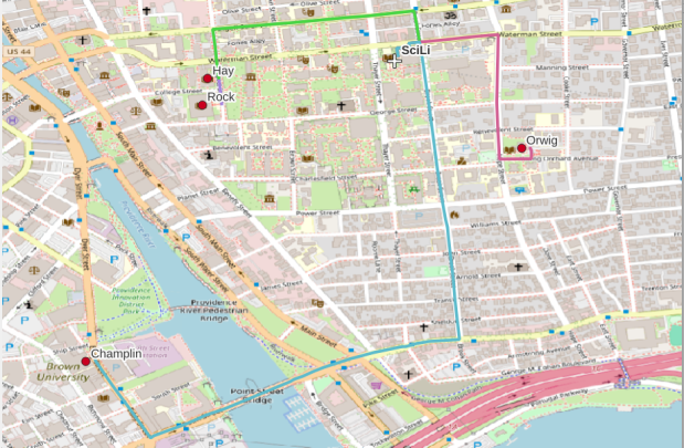
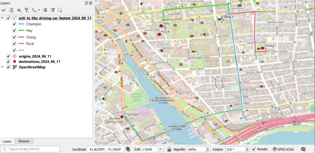
In my sample data (output rendered below in QGIS) I was plotting fastest driving distance from the Brown University Sciences Library to the other libraries in our system. Compared to Google or Apple Maps the result made sense, although the origin coordinates I used for the SciLi had an impact on the outcome (assumed you left from the loading dock behind the building as opposed to the front door as Google did, which produces different routes in this area of one-way streets). My real application was plotting distances of hundreds of miles across South America, which went well and was useful for generating different outcomes using fastest or shortest route.
In an earlier post, I described how to summarize and extract raster temperature data using GIS. In this post I’ll demonstrate some alternate methods using spatial Python. I’ll describe some scripts I wrote for batch clipping rasters, overlaying them with point locations, and extracting raster values (mean temperature) at those locations based on attributes of the points (a matching date). I used a number of third party modules, including geopandas (storing vector data in a tabular form), rasterio (working with raster grids), shapely (building vector geometry), matplotlib (plotting), and datetime (working with date data types). Using Anaconda Python, I searched for and added each of these modules via its package handler. I opted for this modular approach instead of using something like ArcPy, because I don’t want the scripts to be wedded to a specific software package. My scripts and sample data are available in GitHub; I’ll add snippets of code to this post for illustration purposes. The repo includes the full batch scripts that I’ll describe here, plus some earlier, shorter, sample scripts that are not batch-based and are useful for basic experimentation.
Overview
I was working with a medical professor who had point observations of where patients lived, which included a date attribute of when they had visited a clinic to receive certain treatment. For the study we needed to know what the mean temperature was on that day, as well as the temperature of each day of the preceding week. We opted to use daily temperature data from the PRISM Climate Group at Oregon State, where you can download a raster of the continental US for a given day that has the mean temperature (degrees Celsius) in one band, at 4km resolution. There are separate files for min and max temperature, as well as precipitation. You can download a year’s worth of data in one go, with one file per date.
Our challenge was that we had thousands of observations than spanned five years, so doing this one by one in GIS wasn’t going to be feasible. A custom script in Python seemed to be the best solution. Each raster temperature file has the date embedded in the file name. If we iterate through the point observations, we could grab its observation date, and using string manipulation grab the raster with the matching date in its file name, and then do the overlay and extraction. We would need to use Python’s datetime module to convert each date to a common format, and use a function to iterate over dates from the previous week.
Prior to doing that, we needed to clip or mask the rasters to the study area, which consists of the three southern New England states (Connecticut, Rhode Island, and Massachusetts). The PRISM rasters cover the lower 48 states, and clipping them to our small study area would speed processing time. I downloaded the latest Census TIGER file for states, and extracted the three SNE states. ArcGIS Pro does have batch clipping tools, but I found they were terribly slow. I opted to write one Python script to do the clipping, and a second to do the overlay and extraction.
Batch Clipping Rasters
I downloaded a sample of PRISM’s raster data that included two full months of daily mean temperature files, from Jan and Feb 2020. At the top of the clipper script, we import all the modules we need, and set our input and output paths. It’s best to use the path.join method from the os module to construct cross platform paths, so we don’t encounter the forward / backward \ slash issues between Mac and Linux versus Windows. Using geopandas I read in the shapefile of the southern New England (SNE) states into a geodataframe.
import os
import matplotlib.pyplot as plt
import geopandas as gpd
import rasterio
from rasterio.mask import mask
from shapely.geometry import Polygon
from rasterio.plot import show

#Inputs
clip_file=os.path.join('input_raster','mask','states_southern_ne.shp')
# new file created by script:
box_file=os.path.join('input_raster','mask','states_southern_ne_bbox.shp')
raster_path=os.path.join('input_raster','to_clip')
out_folder=os.path.join('input_raster','clipped')

clip_area = gpd.read_file(clip_file)
Next, I create a new geodataframe that represents the bounding box for the SNE states. The total_bounds method provides a list of the four coordinates (west, south, east, north) that form a minimum bounding rectangle for the states. Using shapely, I build polygon geometry from those coordinates by assigning them to pairs, beginning with the northwest corner. This data is from the Census Bureau, so the coordinates are in NAD83. Why bother with the bounding box when we can simply mask the raster using the shapefile itself? Since the bounding box is a simple rectangle, the process will go much faster than if we used the shapefile that contains thousands of coordinate pairs.
Once we have the bounding box as geometry, we proceed to iterate through the rasters in the folder in a loop, reading in each raster (PRISM files are in the .bil format) using rasterio, and its mask function to clip the raster to the bounding box. The PRISM rasters and the TIGER states both use NAD83, so we didn’t need to do any coordinate reference system (CRS) transformation prior to doing the mask (if they were in different systems, we’d have to convert one to match the other). In creating a new raster, we need to specify metadata for it. We copy the metadata from the original input file to the output file, and update specific attributes for the output file (such as the pixel height and width, and the output CRS). Here’s a mask example and update from the rasterio docs. Once that’s done, we write the new file out as a simple GeoTIFF, using the name of the input raster with the prefix “clipped_”.
idx=0
for rf in os.listdir(raster_path):
    if rf.endswith('.bil'):
        raster_file=os.path.join(raster_path,rf)
        in_raster=rasterio.open(raster_file)
        # Do the clip operation
        out_raster, out_transform = mask(in_raster, areabbox.geometry, filled=False, crop=True)
        # Copy the metadata from the source and update the new clipped layer
        out_meta=in_raster.meta.copy()
        out_meta.update({
            "driver":"GTiff",
            "height":out_raster.shape[1], # height starts with shape[1]
            "width":out_raster.shape[2], # width starts with shape[2]
            "transform":out_transform})
        # Write output to file
        out_file=rf.split('.')[0]+'.tif'
        out_path=os.path.join(out_folder,'clipped_'+out_file)
        with rasterio.open(out_path,'w',**out_meta) as dest:
            dest.write(out_raster)
        idx=idx+1
        if idx % 20 ==0:
            print('Processed',idx,'rasters so far...')
    else:
        pass

print('Finished clipping',idx,'raster files to bounding box: \n',corners)
Just to see some evidence that things worked, outside of the loop I take the last raster that was processed, and plot that to the screen. I also export the bounding box out as a shapefile, to verify what it looks like in GIS.
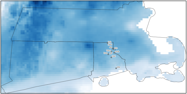
PRISM US mean daily temperature raster, clipped / masked to bounding box of southern New England
Extract Raster Values by Date at Point Locations
In the second script, we begin with reading in the modules and setting paths. I added an option at the top with a variable called temp_many_days; if it’s set to True, it will take the date range below it and retrieve temperatures for x to y days before the observation date in the point file. If it’s False, it will retrieve just the matching date. I also specify the names of columns in the input point observation shapefile that contain a unique ID number, name, and date. In this case the input data consists of ten sample points and dates that I’ve concocted, labeled alfa through juliett, all located in Rhode Island and stored as a shapefile.
import os,csv,rasterio
import matplotlib.pyplot as plt
import geopandas as gpd
from rasterio.plot import show
from datetime import datetime as dt
from datetime import timedelta
from datetime import date

#Calculate temps over multiple previous days from observation
temp_many_days=True # True or False
date_range=(1,7) # Range of past dates

#Inputs
point_file=os.path.join('input_points','test_obsv.shp')
raster_dir=os.path.join('input_raster','clipped')
outfolder='output'
if not os.path.exists(outfolder):
    os.makedirs(outfolder)

# Column names in point file that contain: unique ID, name, and date
obnum='OBS_NUM'
obname='OBS_NAME'
obdate='OBS_DATE'
Next, we loop through the folder of clipped raster files, and for each raster (ending in .tif) we grab the file name and extract the date from it. We take that date and store it in Python’s standard date format. The date becomes a key, and the path to the raster its value, which get added to a dictionary called rf_dict. For example, if we split the file name clipped_PRISM_tmean_stable_4kmD2_20200131_bil.tif using the underscores, counting from zero we get the date in the 5th position, 20200131. Converting that to the standard datetime format gives us datetime.date(2020, 1, 31).
rf_dict={} # Create dictionary of dates and raster file names

for rf in os.listdir(raster_dir):
    if rf.endswith('.tif'):
        rfdatestr=rf.split('_')[5]
        rfdate=dt.strptime(rfdatestr,'%Y%m%d').date() #format of dates is 20200131
        rfpath=os.path.join(raster_dir,rf)
        rf_dict[rfdate]=rfpath
    else:
        pass
Then we read the observation point shapefile into a geodataframe, create an empty result_list that will hold each of our extracted values, and construct the header row for the list. If we are grabbing temperatures for multiple days, we generate extra header values to add to that row.
#open point shapefile
point_data = gpd.read_file(point_file)

result_list=[]
result_list.append(['OBS_NUM','OBS_NAME','OBS_DATE','RASTER_ROW','RASTER_COL','RASTER_FILE','TEMP'])

if temp_many_days==True:
    for d in range(date_range[0],date_range[1]):
        tcol='TMINUS_'+str(d)
        result_list[0].append(tcol)
    result_list[0].append('TEMP_RANGE')
    result_list[0].append('AVG_TEMP')
    temp_ftype='multiday_'
else:
    temp_ftype='singleday_'
Now the preliminaries are out of the way, and processing can begin. This post and tutorial helped me to grasp the basics of the process. We loop through the point data in the geodataframe (we indicate point.data.index because these are dataframe records we’re looping through). We get the observation date for the point and store that it the standard Python date format. Then we take that date, compare it to the dictionary, and get the path to the corresponding temperature raster for that date. We open that raster with rasterio, isolate the x and y coordinate from the geometry of the point observation, and retrieve the corresponding row and column for that coordinate pair from the raster. Then we read the value that’s associated with the grid cell at those coordinates. We take some info from the observation points (the number, name, and date) and the raster data we’ve retrieved (the row, column, file name, and temperature from the raster) and add it to a list called record.
#Pull out and format the date, and use date to look up file
for idx in point_data.index:
    obs_date=dt.strptime(point_data[obdate][idx],'%m/%d/%Y').date() #format of dates is 1/31/2020
    obs_raster=rf_dict.get(obs_date)
    if obs_raster == None:
        print('No raster available for observation and date',
              point_data[obnum][idx],point_data[obdate][idx])
    #Open raster for matching date, overlay point coordinates, get cell location and value
    else:
        raster=rasterio.open(obs_raster)
        xcoord=point_data['geometry'][idx].x
        ycoord=point_data['geometry'][idx].y
        row, col = raster.index(xcoord,ycoord)
        tempval=raster.read(1)[row,col]
        rfile=os.path.split(obs_raster)[1]
        record=[point_data[obnum][idx],point_data[obname][idx],
                point_data[obdate][idx],row,col,rfile,tempval]
If we had specified that we wanted a single day (option near the top of the script), we’d skip down to the bottom of the next block, append the record to the main result_list, and continue iterating through the observation points. Else, if we wanted multiple dates, we enter into a sub-loop to get data from a range of previous dates. The datetime timedelta function allows us to do date subtraction; if we subtract 1 from the current date, we get the previous day. We loop through and get rasters and the temperature values for the points from each previous date in the range and append them to an old_temps list; we also build in a safety mechanism in case we don’t have a raster file for a particular date. Once we have all the dates, we do some calculations to get the average temperature and range for that entire period. We do this on a copy of old_temps called all_temps, where we delete null values and add the current observation date. Then we add the average and range to old_temps, and old_temps to our record list for this point observation, and when finished we append the observation record to our main result_list, and proceed to the next observation.
       # Optional block, if pulling past dates
        if temp_many_days==True:
            old_temps=[]
            for d in range(date_range[0],date_range[1]):
                past_date=obs_date-timedelta(days=d) # iterate through days, subtracting
                past_raster=rf_dict.get(past_date)
                if past_raster == None: # if no raster exists for that date
                    old_temps.append(None)
                else:
                    old_raster=rasterio.open(past_raster)
                    # Assumes rasters from previous dates are identical in structure to 1st date
                    past_temp=old_raster.read(1)[row,col]
                    old_temps.append(past_temp)
            # Calculate avg and range, must exclude None values and include obs day
            all_temps=[t for t in old_temps if t is not None]
            all_temps.append(tempval)
            temp_range=max(all_temps)-min(all_temps)
            avg_temp=sum(all_temps)/len(all_temps)
            old_temps.extend([temp_range,avg_temp])
            record.extend(old_temps)
            result_list.append(record)
        else: # if NOT doing many days, just append data for observation day
            result_list.append(record)
    if (idx+1)%200==0:
        print('Processed',idx+1,'records so far...')
Once the loop is complete, we plot the last point and raster to the screen just to check that it looks good, and we write the results out to a CSV.
#Plot the points over the final raster that was processed
fig, ax = plt.subplots(figsize=(12,12))
point_data.plot(ax=ax, color='black')
show(raster, ax=ax)

today=str(date.today()).replace('-','_')
outfile='temp_observations_'+temp_ftype+today+'.csv'
outpath=os.path.join(outfolder,outfile)

with open(outpath, 'w', newline='') as writefile:
    writer=csv.writer(writefile, quoting=csv.QUOTE_MINIMAL, delimiter=',')
    writer.writerows(result_list)

print('Done. {} observations in input file, {} records in results'.format(len(point_data),len(result_list)-1))
CSV output from script, temperatures extracted from raster by date for observation points
Results and Wrap-up
Visit the GitHub repo for full copies of the scripts, plus input and output data. In creating test observation points, I purposefully added some locations that had identical coordinates, identical dates, dates that varied by a single day, and dates for which there would be no corresponding raster file in the sample data if we went one week back in time. I looked up single dates for all point observations manually, and a sample of multi-day selections as well, and they matched the output of the script. The scripts ran quickly, and the overall process seemed intuitive to me; resetting the metadata for rasters after masking is the one part that wouldn’t have occurred to me, and took a little bit of time to figure out. This solution worked well for this case, and I would definitely apply geospatial Python to a problem like this again. An alternative would have been to use a spatial database like PostGIS; this would be an attractive option if we were working with a bigger dataset and processing time became an issue. The benefit of using this Python approach is that it’s easier to share the script and replicate the process without having to set up a database.
Observation points plotted on temperature raster with single-day output temperatures in QGIS
In this post I’ll demonstrate how I created annotated heatmaps (or what I’m calling a rank change grid) showing change in rank over time using Python and Matplotlib’s imshow plots. I was writing a report on population trends and internal migration using the IRS county to county migration dataset, and wanted to depict the top origins and destinations of migrants for New York City and the New York Metropolitan Area and how they changed from year to year.
I hit upon this idea based on an example in the Matplotlib documentation using the imshow plot. Imshow was designed for manipulating and creating images, but since images are composed of rows and columns of pixels you can use this function to create grids (for GIS folks, think of a raster). The rows can indicate rank from 1 to N, while the columns could represent time, which in my case is years. I could label each grid cell with the name of a place (i.e. origin or destination), and if a place changes ranks over time I could assign the cell a color indicating increase or decrease; otherwise I’d assign a neutral color indicating no change. The idea is that you could look at place at a given rank in year 1 and follow it across the chart by looking at the label. If a new place appears in a given position, the color change clues you in, and you can quickly scan to see whether a given place went up or down.
The image below shows change in rank for the top metro area destinations for migrants leaving the NYC metro from 2011 to 2018. You can see that metro Miami was the top destination for several years, up until 2016-17 when it flips positions with metro Philadelphia, which had been the number 2 destination. The sudden switch from a neutral color indicates that the place occupying this rank is new. You can also follow how 3rd ranked Bridgeport falls to 4th place in the 2nd year (displaced by Los Angeles), remains in 4th place for a few years, and then falls to 5th place (again bumped by Los Angeles, which falls from 3rd to 4th as it’s bumped by Poughkeepsie).
Annual Change in Ranks for Top Destinations for NYC Metro Migrants (Metro Outflows)
I opted for this over a more traditional approach called a bump chart (also referred to a slope chart or graph), with time on the x-axis and ranks on the y-axis, and observations labeled at either the first or last point in time. Each observation is assigned a specific color or symbol, and lines connect each observation to its changing position in rank so you can follow it along the chart. Interpreting these charts can be challenging; if there are frequent changes in rank the whole thing begins to look like spaghetti, and the more observations you have the tougher it gets to interpret. Most of the examples I found depicted a small and finite number of observations. I have hundreds of observations and only want to see the top ten, and if observations fall in and out of the top N ranks you get several discontinuous lines which look odd. Lastly, neither Matplotlib or Pandas have a default function for creating bump charts, although I found a few examples where you could create your own.
Creating the rank change grids was a three-part process that required: taking the existing data and transforming it into an array of the top or bottom N values that you want to show, using that array to generate an array that shows change in ranks over time, and generating a plot using both arrays, one for the value and the other for the labels. I’ll tackle each piece in this post. I’ve embedded the functions at the end of each explanation; you can also look at my GitHub repo that has the Jupyter Notebook I used for the analysis for the paper (to be published in Sept 2020).
Create the Initial Arrays
In the paper I was studying flows between NYC and other counties, and the NYC metro area and other metropolitan statisical areas. I’ll refer just to the metro areas as my example in this post, but my functions were written to handle both types of places, stored in separate dataframes. I began with a large dataframe with every metro that exchanged migrants with the NYC metro. There is a row for each metro where the index is the Census Bureau’s unique FIPS code, and columns that show inflows, outflows, and net flows year by year (see image below). There are some rows that represent aggregates, such as flows to all non-metro areas and the sum of individual metro flows that could not be disclosed due to privacy regulations.
Initial Dataframe
The first step is to create an array that has just the top or bottom N places that I want to depict, just for one flow variable (in, out, or net). Why an array? Arrays are pretty solid structures that allow you to select specific rows and columns, and they mesh nicely with imshow charts as each location in the matrix can correspond with the same location in the chart. Most of the examples I looked at used arrays. It’s possible to use other structures but it’s more tedious; nested Python lists don’t have explicit rows and columns so a lot of looping and slicing is required, and with dataframes there always seems to be some catch with data types, messing with the index versus the values, or something else. I went with NumPy’s array type.
I wrote a function where I pass in the dataframe, the type of variable (in, out, or net flow), the number of places I want, whether they are counties or metro areas, and whether I want the top or bottom N records (true or false). Two arrays are returned: the first shows the FIPS unique ID numbers of each place, while the second returns the labels. You don’t have to do anything to calculate actual ranks, because once the data is sorted the ranks become implicit; each row represents ranks 1 through 10, each column represents a year, and the ID or label for a place that occupies each position indicates its rank for that year.
In my dataframe, the names of the columns are prefixed based on the type of variable (inflow, outflow, or net flow), followed by the year, i.e. inflows_2011_12. In the function, I subset the dataframe by selecting columns that start with the variable I want. I have to deal with different issues based on whether I’m looking at counties or metro areas, and I need to get rid of any IDs that are for summary values like the non-metro areas; these IDS are stored in a list called suppressed, and the ~df.indexisin(suppressed) is pandaesque for taking anything that’s not in this list (the tilde acts as not). Then, I select the top or bottom values for each year, and append them to lists in a nested list (each sub-list represents the top / bottom N places in order for a given year). Next, I get the labels I want by creating a dictionary that relates all ID codes to label names, pull out the labels for the actual N values that I have, and format them before appending them to lists in a nested list. For example, the metro labels are really long and won’t fit in the chart, so I split them and grab just the first piece: Albany-Schenectady-Troy, NY becomes Albany (split using the dash) while Akron, OH becomes Akron (if no dash is present, split at comma). At the end, I use np.array to turn the nested lists into arrays, and transpose (T) them so rows become ranks and years become values. The result is below:
Function and Result for Creating Array of IDs Top N Places
# Create array of top N geographies by flow type, with rows as ranks and columns as years
# Returns 2 arrays with values for geographies (id codes) and place names
# Must specify: number of places to rank, counties or metros, or sort by largest or smallest (True or False)
def create_arrays(df,flowtype,nsize,gtype,largest):
    geogs=[]
    cols=[c for c in df if c.startswith(flowtype)]
    for c in cols:
        if gtype=='counties':
            row=df.loc[~df.index.isin(suppressed),[c]]
        elif gtype=='metros':
            row=df.loc[~df.index.isin(msuppressed),[c]]
        if largest is True:
            row=row[c].nlargest(nsize)
        elif largest is False:
            row=row[c].nsmallest(nsize)
        idxs=list(row.index)
        geogs.append(idxs)

    if gtype=='counties':
        fips=df.to_dict()['co_name']
    elif gtype=='metros':
        fips=df.to_dict()['mname']
    labels=[]
    for row in geogs:
        line=[]
        for uid in row:
            if gtype=='counties':
                if fips[uid]=='District of Columbia, DC':
                    line.append('Washington\n DC')
                else:
                    line.append(fips[uid].replace('County, ','\n')) #creates short labels
            elif gtype=='metros':
                if '-' in fips[uid]:
                    line.append(fips[uid].split('-')[0]) #creates short labels
                else:
                    line.append(fips[uid].split(',')[0])
        labels.append(line)

    a_geogs=np.array(geogs).T
    a_labels=np.array(labels).T

    return a_geogs, a_labels
Change in Rank Array
Using the array of geographic ID codes, I can feed this into function number two to create a new array that indicates change in rank over time. It’s better to use the ID code array as we guarantee that the IDs are unique; labels (place names) may not be unique and pose all kinds of formatting issues. All places are assigned a value of 0 for the first year, as there is no previous year to compare them to. Then, for each subsequent year, we look at each value (ID code) and compare it to the value in the same position (rank) in the previous column (year). If the value is the same, that place holds the same rank and is assigned a 0. Otherwise, if it’s different we look at the new value and see what position it was in in the previous year. If it was in a higher position last year, then it has declined and we assign -1. If it was in a lower position last year or was not in the array in that column (i.e. below the top 10 in that year) it has increased and we assign it a value of 1. This result is shown below:
Function and Result for Creating Change in Rank Array
# Create array showing how top N geographies have changed ranks over time, with rows as rank changes and
# columns as years. Returns 1 array with values: 0 (no change), 1 (increased rank), and -1 (descreased rank)
def rank_change(geoarray):
    rowcount=geoarray.shape[0]
    colcount=geoarray.shape[1]

    # Create a number of blank lists
    changelist = [[] for _ in range(rowcount)]

    for i in range(colcount):
        if i==0:
            # Rank change for 1st year is 0, as there is no previous year
            for j in range(rowcount):
                changelist[j].append(0)
        else:
            col=geoarray[:,i] #Get all values in this col
            prevcol=geoarray[:,i-1] #Get all values in previous col
            for v in col:
                array_pos=np.where(col == v) #returns array
                current_pos=int(array_pos[0]) #get first array value
                array_pos2=np.where(prevcol == v) #returns array
                if len(array_pos2[0])==0: #if array is empty, because place was not in previous year
                    previous_pos=current_pos+1
                else:
                    previous_pos=int(array_pos2[0]) #get first array value
                if current_pos==previous_pos:
                    changelist[current_pos].append(0)
                    #No change in rank
                elif current_posprevious_pos: #Larger value = smaller rank
                    changelist[current_pos].append(-1)
                    #Rank has decreased
                else:
                    pass

    rankchange=np.array(changelist)
    return rankchange
Create the Plot
Now we can create the actual chart! The rank change array is what will actually be charted, but we will use the labels array to display the names of each place. The values that occupy the positions in each array pertain to the same place. The chart function takes the names of both these arrays as input. I do some fiddling around at the beginning to get the labels for the x and y axis the way I want them. Matplotlib allows you to modify every iota of your plot, which is in equal measures flexible and overwhelming. I wanted to make sure that I showed all the tick labels, and changed the default grid lines to make them thicker and lighter. It took a great deal of fiddling to get these details right, but there were plenty of examples to look at (Matplotlib docs, cookbook, Stack Overflow, and this example in particular). For the legend, shrinking the colorbar was a nice option so it’s not ridiculously huge, and I assign -1, 0, and 1 to specific colors denoting decrease, no change, and increase. I loop over the data values to get their corresponding labels, and depending on the color that’s assigned I can modify whether the text is dark or light (so you can see it against the background of the cell). The result is what you saw at the beginning of this post for outflows (top destinations for migrants leaving the NY metro). The function call is below:
Function for Creating Rank Change Grid
# Create grid plot based on an array that shows change in ranks and an array of cell labels
def rank_grid(rank_change,labels):
    alabels=labels
    xlabels=[yr.replace('_','-') for yr in years]
    ranklabels=['1st','2nd','3rd','4th','5th','6th','7th','8th','9th','10th',
               '11th','12th','13th','14th','15th','16th','17th','18th','19th','20th']
    nsize=rank_change.shape[0]
    ylabels=ranklabels[:nsize]

    mycolors = colors.ListedColormap(['#de425b','#f7f7f7','#67a9cf'])
    fig, ax = plt.subplots(figsize=(10,10))
    im = ax.imshow(rank_change, cmap=mycolors)

    # Show all ticks...
    ax.set_xticks(np.arange(len(xlabels)))
    ax.set_yticks(np.arange(len(ylabels)))
    # ... and label them with the respective list entries
    ax.set_xticklabels(xlabels)
    ax.set_yticklabels(ylabels)

    # Create white grid.
    ax.set_xticks(np.arange(rank_change.shape[1]+1)-.5, minor=True)
    ax.set_yticks(np.arange(rank_change.shape[0]+1)-.5, minor=True)
    ax.grid(which="minor", color="w", linestyle='-', linewidth=3)
    ax.grid(which="major",visible=False)

    cbar = ax.figure.colorbar(im, ax=ax, ticks=[1,0,-1], shrink=0.5)
    cbar.ax.set_yticklabels(['Increased','No Change','Decreased'])

    # Loop over data dimensions and create text annotations.
    for i in range(len(ylabels)):
        for j in range(len(xlabels)):
            if rank_change[i,j] < 0:
                text = ax.text(j, i, alabels[i, j],
                           ha="center", va="center", color="w", fontsize=10)
            else:
                text = ax.text(j, i, alabels[i, j],
                           ha="center", va="center", color="k", fontsize=10)

    #ax.set_title("Change in Rank Over Time")
    plt.xticks(fontsize=12)
    plt.yticks(fontsize=12)
    fig.tight_layout()
    plt.show()
    return ax
Conclusions and Alternatives
I found that this approach worked well for my particular circumstances, where I had a limited number of data points to show and the ranks didn’t fluctuate much from year to year. The charts for ten observations displayed over seven points in time fit easily onto standard letter-sized paper; I could even get away with adding two additional observations and an eighth point in time if I modified the size and placement of the legend. However, beyond that you can begin to run into trouble. I generated charts for the top twenty places so I could see the results for my own analysis, but it was much too large to create a publishable graphic (at least in print). If you decrease the dimensions for the chart or reduce the size of the grid cells, the labels start to become unreadable (print that’s too small or overlapping labels).
There are a number of possibilities for circumventing this. One would be to use shorter labels; if we were working with states or provinces we can use the two-letter postal codes, or ISO country codes in the case of countries. Not an option in my example. Alternatively, we could move the place names to the y-axis (sorted alphabetically or by first or final year rank) and then use the rank as the annotation label. This would be a fundamentally different chart; you could see how one place changes in rank over time, but it would be tougher to discern which places were the most important source / destination for the area you’re studying (you’d have to skim through the whole chart). Or, you could keep ranks on the y-axis and assign each place a unique color in the legend, shade the grid cells using that color, and thus follow the changing colors with your eye. But this flops is you have too many places / colors.
A different caveat is this approach doesn’t work so well if there is a lot of fluctuation in ranks from year to year. In this example, the top inflows and outflows were relatively stable from year to year. There were enough places that held the same rank that you could follow the places that changed positions. We saw the example above for outflows, below is an example for inflows (i.e. the top origins or sources of migrants moving to the NY metro):
Annual Change in Ranks for Top Origins for NYC Metro Migrants (Metro Inflows)
In contrast, the ranks for net flows were highly variable. There was so much change that the chart appears as a solid block of colors with few neutral (unchanged) values, making it difficult to see what’s going on. An example of this is below, representing net flows for the NYC metro area. This is the difference between inflows and outflows, and the chart represents metros that receive more migrants from New York than they send (i.e. net receivers of NY migrants). While I didn’t use the net flow charts in my paper, it was still worth generating as it made it clear to me that net flow ranks fluctuate quite a bit, which was a fact I could state in the text.
Annual Change in Ranks for Net Receivers of NYC Metro Migrants (Metro Net Flows)
There are also a few alternatives to using imshow. Matplotlib’s pcolor plot can produce similar effects but with rectangles instead of square grid cells. That could allow for more observations and longer labels. I thought it was less visually pleasing than the equal grid, and early on I found that implementing it was clunkier so I went no further. My other idea was to create a table instead of a chart. Pandas has functions for formatting dataframes in a Jupyter Notebook, and there are options for exporting the results out to HTML. Formatting is the downside – if you create a plot as an image, you export it out and can then embed it into any document format you like. When you’re exporting tables out of a notebook, you’re only exporting the content and not the format. With a table, the content and formatting is separate, and the latter is often tightly bound to the publication format (Word, LaTeX, HTML, etc.) You can design with this in mind if you’re self-publishing a blog post or report, but this is not feasible when you’re submitting something for publication where an editor or designer will be doing the layout.
I really wanted to produce something that I could code and run automatically in many different iterations, and was happy with this solution. It was an interesting experiment, as I grappled with taking something that seemed intuitive to do the old-fashioned way (see below) and reproducing it in a digital, repeatable format.
At the end of my book I briefly illustrate how the Census Bureau’s API works using Python. I’ll expand on that in this post; we’ll pull data from the Population Estimates Program, transform it, and create a chart using Python with Pandas in a Notebook. I’ll conclude with an additional example using the ZIP Code Business Patterns.
The Census Bureau has dedicated API pages for each dataset (decennial, acs, pop estimates, and more), and you need to familiarize yourself with the geographies and variables that are available for each. The API is a basic REST API, where you insert parameters into a base url and retrieve data based on the link you submit. Python has several modules you can use for interacting with APIs – the requests module is a popular choice.
The top of the script contains basic stuff – import the modules you need, read in your key, and define the variables that you want to pull. You don’t have to use an API key, but if you don’t you’re limited to pulling in 500 records a day. Requesting a key is simple and free. A best practice is to store your key (a big integer) in a file that you read in, so you’re not exposing it in the script. Most of the census APIs require that you pass in a year and a dataset (dsource). Larger datasets may be divided into subsets (dname); for example the population estimates is divided into estimates, components of change, and characteristics (age, sex, race, etc.). Save the columns and geographies that you want to get in a comma-separated string. You have to consult the documentation and variable lists that are available for each dataset to build these, and the geography requires ANSI / FIPS codes.
%matplotlib inline
import requests,pandas as pd

with open('census_key.txt') as key:
    api_key=key.read().strip()

year='2018'
dsource='pep'
dname='components'
cols='GEONAME,NATURALINC,DOMESTICMIG,INTERNATIONALMIG'
state='42'
county='017,029,045,091,101'
Next, you can create the url. I’ve been doing this in two parts. The first part:
Includes the base https://api.census.gov/data/ followed by parameters that you fill in. The year, data source, and dataset name are the standard pieces. The output looks like this:
'https://api.census.gov/data/2018/pep/components'
Then you take that base_url and add additional parameters that are going to vary within the script, in this case the columns and the geography, which all appear in the ‘get’ portion of the url. The ‘for’ and ‘in’ options allow you to select the type of geography within another geography, in this case counties within states, and you pass in the appropriate ANSI FIPS codes from the string you’ve created. The key appears at the end of the url, but if you opt not to use it you can omit that part. Once the link is fully constructed you use the requests module to fetch the data using that url. You can print the result out as text (assuming it’s not too long).
The result looks like a nested list, but is actually a string that’s structured in a non-standard JSON format:
[["GEONAME","NATURALINC","DOMESTICMIG","INTERNATIONALMIG","state","county"],
["Bucks County, Pennsylvania","-178","-605","862","42","017"],
["Chester County, Pennsylvania","1829","-887","1374","42","029"],
["Delaware County, Pennsylvania","1374","-2513","1579","42","045"],
["Montgomery County, Pennsylvania","1230","-1987","2315","42","091"],
["Philadelphia County, Pennsylvania","8617","-11796","8904","42","101"]]
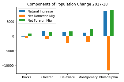
To do anything with it, convert it to JSON with response.json(). Then you can convert it into a list, dictionary, or in this example a Pandas dataframe. Here, I build the dataframe with everything from row one forward [1:]; row zero contains the column headers[0]. I rename some of the columns, build a unique ID by concatenating the state and county FIPS codes and set that as the new index, and drop the individual county and state FIPS columns. By default every object that’s returned is a string, so I convert the numeric columns to integers:
Once the data is in good shape, you can begin to analyze and visualize it. Here’s the components of population change for Philadelphia and the surrounding suburban counties in Pennsylvania from 2017 to 2018 – natural increase is the difference between births and deaths, and there’s net migration within the US (domestic) and between the US and other countries (foreign):
labels=df['GEONAME'].str.split(' ',expand=True)[0]
ax=df.plot.bar(rot=0, title='Components of Population Change 2017-18')
ax.set_xticklabels(labels)
ax.set_xlabel('')
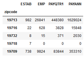
Each request is going to vary based on your specific needs and the construction of the particular dataset. Here’s another example where I pull data on business establishments, employees, and wages (in $1,000s of dollars) from the ZIP Code Business Patterns (ZBP). This dataset is smaller, so it doesn’t have a dataset name, just a data source. To get all the ZIP Codes in Delaware I use the asterisk * wildcard. Because ZIP Codes do not nest within states I can’t use the ‘in’ option, it’s simply not available. A state code is stored in a special field called ST, and I can use it as a general limiter with equals in the query:
data=response.json()
zbp_data=pd.DataFrame(data[1:], columns=data[0]).set_index('zipcode')
zbp_data.drop(columns=['ST'],inplace=True)
for field in cols.split(','):
    zbp_data=zbp_data.astype(dtype={field:'int64'},inplace=True)
zbp_data.head()
One of the issues with the ZBP is that many variables are not disclosed due to privacy regulations; instead of returning nulls a zero is returned, but in this dataset they are not true zeros. Once you retrieve the data and set the types you can replace zeros with NaNs, which are numpy / Panda nulls – although there’s a quirk in that dataframe columns declared as integers cannot contain null values. Instead you can use a float, or a workaround that’s been implemented for new Pandas versions (for my specific use case this data will be inserted into a database, so I’ll use SQL to accomplish the zero to null conversion). ZBP data is also injected with noise to protect privacy, and you can retrieve special columns that contain noise flags.
The API is convenient for automating the data acquisition process, and allows you to cherry pick the variables you want. To avoid accessing the API over and over again as you build your scripts (which is prohibitive when requesting lots of data) you can pickle the data right after you retrieve it – a pickle is a python data object that efficiently stores data locally, and pandas has special functions for creating and accessing them. Once you pull your data and pickle it, you can comment out (or in a notebook, don’t rerun) the requests block, and subsequently pull the data from the pickle as you tweak your code (see caveat in the postscript – perhaps best to use json instead of pickle).
#Write to a pickle
zbp_data.to_pickle('insert path here.pickle')
#Read from a pickle to dataframe
zbp_new=pd.read_pickle('insert path here.pickle')
Take a look at the Census Data API User Guide to learn more. The guide focuses just on the REST API, and is not specific to a scripting language. Of course, you also need to familiarize yourself with the datasets and how they’re created and organized, and with census geography (which is why I wrote this book).
I decided to dump the data I retrieved from the API to a json file and then pull data from it instead of using a pickle. Pickles come with serious security issues. If you don’t intend to share your code with anyone pickles are fine, otherwise consider an alternative.
My method for parsing the retrieved data into a dataframe worked fine because the census API uses non-standard JSON; essentially the string that’s returned resembles a nested Python list. If this was true JSON, we may need to employ a different method to account for the fact that the number of elements per record may vary.
Wildcards are not always available to build urls for certain data; for example to download the number of establishments classified by industry I wasn’t able to grab everything for one state using the method I illustrated in this post. Instead I had to loop through a list of ZIP and NAICS codes to retrieve what I wanted one at a time.
In the case of retrieving establishments classified by industry there were many cases when there was no data for a particular ZIP Code (i.e. no farms and mines in midtown Manhattan). Since I needed records that showed zero establishments, I had to insert them myself if the API returned no result. Even if you didn’t need records with zeros, it’s important to consider the potential impact of getting nothing back from the API on your subsequent code.
Given my experience thus far these APIs were pretty reliable, in that I haven’t had issues with time outs and partially returned data. If this was not the case and you had lots of data to retrieve, you would need to build in some try – except statements to handle exceptions, save data as you go along, and pick up where you left off if something breaks. Read about this geocoding script I wrote a few years back for examples.
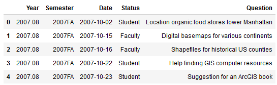
With the dawn of a new academic year I usually spend a little time looking back at the previous one. Since I began my position as Geospatial Data Librarian at Baruch College I’ve logged my questions, consultations, course visits, and workshops in a spreadsheet that I’ve used for creating summaries and charts. I spent a good chunk of this summer improving my Pandas skills, and put them to the test by summarizing and plotting my services data in a Jupyter Notebook instead.
Pandas is a data science module for Python that adds so many new components that it’s like a language all by itself. Its big selling point is that it adds a grid-like data structure to Python. In vanilla Python, you typically read data files into a list of lists where the big list represents the file, the individual lists represent rows, and the list elements represent values. There are no columns; to manipulate data you iterate through the sub-lists and elements by their position number. In well-structured datasets, elements in the same position in each sub-list represent attributes that would be stored in the same column.
In contrast, Pandas provides a true row and column structure called a dataframe, where you access each row by its index (a unique id) and columns by name or position. Furthermore, methods and functions that you apply to the data are automatically applied to entire rows and columns, and in some cases even to the entire dataframe, so that looping through data element by element is largely unnecessary. You’re able to treat a dataframe as if it were a spreadsheet or database table, in that you can concatenate dataframes together, merge them on their index numbers, and group records by values.
Using Pandas in concert with a Jupyter Notebook allows for an iterative approach to exploring and manipulating data, and is particularly conducive to creating plots and charts. You can use Python’s tried and true matplotlib module to build your chart bit by bit, or you can use Panda’s own plotting functions, which are wrappers around matplotlib that allow you to quickly create charts with fewer lines of code. Another plotting module called Seaborn offers a third approach.
This cheat sheet has become my indispensable reference for keeping track of the different Pandas functions and methods, and for helping me mentally navigate the different ways of doing things in Pandas versus regular Python. Plotting was a struggle at first, as I tried to figure out when to use Pandas versus matplotlib versus Seaborn. The fact that it’s possible to use all three at once to create the same plot added to my confusion! This visualization flowchart helped me sort things out. For simple stuff, I used the Pandas plot functions, but if the chart required additional customization I used matplotlib to generate the extra pieces, or the whole thing. In essence, use matplotlib for super detailed control over customization, and use Pandas plot functions as shortcuts for writing more concise code.
Preamble
I’ve stored my notebook and the data file on github (still a work in progress) if you’d like to take a closer look (the notebook is the ipynb file). I’m going to address a portion of what’s in the notebook in this post.
First and foremost you need to import pandas and matplotlib’s pyplot. The %matplotlib inline trick tells the notebook to display all charts that you generate with matplotlib; otherwise it just creates them without displaying them. The plt.style.use() lets you apply a global style (chart colors, background, grid lines etc) to all plots in your notebook. This convenient style sheet reference demonstrates what they all look like.
%matplotlib inline
import pandas as pd
import matplotlib.pyplot as plt
plt.style.use('seaborn-muted')
Web Stats
I’ll start with the simplest example. My spreadsheet doesn’t contain web stats, so I needed to hard code these into the notebook. To create a dataframe you build it column by column, and add the index last. In a notebook you don’t need to use a print function to see the data, you simply enter the name of the object that you want to display:
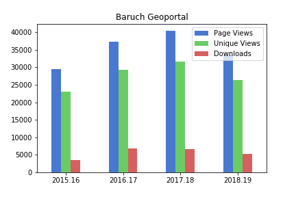
The plot was pretty darn simple, using Panda’s DataFrame.plot you specify the type of chart (bar in this case), pass in a few arguments, and voila! Pandas automatically uses the index for the x axis (academic years in this case) and will attempt to plot all columns on the y axis. If this isn’t desirable you can set x and y in the arguments. The default legend placement isn’t ideal in this example, but we’ll see how to change it later. plt.savefig() saves the chart as an image file outside the notebook.
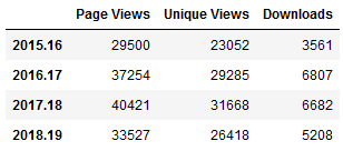
The rest of my data is stored in an Excel spreadsheet. You can quickly read spreadsheets into a dataframe by specifying the file and sheet, and the head() command previews the top records.
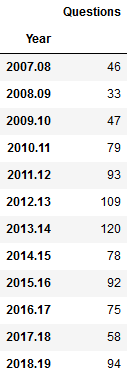
I used the groupby method to summarize the number of questions by semester, indicating what column to use for grouping, and how to aggregate. In this example I use .size() which counts all records (another method called count is similar except it does not count null values). Since this result returns just a single column, Pandas returns a data type called a sequence, which is a single-column dataframe with an index (similar to a dictionary key-value pair in vanilla Python). If I want a new dataframe, I can explicitly feed in the columns, reset the index and set it to the year. You can plot data from either type.
#Summarize as a series
questions_sem=questions.groupby(by='Semester').size()

#Summarize as a dataframe
questions_yr=questions[['Year','Question']].groupby(by='Year').size().reset_index(name='Questions').set_index('Year')
questions_yr
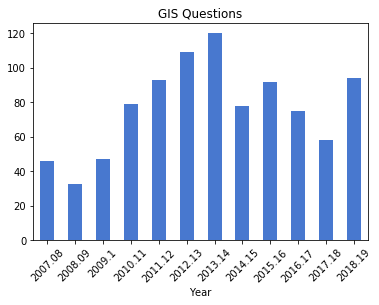
As before, the plot is pretty simple, but in this case when saving the figure I specify bounding box tight so the labels don’t get cut off (I rotated them 45 degrees for legibility).
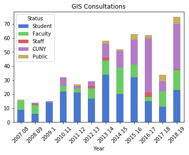
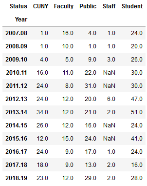
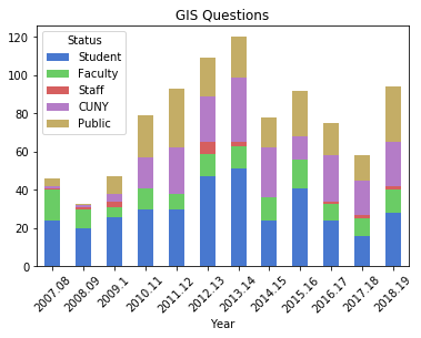
To create a stacked bar chart that shows the number of questions and the status of the person who asked them, I can create a new dataframe where I group by both year and status. One of the initial challenges in learning how to plot data is figuring out what structure is appropriate. After some experimentation, I figured out that each status needs to be as column in order to plot it. I used the following with the unstack method to pivot the data:
Explicitly stating the columns isn’t necessary, but it allows you to specify the order in which they appear in the chart. I have another worksheet that lists my consultations, that I read in, transform, and plot using the same statements:
Questions represent emails or phone calls that I’ve received, while consultations are in- person, one-on-one sessions. Both the questions and consultations are specific to demographic, geospatial, or GIS-related topics. Students, faculty, and staff refer to people affiliated with my college (Baruch), while the CUNY category captures affiliates from all the other schools in the university regardless of their status. Public captures anyone outside the university.
The initial patterns are similar: the number of questions was low for my initial three years, and then began to take off in the 2010-11 academic year. This coincided with my movement out of the library’s Information Services Division and into the Graduate Services Division, where I was able to devote more time to providing my specialized services and less time providing general ones (i.e. the reference desk, visiting freshmen English composition classes). 2010-11 was also the year I introduced my day-long introductory GIS workshops which led to an increase in business, particularly from other CUNY campuses.
Another turning point was 2014-15 but the data diverges; the number of questions dips and hasn’t returned to to the peak I hit in 2013-14, while consultations remain consistently high. This is the year that I moved into the GIS Lab, and was able to provide better on-going in-person support. It was also the year I received tenure and promotion, which immediately resulted in a heavy increase in service commitments, i.e. serving on various college committees that took me away from my work (while I have graduate assistants that help with consultations, questions are sent directly to me). 2017-18 is a big divot on both charts as this was the year I was away on sabbatical to write my book (my grad assistant Janine held down the fort at the lab while I monitored questions from home), but there was a solid rebound in 2018-19.
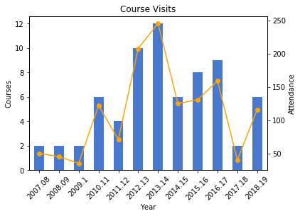
Course Visits and Workshop Stats
I frequently visit public policy, journalism, and other courses to give lectures on census data and GIS, and for these charts I wanted to show the number of classes I visited and attendance on one chart. After loading my teaching data in, I excluded records that represented my GIS workshops by using the query method. Since I wanted to create two different aggregates – a count and a sum – I applied the .agg method after using groupby:
As best as I could tell, the Pandas plot function couldn’t handle a line and bar on the same chart with a secondary Y axis, so I used matplotlib instead, building the chart one piece at a time:
The courses I visit are consistently mid-sized with about 20 students a piece, so visits and attendance track pretty closely. The pattern is similar to my questions and consultations, initially low, rising as I gained independence, dropping once I hit tenure and service commitments, then gradually rising until the 2017-18 sabbatical year.
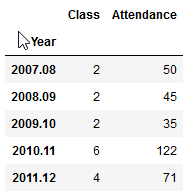
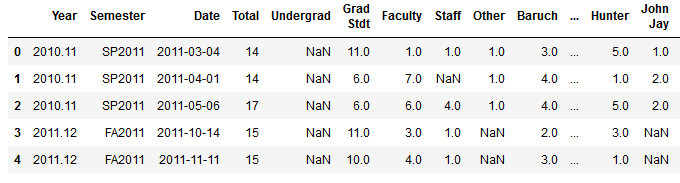
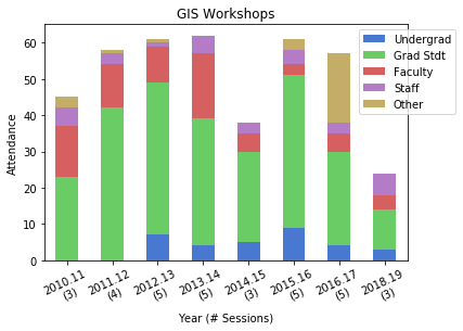
For the GIS workshops (stored in greater detail in a separate worksheet) I wanted to create two charts: a summary of attendance for each year by status, and another showing the schools that participants came from. Since attendance will vary by the number of workshops, I also wanted to incorporate the number of sessions into the first chart. After loading in the data:
and creating a grouped summary:
I created an independent sequence for the labels using string methods:
and I used matplotlib so I could set different tick labels and move the legend, as the default placement blocked portions of the bars:
For the workshops, the status includes all CUNY members regardless of school, while Other is anyone not affiliated with CUNY. Graduate students have always comprised the largest share of participants. Once again, there is the tenure dip in 2014-15 (fewer sessions) and no sessions during 2017-18 sabbatical. 2016-17 was an exceptional year as one of our sessions was held at the FOSS4G conference, so there are lots of participants from the Other category. The latest year was disappointing, as bad weather impacted attendance at two of the sessions.
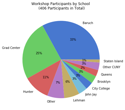
I wanted to create a pie chart to show participation by CUNY school, but to make it aesthetically pleasing I needed to remove schools with few participants and add them to an Other CUNY category. Otherwise there would be tiny wedges with unreadable labels. After creating a subset of the workshops dataframe that summed values only for the school columns, I iterated through the schools to sum attendance to a variable, dropped those schools, and added the sum to the other category (see the notebook for details). I used the Pandas plot function to create the pie chart, and used the autopct argument to display percentages in the wedges. I also specified a figure size, which you can do for any chart (and becomes important when you decide to embed them in documents):
gis_total=gis_schools.sum()

gis_schools.plot.pie(legend=False, figsize=(6,6), \
title='Workshop Participants by School \n ({} Participants in Total)'.format(gis_total), autopct='%i%%')
plt.ylabel("")
plt.savefig('schools.png',bbox_inches='tight')
One-third of participants were from my college, and one-fourth were from the Graduate Center, which is our nearest CUNY neighbor with a large population of master’s and PhD students who are keenly interested in learning GIS. The next biggest contributors are Hunter and Lehman Colleges, which are the two CUNY schools that have geography departments with GIS programs; Hunter is also close to Baruch, and we took a road trip to offer some sessions on Lehman’s campus.
Wrap Up
What I like about this approach is that you can summarize and reconfigure data without messing with the original source, and you can clearly see what your formulas are as they’re not hidden beneath the resulting values. These are both hazards when working directly within spreadsheets. While it takes time to learn these new functions and to grapple with finding work-arounds for exceptions, I don’t think it’s any less difficult than trying to accomplish the same things in a spreadsheet. I’ve always found spreadsheet charting to be rather clumsy, where you’re forced to cycle through numerous windows or to click on minuscule pieces of a chart to access hidden settings that you need. The Pandas / notebook approach makes a lot of sense for iterative data exploration, summation, and visualization, although I’ll continue to rely on regular Python for projects that fall outside this specific domain.


 and creating a grouped summary:
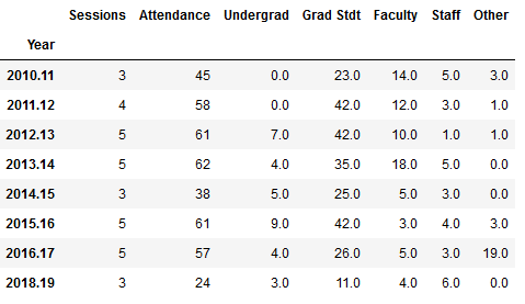


You must be logged in to post a comment.