
In this post I’ll demonstrate how to create least cost paths using QGIS and GRASS GIS, and in doing so will describe how a cost surface is constructed. In a surface analysis, you model movement across a grid whose values represent friction encountered in moving across it. In computing a least cost path, you’re seeking an optimal route from an origin to the closest destination, where ‘close’ incorporates distance and ease of movement across that surface. These kinds of analyses are often conducted in the environmental sciences, in modeling the movement of water across terrain, and in zoology in predicting migration paths for land-based animals.
In this example the idea was to chart the origin of settlements and possible trade routes in ancient history. In applications where we’re studying human activity, network analysis is typically used instead. Networks use geometry, where a node is a place or person, and connections between nodes are indicated with lines. Lines typically have a value associated with them that identify either the strength of a connection, or conversely friction associated with moving between nodes. The idea for this project was to identify how networks formed, so the surface analysis served as a proto-network analysis. While there were roads and maritime routes in pre-modern times, these networks were weaker and less dense. Charting movement over a surface representing terrain could provide a decent approximation of routes (but if you’re interested in ancient Roman network routing, check out the ORBIS project at Stanford).
This example stems from a project I was helping a PhD student with; I don’t want to replicate his specific study, so I’ve modified the data sources and area of focus to model movement between large settlements and stone quarries in the ancient Roman world. My goal is to demonstrate the methods with a plausible example; if we were doing this as part of an actual study, we would need to be more discriminating in selecting and processing our data.
Preliminary Work
The Pleiades project will serve as our source for destinations; it’s an academic gazetteer that includes locations and place names for the ancient and early medieval world, stretching from Europe and North Africa through the Middle East to India. It’s published in many forms, and I’ve downloaded the Pleiades Data for GIS in a CSV format. Using QGIS, I used the Add Delimited Text tool to plot the places.csv to get all of the locations, and joined that file to the places_place_type.csv file which contains different categories of places. I used Select by Attributes to get locations classified as quarries, and exported the selection out to a geopackage.
The Pleiades data includes a category for settlements, but there are about ten thousand of these and there isn’t an easy way to create a subset of the largest places. So I opted to use Hanson’s dataset of the largest settlements in the ancient Roman world to serve as our source for origins (about 1,400 places). This data was packaged in an Excel file; I plotted the coordinates using the Create Points Layer from Table tool in QGIS and converted the result to a geopackage. For testing purposes, I selected a subset of ten major cities and saved them in a separate layer: Athenae, Alexandria (Aegyptus), Antiochia (Syria), Byzantium, Carthago, Ephesus, Lugdunum, Ostia, Pergamum, Roma.
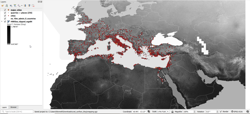
For the friction grid, I downloaded a geoTIFF of the Human Mobility Index by Ozak. The description from the project:
“The Human Mobility Index (HMI) estimates the potential minimum travel time across the globe (measured in hours) accounting for human biological constraints, as well as geographical and technological factors that determined travel time before the widespread use of steam power.”
There are three separate grids that vary in extent based on the availability of seafaring technology. I chose the grid that incorporates seafaring prior to the advent of ocean-going ships, which is appropriate for the Mediterranean world during the classical era. The HMI is a global grid at 925 meter resolution. To minimize processing time, I clipped it to a bounding box that encompasses the area of study. The grid is in the World Cylindrical Equal Area system; I reprojected it to WGS 84 to match the rest of the layers. As long as we’re not measuring actual distances, we don’t need to worry about the system we’re using (but if we were, we’d use an equidistant system). Since the range of values is small and it’s hard to see differences in cell values, I symbolized the grid as single-band psuedo color and used a quantiles classification scheme with 12 categories.
Lastly, I grabbed some modern country boundaries from Natural Earth to serve as a general frame of reference. A screenshot of the workspace is below:
Least Cost Path in QGIS
QGIS has a third-party plug-in for doing a least cost path analysis, which works fine as long as you don’t have too many origin points. Go to Plugins > Manage and Install Plugins > Least Cost Path to turn it on. Then open the Processing toolbox and it will be listed at the bottom. See the screenshot below for the tool’s menu. The Cost raster layer is the friction surface, so the human mobility index in this example. The start points are the ten major cities and the end points are the quarries. The start-point layer dialog only accepts a single point; if you have multiple points, hit the green circular arrow button to iterate across all of them. There’s a checkbox for connecting the start point to just the nearest end point (as opposed to all of them). Save the output to a geopackage.

It took about five minutes to run the analysis and iterate across all ten points. Each path is saved in a separate file, but since they have an identical structure I subsequently used Vector > Data Management Tools > Merge Vector Layers to combine them into one file. The attribute table records the end point ID (for the quarry) and the accumulated cost, but does not include the origin ID; this ID is the number 1 repeated each time, as the tool was iterating over the origin points. We can see the result below; for Athens and Ephesus in the south, land routes were shortest, whereas for Pergamum and Byzantium in the north it was easier (distance and friction-wise) to move across the sea.

While this worked fine for ten cities, it would take a considerable amount of time to compute paths for all 1,400. The problem here is that the plugin was designed for one point at a time. Let’s outline the process so we can understand how alternatives would work.
Cost Surface Analysis
To calculate a least cost path, the first step is to create a cost surface, where we take our friction grid and the destinations and calculate the total cost of movement across all cells to the nearest destination. First, the destinations are placed on the grid, and they become the grid sources. Then, the accumulated cost of moving from each source to its adjacent cells is calculated. For horizontal and vertical movement, it’s the sum of the friction values divided by two, and for diagonal movement it’s the sum of the friction values divided by two then multiplied by 1.4142. Once those calculations are performed, those adjacent cells are assigned to each source. Next, the lowest accumulated cost cell in the grid is identified, the cost for moving to its unassigned neighbors is calculated, and these cells are assigned to the same source. This process is repeated by cycling through the lowest accumulated value until all calculations for the grid are finished. Illustrated in the example below, which I derived from Lloyd’s Spatial Data Analysis (2010) pp. 165-168.

For each cell, three items are recorded, and are saved either as separate bands in one raster, or in three separate raster files:
- Accumulated cost of moving to that cell from the nearest source
- Assignment or allocation of the cell to its source (the nearest one to which it “belongs”)
- A vector that indicates direction from that source
With these cost surfaces, we can take the second step of calculating the least cost path. We place a number of starting points onto this surface, and each point is assigned to the closest destination based on where its grid cell was allocated. The direction to that destination is traced backward using the direction grid, and the total cost of movement is taken from the accumulated cost surface.
Knowing how this process works, there are two practical conclusions we can draw. First, when computing the cost surface, you use your destinations (not the origins) as the source for the cost surface. You use the origins as the start points for the least cost path. Second, there’s no need to recalculate the cost surface for every origin point; you only need to do this once. That’s why the QGIS plugin took so long; it was recomputing the cost surface each time. Knowing this, we can use GRASS GIS to compute the paths, as it’s designed to compute the surface just once (and it’s data structure will also boost performance a bit).
Cost Surface Analysis in GRASS
GRASS GIS comes bundled with QGIS. While it’s possible to run a number of GRASS tools directly within QGIS, it’s a bit undesirable as you’re not able to access the full range of parameters or options for each GRASS command. I opted to create the GRASS environment in QGIS, and loaded all the necessary data into the GRASS format. Then, I flipped over to the GRASS GUI to do the analysis.
GRASS uses a distinct database structure and file format, and we need to create a GRASS workspace and load our data into that database in order to use the cost surface tools. I followed the steps in the QGIS manual for creating a GRASS environment and loading data into a GRASS database. Once you create the database and mapset, you use the QGIS Browser to browse to the grassdata folder and designate your new mapset as your working mapset (mapsets have the little green grass icon beside them). With the GRASS tools open, I used v.in.ogr.qgis to load my my cities and quarries layers into this mapset, and r.in.gdal.qgis to load the mobility index (if these layers weren’t already in your QGIS project, you’d use the tools that don’t have the qgis suffix, i.e. v.in.ogr).

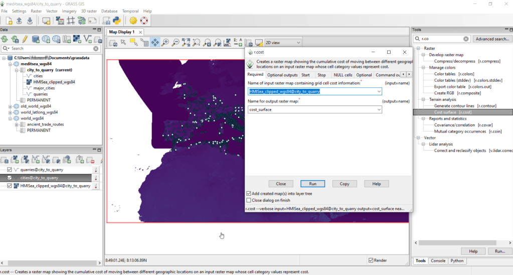
After exiting QGIS and launching GRASS, you select the mapset under the grassdata database at the top, right click and choose Switch mapset, and choose the mapset you want to work with (if you don’t see it, hit the database icon to browse and connect to the grassdata folder). You can display the layers in the GRASS window to visualize them, but it’s not necessary for running the tools. In the tool menu on the right, search for the Cost surface tool, r.cost, and choose the following options:
- Required: input raster map with grid cell cost is the human mobility index, and output raster is cost_surface
- Optional outputs: output raster with nearest start point as allocation_surface, output raster with movement as direction_surface
- Start: vector starting points for the cost surface are the destinations, the quarries
- Optional: check verbose output (to get more details on errors)
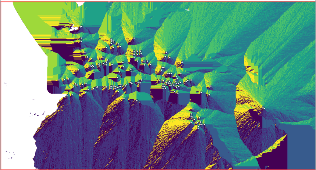
Running this operation on all 1,400 cities took a matter of seconds, and all three rasters described in the previous section were generated: cost, allocation, direction (shown below).


Using these outputs, we can run the Least cost route or flow tool, which is called r.drain (as it’s often used in earth sciences to chart the path that water will drain based on elevation).
- Required: Name of input elevation or cost surface raster is cost_surface, Name of output raster path: is path_raster
- Cost surface: check the Input raster map is a cost surface box, Name of input movement direction raster is direction_surface
- Start: Name of starting points vector map: are the origins (cities)
- Path settings: choose ONE option that you’d like to record (or none)
- Optional: check Verbose mode, Name for output drain vector is path_vector
This also took mere seconds to complete (!) and generated the paths from each origin (city) to the closet destination (quarry) over the surface as both raster cells and vector lines. The output in GRASS is shown below.
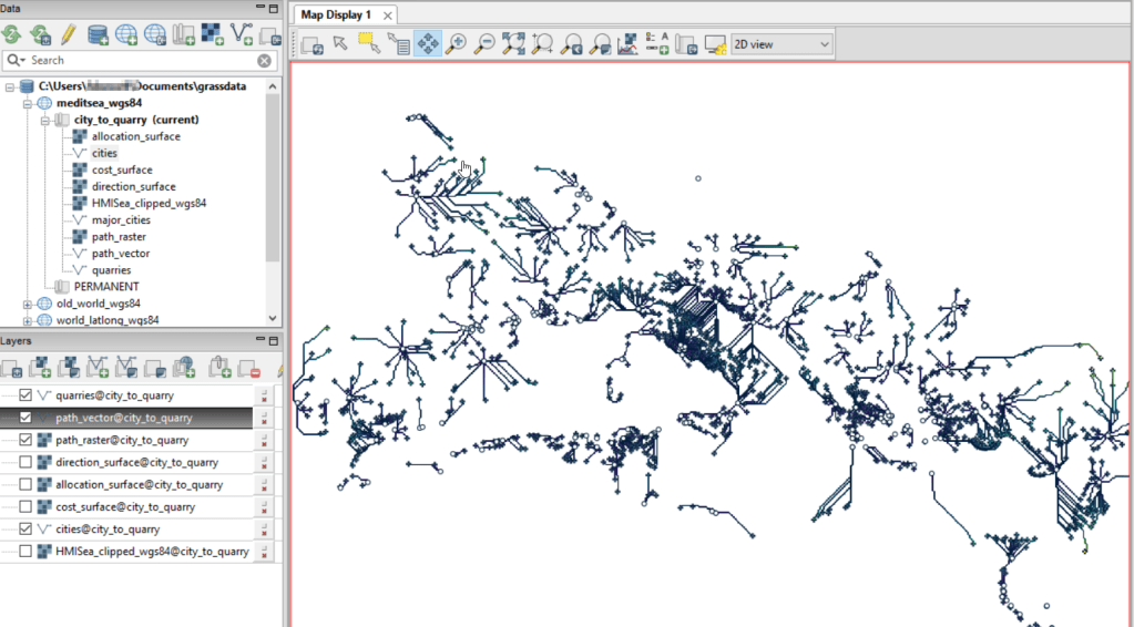
At this stage, we can hop back into QGIS, and load these output paths into our original project to symbolize and study what’s going on. Notice the settlements in northeastern Italy and along the Dalmatian coast; for many of them the least cost path is to a quarry across the sea rather than through rugged mountainous terrain. Even though some quarries in the mountains may be closer in actual distance, it’s a tougher path to travel.

Conclusion
The benefit of using GRASS is that we can run these processes fairly quickly for large datasets. The GRASS commands can also be compiled into a batch script, so you can create a documented and automated process instead of having to drill through multiple menus.
A big downside of the GRASS tools for this analysis is that the resulting vector paths contain no information about the origin or destination points, and only the raster path output carries along values. You might be able to generate this information through some extra steps; using the QGIS field calculator, you can get the coordinates for the start point and end point of each path and add them explicitly to the attribute table. Then take those coordinates, and for the start point of the line select the closest city and get its attributes, and for the end point select the closet quarry and get its attributes. I say “closest” because the vector paths don’t snap perfectly to the start and end points. Modifying the resolution of the human mobility index to make it coarser (fewer cells) might help to resolve this, or converting the origin and destination points to a raster of the same resolution as the index. Alternatively, if you incorporate the GRASS commands into a Python script, you could iterate over the origins in the least cost path analysis and record the origin IDs as you step through.
I haven’t worked all the pieces, but hopefully this will be useful for those of you who are interested in conducting a basic cost surface analysis in open source. The student I was helping was interested in measuring the density of the paths across a grid, so this process worked for him as he didn’t need to associate the paths with origins and destinations. Beyond FOSS GIS, ArcGIS Pro has a full suite of tools for cost surface analysis, and the underlying methods and logic are the same.


You must be logged in to post a comment.