In this post I’ll demonstrate some essential data processing steps prior to joining census American Community Survey (ACS) tables downloaded from data.census.gov to TIGER shapefiles, in order to create thematic maps. I thought this would be helpful for students in my university who are now doing GIS-related courses from home, due to COVID-19. I’ll illustrate the following with Excel and QGIS: choosing an appropriate boundary file for making your map, manipulating geographic id codes (GEOIDs) to insure you can match data file to shapefile, prepping your spreadsheet to insure that the join will work, and calculating new summaries and percent totals with ACS formulas. Much of this info is drawn from the chapters in my book that cover census geography (chapter 3), ACS data (chapter 6), and GIS (chapter 10). I’m assuming that you already have some basic spreadsheet, GIS, and US census knowledge.
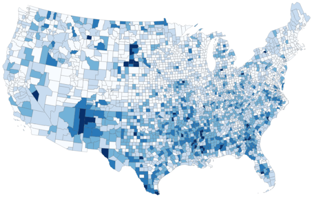
For readers who are not interested in the technical details, you still may be interested in the map we’ll create in this example: how many children under 18 lack access to a computer with internet access at home? With COVID-19 there’s a sudden expectation that all school children will take classes remotely from home. There are 73.3 million children living in households in the US, and approximately 9.3 million (12.7%) either have no computer at home, or have a computer but no internet access. The remaining children have a computer with either broadband or dial-up at home. Click on the map below to explore the county distribution of the under 18 population who lack internet access at home, or follow this link: https://arcg.is/0TrGTy.
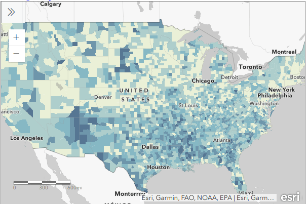
Click on the Map to View Full Screen and Interact
Preliminaries
First, we need to get some ACS data. Read this earlier post to learn how to use data.census.gov (or for a shortcut download the files we’re using here). I downloaded ACS table B28005 Age by Presence of a Computer and Types of Internet Subscription in Household at the county-level. This is one of the detailed tables from the latest 5-year ACS from 2014-2018. Since many counties in the US have less than 65,000 people, we need to use the 5-year series (as opposed to the 1-year) to get data for all of them. The universe for this table is the population living in households; it does not include people living in group quarters (dormitories, barracks, penitentiaries, etc.).
Second, we need a boundary file of counties. You could go to the TIGER Line Shapefiles, which provides precise boundaries of every geographic area. Since we’re using this data to make a thematic map, I suggest using the Cartographic Boundary Files (CBF) instead, which are generalized versions of TIGER. Coastal water has been removed and boundaries have been smoothed to make the file smaller and less detailed. We don’t need all the detail if we’re making a national-scale map of the US that’s going on a small screen or an 8 1/2 by 11 piece of paper. I’m using the medium (5m) generalized county file for 2018. Download the files, put them together in a new folder on your computer, and unzip them.
TIGER Line shapefile
CBF shapefile
GEOIDs
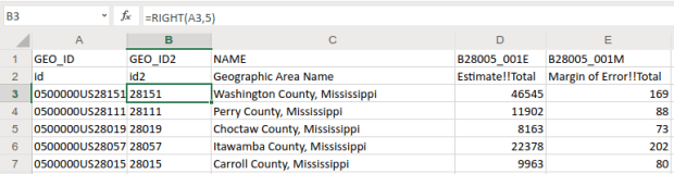
Downloads from data.census.gov include three csv files per table that contain: the actual data (data_with_overlays), metadata (list of variable ids and names), and a description of the table (table_title). There are some caveats when opening csv files with Excel, but they don’t apply to this example (see addendum to this post for details). Open your csv file in Excel, and save it as an Excel workbook (don’t keep it in a csv format).
The first column contains the GEOID, which is a code that uniquely identifies each piece of geography in the US. In my file, 0500000US28151 is the first record. The part before ‘US’ indicates the summary level of the data, i.e. what the geography is and where it falls in the census hierarchy. The 050 indicates this is a county. The part after the ‘US’ is the specific identifier for the geography, known as an ANSI / FIPS code: 28 is the state code for Mississippi, and 151 is the county code for Washington County, MS. You will need to use this code when joining this data to your shapefile, assuming that the shapefile has the same code. Will it?
That depends. There are two conventions for storing these codes; the full code 0500000US28151 can be used, or just the ANSI / FIPS portion, 28151. If your shapefile uses just the latter (find out by adding the shapefile in GIS and opening its attribute table), you won’t have anything to base the join on. The regular 2018 TIGER file uses just the ANSI / FIPS, but the 2018 CBF has both the full GEOID and the ANSI FIPS. So in this case we’re fine, but for the sake of argument if you needed to create the shorter code it’s easy to do using Excel’s RIGHT formula:
The formulas RIGHT, LEFT, and MID are used to return sub-strings of text
The formulas reads X characters from the right side of the value in the cell you reference and returns the result. You just have to count the number of characters up to the “S’ in the “US”. Copy and paste the formula all the way down the column. Then, select the entire column, right click and chose copy, select it again, right click and choose Paste Special and Values (in Excel, the little clipboard image with numbers on top of it). This overwrites all the formulas in the column with the actual result of the formula. You need to do this, as GIS can’t interpret your formulas. Put some labels in the two header spaces, like GEO_ID2 and id2.

Copy a column, and use Paste Special – Values on top of that column to overwrite formulas with values
Subsets and Headers
It’s common that you’ll download census tables that have more variables than you need for your intended purpose. In this example we’re interested in children (people under 18) living in households. We’re not going to use the other estimates for the population 18 to 64 and 65 and over. Delete all the columns you don’t need (if you ever needed them, you’ve got them saved in your csv as a backup).
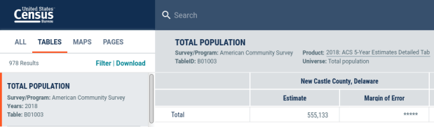
Notice there are two header rows: one has a variable ID and the other has a label. In ACS tables the variables always come in pairs, where the first is the estimate and the second is the margin of error (MOE). For example, in Washington County, Mississippi there are 46,545 people living in households +/- 169. Columns are arranged and named to reflect how values nest: Estimate!!Total is the total number of people in households, Estimate!!Total!!Under 18 years is the number people under 18 living in households, which is a subset of the total estimate.
The rub here is that we’re not allowed to have two header rows when we join this table to our shapefile – we can only have one. We can’t keep the labels because they’re too long – once joined, the labels will be truncated to 10 characters and will be indistinguishable from each other. We’ll have to delete that row, leaving us with the cryptic variable IDs. We can choose to keep those IDs – remember we have a separate metadata csv file where we can look up the labels – or we can rename them. The latter is feasible if we don’t have too many. If you do rename them, you have to keep them short, no more than 10 characters or they’ll be truncated. You can’t use spaces (underscores are ok), any punctuation, and can’t begin variables names with a number. In this example I’m going to keep the variable IDs.
Two odd gotchas: first, find the District of Columbia in your worksheet and look at the MOE for total persons in households (variable 001M). There is a footnote for this value, five asterisks *****. Replace it with a zero. Keep an eye out for footnotes, as they wreak havoc. If you ever notice that a numeric column gets saved as text in GIS, it’s probably because there’s a footnote somewhere. Second, change the label for the county name from NAME to GEO_NAME (our shapefile already has a column called NAME, and it will cause problems if we have duplicates). If you save your workbook now, it’s ready to go if you want to map the data in it. But in this example we have some more work to do.
Create New ACS Values
We want to map the percentage of children that do not have access to either a computer or the internet at home. In this table these estimates are distinct for children with a computer and no internet (variable 006), and without a computer (variable 007). We’ll need to aggregate these two. For most thematic maps it doesn’t make sense to map whole counts or estimates; naturally places that have more people are going to have more computers. We need to normalize the data by calculating a percent total. We could do this work in the GIS package, but I think it’s easier to use the spreadsheet.
To calculate a new estimate for children with no internet access at home, we simply add the two values together (006_E and 007_E). To calculate a new margin of error, we take the square root of the sum of the squares for the MOEs that we’re combining (006_M and 007_M). We also use the ROUND formula so our result is a whole number. Pretty straightforward:
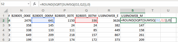
When summing ACS estimates, take the square root of the sum of the squares for each MOE to calculate a MOE for the new estimate.
To calculate a percent total, divide our new estimate by the number of people under 18 in households (002_E). The formula for calculating a MOE for a percent total is tougher: square the percent total and the MOE for the under 18 population (002_M), multiply them, subtract that result from the MOE for the under 18 population with no internet, take the square root of that result and divide it by the under 18 population (002_E):
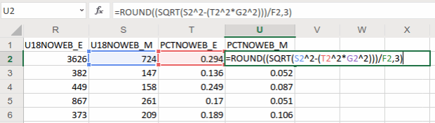
The formula for calculating the MOE for a proportion includes: the percentage, MOE for the subset population (numerator), and the estimate and MOE for the total population (denominator)
In Washington County, MS there are 3,626 +/- 724 children that have no internet access at home. This represents 29.4% +/- 5.9% of all children in the county who live in a household. It’s always a good idea to check your math: visit the ACS Calculator at Cornell’s Program for Applied Demographics and punch in some values to insure that your spreadsheet formulas are correct.
You should scan the results for errors. In this example, there is just one division by zero error for Kalawao County in Hawaii. In this case, replace the formula with 0 for both percentage values. In some cases it’s also possible that the MOE proportion formula will fail for certain values. Not a problem in our example, but if it does the solution is to modify the formula for the failed cases to calculate a ratio instead. Replace the percentage in the formula with the ratio (the total population divided by the subset population) AND change the minus sign under the square root to a plus sign.
Some of these MOE’s look quite high relative to the estimate. If you’d like to quantify this, you can calculate a coefficient of variation for the estimate (not the percentage). This formula is straightforward: divide the MOE by 1.645, divide that result by the estimate, and multiply by 100:

A CV can be used to gauge the reliability of an estimate
Generally speaking, a CV value between 0-15 indicates that as estimate is highly reliable, 12-34 is of medium reliability, and 35 and above is low reliability.
That’s it!. Make sure to copy the columns that have the formulas we created, and do a paste-special values over top of them to replace the formulas with the actual values. Some of the CV values have errors because of division by zero. Select the CV column and do a find and replace, to find #DIV/0! and replace it with nothing. Then save and close the workbook.
For more guidance on working with ACS formulas, take a look at this Census Bureau guidebook, or review Chapter 6 in my book.
Add Data to QGIS and Join
In QGIS, we select the Data Source Manager button , and in the vector menu add the CBF shapefile. All census shapefiles are in the basic NAD83 system by default, which is not great for making a thematic map. Go to the Vector Menu – Data Management Tools – Reproject Layer. Hit the little globe beside Target CRS. In the search box type ‘US National’, select the US National Atlas Equal Area option in the results, and hit OK. Lastly, we press the little ellipses button beside the Reprojected box, Save to File, and save the file in a good spot. Hit Run to create the file.
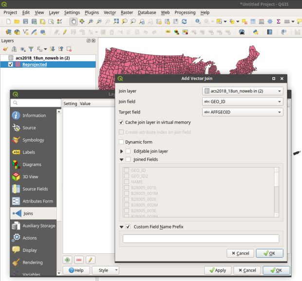
In the layers menu, we remove the original counties file, then select the new one (listed as Reprojected), right click, Set CRS, Set Project CRS From Layer. That resets our window to match the map projection of this layer. Now we have a projected counties layer that looks better for a thematic map. If we right click the layer and open its attribute table, we can see that there are two columns we could use for joining: AFFGEOID is the full census code, and GEOID is the shorter ANSI / FIPS.
Hit the Data Source Manager button again, stay under the vector menu, and browse to add the Excel spreadsheet. If our workbook had multiple sheets we’d be prompted to choose which one. Close the menu and we’ll see the table in the layers panel. Open it up to insure it looks ok.
To do a join, select the counties layer, right click, and choose properties. Go to the Joins tab. Hit the green plus symbol at the bottom. Choose the spreadsheet as the join layer, GEO_ID as the join field in the spreadsheet, and AFFGEOID as the target field in the counties file. Go down and check Custom Field Name, and delete what’s in the box. Hit OK, and OK again in the Join properties. Open the attribute table for the shapefile, scroll over and we should see the fields from the spreadsheet at the end (if you don’t, check and verify that you chose the correct IDs in the join menu).
QGIS Map
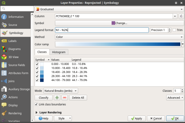
We’re ready to map. Right click the counties and go to the properties. Go to the Symbology tab and flip the dropdown from Single symbol to Graduated. This lets us choose a Column (percentage of children in households with no internet access) and create a thematic map. I’ve chosen Natural Breaks as the Mode and changed the colors to blues. You can artfully manipulate the legend to show the percentages as whole numbers by typing *100 in the Column box beside the column name, and adding a % at the end of the Legend format string. I also prefer to alter the default settings for boundary thickness: click the Change button beside Symbol, select Simple fill, and reduce the width of the boundaries from .26 to .06, and hit OK.
There we have a map! If you right click on the counties in the layers panel and check the Show Feature Count box, you’ll see how many counties fall in each category. Of course, to make a nice finished map with title, legend, and inset maps for AK, HI, and PR, you’d go into the Print Layout Manager. To incorporate information about uncertainty, you can add the county layer to your map a second time, and style it differently – maybe apply crosshatching for all counties that have a CV over 34. Don’t forget to save your project.
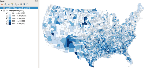
Percentage of Children in Households without Internet Access by County 2014-2018
How About that Web Map?
I used my free ArcGIS Online account to create the web map at the top of the page. I followed all the steps I outlined here, and at the end exported the shapefile that had my data table joined to it out as a new shapefile; in doing so the data became fused to the new shapefile. I uploaded the shapefile to ArcGIS online, chose a base map, and re-applied the styling and classification for the county layer. The free account includes a legend editor and expression builder that allowed me to show my percentages as fractions of 100 and to modify the text of the entries. The free account does not allow you to do joins, so you have to do this prep work in desktop GIS. ArcGIS Online is pretty easy to learn if you’re already familiar with GIS. For a brief run through check out the tutorial Ryan and I wrote as part of my lab’s tutorial series.
Addendum – Excel and CSVs
While csv files can be opened in Excel with one click, csv files are NOT Excel files. Excel interprets the csv data (plain text values separated by commas, with records separated by line breaks) and parses it into rows and columns for us. Excel also makes assumptions about whether values represents text or numbers. In the case of ID codes like GEOIDs or ZIP Codes, Excel guesses wrong and stores these codes as numbers. If the IDs have leading zeros, the zeros are dropped and the codes become incorrect. If they’re incorrect, when you join them to a shapefile the join will fail. Since data.census.gov uses the longer GEOID this doesn’t happen, as the letters ‘US’ are embedded in the code, which forces Excel to recognize it as text. But if you ever deal with files that use the shorter ANSI / FIPS you’ll run into trouble.
Instead of clicking on csvs to open them in Excel: launch Excel to a blank workbook, go to the data ribbon and choose import text files, select your csv file from your folder system, indicate that it’s a delimited text file, and select your ID column and specify that it’s text. This will import the csv and save it correctly in Excel.


You must be logged in to post a comment.