
I often get questions about comparing American Community Survey (ACS) estimates from the US Census Bureau over time. This process is more complicated than you’d think, as the ACS wasn’t designed as a time series dataset. The Census Bureau does publish comparative profile tables that compare two period estimates (in data.census.gov), but for a limited number of geographies (states, counties, metro areas).
For me, this question often takes the form of comparing change at the census tract-level for mapping and GIS projects. In this post, we’ll look at the primary considerations for comparing estimates over time, and I will walk through an example with spreadsheet formulas for calculating: change and percent change (estimates and margins of error), coefficients of variation, and tests for statistical difference. We’ll conclude with examples of mapping this data.
Primary considerations
- The ACS is published in 1-year and 5-year period estimates. 1-year estimates are only available for areas that have at least 65,000 people, which means if you’re looking at small geographies (census tracts, ZCTAs) or rural areas that have small populations (most counties, county subdivisions, places) you will need to use the 5-year series. When comparing 5-year estimates, you should only compare non-overlapping time periods. For example, you would not compare the 2021 ACS (2017-2021) with the 2020 ACS (2016-2020) as these estimates have four years of sample data in common. In contrast, 2021 and 2016 (2012-2016) could be compared as they do not overlap…
- …but, census geography changes over time. All statistical areas (block groups, tracts, ZCTAs, PUMAs, census designated-places, etc.) are updated every ten years with each decennial census. Areas can be re-numbered, aggregated, subdivided, or modified as populations change. This complicates comparisons; 2021 data uses geography created in 2020, while 2016 data uses geography from 2010. The only non-overlapping ACS periods with identical geographic areas would be 2014 (2010-2014) and 2019 (2015-2019). The only other alternative would be to use normalized census data, which involves additional work. While most legal areas (states, counties) can change at any time, they are generally more stable and you can make comparisons over a longer-period with modest adjustments.
- All ACS estimates are fuzzy, representing a midpoint within a possible range of values (indicated with a margin of error) at a 90% confidence level. Because of sampling variability, any difference that you see between one time period and the next could be noise and not actual change. If you’re working with small geographies or small population groups, you’ll encounter large margins of error and it will be difficult to measure actual change. In addition, it’s often difficult to detect change in any area that isn’t experiencing either substantive growth or decline.
ACS Formulas
Let’s look at an example where we’ll use formulas to: calculate change over time, measure the reliability of a difference estimate, and determine whether two estimates are significantly different. I downloaded table B25064 Median Gross Rent (dollars) from the 5-year 2014 (2010-2014) and 2019 (2015-2019) ACS for all census tracts in Providence County, RI, and stitched them together into one spreadsheet. In this post I’ve replaced the cell references with an abbreviated label that indicates what should be referenced (i.e. Est1_MOE is the margin of error for the first estimate). You can download a copy of the spreadsheet with these examples.
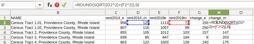
- To calculate the change / difference for an estimate, subtract one from the other.
- To calculate the margin of error for this difference, take the square root of the sum of the squares for each estimate’s margin of error (MOE):
=ROUND(SQRT((Est1_MOE^2)+(Est2_MOE^2)),0)
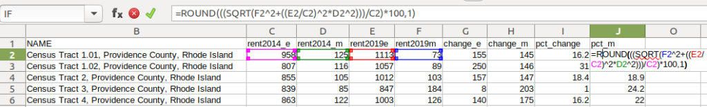
- To calculate percent change, divide the difference by the earliest estimate (Est1), and multiply by 100.
- To calculate the margin of error for the percent change, use the ACS formula for computing a ratio:
=ROUND(((SQRT(Est2_MOE^2+((Est2/Est1)^2*Est1_MOE^2)))/Est1)100,1)
Divide the 2nd estimate by the 1st and square it, multiply that by the square of the 1st estimate’s MOE, add that to the square of the 2nd estimate’s MOE. Take the square root of that result, then divide by the 1st estimate and multiply by 100. Note that this is formula for percent change is different from the one used for calculating a percent total (the latter uses the formula for a proportion; switch the plus symbol under the square root to a minus for percent totals).
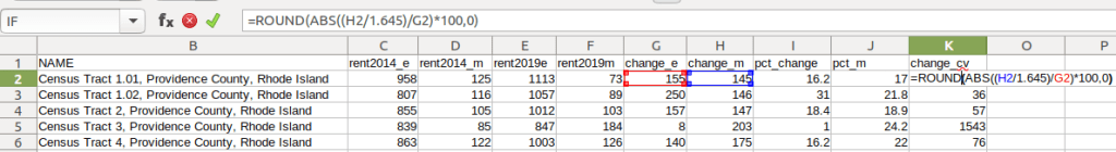
- To characterize the overall accuracy of the new difference estimate, calculate its coefficient of variation (CV):
=ROUND(ABS((Est_MOE/1.645)/Est)*100,0)
Divide the MOE for the difference by 1.645, which is the Z-value for a 90% confidence interval. Divide that by the difference itself, and multiply by 100. Since we can have positive or negative change, we take the absolute value of the result.
- To convert the CV into the generally recognized reliability categories:
=IF(CV<=12,"high",IF(CV>=35,"low","medium"))
If the CV value is between 0 to 12, then it’s considered to be highly reliable, else if the CV value is greater than or equal to 35 it’s considered to be of low reliability, else it is considered to be of medium reliability (between 13 and 34). Note: this is a conservative range; search around and you’ll find more liberal examples that use 0-15, 16-40, 41+.
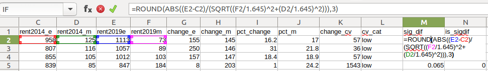
- To measure whether two estimates are significantly different from each other, use the statistical difference formula:
=ROUND(ABS((Est2-Est1)/(SQRT((Est1_MOE/1.645)^2+(Est2_MOE/1.645)^2))),3)
Divide the MOE for both the 1st and 2nd estimate by 1.645 (Z value for 90% confidence), take the sum of their squares, and then square root. Subtract the 1st estimate from the 2nd, and then divide. Again in this case, since we could have a positive or negative value we take the absolute value.
- To create a boolean significant or not value:
=IF(SigDif>1.645,1,0)
If the significant difference value is greater than 1.645, then the two estimates are significantly different from each other (TRUE 1), implying that some actual change occurred. Otherwise, the estimates are not significantly different (FALSE 0), which means any difference is likely the result of variability in the sample, or any true difference is hidden by this variability.
ALWAYS CHECK YOUR WORK! It’s easy to put parentheses in the wrong place or transpose a cell reference. Take one or two examples and plug them into Cornell PAD’s ACS Calculator, or into Fairfax County VA’s ACS Tools (spreadsheets with formulas – bottom of page). The Census Bureau also provides a spreadsheet that lets you test multiple values for significant difference. Caveat: for the Cornell calculator use the ratio option instead of change when testing. For some reason its change formula never matches my results, but the Fairfax spreadsheets do. I’ve also checked my formulas against the Census Bureau’s ACS Handbooks, and they clearly say to use the ratio formula for percent change.
Interpreting Results
Let’s take a look at a few of the records to understand the results. In Census Tract 1.01, median gross rent increased from $958 (+/- 125) in 2014 to $1113 (+/- 73) in 2019, a change of $155 (+/- 145) and a percent change of 16.2% (+/- 17%). The CV for the change estimate was 57, indicating that this estimate has low reliability; the margin of error is almost equal to the estimate, and the change could have been as little as $10 or as great as $300! The rent estimates for 2014 and 2019 are statistically different but not by much (1.761, higher than 1.645). The margins of error for the two estimates do overlap slightly (with $1,083 being the highest possible value in 2014 and $1,040 the lowest possible value in 2019).
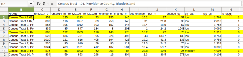
In Census Tract 4, rent increased from $863 (+/- 122) to $1003 (+/- 126), a change of $140 (+/- 175) and percent change of 16.2% (+/- 22%). The CV for the change estimate was 76, indicating very low reliability; indeed the MOE exceeds the value of the estimate. With a score of 1.313 the two estimates for 2014 / 2019 are not significantly different from each other, so any difference here is clouded by sample noise.
In Census Tract 9, rent increased from $875 (+/- 56) to $1083 (+/- 62), a change of $208 (+/- 84) or 23.8% (+/- 10.6%). Compared to the previous examples, these MOEs are much lower than the estimates, and the CV value for the difference is 25, indicating medium reliability. With a score of 4.095, these two estimates are significantly different from each other, indicating substantive change in rent in this tract. The highest possible value in 2014 was $931, and the lowest possible value in 2019 was $1021, so there is no overlap in the value ranges over time.
Mapping Significant Difference and CVs
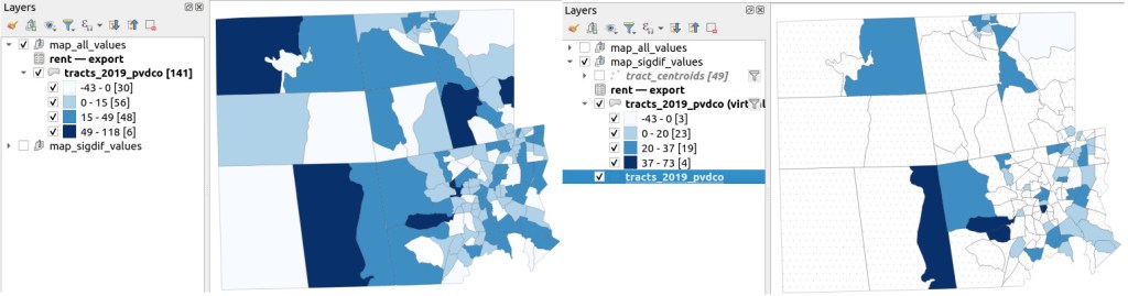
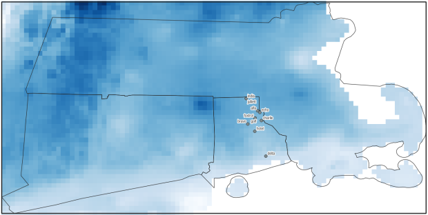
I grabbed the Census Cartographic Boundary File for tracts for Rhode Island in 2019, and selected out just the tracts for Providence County. I made a copy of my worksheet where I saved the data as text and values in a separate sheet (removing the formulas and encoding the actual outputs), and joined this sheet to the shapefile using the AFFGEOID. The City of Providence and surrounding cities and suburban areas appear in the southeast corner of the county.
The map on the left displays simple percent change over time. In the map on the right, I applied a filter to select just tracts where change was significantly different (the non-significant tracts are symbolized with hash marks). In the screenshots, the count of the number of tracts in each class appears in brackets; I used natural breaks, then modified to place all negative values in the same class. Of the 141 tracts, only 49 had statistically different values. The first map is a gross misrepresentation, as change for most of the tracts can’t be distinguished from sampling variability.
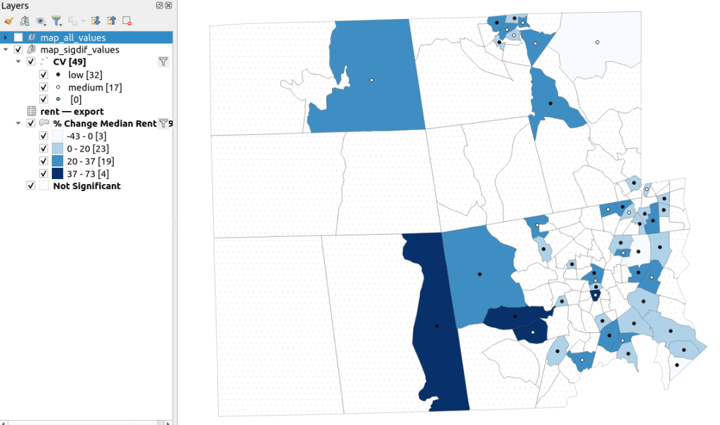
A refined version of the map on the right appears below. In this one, I converted the tracts from polygons to points in a new layer, applied a filter to select significantly different tracts, and symbolized the points by their CV category. Of the 49 statistically different tracts, the actual estimate of change was of low reliability for 32 and medium reliability for the rest. So even if the difference is significant, the precision of most of these estimates is poor.
Conclusion
Comparing change over time for ACS estimates is complex, time consuming, and yields many dubious results. What can you do? The size of the MOE relative to the estimate tends to decline as you look at either larger or more populous areas, or larger and fewer subcategories (i.e. 4 income brackets instead of 8). You could also look at two period estimates that are further apart, making it more likely that you’ll see changes; say 2005-2009 compared to 2016-2020. But – you’ll have to cope with normalizing the data. Places that are rapidly changing will exhibit more difference than places that aren’t. If you are studying basic demographics (age / sex / race / tenure) and not socio-economic indicators, use the decennial census instead, as that’s a count and not a sample survey. Ultimately, it’s important to address these issues, and be honest. There’s a lot of bad research where people ignore these considerations, and thus make faulty claims.
For more information, visit the Census Bureau’s page on Comparing ACS Data. Chapter 6 of my book Exploring the US Census covers the American Community Survey and has additional examples of these formulas. As luck would have it, it’s freely accessible as a preview chapter from my publisher, SAGE.
Final caveat: dollar values in the ACS are based on the release year of the period estimate, so 2010-2014 rent is in 2014 dollars, and 2015-2019 is in 2019 dollars. When comparing dollar values over time you should adjust for inflation; I skipped that here to keep the examples a bit simpler. Inflation in the 2010s was rather modest compared to the 2020s, but still could push tracts that had small changes in rent to none when accounted for.


You must be logged in to post a comment.