python

Folium Map Zoomed In

Folium Maps with Geopandas and Random Color Schemes

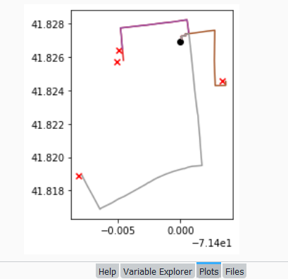
In this post I’ll demonstrate one method for assigning random colors to features on a Folium map, with specific consideration for plotting features from a geopandas geodataframe. I’m picking up where I left off in my previous post, where we plotted routes from a file of origins and destinations using the OpenRouteService. I wrote a regular Python script where I made a simple plot of the points and lines using geopanda’s plot, but in a Jupyter Notebook version I went a step further and used Folium to plot the features on the OpenStreetMap.

Folium is a Python port of Leaflet, a popular javascript library for making basic interactive web maps. I’m not going to cover the basics in this post, so for starters you can view Folium’s documentation: there’s a basic getting started tutorial, and a more detailed user guide. Geopanda’s documentation includes Folium examples that illustrate how you can work with the two packages in tandem.

One important concept to grasp, is that many of the basic examples assume you are working with latitude and longitude coordinates that are either hard-coded as variables, stored in lists, or stored in dedicated columns in a dataframe as attributes. But if you are working with actual geometry stored in a geodataframe, to display features you need to use the folium.GeoJson function instead. For example, this tutorial illustrates how to render points stored in a dedicated geometry column, and not as coordinates stored as numeric attributes in separate columns.

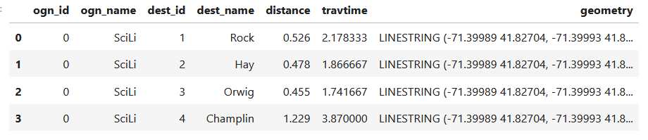
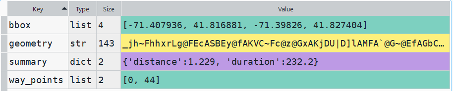
In my example, I have the following geodataframe, where each record is a route with linear geometry, with a sequential integer as the index value:

All I wanted to do was assign random colors to each line to depict them differently on the map – and I could not find a straightforward way to do that! In odd contrast, making a choropleth map (i.e. values shaded by quantity) seems easy. I found a couple posts on stack exchange, here and here, that demonstrated how to create and assign colors by randomly creating hexadecimal color strings. Another post illustrated how to assign specific non-random colors, and this thorough blog post walked through assigning colors to categorical data (where each category gets a distinct color).

I pooled aspects of the last two solutions together to come up with the following:

# Get colors for lines
gdfcount=len(gdf) # number of routes
colors=['red','green','blue','gray','purple','brown']
clist=[] # list of colors, one per route
c=0
for i in range(gdfcount):
    clist.append(colors[c])
    c=c+1
    if c>len(colors)-1:
        c=0 # if we run out of colors, start over
color_series = pd.Series(clist,name='color') # create series in order to...
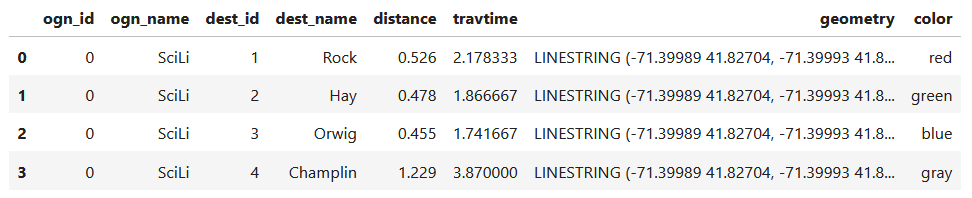
gdf_c=pd.merge(gdf, color_series, left_index=True,right_index=True) # join to routes on seq index #
gdf_c

I get the number of features in my geodataframe, and create a list with a set number of colors. I iterate through my colors list, generating a new list with one color for each record in my frame. If I cycle through all the colors, I reset a counter and cycle through again from the beginning. When finished, I turn the list into a pandas series, which generates a sequential integer index paired with the color. Then I merge the series with my geodataframe (called gdf) using the sequential index, so the color is now part of each record:

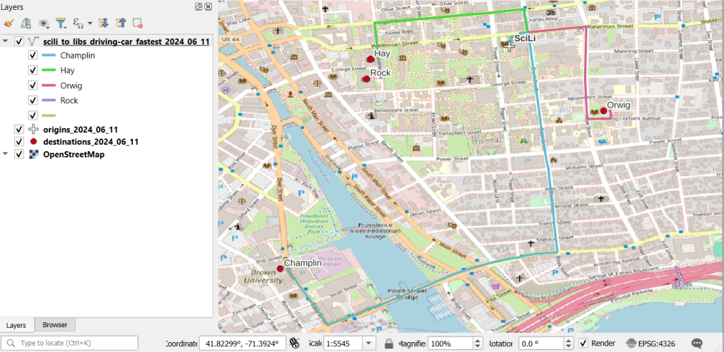
Then I can create the map. When creating a Folium map you need to provide a location on which the map will be centered. I used Geopanda’s total_bounds method to get the bounding box of my features, which returns a list of coordinates: min X, min Y, max X, max Y. I sum the appropriate coordinates for X and Y and divide each by two, which gives me the coordinate pair for the center of the bounding box.

bnds=gdf.total_bounds 
clong=(bnds[0]+bnds[2])/2
clat=(bnds[1]+bnds[3])/2

Next, I generate the map using those coordinates (the name of the map object in the example is “m”). I create a popup menu first, specifying which fields from the geodataframe to display when you click on a line. Then I add the actual geodataframe to the map, applying a style_function parameter to apply the colors and popup to each feature. The lambda business is necessary here, apparently when you’re applying styles that differ for each feature you have to iterate over the features. I guess this is the norm when you’re styling a GeoJSON file (but is at odds with how you would normally operate in a dataframe or GIS environment).

m = folium.Map(location=[clat,clong], tiles="OpenStreetMap")
popup = folium.GeoJsonPopup(
    fields=["ogn_name", "dest_name","distance","travtime"],
    localize=True,
    labels=True)
folium.GeoJson(gdf_c,style_function=lambda x: {'color':x['properties']['color']},popup=popup).add_to(m)

Once the lines are added to the map, we can continue to add additional features. I use folium.GeoJson twice more to plot my origin and destination points. It took me quite a bit of searching around to get the syntax right, so I could change the icon and color. This tutorial helped me identify the possibilities, but again the basic iteration examples don’t work if you’re using GeoJSON or geometry in a geodataframe. If you’re assigning several different colors you have to apply lambda, as in this example in the Folium docs. In my case I just wanted to change the default icon and color and apply them uniformly to all symbols, so I didn’t need to iterate. Once you’ve added everything to the map, you can finally display it!

folium.GeoJson(ogdf,marker=folium.Marker(icon=folium.Icon(icon='home',color='black'))).add_to(m)
folium.GeoJson(dgdf,marker=folium.Marker(icon=folium.Icon(icon='star',color='lightgray'))).add_to(m)
m.fit_bounds(m.get_bounds()) # zoom to bounding box
m

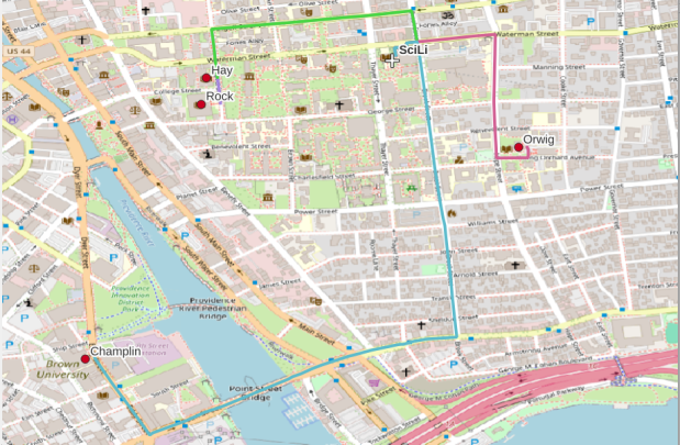
A static screenshot of the result follows, as I can’t embed Folium maps into my WordPress site. Everything works perfectly when using the notebook locally, but GitHub won’t display the map either, even if the Notebook is saved as a trusted source. If you open the notebook in the nbviewer, it renders just fine (scroll to the bottom of the notebook to see the map and interact).

Undoubtedly there are other options for achieving this same result. I saw examples where people had embedded all the styles they needed within a dedicated dataframe column as code and applied them, or wrote a function for applying the styles. I have rarely worked with javascript or coded my own web maps, so I expect there may be aspects of doings things in that world that were ported over to Folium that aren’t intuitive to me. But not being able to readily apply a random color scheme is bizarre, and is a big shortcoming of the module.

I’d certainly benefit from a more formal introduction to Folium / Leaflet, as scattered blog posts and stack exchange solutions can only take you so far. But here’s hoping that this post has added some useful scraps to your knowledge!

Route from SciLi to Libraries on OSM

Plotting Routes with OpenRouteService and Python

I made my first foray into network routing recently, and drafted a python script and notebook that plots routes using the OpenRouteService (ORS) API. ORS is based on underlying data from the OpenStreetMap (OSM), and was created by the Heidelberg Institute for Geoinformation Technology, at Heidelberg University in Germany. They publish several routing APIs that include directions, isochrones, distance matricies, geocoding, and route optimization. You can access them via a basic REST API, but they also have a dedicated Python wrapper and an R package which makes things a bit easier. For non-programmers, there is a plugin for QGIS.

Regardless of which tool you use, you need to register for an API key first. The standard plan is free for small projects; for example you can make 2,000 direction requests per day with a limit of 40 per minute. If you’re affiliated with higher ed, government, or a non-profit and are doing non-commercial research, you can upgrade to a collaborative plan that ups the limits. It’s also possible to install OSR locally on your own server for large jobs.

I opted for Python and used the openrouteservice Python module, in conjunction with other geospatial modules including geopandas and shapely. In my script / notebook I read in two CSV files, one with origins and the other with destinations. At minimum both files must contain a header row, and attributes for unique identifier, place label, longitude, and latitude in the WGS 84 spatial reference system. The script plots a route between each origin and every destination, and outputs three shapefiles that include the origin points, destination points, and routes. Each line in the route file includes the ID and names of each origin and destination, as well as distance and travel time. The script and notebook are identical, except that the script plots the end result (points and lines) using geopanda’s plot function, while the Jupyter Notebook plots the results on a Folium map (Folium is a Python implementation of the popular Leaflet JS langauge).

Visit the GitHub repo to access the scripts; a basic explanation with code snippets follows.

After importing the modules, you define several variables that determine the output, including a general label for naming the output file (routename), and several parameters for the API including the mode of travel (driving, walking, cycling, etc), distance units (meters, kilometers, miles), and route preference (fastest or shortest). Next, you provide the positions or “column” locations of attributes in the origin and destination CSV files for the id, name, longitude, and latitude. Lastly, you specify the location of those input files and the file that contains your API key. The location and names of output files are generated automatically based on the input; all will contain today’s date stamp, and the route file name includes route mode and preference. I always use the os module’s path function to ensure the scripts are cross-platform.

import openrouteservice, os, csv, pandas as pd, geopandas as gpd
from shapely.geometry import shape
from openrouteservice.directions import directions
from openrouteservice import convert
from datetime import date
from time import sleep

# VARIABLES
# general description, used in output file
routename='scili_to_libs'
# transit modes: [“driving-car”, “driving-hgv”, “foot-walking”, “foot-hiking”, “cycling-regular”, “cycling-road”,”cycling-mountain”, “cycling-electric”,]
tmode='driving-car'
# distance units: [“m”, “km”, “mi”]
dunits='mi'
# route preference: [“fastest, “shortest”, “recommended”]
rpref='fastest'

# Column positions in csv files that contain: unique ID, name, longitude, latitude
# Origin file
ogn_id=0
ogn_name=1
ogn_long=2
ogn_lat=3
# Destination file
d_id=0
d_name=1
d_long=2
d_lat=3

# INPUTS and OUTPUTS
today=str(date.today()).replace('-','_')

keyfile='ors_key.txt'
origin_file=os.path.join('input','origins.csv') #CSV must have header row
dest_file=os.path.join('input','destinations.csv') #CSV must have header row
route_file=routename+'_'+tmode+'_'+rpref+'_'+today+'.shp'
out_file=os.path.join('output',route_file)
out_origin=os.path.join('output',os.path.basename(origin_file).split('.')[0]+'_'+today+'.shp')
out_dest=os.path.join('output',os.path.basename(dest_file).split('.')[0]+'_'+today+'.shp')

I define some general functions for reading the origin and destination files into nested lists, and for taking those lists and generating shapefiles out of them (by converting them to geopanda’s geodataframes). We read the origin and destination data in, grab the API key, set up a list to hold the routes, and create a header for the eventual output.

# For reading origin and dest files
def file_reader(infile,outlist):
    with open(infile,'r') as f:
        reader = csv.reader(f)    
        for row in reader:
            rec = [i.strip() for i in row]
            outlist.append(rec)
            
# For converting origins and destinations to geodataframes            
def coords_to_gdf(data_list,long,lat,export):
    """Provide: list of places that includes a header row,
    positions in list that have longitude and latitude, and
    path for output file.
    """
    df = pd.DataFrame(data_list[1:], columns=data_list[0])
    longcol=data_list[0][long]
    latcol=data_list[0][lat]
    gdf = gpd.GeoDataFrame(df, geometry=gpd.points_from_xy(df[longcol], df[latcol]), crs='EPSG:4326')
    gdf.to_file(export,index=True)
    print('Wrote shapefile',export,'\n')
    return(gdf)
      
origins=[]
dest=[]
file_reader(origin_file,origins)
file_reader(dest_file,dest)

# Read api key in from file
with open(keyfile) as key:
    api_key=key.read().strip()

route_count=0
route_list=[]
# Column header for route output file:
header=['ogn_id','ogn_name','dest_id','dest_name','distance','travtime','route']

Here are some nested lists from my sample origin and destination CSV files:

[['origin_id', 'name', 'long', 'lat'], ['0', 'SciLi', '-71.4', '41.8269']]
[['dest_id', 'name', 'long', 'lat'],
 ['1', 'Rock', '-71.405089', '41.825725'],
 ['2', 'Hay', '-71.404947', '41.826433'],
 ['3', 'Orwig', '-71.396609', '41.824581'],
 ['4', 'Champlin', '-71.408194', '41.818912']]

Then the API call begins. For every record in the origin list, we iterate through each record in the destination list (in both cases starting at index 1, skipping the header row) and calculate a route. We create a tuple with each pair of origin and destination coordinates (coords), which we supply to the OSR directions API. We pass in the parameters supplied earlier, and specify instructions as False (instructions are the actual turn by turn directions returned as text).

The result is returned as a JSON object, which we can manipulate like a nested Python dictionary. At the first level in the dictionary, we have three keys and values: a bounding box for the route area with a list value, metadata with a dictionary value, and routes with a list value. Dive into route, and the list contains a single dictionary, and inside that dictionary – more dictionaries that contain the values we want!

1st level, dictionary with three keys, the routes key has a single list value
2nd level, the routes list has a single element, another dictionary
3rd level, inside the dictionary in that list element, four keys with route data

The next step is we extract the values that we need from this container by specifying their location. For example, the distance value is inside the first list of routes, inside summary and inside distance. Travel time is in a similar spot, and we take an extra step of dividing by 60 to get minutes instead of seconds. The geometry is trickier as its encoded in some binary line format. We use OSR’s decoding function to turn it into plain text, and shapely to convert it into WKT text; we’ll need WKT in order to get the geometry into a geodataframe, and eventually output as a shapefile. Once we have the bits we need, we string them together as a list for that origin / destination pair, and append this to our route list.

# API CALL
for ogn in origins[1:]:
    for d in dest[1:]:
        try:
            coords=((ogn[ogn_long],ogn[ogn_lat]),(d[d_long],d[d_lat]))
            client = openrouteservice.Client(key=api_key) 
            # Take the returned object, save into nested dicts:
            results = directions(client, coords, 
                                profile=tmode,instructions=False, preference=rpref,units=dunits)
            dist = results['routes'][0]['summary']['distance']
            travtime=results['routes'][0]['summary']['duration']/60 # Get minutes
            encoded_geom = results['routes'][0]['geometry']
            decoded_geom = convert.decode_polyline(encoded_geom) #convert from binary to txt
            wkt_geom=shape(decoded_geom).wkt #convert from json polyline to wkt
            route=[ogn[ogn_id],ogn[ogn_name],d[d_id],d[d_name],dist,travtime,wkt_geom]
            route_list.append(route)
            route_count=route_count+1
            if route_count%40==0: # API limit is 40 requests per minute
                print('Pausing 1 minute, processed',route_count,'records...')
                sleep(60)
        except Exception as e:
            print(str(e))
            
api_key=''
print('Plotted',route_count,'routes...' )

Here is some sample output for the final origin / destination pair, which contains the IDs and labels for the origin and destination, distance in miles, time in minutes, and a string of coordinates that represents the route:

['0', 'SciLi', '4', 'Champlin', 1.229, 3.8699999999999997,
 'LINESTRING (-71.39989 41.82704, -71.39993 41.82724, -71.39959 41.82727, -71.39961 41.82737, -71.39932 41.8274, -71.39926 41.82704, -71.39924000000001 41.82692, -71.39906000000001 41.82564, -71.39901999999999 41.82534, -71.39896 41.82489, -71.39885 41.82403, -71.39870000000001 41.82308, -71.39863 41.82269, -71.39861999999999 41.82265, -71.39858 41.82248, -71.39855 41.82216, -71.39851 41.8218, -71.39843 41.82114, -71.39838 41.82056, -71.39832 41.82, -71.39825999999999 41.8195, -71.39906000000001 41.81945, -71.39941 41.81939, -71.39964999999999 41.81932, -71.39969000000001 41.81931, -71.39978000000001 41.81931, -71.40055 41.81915, -71.40098999999999 41.81903, -71.40115 41.81899, -71.40186 41.81876, -71.40212 41.81866, -71.40243 41.81852, -71.40266 41.81844, -71.40276 41.81838, -71.40452000000001 41.81765, -71.405 41.81749, -71.40551000000001 41.81726, -71.40639 41.81694, -71.40647 41.81688, -71.40664 41.81712, -71.40705 41.81769, -71.40725 41.81796, -71.40748000000001 41.81827, -71.40792 41.81891, -71.40794 41.81895)']

Finally, we can write the output. We convert the nested route list to a pandas dataframe and use the header row for column names, and convert that dataframe to a geodataframe, building the geometry from the WKT string, and write that out. In contrast, the origins and destinations have simple coordinates (not in WKT), and we create XY geometry from those coordinates. Writing the geodataframe out to a shapefile is straightforward, but for debugging purposes it’s helpful to see the result without having to launch GIS. We can use geopandas’s plot function to draw the resulting geometry. I’m using the Spyder IDE, which displays plots in a dedicated window (in my example the coordinate labels for the X axis look strange, as the distances I’m plotting are small).

# Create shapefiles for routes
df = pd.DataFrame(route_list, columns=header)
gdf = gpd.GeoDataFrame(df, geometry=gpd.GeoSeries.from_wkt(df["route"]),crs = 'EPSG:4326')
gdf.drop(['route'],axis=1,inplace=True) # drop the wkt text
gdf.to_file(out_file,index=True)
print('Wrote route shapefile to:',out_file,'\n')

# Create shapefiles for origins and destinations
ogdf=coords_to_gdf(origins,ogn_long,ogn_lat,out_origin)
dgdf=coords_to_gdf(dest,d_long,d_lat,out_dest)

# Plot
base=gdf.plot(column="dest_id", kind='geo',cmap="Set1")
ogdf.plot(ax=base, marker='o',color='black')
dgdf.plot(ax=base, marker='x', color='red');

In a notebook environment we can employ something like Folium more readily, which gives us a basemap and some basic interactivity for zooming around and clicking on features to see attributes. Implementing this was a more complex than I thought it would be, and took me longer to figure out compared to the routing process. I’ll return to those details in a subsequent post…

In my sample data (output rendered below in QGIS) I was plotting fastest driving distance from the Brown University Sciences Library to the other libraries in our system. Compared to Google or Apple Maps the result made sense, although the origin coordinates I used for the SciLi had an impact on the outcome (assumed you left from the loading dock behind the building as opposed to the front door as Google did, which produces different routes in this area of one-way streets). My real application was plotting distances of hundreds of miles across South America, which went well and was useful for generating different outcomes using fastest or shortest route.

Take a look at the full script in GitHub, or if programming is not your thing check out the QGIS plugin instead (activate in the Plugins menu, search for OSR). Remember to get your API key first.

Coordinates Plotted in Rhode Island

Using PyProj to Transform Coordinates

I’ve written a number of spatial Python posts over the past few months; I’ll cap off this series with a short one on using PyProj to convert coordinates from one spatial reference system to another. PyProj is Python’s interface to PROJ, a library of coordinate system functions that power projection handling in many open source GIS and spatial packages.

A few months back I geocoded a large batch addresses against the Rhode Island DOT’s geocoding API, which returns coordinates in the local state plane system in feet. I decided to run the non-matching addresses against the Census Bureau’s Batch Geocoder, which returns coordinates in NAD 83 longitude and latitude. You can upload a CSV file of 10k addresses and get nearly instant results (one of my students recently wrote a tutorial on how to use it). So I split the unmatched records from my original CSV, uploaded it to the Census geocoder, and got matches.

Next, I needed to get the results from both processes into the same spatial reference system back in one unified file. The kludgy way to do this would be to plot each file separately in their respective systems in QGIS or ArcGIS, convert the NAD 83 plot to the state plane system, and merge the two vector files together. I used PyProj instead, to convert the NAD 83 coordinate data in the CSV to state plane, added that data to my main address CSV file, and plotted them all at once in the state plane system.

PyProj’s Transformer function does the job. I pass the EPSG / WKID codes for the input and output systems (4269 for NAD 83 and 3438 for NAD 83 RI State Plane ft-US) to Transformer.from_crs, and specify that I’m working with XY coordinates. I open the CSV file that contains the results from the Census Geocoder and read it in as a nested list, with each record as a sublist. Here are some sample records:

[["42221","1720 Victory Hwy, Glendale, RI, ","Match","Exact","1720 VICTORY HWY, GLENDALE, RI, 02826","-71.63746768099998,41.96913042600005","647200684","L","44","007","013002","1083"],
["44882","129 SHORE RD, Riverside, RI, ","No_Match"]]

Then I iterate through the records; in my example any record with less than 3 variables was a non-match, so I skip those. The Census geocoder returns longitude and latitude in the 5th position, in the same field separated with a comma (notice quotes around the coordinates in the example above, indicating that these are part of the same field so the comma is not used as a delimiter). I split this value on the comma, read the longitude as x1 and latitude as y1. The output of the transformer function returns coordinates x2 and y2 in the new system. I tack these new coordinates on to the existing record. Once the loop is finished, I write the result out as a new CSV; I used the name of the input file and tacked “stateplane” plus today’s date to the end. Here are the results for the same records:

[["42221","1720 Victory Hwy, Glendale, RI, ","Match","Exact","1720 VICTORY HWY, GLENDALE, RI, 02826","-71.63746768099998,41.96913042600005","647200684","L","44","007","013002","1083","290699.10687381076","322797.1874965105"],
["44882","129 SHORE RD, Riverside, RI, ","No_Match"]]

That’s it! I took the resulting CSV and tacked it to end of my primary CSV, which contained the successful matches from the RIDOT geocoder, in such a way that matching fields lined up. I can still identify which results came from what geocoder, as a few of the fields are different.

import csv
from datetime import date
from pyproj import Transformer

reproject = Transformer.from_crs(4269,3438,always_xy=True)

records=[]

addfile='GeocodeResults.csv'
with open(addfile,'r') as infile:
    reader = csv.reader(infile)
    for row in reader:
        records.append(row)

for r in records:
    if len(r)>3:
        x1,y1=r[5].split(',')
        x2,y2=reproject.transform(float(x1),float(y1))
        r.extend([str(x2),str(y2)])

today=str(date.today())        

outfile=addfile.split('.')[0]+'_stateplane_'+today+'.csv'
with open(outfile, 'w', newline='') as writefile:
    writer = csv.writer(writefile, quoting=csv.QUOTE_ALL, delimiter=',')
    writer.writerows(records)

print('Done')
PRISM Temperature Raster and Test Points Jan 15, 2020

Clipping Rasters and Extracting Values with Geospatial Python

In an earlier post, I described how to summarize and extract raster temperature data using GIS. In this post I’ll demonstrate some alternate methods using spatial Python. I’ll describe some scripts I wrote for batch clipping rasters, overlaying them with point locations, and extracting raster values (mean temperature) at those locations based on attributes of the points (a matching date). I used a number of third party modules, including geopandas (storing vector data in a tabular form), rasterio (working with raster grids), shapely (building vector geometry), matplotlib (plotting), and datetime (working with date data types). Using Anaconda Python, I searched for and added each of these modules via its package handler. I opted for this modular approach instead of using something like ArcPy, because I don’t want the scripts to be wedded to a specific software package. My scripts and sample data are available in GitHub; I’ll add snippets of code to this post for illustration purposes. The repo includes the full batch scripts that I’ll describe here, plus some earlier, shorter, sample scripts that are not batch-based and are useful for basic experimentation.

Overview

I was working with a medical professor who had point observations of where patients lived, which included a date attribute of when they had visited a clinic to receive certain treatment. For the study we needed to know what the mean temperature was on that day, as well as the temperature of each day of the preceding week. We opted to use daily temperature data from the PRISM Climate Group at Oregon State, where you can download a raster of the continental US for a given day that has the mean temperature (degrees Celsius) in one band, at 4km resolution. There are separate files for min and max temperature, as well as precipitation. You can download a year’s worth of data in one go, with one file per date.

Our challenge was that we had thousands of observations than spanned five years, so doing this one by one in GIS wasn’t going to be feasible. A custom script in Python seemed to be the best solution. Each raster temperature file has the date embedded in the file name. If we iterate through the point observations, we could grab its observation date, and using string manipulation grab the raster with the matching date in its file name, and then do the overlay and extraction. We would need to use Python’s datetime module to convert each date to a common format, and use a function to iterate over dates from the previous week.

Prior to doing that, we needed to clip or mask the rasters to the study area, which consists of the three southern New England states (Connecticut, Rhode Island, and Massachusetts). The PRISM rasters cover the lower 48 states, and clipping them to our small study area would speed processing time. I downloaded the latest Census TIGER file for states, and extracted the three SNE states. ArcGIS Pro does have batch clipping tools, but I found they were terribly slow. I opted to write one Python script to do the clipping, and a second to do the overlay and extraction.

Batch Clipping Rasters

I downloaded a sample of PRISM’s raster data that included two full months of daily mean temperature files, from Jan and Feb 2020. At the top of the clipper script, we import all the modules we need, and set our input and output paths. It’s best to use the path.join method from the os module to construct cross platform paths, so we don’t encounter the forward / backward \ slash issues between Mac and Linux versus Windows. Using geopandas I read in the shapefile of the southern New England (SNE) states into a geodataframe.

import os
import matplotlib.pyplot as plt
import geopandas as gpd
import rasterio
from rasterio.mask import mask
from shapely.geometry import Polygon
from rasterio.plot import show

#Inputs
clip_file=os.path.join('input_raster','mask','states_southern_ne.shp')
# new file created by script:
box_file=os.path.join('input_raster','mask','states_southern_ne_bbox.shp') 
raster_path=os.path.join('input_raster','to_clip')
out_folder=os.path.join('input_raster','clipped')

clip_area = gpd.read_file(clip_file)

Next, I create a new geodataframe that represents the bounding box for the SNE states. The total_bounds method provides a list of the four coordinates (west, south, east, north) that form a minimum bounding rectangle for the states. Using shapely, I build polygon geometry from those coordinates by assigning them to pairs, beginning with the northwest corner. This data is from the Census Bureau, so the coordinates are in NAD83. Why bother with the bounding box when we can simply mask the raster using the shapefile itself? Since the bounding box is a simple rectangle, the process will go much faster than if we used the shapefile that contains thousands of coordinate pairs.

corners=clip_area.total_bounds
minx=corners[0]
miny=corners[1]
maxx=corners[2]
maxy=corners[3]
areabbox = gpd.GeoDataFrame({'geometry':Polygon([(minx,maxy),
                                                (maxx,maxy),
                                                (maxx,miny),
                                                (minx,miny),
                                                (minx,maxy)])},index=[0],crs="EPSG:4269")

Once we have the bounding box as geometry, we proceed to iterate through the rasters in the folder in a loop, reading in each raster (PRISM files are in the .bil format) using rasterio, and its mask function to clip the raster to the bounding box. The PRISM rasters and the TIGER states both use NAD83, so we didn’t need to do any coordinate reference system (CRS) transformation prior to doing the mask (if they were in different systems, we’d have to convert one to match the other). In creating a new raster, we need to specify metadata for it. We copy the metadata from the original input file to the output file, and update specific attributes for the output file (such as the pixel height and width, and the output CRS). Here’s a mask example and update from the rasterio docs. Once that’s done, we write the new file out as a simple GeoTIFF, using the name of the input raster with the prefix “clipped_”.

idx=0
for rf in os.listdir(raster_path):
    if rf.endswith('.bil'):
        raster_file=os.path.join(raster_path,rf)
        in_raster=rasterio.open(raster_file)
        # Do the clip operation
        out_raster, out_transform = mask(in_raster, areabbox.geometry, filled=False, crop=True)
        # Copy the metadata from the source and update the new clipped layer 
        out_meta=in_raster.meta.copy() 
        out_meta.update({
            "driver":"GTiff",
            "height":out_raster.shape[1], # height starts with shape[1]
            "width":out_raster.shape[2], # width starts with shape[2]
            "transform":out_transform})  
        # Write output to file
        out_file=rf.split('.')[0]+'.tif'
        out_path=os.path.join(out_folder,'clipped_'+out_file)
        with rasterio.open(out_path,'w',**out_meta) as dest:
            dest.write(out_raster)
        idx=idx+1
        if idx % 20 ==0:
            print('Processed',idx,'rasters so far...')
    else:
        pass
    
print('Finished clipping',idx,'raster files to bounding box: \n',corners)

Just to see some evidence that things worked, outside of the loop I take the last raster that was processed, and plot that to the screen. I also export the bounding box out as a shapefile, to verify what it looks like in GIS.

#Show last clipped raster
fig, ax = plt.subplots(figsize=(12,12))
areabbox.plot(ax=ax, facecolor='none', edgecolor='black', lw=1.0)
show(in_raster,ax=ax)

fig, ax = plt.subplots(figsize=(12,12))
show(out_raster,ax=ax)

# Write bbox to shapefile 
areabbox.to_file(box_file)
Clipped raster with bounding box
PRISM US mean daily temperature raster, clipped / masked to bounding box of southern New England

Extract Raster Values by Date at Point Locations

In the second script, we begin with reading in the modules and setting paths. I added an option at the top with a variable called temp_many_days; if it’s set to True, it will take the date range below it and retrieve temperatures for x to y days before the observation date in the point file. If it’s False, it will retrieve just the matching date. I also specify the names of columns in the input point observation shapefile that contain a unique ID number, name, and date. In this case the input data consists of ten sample points and dates that I’ve concocted, labeled alfa through juliett, all located in Rhode Island and stored as a shapefile.

import os,csv,rasterio
import matplotlib.pyplot as plt
import geopandas as gpd
from rasterio.plot import show
from datetime import datetime as dt
from datetime import timedelta
from datetime import date

#Calculate temps over multiple previous days from observation
temp_many_days=True # True or False
date_range=(1,7) # Range of past dates 

#Inputs
point_file=os.path.join('input_points','test_obsv.shp')
raster_dir=os.path.join('input_raster','clipped')
outfolder='output'
if not os.path.exists(outfolder):
    os.makedirs(outfolder)

# Column names in point file that contain: unique ID, name, and date
obnum='OBS_NUM'
obname='OBS_NAME'
obdate='OBS_DATE'

Next, we loop through the folder of clipped raster files, and for each raster (ending in .tif) we grab the file name and extract the date from it. We take that date and store it in Python’s standard date format. The date becomes a key, and the path to the raster its value, which get added to a dictionary called rf_dict. For example, if we split the file name clipped_PRISM_tmean_stable_4kmD2_20200131_bil.tif using the underscores, counting from zero we get the date in the 5th position, 20200131. Converting that to the standard datetime format gives us datetime.date(2020, 1, 31).

rf_dict={} # Create dictionary of dates and raster file names

for rf in os.listdir(raster_dir):
    if rf.endswith('.tif'):
        rfdatestr=rf.split('_')[5]
        rfdate=dt.strptime(rfdatestr,'%Y%m%d').date() #format of dates is 20200131
        rfpath=os.path.join(raster_dir,rf)
        rf_dict[rfdate]=rfpath
    else:
        pass

Then we read the observation point shapefile into a geodataframe, create an empty result_list that will hold each of our extracted values, and construct the header row for the list. If we are grabbing temperatures for multiple days, we generate extra header values to add to that row.

#open point shapefile
point_data = gpd.read_file(point_file)

result_list=[]
result_list.append(['OBS_NUM','OBS_NAME','OBS_DATE','RASTER_ROW','RASTER_COL','RASTER_FILE','TEMP'])

if temp_many_days==True:
    for d in range(date_range[0],date_range[1]):
        tcol='TMINUS_'+str(d)
        result_list[0].append(tcol)
    result_list[0].append('TEMP_RANGE')
    result_list[0].append('AVG_TEMP')
    temp_ftype='multiday_'
else:
    temp_ftype='singleday_'

Now the preliminaries are out of the way, and processing can begin. This post and tutorial helped me to grasp the basics of the process. We loop through the point data in the geodataframe (we indicate point.data.index because these are dataframe records we’re looping through). We get the observation date for the point and store that it the standard Python date format. Then we take that date, compare it to the dictionary, and get the path to the corresponding temperature raster for that date. We open that raster with rasterio, isolate the x and y coordinate from the geometry of the point observation, and retrieve the corresponding row and column for that coordinate pair from the raster. Then we read the value that’s associated with the grid cell at those coordinates. We take some info from the observation points (the number, name, and date) and the raster data we’ve retrieved (the row, column, file name, and temperature from the raster) and add it to a list called record.

#Pull out and format the date, and use date to look up file
for idx in point_data.index:
    obs_date=dt.strptime(point_data[obdate][idx],'%m/%d/%Y').date() #format of dates is 1/31/2020
    obs_raster=rf_dict.get(obs_date)
    if obs_raster == None:
        print('No raster available for observation and date',
              point_data[obnum][idx],point_data[obdate][idx])
    #Open raster for matching date, overlay point coordinates, get cell location and value
    else:
        raster=rasterio.open(obs_raster)
        xcoord=point_data['geometry'][idx].x
        ycoord=point_data['geometry'][idx].y
        row, col = raster.index(xcoord,ycoord)
        tempval=raster.read(1)[row,col]
        rfile=os.path.split(obs_raster)[1]
        record=[point_data[obnum][idx],point_data[obname][idx],
                point_data[obdate][idx],row,col,rfile,tempval]

If we had specified that we wanted a single day (option near the top of the script), we’d skip down to the bottom of the next block, append the record to the main result_list, and continue iterating through the observation points. Else, if we wanted multiple dates, we enter into a sub-loop to get data from a range of previous dates. The datetime timedelta function allows us to do date subtraction; if we subtract 1 from the current date, we get the previous day. We loop through and get rasters and the temperature values for the points from each previous date in the range and append them to an old_temps list; we also build in a safety mechanism in case we don’t have a raster file for a particular date. Once we have all the dates, we do some calculations to get the average temperature and range for that entire period. We do this on a copy of old_temps called all_temps, where we delete null values and add the current observation date. Then we add the average and range to old_temps, and old_temps to our record list for this point observation, and when finished we append the observation record to our main result_list, and proceed to the next observation.

       # Optional block, if pulling past dates
        if temp_many_days==True:
            old_temps=[]
            for d in range(date_range[0],date_range[1]):
                past_date=obs_date-timedelta(days=d) # iterate through days, subtracting
                past_raster=rf_dict.get(past_date)
                if past_raster == None: # if no raster exists for that date
                    old_temps.append(None)
                else:
                    old_raster=rasterio.open(past_raster)
                    # Assumes rasters from previous dates are identical in structure to 1st date
                    past_temp=old_raster.read(1)[row,col]
                    old_temps.append(past_temp)
            # Calculate avg and range, must exclude None values and include obs day
            all_temps=[t for t in old_temps if t is not None]
            all_temps.append(tempval)
            temp_range=max(all_temps)-min(all_temps)
            avg_temp=sum(all_temps)/len(all_temps)
            old_temps.extend([temp_range,avg_temp])
            record.extend(old_temps)
            result_list.append(record)
        else: # if NOT doing many days, just append data for observation day
            result_list.append(record)
    if (idx+1)%200==0:
        print('Processed',idx+1,'records so far...')

Once the loop is complete, we plot the last point and raster to the screen just to check that it looks good, and we write the results out to a CSV.

#Plot the points over the final raster that was processed    
fig, ax = plt.subplots(figsize=(12,12))
point_data.plot(ax=ax, color='black')
show(raster, ax=ax)

today=str(date.today()).replace('-','_')
outfile='temp_observations_'+temp_ftype+today+'.csv'
outpath=os.path.join(outfolder,outfile)

with open(outpath, 'w', newline='') as writefile:
    writer=csv.writer(writefile, quoting=csv.QUOTE_MINIMAL, delimiter=',')
    writer.writerows(result_list)  

print('Done. {} observations in input file, {} records in results'.format(len(point_data),len(result_list)-1))
Output data for script
CSV output from script, temperatures extracted from raster by date for observation points

Results and Wrap-up

Visit the GitHub repo for full copies of the scripts, plus input and output data. In creating test observation points, I purposefully added some locations that had identical coordinates, identical dates, dates that varied by a single day, and dates for which there would be no corresponding raster file in the sample data if we went one week back in time. I looked up single dates for all point observations manually, and a sample of multi-day selections as well, and they matched the output of the script. The scripts ran quickly, and the overall process seemed intuitive to me; resetting the metadata for rasters after masking is the one part that wouldn’t have occurred to me, and took a little bit of time to figure out. This solution worked well for this case, and I would definitely apply geospatial Python to a problem like this again. An alternative would have been to use a spatial database like PostGIS; this would be an attractive option if we were working with a bigger dataset and processing time became an issue. The benefit of using this Python approach is that it’s easier to share the script and replicate the process without having to set up a database.

Observation points on raster in QGIS
Observation points plotted on temperature raster with single-day output temperatures in QGIS
Sample of Geolocated Tweets Nov 1, 2022

Parsing the Internet Archive’s Twitter Stream Grab with Python

In this post I’ll share a process for getting geo-located tweets from Twitter, using large files of tweets archived by the Internet Archive. These are tweets where the user opted to have their phone or device record the longitude and latitude coordinates for their location, at the time of the tweet. I’ve created some straightforward scripts in Python without any 3rd party modules for processing a daily file of tweets. Given all the turmoil at Twitter in early 2023, most of the tried and true solutions for scraping tweets or using their APIs no longer function. What I’m presenting here is one, simple solution.

Social media data is not my forte, as I specialize in working with official government datasets. When such questions turn up from students, I’ve always turned to the great Web Scraping Toolkit developed by our library’s Center for Digital Scholarship. But the graduate student I was helping last week and I discovered that both the Twint and TAGS tools no longer function due to changes in Twitter’s developer policies. Surely there must be another solution – there are millions of posts on the internet that show how easy it is to grab tweets via R or Python! Alas, we tried several alternatives to no avail. Many of these projects rely on third party modules that are deprecated or dodgy (or both), and even if you can escape from dependency hell and get everything working, the changed policies rendered them moot.

You can register under Twitter’s new API policy and get access to a paltry number of records. But I thought – surely, someone else has scraped tons of tweets for academic research purposes and has archived them somewhere – could we just access those? Indeed, the folks at Harvard have. They have an archive of geolocated tweets in their dataverse repository, and another one for political tweets. They are also affiliated with a much larger project called DocNow with other schools that have different tweet archives. But alas, there are rules to follow, and to comply with Twitter’s license agreement Harvard and these institutions can’t directly share the raw tweets with anyone outside their institutions. You can search and get IDs to the tweets, using their Hydrator application, which you can use in turn to get the actual tweets. But then in small print:

“Twitter’s changes to their API which greatly reduce the amount of read-only access means that the Hydrator is no longer a useful application. The application keys, which functioned for the last 7 years, have been rescinded by Twitter.”

Fortunately, there is the Internet Archive, which has been working to preserve pieces of the internet for posterity for several decades. Their Twitter Stream Grab consists of monthly collections of daily files for the past few years, from 2016 to 2022. This project is no longer active, but there’s a newer one called the Twitter Archiving Project which has data from 2017 to now. I didn’t investigate this latter one, because I wasn’t sure if it provided the actual tweets or just metadata about them, while the older project definitely did. The IA describes the Stream Grab as the “spritzer” version of Twitter grabs (as opposed to a sprinkler or garden hose). Thanks to the internet, it’s easy to find statistics but hard to find reliable ones – this one, credible looking source (the GDELT Project) suggests that there are between 400 and 500 million tweets a day in recent years. The file I downloaded from IA for one day had over 4 million tweets, so that’s about 1% of all tweets.

I went into the November 2022 collection and downloaded the file for Nov 1st. It’s a TAR file that’s about 3 GB. Unzipping it gives you a folder for that data named for the date, with hundreds of gz ZIP files. Unzip those, and you have tons of JSON Line files. These are JSON files where each JSON record has been collapsed into one line.

Internet Archive Twitter Stream Grab

Python to the rescue. See GitHub for the full scripts – I’ll just add some snippets here for illustration. I wrote two scripts: the first reads in and aggregates all the tweets from the JSONL files, parses them into a Python dictionary, and writes out the geo-located records into regular JSON. The second reads in that file, selects the elements and values that we want into a list format, and writes those out to a CSV. The rationale was to separate importing and parsing from making these selections, as we’re not going to want to repeat the time-consuming first part while we’re tweaking and modifying the second part.

In the sample data I used for 11/01/2022, unzipping the downloaded TAR file gave me a date folder, and in that date folder were hundreds of gz ZIP files. Unzipping those revealed the JSONL files. I wrote the script to look in that date folder, one level below the folder that holds the scripts, and read in anything that ended with .json. Not all of the Internet Archive’s stream’s are structured this way; if your downloads are structured differently, you can simply move all the unzipped json files to one directory below the script to read them. Or, you can modify the script to iterate through sub-directories.

Because the data was stored as JSONL, I wasn’t able to read it in as regular JSON. I read each line as a string that I appended to a list, iterated through that list to convert it into a dictionary, pulled out the records that had geo-located elements, and added those records to a larger dictionary where I used an identifier in the record as a key and the value as a dictionary with all elements and values for a tweet. This gets written out as regular JSON at the end. Reading the data in didn’t take long; parsing the strings into dictionaries was the time consuming part. Originally, I wanted to parse and save all 4 million records, but the process stalled around 750k as I ran out of memory. Since so few records are geo-located, just selecting these circumvented this problem. If you wanted to modify this part to get other kinds of records, you would need to apply some filter, or implement a more efficient process than what I’m using.

json_list=[] # list of lists, each sublist has 1 string element = 1 line

for f in os.listdir(json_dir):
    if f.endswith('.json'):
        json_file=os.path.join(json_dir,f)
        with open(json_file,'r',encoding='utf-8') as jf:
            jfile_list = list(jf) # create list with one element, a line saved as a string 
            json_list.extend(jfile_list)
            print('Processed file',f,'...')

geo_dict={} # dictionary of dicts, each dict has line parsed into keys / values
i=0   
for json_str in json_list:
    result = json.loads(json_str) # convert line / string to dict
    if result.get('geo')!=None: # only take records that were geocoded
        geo_dict[result['id']]=result 
    i=i+1
    if i%100000==0:
        print('Processed',i,'records...')

The second script reads the JSON output from the first, and simply iterates through the dictionary and chooses the elements and values I want and assigns them to variables. Some of these are straightforward, such as grabbing the timestamp and tweet. Others required additional work. The source element provides HTML code with a source link and name, so I split and strip this value to get them separately. The coordinates are stored as a list, so to get longitude and latitude as separate values I indicate the list position. In cases where I’m delving into a sub-dictionary to get a value (like the coordinates), I added if statements to set values to None if they don’t exist in the JSON, otherwise you get an error. Once I finish iterating, I append all these variables to a list, and add this list to the main one that captures every record. I create a matching header row list, and both are written out as a CSV.

with open(input_json) as json_file:
    twit_data = json.load(json_file)

twit_list=[]

# In this block, select just the keys / values to save
for k,v in twit_data.items():
    tweet_id=k
    timestamp=v.get('created_at')
    tweet=v.get('text')
    # Source is in HTML with anchors. Separate the link and source name
    source=v.get('source') # This is in HTML
    source_url=source.split('"')[1] # This gets the url
    source_name=source.strip('</a>').split('>')[-1] # This gets the name
    lang=v.get('lang')
    # Value for long / lat is stored in a list, must specify position
    if v['geo'] !=None:
        longitude=v.get('geo').get('coordinates')[1]
        latitude=v.get('geo').get('coordinates')[0]
    else:
        longitude=None
        latitude=None
...

My code could use improvement – much of this could be abstracted into a function to avoid repetition. We were in a hurry, and I’m also working with folks who need data but aren’t necessarily familiar with Python, so something that’s inefficient but understandable is okay (although I will polish this up in the future).

I provide the output in GitHub, examples of the final CSV appear below. Every language in the world is captured in these tweets, so Windows users need to import the CSV into Excel (Data – From Text/CSV) and choose UTF-8 encoding. Double-clicking the CSV to open it in Excel in Windows will render most of the text as junk, in the default Windows-1252 encoding.

Tweets extracted from Internet Archive with timestamp, tweets, and source information
Geolocated Twitter Data 1
Tweets extracted from Internet Archive, showing geo-located information

So, is this data actually useful? That’s an open question. Of the 4 million tweets in this file, just over 1,158 were geo-located! I checked and this is not a mistake. The metadata record for the Harvard geolocated tweets mentions that only 1% to 2% of all tweets are geo-located. So of the 400 million daily tweets, only 4 million. And out of our daily 4 million sample from IA, just 1,158 (less than 1%). What we ended up with does give you a sense of variety and global coverage (see map at the top of the post, showing sample of tweets by language Nov 1, 2022). In this sample, the top five countries represented were: US (35%), Japan (17%), Brazil (4%), UK (4%), Mexico and Turkey (tied 3%). For languages, the top five: English (51%), Japanese (17%), Spanish (9%), Portuguese (5%), and Turkish (3%).

In many cases, I think you’d need a larger sample than a single day, assuming you’re interested in just geo-located records. Perhaps 4 million is large enough for certain non-spatial research? Again, not my area of expertise, but you would want to be aware of events that happened on a certain date that would influence what was tweeted. My graduate student wanted to see differences in certain kinds of tweets in the LA metro area versus the rest of the US, but this sample includes less than 20 tweets from LA. To do anything meaningful, she’d have to download and process a whole month of tweets (at least). Even then, there are certain tweeters that show up repeatedly in given areas. In NYC, most of the tweets on this date were from the 511 service, warning people where that day’s potholes were.

Beyond the location of the tweet, there is a lot of information about the user, including their self-reported location. This data is available in all tweets (not just the geo-located ones). But there are a lot problems with this attribute: the user isn’t necessarily tweeting from that location, as it represents their “static” home. This location is not geocoded, and it’s self reported and uncontrolled. In this example, some users dutifully reported their home as ‘Cleveland, OH’ or ‘New York City’. Other folks listed ‘NYC – LA – ATL – MIA’, ‘CIUDAD DE LAS BAJAS PASIONES’, ‘H E L L’, and ‘Earth. For now’.

Even for research that incorporated geo-located tweets from other, larger data sources that were previously accessible, how representative are all those studies when the data represents only 1% of the total tweet volume? I am skeptical. Also consider the information from the good folks at the Pew Research Center, that tells us that only one in five US adults use Twitter, and that the minority of Twitter users generate the vast majority of tweets: “The top 25% of US users by tweet volume produce 97% of all tweets, while the bottom 75% of users produce just 3%” (10 Facts About Americans and Twitter May 5, 2022).

For what’s it worth, if you need access to Twitter data for academic, non-commercial research purposes and the old methods aren’t working, perhaps the Internet Archive’s data and the solution posed here will fit the bill. You can see the geo-located output (JSON and CSV) from this example in the GitHub repo’s output folder. There is also a samples folder, which contains JSON and CSV for about 77k records that include both geo-located and non-geolocated examples. Looking at the examples can help you decide how to modify the scripts, to pull out different elements and values of interest.

UN ICSC Retail Price Index Map

UN Retail Price Index Time Series

We recently launched our fledgling geodata portal on GitHub for the open datasets we’ll create in our new lab. In the spring we carved out a space on the 11th floor of the Sciences Library at Brown which we’ve christened GeoData@SciLi, a GIS and data consultation and work space. We’ll be doing renovations on both the webspace and workspace over the summer.

Our inaugural dataset was created by Ethan McIntosh, a senior (now graduate) who began working with me this spring. The dataset is the United Nations International Civil Service Commission’s (UN ICSC) Retail Price Indices with Details (RPID). The index measures the cost of living based on several categories of goods and services in duty stations around the world. It’s used to adjust the salaries of the UN’s international staff relative to UN headquarters in New York City (index value of 100 = cost of living in New York). The data is updated six times a year, published in an Excel spreadsheet that contains a macro that allows you to look up the value of each duty station via a dropdown menu. The UN ICSC makes the data public by request; you register and are granted access to download the data in PDF and Excel format in files that are packaged in one month / year at a time.

We were working with a PhD student in economics who wanted to construct a time-series of this data. Ethan wrote a Python script to aggregate all of the files from 2004 to present into a single CSV; the actual values for each country / duty station were stored in hidden cells that the macro pulled from, and he was able to pull them from these cells. He parsed the data into logical divisions, and added the standard 3-letter ISO 3166 country code to each duty station so that each record now has a unique place identifier. His script generates three outputs: a basic CSV of the data in separate month / year files, a “long” (aka flat) time series file where each record represents a specific duty station and retail index category or weight for a given month and year, and a “wide” time series file where the category / weight has been pivoted to a column, so each record represents all values for a duty station for a given month / year. He’s written the program to process and incorporate additional files as they’re published.

While the primary intention was to study this data as a time series in a statistical analysis, it can also be used for geospatial analysis and mapping. Using the wide file, I created the map in the header of this post, which depicts the total retail index for February 2022 for each country, where the value represents the duty station within the country (usually the capital city). I grabbed some boundaries from Natural Earth and joined the data to it using the ISO code. I classified the data using natural breaks, but manually adjusted the top level category to include all countries with a value greater than or equal to the base value of 100.

There were only five duty stations that were more expensive than New York, with values between 102 and 124: Tokyo, Ashkhabad (Turkmenistan), Singapore, Beirut, and Hong Kong. Beijing and Geneva were equivalent in price at 100. The least expensive stations with values between 52 and 69 were: Caracas (Venezuela), Tripoli, Damascus, Ankara (Turkey), Bucharest (Romania), Mbabane (Eswatini – formerly Swaziland), and Sofia (Bulgaria). There appears to be regional clustering of like values, although I didn’t run any tests. The station in the US that’s measured relative to NYC is Washington DC (index value of 89).

The final datasets and code used to generate them are available on GitHub, and we’ll update it at least once, if not a couple times, a year. We are not providing the original month / year macro spreadsheets; if you want those you should register with the UN ICSC and access them there. If you’re using our data files, you should still register with them, as they would like to be aware of how their data is being used.

We will post additional projects, datasets, and code in individual repos as we create them, linked to from our main page. I’m working on creating a basic metadata profile for our lab, so we’ll provide structured metadata for each of our datasets in the near future.