
Last month I cobbled together bits and pieces of geospatial Python code I’ve written in various scripts into one cohesive example. You can script, automate, and document a lot of GIS operations with Python, and if you use a combination of Pandas, GeoPandas, and Shapely you don’t even need to have desktop GIS software installed (packages like ArcPy and PyQGIS rely on their underlying base software).
I’ve created a GitHub repository that contains sample data, a basic Python script, and a Jupyter Notebook (same code and examples, in two different formats). The script covers these fundamental operations: reading shapefiles into a geodataframe, reading coordinate data into a dataframe and creating geometry, getting coordinate reference system (CRS) information and transforming the CRS of a geodataframe, generating line geometry from groups and sequences of points, measuring length, spatially joining polygons and points to assign the attributes of one to the other, plotting geodataframes to create a basic map, and exporting geodataframes out as shapefiles.
A Pandas dataframe is a Python structure for tabular data that allows you to store and manipulate data in rows and columns. Like a database, Pandas columns are assigned explicit data types (text, integers, decimals, dates, etc). A GeoPandas geodataframe adds a special geometry column for holding and manipulating coordinate data that’s encoded as point, line, or polygon objects (either single or multi). Similar to a spatial database, the geometry column is referenced with standard coordinate reference system definitions, and there are many different spatial functions that you can apply to the geometry. GeoPandas allows you to work with vector GIS datasets; there are wholly different third-party modules for working with rasters (Rasterio for instance – see this post for examples).
First, you’ll likely have to install the packages Pandas, GeoPandas, and Shapely with pip or your distro’s package handler. Then you can import them. The Shapely package is used for building geometry from other geometry. Matplotlib is used for plotting, but isn’t strictly necessary depending on how detailed you want your plots to be (you could simply use Panda’s own plot library).
import os, pandas as pd
import geopandas as gpd
from shapely.geometry import LineString
import matplotlib.pyplot as plt
%matplotlib inline
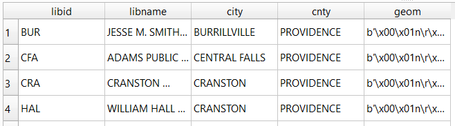
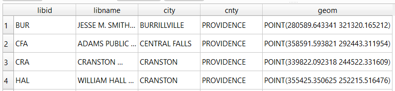
Reading a shapefile into a geodataframe is a piece of cake with read_file. We use path.join from the os module to build paths that work in any operating system. Reading in a polygon file of Rhode Island counties:
county_file=os.path.join('input','ri_county_bndy.shp')
gdf_cnty=gpd.read_file(county_file)
gdf_cnty.head()

If you have coordinate data in a CSV file, there’s a two step process where you load the coordinates as numbers into a dataframe, and then convert the dataframe and coordinates into a geodataframe with actual point geometry. Pandas / GeoPandas makes assumptions about the column types when you read a CSV, but you have the option to explicitly define them. In this example I define the Census Bureau’s IDs as strings to avoid dropping leading zeros (an annoying and perennial problem). The points_from_xy function takes the longitude and latitude (in that order!) and creates the points; you also have to define what system the coordinates are presently in. This sample data came from the US Census Bureau, so they’re in NAD 83 (EPSG 4269) which is what most federal agencies use. For other modern coordinate data, WGS 84 (EPSG 4326) is usually a safe bet. GeoPandas relies on the EPSG / ESRI CRS library, and familiarity with these codes is a must for working with spatial data.
point_file=os.path.join('input','test_points.csv')
df_pnts=pd.read_csv(point_file, index_col='OBS_NUM', delimiter=',',dtype={'GEOID':str})

gdf_pnts = gpd.GeoDataFrame(df_pnts,geometry=gpd.points_from_xy(
df_pnts['INTPTLONG'],df_pnts['INTPTLAT']),crs = 'EPSG:4269')
gdf_pnts
In the output below, you can see the distinction between the coordinates, stored separately in two numeric columns, and point-based geometry in the geometry column. The sample data consists of eleven point locations, ten in Rhode Island and one in Connecticut, labeled alfa through kilo. Each point is assigned to a group labeled a, b, or c.

You can obtain the CRS metadata for a geodataframe with this simple command:
gdf_cnty.crs

You can also get the bounding box for the geometry:
gdf_cnty.total_bounds
These commands are helpful for determining whether different geodataframes share the same CRS. If they don’t, you can transform the CRS of one to match the other. The geometry in the frames must share the same CRS if you want to interact with the data. In this example, we transform our points from NAD 83 to the RI State Plane zone that the counties are in with to_crs; the EPSG code is 3438.
gdf_pnts.to_crs(3438,inplace=True)
gdf_pnts.crs
If our points represent a sequence of events, we can do a points to lines operation to create paths. In this example our points are ordered in the correct sequence; if this was not the case, we’d sort the frame on a sequence column first. If there are different events or individuals in the table that have an identifying field, we use this as the group field to create distinct lines. We use lambda to repeat Shapely’s LineString function across the points to build the lines, and then assign them to a new geodataframe. Then we add a column where we compute the length of the lines; this RI CRS uses feet for units, so we divide by 5,280 feet to get miles. The Panda’s loc function grabs all the rows and a subset of the columns to display them on the screen (we could save them to a new geodataframe if we wanted to subset rows or columns).
lines = gdf_pnts.groupby('GROUP')['geometry'].apply(lambda x: LineString(x.tolist()))
gdf_lines = gpd.GeoDataFrame(lines, geometry='geometry',crs = 'EPSG:3438').reset_index()
gdf_lines['length_mi']=(gdf_lines.length)/5280
gdf_lines.loc[:,['GROUP','length_mi']]

To assign every point the attributes of the polygon (county) that it intersects with , we do a spatial join with the sjoin function. Here we take all attributes from the points frame, and a select number of columns from the polygon frame; we have to take the geometry from both frames to do the join. In this example we do a left join, keeping all the points on the left regardless of whether they have a matching polygon on the right. There’s one point that falls oustide of RI, so it will be assigned null values on the right. We rename a few of the columns, and use loc again to display a subset of them to the screen.
gdf_pnts_wcnty=gpd.sjoin(gdf_pnts, gdf_cnty[['geoid','namelsad','geometry']],
how='left', predicate='intersects')
gdf_pnts_wcnty.rename(columns={'geoid': 'COUNTY_ID', 'namelsad': 'COUNTY'}, inplace=True)
gdf_pnts_wcnty.loc[:,['OBS_NAME','OBS_DATE','COUNTY']]

To see what’s going on, we can generate a basic plot to display the polygons, points, and lines. I used matplotlib to create a figure and axes, and then placed each layer one on top of the other. We could opt to simply use Pandas / GeoPandas internal plotting instead as illustrated in this tutorial, which works for basic plots. If we want more flexibility or need additional functions we can call on matplotlib. In this example the default placement for the tick marks (coordinates in the state plane system) was bad, and the only way I could fix them was by rotating the labels, which required matplotlib.
fig, ax = plt.subplots()
plt.xticks(rotation=315)
gdf_cnty.plot(ax=ax, color='yellow', edgecolor='grey')
gdf_pnts.plot(ax=ax,color='black', markersize=5)
gdf_lines.plot(ax=ax, column="GROUP", legend=True)

Exporting the results out a shapefiles is also pretty straightforward with to_file. Shapefiles come with many limitations, such as a limit on ten characters for column names. You can opt to export to a variety of other vector formats, such a geopackages or geoJSON.
out_points=os.path.join('output','test_points_counties.shp')
out_lines=os.path.join('output','test_lines.shp')

gdf_pnts_wcnty.to_file(out_points)
gdf_lines.to_file(out_lines)
Hopefully this little intro will help get you started with using geospatial Python with GeoPandas. Happy New Year!
Best – Frank


You must be logged in to post a comment.