Author: Frank

Head of GIS & Data Services at Brown University Library

Route from SciLi to Libraries on OSM

Plotting Routes with OpenRouteService and Python

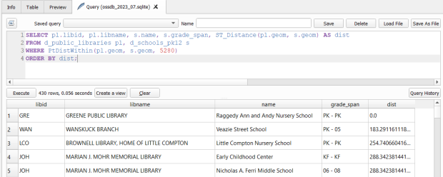
I made my first foray into network routing recently, and drafted a python script and notebook that plots routes using the OpenRouteService (ORS) API. ORS is based on underlying data from the OpenStreetMap (OSM), and was created by the Heidelberg Institute for Geoinformation Technology, at Heidelberg University in Germany. They publish several routing APIs that include directions, isochrones, distance matricies, geocoding, and route optimization. You can access them via a basic REST API, but they also have a dedicated Python wrapper and an R package which makes things a bit easier. For non-programmers, there is a plugin for QGIS.

Regardless of which tool you use, you need to register for an API key first. The standard plan is free for small projects; for example you can make 2,000 direction requests per day with a limit of 40 per minute. If you’re affiliated with higher ed, government, or a non-profit and are doing non-commercial research, you can upgrade to a collaborative plan that ups the limits. It’s also possible to install OSR locally on your own server for large jobs.

I opted for Python and used the openrouteservice Python module, in conjunction with other geospatial modules including geopandas and shapely. In my script / notebook I read in two CSV files, one with origins and the other with destinations. At minimum both files must contain a header row, and attributes for unique identifier, place label, longitude, and latitude in the WGS 84 spatial reference system. The script plots a route between each origin and every destination, and outputs three shapefiles that include the origin points, destination points, and routes. Each line in the route file includes the ID and names of each origin and destination, as well as distance and travel time. The script and notebook are identical, except that the script plots the end result (points and lines) using geopanda’s plot function, while the Jupyter Notebook plots the results on a Folium map (Folium is a Python implementation of the popular Leaflet JS langauge).

Visit the GitHub repo to access the scripts; a basic explanation with code snippets follows.

After importing the modules, you define several variables that determine the output, including a general label for naming the output file (routename), and several parameters for the API including the mode of travel (driving, walking, cycling, etc), distance units (meters, kilometers, miles), and route preference (fastest or shortest). Next, you provide the positions or “column” locations of attributes in the origin and destination CSV files for the id, name, longitude, and latitude. Lastly, you specify the location of those input files and the file that contains your API key. The location and names of output files are generated automatically based on the input; all will contain today’s date stamp, and the route file name includes route mode and preference. I always use the os module’s path function to ensure the scripts are cross-platform.

import openrouteservice, os, csv, pandas as pd, geopandas as gpd
from shapely.geometry import shape
from openrouteservice.directions import directions
from openrouteservice import convert
from datetime import date
from time import sleep

# VARIABLES
# general description, used in output file
routename='scili_to_libs'
# transit modes: [“driving-car”, “driving-hgv”, “foot-walking”, “foot-hiking”, “cycling-regular”, “cycling-road”,”cycling-mountain”, “cycling-electric”,]
tmode='driving-car'
# distance units: [“m”, “km”, “mi”]
dunits='mi'
# route preference: [“fastest, “shortest”, “recommended”]
rpref='fastest'

# Column positions in csv files that contain: unique ID, name, longitude, latitude
# Origin file
ogn_id=0
ogn_name=1
ogn_long=2
ogn_lat=3
# Destination file
d_id=0
d_name=1
d_long=2
d_lat=3

# INPUTS and OUTPUTS
today=str(date.today()).replace('-','_')

keyfile='ors_key.txt'
origin_file=os.path.join('input','origins.csv') #CSV must have header row
dest_file=os.path.join('input','destinations.csv') #CSV must have header row
route_file=routename+'_'+tmode+'_'+rpref+'_'+today+'.shp'
out_file=os.path.join('output',route_file)
out_origin=os.path.join('output',os.path.basename(origin_file).split('.')[0]+'_'+today+'.shp')
out_dest=os.path.join('output',os.path.basename(dest_file).split('.')[0]+'_'+today+'.shp')

I define some general functions for reading the origin and destination files into nested lists, and for taking those lists and generating shapefiles out of them (by converting them to geopanda’s geodataframes). We read the origin and destination data in, grab the API key, set up a list to hold the routes, and create a header for the eventual output.

# For reading origin and dest files
def file_reader(infile,outlist):
    with open(infile,'r') as f:
        reader = csv.reader(f)    
        for row in reader:
            rec = [i.strip() for i in row]
            outlist.append(rec)
            
# For converting origins and destinations to geodataframes            
def coords_to_gdf(data_list,long,lat,export):
    """Provide: list of places that includes a header row,
    positions in list that have longitude and latitude, and
    path for output file.
    """
    df = pd.DataFrame(data_list[1:], columns=data_list[0])
    longcol=data_list[0][long]
    latcol=data_list[0][lat]
    gdf = gpd.GeoDataFrame(df, geometry=gpd.points_from_xy(df[longcol], df[latcol]), crs='EPSG:4326')
    gdf.to_file(export,index=True)
    print('Wrote shapefile',export,'\n')
    return(gdf)
      
origins=[]
dest=[]
file_reader(origin_file,origins)
file_reader(dest_file,dest)

# Read api key in from file
with open(keyfile) as key:
    api_key=key.read().strip()

route_count=0
route_list=[]
# Column header for route output file:
header=['ogn_id','ogn_name','dest_id','dest_name','distance','travtime','route']

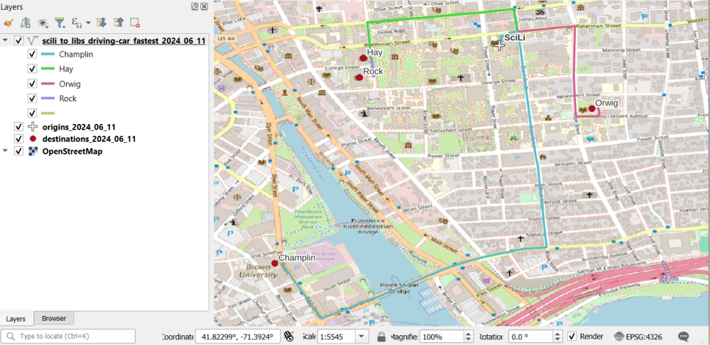
Here are some nested lists from my sample origin and destination CSV files:

[['origin_id', 'name', 'long', 'lat'], ['0', 'SciLi', '-71.4', '41.8269']]
[['dest_id', 'name', 'long', 'lat'],
 ['1', 'Rock', '-71.405089', '41.825725'],
 ['2', 'Hay', '-71.404947', '41.826433'],
 ['3', 'Orwig', '-71.396609', '41.824581'],
 ['4', 'Champlin', '-71.408194', '41.818912']]

Then the API call begins. For every record in the origin list, we iterate through each record in the destination list (in both cases starting at index 1, skipping the header row) and calculate a route. We create a tuple with each pair of origin and destination coordinates (coords), which we supply to the OSR directions API. We pass in the parameters supplied earlier, and specify instructions as False (instructions are the actual turn by turn directions returned as text).

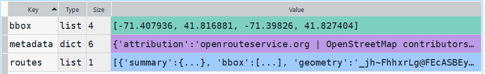
The result is returned as a JSON object, which we can manipulate like a nested Python dictionary. At the first level in the dictionary, we have three keys and values: a bounding box for the route area with a list value, metadata with a dictionary value, and routes with a list value. Dive into route, and the list contains a single dictionary, and inside that dictionary – more dictionaries that contain the values we want!

1st level, dictionary with three keys, the routes key has a single list value
2nd level, the routes list has a single element, another dictionary
3rd level, inside the dictionary in that list element, four keys with route data

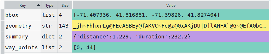
The next step is we extract the values that we need from this container by specifying their location. For example, the distance value is inside the first list of routes, inside summary and inside distance. Travel time is in a similar spot, and we take an extra step of dividing by 60 to get minutes instead of seconds. The geometry is trickier as its encoded in some binary line format. We use OSR’s decoding function to turn it into plain text, and shapely to convert it into WKT text; we’ll need WKT in order to get the geometry into a geodataframe, and eventually output as a shapefile. Once we have the bits we need, we string them together as a list for that origin / destination pair, and append this to our route list.

# API CALL
for ogn in origins[1:]:
    for d in dest[1:]:
        try:
            coords=((ogn[ogn_long],ogn[ogn_lat]),(d[d_long],d[d_lat]))
            client = openrouteservice.Client(key=api_key) 
            # Take the returned object, save into nested dicts:
            results = directions(client, coords, 
                                profile=tmode,instructions=False, preference=rpref,units=dunits)
            dist = results['routes'][0]['summary']['distance']
            travtime=results['routes'][0]['summary']['duration']/60 # Get minutes
            encoded_geom = results['routes'][0]['geometry']
            decoded_geom = convert.decode_polyline(encoded_geom) #convert from binary to txt
            wkt_geom=shape(decoded_geom).wkt #convert from json polyline to wkt
            route=[ogn[ogn_id],ogn[ogn_name],d[d_id],d[d_name],dist,travtime,wkt_geom]
            route_list.append(route)
            route_count=route_count+1
            if route_count%40==0: # API limit is 40 requests per minute
                print('Pausing 1 minute, processed',route_count,'records...')
                sleep(60)
        except Exception as e:
            print(str(e))
            
api_key=''
print('Plotted',route_count,'routes...' )

Here is some sample output for the final origin / destination pair, which contains the IDs and labels for the origin and destination, distance in miles, time in minutes, and a string of coordinates that represents the route:

['0', 'SciLi', '4', 'Champlin', 1.229, 3.8699999999999997,
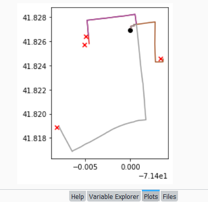
 'LINESTRING (-71.39989 41.82704, -71.39993 41.82724, -71.39959 41.82727, -71.39961 41.82737, -71.39932 41.8274, -71.39926 41.82704, -71.39924000000001 41.82692, -71.39906000000001 41.82564, -71.39901999999999 41.82534, -71.39896 41.82489, -71.39885 41.82403, -71.39870000000001 41.82308, -71.39863 41.82269, -71.39861999999999 41.82265, -71.39858 41.82248, -71.39855 41.82216, -71.39851 41.8218, -71.39843 41.82114, -71.39838 41.82056, -71.39832 41.82, -71.39825999999999 41.8195, -71.39906000000001 41.81945, -71.39941 41.81939, -71.39964999999999 41.81932, -71.39969000000001 41.81931, -71.39978000000001 41.81931, -71.40055 41.81915, -71.40098999999999 41.81903, -71.40115 41.81899, -71.40186 41.81876, -71.40212 41.81866, -71.40243 41.81852, -71.40266 41.81844, -71.40276 41.81838, -71.40452000000001 41.81765, -71.405 41.81749, -71.40551000000001 41.81726, -71.40639 41.81694, -71.40647 41.81688, -71.40664 41.81712, -71.40705 41.81769, -71.40725 41.81796, -71.40748000000001 41.81827, -71.40792 41.81891, -71.40794 41.81895)']

Finally, we can write the output. We convert the nested route list to a pandas dataframe and use the header row for column names, and convert that dataframe to a geodataframe, building the geometry from the WKT string, and write that out. In contrast, the origins and destinations have simple coordinates (not in WKT), and we create XY geometry from those coordinates. Writing the geodataframe out to a shapefile is straightforward, but for debugging purposes it’s helpful to see the result without having to launch GIS. We can use geopandas’s plot function to draw the resulting geometry. I’m using the Spyder IDE, which displays plots in a dedicated window (in my example the coordinate labels for the X axis look strange, as the distances I’m plotting are small).

# Create shapefiles for routes
df = pd.DataFrame(route_list, columns=header)
gdf = gpd.GeoDataFrame(df, geometry=gpd.GeoSeries.from_wkt(df["route"]),crs = 'EPSG:4326')
gdf.drop(['route'],axis=1,inplace=True) # drop the wkt text
gdf.to_file(out_file,index=True)
print('Wrote route shapefile to:',out_file,'\n')

# Create shapefiles for origins and destinations
ogdf=coords_to_gdf(origins,ogn_long,ogn_lat,out_origin)
dgdf=coords_to_gdf(dest,d_long,d_lat,out_dest)

# Plot
base=gdf.plot(column="dest_id", kind='geo',cmap="Set1")
ogdf.plot(ax=base, marker='o',color='black')
dgdf.plot(ax=base, marker='x', color='red');

In a notebook environment we can employ something like Folium more readily, which gives us a basemap and some basic interactivity for zooming around and clicking on features to see attributes. Implementing this was a more complex than I thought it would be, and took me longer to figure out compared to the routing process. I’ll return to those details in a subsequent post…

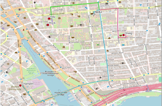
In my sample data (output rendered below in QGIS) I was plotting fastest driving distance from the Brown University Sciences Library to the other libraries in our system. Compared to Google or Apple Maps the result made sense, although the origin coordinates I used for the SciLi had an impact on the outcome (assumed you left from the loading dock behind the building as opposed to the front door as Google did, which produces different routes in this area of one-way streets). My real application was plotting distances of hundreds of miles across South America, which went well and was useful for generating different outcomes using fastest or shortest route.

Take a look at the full script in GitHub, or if programming is not your thing check out the QGIS plugin instead (activate in the Plugins menu, search for OSR). Remember to get your API key first.

Least Cost Paths in QGIS and GRASS

Cost Surfaces and Least Cost Paths in QGIS and GRASS

In this post I’ll demonstrate how to create least cost paths using QGIS and GRASS GIS, and in doing so will describe how a cost surface is constructed. In a surface analysis, you model movement across a grid whose values represent friction encountered in moving across it. In computing a least cost path, you’re seeking an optimal route from an origin to the closest destination, where ‘close’ incorporates distance and ease of movement across that surface. These kinds of analyses are often conducted in the environmental sciences, in modeling the movement of water across terrain, and in zoology in predicting migration paths for land-based animals.

In this example the idea was to chart the origin of settlements and possible trade routes in ancient history. In applications where we’re studying human activity, network analysis is typically used instead. Networks use geometry, where a node is a place or person, and connections between nodes are indicated with lines. Lines typically have a value associated with them that identify either the strength of a connection, or conversely friction associated with moving between nodes. The idea for this project was to identify how networks formed, so the surface analysis served as a proto-network analysis. While there were roads and maritime routes in pre-modern times, these networks were weaker and less dense. Charting movement over a surface representing terrain could provide a decent approximation of routes (but if you’re interested in ancient Roman network routing, check out the ORBIS project at Stanford).

This example stems from a project I was helping a PhD student with; I don’t want to replicate his specific study, so I’ve modified the data sources and area of focus to model movement between large settlements and stone quarries in the ancient Roman world. My goal is to demonstrate the methods with a plausible example; if we were doing this as part of an actual study, we would need to be more discriminating in selecting and processing our data.

Preliminary Work

The Pleiades project will serve as our source for destinations; it’s an academic gazetteer that includes locations and place names for the ancient and early medieval world, stretching from Europe and North Africa through the Middle East to India. It’s published in many forms, and I’ve downloaded the Pleiades Data for GIS in a CSV format. Using QGIS, I used the Add Delimited Text tool to plot the places.csv to get all of the locations, and joined that file to the places_place_type.csv file which contains different categories of places. I used Select by Attributes to get locations classified as quarries, and exported the selection out to a geopackage.

The Pleiades data includes a category for settlements, but there are about ten thousand of these and there isn’t an easy way to create a subset of the largest places. So I opted to use Hanson’s dataset of the largest settlements in the ancient Roman world to serve as our source for origins (about 1,400 places). This data was packaged in an Excel file; I plotted the coordinates using the Create Points Layer from Table tool in QGIS and converted the result to a geopackage. For testing purposes, I selected a subset of ten major cities and saved them in a separate layer: Athenae, Alexandria (Aegyptus), Antiochia (Syria), Byzantium, Carthago, Ephesus, Lugdunum, Ostia, Pergamum, Roma.

For the friction grid, I downloaded a geoTIFF of the Human Mobility Index by Ozak. The description from the project:

“The Human Mobility Index (HMI) estimates the potential minimum travel time across the globe (measured in hours) accounting for human biological constraints, as well as geographical and technological factors that determined travel time before the widespread use of steam power.”

There are three separate grids that vary in extent based on the availability of seafaring technology. I chose the grid that incorporates seafaring prior to the advent of ocean-going ships, which is appropriate for the Mediterranean world during the classical era. The HMI is a global grid at 925 meter resolution. To minimize processing time, I clipped it to a bounding box that encompasses the area of study. The grid is in the World Cylindrical Equal Area system; I reprojected it to WGS 84 to match the rest of the layers. As long as we’re not measuring actual distances, we don’t need to worry about the system we’re using (but if we were, we’d use an equidistant system). Since the range of values is small and it’s hard to see differences in cell values, I symbolized the grid as single-band psuedo color and used a quantiles classification scheme with 12 categories.

Lastly, I grabbed some modern country boundaries from Natural Earth to serve as a general frame of reference. A screenshot of the workspace is below:

Least Cost Path in QGIS

QGIS has a third-party plug-in for doing a least cost path analysis, which works fine as long as you don’t have too many origin points. Go to Plugins > Manage and Install Plugins > Least Cost Path to turn it on. Then open the Processing toolbox and it will be listed at the bottom. See the screenshot below for the tool’s menu. The Cost raster layer is the friction surface, so the human mobility index in this example. The start points are the ten major cities and the end points are the quarries. The start-point layer dialog only accepts a single point; if you have multiple points, hit the green circular arrow button to iterate across all of them. There’s a checkbox for connecting the start point to just the nearest end point (as opposed to all of them). Save the output to a geopackage.

It took about five minutes to run the analysis and iterate across all ten points. Each path is saved in a separate file, but since they have an identical structure I subsequently used Vector > Data Management Tools > Merge Vector Layers to combine them into one file. The attribute table records the end point ID (for the quarry) and the accumulated cost, but does not include the origin ID; this ID is the number 1 repeated each time, as the tool was iterating over the origin points. We can see the result below; for Athens and Ephesus in the south, land routes were shortest, whereas for Pergamum and Byzantium in the north it was easier (distance and friction-wise) to move across the sea.

While this worked fine for ten cities, it would take a considerable amount of time to compute paths for all 1,400. The problem here is that the plugin was designed for one point at a time. Let’s outline the process so we can understand how alternatives would work.

Cost Surface Analysis

To calculate a least cost path, the first step is to create a cost surface, where we take our friction grid and the destinations and calculate the total cost of movement across all cells to the nearest destination. First, the destinations are placed on the grid, and they become the grid sources. Then, the accumulated cost of moving from each source to its adjacent cells is calculated. For horizontal and vertical movement, it’s the sum of the friction values divided by two, and for diagonal movement it’s the sum of the friction values divided by two then multiplied by 1.4142. Once those calculations are performed, those adjacent cells are assigned to each source. Next, the lowest accumulated cost cell in the grid is identified, the cost for moving to its unassigned neighbors is calculated, and these cells are assigned to the same source. This process is repeated by cycling through the lowest accumulated value until all calculations for the grid are finished. Illustrated in the example below, which I derived from Lloyd’s Spatial Data Analysis (2010) pp. 165-168.

For each cell, three items are recorded, and are saved either as separate bands in one raster, or in three separate raster files:

  1. Accumulated cost of moving to that cell from the nearest source
  2. Assignment or allocation of the cell to its source (the nearest one to which it “belongs”)
  3. A vector that indicates direction from that source

With these cost surfaces, we can take the second step of calculating the least cost path. We place a number of starting points onto this surface, and each point is assigned to the closest destination based on where its grid cell was allocated. The direction to that destination is traced backward using the direction grid, and the total cost of movement is taken from the accumulated cost surface.

Knowing how this process works, there are two practical conclusions we can draw. First, when computing the cost surface, you use your destinations (not the origins) as the source for the cost surface. You use the origins as the start points for the least cost path. Second, there’s no need to recalculate the cost surface for every origin point; you only need to do this once. That’s why the QGIS plugin took so long; it was recomputing the cost surface each time. Knowing this, we can use GRASS GIS to compute the paths, as it’s designed to compute the surface just once (and it’s data structure will also boost performance a bit).

Cost Surface Analysis in GRASS

GRASS GIS comes bundled with QGIS. While it’s possible to run a number of GRASS tools directly within QGIS, it’s a bit undesirable as you’re not able to access the full range of parameters or options for each GRASS command. I opted to create the GRASS environment in QGIS, and loaded all the necessary data into the GRASS format. Then, I flipped over to the GRASS GUI to do the analysis.

GRASS uses a distinct database structure and file format, and we need to create a GRASS workspace and load our data into that database in order to use the cost surface tools. I followed the steps in the QGIS manual for creating a GRASS environment and loading data into a GRASS database. Once you create the database and mapset, you use the QGIS Browser to browse to the grassdata folder and designate your new mapset as your working mapset (mapsets have the little green grass icon beside them). With the GRASS tools open, I used v.in.ogr.qgis to load my my cities and quarries layers into this mapset, and r.in.gdal.qgis to load the mobility index (if these layers weren’t already in your QGIS project, you’d use the tools that don’t have the qgis suffix, i.e. v.in.ogr).

After exiting QGIS and launching GRASS, you select the mapset under the grassdata database at the top, right click and choose Switch mapset, and choose the mapset you want to work with (if you don’t see it, hit the database icon to browse and connect to the grassdata folder). You can display the layers in the GRASS window to visualize them, but it’s not necessary for running the tools. In the tool menu on the right, search for the Cost surface tool, r.cost, and choose the following options:

  • Required: input raster map with grid cell cost is the human mobility index, and output raster is cost_surface
  • Optional outputs: output raster with nearest start point as allocation_surface, output raster with movement as direction_surface
  • Start: vector starting points for the cost surface are the destinations, the quarries
  • Optional: check verbose output (to get more details on errors)
GRASS GIS GUI and r.cost

Running this operation on all 1,400 cities took a matter of seconds, and all three rasters described in the previous section were generated: cost, allocation, direction (shown below).

Using these outputs, we can run the Least cost route or flow tool, which is called r.drain (as it’s often used in earth sciences to chart the path that water will drain based on elevation).

  • Required: Name of input elevation or cost surface raster is cost_surface, Name of output raster path: is path_raster
  • Cost surface: check the Input raster map is a cost surface box, Name of input movement direction raster is direction_surface
  • Start: Name of starting points vector map: are the origins (cities)
  • Path settings: choose ONE option that you’d like to record (or none)
  • Optional: check Verbose mode, Name for output drain vector is path_vector

This also took mere seconds to complete (!) and generated the paths from each origin (city) to the closet destination (quarry) over the surface as both raster cells and vector lines. The output in GRASS is shown below.

Least cost path output in GRASS GIS

At this stage, we can hop back into QGIS, and load these output paths into our original project to symbolize and study what’s going on. Notice the settlements in northeastern Italy and along the Dalmatian coast; for many of them the least cost path is to a quarry across the sea rather than through rugged mountainous terrain. Even though some quarries in the mountains may be closer in actual distance, it’s a tougher path to travel.

Conclusion

The benefit of using GRASS is that we can run these processes fairly quickly for large datasets. The GRASS commands can also be compiled into a batch script, so you can create a documented and automated process instead of having to drill through multiple menus.

A big downside of the GRASS tools for this analysis is that the resulting vector paths contain no information about the origin or destination points, and only the raster path output carries along values. You might be able to generate this information through some extra steps; using the QGIS field calculator, you can get the coordinates for the start point and end point of each path and add them explicitly to the attribute table. Then take those coordinates, and for the start point of the line select the closest city and get its attributes, and for the end point select the closet quarry and get its attributes. I say “closest” because the vector paths don’t snap perfectly to the start and end points. Modifying the resolution of the human mobility index to make it coarser (fewer cells) might help to resolve this, or converting the origin and destination points to a raster of the same resolution as the index. Alternatively, if you incorporate the GRASS commands into a Python script, you could iterate over the origins in the least cost path analysis and record the origin IDs as you step through.

I haven’t worked all the pieces, but hopefully this will be useful for those of you who are interested in conducting a basic cost surface analysis in open source. The student I was helping was interested in measuring the density of the paths across a grid, so this process worked for him as he didn’t need to associate the paths with origins and destinations. Beyond FOSS GIS, ArcGIS Pro has a full suite of tools for cost surface analysis, and the underlying methods and logic are the same.

Map of Avg Temperature by County Mar 2024

Historic County Climate Data for the US

I recently had a question about finding historic climate data in the United States at the county-level. In this post I’ll show you how to access it, and how to parse fixed-width text files in Excel. Weather data is captured and reported by point-based weather stations, and then is often interpolated and modeled over gridded surfaces (rasters). The National Centers for Environmental Information at NOAA have used their models to create zonal statistics for counties, which they publish via the Climate at a Glance County Mapping program (I described what zonal statistics are in an earlier post).

The basic application lets you map the continental US or an individual state (includes AK but not HI). You choose a parameter (Avg / Min / Max temperature, precipitation, cooling / heating days, drought indexes), year (1895 to present), month, and time scale (1 month to 5 years). This creates a map that you can modify to depict that value, or to display ranks or anomalies. You can download the map as an image, or the underlying data as CSV or JSON.

A separate app allows you to create a time series profile for a particular county, with a table, chart, and data that you can download.

These apps are great for the basics, but bulk downloading the underlying data for all counties and years is a bit trickier. You crash land in a file directory and have to choose from an array of zipped files. Fortunately there is good documentation. In that folder, these are the county-level files for precipitation, min temp, max temp, and avg temp:

  • climdiv-pcpncy-vx.y.z-YYYYMMDD
  • climdiv-tmaxcy-vx.y.z-YYYYMMDD
  • climdiv-tmincy-vx.y.z-YYYYMMDD
  • climdiv-tmpccy-vx.y.z-YYYYMMDD

Where v is for “version”, the xyz is a version number, and the final portion is the date. The archive is updated monthly. The other files in the directory are for climate divisions, states and regions, and data that pertains to the drought indexes. There are also files that have climate normals for each of these areas. If you’re interested in these, you can go up to the parent-level directory and view the relevant documentation.

The county files are fixed-width text files, which means you have to parse them to separate the values. If you treat them as delimited files (using spaces), then all of the fields at the beginning of the file will be lumped together, which is not useful. Spreadsheets and stats packages have tools for importing delimited text, or you could script something in Python or R. Modern versions of Excel will allow you to parse fixed-width data by supplying a list of endpoints for each column; older versions of Excel and other spreadsheets have you “eyeball” the columns and manually insert breaks in an import screen.

If you’re using a modern version of Excel: open a blank workbook and on the Data ribbon click the From Text/CSV button. Browse and select the county text file you’ve downloaded. In the import screen change the Delimiter drop down to Fixed Width.

In the box underneath, begin with zero and type the end points for each position (with the exception of the final endpoint, 95) as a comma separated list. You’ll find these in the README file, but I’ve also tacked on the most salient bits to the end of this post. For your convenience:

0,5,7,11,18,25,32,39,46,53,60,67,74,81,88

If you click on the preview grid, it will parse the columns.

In this example, I’m not parsing the state and county code separately, but am keeping them together to create a single unique identifier. Once everything is parsed, hit the Transform Data button. For column 1, hit the small 123 button, and change the option to Text, and choose Replace data.

This will preserve the leading zero in the state/county code. It’s important to do this, so the codes in this table with match the codes in other county data table or spatial data files that you may wish to join this table to. Do the same for the element code in column 2. The remaining Year and Month columns can be left alone, as they’re already appropriately saved as integers and decimals respectively.

Hit the Close and Load button in the upper left hand corner, and Excel will parse and load the data. It formats the columns and applies a filter option. To get rid of the styling and filter dropdowns, I’d copy the entire table, and do a Paste-Special-Values in a new worksheet. Then replace the generic column labels with these:

CNTYCODE,ELEMENT,YEAR,JAN,FEB,MAR,APR,MAY,JUNE,JULY,AUG,SEPT,OCT,NOV,DEC

Save the file, and now you have something to work with. Each record represents the monthly temperature or precipitation for a particular county for a particular year. To create a unique record ID, you can concatenate the state/county code, element code, and year values. For GIS applications, you would need to pivot the data to a wide form, so that the year becomes a column to give you month-year as a column, and each row represents each county with no repeats. With over 120 years of monthly data, that would give you over 1500 columns – so filter out what you don’t need. The state / county code can be used to join the table to the Census Bureau’s Cartographic Boundary Files, using the CBF’s GEOID field.

When would you use this data? If you’re creating data profiles or are running a statistical analysis and are using counties as your geographic unit, and temperature or precipitation is one variable among many that you need. Or, you’re making a series of county-level maps, and this is one of your variables. This dataset is clearly pretty convenient for doing time series analyses, as compiling data for a times series is usually time consuming. The counties in this dataset represent present day boundaries, so normalizing geography over time isn’t necessary.

When not to use it? Counties vary in size and can encompass a great deal of internal variety in terms of elevation, land use and land cover, and proximity to / presence of water bodies, all of which impact the climate. So the weather in one part of a county could be quite different from another part. To capture these internal differences, it would be better to use gridded data, such as the 4×4 km rasters that PRISM produces for daily, monthly, annual, and normal summaries.

Gridded climate data and zonal stats derived from grids are estimates based on models; if you wanted or needed the actual measurements as they were recorded, you would need to go back and get point-based weather station data, from the Local Climatological Database for instance. There are a limited number of stations, and not one for every county. The closest station to a given place could be used to represent or approximate the weather for that place.

Codebook for county data files (extracted from README):

Element Record
Name Position Element Description
STATE-CODE 1-2 as indicated in State Code Table as described in FILE 1. Range of values is 01-48.
DIVISION-NUMBER 3-5 COUNTY FIPS - Range of values 001-999.
ELEMENT CODE 6-7 
01 = Precipitation
02 = Average Temperature
25 = Heating Degree Days
26 = Cooling Degree Days
27 = Maximum Temperature
28 = Minimum Temperature
YEAR 8-11 This is the year of record. Range is 1895 to current year processed. 
Monthly Divisional Temperature format (f7.2) Range of values -50.00 to 140.00 degrees Fahrenheit. Decimals retain a position in the 7-character field.  Missing values in the latest year are indicated by -99.99.

Monthly Divisional Precipitation format (f7.2) Range of values 00.00 to 99.99.  Decimal point retains a position in the 7-character field. Missing values in the latest year are indicated by -9.99.

JAN-VALUE 12-18

FEB-VALUE 19-25

MAR-VALUE 26-32

APR-VALUE 33-39

MAY-VALUE 40-46

JUNE-VALUE 47-53

JULY-VALUE 54-60

AUG-VALUE 61-67

SEPT-VALUE 68-74

OCT-VALUE 75-81

NOV-VALUE 82-88

DEC-VALUE 89-95

SQL in QGIS Database Manager

Spatial SQL with Spatialite and QGIS

I’ve recently given a few presentations on the Ocean State Spatial Database, which is a basic geodatabase for Rhode Island that we’ve created in our lab. The database was designed so that new and experienced users alike could easily access a curated collection of foundational layers and data tables for thematic mapping and geospatial analysis. The database is available for download on GitHub, and there is documentation that describes the layers and tables that are included. The database comes in two formats: SQLite/ Spatialite that’s great for QGIS, and a File Geoadatabase version for ArcGIS Pro users.

One of the big advantages of using the Spatialite database in QGIS is that you can take advantage of the Database Manager, and write SQL and spatial SQL queries for selecting records and doing spatial analysis. Instead of using a series of point and click tools that create a bunch of new files, you can write a single block of code to perform an entire operation, and you can save that code to document your work. Access the Database Manager above the toolbars at the top of the QGIS interface. Once you’re in, you can select the Spatialite option, right click and then browse your file system to point to the database to establish a connection. At the top of the DB Manager is a button (piece of paper with wrench) to open a SQL query window.

Database Manager in QGIS with SQL Window Open

The following commands are basic SQL: SELECT some columns FROM some tables WHERE some criteria is met. This returns all rows and columns from the public libraries layer in the database:

SELECT *
FROM d_public_libraries;

This returns just some of the columns for all rows:

SELECT libid, libname, city, cnty
FROM d_public_libraries;

While this returns some of the columns and rows that meet specific criteria, in this case where libraries are located in Providence County, RI:

SELECT libid, libname, city, cnty, geom
FROM d_public_libraries
WHERE cnty='PROVIDENCE'
ORDER BY city;

Traditional database column types include strings (aka text), integers, and decimal numbers, which limit the values that can be stored in the column, and allow specific functions that can operate on values of that type (math on numeric columns, string operations on text columns). Beyond the basic data types, many databases have special ones, such as date types that allow you to store and manipulate dates and times as distinct objects.

Spatial databases incorporate special columns for storing the geometry of features as strings of coordinates, and provide functions that can operate on that geometry. In the example above, the values stored in the geometry column were returned in a binary format. But we can apply a spatial function called ST_AsText to display the geometry as readable text:

SELECT libid, libname, city, cnty, ST_AsText(geom) AS geom
FROM d_public_libraries
WHERE cnty='PROVIDENCE'
ORDER BY city;

We can see that this is point geometry (as opposed to lines or polygons), and we have an X and Y coordinate for each point. The layers in this database are in the Rhode Island State Plane System, so the coordinates that are returned are in that system. We can convert these to longitude and latitude using the ST_Transform function:

SELECT libid, libname, city, cnty, ST_AsText(ST_Transform(geom,4269)) AS geom
FROM d_public_libraries
WHERE cnty='PROVIDENCE'
ORDER BY city;

This illustrates that the functions can be nested, first we transform the geometry and then display the result of that function as text. The number in the transform function is the unique identifier of the spatial reference system that we wish to transform the geometry to. In the open source world these are EPSG codes, and 4269 is the identifier for NAD 83, the basic long / lat system for North America (alternatively, we could use 4326 for WGS 84, the standard global long / lat system). The geometry column in a spatial table is connected to a series of internal tables that store all the definitions of the spatial reference systems. You can view the spatial reference system table:

SELECT * from spatial_ref_sys;

You can also get a read out of all the spatial tables in the database which include their type of geometry and the spatial reference system (3438 is the EPSG code for the RI State Plane zone, geometry of type 6 is a multipolygon, while type 1 is a point):

SELECT * from geometry_columns;

With a spatial database, you perform operations within and between tables by running functions against the geometry columns. For example, to return all public libraries and schools that are within a mile of a library while measuring the distance:

SELECT pl.libid, pl.libname, s.name, s.grade_span, ST_Distance(pl.geom, s.geom) AS dist
FROM d_public_libraries pl, d_schools_pk12 s
WHERE PtDistWithin(pl.geom, s.geom, 5280)
ORDER BY dist;

The ST_Distance function returns the actual distance in a new column, while the PtDistWithin function only returns libraries that have a school within one mile (5,280 feet – we have to express the measurement in the units used by the spatial reference system of both layers). In the FROM statement we provide aliases after each table name, so we can use those as shorthand (if our statement includes multiple tables, we need to indicate which table each column comes from).

You can also do summaries, like you would in standard SQL using GROUP BY. To count the number of schools that are within a mile of every library:

SELECT pl.libid, pl.libname, CAST(COUNT (s.name) AS integer) AS school_count, pl.geom
FROM d_public_libraries pl, d_schools_pk12 s
WHERE PtDistWithin(pl.geom, s.geom, 5280)
GROUP BY pl.libid, pl.libname, pl.geom
ORDER BY school_count DESC;

The rule for GROUP BY is that every column in the select statement must be used as a grouping variable, or has an aggregate function applied to it (COUNT, SUM, MEAN, etc). In this example we added the CAST function, which defines the data type for new columns that you create. Unless we explicitly declare it as an integer or real (decimal), values are returned as strings.

You can save your statements as views, by adding CREATE VIEW [view name] AS followed by the statement. Views are saved statements that appear as objects in the database; by opening a view, the statement is rerun and the result is returned. This approach works if you want to save a non-spatial view, i.e. a table without geometry. To save a spatial one with geometry, omit the VIEW statement and hit the Create a view button below the SQL window (each record must have a unique identifier and the geometry column in order for this to work). That registers the geometry column of the view in the database. Then, you can return to the main QGIS window, add the view and symbolize it. Alternatively, there is a Load as new layer button at the bottom of the screen, which allows you to see a temporary result without saving anything (while you can see features and records returned, you won’t be able to symbolize or manipulate the layer).

Count schools within 1 mile of libraries, and save as a spatial view
Symbolize the spatial query out in the main QGIS window

One of the primary reasons to use a database is to join related data stored in separate tables. This statement has two joins: a tabular join between the census tracts and an ACS data table, and a spatial join between the geometry of public libraries and tracts:

SELECT pl.libid, pl.libname, a.geoidshort, a.name, c.hshd01_e, c.hshd01_m
FROM d_public_libraries pl, a_census_tracts a
INNER JOIN c_tracts_acs2021_socecon c
ON a.geoidlong=c.geoidlong
WHERE ST_Intersects(pl.geom, a.geom);

This returns all public libraries and their intersecting tracts based on the relationship between their two geometries (could also have done ST_Within in this case to get the same result). Spatialite supports most of the spatial relationship functions defined by the OGC. The estimated number of households for these tracts are returned based on the shared unique census identifier between the two census tract tables.

You can visit the following references for a full list of SQLite functions and Spatialite functions. As it’s designed to be “Lite”, SQLite contains a smaller subset of the SQL standard. Spatialite contains a pretty full range of OGC spatial SQL functions, but there are instances where it deviates from the standard. PostgreSQL / PostGIS provides a greater range of functions that adhere more closely to the standard; it also provides you with greater storage, efficiency, and processing power. As a file-based database, SQLite / Spatialite’s strengths are that it’s compact and transportable, and gives you the option to write SQL rather than relying solely on the point and click tools of a desktop GIS package.

In addition to the QGIS DB Manager, you could also use the Spatialite command line tools provided by the developer, and the Spatialite GUI (graphic user interface) that gives you a standard, stand-alone database interface. Downloading it is a bit confusing; Windows users can grab one of the binaries at the bottom of this page. If you’re a Linux person, search for it in your package manager. Mac users can get it via Homebrew.

US Stamp of Antarctic Treaty Map

Maps in Miniature: Geography on Postage Stamps

I carted several boxes of old stuff from my mom’s basement to mine about a year ago, since I finally had a basement of my own for storing boxes of old stuff. This stuff included a bin with my old stamp collection, one of many childhood hobbies. Leafing through it for the first time in decades, my interest was rekindled and I thought this would make for a relaxing, non-screen-based hobby that I could work on for an hour or so in the evenings. I’ve been transferring and re-organizing this collection over the past year.

Similar to other leisurely pursuits that I’ve written about (usually around this time each year), such as video games and hunting for USGS survey markers while hiking, this hobby has a strong connection to geography. Stamps express the geography, culture, and history of the world’s countries in miniature, and collecting them familiarizes you with different places, languages, and currencies. Postage stamps were introduced in the mid 19th century, so any collection will recount modern history, documenting the: aggregation of states into nations and empires, collapse of empires and states into smaller countries, emergence of colonies as independent states, shifting boundaries as countries fought and occupied one another, and coalescence of nations into larger alliances and supra-national bodies.

This natural connection between stamps and geography becomes even more literal when countries depict themselves on stamps through maps, landscapes, and places. In this post I’ll share examples from my collection that illustrate these themes. I recently finished teaching and consulting for S4’s two week GIS Institute; my favorite lecture is the one I give on cartography, a topic that I generally don’t get to cover in classes where I guest lecture. For that talk, I use a gallery of maps to illustrate different aspects of cartographic design, good and bad. I’ll take a similar approach here. While I’ve endeavored to select stamps from a cross-section of the world’s nations, my selection is a bit skewed by luck of the draw, in terms of stamps I happen to have that fit the theme, and as my collection is largely frozen in time. I stopped around 1992, right when the world’s map changed quite a bit at the abrupt end of the cold war.

Maps on Stamps

Reference maps are the most basic of maps, designed to show you where places are located. Many countries have issued stamps depicting their location, such as this 1980s stamp from New Zealand. In this case, latitude and longitude coordinates are used to help you identify precisely where the Kiwis are; a southerly spot at 42 degrees south latitude and 174 degrees east longitude.

A broader frame of reference can be used for putting a place in context, in order to locate it. This 1930s stamp of Argentina depicts its location in the southern cone of South America, with the Atlantic and Pacific Ocean labeled. We can clearly see that Argentina is the focus of the map based on the shading and title, and figure ground relationship (the distinction between a foreground and background on a flat surface) is established between the country, continent, and ocean so that Argentina is in the foreground (although the bold frame gives us the impression of looking at a painting). There is something else going on though…

Which is more apparent in this subsequent map from the 1950s. The Falklands Islands (a territory of the UK) are claimed by Argentina and shaded as part of the country in both maps, and in this later stamp so is a big chunk of Antarctica. Nations use maps, and stamps, to assert their authority and control over space, in a message that is affixed to envelopes and sent around the world. A counterpoint to this example is the stamp displayed in the header of this post, a 1971 US stamp commemorating the Antarctic Treaty (which essentially states that no nation can claim or own Antarctica).

This detailed reference map of Angola was issued as part of a series of stamps in the 1950s, when Angola was a Portuguese colony. The issuance of stamps and depiction of territories was one method for empires to assert authority over their colonies. Visually this is a busy map, as they squeezed in as many cities, roads, railroads, and rivers as they could (emphasizing the development of the colony). The white on grey contrast with a blue halo brings the country to the foreground, and if you look closely you’ll see latitude and longitude coordinates around the edges. Ultimately, too much material squeezed into this little map makes it hard to read.

As colonies gained independence throughout the post World War II period, the depiction of nations switched from being one of colonial authority and control to independence and national pride. It was common for many western states at this time to issue series of stamps that depicted a head of state, using the same design but with bold primary colors for different denominations. India put a unique spin on this practice by depicting their country instead, on a large series issued in the late 1950s (Gandhi had received a multicolored depiction in 1948, one year after independence). The map shows the physical geography of India, framed with a motif that evokes Indian design and culture.

Rwanda also celebrated their independence in a series of multicolored stamps in different denominations. Beyond national pride, these stamps also assert the authority of the new government in the new state (the new president stands in the foreground). Rwanda’s location in Africa is clearly illuminated, emphasized by a halo of white around a dark fill. The geometric frame evokes a distinct African aesthetic.

You can emphasize specific locations by modifying the extent and scale of a map. This 1960s stamp from Hungary emphasizes the location of its capital city Budapest as being in the center of Europe. The railroad traffic light and prominent label draw your eye right to the location, while simultaneously blotting out surrounding areas (of lesser importance). Clearly there is no better place for hosting the… Esperanto Congress.

This 1960s Chilean stamp celebrates the Alliance for Progress, a ten year plan launched by US President Kennedy to strengthen economic ties between the US and Latin America and to promote democracy (which meant, stop communism). The choice of a globe rather than a flat map better emphasizes the scope and reach of an initiative than spans vast distances and ties nations together. Not very well as it turned out – the initiative was considered a big failure.

Reference maps show us where things are, while thematic maps show us what’s going on there. As the name suggests, they illustrate a specific theme. This fun 1960s stamp from Poland illustrates the mix of architecture, settlements, and industry across the nation, for tourists (Mapa Turystyczna). Figure ground relationship is clearly established with a white foreground for the state and a red background (solid on land and hashed on water).

It’s one thing to make map stamps of your own country, but the implications are quite different when your neighbor is making map stamps of you. This map of Poland was part of a series of stamps the USSR issued of its Warsaw Pact neighbors, featuring their friendly and productive comrades, and all the wonderful resources their nations have to share… Also a way of broadcasting to the rest of the world the alliances between nations.

Maps are a visual means of communicating messages about places, sometimes through data, sometimes with symbols or images. These messages can be pretty overt, as in this 1980s stamp from Iran that expresses solidarity with the Afghan resistance to Soviet occupation. Angry, red clenched fists and bayonets – no friendly comrades here. The bayonets come from the direction in which the invaders came, and their downward thrust draws your eyes to the raised fists.

Messages can be more subtle, as in this East German stamp that proclaims the Baltic as the “Friendly Sea” (a better translation is the “Sea of Peace”). The muted blues evoke a nautical theme, and are also subdued and non-threatening, while the halo effect along the coast and variation in tone distinguishes land from water. The DDR began constructing the Berlin Wall one year before this stamp was issued, and it was not a Friendly Wall.

Maps for navigation are a distinct type of reference map, designed to help us get from point A to point B. This 1970s East German stamp was part of a series that depicted lighthouses over nautical charts, which display varying levels of ocean depth (by using shading and labeling depths at spot locations) and a selection of prominent features on land that can be spotted from ships. Useful for navigating the Friendly Sea no doubt.

This 1960s map from the US depicts the Mississippi River as the “River Road”. The broad white buffer around the river plants it within the foreground, while the orange arrow imparts a dynamic sense of north / south movement. The tributaries feed into this central trunk, giving us a sense of the breadth of the network. The extent of the map omits the east and west coasts, so we don’t see the overall context for where the river is situated. But it’s a good trade-off, as it focuses our attention squarely on the river system, leaving out the empty spaces that the network doesn’t reach. Still, it would have made sense to indicate that this is the Mississippi River somewhere on the stamp.

This map of Columbia depicts the Ferrocarril del Atlántico, a railroad line that connects the Atlantic coast to the capital of Bogota and whose construction was quite an achievement. The line is in red, and presumably the brown lines are connecting railroads. The overlapping labels (there are too many of them) make it difficult to read, and the thickness of the lines for railroads, rivers, and country boundaries are the same, making them hard to distinguish. There is no visual hierarchy for the labels to distinguish importance, as the font sizes are all the same, and the labels for the oceans and neighboring countries use the same color, a cartographic no-no. But there is a nice compass rose.

Air travel was often celebrated on mid 20th century stamps, sometimes in relation to air mail services. This compact map of Bolivia from 1945 depicts the seemingly comprehensive system of the national airline within the country, with a vector graph of points and lines, and with labels for the major nodes. The labels and LAB logo fill in and hide areas that don’t have much service, particularly the eastern part of the country. The traditional Mesoamerican motif in the frame is an interesting contrast to the modern subject matter of the map.

Landscapes and Places

Beyond maps, geography is also communicated on stamps through the depiction of landscapes. The gallery below includes a sample of stamps that illustrate both natural and built environments. The depictions of landscape can be literal, such as the photograph of Wakanoura Bay on the Japanese stamp, or artistic representations like the painting of Rural America and drawing of a Pakistani river valley, or more abstract views such as the stylized image of Swiss (Helvetia) farmland. Stamps can depict specific places, such as the Himalayas in India or the skyline of Singapore, or can be general representations of a landscape, such as an idyllic lakeside in Finland.

A birds-eye view offers a different perspective. The gliders are the focus of the Luxembourg stamp below, but we get to share the pilot’s view of the villages and countryside. Canada issued a series of stamps in the 1970s that depicted its diverse terrain, including this oblique aerial photo of farmland on the Canadian prairie. The US issued a series entitled Earthscapes in 2012, that celebrated both its landscapes and the technology used for capturing them as orthophotos and satellite images.

The depiction of places and administrative subdivisions on stamps is a common theme, particularly in nations that are federated states. Canada issued a series of stamps in 1981 that illustrate the evolution of the nation from individual settlements and colonies into provinces and territories that formed the Canadian Confederation. Each stamp represents a specific point in time.

The constituent states and territories of the United States are popular subjects on American stamps. These can be singular, commemorative stamps that celebrate the founding or statehood of a particular state, such as this 1991 stamp marking Vermont’s 200th anniversary of statehood. Or, they can be large series issued as sets that include one stamp for each state. State maps, landscapes, flags, and even official state birds and flowers have served as subjects over the years.

The French postal service published a large series that showcased its historic provinces, releasing stamps individually and in small sets from the 1940s to the 1960s. These stamps depicted the coat of arms for each place, connecting heraldry from the medieval past to the modern French Republic.

Wrap-up

I hope you enjoyed this little, and by no means exhaustive, tour of cartography and geography on postage stamps! There are countless other avenues we could have strolled down in our travels, such as the depiction of explorers and exploration, climate and weather, environmentalism, how map projections are employed, and views from space. My parting example is a reminder that maps are 2D representations of our spherical 3D world. And that “E ” is for “Earth”.

(In the 1980s and 90s the US Postal Service issued non-denominational stamps for domestic 1st class mail during transition periods when postal rates increased. They featured letters instead of currency values, and you could use them before and after a rate changed. A through D featured a stylized eagle from the postal service logo, but by the time they got to E they followed Sesame Street’s lead and depicted objects that began with each letter. The USPS dropped the letter convention in the 2000s, and in 2011 dropped denominations altogether in favor of Forever stamps.)

End of Year Reflections

I’ve missed my once-a-month goal for writing posts several times this year. This is partially for good reasons, as I’ve been busy supporting students and faculty with coursework and projects, and have been supervising the excellent work of my own students in the lab. We’ve made great progress, releasing a spatial database for Rhode Island mapping projects, writing new tutorials, inventorying thousands of USGS topo maps, and supporting hundreds of students and faculty with their geospatial and demographic research.

But in order to effectively support the work of others, academic librarians need to have a research agenda of their own; to keep up with evolving technology and scholarship to remain effective, and to sustain your own intellectual interests as a professional. Which brings us to the bad reasons behind my posting inactivity. My professional development has come to a screeching halt since I began my new position three years ago. My employer is adverse to supporting scholarly activities for professional librarians (although they gladly share credit if you do the work on evenings, weekends, and vacation time), and a heavy workload makes it impossible to find time for professional development. There are many reasons behind this for which I can’t go into detail – I’ll generally say that bad management and an over-sized library managerial caste are the primary culprits.

Unfortunately this is all too common in academic librarianship. Some high-profile articles have discussed this recently, surveys show that morale is low, and there’s a small but budding branch of scholarship that focuses on library dysfunction. It’s a shame, because both traditional “core-research” librarians and data services-oriented librarians play vital roles within higher ed, and there is no shortage of students and professors who remind me of this on a regular basis. In my opinion, while many students and professors understand and value the work of librarians, many library administrators do not. They dismiss traditional subject librarians as legacy service providers, and they completely do not understand the work of data librarians.

I’ve heard several depressing stories from colleagues at other schools who have been undermined, shuffled around, and in some cases put out of business by incompetent leadership within their library. Within GIS and data librarianship I know several folks who have given up, leaving higher ed for the private sector or independent consulting.

Towards the end of the semester, as I was finishing an hour-long GIS consultation with a grateful undergrad, he asked me what research projects I was currently working on, and what kind of research I do. I was embarrassed to admit that I haven’t been working on anything of my own. After having written a book and publishing several well-received reports, I’m doing nothing more than the intellectual equivalent of shoveling snow. I can’t help but think that I’ve taken a wrong turn, and as the new year begins it’s time to consider the options: focus more sharply on the positive aspects of my position while minimizing the negatives? And somehow, carve out time to do work that I’m interested in? Or, consider moving on, being mindful to avoid exchanging one set of bad circumstances with another? For the latter, this may mean leaving academic librarianship behind.

I am most fortunate in that I don’t have to return to work until the second week of January, and it’s good to have this time to recuperate and reflect. Best wishes to you in the coming new year – Frank