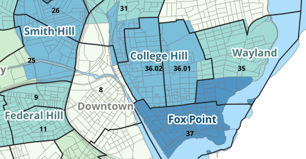
Last semester we completed a project to create a crosswalk between census geographies and local geographies in Providence, RI. Crosswalks are used for relating two disparate sets of geography, so that you can compile data that’s published for one set of geography in another. Many cities have locally-defined jurisdictions like wards or community districts, as well as informally defined areas like neighborhoods. When you’re working with US Census data, you use small statistical areas that the Bureau defines and publishes data for; blocks, block groups, census tracts, and perhaps ZCTAs and PUMAs. A crosswalk allows you to apportion data that’s published for census areas, to create estimates for local areas (there are also crosswalks that are used for relating census geography that changes over time, such as the IPUMS crosswalks).
How the Crosswalk Works
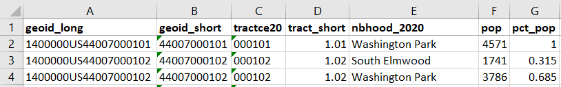
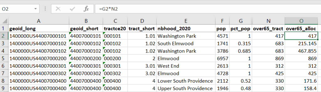
For example, in the Providence Census Geography Crosswalk we have two crosswalks that allow you to take census tract data, and convert it to either neighborhoods or wards. I’ll refer to the neighborhoods in this post. In the crosswalk table, there is one record for each portion of a tract that overlaps a neighborhood. For each record, there are attribute columns that indicate the count and the percentage of a tract’s population, housing units, land area, and total area that fall within a given neighborhood. If a tract appears just once in the table, that means it is located entirely within one neighborhood. In the image below, we see that tract 1.01 appears in the table once, and its population percentage is 1. That means that it falls entirely within the Washington Park neighborhood, and 100% of its population is in that neighborhood. In contrast, tract 1.02 appears in the table twice, which means it’s split between two neighborhoods. Its pct_pop column indicates that 31.5% of its population is in South Elmwood, while 68.5% is in Washington Park. The population count represents the number of people from that tract that are in that neighborhood.
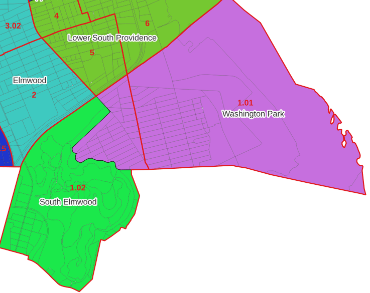
Looking at the map below, we can see that census tract 1.01 falls entirely within Washington Park, and tract 1.02 is split between Washington Park and South Elmwood. To generate estimates for Washington Park, we would sum data for tract 1.01 and the portion of tract 1.02 that falls within it. Estimates for South Elmwood would be based solely on the portion of tract 1.02 that falls within it. With the crosswalk, “portion” can be defined as the percentage of the tract’s population, housing units, land area, or total area that falls within a neighborhood.
The primary purpose of the crosswalk is to generate census data estimates for neighborhoods. You apportion tract data to neighborhoods using an allocation factor (population, housing units, or area) and aggregate the result. For example, if we have a census tract table from the 2020 census with the population that’s 65 years and older, we can use the crosswalk to generate neighborhood-level estimates of the 65+ population. To do that, we would:
- Join the data table to the crosswalk using the tract’s unique ID; the crosswalk has both the long and short form of the GEOIDs used by the Census Bureau. So for each crosswalk record, we would associate the 65+ population for the entire tract with it.
- Multiply the 65+ population by one of the allocation columns – the percent population in this example. This would give us an estimate of the 65+ population that live in that tract / neighborhood piece.
- Group or aggregate this product by the neighborhood name, to obtain a neighborhood-level table of the 65+ population.
- Round decimals to whole numbers.
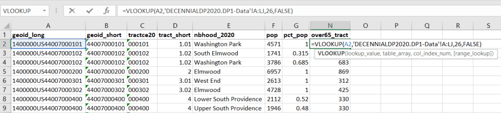
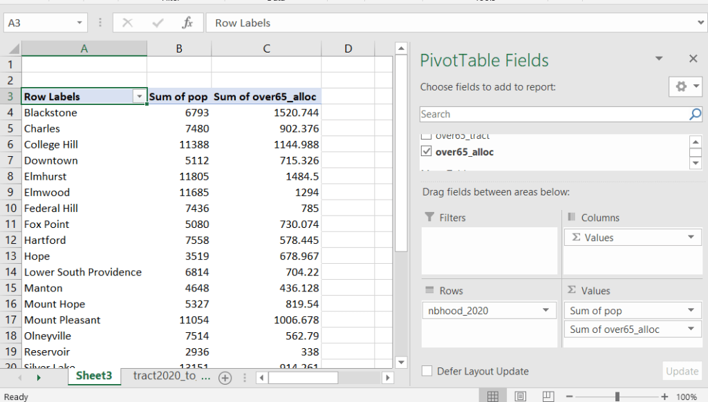
To do the calculations in a spreadsheet, you would import the appropriate crosswalk sheet into the workbook that contains the census data that you want to apportion, so that they appear as separate sheets in the same workbook. In the crosswalk worksheet, use the VLOOKUP formula and reference the GEOID to “join” the census tract data to the crosswalk. The formula requires: cell containing the ID value you wish to look up, the range of cells in a worksheet that you will search through, the number of the column that contains the value you wish to retrieve (column A is 1, Z is 26, etc.), and the parameter “FALSE” to get an exact match. It is assumed that the look up value in the target table (the matching ID) appears in the first column (A).
The tract data is now repeated for each tract / neighborhood segment. Next, use formulas to multiply the allocation percentage (pct_pop in this example) by the census data value (over 65 pop for the entire tract) to create an allocated estimate for each tract / neighborhood piece.
Then you can generate a pivot table (on the Insert ribbon in Excel) where you group and sum that allocated result by neighborhood (neighborhoods as rows, census data as summed values in columns). Final step is to round the estimates.
This process is okay for small projects where you have a few estimates you want to quickly tabulate, but it doesn’t scale well. I’d use a relational database instead; import the crosswalk and census data table into SQLite, where you can easily do a left join, calculated field, and then a group by statement. Or, use the joining / calculating / aggregating equivalents in Python or R.
I used the percentage of population as the allocation factor in this example. If the census data you’re apportioning pertains to housing units, you could use the housing units percentage instead. In any case, there is an implicit assumption that the data you are apportioning has the same distribution as the allocation factor. In reality this may not be true; the distribution of children, seniors, homeowners, people in poverty etc. may vary from the total population’s distribution. It’s important to bear in mind that you’re creating an estimate. If you are apportioning American Community Survey data this process gets more complicated, as the ACS statistics are fuzzy estimates. You’d also need to apportion the margin of error (MOE) and create a new MOE for the neighborhood-level estimates.
The Providence crosswalk has some additional sheets that allow you to go from tracts, ZCTAs, or blocks to neighborhoods or wards. The tract crosswalk is by far the most useful. The ZCTA crosswalk was an exercise in futility; I created it to demonstrate the complete lack of correlation between ZCTAs and the other geographies, and recommend against using it (we also produced a series of maps to visually demonstrate the relationship between all the geographies). There is a limited amount of data published at the block level, but I included it in the crosswalk for another reason…
Creating the Crosswalk
I used census blocks to create the crosswalk. They are the smallest unit of census geography, and nest within all other census geographies. I used GIS to assign each block to a neighborhood or ward based on the geography the block fell within, and then aggregated the blocks into distinct tract / ward and tract / neighborhood combinations. Then I calculated the allocation factors, the percentage of the tract’s total attributes that fell in a particular neighborhood or ward. This operation was straightforward for the wards; the city constructed them using 2020 census blocks, so the blocks nested or fit perfectly within the wards.
The neighborhoods were more complicated, as these were older boundaries that didn’t correspond to the 2020 blocks, and there were many instances where blocks were split between neighborhoods. My approach was to create a new set of neighborhood boundaries based on the 2020 blocks, and then use those new boundaries to create the crosswalk. I began with a spatial join, assigning each block a neighborhood ID based on where the center of the block fell. Then, I manually inspected the borders between each neighborhood, to determine whether I should manually re-assign a block. In almost all instances, blocks I reassigned were unpopulated and consisted of slivers that contained large highways, or blocks of greenspace or water. I struck a balance between remaining as faithful to the original boundaries as possible, while avoiding the separation of unpopulated blocks from a tract IF the rest of the blocks in that tract fell entirely within one neighborhood. In two cases where I had to assign a populated block, I used satellite imagery to determine that the population of the block lived entirely on one side of a neighborhood boundary, and made the assignment accordingly.
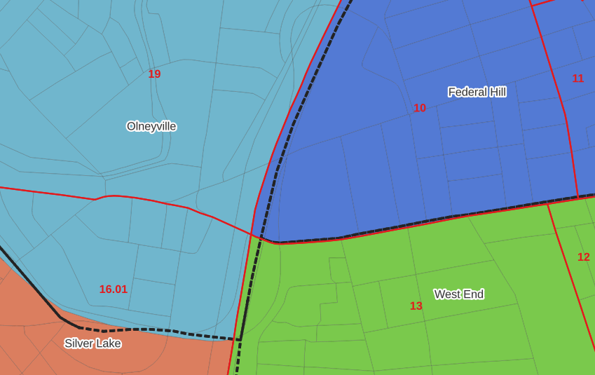
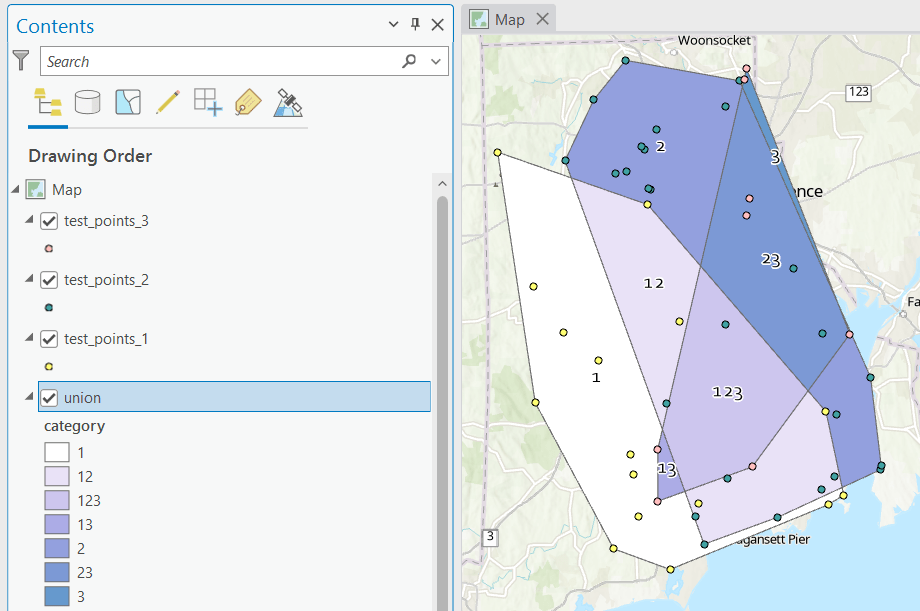
In the example below, 2020 tract boundaries are shown in red, 2020 block boundaries are light grey, original neighborhood boundaries are shown with dotted black lines, and reconstituted neighborhoods using 2020 blocks are shown in different colors. The boundaries of Federal Hill and the West End are shifted west, to incorporate thin unpopulated blocks that contain expressways. These empty blocks are part of tracts (10 and 13) that fall entirely within these neighborhoods; so splitting them off to adjacent Olneyville and Silver Lake didn’t make sense (as there would be no population or homes to apportion). Reassigning them doesn’t change the fact that the true boundary between these neighborhoods is still the expressway. We also see an example between Olneyville and Silver Lake where the old neighborhood boundary was just poorly aligned, and in this case blocks are assigned based on where the center of the block fell.
Creating the crosswalk from the ground up with blocks was the best approach for accounting how population is distributed within larger areas. It was primarily an aggregation-based approach, where I could sum blocks that fell within geographies. This approach allowed me to generate allocation factors for population and housing units, since this data was published with the blocks and could be carried along.
Conversely, in GIS 101 you would learn how to calculate the percentage of an area that falls within another area. You could use that approach to create a tract-level crosswalk based on area, i.e. if a tract’s area is split 50/50 between two neighborhoods, we’ll apportion its population 50/50. While this top down approach is simpler to implement, it’s far less ideal because you often can’t assume that population and area are equally distributed. Reconsider the example we began with: 31.5% of tract 1.02’s population is in South Elmwood, while 68.5% is in Washington Park. In contrast, 75.3% of tract 1.02’s land area is in South Elmwood, versus only 24.7% in Washington Park! If we apportioned our census data by area instead of population, we’d get a dramatically different, and less accurate, result. Roger Williams Park is primarily located in the portion of tract 1.02 that falls within Elmwood; it covers a lot of land but includes zero people.
Why can’t we just simply aggregate block-level census data to neighborhoods and skip the whole apportionment step? The answer is that there isn’t much data published at the block level. There’s a small set of tables that capture basic demographic variables as part of the decennial census, and that’s it. There was a sharp reduction in the number of block-level tables in the 2020 census due to new privacy regulations, and the ACS isn’t published at the block-level at all. While you can use the block-level table in the crosswalk to join and aggregate block data, in most cases you’ll need to work with tract-data and apportion it.
I used spatial SQL to create the crosswalks in Spatialite and QGIS , and if you’re interested in seeing all the gory details you can look at the code and spatial database in source folder of the project’s GitHub repo. I always prefer SQL for spatial join and aggregation operations, as I can write a single block of code instead of running 4 or 5 different of desktop GIS tools in a sequence. I’ll be updating the project this semester to include additional geographies (block groups – the level between blocks and tracts), and perhaps an introductory tutorial for using it (there are some basic docs at present).


You must be logged in to post a comment.