It’s been awhile since I’ve written a post that showcases different GIS datasets. So in this one, I’ll provide an overview of some free and open data sources that I’ve learned about and worked with this past spring semester. The topics in these series include: global land use and land cover, US heat and temperature, detailed population data for India, and public health in low and middle income countries.
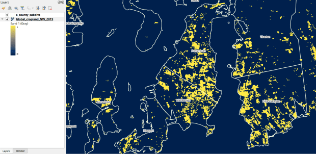
The GLAD lab at the Department of Geographical Sciences at the University of Maryland produces over a dozen GIS datasets related to global land use, land cover, and change in land surface over time. Last semester I had folks who were interested in looking at recent global change in cropland and forest. GLAD publishes rasters that include point-in-time coverage, period averages, and net change and loss over the period 2000 to 2020. Much of the data is generated from LANDSAT, and resolution varies from 30m to 3km. Other series include tropical forest cover and change, tree canopies, forest lost due to fires, a few non-global datasets that focus on specific regions, and LANDSAT imagery that’s been processed so it’s ready for LULC analysis.
Most of the sets have been divided up into tiles and segmented based on what they’re depicting (change in crops, forest, etc). The download process is basic point and click, and for larger sets they provide a list of tifs in a text file so you can automate downloading by writing a basic script. Alternatively, they also publish datasets via Google Earth Engine.
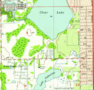
GLAD Cropland Extent in 2019 in QGIS, Zoomed in to Optimal Resolution in SE Rhode Island
For the past few years, the Trust for Public Land has published an annual heat severity index. This layer represents the relative heat severity for 30m pixels for every city in the United States; depicting where areas of cities are hotter than the average temperature for that same city as a whole (i.e. the surface temperature for each pixel relative to the general air temperature reading for the entire city). Severity is measured on a scale of 1 to 5, with 1 being a relatively mild and 5 being severe heat. The index is generated from a Heat Anomalies raster which they also provide; it contains the relative degrees Fahrenheit difference between any given pixel and the mean heat value for the city in which the pixel is located. Both datasets are generated from 30-meter Landsat 8 imagery, band 10 (ground-level thermal sensor) from summertime images.
The dataset is published as an ArcGIS image service. The easiest way to access it is by to adding it from the Living Atlas to ArcGIS Pro (or Online), and then export the service from there as a raster feature class (while doing so, you can also clip the layer to a smaller area of interest). It’s possible that you can also connect to it as an ArcGIS REST Server in QGIS, but I haven’t tried. While there are files that go back to 2019, the methodology has changed over time, so studying this as a national, annual time series is not appropriate. The coverage area expanded from just large, incorporated cities in earlier years to the entire US in recent years.
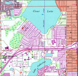
US Heat Severity Index 2023 in ArcGIS Pro, Providence and Adjacent Areas with Census Blocks
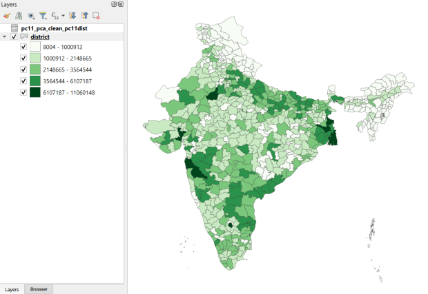
Created and hosted by the Development Data Lab (a collaborative project created by academic researchers from several universities), the Socioeconomic High-resolution Rural-Urban Geographic Platform for India (SHRUG) is an open access repository consisting of datasets for India’s medium to small geographies (districts, subdistricts, constituencies, towns, and villages), linked together with a set of common geographic IDs. Getting geographically detailed census data for India is challenging as you have to purchase it through 3rd party vendors, and comparing data across time is tough given the complex sets of administrative subdivisions and constant revisions to geographic identifiers. SHRUG makes it easy and open source, providing boundaries from the 2011 census and a unique ID that links geographies together and across time, back to 1991. In addition to the census, there are also environmental and election datasets.
Polygon boundaries can be downloaded as shapefiles or geopackages, and tabular data is available in CSV and DTA (STATA) formats. Researchers can also contribute data created from their own research to the repository.
SHRUG India Districts Total Population Data from 2011 Census in QGIS
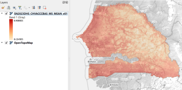
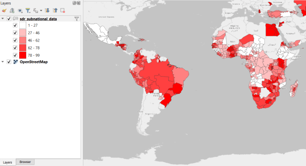
USAID published the detailed Demographic and Health Surveys (DHS) as far back as the mid 1980s for many of the world’s low and middle income countries. The surveys captured information about fertility, family planning, maternal and child health, gender, HIV/AIDS, literacy, malaria, nutrition, and sanitation. A selection of different countries were surveyed each year, and for most countries data was captured at two or three different points in time over a 40 year period. While researchers had to submit proposals and request access to the microdata (individual person and household level responses), the agency generated population-level estimates for countries and country subdivisions that were readily downloadable. They also generated rasters that interpolated certain variables across the surface of a country (the header image for this post is a raster of Senegal in 2023, illustrating the percentage of children aged 12-36 months who are vaccinated for eight fundamental diseases, including measles and polio). The rasters, boundary files, and a selection of survey indicators pre-joined to country and subdivision boundaries were published in their Spatial Data Repository. You could access the full range of population indicators as tables from a point and click website, or alternatively via API.
I’m writing in the past tense, as USAID has been decimated and de-funded by DOGE. There is currently no way to request access to the microdata. The summary data is still available on the USAID website (via links in the previous paragraph), but who knows for how long. As part of the Data Rescue Project, I captured both the Spatial Data Repository and the Indicators data, and posted them on DataLumos, an archive of archived federal government datasets. You can download these datasets in bulk from DataLumos, from the links under the title for this section. Unfortunately this series is now an archive of data that will be frozen in time, with no updates expected. The loss of these surveys is not only detrimental to researchers and policymakers, but to millions of the world’s most vulnerable people, whose health and well-being were secured and improved thanks to the information this data provided.
USAID Country Subdivisions in QGIS where Recent Data is Available on % Children who are Vaccinated
In this post I’ll demonstrate how to create least cost paths using QGIS and GRASS GIS, and in doing so will describe how a cost surface is constructed. In a surface analysis, you model movement across a grid whose values represent friction encountered in moving across it. In computing a least cost path, you’re seeking an optimal route from an origin to the closest destination, where ‘close’ incorporates distance and ease of movement across that surface. These kinds of analyses are often conducted in the environmental sciences, in modeling the movement of water across terrain, and in zoology in predicting migration paths for land-based animals.
In this example the idea was to chart the origin of settlements and possible trade routes in ancient history. In applications where we’re studying human activity, network analysis is typically used instead. Networks use geometry, where a node is a place or person, and connections between nodes are indicated with lines. Lines typically have a value associated with them that identify either the strength of a connection, or conversely friction associated with moving between nodes. The idea for this project was to identify how networks formed, so the surface analysis served as a proto-network analysis. While there were roads and maritime routes in pre-modern times, these networks were weaker and less dense. Charting movement over a surface representing terrain could provide a decent approximation of routes (but if you’re interested in ancient Roman network routing, check out the ORBIS project at Stanford).
This example stems from a project I was helping a PhD student with; I don’t want to replicate his specific study, so I’ve modified the data sources and area of focus to model movement between large settlements and stone quarries in the ancient Roman world. My goal is to demonstrate the methods with a plausible example; if we were doing this as part of an actual study, we would need to be more discriminating in selecting and processing our data.
Preliminary Work
The Pleiades project will serve as our source for destinations; it’s an academic gazetteer that includes locations and place names for the ancient and early medieval world, stretching from Europe and North Africa through the Middle East to India. It’s published in many forms, and I’ve downloaded the Pleiades Data for GIS in a CSV format. Using QGIS, I used the Add Delimited Text tool to plot the places.csv to get all of the locations, and joined that file to the places_place_type.csv file which contains different categories of places. I used Select by Attributes to get locations classified as quarries, and exported the selection out to a geopackage.
The Pleiades data includes a category for settlements, but there are about ten thousand of these and there isn’t an easy way to create a subset of the largest places. So I opted to use Hanson’s dataset of the largest settlements in the ancient Roman world to serve as our source for origins (about 1,400 places). This data was packaged in an Excel file; I plotted the coordinates using the Create Points Layer from Table tool in QGIS and converted the result to a geopackage. For testing purposes, I selected a subset of ten major cities and saved them in a separate layer: Athenae, Alexandria (Aegyptus), Antiochia (Syria), Byzantium, Carthago, Ephesus, Lugdunum, Ostia, Pergamum, Roma.
For the friction grid, I downloaded a geoTIFF of the Human Mobility Index by Ozak. The description from the project:
“The Human Mobility Index (HMI) estimates the potential minimum travel time across the globe (measured in hours) accounting for human biological constraints, as well as geographical and technological factors that determined travel time before the widespread use of steam power.”
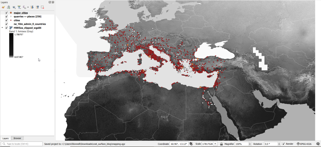
There are three separate grids that vary in extent based on the availability of seafaring technology. I chose the grid that incorporates seafaring prior to the advent of ocean-going ships, which is appropriate for the Mediterranean world during the classical era. The HMI is a global grid at 925 meter resolution. To minimize processing time, I clipped it to a bounding box that encompasses the area of study. The grid is in the World Cylindrical Equal Area system; I reprojected it to WGS 84 to match the rest of the layers. As long as we’re not measuring actual distances, we don’t need to worry about the system we’re using (but if we were, we’d use an equidistant system). Since the range of values is small and it’s hard to see differences in cell values, I symbolized the grid as single-band psuedo color and used a quantiles classification scheme with 12 categories.
Lastly, I grabbed some modern country boundaries from Natural Earth to serve as a general frame of reference. A screenshot of the workspace is below:
Least Cost Path in QGIS
QGIS has a third-party plug-in for doing a least cost path analysis, which works fine as long as you don’t have too many origin points. Go to Plugins > Manage and Install Plugins > Least Cost Path to turn it on. Then open the Processing toolbox and it will be listed at the bottom. See the screenshot below for the tool’s menu. The Cost raster layer is the friction surface, so the human mobility index in this example. The start points are the ten major cities and the end points are the quarries. The start-point layer dialog only accepts a single point; if you have multiple points, hit the green circular arrow button to iterate across all of them. There’s a checkbox for connecting the start point to just the nearest end point (as opposed to all of them). Save the output to a geopackage.
It took about five minutes to run the analysis and iterate across all ten points. Each path is saved in a separate file, but since they have an identical structure I subsequently used Vector > Data Management Tools > Merge Vector Layers to combine them into one file. The attribute table records the end point ID (for the quarry) and the accumulated cost, but does not include the origin ID; this ID is the number 1 repeated each time, as the tool was iterating over the origin points. We can see the result below; for Athens and Ephesus in the south, land routes were shortest, whereas for Pergamum and Byzantium in the north it was easier (distance and friction-wise) to move across the sea.
While this worked fine for ten cities, it would take a considerable amount of time to compute paths for all 1,400. The problem here is that the plugin was designed for one point at a time. Let’s outline the process so we can understand how alternatives would work.
Cost Surface Analysis
To calculate a least cost path, the first step is to create a cost surface, where we take our friction grid and the destinations and calculate the total cost of movement across all cells to the nearest destination. First, the destinations are placed on the grid, and they become the grid sources. Then, the accumulated cost of moving from each source to its adjacent cells is calculated. For horizontal and vertical movement, it’s the sum of the friction values divided by two, and for diagonal movement it’s the sum of the friction values divided by two then multiplied by 1.4142. Once those calculations are performed, those adjacent cells are assigned to each source. Next, the lowest accumulated cost cell in the grid is identified, the cost for moving to its unassigned neighbors is calculated, and these cells are assigned to the same source. This process is repeated by cycling through the lowest accumulated value until all calculations for the grid are finished. Illustrated in the example below, which I derived from Lloyd’s Spatial Data Analysis (2010) pp. 165-168.
For each cell, three items are recorded, and are saved either as separate bands in one raster, or in three separate raster files:
Accumulated cost of moving to that cell from the nearest source
Assignment or allocation of the cell to its source (the nearest one to which it “belongs”)
A vector that indicates direction from that source
With these cost surfaces, we can take the second step of calculating the least cost path. We place a number of starting points onto this surface, and each point is assigned to the closest destination based on where its grid cell was allocated. The direction to that destination is traced backward using the direction grid, and the total cost of movement is taken from the accumulated cost surface.
Knowing how this process works, there are two practical conclusions we can draw. First, when computing the cost surface, you use your destinations (not the origins) as the source for the cost surface. You use the origins as the start points for the least cost path. Second, there’s no need to recalculate the cost surface for every origin point; you only need to do this once. That’s why the QGIS plugin took so long; it was recomputing the cost surface each time. Knowing this, we can use GRASS GIS to compute the paths, as it’s designed to compute the surface just once (and it’s data structure will also boost performance a bit).
Cost Surface Analysis in GRASS
GRASS GIS comes bundled with QGIS. While it’s possible to run a number of GRASS tools directly within QGIS, it’s a bit undesirable as you’re not able to access the full range of parameters or options for each GRASS command. I opted to create the GRASS environment in QGIS, and loaded all the necessary data into the GRASS format. Then, I flipped over to the GRASS GUI to do the analysis.
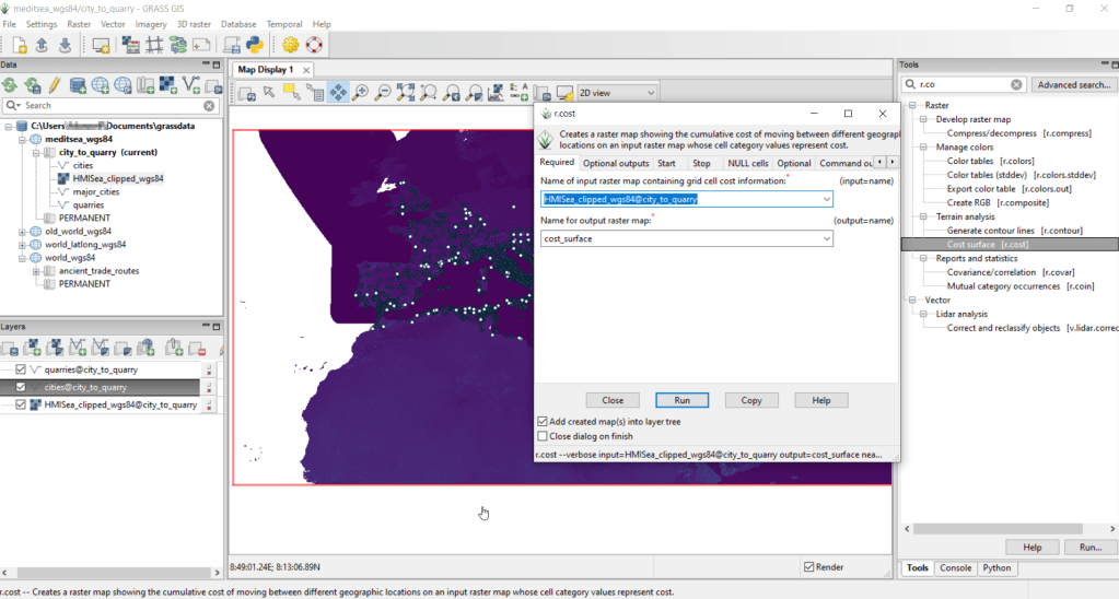
GRASS uses a distinct database structure and file format, and we need to create a GRASS workspace and load our data into that database in order to use the cost surface tools. I followed the steps in the QGIS manual for creating a GRASS environment and loading data into a GRASS database. Once you create the database and mapset, you use the QGIS Browser to browse to the grassdata folder and designate your new mapset as your working mapset (mapsets have the little green grass icon beside them). With the GRASS tools open, I used v.in.ogr.qgis to load my my cities and quarries layers into this mapset, and r.in.gdal.qgis to load the mobility index (if these layers weren’t already in your QGIS project, you’d use the tools that don’t have the qgis suffix, i.e. v.in.ogr).
After exiting QGIS and launching GRASS, you select the mapset under the grassdata database at the top, right click and choose Switch mapset, and choose the mapset you want to work with (if you don’t see it, hit the database icon to browse and connect to the grassdata folder). You can display the layers in the GRASS window to visualize them, but it’s not necessary for running the tools. In the tool menu on the right, search for the Cost surface tool, r.cost, and choose the following options:
Required: input raster map with grid cell cost is the human mobility index, and output raster is cost_surface
Optional outputs: output raster with nearest start point as allocation_surface, output raster with movement as direction_surface
Start: vector starting points for the cost surface are the destinations, the quarries
Optional: check verbose output (to get more details on errors)
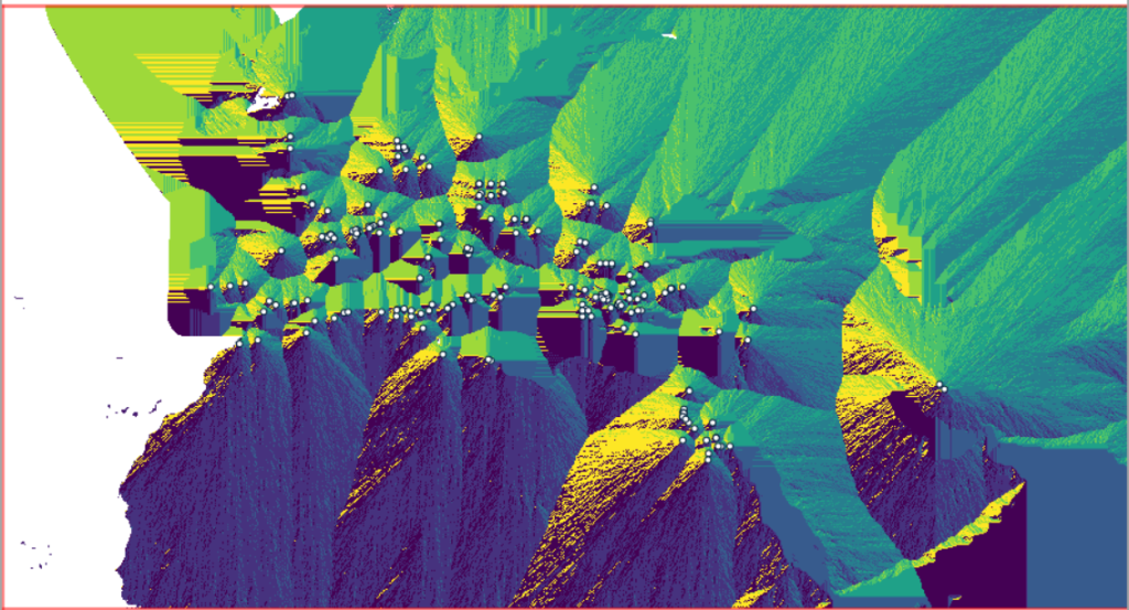
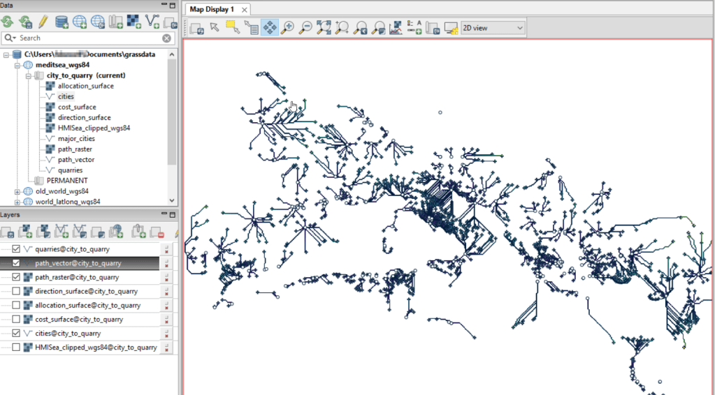
Running this operation on all 1,400 cities took a matter of seconds, and all three rasters described in the previous section were generated: cost, allocation, direction (shown below).
Using these outputs, we can run the Least cost route or flow tool, which is called r.drain (as it’s often used in earth sciences to chart the path that water will drain based on elevation).
Required: Name of input elevation or cost surface raster is cost_surface, Name of output raster path: is path_raster
Cost surface: check the Input raster map is a cost surface box, Name of input movement direction raster is direction_surface
Start: Name of starting points vector map: are the origins (cities)
Path settings: choose ONE option that you’d like to record (or none)
Optional: check Verbose mode, Name for output drain vector is path_vector
This also took mere seconds to complete (!) and generated the paths from each origin (city) to the closet destination (quarry) over the surface as both raster cells and vector lines. The output in GRASS is shown below.
At this stage, we can hop back into QGIS, and load these output paths into our original project to symbolize and study what’s going on. Notice the settlements in northeastern Italy and along the Dalmatian coast; for many of them the least cost path is to a quarry across the sea rather than through rugged mountainous terrain. Even though some quarries in the mountains may be closer in actual distance, it’s a tougher path to travel.
Conclusion
The benefit of using GRASS is that we can run these processes fairly quickly for large datasets. The GRASS commands can also be compiled into a batch script, so you can create a documented and automated process instead of having to drill through multiple menus.
A big downside of the GRASS tools for this analysis is that the resulting vector paths contain no information about the origin or destination points, and only the raster path output carries along values. You might be able to generate this information through some extra steps; using the QGIS field calculator, you can get the coordinates for the start point and end point of each path and add them explicitly to the attribute table. Then take those coordinates, and for the start point of the line select the closest city and get its attributes, and for the end point select the closet quarry and get its attributes. I say “closest” because the vector paths don’t snap perfectly to the start and end points. Modifying the resolution of the human mobility index to make it coarser (fewer cells) might help to resolve this, or converting the origin and destination points to a raster of the same resolution as the index. Alternatively, if you incorporate the GRASS commands into a Python script, you could iterate over the origins in the least cost path analysis and record the origin IDs as you step through.
I haven’t worked all the pieces, but hopefully this will be useful for those of you who are interested in conducting a basic cost surface analysis in open source. The student I was helping was interested in measuring the density of the paths across a grid, so this process worked for him as he didn’t need to associate the paths with origins and destinations. Beyond FOSS GIS, ArcGIS Pro has a full suite of tools for cost surface analysis, and the underlying methods and logic are the same.
I carted several boxes of old stuff from my mom’s basement to mine about a year ago, since I finally had a basement of my own for storing boxes of old stuff. This stuff included a bin with my old stamp collection, one of many childhood hobbies. Leafing through it for the first time in decades, my interest was rekindled and I thought this would make for a relaxing, non-screen-based hobby that I could work on for an hour or so in the evenings. I’ve been transferring and re-organizing this collection over the past year.
Similar to other leisurely pursuits that I’ve written about (usually around this time each year), such as video games and hunting for USGS survey markers while hiking, this hobby has a strong connection to geography. Stamps express the geography, culture, and history of the world’s countries in miniature, and collecting them familiarizes you with different places, languages, and currencies. Postage stamps were introduced in the mid 19th century, so any collection will recount modern history, documenting the: aggregation of states into nations and empires, collapse of empires and states into smaller countries, emergence of colonies as independent states, shifting boundaries as countries fought and occupied one another, and coalescence of nations into larger alliances and supra-national bodies.
This natural connection between stamps and geography becomes even more literal when countries depict themselves on stamps through maps, landscapes, and places. In this post I’ll share examples from my collection that illustrate these themes. I recently finished teaching and consulting for S4’s two week GIS Institute; my favorite lecture is the one I give on cartography, a topic that I generally don’t get to cover in classes where I guest lecture. For that talk, I use a gallery of maps to illustrate different aspects of cartographic design, good and bad. I’ll take a similar approach here. While I’ve endeavored to select stamps from a cross-section of the world’s nations, my selection is a bit skewed by luck of the draw, in terms of stamps I happen to have that fit the theme, and as my collection is largely frozen in time. I stopped around 1992, right when the world’s map changed quite a bit at the abrupt end of the cold war.
Maps on Stamps
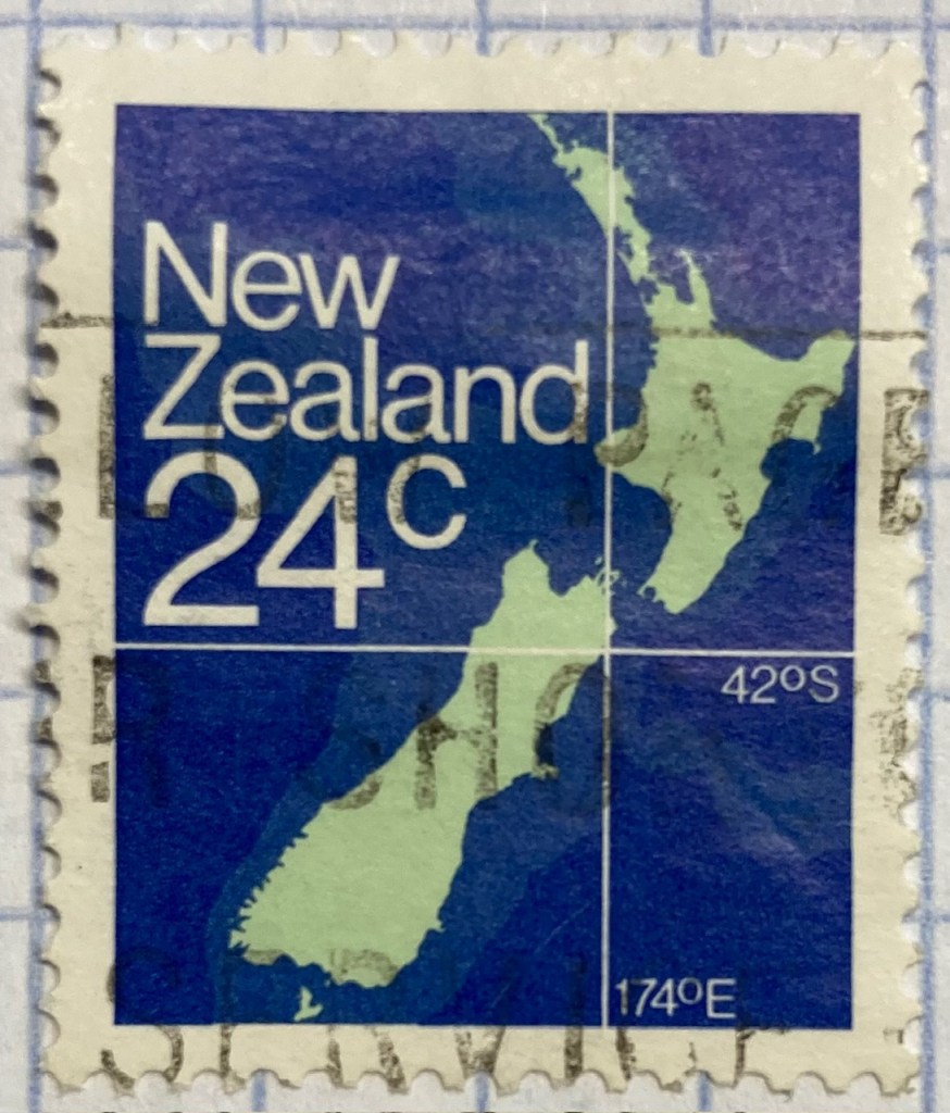
Reference maps are the most basic of maps, designed to show you where places are located. Many countries have issued stamps depicting their location, such as this 1980s stamp from New Zealand. In this case, latitude and longitude coordinates are used to help you identify precisely where the Kiwis are; a southerly spot at 42 degrees south latitude and 174 degrees east longitude.
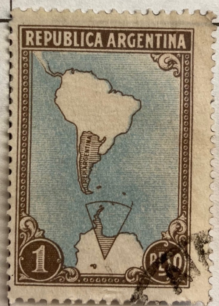
A broader frame of reference can be used for putting a place in context, in order to locate it. This 1930s stamp of Argentina depicts its location in the southern cone of South America, with the Atlantic and Pacific Ocean labeled. We can clearly see that Argentina is the focus of the map based on the shading and title, and figure ground relationship (the distinction between a foreground and background on a flat surface) is established between the country, continent, and ocean so that Argentina is in the foreground (although the bold frame gives us the impression of looking at a painting). There is something else going on though…
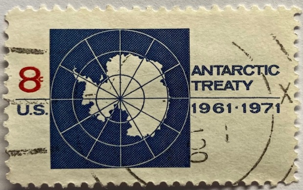
Which is more apparent in this subsequent map from the 1950s. The Falklands Islands (a territory of the UK) are claimed by Argentina and shaded as part of the country in both maps, and in this later stamp so is a big chunk of Antarctica. Nations use maps, and stamps, to assert their authority and control over space, in a message that is affixed to envelopes and sent around the world. A counterpoint to this example is the stamp displayed in the header of this post, a 1971 US stamp commemorating the Antarctic Treaty (which essentially states that no nation can claim or own Antarctica).
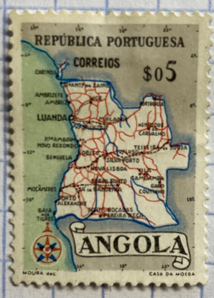
This detailed reference map of Angola was issued as part of a series of stamps in the 1950s, when Angola was a Portuguese colony. The issuance of stamps and depiction of territories was one method for empires to assert authority over their colonies. Visually this is a busy map, as they squeezed in as many cities, roads, railroads, and rivers as they could (emphasizing the development of the colony). The white on grey contrast with a blue halo brings the country to the foreground, and if you look closely you’ll see latitude and longitude coordinates around the edges. Ultimately, too much material squeezed into this little map makes it hard to read.
As colonies gained independence throughout the post World War II period, the depiction of nations switched from being one of colonial authority and control to independence and national pride. It was common for many western states at this time to issue series of stamps that depicted a head of state, using the same design but with bold primary colors for different denominations. India put a unique spin on this practice by depicting their country instead, on a large series issued in the late 1950s (Gandhi had received a multicolored depiction in 1948, one year after independence). The map shows the physical geography of India, framed with a motif that evokes Indian design and culture.
Rwanda also celebrated their independence in a series of multicolored stamps in different denominations. Beyond national pride, these stamps also assert the authority of the new government in the new state (the new president stands in the foreground). Rwanda’s location in Africa is clearly illuminated, emphasized by a halo of white around a dark fill. The geometric frame evokes a distinct African aesthetic.
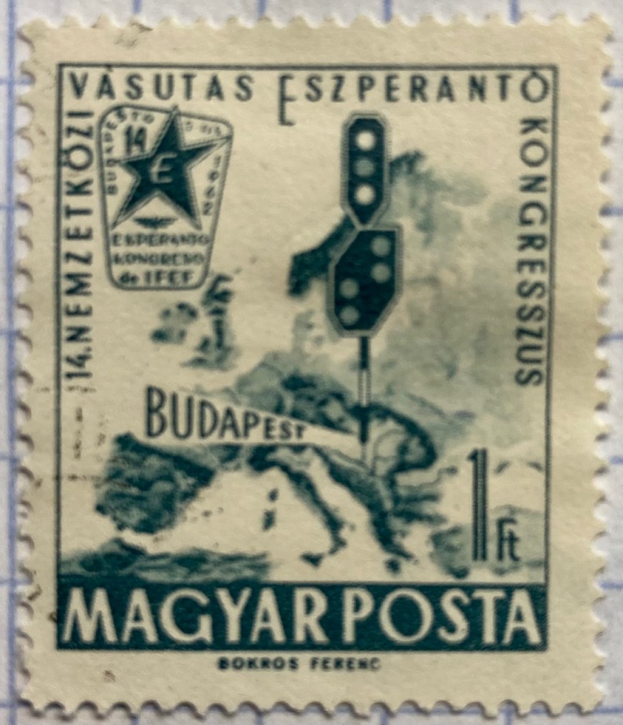
You can emphasize specific locations by modifying the extent and scale of a map. This 1960s stamp from Hungary emphasizes the location of its capital city Budapest as being in the center of Europe. The railroad traffic light and prominent label draw your eye right to the location, while simultaneously blotting out surrounding areas (of lesser importance). Clearly there is no better place for hosting the… Esperanto Congress.
This 1960s Chilean stamp celebrates the Alliance for Progress, a ten year plan launched by US President Kennedy to strengthen economic ties between the US and Latin America and to promote democracy (which meant, stop communism). The choice of a globe rather than a flat map better emphasizes the scope and reach of an initiative than spans vast distances and ties nations together. Not very well as it turned out – the initiative was considered a big failure.
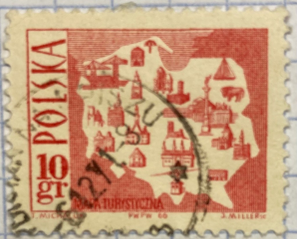
Reference maps show us where things are, while thematic maps show us what’s going on there. As the name suggests, they illustrate a specific theme. This fun 1960s stamp from Poland illustrates the mix of architecture, settlements, and industry across the nation, for tourists (Mapa Turystyczna). Figure ground relationship is clearly established with a white foreground for the state and a red background (solid on land and hashed on water).
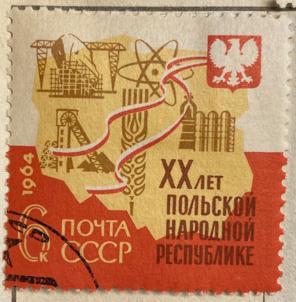
It’s one thing to make map stamps of your own country, but the implications are quite different when your neighbor is making map stamps of you. This map of Poland was part of a series of stamps the USSR issued of its Warsaw Pact neighbors, featuring their friendly and productive comrades, and all the wonderful resources their nations have to share… Also a way of broadcasting to the rest of the world the alliances between nations.
Maps are a visual means of communicating messages about places, sometimes through data, sometimes with symbols or images. These messages can be pretty overt, as in this 1980s stamp from Iran that expresses solidarity with the Afghan resistance to Soviet occupation. Angry, red clenched fists and bayonets – no friendly comrades here. The bayonets come from the direction in which the invaders came, and their downward thrust draws your eyes to the raised fists.
Messages can be more subtle, as in this East German stamp that proclaims the Baltic as the “Friendly Sea” (a better translation is the “Sea of Peace”). The muted blues evoke a nautical theme, and are also subdued and non-threatening, while the halo effect along the coast and variation in tone distinguishes land from water. The DDR began constructing the Berlin Wall one year before this stamp was issued, and it was not a Friendly Wall.
Maps for navigation are a distinct type of reference map, designed to help us get from point A to point B. This 1970s East German stamp was part of a series that depicted lighthouses over nautical charts, which display varying levels of ocean depth (by using shading and labeling depths at spot locations) and a selection of prominent features on land that can be spotted from ships. Useful for navigating the Friendly Sea no doubt.
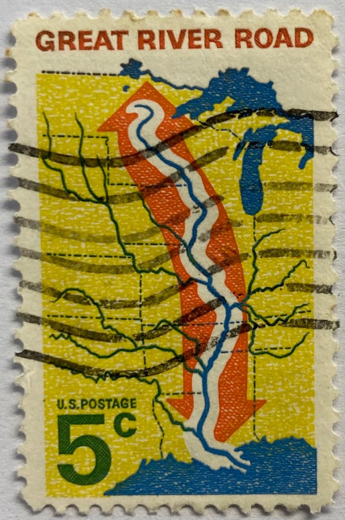
This 1960s map from the US depicts the Mississippi River as the “River Road”. The broad white buffer around the river plants it within the foreground, while the orange arrow imparts a dynamic sense of north / south movement. The tributaries feed into this central trunk, giving us a sense of the breadth of the network. The extent of the map omits the east and west coasts, so we don’t see the overall context for where the river is situated. But it’s a good trade-off, as it focuses our attention squarely on the river system, leaving out the empty spaces that the network doesn’t reach. Still, it would have made sense to indicate that this is the Mississippi River somewhere on the stamp.
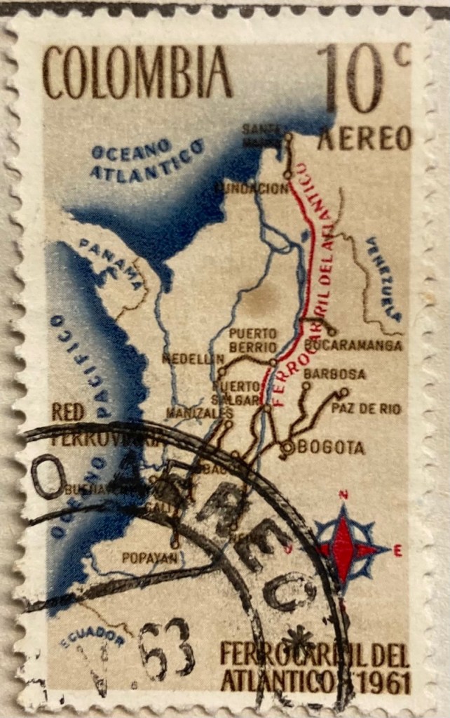
This map of Columbia depicts the Ferrocarril del Atlántico, a railroad line that connects the Atlantic coast to the capital of Bogota and whose construction was quite an achievement. The line is in red, and presumably the brown lines are connecting railroads. The overlapping labels (there are too many of them) make it difficult to read, and the thickness of the lines for railroads, rivers, and country boundaries are the same, making them hard to distinguish. There is no visual hierarchy for the labels to distinguish importance, as the font sizes are all the same, and the labels for the oceans and neighboring countries use the same color, a cartographic no-no. But there is a nice compass rose.
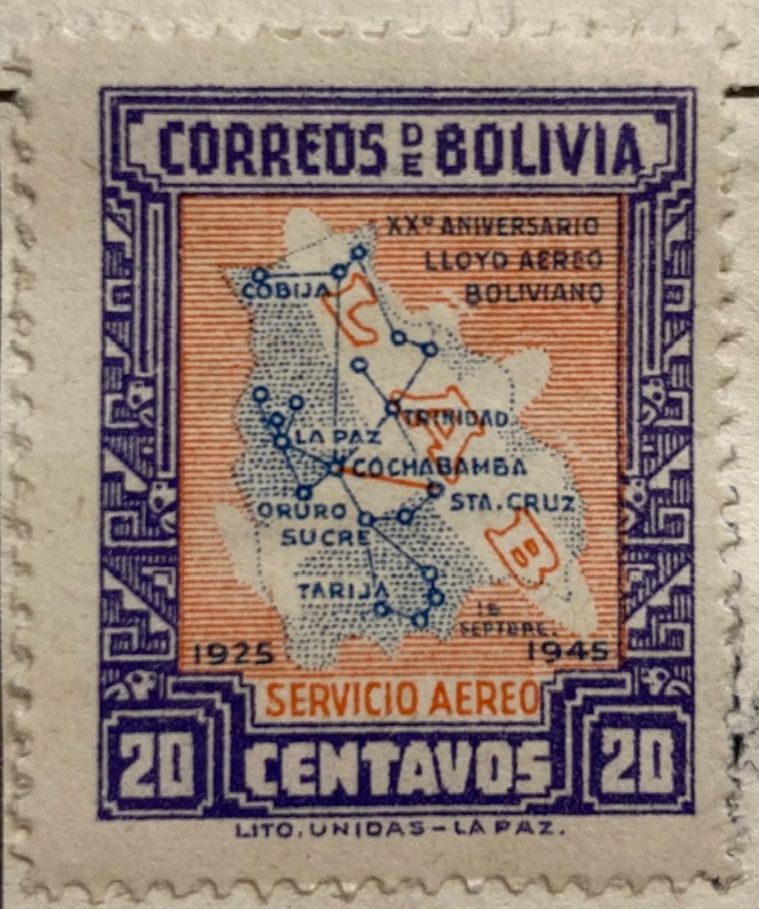
Air travel was often celebrated on mid 20th century stamps, sometimes in relation to air mail services. This compact map of Bolivia from 1945 depicts the seemingly comprehensive system of the national airline within the country, with a vector graph of points and lines, and with labels for the major nodes. The labels and LAB logo fill in and hide areas that don’t have much service, particularly the eastern part of the country. The traditional Mesoamerican motif in the frame is an interesting contrast to the modern subject matter of the map.
Landscapes and Places
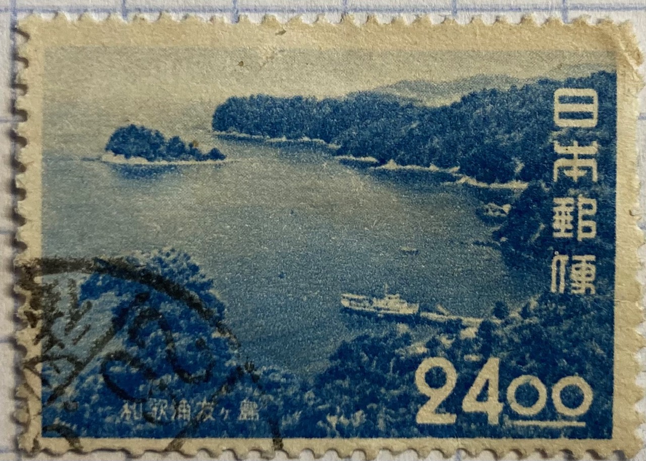
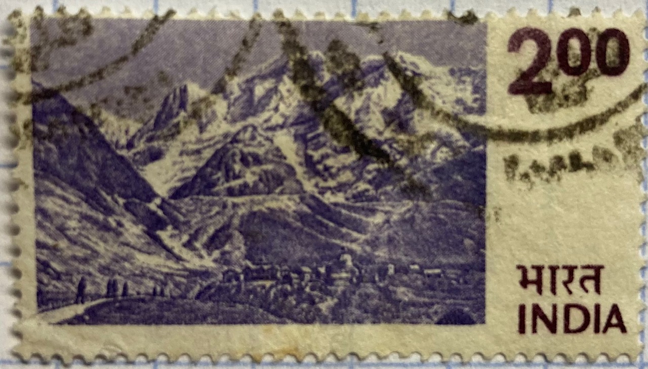
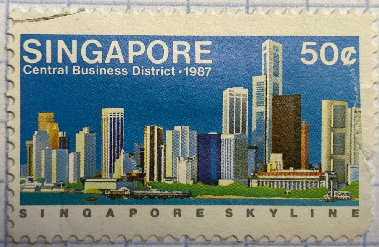
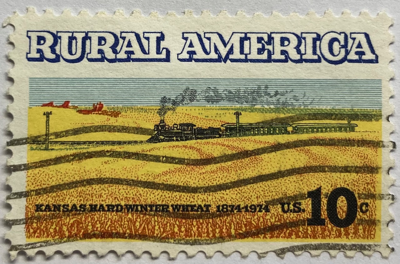
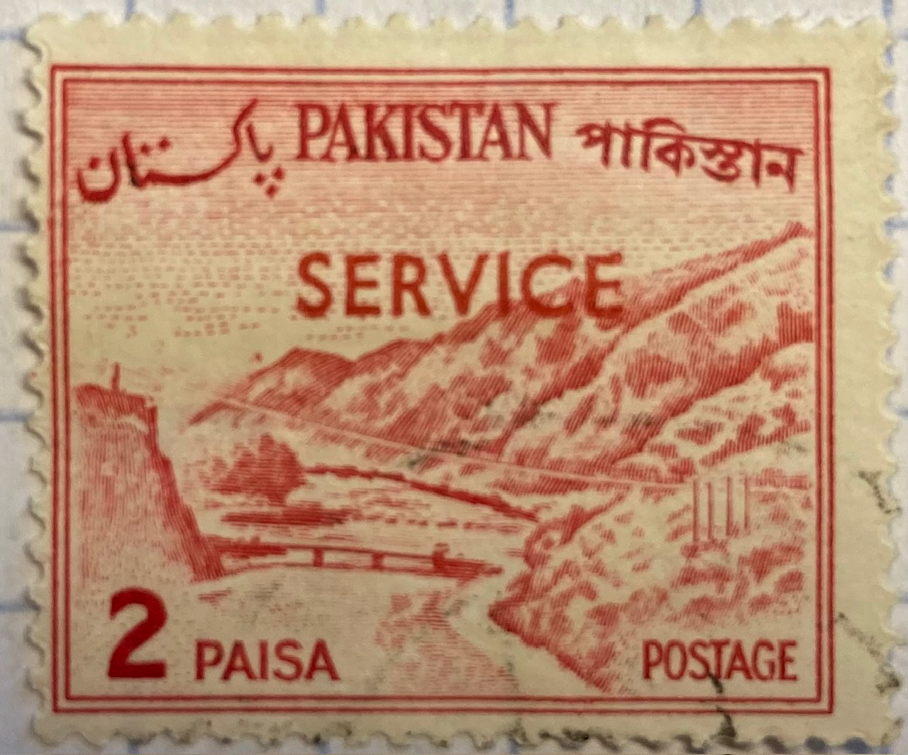
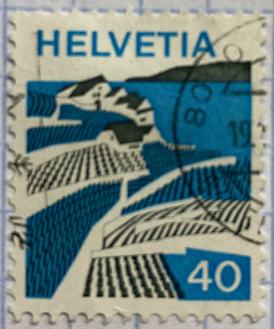
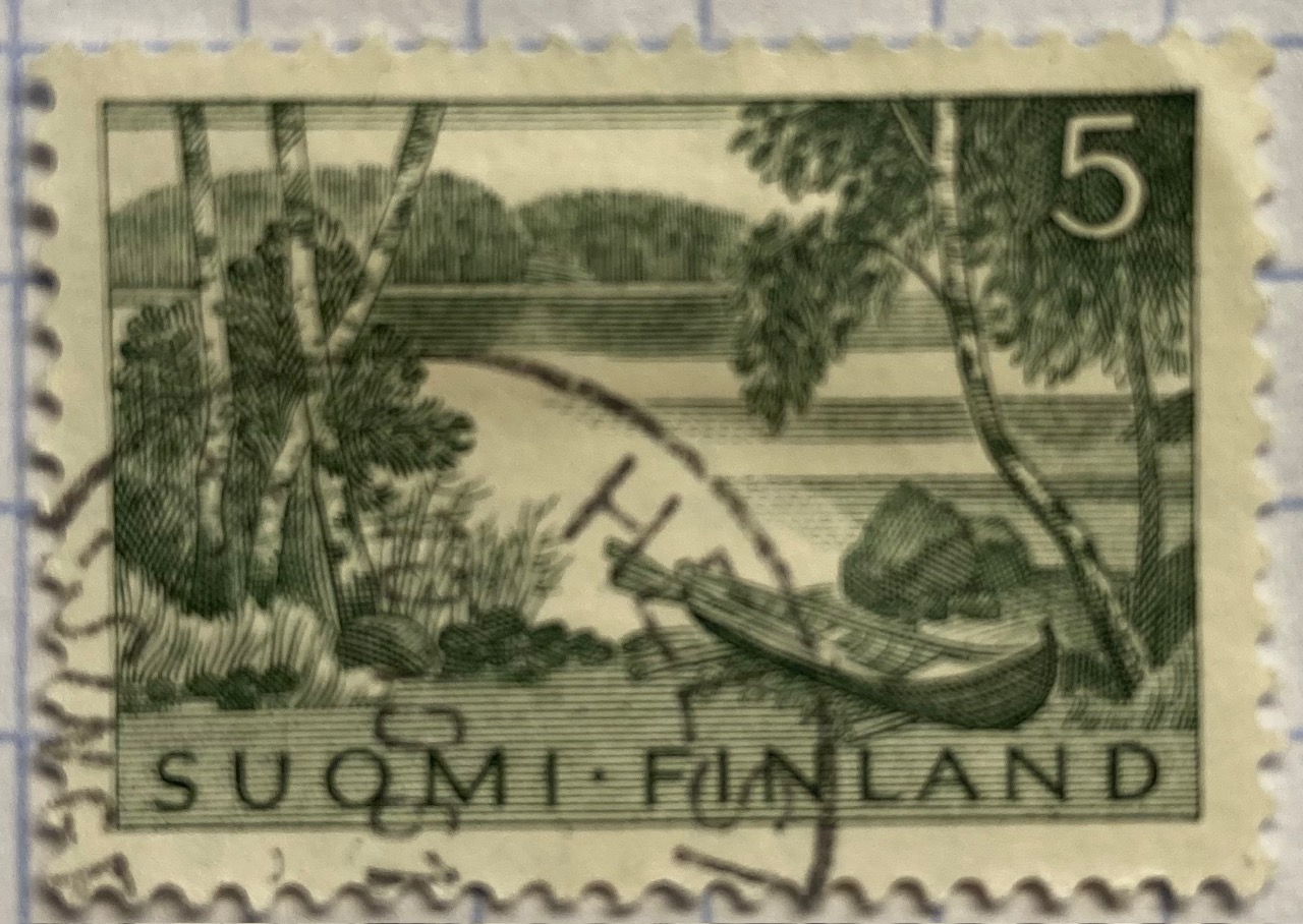
Beyond maps, geography is also communicated on stamps through the depiction of landscapes. The gallery below includes a sample of stamps that illustrate both natural and built environments. The depictions of landscape can be literal, such as the photograph of Wakanoura Bay on the Japanese stamp, or artistic representations like the painting of Rural America and drawing of a Pakistani river valley, or more abstract views such as the stylized image of Swiss (Helvetia) farmland. Stamps can depict specific places, such as the Himalayas in India or the skyline of Singapore, or can be general representations of a landscape, such as an idyllic lakeside in Finland.
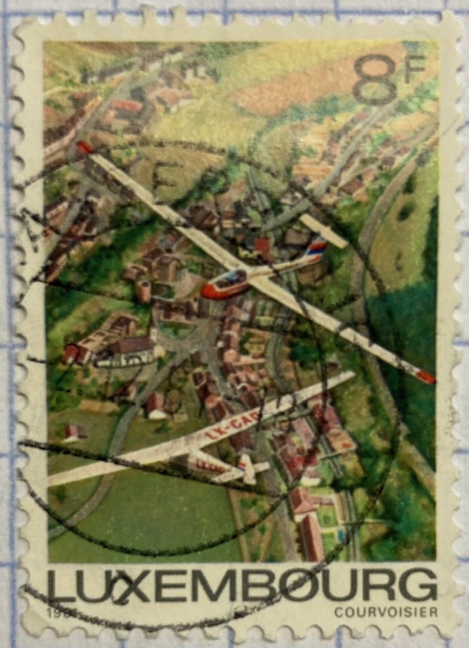
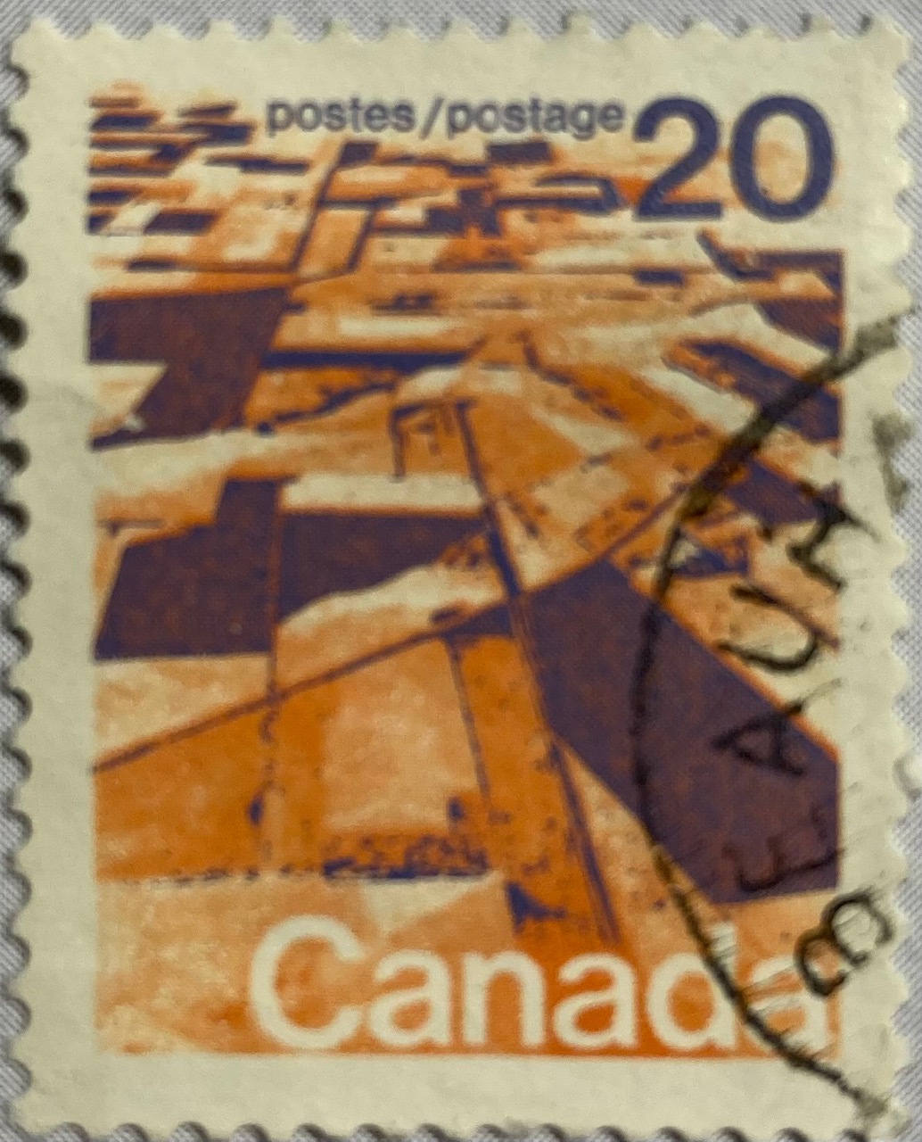
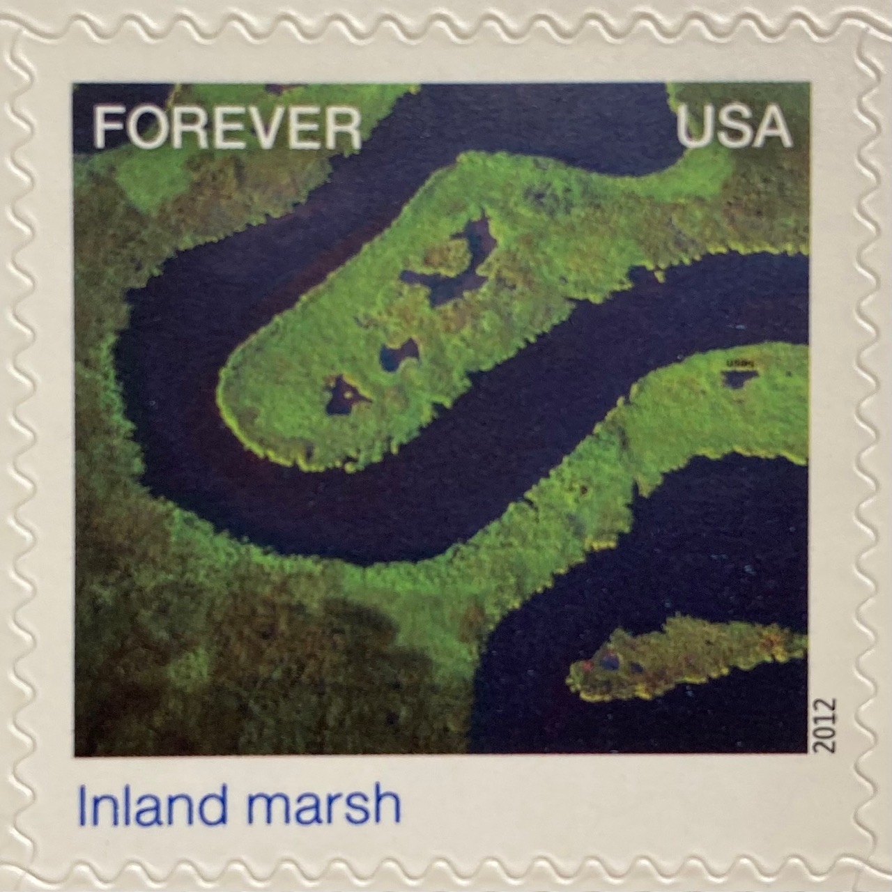
A birds-eye view offers a different perspective. The gliders are the focus of the Luxembourg stamp below, but we get to share the pilot’s view of the villages and countryside. Canada issued a series of stamps in the 1970s that depicted its diverse terrain, including this oblique aerial photo of farmland on the Canadian prairie. The US issued a series entitled Earthscapes in 2012, that celebrated both its landscapes and the technology used for capturing them as orthophotos and satellite images.
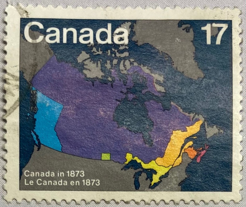
The depiction of places and administrative subdivisions on stamps is a common theme, particularly in nations that are federated states. Canada issued a series of stamps in 1981 that illustrate the evolution of the nation from individual settlements and colonies into provinces and territories that formed the Canadian Confederation. Each stamp represents a specific point in time.
The constituent states and territories of the United States are popular subjects on American stamps. These can be singular, commemorative stamps that celebrate the founding or statehood of a particular state, such as this 1991 stamp marking Vermont’s 200th anniversary of statehood. Or, they can be large series issued as sets that include one stamp for each state. State maps, landscapes, flags, and even official state birds and flowers have served as subjects over the years.
The French postal service published a large series that showcased its historic provinces, releasing stamps individually and in small sets from the 1940s to the 1960s. These stamps depicted the coat of arms for each place, connecting heraldry from the medieval past to the modern French Republic.
Wrap-up
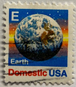
I hope you enjoyed this little, and by no means exhaustive, tour of cartography and geography on postage stamps! There are countless other avenues we could have strolled down in our travels, such as the depiction of explorers and exploration, climate and weather, environmentalism, how map projections are employed, and views from space. My parting example is a reminder that maps are 2D representations of our spherical 3D world. And that “E ” is for “Earth”.
(In the 1980s and 90s the US Postal Service issued non-denominational stamps for domestic 1st class mail during transition periods when postal rates increased. They featured letters instead of currency values, and you could use them before and after a rate changed. A through D featured a stylized eagle from the postal service logo, but by the time they got to E they followed Sesame Street’s lead and depicted objects that began with each letter. The USPS dropped the letter convention in the 2000s, and in 2011 dropped denominations altogether in favor of Forever stamps.)
I was working with a graduate student last month who was looking for contour lines for specific towns within the US, for large-scale (small area) mapping and analysis. They were specifically interested in elevation for landfills, and some of the contour data they found didn’t map these as they aren’t natural features. We looked at current USGS topographic maps, and they do indeed map contours for landfills. But the topo maps are raster images, and they wanted vectors. Is it possible to access the underlying GIS data that was used to create the topo maps?
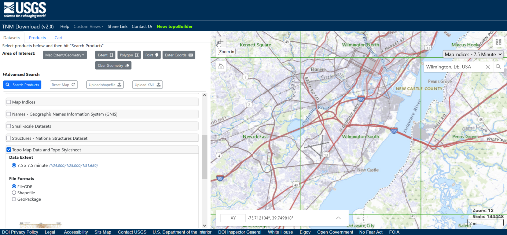
Indeed, it is! Option 1 is to use the National Map Download app. Search for a place name to zoom into your area of interest. Use the Show Map Index dropdown menu to draw the quad boundaries for the topo scale you’re interested in on the map; the 7.5 minute / 1:24,000 series is the USGS topo scale that most people are familiar with. Adjust the zoom so your area of interest fits within the map window; that way when you search in the Datasets tab on the left, the default search looks within this map extent.
Next, choose the specific data product you’re interested in. Here’s a list and description of all the National Map Datasets. For example, if you just wanted contour lines, you can select that under Small-scaleDatasets. Note that raster imagery and data that’s used to derive the vectors is also available for download. If you want all the vector features that appear on a particular topo map, check the Topo Map Data and Topo Stylesheet option. Once you check a product, you can choose a file format for the data. Given the size of these datasets, the FileGDB option is probably best.
The National Map Download Interface, Showing the Datasets Tab for Selecting and Searching
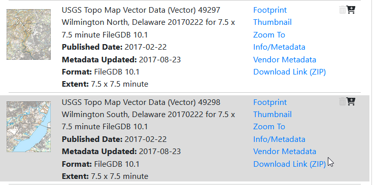
Then, click the blue Search Products button. That flips you to the Products tab, and displays data available within the extent of the map view. If you chose Topo Map Data and Topo Stylesheet, the results will be maps of individual quads. You can add a bunch of maps to your shopping cart by clicking on the little cart icon, or download one immediately by clicking the Download Link (ZIP).
On the Product Tab, click Download Link (ZIP) to get data for a specific map
Option 2 for downloading data: skip the map interface and use the Stage Products Directory. This no frills option is good if you know exactly which products you’re looking for. For example, you can drill down through TopoMapVector, then by state, and then data format to get to the same files you would have downloaded via option 1. You would need to know the name of the quad that encompasses the area you want; consult an index to figure it out.
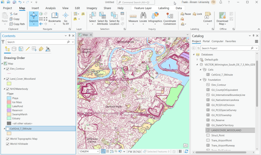
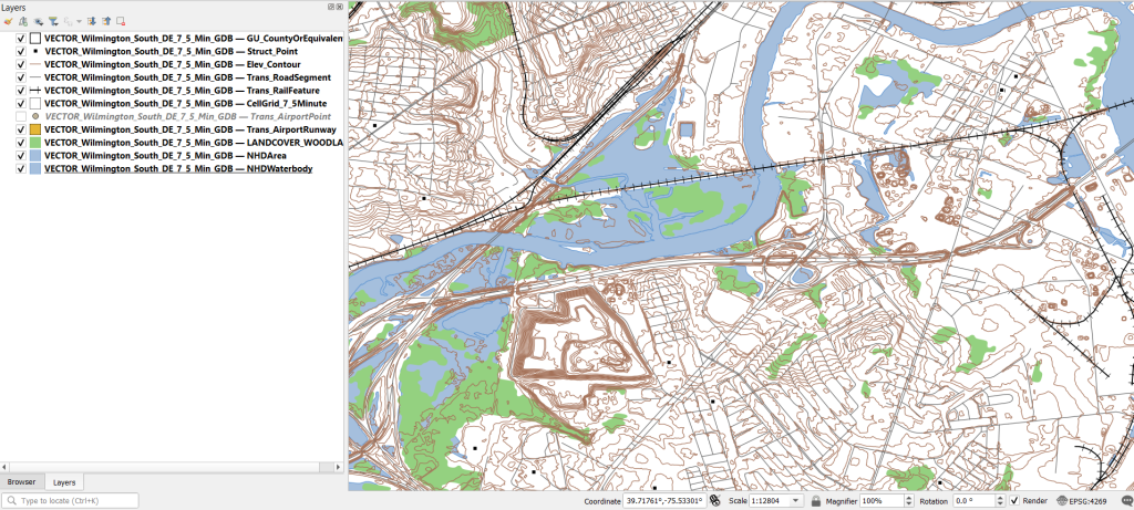
Once you download and unzip the file, you can launch your desktop GIS package to connect to the database and view the contents. In ArcGIS Pro, use the Catalog Pane, select the Databases option, right click, and Add Database. Browse to the location where you unzipped it, and select it. Then hit the dropdown for the newly added database and browse the contents, which are divided into schemas or groups. Foundation and Hydrography contain most of the features. GazVector has place name labels not captured in other features, and Cells contains outlines of the quad grid cells. Drag them into the Map Pane to view them.
USGS Topo Map Vector Data in ArcGIS Pro
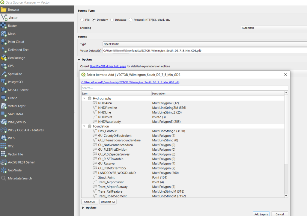
QGIS users can use the Data Source Manager. With the Vector option selected, change the Source Type from File to Directory, and in the Type dropdown choose OpenFileGDB. Then hit the dots button to browse your file system and select the database folder. Click Add, and you’ll be prompted to choose layers and tables to add to a project. You’ll see the same schema organization described previously, and you can use the CTRL and / or Shift keys to select what you want. Add the Layers, hit OK, and close the Manager.
Adding File Geodatabase Features in the QGIS Data Source Manager
From there, it takes some artful manipulation of the overlays, color schemes, and labels to clearly symbolize the features. Both ArcGIS and QGIS have default symbol styles for topographic features that you can choose from. Apparently there’s a stylesheet packaged with the data, but I haven’t dug in enough yet to find and apply it. The attributes for the features seem fairly rich; the table includes columns that indicate the original data source for each feature, dates when records were added or updated, and a number of identifiers, labels, and categories. Some of the features, like bodies of water and county boundaries, extend beyond the quad cell for the map, as the USGS opted to keep whole features rather than clipping them. If the area you’re interested in happens to fall across two maps, you can download the topo map vector data for both quads, and use the Merge tool to combine them. The default CRS is un-projected NAD83 (EPSG 4269). You’ll probably want to reproject to a state plane or UTM zone that’s appropriate for your area. These post that describe styling and labeling contour lines in QGIS and ArcGIS Pro are helpful. Happy mapping!
This semester we launched a project to inventory our USGS topographic map collection. Our holdings include tens of thousands (probably over a 100,000) of these maps that depict the nation’s physical terrain and built environment in great detail. One of my former students wrote a Python program using the tkinter module to create a GUI, which we’re using to filter a list of published maps in a SQLite database to match ones that we have in hand. Here’s a short guide that documents our process.
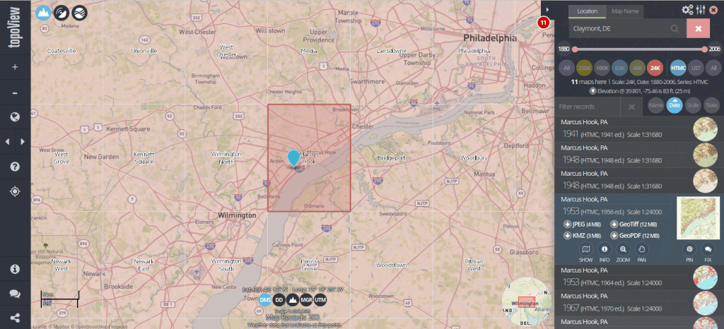
The list we’re using as our base table is what powers USGS topoView, which allows you to browse and download over 200,000 historic topos (1880 to 2006) that have been digitized and georferenced. The application also includes maps produced from 2009 forward that are part of the newer US Topo project; these maps are created on an on-going basis by pulling together a number of existing government data sources (unlike the historic maps, which were created by manual field surveys and updated over time using aerial photographs and satellite imagery).
You can search topoView using the name of a location or quadrangle (the grid cell that represents the area of each map, named after the most prominent feature in that area) to find all available maps for that location. There’s a set of filters that allows you to focus on the Historic Topographic Map Collection (HTMC) versus the US Topo Collection (2009 to present), or a specific scale. Choose a scale and zoom in, and you’ll see the grid cells for that series so you can identify map coverage. The 24k scale is the most familiar series; as the largest scale / smallest area maps that the USGS produced, it provides the most detail and covers every state and US territory. Each map covers an area of 7.5 x 7.5 minutes (think of a degree as 60 mins) and an inch on these maps represents 2,000 feet. This scale was introduced in the late 1940s, and replaced both the 63k scale map (a 15 x 15 minute map where 1 inch = 1 mile) that was the previous standard, and the less common 48k scale.
There are also smaller scale maps, which cover larger areas. The 100k series was introduced in the mid 1970s and covers the lower 48 states and Hawaii. Each map covers an area of 30 x 60 minutes and uses metric units (1 inch = 1.6 miles). The 250k series was introduced in the 1940s by the US Army Map Service and was eventually taken over by the USGS. These maps include all 50 states, cover an area of 1 x 2 degrees, and use imperial units (1 inch = 4 miles). There are about 1,800 quads for the 100k series and only 900 or so for the 250k, versus over 60,000 for the 24k series.
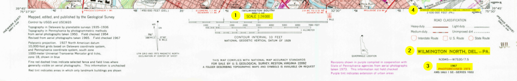
Once you search for an area or click on a quad, you’ll see all the maps available in that area over time. Applying the scale filter shows you just maps at that scale, plus some similar but odd scale maps that are not numerous enough to get their own filter. The predominate year listed for each record is the “map year”, which is when field work was done to either create the map or substantively update it. There’s also an edition or “print year” that indicates when the map was printed. If you look at the metadata (use the info button) or preview the map, there may be an edit or photo revision year, indicating if the map was updated back at headquarters using air photos or imagery. The image below illustrates where you can find this information on a standard 24k scale map.
1: Map Scale 2: Quad Name 3: Map Year and Revision Year 4: Print Year
Clicking on the thumbnail of the map in the results gives you a quick full screen preview. There are several download options, including a JPEG if you want a small compressed image, or a GeoTiff if you want a lossless format with the best resolution, and if you want to use it in GIS software as a raster layer.
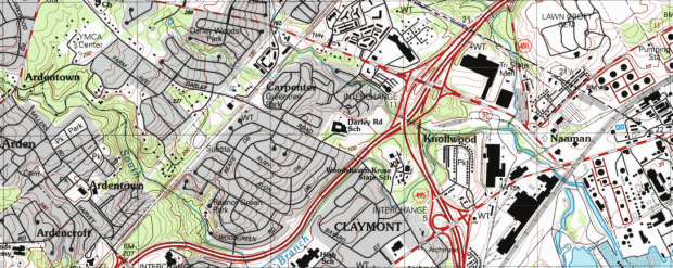
The changes you can see over time on these maps can be striking, illustrating the suburban sprawl of the 20th century. Consider the snippets from a 24k map of the Orlando West, Florida quadrangle below.
Orlando West 1956
Orlando West 1980
While many people are familiar with the topographic series, the USGS also publishes a number of other map and report series that cover topics like hydrography, oil and gas exploration, mining, land use and land cover, and special scientific investigations. They have digitized (but not georeferenced) many of these maps, from the 1950s to present. You can browse through a list of all these publications, or you can search across them in the Publications Warehouse. If you search, try the Advanced Search and specify publication type and subtype as filters. Most of the maps are classified as publication type: Report, and subtype: USGS Numbered Series.
For example, the IMAP series includes special investigation maps that cover tectonic, geologic, mineral, topographic, and bathymetric maps of specific small or regional areas in the US. They also include maps of Antarctica, special investigations in other countries, the moon, and other planets and moons. Every report / map has a landing page with a permanent URL and doi that uses the series number of the map, with links to a PDF of the map as well as a Dublin Core metadata record. For example, here’s a Geologic Map of Io from 1992, part of the IMAP series.
Portion of a Geologic Map of the Jovian Moon Io
This is great, as you can use these records and metadata for building other interactive finding aids, and can link directly to individual maps. The USGS has created different portals for accessing subsets of these materials, such as this special topics page for identifying different planetary maps in the SIM and IMAP series.
Some other gems I’ve discovered stashed away in the publications warehouse: a poster of map projections (with a flip side portrait of Gerardus Merctor) which should be familiar to most 1990s university geography students; it was often hung in classrooms and provided as an insert in cartography textbooks. Also, a digitized copy of the book Maps for America. Originally published for the USGS centenary in 1979, this book provides a comprehensive history and overview of the topographic map series. The scanned copy is the 3rd edition, printed in 1987. If you suddenly find yourself in the position of having to curate a hundred thousand 20th century topo maps, there is no better guide than this book.
I’ve suffered from a bit of the blues in this new year, so two weekends ago I logged into Steam and bought a new game to relax a little. It’s been a few years since I’ve bought a new game, and in playing this one and perusing my existing collection I realized they all had one thing in common: geography plays a central role in all of them. So in this first post of the year, I’ll explore the role of geography in video games using examples from my favorites.
Terrain and Exploration in 4X Games
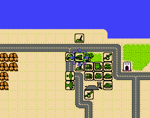
My latest purchase is Signals by MKDB Studios, an indie husband and wife developer team in the UK. It can be classified as a “casual” game, in that it’s: easy to learn and play yet possesses subtle complexity, is relatively relaxing in that it doesn’t require constant action and mental exertion, and you can finish a scenario or round in an hour or so. In Signals, you are part of a team that has discovered an alien signaling device on a planet. The device isn’t working; fixing it requires setting up a fully functional research station adjacent to the device, so you can unlock its secrets. The researchers need access to certain key elements that you must discover and mine. The planet you’re on doesn’t have these resources, so you’ll need to explore neighboring systems in the sector and beyond to find and bring them back.
Space travel is expensive, and the further you journey the more credits (money) you’ll need. To fund travel to neighboring systems in search of the research components (lithium, silicon, and titanium) you can harvest and sell a variety of other resources including copper, iron, aluminum, salt, gold, gems, diamonds, oil, and plutonium. As you flood the market with resources their value declines, yielding diminishing returns. You must be strategic in hopping from planet to planet and deciding what to harvest and sell. Mining resources incurs initial fixed costs for building harvesters (one per resource patch), a solar array for powering them (which can only cover a small area), and a trade post for moving resources to the market (one per planet).
Terrain view on Signals. Harvesters extracting resources in the center, other resource patches to the right
The game has two distinct views: one displays the terrain of the planet you’re on, while the other is a map of the sector(s) with different solar systems, so you can explore the planets and their resources and make travel plans. Different terrain provides different resources and imposes limits on game play. You are precluded from constructing buildings on water and mountains, and must clear forests if you wish to build on forested spaces. Terrain varies by type of planet: habitable Earth-like, red Mars-like, ice worlds, and desert worlds. The type of world influences what you will find in terms of resources; salt is only found on habitable worlds, while iron is present in higher quantities on Mars-like worlds. Video games, like maps, are abstractions of reality. The planet view shows you just a small slice of terrain that stands in for the entire world, so that the game can emphasize the planet hopping concept that’s central to its design. The other view – the sector map – is used for navigation and reference, keeping track of where you are, where you’ve been, and where you should go next.
Select a system in the sector map……to view its planets and resources.
The use of terrain and the role of physical geography are key aspects in simulators (like SimCity, an old favorite) and the so-called 4X games which focus on exploration, mining, trading, and fighting, although not all games employ all four aspects (Signals has no fighting or conquest component). Another example of a 4X game is Factorio by Wube Software, which I’ve written about previously. Like Signals, exploring terrain and mining resources are central to the game play. Similarities end there, as Factorio is anything but a casual game. It requires a significant amount of research and experimentation to learn how to play, which means consulting wikis, tutorials, and YouTube. It also takes a long time – 30 to 40 hours to complete one game!
The action in Factorio occurs on a single planet, where you’re looking for resources to mine to build higher order goods in factories, that you turn into even higher order products as you unlock more technologies by conducting research, with the ultimate goal of constructing a rocket to get off the planet. There are also two map views: the primary terrain view that you navigate as the player, and an overview map displaying the extent of the planet that you’ve explored. You begin with good knowledge of what lies around you, as you captured this info before your spaceship crashed and marooned you here. Beyond that is simply unknown darkness. To reveal it, you physically have to go out and explore, or build radar devices that gradually expand your knowledge. The terrain imposes limits on building and movement; water can’t be traversed or built upon, canyons block your path, and forests slow movement and prevent construction unless you chop them down (or build elsewhere). The world generated in Factorio is endless, and as you use up resources you have to push outward to find more; you can build vehicles to travel more quickly, while conveyor belts and trains can transport resources and products to and around your factory; this growing logistical puzzle forms a large basis of the game.
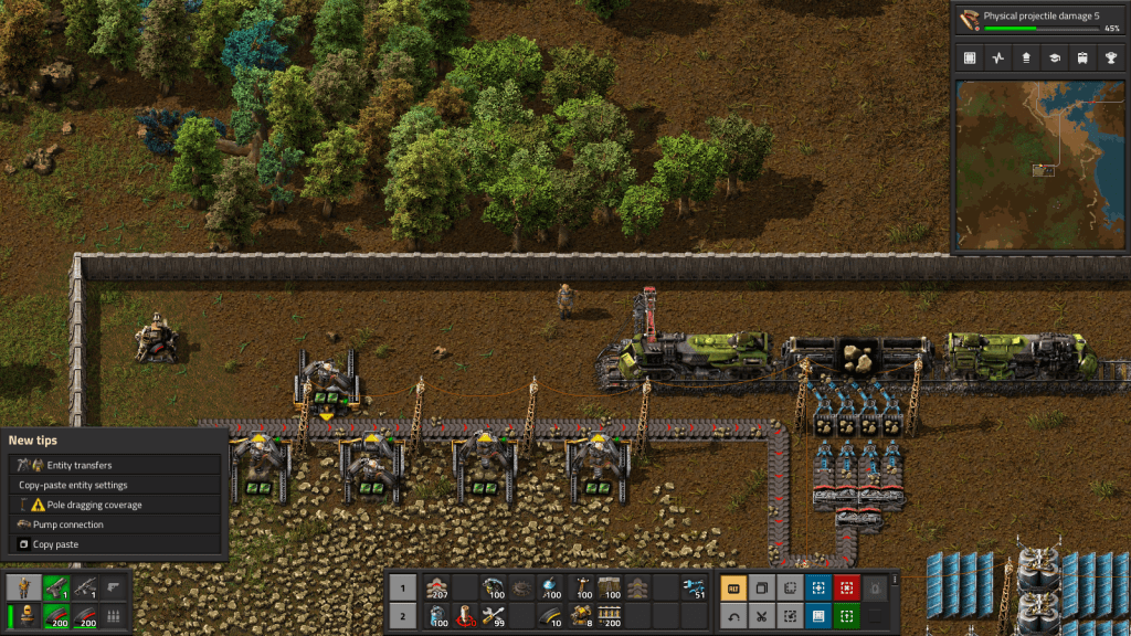
Mining drills in Factorio extracting stone. Belts transport resources short distances, while trains cover longer distances.
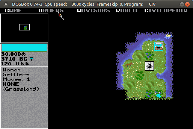
The role of terrain and exploration has long been a mainstay in these kinds of games. Thanks to DOSbox (an emulator that let’s you run DOS and DOS programs on any OS), I was recently playing the original Sid Meier’s Civilization from 1991 by Microprose. This game served as a model for many that followed. Your small band of settlers sets out in 4000 BC, to found the first city for your particular civilization. You can see the terrain immediately around you, but the rest of the world is shrouded in darkness. Moving about slowly reveals more of the world, and as you meet other civs you can exchange maps to expand your knowledge. The terrain – river basins, grasslands, deserts, hills, mountains, and tundra – influences how your cities will grow and develop based on the varying amount of food and resources it produces. Terrain also influences movement; it is tougher and takes longer to move over mountains versus plains, and if you construct roads that will increase speed and trade. The terrain also influences attack and defense capabilities for military units…
The unknown, unexplored world is shrouded in darkness in Civilization
Terrain and Exploration in Strategic Wargames
Strategic war games are another genre where physical geography matters. One weekend shortly after the pandemic lock-down began in 2020, I dug my old Nintendo out of the closet and replayed some of my old favorites. Desert Commander by Kemco was a particular favorite, and one of Nintendo’s only war strategy games. You command one of two opposing armies in the North African desert during World War II, and your objective is simple: eliminate the enemy’s headquarters unit, or their entire army. You have a mix of tanks, infantry, armored cars, artillery, anti-aircraft guns, supply trucks, fighters, and bombers at your command. Each unit varies in terms of range of movement and offensive and defensive strength, in total and relative to other units. Tanks are powerful attackers, but weak defenders against artillery and hopeless against bombers. Armored cars cruise quickly across the sands compared to slowly trudging infantry.
Terrain also influences movement, offense, and defense. You can speed along a road, but if you’re attacked by planes or enemy tanks you’ll be a sitting duck. Desert, grassland, wilds (mountains), and ocean make up the rest of the terrain, but scattered about are individual features like pillboxes and oases which provide extra defense. A novel aspect of the game was its reliance on supply: units run low on fuel and ammo, and after combat their numbers are depleted. You can supply fuel and ammo to ground units with trucks, but eventually these also run out of gas. Scattered about the map are towns, which are used for resupply and reinforcement. There are a few airfields scattered about, which perform the same functions for aircraft. Far from being a simple battle game, you have to constantly gauge your distance and access to these supply bases, and consider the terrain that you’re fighting on. The later scenarios leave you hopelessly outnumbered against the enemy, which makes the only winning strategy a defensive one where you position your headquarters and the bulk of your forces at the best strong point, while simultaneously sending out a smaller strike force to get the enemy HQ.
Units and terrain in NES Desert Commander. Towns and airfields are used for resupply.
There have been countless iterations and updates on this type of game. One that I have in my Steam library is Unity of Command by 2×2 Games, which pits the German and Soviet armies in the campaigns around Stalingrad during World War II. Like most modern turn-based games, the grid structure (used in Desert Commander) has been replaced with a hex structure, reflecting greater adjacency between areas. Again, there are a mix of different units with different strengths and capabilities. The landscape on the Russian steppe is flat, so much of the terrain challenge lies in securing bridgeheads or flanking rivers when possible, as attacking across them is suicidal. The primary goal is to capture key objectives like towns and bridgeheads in a given period of turns. A unit’s attack and movement phase are not strictly separated, so you can attack with a unit, move out of the way, and move another in to attack again until you defeat a given enemy. This opens up a hole, allowing you to pour more units through a gap to capture territory and move towards the objectives. The supply concept is even more crucial in UOC; as units move beyond their base, which radiates from either a single point or from a roadway, they will eventually run out of supplies and will be unable to fight. By pushing through gaps in defense and outflanking the enemy, you can capture terrain that cuts off this supply, which is more effective than trying to attack and destroy everything.
Unity of Command Stalingrad Campaign. Push units through gaps to capture objectives and cut off enemy supplies.
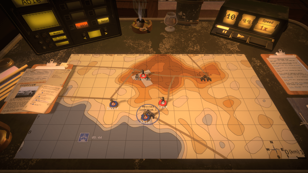
The most novel take on this type of game that I’ve seen is Radio General by Foolish Mortals. This WWII game is a mix of strategy and history lesson, as you command and learn about the Canadian army’s role in the war (it incorporates an extensive amount of real archival footage). As the general commanding the army, you can’t see the terrain, or even where any of the units are – including your own. You’re sitting behind the lines in a tent, looking at a topographic map and communicating with your army – by voice! – on the radio. You check in and confirm where they are, so you can issue orders (“Charlie company go to grid cell Echo 8”), and then slide their little unit icons on the map to their last reported position. They radio in updates, including the position of enemy units. The map doesn’t give you complete and absolute knowledge in this game; instead it’s a tool that you use to record and understand what’s going on. Another welcome addition is the importance of elevation, which aids or detracts in movement, attack, defense, and observation. A unit sitting on top of a hill can relay more information to you about battlefield circumstances compared to one hunkered down in a valley.
In Radio General, the topo map is the battlefield. You rely on the radio to figure out where your units, and the enemy units, are.
Strategy Games with the Map as Focal Point
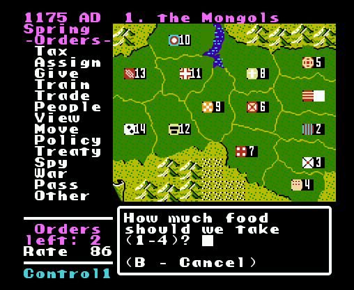
While terrain takes center stage in many games, in others all the action takes place on a map. Think of board games like Risk, where the map is the board and players capture set geographic areas like countries, which may be grouped into hierarchies (like continents) that yield more resources. Unlike the terrain-based games where the world is randomly generated, most map-based games are relatively fixed. Back to the Nintendo, the company Koei was a forerunner of historical strategy games on consoles, my favorite being Genghis Khan. The basic game view was the map, which displayed the “countries” of the world in the late 12th and early 13th centuries. Each country produced specialized resources based on its location, had military units unique to its culture, and produced gold, food, and resources based on its infrastructure. Your goal was to unite Mongolia and then conquer the world (of course). Once you captured other countries, they remained as distinct areas within your empire, and you would appoint governors to manage them. When invading, the view switched from an administrative map mode to a battlefield terrain mode, similar to ones discussed previously.
Genghis Khan on the original NES. The map is the focal point of the game.
Fast forward to now, and Paradox has become a leading developer of historical strategy games. Crusader Kings 2 is one of their titles that I have, where the goal is to rule a dynasty from the beginning to the end of the medieval period in the old world. Conquering the entire world is unlikely; you aim to rule some portion of it, with the intention of earning power and prestige for your dynasty through a variety of means, warlike and peaceful. These are complex games, which require diving into wikis and videos to understand all the medieval mechanics that you need to keep the dynasty going. Should you use gavelkind, primogeniture, seniority, or feudal elective succession? Choose wisely, otherwise your kingdom could fracture into pieces upon your demise, or worse your nefarious uncle could take the throne.
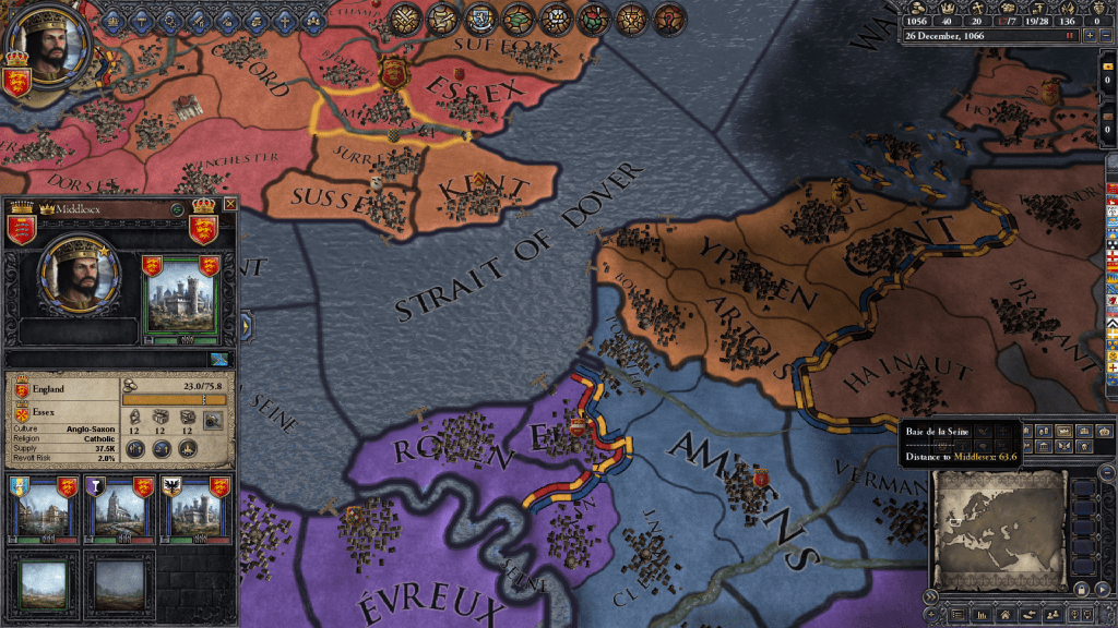
CK2 takes human geographical complexity to a new level with its intricate hierarchy of places. The fundamental administrative unit on the map is a county. Within the county you have sub-divisions, which in GIS-speak are like “points in polygons”: towns ruled by a non-noble mayor, parishes ruled by a bishop, and maybe a barony ruled by a noble baron. Ostensibly, these would be vassals to the count, while the count in turn is a vassal to a duke. Several counties form a duchy, which in turn make up a kingdom, and in some cases several kingdoms are part of empires (i.e. Holy Roman and Byzantine). In every instance, rulers at the top of the chain will hold titles to smaller areas. A king holds a title to the kingdom, plus one or more duchies, one or more counties (the king’s demesne), and maybe a barony or two. If he / she doesn’t hold these titles directly, they are granted to a vassal. A big part of the game is thwarting the power of vassals to lay claim to your titles, or if you are a vassal, getting claims to become the rightful heir. Tracking and shaping family relations and how they are tied to places is a key to success, more so than simply invading places.
Geographic hierarchy in Crusader Kings 2. Middlesex is a county with a town, barony, and parish. It’s one of four counties in the Duchy of Essex, in the Kingdom of England.
Which in CK2, is hard to do. Unlike other war games, you can’t invade whoever you want (unless they are members of a rival religion). The only way to go to war is if you have a legitimate claim to territory. You gain claims through marriage and inheritance, through your vassals and their claims, by fabricating claims, or by claiming an area that’s a dejure part of your territory, i.e. that is historically and culturally part of your lands. While the boundaries of the geographic units remain stable, their claims and dejure status change over time depending on how long they’re held, which makes for a map that’s dynamic. In another break from the norm, the map in CK2 performs all functions; it’s the main screen for game play, both administration and combat. You can modify the map to show terrain, political boundaries, and a variety of other themes.
Conclusion
I hope you enjoyed this little tour, which merely scratches the surface of the relation between geography and video games, based on a small selection of games I’ve played and enjoyed over the years. There’s a tight relationship between terrain and exploration, and how topography influences resource availability and development, the construction of buildings, movement, offense and defense. In some cases maps provide the larger context for tracking and explaining what happens at the terrain level, as well as navigating between different terrain spaces. In other cases the map is the central game space, and the terrain element is peripheral. Different strategies have been employed for equating the players knowledge with the map; the player can be all knowing and see the entire layout, or they must explore to reveal what lies beyond their immediate surroundings.
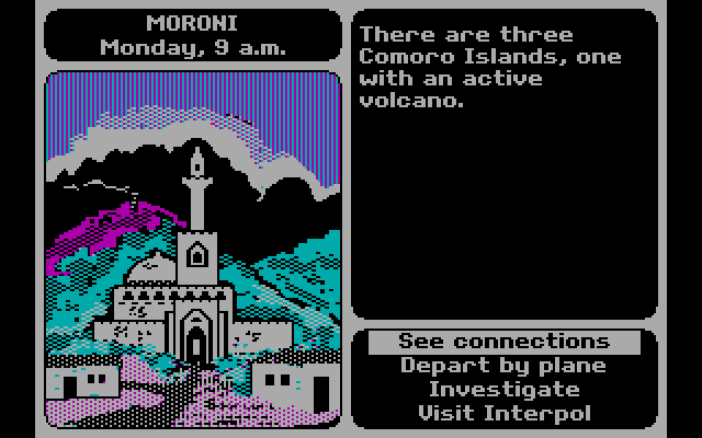
There are also a host of geographically-themed games that make little use of maps or terrain. For example, Mini Metro by Dinosaur Polo Club is a puzzle game where you connect constantly emerging stations to form train lines to move passengers, using a schematic resembling the London tube map. In this game, the connectivity between nodes in a network is what’s important, and you essentially create the map as you go. Or 3909 LLC’s Papers, Please, a dystopian 1980s “document simulator” where you are a border control guard in an authoritarian country in a time of revolution, checking the documentation of travelers against ever changing rules and regulations (do traveler’s from Kolechia need a work permit? Is Skal a city in Orbistan or is this passport a forgery…). Of course, we can’t end this discussion without mentioning Where in the World is Carmen Sandiego, Broderbund’s 1985 travel mystery that introduced geography and video games to many Gen Xers like myself. Without it, I may have never learned that perfume is the chief export of Comoros, or that Peru is slightly smaller than Alaska!
Where in the World is Carmen Sandiego? In hi-tech CGA resolution!


You must be logged in to post a comment.