HIFLD Open, a key repository for accessing US GIS datasets on infrastructure, is shutting down on August 26, 2025. This is a revision from a previous announcement, which said that it would be live until at least Sept 30. The portal provided national layers for schools, power lines, flood plains, and more from one convenient location. DHS provides no sensible explanation for dismantling it, other than saying that hosting the site is no longer a priority for their mission (here’s a copy of an official announcement). In other words, “Public domain data for community preparedness, resiliency, research, and more” is no longer a DHS priority.
The 300 plus datasets in Open HIFLD are largely created and hosted by other agencies, and Open HIFLD was aggregating different feeds into one portal. So, much of the data will still be accessible from the original sources. It will just be harder to find.
DHS has published a crosswalk with links to alternative portals and the source feeds for each dataset, so you can access most of the data once Open HIFLD goes offline. I’ve saved a copy here, in case it also disappears. Most of these sources use ESRI REST APIs. Using ArcGIS Online or Pro, and even QGIS (for example), you can connect to these feeds, get a listing in your contents pane, and drag and drop layers into a project (many of the layers are also available via ArcGIS Online or the Living Atlas if you’re using Arc). Once you’ve added a layer to a project, you can export and save local copies.
Adding ArcGIS Rest Server for US Army Corps of Engineers Data in QGIS
If you want to download copies directly from Open HIFLD before it vanishes on Aug 26, I’ve created this spreadsheet with direct links to download pages, and to metadata records when available (some datasets don’t have metadata, and the links will bring you to an empty placeholder). Some datasets have multiple layers, and you’ll need to click on each one in a list to get to it’s download page. In some cases there won’t be a direct download link, and you’ll need to go to the source (a useful exercise, as you’ll need to remember where it is in the future). Alternatively, you can connect to the REST server (before Aug 26, 2025) in QGIS or ArcGIS, drag and drop the layers you want, and then export:
I’m coordinating with the Data Rescue Project, and we’re working on downloading copies of everything on Open HIFLD and hosting it elsewhere. I’ll provide an update once this work is complete. Even though most of these datasets will still be available from the original sources, better safe than sorry. There’s no telling what could disappear tomorrow.
The secure HIFLD site for registered users will remain available, but many of the open layers aren’t being migrated there (see the crosswalk for details). The secure site is available to DHS partners, and there are restrictions on who can get an account. It’s not exactly clear what they are, but it seems unlikely that most Open users will be eligible: “These instructions [for accessing a secure account] are for non-DHS users who support a homeland security or homeland defense mission AND whose role requires access to the Geospatial Information Infrastructure (GII) and/or any geospatial dashboards, data, or tools housed on the GII…“
I’m fortunate to be on sabbatical for much of this summer, and am working on a project where I’m measuring the effectiveness of comparing census American Community Survey estimates over time. I’ve written a lot of Python code over the past six weeks, and thought I’d share some general tips for working with bigger datasets.
For my project, I’m looking at 317 variables stored in 25 tables for over 406,000 individual geographic areas; approximately 129.5 million data points. Multiply that by two, as I’m comparing two time periods. While this wouldn’t fall into the realm of what data scientists would consider as ‘big data’, it is big enough that you have to think strategically about how handle it, so you don’t run out of memory or have to wait hours while tasks grind away. While you could take advantage of parallel processing, or find access to a high performance computer, with this amount of data you can stick with a decent laptop, if you take steps to ensure that it doesn’t go kaput.
While the following suggestions may seem obvious to experienced programmers, it should be helpful to novices. I work with a lot of students whose exposure to Python programming is using Google Colab with Pandas. While that’s a fine place to start, the basic approaches you learn in an intro course will fall flat once you start working with datasets that are this big.
Don’t use a notebook. Ipython notebooks like Jupyter or Colab are popular, and are great for doing iterative analysis, visualization, and annotation of your work. But they run via web browsers which introduce extra overhead memory-wise. Iterative notebooks are unnecessary if you’re processing lots of data and don’t need to see step by step results. Use a traditional development environment instead (Spyder is my favorite – see the pic in this post’s header).
Don’t rely so much on Pandas DataFrames. They offer convenience as you can explicitly reference rows and columns, and reading and writing data to and from files is straightforward. But DataFrames can hog memory, and processing them can be inefficient (depending on what you’re doing). Instead of loading all your data from a file into a frame, and then making a copy of it where you filter out records you don’t need, it’s more efficient to read a file line by line and omit records while reading. Appending records to a DataFrame one at a time is terribly slow. Instead, use Python’s basic CSV module for reading and append records to nested lists. When you reach the point where a DataFrame would be easier for subsequent steps, you can convert the nested list to a frame. The basic Python data structures – lists, dictionaries, and sets – give you a lot of power at less cost. Novices would benefit from learning how to use these structures effectively, rather than relying on DataFrames for everything. Case in point: after loading a csv file with 406,000 records and 49 columns into a Pandas DataFrame, the frame consumed 240 MB of memory. Loading that same file with the csv module into a nested list, the list consumed about 3 MB.
Reads a file, skips the header row, adds a key / value pair to a dictionary for each row using the first and second value (assuming the key value is unique).
import os, csv

keep_ids={}
with open(recskeep_file,'r') as csv_file:
    reader=csv.reader(csv_file,delimiter='\t')
    next(reader)
    for row in reader:
        keep_ids[row[0]]=row[1]
Or, save all the records as a list in a nested list, while keeping the header row in a separate list.
records=[]
with open(recskeep_file,'r') as csv_file:
    reader=csv.reader(csv_file,delimiter='\t')
    header=next(reader)
    for row in reader:
        records.append(row)]
Delete big variables when you’re done with them. The files I was reading were segmented in twos: one file for estimates, and one for margins of error for those same estimates. I read each into separate, nested lists while filtering for records I wanted. I had to associate each set with a header row, filter by columns, and then join the two together. Arguably that part was easier to do with DataFrames, so at that stage I read both into separate frames, filtered by column, and joined the two. Once I had the joined frame as a distinct copy, I deleted the two individual frames to save memory.
Take out the garbage. Python automatically frees up memory when it can, but you can force the issue by emptying deleted objects from memory by calling the garbage collection module. After I deleted the two DataFrames in the previous step, I explicitly called gc.collect() to free up the space.
...
del est_df
del moe_df
gc.collect()
Write as you read. There’s no way I could read all my data in and hold it in memory before writing it all out. Instead I had to iterate – in my case the data is segmented by data tables, which were logical collections of variables. After I read and processed one table, I wrote it out as a file, then moved on to the next one. The variable that held the table was overwritten each time by the next table, and never grew in size beyond the table I was actively processing.
Take a break. You can use the sleep module to build in brief pauses between big operations. This can give your program time to “catch up”, finishing one task and freeing up some juice before proceeding to the next one.
time.sleep(3)
Write several small scripts, not one big one. The process for reading, processing, and writing my files was going to be one of the longer processes that I had to run. It’s also one that I’d likely not have to repeat if all went well. In contrast, there were subsequent analytical tasks that I knew would require a lot of back and forth, and revision. So I wrote several scripts to handle individual parts of the process, to avoid having to repeat a lot of long, unnecessary tasks.
Lean on a database for heavy stuff. Relational databases can handle large, structured data more efficiently compared to scripts reading data from text files. I installed PostgreSQL on my laptop to operate as a localhost database server. After I created my filtered, processed CSV files, I wrote a second program that loaded them into the database using Psycopg2, a Python module that interacts with PostgreSQL (this is a good tutorial that demonstrates how it works). SQL statements can be long, but you can use Python to iteratively write the statements for you, by building strings and filling placeholders in with the format method. This gives you two options. Option 1, you execute the SQL statements from within Python. This is what I did when I loaded my processed CSV files; I used Python to iterate and read the files into memory, wrote CREATE TABLE and INSERT statements in the script, and then inserted the data from Python’s data structures into the database. Option 2, is you can use Python to write a SQL transaction statement, save the transaction as a SQL text file, and then load it in the database and run it. I followed this approach later in my process, where I had to iterate through two sets of 25 tables for each year, and perform calculations to create a host of new variables. It was much quicker to do these operations within the database rather than have Python do them, and executing the SQL script as a separate process made it easier for me to debug problems.
Connect to a database, save SQL statement as a string, loops through a list of variables IDs, and for each variable format the string by passing the values in as parameters, execute the statement and fetch the result – fetchone() in this case, but could also fetchmany():
# Database connection parameters
pgdb='acs_timeseries'
pguser='postgres'
pgpswd='password'
pgport='5432'
pghost='localhost'
pgschema='public'

conpg = psycopg2.connect(database=pgdb, user=pguser, password=pgpswd,
                             host=pghost, port=pgport)
curpg=conpg.cursor()

sql_varname="SELECT var_lbl from acs{}_variables_mod WHERE var_id='{}'"
year='2019'

for v in varids:
    # Get labels associated with variables
    qvarname=sql_varname.format(year, v)
    curpg.execute(qvarname)
    vname=curpg.fetchone()[0]
... #do stuff...

curpg.close()
When using Psycopg2, don’t use the executemany() function. When performing an INSERT statement, you can have the module executeone() statement at a time, or executemany(). But the latter was excruciatingly slow – in my case it ran overnight before it finished. Instead I found this trick called mogrify, where you convert your INSERT arguments into one enormous string, and pass that to the mogrify() function. This was lightning fast, but because the text string is massive I ran out of memory if my tables were too big. My solution was to split tables in half if the number of columns exceeded a certain number, and pass them in one after the other.
Use the database and script for what they do best. Once I finished my processing, I was ready to begin analyzing. I needed to do several different cross-tabulations on the entire dataset, which was segmented into 25 tables. PostgreSQL is able to summarize data quickly, but it would be cumbersome to union all these tables together, and calculating percent totals in SQL for groups of data is a pain. Python with Pandas would be much better at the latter, but there’s no way I could load a giant flat file of my data into Python to use as the basis for all my summaries. So, I figured out the minimal level of grouping that I would need to do, which would still allow me to run summaries on the output for different combinations of groups (i.e. in total and by types of geography, tables, types of variables, and by variables). I used Python to write and execute GROUP BY statements in the database, iterating over each table and appending the result to a nested list, where one record represented a summary count for a variable by table and geography type. This gave me a manageable number of records. Since the GROUP BY operation took some time, I did that in one script to produce output files. Creating different summaries and reports was a more iterative process that required many revisions, but was quick to execute, so I performed those operations in a subsequent script.
Instead of 386 mil records for (406k geographies * 317 variables * 3 categories), about 18k summary counts for 19 groups of geography
Lastly, while writing and perfecting your script, run it against a sample of your data and not the entire dataset! This will save you time and needless frustration. If I have to iterate through hundreds of files, I’ll begin by creating a list that has a couple of file names in it and iterate over those. If I have a giant nested list of records to loop through, I’ll take a slice and just go through the first ten. Once I’m confident that all is well, then I’ll go back and make changes to execute the program on everything.
It’s been awhile since I’ve written a post that showcases different GIS datasets. So in this one, I’ll provide an overview of some free and open data sources that I’ve learned about and worked with this past spring semester. The topics in these series include: global land use and land cover, US heat and temperature, detailed population data for India, and public health in low and middle income countries.
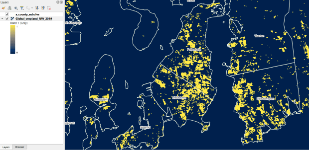
The GLAD lab at the Department of Geographical Sciences at the University of Maryland produces over a dozen GIS datasets related to global land use, land cover, and change in land surface over time. Last semester I had folks who were interested in looking at recent global change in cropland and forest. GLAD publishes rasters that include point-in-time coverage, period averages, and net change and loss over the period 2000 to 2020. Much of the data is generated from LANDSAT, and resolution varies from 30m to 3km. Other series include tropical forest cover and change, tree canopies, forest lost due to fires, a few non-global datasets that focus on specific regions, and LANDSAT imagery that’s been processed so it’s ready for LULC analysis.
Most of the sets have been divided up into tiles and segmented based on what they’re depicting (change in crops, forest, etc). The download process is basic point and click, and for larger sets they provide a list of tifs in a text file so you can automate downloading by writing a basic script. Alternatively, they also publish datasets via Google Earth Engine.
GLAD Cropland Extent in 2019 in QGIS, Zoomed in to Optimal Resolution in SE Rhode Island
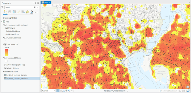
For the past few years, the Trust for Public Land has published an annual heat severity index. This layer represents the relative heat severity for 30m pixels for every city in the United States; depicting where areas of cities are hotter than the average temperature for that same city as a whole (i.e. the surface temperature for each pixel relative to the general air temperature reading for the entire city). Severity is measured on a scale of 1 to 5, with 1 being a relatively mild and 5 being severe heat. The index is generated from a Heat Anomalies raster which they also provide; it contains the relative degrees Fahrenheit difference between any given pixel and the mean heat value for the city in which the pixel is located. Both datasets are generated from 30-meter Landsat 8 imagery, band 10 (ground-level thermal sensor) from summertime images.
The dataset is published as an ArcGIS image service. The easiest way to access it is by to adding it from the Living Atlas to ArcGIS Pro (or Online), and then export the service from there as a raster feature class (while doing so, you can also clip the layer to a smaller area of interest). It’s possible that you can also connect to it as an ArcGIS REST Server in QGIS, but I haven’t tried. While there are files that go back to 2019, the methodology has changed over time, so studying this as a national, annual time series is not appropriate. The coverage area expanded from just large, incorporated cities in earlier years to the entire US in recent years.
US Heat Severity Index 2023 in ArcGIS Pro, Providence and Adjacent Areas with Census Blocks
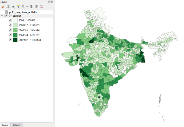
Created and hosted by the Development Data Lab (a collaborative project created by academic researchers from several universities), the Socioeconomic High-resolution Rural-Urban Geographic Platform for India (SHRUG) is an open access repository consisting of datasets for India’s medium to small geographies (districts, subdistricts, constituencies, towns, and villages), linked together with a set of common geographic IDs. Getting geographically detailed census data for India is challenging as you have to purchase it through 3rd party vendors, and comparing data across time is tough given the complex sets of administrative subdivisions and constant revisions to geographic identifiers. SHRUG makes it easy and open source, providing boundaries from the 2011 census and a unique ID that links geographies together and across time, back to 1991. In addition to the census, there are also environmental and election datasets.
Polygon boundaries can be downloaded as shapefiles or geopackages, and tabular data is available in CSV and DTA (STATA) formats. Researchers can also contribute data created from their own research to the repository.
SHRUG India Districts Total Population Data from 2011 Census in QGIS
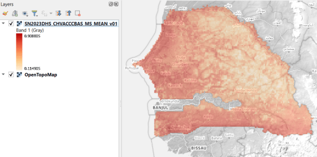
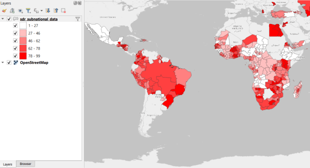
USAID published the detailed Demographic and Health Surveys (DHS) as far back as the mid 1980s for many of the world’s low and middle income countries. The surveys captured information about fertility, family planning, maternal and child health, gender, HIV/AIDS, literacy, malaria, nutrition, and sanitation. A selection of different countries were surveyed each year, and for most countries data was captured at two or three different points in time over a 40 year period. While researchers had to submit proposals and request access to the microdata (individual person and household level responses), the agency generated population-level estimates for countries and country subdivisions that were readily downloadable. They also generated rasters that interpolated certain variables across the surface of a country (the header image for this post is a raster of Senegal in 2023, illustrating the percentage of children aged 12-36 months who are vaccinated for eight fundamental diseases, including measles and polio). The rasters, boundary files, and a selection of survey indicators pre-joined to country and subdivision boundaries were published in their Spatial Data Repository. You could access the full range of population indicators as tables from a point and click website, or alternatively via API.
I’m writing in the past tense, as USAID has been decimated and de-funded by DOGE. There is currently no way to request access to the microdata. The summary data is still available on the USAID website (via links in the previous paragraph), but who knows for how long. As part of the Data Rescue Project, I captured both the Spatial Data Repository and the Indicators data, and posted them on DataLumos, an archive of archived federal government datasets. You can download these datasets in bulk from DataLumos, from the links under the title for this section. Unfortunately this series is now an archive of data that will be frozen in time, with no updates expected. The loss of these surveys is not only detrimental to researchers and policymakers, but to millions of the world’s most vulnerable people, whose health and well-being were secured and improved thanks to the information this data provided.
USAID Country Subdivisions in QGIS where Recent Data is Available on % Children who are Vaccinated
In my previous post, I summarized several efforts to rescue and preserve US federal government datasets that are being removed from the internet. In this post, I’ll provide a basic primer on screen scraping with Python, which is what I’ve used to capture datasets in participating in the Data Rescue Project. Screen scraping can employed to many ends, such as capturing text on web pages so it can be analyzed, or taking statistics embedded in HTML tables and saving them in machine readable formats. In the context of this post, screen scraping is an approach for downloading data and documentation files stored on websites.
There are several benefits to using a scripting approach for this work. It saves you from the tedious task of clicking and downloading files one by one. The script serves as documentation for what you did, and allows you to easily repeat the process in the future, if the datasets continue to exist and are updated. A scripted, screen-scraping approach may not be best or necessary if the website and datasets are relatively small and simple, or conversely if the site is complicated and difficult to scrape given the technology it employs. In both cases, manual downloading may be quicker, especially with a team of volunteers. Furthermore, if it seems clear that the dataset or website are not going to be updated, or are going to vanish, then the benefit of repeating the process in the future is moot.
In this example, we’ll assume that screen scraping is the way to go, and we’ll use Python to do it. I’ll address a few alternatives to this approach at the end, the primary one being using an API if and when it’s available, and will share links to working code that colleagues and I have written to save datasets.
You should only apply these approaches to public, open data. Capturing restricted or proprietary information violates licenses, terms of service, and in some cases privacy constraints, and is not condoned by any of the rescue projects. Even if the data is public, bear in mind that scraping can put undue pressure on web servers. For large websites, plan accordingly by building pauses into the process, breaking up the work into segments, or running programs at non-peak times (overnight). When writing and testing scripts, don’t repeat the process over and over again on the entire website; run your tests on samples until you get everything working.
Screen Scraping Basics
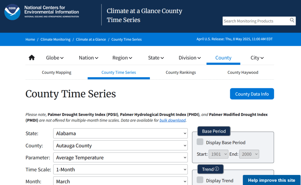
The first step is to explore the website where the data is hosted, to identify the best pages to use as a source and determine the feasibility of the approach. Many websites will have feature rich, user friendly pages that make it easy to view extracts of data and visualize it, such as the NOAA climate website below.
While easy to use, these pages can be complex and tedious to scrape. Always look for an option for bulk downloading datasets. They may lead you to a page sitting behind the scenes of the fancy website, such as the NOAA file directory below. Saving data from a page like this is fairly straightforward.
For the benefit of those of you who are not 1990s era people like myself and may not be familiar with working with HTML, the example below illustrates a simple webpage. With any browser, you can right click on a page and View the Source, to see the HTML code and stylesheets behind the page, which the browser processes and renders to display the site. HTML is a markup language where text is enclosed in tags that tell us something about the content within the tags, and which can be used for displaying the content in different ways. HTML is also hierarchical, so that content can be nested. For example, there is a head section that contains preliminary content about the page, and a body section that encloses the main content. Within the body there can be divisions, and anchor tags that represent links. In this example, one of these anchors is a link to a data file that we want to download.
We can use Python to parse these tags and pull out desired content. There are four core modules I always use: Requests for downloading content, os for creating folders and working with paths, Beautiful Soup for screen scraping, and datetime for creating time stamps. In the code below, we begin by importing the modules and saving the url of the page we wish to scrape as a variable.
In most Python environments (unless you’ve modified some settings) it’s assumed that your current working directory is the folder where your Python script is stored. When you download files, they will automatically be stored in that folder. To keep things tidy, I always create a subfolder named with the date; I use the date function from datetime to retrieve today’s date, append that date to the word “downloaded-‘, and use the os module to create a subfolder with that name. If we run the program at a later date it will save everything in a new folder, rather than overwriting existing files.
import requests, os
from bs4 import BeautifulSoup as soup
from datetime import date

url='https://www.page.gov'

today = str(date.today())
outfolder='downloaded-'+today
if not os.path.exists(outfolder):
    os.makedirs(outfolder)

webpage=requests.get(url).content
soup_page=soup(webpage,'html.parser')
page_title = soup_page.title.text
container=soup_page.find('div',{'class':'content'})
links=container.findAll('a')
The final block in this example captures data from the website. We use requests to get the content stored at the url (the webpage), and then we pass this to Beautiful Soup, which parses all the HTML using their tags. Once parsed, we can retrieve specific objects. For example, we can save the page title (the text that appears in the heading of your browser for a particular site) as a variable. We also grab the section of the page that contains the links we want to capture by looking for a specific div or id tag. This isn’t strictly necessary for simple pages like this one, but speeds up processing for larger, more complex pages. Lastly, we can search through that specific container to find all the anchor tags, or links.
Once we have the links, we loop through and save the ones we want. My preference is to store them in a dictionary as key / value pairs, where the key is the name of the file, and the value is the file’s URL. We iterate through the links we saved, and with the soup we determine if the link has an ‘href’ attribute. If it does, we see if it ends with .zip, which is the data file. This skips any link that’s not a file we want, including links that go to other webpages as opposed to files. In practice, I provide a list of several file types here such as .zip, .csv, .txt, .xlsx, .pdf, etc to capture anything that could be data or documentation. If we find the zip, we split the link’s attributes from one string of text into a list of strings that are separated by the backslash, and grab the last element, which is the name of the file. Lastly, we add this to our datalinks dictionary; in this example, we’d have: {'data.zip':'https://www.page.gov/data.zip'}.
datalinks={}

for lnk in links:
    if 'href' in lnk.attrs:
        if lnk.attrs['href'].endswith(('.zip')):
            fname=lnk.attrs['href'].split('/')[-1]
            datalinks[fname]=lnk.attrs['href']
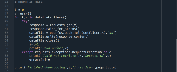
Time to download! We loop through each key (file name) and value (url) in our dictionary. We use the requests module to try and get the url (v), but if there’s a problem with the website or the link is invalid we bail out. If successful, we use the os module to go to our output folder and we supply the name of the file from the website (k) as the name of the file that we want to store on our computer. The ‘wb’ parameter specifies that we’re writing bytes to a file. I always like to keep count of the number of files I’ve done with an iterator (i) so I can print messages to a screen or a log file.
i = 0
for k,v in datalinks.items():
    try:
        response=requests.get(v)
        response.raise_for_status()
        dfile=open(os.path.join(outfolder,k),'wb')
        dfile.write(response.content)
        dfile.close()
        i=i+1
        print('Downloaded',k)
    except requests.exceptions.RequestException as e:
        print('Could not get',k,'because of',e)
print('Downloaded',i,'files from',page_title)
It’s important to save documentation too, so people can understand how the data was created and structured. In addition to saving pdf and text files, you can also save a vanilla copy of the website; I use a generic name with a date stamp. This saves the basic HTML text of the page, but not any images, documents, or styling. Which is usually good enough for providing documentation.
As mentioned previously, you don’t want to place undue burden on the webserver. With the time module, you can use the sleep function and add a pause to your script for a fixed amount of time, usually at the end of a loop, or after your iterator has recorded a certain number of files. The random module allows you to supply a random time value within a range, if you want to vary the length of the pause.
import time
from random import randint

# Pause fixed amount
time.sleep(5)

# Pause random amount within a range
time.sleep(randint(10,20))
Screen Scraping Caveats
Those are the basics! Now here are the primary exceptions. The first problem is that links to files may not be absolute links that contain the entire path to a file. Sometimes they’re relative, containing a reference to just the subfolder and file. The requests module won’t be able to find these, so we have to take the extra step of building the full path, as in the example below. You can do this by identifying what the relative path starts with (unless they’re all relative and the same), and you create the absolute by adding (concatenating) the root url and the relative one contained in the soup.
    <div class='content'>
        <p>Paragraph with text.</p>
        <a href='/us/data.zip'/>
    </div>
url='https://www.page.gov'
datalinks={}
for lnk in links:
    if lnk.attrs['href'].endswith(('.zip')):
        if lnk.attrs['href'].startswith('/us/'):
            fname=lnk.attrs['href'].split('/')[-1]
            datalinks[fname]=url+lnk.attrs['href']
            ...
In other cases, a link to a data file may not lead directly to the file, but leads to another web page where that file is stored. We can embed another scraping block into a loop; retrieve and start scraping the main page, then once you find a link go to that page, and repeat retrieval and scraping. In these cases, it’s best to save these steps in a function, so you can call the function multiple times instead of repeating the same code.
<div class='content'>
        <p>Paragraph with text.</p>
        <a href='https://www.page.gov/us/'>
 </div>
Some websites will have dedicated pages where they embed a parameter in the url, such as codes for countries or states. If you know what these are, you can define them in a list, and iterate through that list by formatting the url to insert the code, and then scrape that page. If a page uses a unique integer as an ID and you know what the upper limit is, you can use for i in range(1,n) to step through each page (but make sure you handle exceptions, in case an integer isn’t used or is missing).
codes=['us','ca','mx']
url='https://www.page.gov/{}'
for c in codes:
    webpage=requests.get(url.format(c)).content
    soup_page=soup(webpage,'html.parser')
    ...
For complicated sites with several pages, you might not want to dump all the files into the same folder. Instead, as you iterate through pages, you can create a dedicated folder for that iteration. Using the example above, if there is a page for each country code, you can create a folder for that code and when writing files, use the path module to store files in that folder for that iteration.
codes=['us','ca','mx']
for c in codes:
    ...
    cfolder=os.path.join(outfolder,c)
        if not os.path.exists(cfolder):
            os.makedirs(cfolder)
    ...
    response=requests.get(v)
        response.raise_for_status()
        dfile=open(os.path.join(cfolder,k),'wb')
        dfile.write(response.content)
        dfile.close()
For websites with lots of files, or with a few big files, you may run out of memory during the download process and your script will go kaput. To avoid this, you can stream a file in chunks instead of trying to download it in one go. Use the request module’s iter_content function, and supply a reasonable chunk size in bytes (10000000 bytes is 10 MB).
...
try:
    with requests.get(v,stream=True) as response:
        response.raise_for_status()
        fpath=os.path.join(outfolder,k)
        with open(fpath,'wb') as writefile:
            for chunk in response.iter_content(chunk_size=10000000):
                writefile.write(chunk)
    i=i+1
    print('Downloaded',k)
except requests.exceptions.RequestException as e:
        print('Could not get',fname,'because of',e)
If you view the page source for a website, and don’t actually see the anchor links and file names in the HTML, you’re probably dealing with a page that employs JavaScript, which is a show stopper if you’re using Beautiful Soup. There may be a dropdown menu or option you have to choose first, in order to render the actual page (and you may be able to use the page parameters trick above, if the url on each page varies). But you may be stuck; instead of links, there may be download buttons you have to press or a dropdown menu option you have to choose in order to download the file.
One option would be to use a Python module called Selenium, which allows you to automate the process of using a web browser, to open a page, find a button, and click it. I’ve tried Selenium with some success, but find that it’s complex and clunky for screen scraping. It’s browser dependent (you’re automating the use of a browser, and they’re all different), and you’re forced to incorporate lots of pauses; waiting for a page to load before attempting to parse it, and dealing with pop up menus in the browser as you attempt to download multiple files, etc.
Another option that I’m not familiar with, and thus haven’t tried, would be to use JavaScript since that’s what the page uses. Most browsers have web developer console add-ons that allow you to execute snippets of JavaScript code in order to do something on a page. So some automation may be possible.
Using an API
You may be able to avoid scraping altogether if the data is made available via an API. With a REST API, you pass parameters into a base link to make a specific request. Using requests, you go to that URL, and instead of getting a web page you get the data that you’ve asked for, usually packaged in a JSON type object within your program (Python or another scripting language). Some APIs retrieve documents or dataset files, that you can stream and download as described previously. But most APIs for statistical data retrieve individual data records, which you would store in a nested list or dictionary and then write out to a CSV. The example below grabs the total population for four large cities in Rhode Island from 2020 decennial census public redistricting dataset.
import requests,csv

year='2020'
dsource='dec' # survey
dseries='pl' # dataset
cols='NAME,P1_001N' # variables
state='44' # geocodes for states
place='19180,54640,59000,74300' # geocodes for places
outfile='census_pop2020.csv'
keyfile='census_key.txt'

with open(keyfile) as key:
	api_key=key.read().strip()

base_url = f'https://api.census.gov/data/{year}/{dsource}/{dseries}'

# for sub-geography within larger geography - geographies must nest
data_url = f'{base_url}?get={cols}&for=place:{place}&in=state:{state}&key={api_key}'

response=requests.get(data_url)

popdata=response.json()
for record in popdata:
    print(record)

with open(outfile, 'w', newline='') as writefile:
    writer=csv.writer(writefile, quoting=csv.QUOTE_MINIMAL, delimiter=',')
    writer.writerows(popdata)
The benefit of an API is that it’s designed to retrieve machine readable data, and might be easier than scraping pages that have complex interfaces. The major downside is, if you’re forced to download individual records as opposed to entire files, the process can take a long time, to the point where it may be infeasible if the datasets are too large. It’s always worth checking to see if there is a bulk download option as that could be easier and more efficient (for example, the Census Bureau has an FTP site for downloading datasets in their entirety). Using an API also requires you to invest time in studying how it works, so you can build the appropriate links and ensure that you’re capturing everything.
Conclusion
Screen scraping will vary from website to website, but once you have enough examples it becomes easy to resample your code. You’ll always need to modify the Beautiful Soup step based on the structure of the individual pages, but the requests downloading step is more rote and may not require much modification. While I use Python, you can use other languages like R to achieve similar results.
Visit my library’s US Federal Government Data Backup GitHub for working examples of code that I and colleagues have used to capture datasets. In my programs I’ve added extra components, like writing a basic metadata file and error logs, which I haven’t covered in this post. The NOAA County at a Glance, IRS-SOI, and IMLS, scripts are basic examples, and the IMLS ones include some of the caveats I’ve described. The NOAA lake and sea level rise scripts are far more complex, and include cycling through many pages, creating multiple folders, streaming downloads, and encapsulating processes into functions. The USAID DHS Indicators scripts used APIs that retrieved files, while the USAID DHS SDR script used Selenium to step through a series of JavaScript pages.
You’ll find scripts but no datasets in the GitHub repo due to file size limitations. If you’re a member of an institution that has access to GLOBUS, you can access the data files by following the instructions at the top of the page. Otherwise, we’ve contributed all of our datasets to DataLumos (except for the sea level rise data, I’m working with another university to host that).
There’s been a lot of turmoil emanating from Washington DC lately. One development that’s been more under the radar than others has been the modification or removal of US federal government datasets from the internet (for some news, see these articles in the New Yorker, Salon, Forbes, and CEN). In some cases, this is the intentional scrubbing or deletion of datasets that focus on topics the current administration doesn’t particularly like, such as climate and public health. In other cases, the dismemberment of agencies and bureaus makes data unavailable, as there’s no one left to maintain or administer it. While most government data is still available via functioning portals, most of the faculty and researchers I work with can identify at least a few series they rely on that have disappeared.
Librarians, archivists, researchers, professors, and non-profits across the country (and even in other parts of the world), have established rescue projects, where they are actively downloading and saving data in repositories. I’ve been participating in these efforts since January, and will outline some of the initiatives in this post.
The Internet Archive
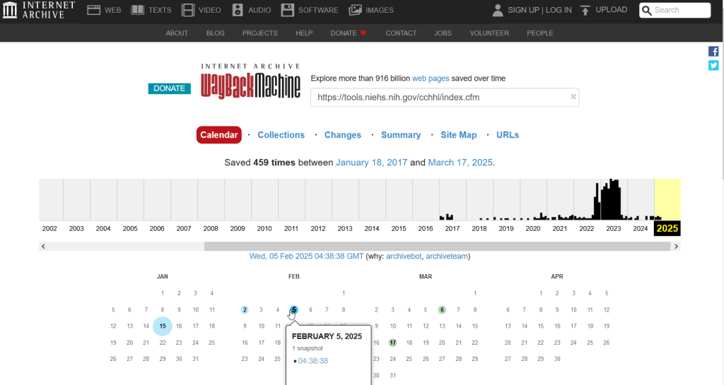
The place of last resort for finding deleted web content is the Internet Archive. This large, non-profit project has been around as long as the web has existed, with the goal of creating a historic archive of the internet. It uses web crawlers or spiders to creep across the web and make copies of websites. With the Wayback Machine, you can enter a URL and find previous copies of web pages, including sites that no longer exist. You’re presented with a calendar page where you can scroll by year and month to select a date when a page was captured, which opens up a copy.
This allows you to see the content, navigate through the old website, and in many cases download files that were stored on those pages. It’s a great resource, but it can’t capture everything; given the variety and complexity of web pages and evolving web technologies, some websites can’t be saved in working order (either partially or entirely). Content that was generated and presented dynamically with JavaScript, or was pulled and presented from a database, is often not preserved, as are restricted pages that required log-ins.
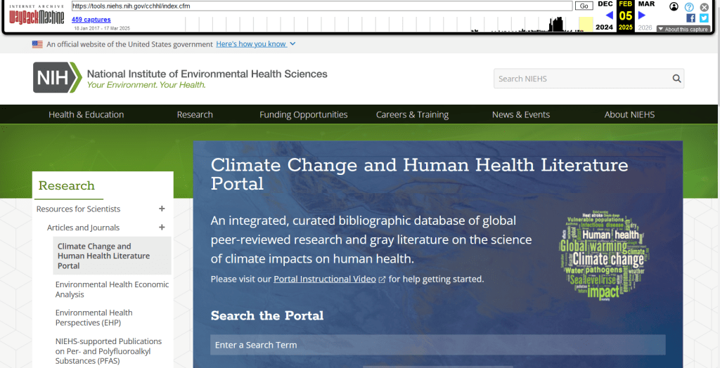
An archived copy of the NIEHS page (the actual website was deleted in mid February 2025)
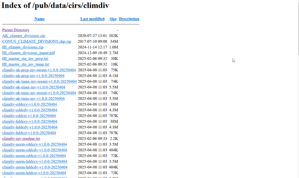
The Internet Archive also hosts a number of special collections where folks have saved documents, images, sound and video, and software. For example, you can find many research articles that are available in PubMed from the PubMed Central collection, a ton of documents from the USDA’s National Agricultural Library, and about 100 GB of data someone captured from the CDC in January 2025. A large project called the End of Term Archive was launched in 2008 to capture what federal government websites looked like at the end of each presidential term. The pages are saved in a special collection in the IA.
Data Rescue Project
Dozens of new data archiving projects were launched at the end of 2024 and beginning of 2025 with the intention of saving federal datasets. The Data Rescue Project is one of the larger efforts, which has been driven by data librarians and archivists with non-profit partners. Professional groups including IASSIST, ICPSR, RDAP, the Data Curation Network, and the Safeguarding Research & Culture project have been active organizers and participators. While this will be an oversimplification, I’ll summarize the project as having two goals
The first goal is to keep track of what the other archiving projects are, and what they have saved. To this end, they created the Data Rescue Tracker, which has two modules. The Downloads List is an archive of datasets that have been saved, with details about where the data came from and locations of archived copies. The Maintainers List is a catalog of all the different preservation projects, with links to their home pages. There is also a narrative page with a comprehensive list of links to the various rescue efforts, data repositories, alternate sources for government data, and tools and resources you can use to save and archive data.
The Data Rescue Tracker Downloads List
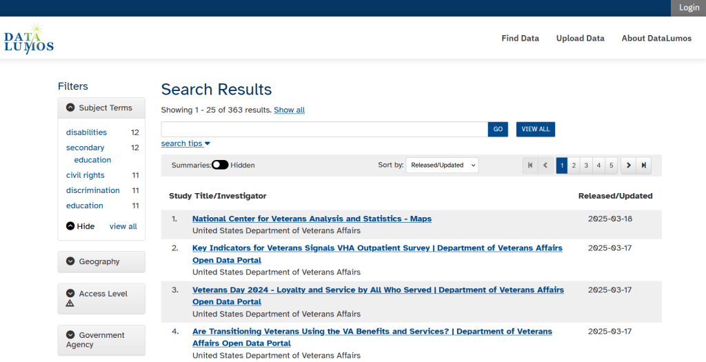
The second goal is to contribute to the effort of saving and archiving data. The team maintains an online spreadsheet with tabs for agencies that contain lists of datasets and URLs that are currently prioritized for saving. Volunteers sign up for a dataset, and then go out and get it. Some folks are manually downloading and saving files (pointing and clicking), while others write short screen scraping scripts to automate the process. The Data Rescue Project has partnered with ICPSR, a preeminent social science research center and repository in the US, at the University of Michigan. They created a repository called DataLumos, which was launched specifically for hosting extracts of US federal government data. Once data is captured, volunteers organize it and generate metadata records prior to submitting it to DataLumos (provided that the datasets are not too big).
DataLumos archive for federal government datasets, maintained by ICPSR
Most of the datasets that DRP is focused on are related to the social sciences and public policy. The Data Rescue Project coordinates with the Environmental and Government Data Initiative and the Public Environmental Data Partners (which I believe are driven by non-profit and academic partners), who are saving data related to the environment and health. They have their own workflows and internal tracking spreadsheets, and are archiving datasets in various places depending on how large they are. Data may be submitted to the Internet Archive, the Harvard Dataverse, GitHub, SciOp, and Zenodo (you can find out where in the Data Rescue Tracker Download’s List).
Mega Projects
There are different approaches for tackling these data preservation efforts. For the Data Rescue Project and related efforts, it’s like attacking the problem with millions of ants. Individual people are coordinating with one another in thousands of manual and semi-automated download efforts. A different approach would be to attack the problem with a small herd of elephants, who can employ larger resources and an automated approach.
For example, the Harvard Law School Library Innovation Lab launched the Archive of data.gov, a large project to crawl and download everything that’s in data.gov, the US federal government’s centralized data repository. It mirrors all the data files stored there and is updated regularly. The benefit of this approach is that it captures a comprehensive amount of data in one go, and can be readily updated. The primary limitation is that there are many cases where a dataset is not actually stored in data.gov, but is referenced in a catalog record with a link that goes out to a specific agency’s website. These datasets are not captured with this approach.
If trying to find back-ups is a bit bewildering, there’s a tool that can help. Boston University’s School of Public Health and Center for Health Data Science have created a find lost* data search engine, which crawls across the Harvard Project, DataLumos, the Data Rescue Project, and others.
Beyond the immediate data preservation projects that have sprung up recently, there are a number of large, on-going projects that serve as repositories for current and historical datasets. Some, like IPUMS at the University of Minnesota and the Election Lab at MIT focus on specific datasets (census data for the former, election results data for the latter). There are also more heterogeneous repositories like ICPSR (including OpenICPSR which doesn’t require a subscription), and university-based repositories like the Harvard Dataverse (which includes some special collections of federal data extracts, like CAFE). There are also private-sector partners that have an equal stake in preserving and providing access to government data, including PolicyMap and the Social Explorer.
Wrap-up
I’ve been practicing my Python screen scraping skills these past few months, and will share some tips in a subsequent post. I’ve been busy contributing data to these projects and coordinating a response on my campus. We’ve created a short list of data archives and alternative sources, which captures many of the sources I’ve mentioned here plus a few others. My library colleagues in the health and medical sciences have created a list of alternatives to government medical databases including PubMed and ClinicalTrials.gov
Having access to a public and robust federal statistical system is a non-partisan issue that we should all be concerned about. Our Constitution justifies (in several sections) that we should have such a system, and we have a large body of federal laws that require it. Like many other public goods, the federal statistical system contributes to providing a solid foundation on which our society and economy rest, and helps drive innovation in business, policy, science, and medicine. It’s up to us to protect and preserve it.
Last semester we completed a project to create a crosswalk between census geographies and local geographies in Providence, RI. Crosswalks are used for relating two disparate sets of geography, so that you can compile data that’s published for one set of geography in another. Many cities have locally-defined jurisdictions like wards or community districts, as well as informally defined areas like neighborhoods. When you’re working with US Census data, you use small statistical areas that the Bureau defines and publishes data for; blocks, block groups, census tracts, and perhaps ZCTAs and PUMAs. A crosswalk allows you to apportion data that’s published for census areas, to create estimates for local areas (there are also crosswalks that are used for relating census geography that changes over time, such as the IPUMS crosswalks).
How the Crosswalk Works
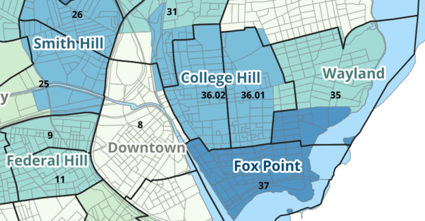
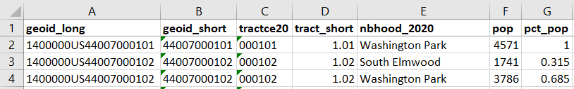
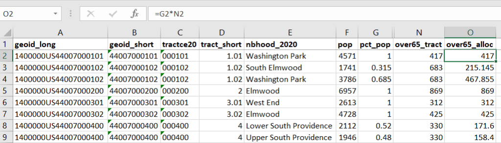
For example, in the Providence Census Geography Crosswalk we have two crosswalks that allow you to take census tract data, and convert it to either neighborhoods or wards. I’ll refer to the neighborhoods in this post. In the crosswalk table, there is one record for each portion of a tract that overlaps a neighborhood. For each record, there are attribute columns that indicate the count and the percentage of a tract’s population, housing units, land area, and total area that fall within a given neighborhood. If a tract appears just once in the table, that means it is located entirely within one neighborhood. In the image below, we see that tract 1.01 appears in the table once, and its population percentage is 1. That means that it falls entirely within the Washington Park neighborhood, and 100% of its population is in that neighborhood. In contrast, tract 1.02 appears in the table twice, which means it’s split between two neighborhoods. Its pct_pop column indicates that 31.5% of its population is in South Elmwood, while 68.5% is in Washington Park. The population count represents the number of people from that tract that are in that neighborhood.
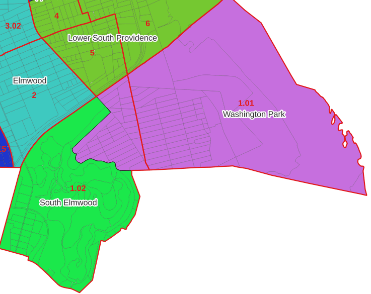
Looking at the map below, we can see that census tract 1.01 falls entirely within Washington Park, and tract 1.02 is split between Washington Park and South Elmwood. To generate estimates for Washington Park, we would sum data for tract 1.01 and the portion of tract 1.02 that falls within it. Estimates for South Elmwood would be based solely on the portion of tract 1.02 that falls within it. With the crosswalk, “portion” can be defined as the percentage of the tract’s population, housing units, land area, or total area that falls within a neighborhood.
The primary purpose of the crosswalk is to generate census data estimates for neighborhoods. You apportion tract data to neighborhoods using an allocation factor (population, housing units, or area) and aggregate the result. For example, if we have a census tract table from the 2020 census with the population that’s 65 years and older, we can use the crosswalk to generate neighborhood-level estimates of the 65+ population. To do that, we would:
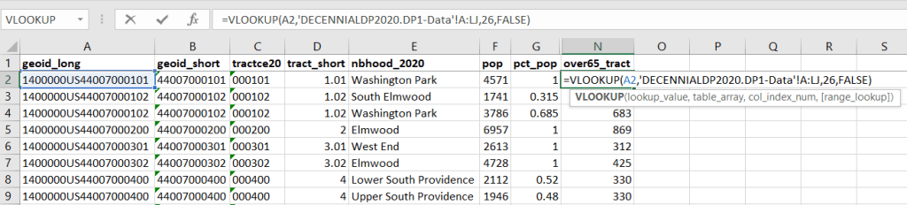
Join the data table to the crosswalk using the tract’s unique ID; the crosswalk has both the long and short form of the GEOIDs used by the Census Bureau. So for each crosswalk record, we would associate the 65+ population for the entire tract with it.
Multiply the 65+ population by one of the allocation columns – the percent population in this example. This would give us an estimate of the 65+ population that live in that tract / neighborhood piece.
Group or aggregate this product by the neighborhood name, to obtain a neighborhood-level table of the 65+ population.
Round decimals to whole numbers.
To do the calculations in a spreadsheet, you would import the appropriate crosswalk sheet into the workbook that contains the census data that you want to apportion, so that they appear as separate sheets in the same workbook. In the crosswalk worksheet, use the VLOOKUP formula and reference the GEOID to “join” the census tract data to the crosswalk. The formula requires: cell containing the ID value you wish to look up, the range of cells in a worksheet that you will search through, the number of the column that contains the value you wish to retrieve (column A is 1, Z is 26, etc.), and the parameter “FALSE” to get an exact match. It is assumed that the look up value in the target table (the matching ID) appears in the first column (A).
The tract data is now repeated for each tract / neighborhood segment. Next, use formulas to multiply the allocation percentage (pct_pop in this example) by the census data value (over 65 pop for the entire tract) to create an allocated estimate for each tract / neighborhood piece.
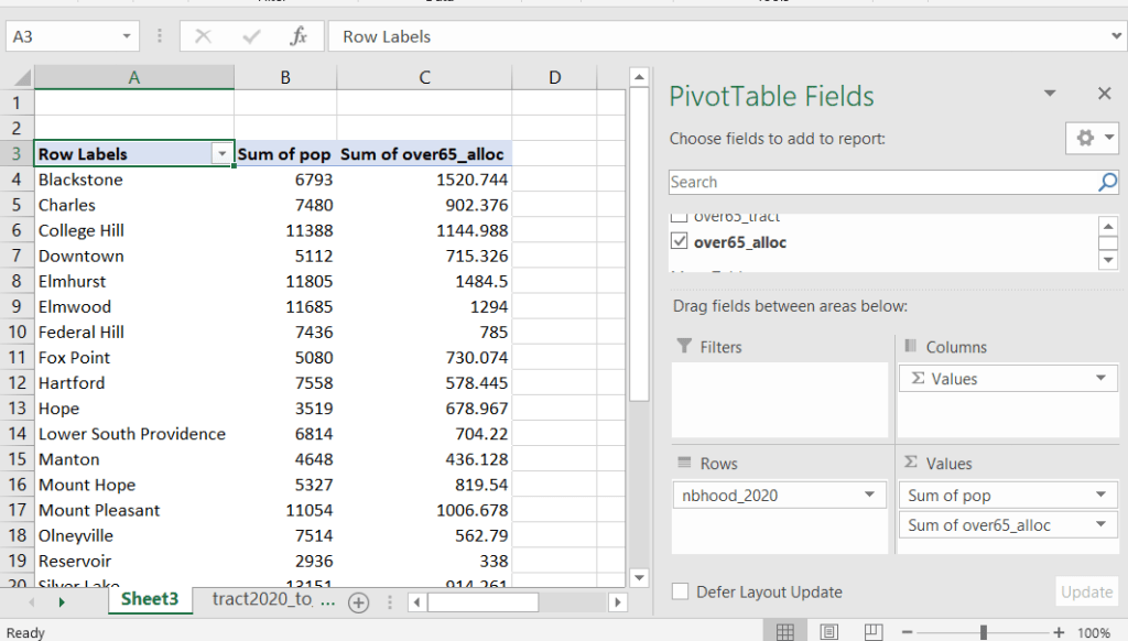
Then you can generate a pivot table (on the Insert ribbon in Excel) where you group and sum that allocated result by neighborhood (neighborhoods as rows, census data as summed values in columns). Final step is to round the estimates.
This process is okay for small projects where you have a few estimates you want to quickly tabulate, but it doesn’t scale well. I’d use a relational database instead; import the crosswalk and census data table into SQLite, where you can easily do a left join, calculated field, and then a group by statement. Or, use the joining / calculating / aggregating equivalents in Python or R.
I used the percentage of population as the allocation factor in this example. If the census data you’re apportioning pertains to housing units, you could use the housing units percentage instead. In any case, there is an implicit assumption that the data you are apportioning has the same distribution as the allocation factor. In reality this may not be true; the distribution of children, seniors, homeowners, people in poverty etc. may vary from the total population’s distribution. It’s important to bear in mind that you’re creating an estimate. If you are apportioning American Community Survey data this process gets more complicated, as the ACS statistics are fuzzy estimates. You’d also need to apportion the margin of error (MOE) and create a new MOE for the neighborhood-level estimates.
The Providence crosswalk has some additional sheets that allow you to go from tracts, ZCTAs, or blocks to neighborhoods or wards. The tract crosswalk is by far the most useful. The ZCTA crosswalk was an exercise in futility; I created it to demonstrate the complete lack of correlation between ZCTAs and the other geographies, and recommend against using it (we also produced a series of maps to visually demonstrate the relationship between all the geographies). There is a limited amount of data published at the block level, but I included it in the crosswalk for another reason…
Creating the Crosswalk
I used census blocks to create the crosswalk. They are the smallest unit of census geography, and nest within all other census geographies. I used GIS to assign each block to a neighborhood or ward based on the geography the block fell within, and then aggregated the blocks into distinct tract / ward and tract / neighborhood combinations. Then I calculated the allocation factors, the percentage of the tract’s total attributes that fell in a particular neighborhood or ward. This operation was straightforward for the wards; the city constructed them using 2020 census blocks, so the blocks nested or fit perfectly within the wards.
The neighborhoods were more complicated, as these were older boundaries that didn’t correspond to the 2020 blocks, and there were many instances where blocks were split between neighborhoods. My approach was to create a new set of neighborhood boundaries based on the 2020 blocks, and then use those new boundaries to create the crosswalk. I began with a spatial join, assigning each block a neighborhood ID based on where the center of the block fell. Then, I manually inspected the borders between each neighborhood, to determine whether I should manually re-assign a block. In almost all instances, blocks I reassigned were unpopulated and consisted of slivers that contained large highways, or blocks of greenspace or water. I struck a balance between remaining as faithful to the original boundaries as possible, while avoiding the separation of unpopulated blocks from a tract IF the rest of the blocks in that tract fell entirely within one neighborhood. In two cases where I had to assign a populated block, I used satellite imagery to determine that the population of the block lived entirely on one side of a neighborhood boundary, and made the assignment accordingly.
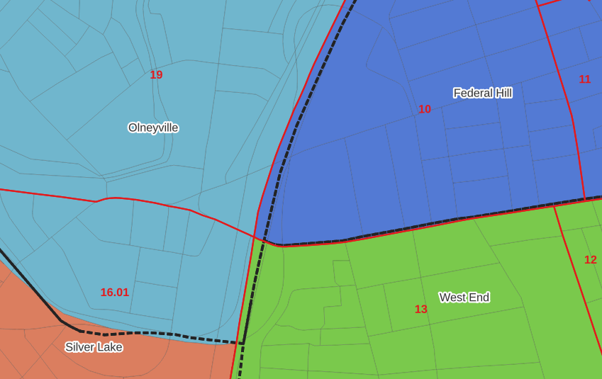
In the example below, 2020 tract boundaries are shown in red, 2020 block boundaries are light grey, original neighborhood boundaries are shown with dotted black lines, and reconstituted neighborhoods using 2020 blocks are shown in different colors. The boundaries of Federal Hill and the West End are shifted west, to incorporate thin unpopulated blocks that contain expressways. These empty blocks are part of tracts (10 and 13) that fall entirely within these neighborhoods; so splitting them off to adjacent Olneyville and Silver Lake didn’t make sense (as there would be no population or homes to apportion). Reassigning them doesn’t change the fact that the true boundary between these neighborhoods is still the expressway. We also see an example between Olneyville and Silver Lake where the old neighborhood boundary was just poorly aligned, and in this case blocks are assigned based on where the center of the block fell.
Creating the crosswalk from the ground up with blocks was the best approach for accounting how population is distributed within larger areas. It was primarily an aggregation-based approach, where I could sum blocks that fell within geographies. This approach allowed me to generate allocation factors for population and housing units, since this data was published with the blocks and could be carried along.
Conversely, in GIS 101 you would learn how to calculate the percentage of an area that falls within another area. You could use that approach to create a tract-level crosswalk based on area, i.e. if a tract’s area is split 50/50 between two neighborhoods, we’ll apportion its population 50/50. While this top down approach is simpler to implement, it’s far less ideal because you often can’t assume that population and area are equally distributed. Reconsider the example we began with: 31.5% of tract 1.02’s population is in South Elmwood, while 68.5% is in Washington Park. In contrast, 75.3% of tract 1.02’s land area is in South Elmwood, versus only 24.7% in Washington Park! If we apportioned our census data by area instead of population, we’d get a dramatically different, and less accurate, result. Roger Williams Park is primarily located in the portion of tract 1.02 that falls within Elmwood; it covers a lot of land but includes zero people.
Why can’t we just simply aggregate block-level census data to neighborhoods and skip the whole apportionment step? The answer is that there isn’t much data published at the block level. There’s a small set of tables that capture basic demographic variables as part of the decennial census, and that’s it. There was a sharp reduction in the number of block-level tables in the 2020 census due to new privacy regulations, and the ACS isn’t published at the block-level at all. While you can use the block-level table in the crosswalk to join and aggregate block data, in most cases you’ll need to work with tract-data and apportion it.
I used spatial SQL to create the crosswalks in Spatialite and QGIS , and if you’re interested in seeing all the gory details you can look at the code and spatial database in source folder of the project’s GitHub repo. I always prefer SQL for spatial join and aggregation operations, as I can write a single block of code instead of running 4 or 5 different of desktop GIS tools in a sequence. I’ll be updating the project this semester to include additional geographies (block groups – the level between blocks and tracts), and perhaps an introductory tutorial for using it (there are some basic docs at present).


You must be logged in to post a comment.