I’m working on a project where I needed to generate a list of all the administrative subdivisions (i.e. states / provinces, counties / departments, etc) and their ID codes for several different countries. In this post I’ll demonstrate how I accomplished this using the Geonames API and Python. Geonames (https://www.geonames.org/) is a gazetteer, which is a directory of geographic features that includes coordinates, variant place names, and identifiers that classify features by type and location. Geonames includes many different types of administrative, populated, physical, and built-environment features. Last year I wrote a post about gazetteers where I compared Geonames with the NGA Geonet Names Server, and illustrated how to download CSV files for all places within a given country and load them into a database.
In this post I’ll focus on using an API to retrieve gazetteer data. Geonames provides over 40 different REST API services for accessing their data, all of them well documented with examples. You can search for places by name, return all the places that are within a distance of a set of coordinates, retrieve all places that are subdivisions of another place, geocode addresses, obtain lists of centroids and bounding boxes, and much more. Their data is crowd sourced, but is largely drawn from a body of official gazetteers and directories published by various countries.
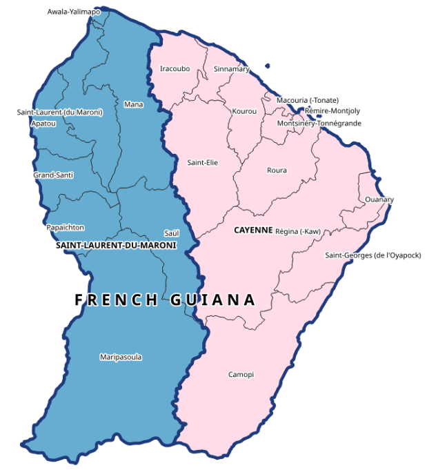
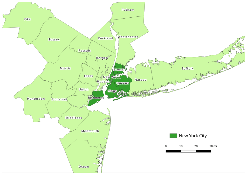
This makes it an ideal source for generating lists of administrative divisions and subdivisions with codes for multiple countries. This information is difficult to find, because there isn’t an international body that collates and freely provides it. ISO 3166-1 includes the standard country codes that most of the world uses. ISO 3166-2 includes codes for 1st-level administrative divisions, but ISO doesn’t freely publish them. You can find them from various sources; Wikipedia lists them and there are several gist and github repos with screen scraped copies. The US GNA is a more official source that includes both ISO 3166 1 and 2. But as far as I know there isn’t a solid source for codes below the 1st level divisions. Many countries create their own systems and freely publish their codes (i.e. ANSI FIPS codes in the US, INSEE COG codes in France), but that would require you to tie them altogether. GADM is the go to source for vector-based GIS files of country subdivisions (map at the top of this post for example). For some countries they include ISO division codes, but for others they don’t (they do employ the HASC codes from Statoids, but it’s not clear if these codes are still being actively maintained) .
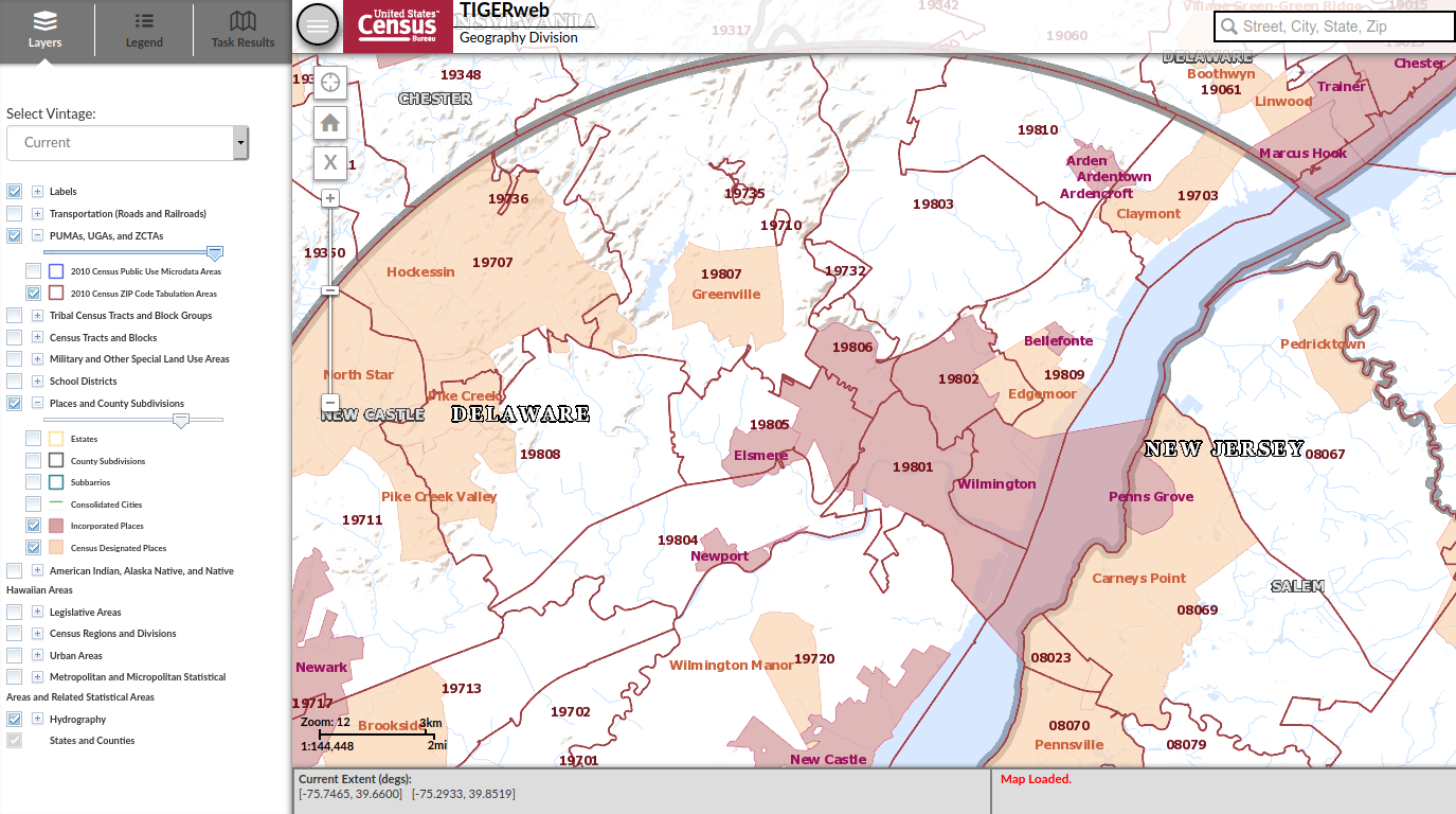
Geonames to the rescue – you can browse the countries on the website to see the country and 1st level admin codes (see image below), but the API will give us a quick way to obtain all division levels. First, you have to register to get an API username – it’s free – and you’ll tack that username on to the end of your requests. That gives you 20k credits per day, which in most instances equates with 1 request per credit. I recommend downloading one of their prepackaged country files first, to give you a sense for how the records are structured and what attributes are available. A readme file that describes all of the available fields accompanies each download.

My goal was to get all administrative divisions – names and codes and how the divisions nest within each other – for all of the countries in the French-speaking Caribbean (countries that are currently, or formerly, overseas territories of France). I also needed to get place names as they’re written in French. I’ll walk through my Python script that I’ve pasted below.
import requests,csv
from time import strftime

ccodes=['BL','DM','GD','GF','GP','HT','KN','LC','MF','MQ','VC']
fclass='A'
lang='fr'
uname='REQUEST FROM GEONAMES'

#Columns to keep
fields=['countryId','countryName','countryCode','geonameId','name','asciiName',
        'alternateNames','fcode','fcodeName','adminName1','adminCode1',
        'adminName2','adminCode2','adminName3','adminCode3','adminName4','adminCode4',
        'adminName5','adminCode5','lng','lat']
fcode=fields.index('fcode')

#Divisions to keep
divisions=['ADM1','ADM2','ADM3','ADM4','ADM5','PCLD','PCLF','PCLI','PCLIX','PCLS']

base_url='http://api.geonames.org/searchJSON?'

def altnames(names,lang):
    "Given a dict of names, extract preferred names for a given language"
    aname=''
    for entry in names:
        if 'isPreferredName' in entry.keys() and entry['lang']==lang:
            aname=entry.get('name')
        else:
            pass
    return aname

places=[]
tossed=[]

for country in ccodes:
    data_url = f'{base_url}?name=*&country={country}&featureClass={fclass}&lang={lang}&style=full&username={uname}'
    response=requests.get(data_url)
    data=response.json() #total retrieved and results in list of dicts
    gnames=response.json()['geonames'] #create list of dicts only
    gnames.sort(key=lambda e: (e.get('countryCode',''),e.get('fcode',''),
                               e.get('adminCode1',''),e.get('adminCode2',''),
                               e.get('adminCode3',''),e.get('adminCode4',''),
                               e.get('adminCode5','')))
    for record in gnames:
        r=[]
        for f in fields:
            item=record.get(f,'')
            if f=='alternateNames' and f !='':
                aname=altnames(item,'en')
                r.append(aname)
            else:
                r.append(item)
        if r[fcode] in divisions: #keep certain admin divs, toss others
            places.append(r)
        else:
            tossed.append(r)

filetoday=strftime('%Y_%m_%d')
outfile='geonames_fwi_adm_'+filetoday+'.csv'

writefile=open(outfile,'w', newline='', encoding='utf8')
writer=csv.writer(writefile, delimiter=",", quotechar='"',quoting=csv.QUOTE_NONNUMERIC)
writer.writerow(fields) #header row
writer.writerows(places)
writefile.close()

print(len(places),'records written to file',outfile)
First, I identify all of the variables I need: the two-letter ISO codes of the countries, a list of the Geonames attributes that I want to keep, the two-letter language code, and the specific feature type I’m interested in. There are different features codes classified with a single letter, and a number of subtypes below that. Feature class A is for records that represent administrative divisions, and within that class I needed records that represented the country as a whole (PCL codes) and its subdivisions (ADM codes). There are several different place name variables that include official names, short forms, and an ASCII form that only includes characters found in the Latin alphabet used in English. The language code that you pass into the url will alter these results, but you still have the option to obtain preferred place names from an alternate languages field. The admin codes I’m retrieving are the actual admin codes; you can also opt to retrieve the unique Geonames integer IDs for each admin level, if you wanted to use these for bridging places together (not necessary in my case).
There are a few different approaches for achieving this goal. I decided to use the Geonames full text search, where you search for features by name (separate APIs for working with hierarchies for parent and child entities are another option). I used an asterisk as a wildcard to retrieve all names, and the other parameters to filter for specific countries and feature classes. At the end of the base url I added JSON for the search; if you leave this off the records are returned as XML.
base_url='http://api.geonames.org/searchJSON?'
My primary for loop loops through each country, and passes the parameters into the data url to retrieve the data for that country: I pass in country code, feature class A, and French as the language for the place names. It took me a while to figure out that I also needed to add style=full to retrieve all of the possible info that’s available for a given record; the default is to capture a subset of basic information, which lacked the admin codes I needed.
data_url = f'{base_url}?name=*&country={country}&featureClass={fclass}&lang={lang}&style=full&username={uname}'
I use the Python Requests module to interact with the API. Geonames returns two objects in JSON: an integer count of the total records retrieved, and another JSON object that essentially represents a list of python dictionaries, where each dictionary contains all the attributes for a record as a series of key and value pairs where the key is the attribute name (see examples below). I create a new gnames variable to isolate just this list, and then I sort the list based on how I want the final output to appear; by country and by admin codes, so that like-levels of admin codes are grouped together. The trick of using lamba to sort nested lists or dictionaries is well documented, but one variation I needed was to use the dictionary get method. Some features may not have five levels of admin codes; if they don’t then there is no key for that attribute, and using the simple dict[key] approach returns an error in those cases. Using dict.get(key,”) allows you to pass in a default value if no key is present. I provide a blank string as a placeholder, as ultimately I want each record to have the same number of columns in the output and need the attributes to line up correctly.
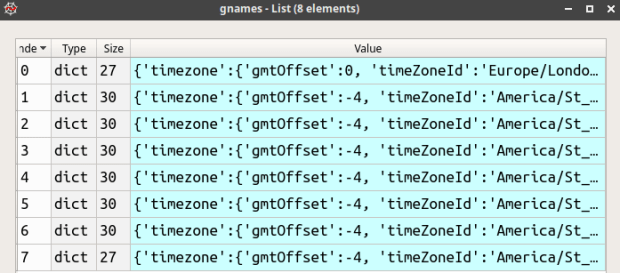

Once I have records for the first country, I loop through them and choose just the attributes that I want from my field list. The attribute name is the key, I get the associated value, but if that key isn’t present I insert an empty string. In most cases the value associated with a key is a string or integer, but in a few instance it’s another container, as in the case of alternate names which is another list of dictionaries. If there are alternate names I want to pull out a preferred name in English if one exists. I handle this with a function so the loop looks less cluttered. Lastly, if this record represents an admin division or is a country-level record then I want to keep it, otherwise I append it to a throw-away list that I’ll inspect later.
Once the records returned for that country have been processed, we move on to the next country and keep appending records to the main list of places (image below). When we’re done, we write the results out to a CSV file. I write the list of fields out first as my header row, and then the records follow.

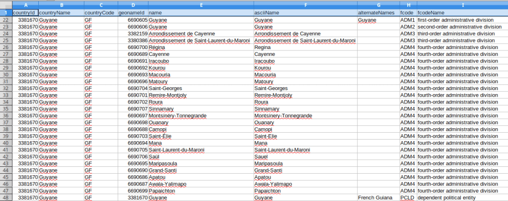
Overall I think this approach worked well, but there are some small caveats. A number of the countries I’m studying are not independent, but are dependencies of France. For dependent countries, their 1st and sometimes even 2nd level subdivision codes appear identical to their top-level country code, as they represent a subdivision of an independent country (many overseas territories are departments of France). If I need to harmonize these codes between countries I may have to adjust the dependencies. The alternate English places names always appear for the country-level record, but usually not below that. I think I’d need to do some additional tweaking or even run a second set of requests in English if I wanted all the English spellings; for example in French many compound place names like Saint-Paul are separated by a hyphen, but in English they’re separated by a space. Not a big deal in my case as I was primarily interested in the alternate spellings for countries, i.e. Guyane versus French Guiana. See the final output below for Guyane; these subdivision codes are from INSEE COG, which are the official codes used by the French government for identifying all geographic areas for both metropolitan France and overseas departments and collectivities.

Two final things to point out. First, my script lacks any exception handling, since my request is rather small and the API is reliable. If I was pulling down a lot of data I would replace my main for loop with a try and except block to handle errors, and would capture retrieved data as the process unfolds in case some problem forces a bail out. Second, when importing the CSV into a spreadsheet or database, it’s important to import the admin codes as text, as many of them have leading zeros that need to be preserved.
This example represents just the tip of the iceberg in terms of things you can do with Geonames APIs. Check it out!


You must be logged in to post a comment.