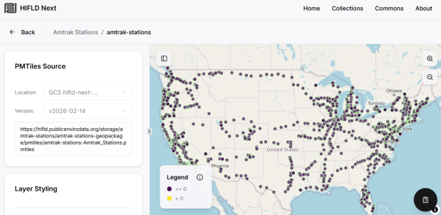
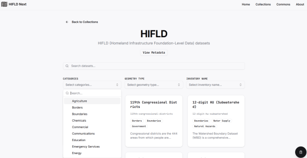
The Public Environmental Data Partners and Fulton Ring have launched a new community-shaped hub for finding, previewing and downloading GIS data collections, and its debut HIFLD Nextcollection is built on this rescued dataset. The portal increases the accessibility of the HIFLD Open data, with enhanced options for searching, previewing attribute tables and layers, and downloading or streaming data in a number of different formats. Beyond publishing a website, the group is hoping to build a community of practitioners around this project to support and sustain it, and to provide updated datasets and additional collections in the future.
They are keen to solicit feedback from GIS data users, and particularly from librarians and data specialists who provide active user support and who would potentially refer to the portal as a source. After you’ve explored the portal, feel free to submit feedback via their survey.
While spending February buried under snow here in Providence, I took the opportunity to update several of the data products we create here at GeoData@SciLi. I’ll provide a summary of what we’re working on in this post. The heading for each project links to its GitHub repo, where you can access the datasets and the scripts we wrote for creating them.
My overall vision has always been that library data services should go beyond simply finding public data and purchasing data for students and faculty; we should actively engage in creating value-added products to meet the research and teaching needs of the university. With a dedication to open data, we also contribute to building a data infrastructure that benefits our local communities, and researchers around world. Creating our own projects keeps our technical skills sharp, gives us more in-depth knowledge about working with particular datasets, and exposes us to the practical processing problems our users face, which makes us better at understanding these issues and thus better able to serve them. To ensure that we can maintain and update our datasets, we automate and script as many of our processes as much as possible. The goal is not to build products, but to build processes to create products.
This is our signature product, a geodatabase of basic Rhode Island GIS and tabular data that folks can use as a foundation for building local projects. The idea is to save mappers the trouble of reinventing the wheel every time they want to do state-based research. I’ve honed this idea over a long period of time; as an graduate student at UW twenty years ago I was creating census databases for the Seattle metropolitan area that we published in WAGDA. I expanded this concept at CUNY, where we created and updated the NYC Geodatabase for many years, which included all forms of mass transit data (which wasn’t readily available at the time). For the Rhode Island version, I pivoted to include layers and attributes that would be of interest at a state-level, and was able to re-use many of the scripts and processes I built previously.
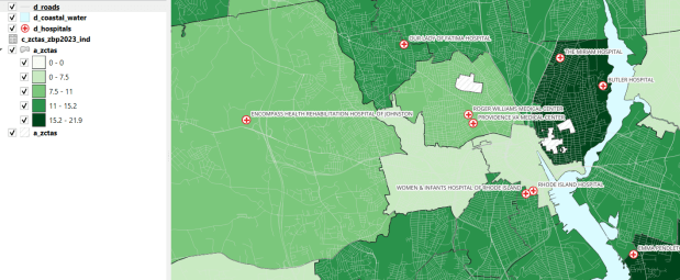
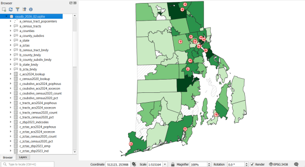
The Census TIGER files are the foundation, and we spent time creating suitably generalized base layers from them. Each layer or object is named with a prefix that categorizes and alphabetizes them in a logical order. “a” layers are areal features that represent land areas (counties, cities and towns, tracts, ZCTAs), “b” features are the actual legal boundaries for these areas (not generalized), “c” features are census data tables that can be joined to the a and b features, and “d” features consist of other points and lines (roads, water bodies, schools, hospitals, etc). The database is published in two formats: a Spatialite version for QGIS, and a file geodatabase for ArcGIS.
OSSDB Features and Sample Map in QGIS (Hospitals and the Percentage of Business Establishments that are Health Care Services by ZCTA)
Most of the features are fixed to the 2020 census and don’t change. There are two feature sets that we need to update every year. The first set are tables from the American Community Survey (ACS) and ZIP Code Business Pattern (ZBP). We’ve created tables that consist of a selection of variables that would be of broad interest to many users. We use python notebooks to download the data from the Census Bureau’s API. The ACS variable IDs and labels are stored in a spreadsheet that the script reads in, and checks it against the Census Bureau’s variable list for the demographic profile tables, to see if identifiers and labels have changed compared to the previous year. They often change, so the program flags these and we update the spreadsheet to pull the correct variables. We run the program for a specific geography, and the results are stored in a temporary database. For the ZBP data, we crosswalk and aggregate ZIP Codes to ZCTAs to create ZCTA-level data. I have separate scripts for quality control, where we check number of columns, count of rows, and any given variable to data from last year to see if there are any significant differences that could be errors, and another script for copying the data from the temporary database into the new one.
The other set of features we update are points representing schools, colleges and universities, hospitals, and public libraries. The libraries come from a federal source (IMLS PLS survey), while the others come from state sources (schools and colleges from an educational directory, and hospitals from a licensing directory). We use python to access RIDOT’s geocoding API (their parcel or point-based geocoder) to get coordinates for each feature. There’s a lot of exception handling, to deal with bad or non-matching addresses, some of which creep up every year. I store these in a JSON file; the program runs a preliminary check to see if these addresses have been corrected, and if they’re not the program uses the good address stored in the JSON. For quality control, the Detect Dataset Changes tool in the QGIS Processing toolbox allows us to see if features and attributes have changed, and we do extra work to verify the existence of records that have fallen in or out since last year.
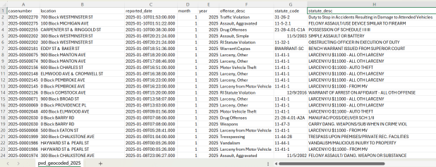
A few years ago I had an excellent undergraduate fellow in the Data Sciences program who created a process for taking all of the police case logs from the Providence Open Data Portal and creating a GIS dataset out of them. We created this dataset for three reasons: the portal contains just the last 180 days and we wanted to create a historic archive, the records did not have coordinates, and the crimes were not standardized. Geocoding was the biggest challenge, as the location information was listed as one of the following: a street intersection, a block number, or a landmark. The script identifies the type of location, and then employs a different procedure for each. Intersections were easy, as we could pass these to the RIDOT geocoder (their street-interpolation geocoder). For block numbers, the program looks at a local file that contains all addresses in the state’s 911 database, which we filter down to just the City of Providence. It finds the matching street, gets the minimum and maximum address numbers within the given block, and computes the centroid between those addresses. For landmarks like Roger Williams Park or Providence Place Mall, we have a local list of major landmarks with coordinates that the program draws from. All non-matching addresses are written to a separate file, and you have the opportunity to add additional landmarks that didn’t match and rerun them. Crimes are matched to the FBI’s uniform categories for violent and non-violent crime, and there’s also an opportunity to update the list if new incident descriptions appear in the data.
Providence Crime Incident Data
We warn users that the matches are not exact, and this needs to be kept in mind when doing any analysis; for every incident we record the match type so users can assess quality. For all of our projects, we provide detailed documentation that explains exactly how the data was created. At this point we have half the data for 2023, and everything for 2024 and 2025. We run the program a few times each year, to ensure that we capture every incident before 180 days elapses.
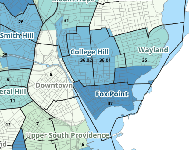
I wrote about this project when we released it last year; it is a set of relational tables for taking census data published at the tract, block group, and block level, and apportioning and aggregating it to local Providence geographies that include neighborhoods and wards (there’s also a crosswalk for ZCTAs to local geographies, but it’s rather useless as there is little correspondence). We also published a set of reference maps for showing correspondence or lack thereof between the census and local areas.
Census Tracts (black outlines) and Neighborhoods in Providence
The newest development is that one of my undergraduates used the crosswalk to generate 2020 census demographic profile summaries for neighborhoods and wards, so that users can simply download a pre-compiled set of data without having to do their own crosswalking. Population and household variables were apportioned using total population as a weight, while housing unit variables were apportioned using total housing units. He also generated percent totals for each variable, which required carefully scrutinizing what the proper numerators and denominators should be based on published census results. Python to the rescue again, he used a notebook that read the census tables in from the Ocean State Spatial Database, which saved us the trouble of using the census API. We publish the data tables in the same GitHub repository as the crosswalk.
I haven’t updated this one yet, but it’s next on the list. I wrote about this project a few years ago; this is a country-level index that documents variation in the cost of living at different UN duty stations. The UN publishes this data at different intervals throughout the year, in macro-driven Excel files that allow you to pull up data for one country at a time. The trick for this project was looping through hundreds of these files, finding the data hidden by the macro, and turning it into a single time series that includes unique identifiers for place, time, and good / service. This project was born from a research request from a PhD student, and we saw the value of building a process to keep it updated and to publish it for others to use. The scripting was done by the first undergraduate student worker I had at Brown, Ethan McIntosh. Thanks to him, I download the new data each year, run the program, and voila, new data!
Conclusion
I hope you found this summary useful, either because you can use these datasets, or you can learn something from one of our scripts and processes that you can apply to your own work. I hope that more academic libraries will embrace the concept of being data creators, and would incorporate this work into their data service models (along with formally contributing to existing initiatives like the Data Rescue Project or the OpenStreetMap). Feel free to reach out with comments and feedback.
I recently revisited a project from a few years ago, where I needed to extract temperature and precipitation data from a raster at specific points on specific dates. I used python to iterate through the points and pull up a raster for matching attribute dates, and Rasterio to overlay the raster and extract the climate data at those points. I was working with PRISM’s daily climate rasters for the US, where each nation-wide file represented a specific variable and date, and the date was embedded in the filename. I wrote a separate program to clip the raster to my area of interest prior to processing.
This time around, I am working with global climate data from ERA5, produced by the European Centre for Medium-Range Weather Forecasts (ECMWF). I needed to extract all monthly mean temperature and total precipitation values for a series of points within a range of years. Each point also had a specific date associated with it, and I had to store the month / year in which that date fell in a dedicated column. The ERA5 data is packaged in a single GRIB file, where each observation is stored in sequential bands. So if you download two full years worth of data, band 1 would contain January of year 1, while band 24 holds December of year 2. This process was going to be a bit simpler than my previous project, with a few new things to learn.
There are multiple versions of ERA5; I was using the monthly averages but you can also get daily and hourly versions. The cell resolution was 1/4 of a degree, and the CRS is WGS 84. When downloading the data, you have the option to grab multiple variables at once, so you could combine temperature and precipitation in one raster and they’d be stored in sequence (all temperature values first, all precipitation values second). To make the process a little more predictable, I opted for two downloads and stored the variables in separate files. The download interface gives you the option to clip the global image to bounding coordinates, which is quite convenient and saves you some extra work. This project is in Sierra Leone in Africa, and I eyeballed a web map to get appropriate bounds.
I follow my standard approach, creating separate input and output folders for storing the data, and placing variables that need to be modified prior to execution at the top of the script. The point file can be a geopackage or shapefile in the WGS 84 CRS, and we specify which raster to read and mark whether it’s temperature or precipitation. The point file must have three variables: a unique ID, a label of some kind, and a date. We store the date of the first observation in the raster as a separate variable, and create a boolean variable where we specify the format of the date in the point file; standard_date is True if the date is stored as YYYY-MM-DD or False if it’s DD-MM-YYYY.
import os,csv,sys,rasterio
import numpy as np
import matplotlib.pyplot as plt
import geopandas as gpd
from rasterio.plot import show
from rasterio.crs import CRS
from datetime import datetime as dt
from datetime import date

""" VARIABLES - MUST UPDATE THESE VALUES """

# Point file, raster file, name of the variable in the raster
point_file='test_points.gpkg'
raster_file='temp_2018_2025_sl.grib'
varname='temp' # 'temp' or 'precip'

# Column names in point file that contain: unique ID, name, and date
obnum='OBS_NUM'
obname='OBS_NAME'
obdate='OBS_DATE'

 #The first period in the ERA data write as YYYY-MM
startdate='2018-01' # YYYY-MM

# True means dates in point file are YYYY-MM-DD, False means DD-MM-YYYY
standard_date=False # True or False
I wrote a function to convert the units of the raster’s temperature (Kelvin to Celsius) and precipitation (meters to millimeters) values. We establish all the paths for reading and writing files, and read the point file into a Geopandas geodataframe (see my earlier post for a basic Geopandas introduction). If the column with the unique identifier is not unique, we bail out of the program. We do likewise if the variable name is incorrect.
""" MAIN PROGRAM """

def convert_units(varname,value):
    # Convert temperature from Kelvin to Celsius
    if varname=='temp':
        newval=value-272.15
    # Convert precipitation from meters to millimeters
    elif varname=='precip':
        newval=value*1000
    else:
        newval=value
    return newval

# Estabish paths, read files
yearmonth=np.datetime64(startdate)
point_path=os.path.join('input',point_file)
raster_path=os.path.join('input',raster_file)
outfolder='output'
if not os.path.exists(outfolder):
    os.makedirs(outfolder)
point_data = gpd.read_file(point_path)

# Conditions for exiting the program
if point_data[obnum].is_unique is True:
    pass
else:
    print('\n FAIL: unique ID column in the input file contains duplicate values, cannot proceed.')
    sys.exit()

if varname in ('temp','precip'):
    pass
else:
    print('\n FAIL: variable name must be set to either "temp" or "precip"')
    sys.exit()
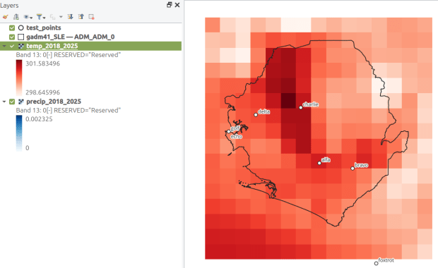
We’re going to use Rasterio to pull the climate value from the raster row and column that each point intersects. Since each band has an identical structure, we only need to find the matching row and column once, and then we can apply it for each band. We create a dictionary to hold our results, open the raster, and iterate through the points, getting the X and Y coordinates from each point and using them to look up the row and column. We add a record to our result dictionary, where the key is the unique ID of the point, and the value is another dictionary with several key / value pairs (observation name, observation date, raster row, and raster column).
# Dictionary holds results, key is unique ID from point file, value is
# another dictionary with column and observation names as keys
result_dict={}

# Identify and save the raster row and column for each point
with rasterio.open(raster_path,'r+') as raster:
    raster.crs = CRS.from_epsg(4326)
    for idx in point_data.index:
        xcoord=point_data['geometry'][idx].x
        ycoord=point_data['geometry'][idx].y
        row, col = raster.index(xcoord,ycoord)
        result_dict[point_data[obnum][idx]]={
            obname:point_data[obname][idx],
            obdate:point_data[obdate][idx],
            'RASTER_ROW':row,
            'RASTER_COL':col}
Now, we can open the raster and iterate through each band. For each band, we loop through the keys (the points) in the results dictionary and get the raster row and column number. If the row or column falls outside the raster’s bounds (i.e. the point is not in our study area), we save the year/month climate value as None. Otherwise, we obtain the climate value for that year/month (remember we hardcoded our start date at the top of the script), convert the units and save it. The year/month becomes the key with the prefix ‘YM-‘, so YM-2019-01 (this data will ultimately be stored in a table, and best practice dictates that column names should be strings and should not begin with integers). Before we move to the next band, we update our year / month value by 1 so we can proceed to the next one; Python’s timedelta function allows us to do math on dates, so if we add 1 month to 2019-12 the result is 2020-01.
# Iterate through raster bands, extract the climate value,
# store in column named for Year-Month, handle points outside the raster
with rasterio.open(raster_path,'r+') as raster:
    raster.crs = CRS.from_epsg(4326)
    for band_index in range(1, raster.count + 1):
        for k,v in result_dict.items():
            rrow=v['RASTER_ROW']
            rcol=v['RASTER_COL']
            if any ([rrow < 0, rrow >= raster.height,
                    rcol < 0, rcol >= raster.width]):
                result_dict[k]['YM-'+str(yearmonth)]=None
            else:
                climval=raster.read(band_index)[rrow,rcol]
                climval_new=round(convert_units(varname,climval.item()),4)
                result_dict[k]['YM-'+str(yearmonth)]=climval_new
        yearmonth=yearmonth+np.timedelta64(1, 'M')
The next block identifies the year/month that matches the date for each point, and saves that value in a dedicated column. We identify whether we are using a standard date or not (specified at the top of the script). If it was not standard (DD-MM-YYYY), we convert it to standard (YYYY-MM-DD). We use the datetime function to get just the year / month from the observation date, so we can look it up in our results dictionary and pull the matching value. If our observation date falls outside the range of our raster data, we record None.
# Iterate through results, find matching climate value for the
# observation date in the point file, handle dates outside the raster
for k,v in result_dict.items():
    if standard_date is False: # handles dd-mm-yyyy dates
        formatdate=dt.strptime(v[obdate].strip(),'%m/%d/%Y').date()
        numdate=np.datetime64(formatdate)
    else:
        numdate=v[obdate] # handles yyyy-mm-dd dates
    obyrmonth='YM-'+np.datetime_as_string(numdate, unit='M').item()
    if obyrmonth in v:
        matchdate=v[obyrmonth]
    else:
        matchdate=None
    result_dict[k]['MATCH_VALUE']=matchdate
Here’s a sample of the first record in the results dictionary:
{0:
{'OBS_NAME': 'alfa',
'OBS_DATE': '1/1/2019',
'RASTER_ROW': 9,
'RASTER_COL': 7,
'YM-2018-01': 28.4781,
'YM-2018-02': 29.6963,
'YM-2018-03': 28.9622,
...
'YM-2025-12': 26.6185,
'MATCH_VALUE': 28.7401},
}
The last bit writes our output. We want to use the keys in our dictionary as our header row, but they are repeated for every point and we only need them once. So we pull the first entry out of the dictionary and convert its keys to a list, and then insert the name of the observation variable as the first list element (since it doesn’t appear in our dictionary). Then we proceed to flatten our dictionary out to a list, with one record for each point. We do a quick plot of the points and the first band (just for show), and use the CSV module to write the data out. We name the output file using the variable’s name (provided at the beginning) and today’s date.
# Converts dictionary to list for output
firstkey=next(iter(result_dict))
header=list(result_dict[firstkey].keys())
header.insert(0,obnum)
result_list=[header]
for k,v in result_dict.items():
    record=[k]
    for k2, v2 in v.items():
        record.append(v2)
    result_list.append(record)

# Plot the points over the first raster that was processed to see visual
with rasterio.open(raster_path,'r+') as raster:
    raster.crs = CRS.from_epsg(4326)
    fig, ax = plt.subplots(figsize=(12,12))
    point_data.plot(ax=ax, color='black')
    show((raster,1), ax=ax)

# Output results to CSV file
today=str(date.today())
outfile=varname+'_'+today+'.csv'
outpath=os.path.join(outfolder,outfile)
with open(outpath, 'w', newline='') as writefile:
    writer=csv.writer(writefile, quoting=csv.QUOTE_MINIMAL, delimiter=',')
    writer.writerows(result_list)

count_r=len(result_list)
count_c=len(result_list[0])
print('\n Done, wrote {} rows with {} values for {} data to {}'.format(count_r,count_c,varname,outpath))
This gives us temperature; the next step would be to modify the variables at the top of the script to read in and process the precipitation raster. Geospatial python makes it super easy to automate these tasks and perform them quickly. My use of desktop GIS was limited to examining the GRIB file at the beginning so I could understand how it was structured, and creating a visualization at the end so I could verify my results (see the QGIS screenshot in the header of this post).
This project was an archival one, in that we were taking a final snapshot of what was in the repository before it went offline. In the coming year, I’ll be thinking about approaches for consistently capturing updates, and there are some folks who are interested in creating a community-driven portal to replace the defunct government site. Stay tuned!
2025 has been a tough year. Wishing you all the best for the year to come. – Frank
HIFLD Open, a key repository for accessing US GIS datasets on infrastructure, is shutting down on August 26, 2025. This is a revision from a previous announcement, which said that it would be live until at least Sept 30. The portal provided national layers for schools, power lines, flood plains, and more from one convenient location. DHS provides no sensible explanation for dismantling it, other than saying that hosting the site is no longer a priority for their mission (here’s a copy of an official announcement). In other words, “Public domain data for community preparedness, resiliency, research, and more” is no longer a DHS priority.
The 300 plus datasets in Open HIFLD are largely created and hosted by other agencies, and Open HIFLD was aggregating different feeds into one portal. So, much of the data will still be accessible from the original sources. It will just be harder to find.
DHS has published a crosswalk with links to alternative portals and the source feeds for each dataset, so you can access most of the data once Open HIFLD goes offline. I’ve saved a copy here, in case it also disappears. Most of these sources use ESRI REST APIs. Using ArcGIS Online or Pro, and even QGIS (for example), you can connect to these feeds, get a listing in your contents pane, and drag and drop layers into a project (many of the layers are also available via ArcGIS Online or the Living Atlas if you’re using Arc). Once you’ve added a layer to a project, you can export and save local copies.
Adding ArcGIS Rest Server for US Army Corps of Engineers Data in QGIS
If you want to download copies directly from Open HIFLD before it vanishes on Aug 26, I’ve created this spreadsheet with direct links to download pages, and to metadata records when available (some datasets don’t have metadata, and the links will bring you to an empty placeholder). Some datasets have multiple layers, and you’ll need to click on each one in a list to get to it’s download page. In some cases there won’t be a direct download link, and you’ll need to go to the source (a useful exercise, as you’ll need to remember where it is in the future). Alternatively, you can connect to the REST server (before Aug 26, 2025) in QGIS or ArcGIS, drag and drop the layers you want, and then export:
I’m coordinating with the Data Rescue Project, and we’re working on downloading copies of everything on Open HIFLD and hosting it elsewhere. I’ll provide an update once this work is complete. Even though most of these datasets will still be available from the original sources, better safe than sorry. There’s no telling what could disappear tomorrow.
The secure HIFLD site for registered users will remain available, but many of the open layers aren’t being migrated there (see the crosswalk for details). The secure site is available to DHS partners, and there are restrictions on who can get an account. It’s not exactly clear what they are, but it seems unlikely that most Open users will be eligible: “These instructions [for accessing a secure account] are for non-DHS users who support a homeland security or homeland defense mission AND whose role requires access to the Geospatial Information Infrastructure (GII) and/or any geospatial dashboards, data, or tools housed on the GII…“
It’s been awhile since I’ve written a post that showcases different GIS datasets. So in this one, I’ll provide an overview of some free and open data sources that I’ve learned about and worked with this past spring semester. The topics in these series include: global land use and land cover, US heat and temperature, detailed population data for India, and public health in low and middle income countries.
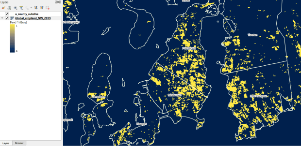
The GLAD lab at the Department of Geographical Sciences at the University of Maryland produces over a dozen GIS datasets related to global land use, land cover, and change in land surface over time. Last semester I had folks who were interested in looking at recent global change in cropland and forest. GLAD publishes rasters that include point-in-time coverage, period averages, and net change and loss over the period 2000 to 2020. Much of the data is generated from LANDSAT, and resolution varies from 30m to 3km. Other series include tropical forest cover and change, tree canopies, forest lost due to fires, a few non-global datasets that focus on specific regions, and LANDSAT imagery that’s been processed so it’s ready for LULC analysis.
Most of the sets have been divided up into tiles and segmented based on what they’re depicting (change in crops, forest, etc). The download process is basic point and click, and for larger sets they provide a list of tifs in a text file so you can automate downloading by writing a basic script. Alternatively, they also publish datasets via Google Earth Engine.
GLAD Cropland Extent in 2019 in QGIS, Zoomed in to Optimal Resolution in SE Rhode Island
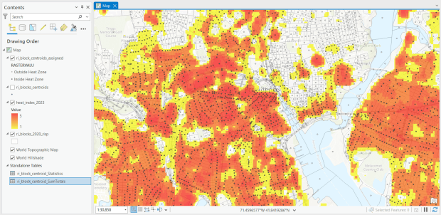
For the past few years, the Trust for Public Land has published an annual heat severity index. This layer represents the relative heat severity for 30m pixels for every city in the United States; depicting where areas of cities are hotter than the average temperature for that same city as a whole (i.e. the surface temperature for each pixel relative to the general air temperature reading for the entire city). Severity is measured on a scale of 1 to 5, with 1 being a relatively mild and 5 being severe heat. The index is generated from a Heat Anomalies raster which they also provide; it contains the relative degrees Fahrenheit difference between any given pixel and the mean heat value for the city in which the pixel is located. Both datasets are generated from 30-meter Landsat 8 imagery, band 10 (ground-level thermal sensor) from summertime images.
The dataset is published as an ArcGIS image service. The easiest way to access it is by to adding it from the Living Atlas to ArcGIS Pro (or Online), and then export the service from there as a raster feature class (while doing so, you can also clip the layer to a smaller area of interest). It’s possible that you can also connect to it as an ArcGIS REST Server in QGIS, but I haven’t tried. While there are files that go back to 2019, the methodology has changed over time, so studying this as a national, annual time series is not appropriate. The coverage area expanded from just large, incorporated cities in earlier years to the entire US in recent years.
US Heat Severity Index 2023 in ArcGIS Pro, Providence and Adjacent Areas with Census Blocks
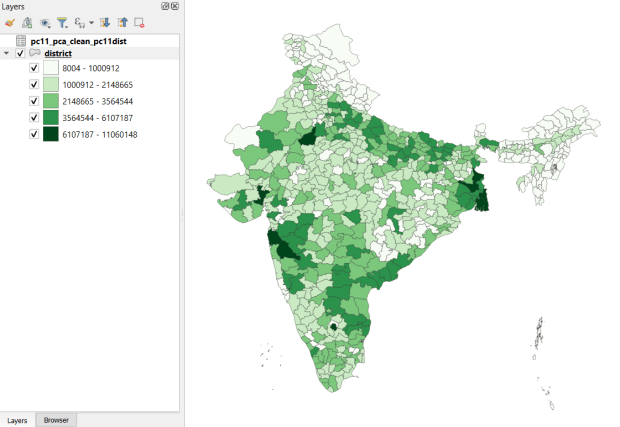
Created and hosted by the Development Data Lab (a collaborative project created by academic researchers from several universities), the Socioeconomic High-resolution Rural-Urban Geographic Platform for India (SHRUG) is an open access repository consisting of datasets for India’s medium to small geographies (districts, subdistricts, constituencies, towns, and villages), linked together with a set of common geographic IDs. Getting geographically detailed census data for India is challenging as you have to purchase it through 3rd party vendors, and comparing data across time is tough given the complex sets of administrative subdivisions and constant revisions to geographic identifiers. SHRUG makes it easy and open source, providing boundaries from the 2011 census and a unique ID that links geographies together and across time, back to 1991. In addition to the census, there are also environmental and election datasets.
Polygon boundaries can be downloaded as shapefiles or geopackages, and tabular data is available in CSV and DTA (STATA) formats. Researchers can also contribute data created from their own research to the repository.
SHRUG India Districts Total Population Data from 2011 Census in QGIS
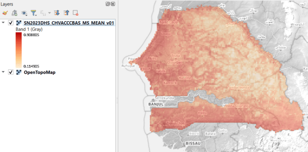
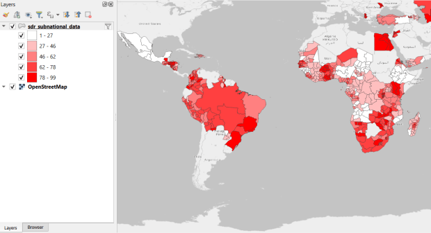
USAID published the detailed Demographic and Health Surveys (DHS) as far back as the mid 1980s for many of the world’s low and middle income countries. The surveys captured information about fertility, family planning, maternal and child health, gender, HIV/AIDS, literacy, malaria, nutrition, and sanitation. A selection of different countries were surveyed each year, and for most countries data was captured at two or three different points in time over a 40 year period. While researchers had to submit proposals and request access to the microdata (individual person and household level responses), the agency generated population-level estimates for countries and country subdivisions that were readily downloadable. They also generated rasters that interpolated certain variables across the surface of a country (the header image for this post is a raster of Senegal in 2023, illustrating the percentage of children aged 12-36 months who are vaccinated for eight fundamental diseases, including measles and polio). The rasters, boundary files, and a selection of survey indicators pre-joined to country and subdivision boundaries were published in their Spatial Data Repository. You could access the full range of population indicators as tables from a point and click website, or alternatively via API.
I’m writing in the past tense, as USAID has been decimated and de-funded by DOGE. There is currently no way to request access to the microdata. The summary data is still available on the USAID website (via links in the previous paragraph), but who knows for how long. As part of the Data Rescue Project, I captured both the Spatial Data Repository and the Indicators data, and posted them on DataLumos, an archive of archived federal government datasets. You can download these datasets in bulk from DataLumos, from the links under the title for this section. Unfortunately this series is now an archive of data that will be frozen in time, with no updates expected. The loss of these surveys is not only detrimental to researchers and policymakers, but to millions of the world’s most vulnerable people, whose health and well-being were secured and improved thanks to the information this data provided.
USAID Country Subdivisions in QGIS where Recent Data is Available on % Children who are Vaccinated


You must be logged in to post a comment.