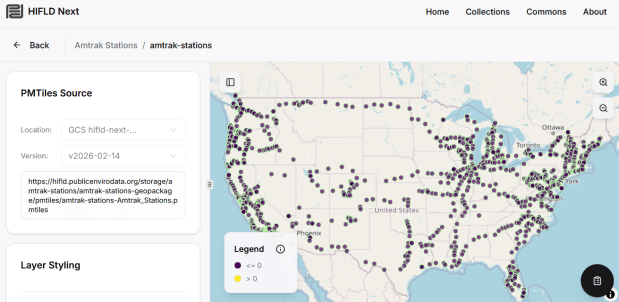
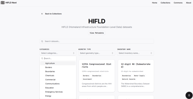
The Public Environmental Data Partners and Fulton Ring have launched a new community-shaped hub for finding, previewing and downloading GIS data collections, and its debut HIFLD Next collection is built on this rescued dataset. The portal increases the accessibility of the HIFLD Open data, with enhanced options for searching, previewing attribute tables and layers, and downloading or streaming data in a number of different formats. Beyond publishing a website, the group is hoping to build a community of practitioners around this project to support and sustain it, and to provide updated datasets and additional collections in the future.
They are keen to solicit feedback from GIS data users, and particularly from librarians and data specialists who provide active user support and who would potentially refer to the portal as a source. After you’ve explored the portal, feel free to submit feedback via their survey.
While spending February buried under snow here in Providence, I took the opportunity to update several of the data products we create here at GeoData@SciLi. I’ll provide a summary of what we’re working on in this post. The heading for each project links to its GitHub repo, where you can access the datasets and the scripts we wrote for creating them.
My overall vision has always been that library data services should go beyond simply finding public data and purchasing data for students and faculty; we should actively engage in creating value-added products to meet the research and teaching needs of the university. With a dedication to open data, we also contribute to building a data infrastructure that benefits our local communities, and researchers around world. Creating our own projects keeps our technical skills sharp, gives us more in-depth knowledge about working with particular datasets, and exposes us to the practical processing problems our users face, which makes us better at understanding these issues and thus better able to serve them. To ensure that we can maintain and update our datasets, we automate and script as many of our processes as much as possible. The goal is not to build products, but to build processes to create products.
This is our signature product, a geodatabase of basic Rhode Island GIS and tabular data that folks can use as a foundation for building local projects. The idea is to save mappers the trouble of reinventing the wheel every time they want to do state-based research. I’ve honed this idea over a long period of time; as an graduate student at UW twenty years ago I was creating census databases for the Seattle metropolitan area that we published in WAGDA. I expanded this concept at CUNY, where we created and updated the NYC Geodatabase for many years, which included all forms of mass transit data (which wasn’t readily available at the time). For the Rhode Island version, I pivoted to include layers and attributes that would be of interest at a state-level, and was able to re-use many of the scripts and processes I built previously.
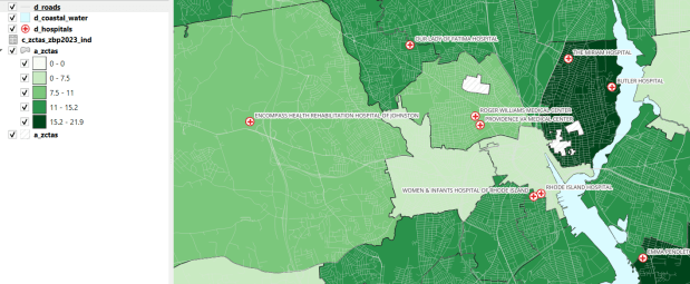
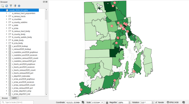
The Census TIGER files are the foundation, and we spent time creating suitably generalized base layers from them. Each layer or object is named with a prefix that categorizes and alphabetizes them in a logical order. “a” layers are areal features that represent land areas (counties, cities and towns, tracts, ZCTAs), “b” features are the actual legal boundaries for these areas (not generalized), “c” features are census data tables that can be joined to the a and b features, and “d” features consist of other points and lines (roads, water bodies, schools, hospitals, etc). The database is published in two formats: a Spatialite version for QGIS, and a file geodatabase for ArcGIS.
OSSDB Features and Sample Map in QGIS (Hospitals and the Percentage of Business Establishments that are Health Care Services by ZCTA)
Most of the features are fixed to the 2020 census and don’t change. There are two feature sets that we need to update every year. The first set are tables from the American Community Survey (ACS) and ZIP Code Business Pattern (ZBP). We’ve created tables that consist of a selection of variables that would be of broad interest to many users. We use python notebooks to download the data from the Census Bureau’s API. The ACS variable IDs and labels are stored in a spreadsheet that the script reads in, and checks it against the Census Bureau’s variable list for the demographic profile tables, to see if identifiers and labels have changed compared to the previous year. They often change, so the program flags these and we update the spreadsheet to pull the correct variables. We run the program for a specific geography, and the results are stored in a temporary database. For the ZBP data, we crosswalk and aggregate ZIP Codes to ZCTAs to create ZCTA-level data. I have separate scripts for quality control, where we check number of columns, count of rows, and any given variable to data from last year to see if there are any significant differences that could be errors, and another script for copying the data from the temporary database into the new one.
The other set of features we update are points representing schools, colleges and universities, hospitals, and public libraries. The libraries come from a federal source (IMLS PLS survey), while the others come from state sources (schools and colleges from an educational directory, and hospitals from a licensing directory). We use python to access RIDOT’s geocoding API (their parcel or point-based geocoder) to get coordinates for each feature. There’s a lot of exception handling, to deal with bad or non-matching addresses, some of which creep up every year. I store these in a JSON file; the program runs a preliminary check to see if these addresses have been corrected, and if they’re not the program uses the good address stored in the JSON. For quality control, the Detect Dataset Changes tool in the QGIS Processing toolbox allows us to see if features and attributes have changed, and we do extra work to verify the existence of records that have fallen in or out since last year.
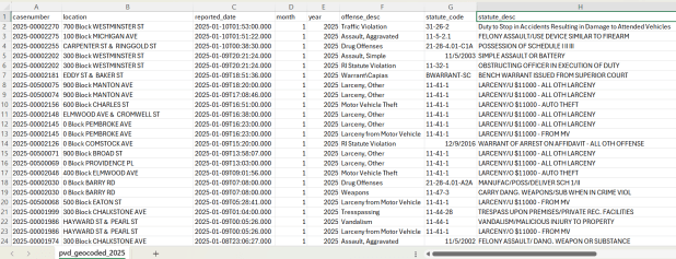
A few years ago I had an excellent undergraduate fellow in the Data Sciences program who created a process for taking all of the police case logs from the Providence Open Data Portal and creating a GIS dataset out of them. We created this dataset for three reasons: the portal contains just the last 180 days and we wanted to create a historic archive, the records did not have coordinates, and the crimes were not standardized. Geocoding was the biggest challenge, as the location information was listed as one of the following: a street intersection, a block number, or a landmark. The script identifies the type of location, and then employs a different procedure for each. Intersections were easy, as we could pass these to the RIDOT geocoder (their street-interpolation geocoder). For block numbers, the program looks at a local file that contains all addresses in the state’s 911 database, which we filter down to just the City of Providence. It finds the matching street, gets the minimum and maximum address numbers within the given block, and computes the centroid between those addresses. For landmarks like Roger Williams Park or Providence Place Mall, we have a local list of major landmarks with coordinates that the program draws from. All non-matching addresses are written to a separate file, and you have the opportunity to add additional landmarks that didn’t match and rerun them. Crimes are matched to the FBI’s uniform categories for violent and non-violent crime, and there’s also an opportunity to update the list if new incident descriptions appear in the data.
Providence Crime Incident Data
We warn users that the matches are not exact, and this needs to be kept in mind when doing any analysis; for every incident we record the match type so users can assess quality. For all of our projects, we provide detailed documentation that explains exactly how the data was created. At this point we have half the data for 2023, and everything for 2024 and 2025. We run the program a few times each year, to ensure that we capture every incident before 180 days elapses.
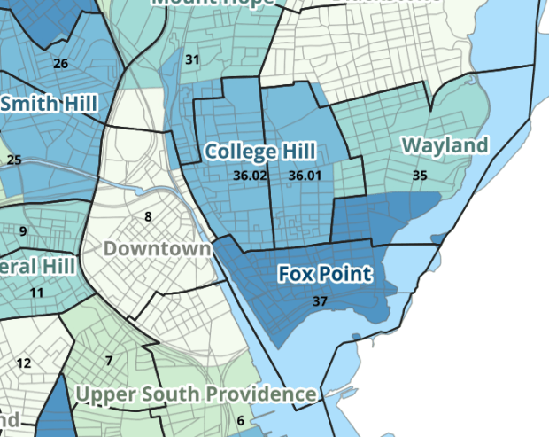
I wrote about this project when we released it last year; it is a set of relational tables for taking census data published at the tract, block group, and block level, and apportioning and aggregating it to local Providence geographies that include neighborhoods and wards (there’s also a crosswalk for ZCTAs to local geographies, but it’s rather useless as there is little correspondence). We also published a set of reference maps for showing correspondence or lack thereof between the census and local areas.
Census Tracts (black outlines) and Neighborhoods in Providence
The newest development is that one of my undergraduates used the crosswalk to generate 2020 census demographic profile summaries for neighborhoods and wards, so that users can simply download a pre-compiled set of data without having to do their own crosswalking. Population and household variables were apportioned using total population as a weight, while housing unit variables were apportioned using total housing units. He also generated percent totals for each variable, which required carefully scrutinizing what the proper numerators and denominators should be based on published census results. Python to the rescue again, he used a notebook that read the census tables in from the Ocean State Spatial Database, which saved us the trouble of using the census API. We publish the data tables in the same GitHub repository as the crosswalk.
I haven’t updated this one yet, but it’s next on the list. I wrote about this project a few years ago; this is a country-level index that documents variation in the cost of living at different UN duty stations. The UN publishes this data at different intervals throughout the year, in macro-driven Excel files that allow you to pull up data for one country at a time. The trick for this project was looping through hundreds of these files, finding the data hidden by the macro, and turning it into a single time series that includes unique identifiers for place, time, and good / service. This project was born from a research request from a PhD student, and we saw the value of building a process to keep it updated and to publish it for others to use. The scripting was done by the first undergraduate student worker I had at Brown, Ethan McIntosh. Thanks to him, I download the new data each year, run the program, and voila, new data!
Conclusion
I hope you found this summary useful, either because you can use these datasets, or you can learn something from one of our scripts and processes that you can apply to your own work. I hope that more academic libraries will embrace the concept of being data creators, and would incorporate this work into their data service models (along with formally contributing to existing initiatives like the Data Rescue Project or the OpenStreetMap). Feel free to reach out with comments and feedback.
I recently revisited a project from a few years ago, where I needed to extract temperature and precipitation data from a raster at specific points on specific dates. I used python to iterate through the points and pull up a raster for matching attribute dates, and Rasterio to overlay the raster and extract the climate data at those points. I was working with PRISM’s daily climate rasters for the US, where each nation-wide file represented a specific variable and date, and the date was embedded in the filename. I wrote a separate program to clip the raster to my area of interest prior to processing.
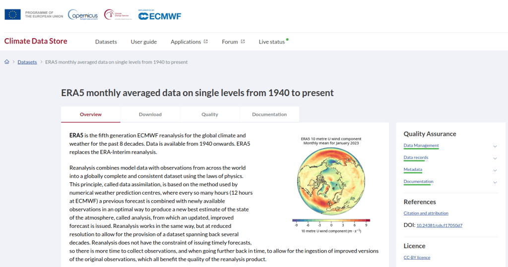
This time around, I am working with global climate data from ERA5, produced by the European Centre for Medium-Range Weather Forecasts (ECMWF). I needed to extract all monthly mean temperature and total precipitation values for a series of points within a range of years. Each point also had a specific date associated with it, and I had to store the month / year in which that date fell in a dedicated column. The ERA5 data is packaged in a single GRIB file, where each observation is stored in sequential bands. So if you download two full years worth of data, band 1 would contain January of year 1, while band 24 holds December of year 2. This process was going to be a bit simpler than my previous project, with a few new things to learn.
There are multiple versions of ERA5; I was using the monthly averages but you can also get daily and hourly versions. The cell resolution was 1/4 of a degree, and the CRS is WGS 84. When downloading the data, you have the option to grab multiple variables at once, so you could combine temperature and precipitation in one raster and they’d be stored in sequence (all temperature values first, all precipitation values second). To make the process a little more predictable, I opted for two downloads and stored the variables in separate files. The download interface gives you the option to clip the global image to bounding coordinates, which is quite convenient and saves you some extra work. This project is in Sierra Leone in Africa, and I eyeballed a web map to get appropriate bounds.
I follow my standard approach, creating separate input and output folders for storing the data, and placing variables that need to be modified prior to execution at the top of the script. The point file can be a geopackage or shapefile in the WGS 84 CRS, and we specify which raster to read and mark whether it’s temperature or precipitation. The point file must have three variables: a unique ID, a label of some kind, and a date. We store the date of the first observation in the raster as a separate variable, and create a boolean variable where we specify the format of the date in the point file; standard_date is True if the date is stored as YYYY-MM-DD or False if it’s DD-MM-YYYY.
import os,csv,sys,rasterio
import numpy as np
import matplotlib.pyplot as plt
import geopandas as gpd
from rasterio.plot import show
from rasterio.crs import CRS
from datetime import datetime as dt
from datetime import date

""" VARIABLES - MUST UPDATE THESE VALUES """

# Point file, raster file, name of the variable in the raster
point_file='test_points.gpkg'
raster_file='temp_2018_2025_sl.grib'
varname='temp' # 'temp' or 'precip'

# Column names in point file that contain: unique ID, name, and date
obnum='OBS_NUM'
obname='OBS_NAME'
obdate='OBS_DATE'

 #The first period in the ERA data write as YYYY-MM
startdate='2018-01' # YYYY-MM

# True means dates in point file are YYYY-MM-DD, False means DD-MM-YYYY
standard_date=False # True or False
I wrote a function to convert the units of the raster’s temperature (Kelvin to Celsius) and precipitation (meters to millimeters) values. We establish all the paths for reading and writing files, and read the point file into a Geopandas geodataframe (see my earlier post for a basic Geopandas introduction). If the column with the unique identifier is not unique, we bail out of the program. We do likewise if the variable name is incorrect.
""" MAIN PROGRAM """

def convert_units(varname,value):
    # Convert temperature from Kelvin to Celsius
    if varname=='temp':
        newval=value-272.15
    # Convert precipitation from meters to millimeters
    elif varname=='precip':
        newval=value*1000
    else:
        newval=value
    return newval

# Estabish paths, read files
yearmonth=np.datetime64(startdate)
point_path=os.path.join('input',point_file)
raster_path=os.path.join('input',raster_file)
outfolder='output'
if not os.path.exists(outfolder):
    os.makedirs(outfolder)
point_data = gpd.read_file(point_path)

# Conditions for exiting the program
if point_data[obnum].is_unique is True:
    pass
else:
    print('\n FAIL: unique ID column in the input file contains duplicate values, cannot proceed.')
    sys.exit()

if varname in ('temp','precip'):
    pass
else:
    print('\n FAIL: variable name must be set to either "temp" or "precip"')
    sys.exit()
We’re going to use Rasterio to pull the climate value from the raster row and column that each point intersects. Since each band has an identical structure, we only need to find the matching row and column once, and then we can apply it for each band. We create a dictionary to hold our results, open the raster, and iterate through the points, getting the X and Y coordinates from each point and using them to look up the row and column. We add a record to our result dictionary, where the key is the unique ID of the point, and the value is another dictionary with several key / value pairs (observation name, observation date, raster row, and raster column).
# Dictionary holds results, key is unique ID from point file, value is
# another dictionary with column and observation names as keys
result_dict={}

# Identify and save the raster row and column for each point
with rasterio.open(raster_path,'r+') as raster:
    raster.crs = CRS.from_epsg(4326)
    for idx in point_data.index:
        xcoord=point_data['geometry'][idx].x
        ycoord=point_data['geometry'][idx].y
        row, col = raster.index(xcoord,ycoord)
        result_dict[point_data[obnum][idx]]={
            obname:point_data[obname][idx],
            obdate:point_data[obdate][idx],
            'RASTER_ROW':row,
            'RASTER_COL':col}
Now, we can open the raster and iterate through each band. For each band, we loop through the keys (the points) in the results dictionary and get the raster row and column number. If the row or column falls outside the raster’s bounds (i.e. the point is not in our study area), we save the year/month climate value as None. Otherwise, we obtain the climate value for that year/month (remember we hardcoded our start date at the top of the script), convert the units and save it. The year/month becomes the key with the prefix ‘YM-‘, so YM-2019-01 (this data will ultimately be stored in a table, and best practice dictates that column names should be strings and should not begin with integers). Before we move to the next band, we update our year / month value by 1 so we can proceed to the next one; Python’s timedelta function allows us to do math on dates, so if we add 1 month to 2019-12 the result is 2020-01.
# Iterate through raster bands, extract the climate value,
# store in column named for Year-Month, handle points outside the raster
with rasterio.open(raster_path,'r+') as raster:
    raster.crs = CRS.from_epsg(4326)
    for band_index in range(1, raster.count + 1):
        for k,v in result_dict.items():
            rrow=v['RASTER_ROW']
            rcol=v['RASTER_COL']
            if any ([rrow < 0, rrow >= raster.height,
                    rcol < 0, rcol >= raster.width]):
                result_dict[k]['YM-'+str(yearmonth)]=None
            else:
                climval=raster.read(band_index)[rrow,rcol]
                climval_new=round(convert_units(varname,climval.item()),4)
                result_dict[k]['YM-'+str(yearmonth)]=climval_new
        yearmonth=yearmonth+np.timedelta64(1, 'M')
The next block identifies the year/month that matches the date for each point, and saves that value in a dedicated column. We identify whether we are using a standard date or not (specified at the top of the script). If it was not standard (DD-MM-YYYY), we convert it to standard (YYYY-MM-DD). We use the datetime function to get just the year / month from the observation date, so we can look it up in our results dictionary and pull the matching value. If our observation date falls outside the range of our raster data, we record None.
# Iterate through results, find matching climate value for the
# observation date in the point file, handle dates outside the raster
for k,v in result_dict.items():
    if standard_date is False: # handles dd-mm-yyyy dates
        formatdate=dt.strptime(v[obdate].strip(),'%m/%d/%Y').date()
        numdate=np.datetime64(formatdate)
    else:
        numdate=v[obdate] # handles yyyy-mm-dd dates
    obyrmonth='YM-'+np.datetime_as_string(numdate, unit='M').item()
    if obyrmonth in v:
        matchdate=v[obyrmonth]
    else:
        matchdate=None
    result_dict[k]['MATCH_VALUE']=matchdate
Here’s a sample of the first record in the results dictionary:
{0:
{'OBS_NAME': 'alfa',
'OBS_DATE': '1/1/2019',
'RASTER_ROW': 9,
'RASTER_COL': 7,
'YM-2018-01': 28.4781,
'YM-2018-02': 29.6963,
'YM-2018-03': 28.9622,
...
'YM-2025-12': 26.6185,
'MATCH_VALUE': 28.7401},
}
The last bit writes our output. We want to use the keys in our dictionary as our header row, but they are repeated for every point and we only need them once. So we pull the first entry out of the dictionary and convert its keys to a list, and then insert the name of the observation variable as the first list element (since it doesn’t appear in our dictionary). Then we proceed to flatten our dictionary out to a list, with one record for each point. We do a quick plot of the points and the first band (just for show), and use the CSV module to write the data out. We name the output file using the variable’s name (provided at the beginning) and today’s date.
# Converts dictionary to list for output
firstkey=next(iter(result_dict))
header=list(result_dict[firstkey].keys())
header.insert(0,obnum)
result_list=[header]
for k,v in result_dict.items():
    record=[k]
    for k2, v2 in v.items():
        record.append(v2)
    result_list.append(record)

# Plot the points over the first raster that was processed to see visual
with rasterio.open(raster_path,'r+') as raster:
    raster.crs = CRS.from_epsg(4326)
    fig, ax = plt.subplots(figsize=(12,12))
    point_data.plot(ax=ax, color='black')
    show((raster,1), ax=ax)

# Output results to CSV file
today=str(date.today())
outfile=varname+'_'+today+'.csv'
outpath=os.path.join(outfolder,outfile)
with open(outpath, 'w', newline='') as writefile:
    writer=csv.writer(writefile, quoting=csv.QUOTE_MINIMAL, delimiter=',')
    writer.writerows(result_list)

count_r=len(result_list)
count_c=len(result_list[0])
print('\n Done, wrote {} rows with {} values for {} data to {}'.format(count_r,count_c,varname,outpath))
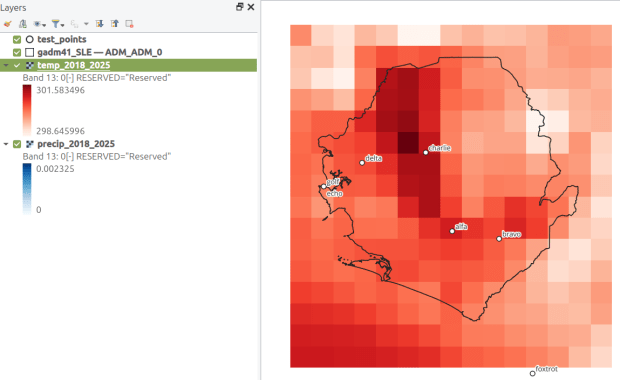
This gives us temperature; the next step would be to modify the variables at the top of the script to read in and process the precipitation raster. Geospatial python makes it super easy to automate these tasks and perform them quickly. My use of desktop GIS was limited to examining the GRIB file at the beginning so I could understand how it was structured, and creating a visualization at the end so I could verify my results (see the QGIS screenshot in the header of this post).
This project was an archival one, in that we were taking a final snapshot of what was in the repository before it went offline. In the coming year, I’ll be thinking about approaches for consistently capturing updates, and there are some folks who are interested in creating a community-driven portal to replace the defunct government site. Stay tuned!
2025 has been a tough year. Wishing you all the best for the year to come. – Frank
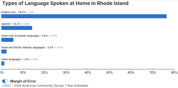
I visit courses to guest lecture on census data every semester, and one of the primary topics is immigrant or ethnic communities in the US. There are many different variables in the Census Bureau’s American Community Survey (ACS) that can be used to study different groups: Race, Hispanic or Latino Origin, Ancestry, Place of Birth, and Residency. Each category captures different aspects of identity, and many of these variables are cross-tabulated with others such as citizenship status, education, language, and income. It can be challenging to pull statistics together on ethnic groups, given the different questions the data are drawn from, and the varying degrees of what’s available for one group versus another.
But you learn something new every day. This week, while helping a student I stumbled across summary table S0201, which is the Selected Population Profile table. It is designed to provide summary overviews of specific race, Hispanic origin, ancestry, and place of birth subgroups. It’s published as part of the 1-year ACS, for large geographic areas that have at least 500,000 people (states, metropolitan areas, large counties, big cities), and where the size of the specific population group is at least 65,000. The table includes a broad selection of social, economic, and demographic statistics for each particular group.
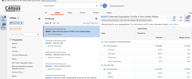
We discovered these tables by typing in the name of a group (Cuban, Nigerian, or Polish for example) in the search box for data.census.gov. Table S0201 appeared at the top of the table results, and clicking on it opened the summary table for the group for the entire US for the most recent 1-year dataset (2024 at the time I’m writing this). The name of the group appears in the header row of the table. Clicking on the dataset name and year in the grey box at the top of the table allows you to select previous years.
Selected Population Profile for Dominicans in the US
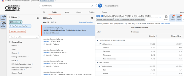
Using the Filters on the left, you can narrow the data down to a specific geography and year. You may get no results if either the geographic area or the ethnic or racial group is too small. Besides table S0201, additional detailed tables appear for a few, isolated years (the most recent being 2021).
Selected Population Profile for Dominicans in NYC
A more formal approach, which is better for seeing and understanding the full set of possibilities for ethnic groups and their data availability:
At data.census.gov, search for S0201, and select that table. You’ll get the totals for the entire US.
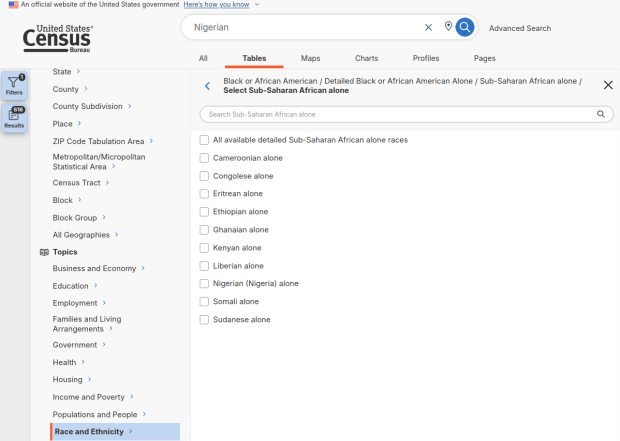
Using the filters on the left, choose Race and Ethnicity – then a racial or ethnic group – then a detailed race or group – then specific categories until you reach a final menu. This gives you the US-wide table for that group (if available).
Alternatively – you could choose Populations and People – Ancestry instead of Race to filter for certain groups. See my explanation below.
Use the filters again to select a specific geographic area (if available) and years.
With either approach, once you have your table, click the More Tools button (…) and download the data. Alternatively, like all of the ACS tables S0201 can be accessed via the Census Bureau’s API.
Filter Menu for Race and Ethnicity – Detailed Options
Where does this data come from? It can be generated from several questions on the ACS survey: Hispanic and Race (respectively, with respondents self-identifying a category), Place of Birth (specifically captures first-generation immigrants), and Ancestry (an open ended question about who your ancestors were).
The documentation I found provided just a cursory overview. I discovered additional information that describes recent changes in the race and ancestry questions. Persons identifying as Native American, Asian, or Pacific Islander as a race, or as Hispanic as an ethnicity, have long been able to check or write in a specific ethnic, national, or tribal group (Chinese, Japanese, Cuban, Mexican, Samoan, Apache, etc). People who identified as Black or White did not have this option until the 2020 census, and it looks like the ACS is now catching up with this. This page links to a document that provides an overview of the overlap between race and ancestry in different ACS tables.
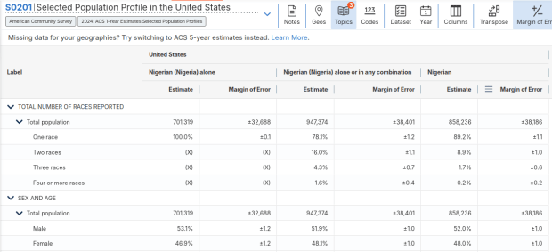
The final paragraph in that document describes table S0201, which I’ll quote here in full:
Table S0201 is iterated by both race and ancestry groups. Group names containing the words “alone” or “alone or in any combination” are based on race data, while group names without “alone” or “alone or in any combination” are based on ancestry data. For example, “German alone or in any combination” refers to people who reported one or more responses to the race question such as only German or German and Austrian. “German” (without any further text in the group name) refers to people who reported German in response to the ancestry question.
For example, when I used my first approach and simply searched for Nigerians as a group, the name appeared in the 2024 ACS table simply as Nigerian. This indicates that the data was drawn from the ancestry question. I was also able to flip back to earlier years. But in my second approach, when I searched for the table by its ID number and subsequently chose a racial group, the name appeared as Nigerian (Nigeria) alone, which means the data came from the race table. I couldn’t flip back to earlier periods, as Nigerian wasn’t captured in the race question prior to 2024.
Consider the screenshot below to evaluate the differences. Nigerian alone indicates people who chose just one race (Black) and wrote in Nigerian under their race. Nigerian alone or in any combination indicates any person who wrote Nigerian as a race, could be Black and Nigerian, or Black and White and Nigerian, etc. Finally, Nigerian refers to the ancestry question, where people are asked to identify who their ancestors are, regardless of whether they or their parents have a direct connection to the given place where that group originates.
Comparison of Race alone, Race Alone or in Combination, and Ancestry for Nigerians
Here’s where it gets confusing. If you search for the S0201 table first, and then try filtering by ancestry, the only options that appear are for ethnic or national groups that would traditionally be considered as Black or White within a US context. Places in Europe, Africa, the Middle East, and Central Asia, as well as parts of the world that were initially colonized by these populations (the non-Spanish Caribbean, Australia, Canada, etc). Options for Asians (south, southeast, and east Asia), Pacific Islanders, Native Americans, and any person who identifies as Hispanic or Latino do not appear as ancestry options, as the data for these groups is pulled from elsewhere. So when I tried searching for Chinese, Chinese alone appears in the table, as this data is drawn from the race table. When I searched for Dominican, the term Dominican appears in the table… Hispanic or Latino is not a race, but a separate ethnic category, and Dominican may identify a person of any race who also identifies as Hispanic. This data comes from the Hispanic / Latino origin table.
My interpretation is that data for Table S0201 is drawn from:
The ancestry table (prior to 2024), and either the race or ancestry table (from 2024 forward), for any group that is Black or White within the US context.
The race table for any group that is Asian, Pacific Islander, or Native American (although for smaller groups, ancestry may have been used prior to 2022 or 2023).
The Hispanic / Latino origin table for any group that is of Hispanic ethnicity, regardless of their race.
Place of birth isn’t used for defining groups, but appears as a set of variables within the table so you can identify how many people in the group are first-generation immigrants who were born abroad.
That’s my best guess, based on the available documentation and my interpretation of the estimates as they appear for different groups in this table. I did some traditional web searching, and then also tried asking ChatGPT. After pressing it to answer my question rather than just returning links to the Census Bureau’s standard documentation, it did provide a detailed explanation for the table’s sources. But when I prompted it to provide me with links to documentation from which its explanation was sourced, it froze and did nothing. So much for AI.
Despite this complexity, the Selected Population Profile tables are incredibly useful for obtaining summary statistics for different ethnic groups, and was perfect for the introductory sociology class I visited that was studying immigration and ancestry. Just bear in mind that the availability of S0201 is limited by size of the geographic area as a whole, and the size of the group within that area.
Just when we thought the US government couldn’t possibly become more dysfunctional, it shut down completely on Sept 30, 2025. Government websites are not being updated, and many have gone offline. I’ve had trouble accessing data.census.gov; access has been intermittent, and sometimes it has worked with some web browsers but not with others.
In this post I’ll summarize some solid, alternative portals for accessing US census data. I’ve sorted the free resources from the simplest and most basic to the most exhaustive and complex, and I mention a couple of commercial sources at the end. These are websites; the Census Bureau’s API is still working (for now), so if you are using scripts that access its API or use R packages like tidycensus you should still be in business.
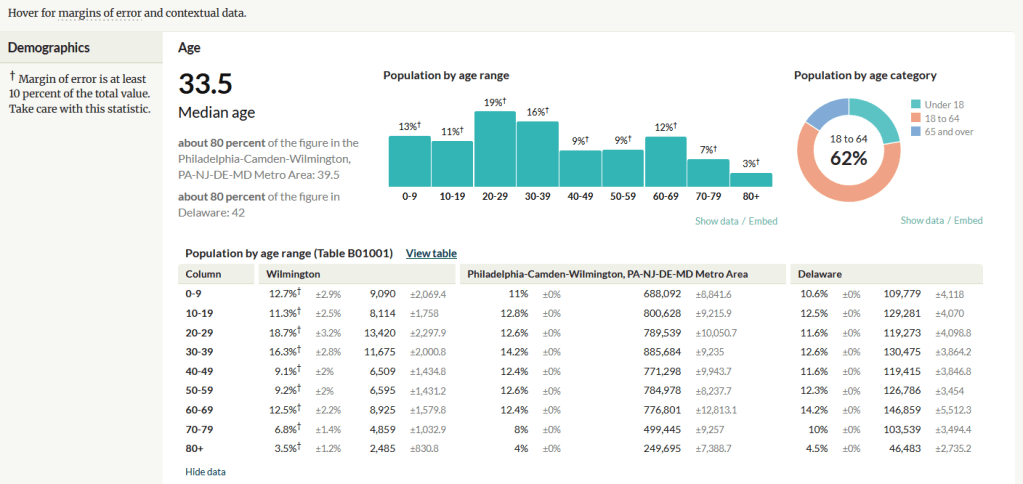
A non-profit project originally created by journalists, the Census Reporter provides just the most recent ACS data, making it easy to access the latest statistics. Search for a place to get a broad profile with interactive summaries and charts, or search for a topic to download specific tables that include records for all geographies of a particular type, within a specific place. There are also basic mapping capabilities.
Census Reporter Showing ACS Data for Wilmington, DE
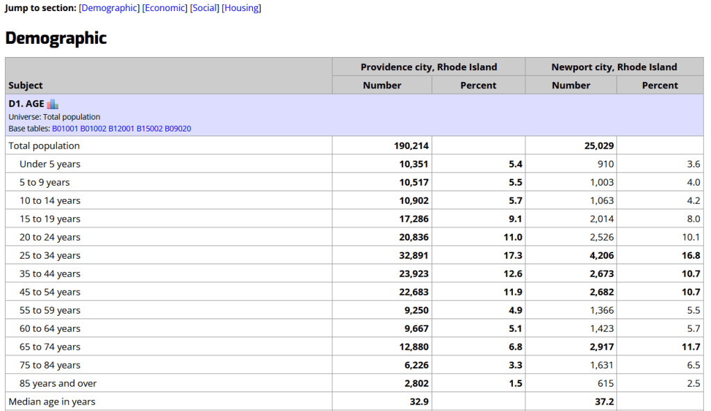
Missouri Census Data Center Profiles and Trends https://mcdc.missouri.edu/ Focus: data from the ACS and decennial profile tables for the entire US
The Census Bureau publishes four profile tables for the ACS and one for the decennial census that are designed to capture a wide selection of variables that are of broad interest to most researchers. The MCDC makes these readily available through a simple interface where you select the time period, summary level, and up to four places to compare in one table, which you can download as a spreadsheet. There are also several handy charts, and separate applications for studying short term trends. Access the apps from the menu on the right-hand side of the page.
Missouri Census Data Center ACS Profiles Showing Data for Providence and Newport, RI
State and Local Government Data Pages Focus: extracts and applications for that particular area
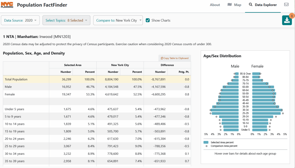
Hundreds of state, regional, county, and municipal governments create extracts of census data and republish them on their websites, to provide local residents with accessible summaries for their jurisdictions. In most cases these are in spreadsheets or reports, but some places have rich applications, and may recompile census data for geographies of local interest such as neighborhoods. Search for pages for planning agencies, economic development orgs, and open data portals. New York City is a noteworthy example; not only do they provide detailed spreadsheets, they also have the excellent map-based Population FactFinder application. Fairfax County, VA provides spreadsheets, reports, an interactive map, and spreadsheet tools and macros that facilitate working with ACS data.
NYC Population Factfinder Showing ACS Data for Inwood in Northern Manhattan
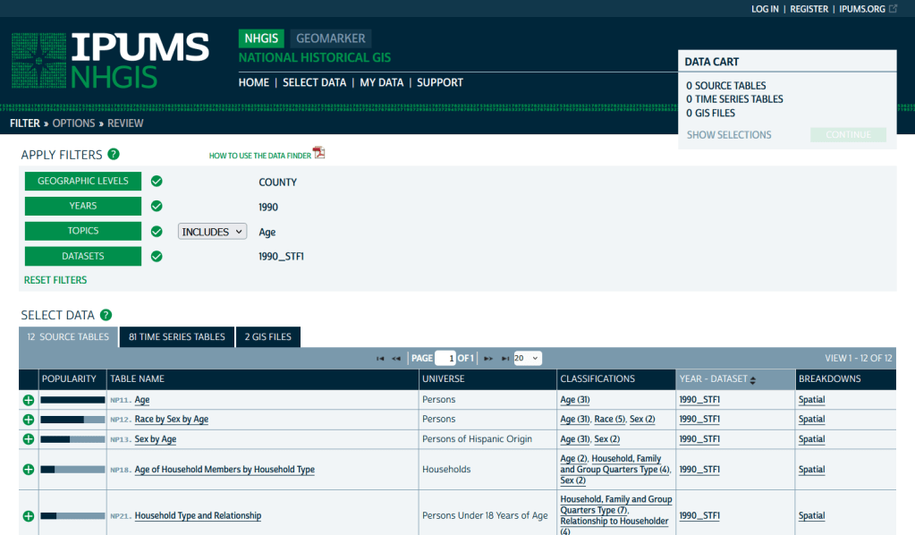
IPUMS NHGIS https://www.nhgis.org/ Focus: all contemporary and historic tables and GIS boundary files for the ACS and decennial census
If you need access to everything, this is the place to go. The National Historic Geographic Information System uses an interface similar to the old American Factfinder (or the Advanced Search for data.census.gov). Choose your dataset, survey, year, topic, and geographies, and access all the tables as they were originally published. There is also a limited selection of historical comparison tables (which I’ve written about previously). Given the volume of data, the emphasis is on selecting and downloading the tables; you can see variable definitions, but you can’t preview the statistics. This is also your best option to download GIS boundary files, past and present. You must register to use NHGIS, but accounts are free and the data is available for non-commercial purposes. For users who prefer scripting, there is an API.
IPUMS NHGIS Filtered to Show County Data on Age from the 1990 Census
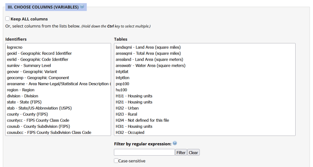
Unlike other applications where you download data that’s prepackaged in tables, Uexplore allows you to create targeted, customized extracts where you can pick and choose variables from multiple tables. While the interface looks daunting at first, it’s not bad once you get the hang of it, and it offers tremendous flexibility and ample documentation to get you started. This is a good option for folks who want customized extracts, but are not coders or API users.
Portion of the Filter Interface for MCDC Uexplore / Dexter
Commercial Products
There are some commercial products that are quite good; they add value by bundling data together and utilizing interactive maps for exploration, visualization, and access. The upsides are they are feature rich and easy to use, while the downsides are they hide the fuzziness of ACS estimates by omitting margins of error (making it impossible to gauge reliability), and they require a subscription. Many academic libraries, as well as a few large public ones, do subscribe, so check the list of library databases at your institution to see if they subscribe (the links below take you to the product website, where you can view samples of the applications).
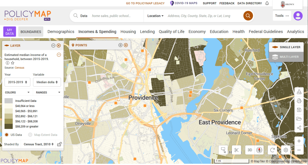
PolicyMap bundles 21st century census data, datasets from several government agencies, and a few proprietary series, and lets you easily create thematic maps. You can generate broad reports for areas or custom regions you define, and can download comparison tables by choosing a variable and selecting all geographies within a broader area. It also incorporates some basic analytical GIS functions, and enables you to upload your own coordinate point data.
PolicyMap Displaying ACS Income Data for Providence, RI
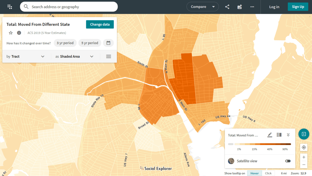
Social Explorer allows you to effortlessly create thematic maps of census data from 1790 to the present. You can create a single map, side by side maps for showing comparisons over time, and swipe maps to move back and forth from one period to the other to identify change. You can also compile data for customized regions and generate a variety of reports. There is a separate interface for downloading comparison tables. Beyond the US demographic module are a handful of modules for other datasets (election data for example), as well as census data for other countries, such as Canada and the UK.
Social Explorer Map Displaying ACS Migration Data for Providence, RI


You must be logged in to post a comment.